
什么是ECharts图表
ECharts,一个使用 JavaScript 实现的开源可视化库,可以流畅的运行在 PC 和移动设备上,兼容当前绝大部分浏览器(IE9/10/11,Chrome,Firefox,Safari等),底层依赖矢量图形库 ZRender,提供直观,交互丰富,可高度个性化定制的数据可视化图表。
官网网址:Apache ECharts
自主封装网址:ChartLib
快速入门
1.安装Echarts
npm install echarts --save
2.在项目中引入Apache Echarts
import * as echarts from 'echarts
3.按需引入Apache Echarts
// 引入 echarts 核心模块,核心模块提供了 echarts 使用必须要的接口。
import * as echarts from 'echarts/core';
// 引入柱状图图表,图表后缀都为 Chart
import { BarChart } from 'echarts/charts';
// 引入提示框,标题,直角坐标系,数据集,内置数据转换器组件,组件后缀都为 Component
import {
  TitleComponent,
  TooltipComponent,
  GridComponent,
  DatasetComponent,
  TransformComponent
} from 'echarts/components';
// 标签自动布局、全局过渡动画等特性
import { LabelLayout, UniversalTransition } from 'echarts/features';
// 引入 Canvas 渲染器,注意引入 CanvasRenderer 或者 SVGRenderer 是必须的一步
import { CanvasRenderer } from 'echarts/renderers';
4.基本配置参数
| itle | 标题设置 |
|---|
| tooltip | 工具提示 |
| xAxis | x轴 |
| yAxis | y轴 |
| series | 图表系列信息 |
| toolbox | 工具箱按钮 |
| legend | 图例组件(图例可以帮助我们对图表进行筛选) |
| color | 线条颜色 |
| grid | 是否显示绘图网格 |
title标题常用参数
| 参数 | 含义 |
|---|
| textStyle | 标题文字样式设置(是个对象,里面能设置文字的具体样式,颜色、字体大小……) |
| borderWidth | 标题边框宽度(number数据类型,写数字即可) |
| borderColor | 标题边框颜色 |
| borderRadius | 边框圆角(统一设置四个时是数字,分开设置用数组) |
| top/right/bottom/left | 标题距离(上/右/下/左)边的距离(number数据类型,写数字即可) |
tooltip工具提示
| 参数 | 含义 |
|---|
| trigger | 工具提示的类型(item/axis/none) |
| triggerOn | 触发时机(click/mouseOver……) |
| formatter | 提示框浮层内容格式器 |
xAxis/yAxis x/y轴
| 参数 | 含义 |
|---|
| type | 坐标轴类型(value数轴/category类目轴/time时间轴) |
| data | x/y轴的数据(数组,需要一一对应) |
| position | x/y轴的位置 |
toolbox 工具箱按钮:feature:{}中的参数
| 参数 | 含义 |
|---|
| saveAsImage | 导出图片({}) |
| dataView | 数据视图({}) |
| restore | 重置({}) |
| dataZoom | 区域缩放({}) |
| magicType | 动态图表类型的切换({type: ['bar', 'line',……] }) |
legend 图例组件
| 参数 | 含义 |
|---|
| data | 图例的数据数组(与series个数对应) |
grid 是否显示绘图网格
| 参数 | 含义 |
|---|
| show | 是否显示(flase/true) |
| borderWidth | 网格线边框宽度 |
| borderColor | 网格线边框颜色 |
| top/right/bottom/left | 网格线离容器上/右/下/左侧的距离 |
| width/height | 网格线的宽高 |
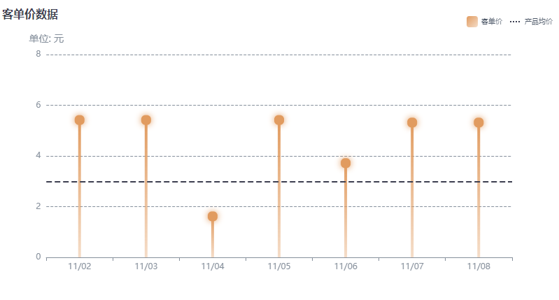
5.案例
棒棒糖图(点棒图)
主要代码(代码块包含配置信息)
// 引入 echarts 核心模块,核心模块提供了 echarts 使用必须要的接口。
import * as echarts from 'echarts/core';
// 引入柱状图图表,图表后缀都为 Chart
import { BarChart } from 'echarts/charts';
// 引入提示框,标题,直角坐标系,数据集,内置数据转换器组件,组件后缀都为 Component
import {
TitleComponent,
TooltipComponent,
GridComponent,
DatasetComponent,
TransformComponent
} from 'echarts/components';
// 标签自动布局、全局过渡动画等特性
import { LabelLayout, UniversalTransition } from 'echarts/features';
// 引入 Canvas 渲染器,注意引入 CanvasRenderer 或者 SVGRenderer 是必须的一步
import { CanvasRenderer } from 'echarts/renderers';
4.案例
棒棒糖图(点棒图)
<template>
<div style="width: 100%; height: 420px; position: absolute; margin-top: 30px" id="dotbar"></div>
</template>
•
<script setup>
import * as echarts from 'echarts'
•
setTimeout(() => { // 通过计时器拉取延时数据,防止页面加载数据没更新状态
room()
}, 500)
let room = () => {
var chartDom = document.getElementById('dotbar') // 获取dom元素
var myChart = echarts.init(chartDom)
var option
•
option = {
// legend 设置图例的样式
legend: {
right: 20, //距离盒子右边距离
itemWidth: 16, //图例颜色块的宽度和高度
itemHeight: 16,
•
textStyle: {
fontSize: 10, //图例字号大小
color: '#4E5969' //图例字号颜色
},
//设置图表数据
data: [
{ name: '客单价'}, //设置图表数据
{
/* TIP: 设置虚线 */ // 增加数据的平均值
name: '产品均价',
lineStyle: { // 设置图标样式
type: 'dotted', // 虚线格式
width: 2, //虚线宽度
color: '#3D3F50' //虚线颜色
}
}
],
selectedMode: false, //图例选择模式关闭
},
xAxis: { //设置X轴样式
axisLabel: { //坐标轴刻度标签设置
textStyle: {
color: '#86909C', //文字颜色
fontSize: 12 //文字大小
}
},
axisLine: { //坐标轴线条标签设置
lineStyle: {
color: '#86909C' //线条颜色
}
},
// X轴坐标数据标签
data: ['11/02', '11/03', '11/04', '11/05', '11/06', '11/07', '11/08']
},
// Y轴样式设置
yAxis: [
{
name: '单位: 元', //Y轴 标签名称
nameTextStyle: { //设置名字样式
color: '#86909C',
fontSize: 14
},
type: 'value', //对象类型
position: 'left', // Y轴位置
max: 8,
interval: 2,
axisLabel: {
formatter: '{value}',
textStyle: {
color: '#86909C',
fontSize: 12
}
},
axisLine: { show: false },
axisTick: { show: false },
splitLine: {
lineStyle: {
color: '#86909C',
type: 'dashed'
}
}
}
],
series: [ //设置数据内容的样式以及数据
{
name: '客单价', //数据名称
type: 'bar', //数据类型
barWidth: 4,
barGap: '400%',
label: { //样式设置
show: true,
formatter: '{a|}',
color: '#fff',
position: 'top',
distance: -10,
backgroundColor: '#E19B5F',
shadowColor: '#E19B5F',
shadowBlur: 10,
padding: 4,
borderRadius: 6,
rich: {
a: {
width: 6,
height: 6,
borderRadius: 6,
lineHeight: 6,
backgroundColor: '#E19B5F'
}
}
},
itemStyle: { // 棒棒糖的样式数据
normal: {
color: {
type: 'linear',
x: 0,
y: 0,
x2: 1,
y2: 1,
colorStops: [
{
offset: 0,
color: 'rgba(225, 155, 95, 1)' // 0% 处的颜色
},
{
offset: 1,
color: 'rgba(225, 155, 95, 0.34)' // 100% 处的颜色
}
]
}
}
},
data: [5.5, 5.5, 1.7, 5.5, 3.8, 5.4, 5.4], //对象数据
markLine: { //平均线的设置
symbol: ['none', 'none'], //去掉箭头
lineStyle: {
normal: {
type: 'dashed',
color: '#3D3F50', //基准线颜色
width: 2,
}
},
data: [
{
yAxis: 3
}
],
label: {
show: true,
position: 'end', // 表现内容展示的位置
// position: "insideStartBottom",
color: '#3D3F50', // 基准线文字颜色
normal: {
formatter: '' // 这儿设置安全基线
}
}
}
},
{
/* TIP: 增加的series */
type: 'line',
symbol: 'none',
name: '产品均价',
color: 'transparent'
}
]
}
•
option && myChart.setOption(option)
}
</script>


 本文介绍了ECharts,一个强大的JavaScript可视化库,用于创建交互式图表,包括安装步骤、配置参数详解和一个棒棒糖图示例。ECharts支持多种图表类型,兼容多种浏览器,并详细阐述了如何设置标题、工具提示、轴和系列等关键组件。


 1744
1744

 被折叠的 条评论
为什么被折叠?
被折叠的 条评论
为什么被折叠?
 到【灌水乐园】发言


