


1.CSS盒子布局
| 标签 | 含义 |
|---|---|
| margin | 外边距 |
| padding | 内边距 |
| background-color | 背景颜色 |
| border | 边框 |
| border-style | 边框类型(solid.dish.double) |
<!DOCTYPE html>
<html lang="en">
<head>
<meta charset="UTF-8">
<meta name="viewport" content="width=device-width, initial-scale=1.0">
<title>CSS盒子布局</title>
<style>
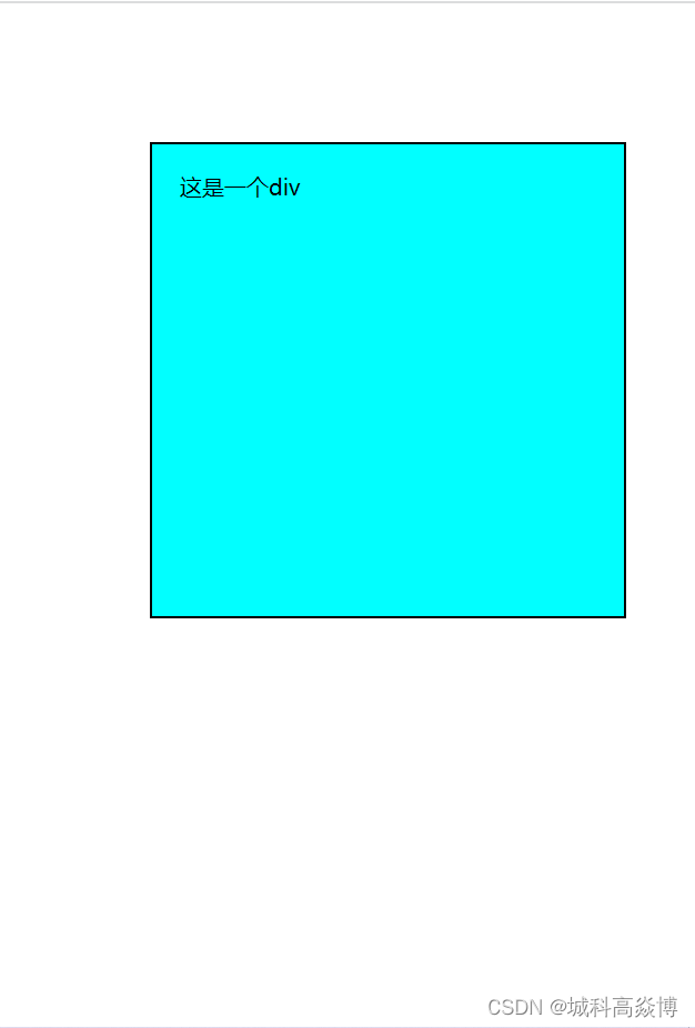
div
{
width: 300px;
height: 300px;
background-color: aqua;
margin: 100px;
padding: 20px;
border: 2px solid black;
}
</style>
</head>
<body>
<div>这是一个div</div>
</body>
</html>
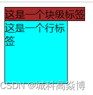
2.元素的分类
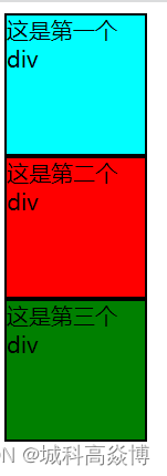
1.块级元素:独占一行(自动换行),设置宽度和高度:div.p.hn(h1.h2.h3…).hr等。
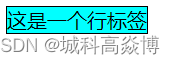
2.内联元素:不会自动换行,设置宽度和高度的时候不起作用的:span.a
<!DOCTYPE html>
<html lang="en">
<head>
<meta charset="UTF-8">
<meta name="viewport" content="width=device-width, initial-scale=1.0">
<title>CSS盒子布局</title>
<style>
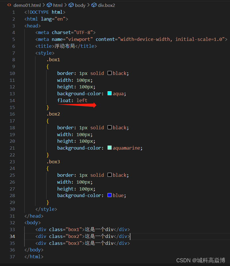
div.box1
{
width: 100px;
height: 100px;
background-color: aqua;
border: 2px solid black;
}
div.box2
{
width: 100px;
height: 100px;
background-color: red;
border: 2px solid black;
}
div.box3
{
width: 100px;
height: 100px;
background-color: green;
border: 2px solid black;
}
</style>
</head>
<body>
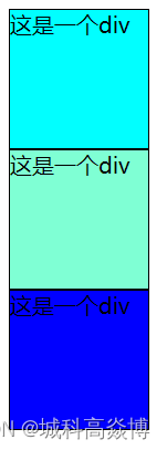
<div class="box1">这是第一个div</div>
<div class="box2">这是第二个div</div>
<div class="box3">这是第三个div</div>
</body>
</html>
<!DOCTYPE html>
<html lang="en">
<head>
    <meta charset="UTF-8">
    <meta name="viewport" content="width=device-width, initial-scale=1.0">
    <title>Document</title>
    <style>
        span
        {
            border: 1px solid black;
            width: 100px;
            height: 100px;
            background-color: aqua;
        }
    </style>
</head>
<body>
    <span>这是一个行标签</span>
</body>
</html>
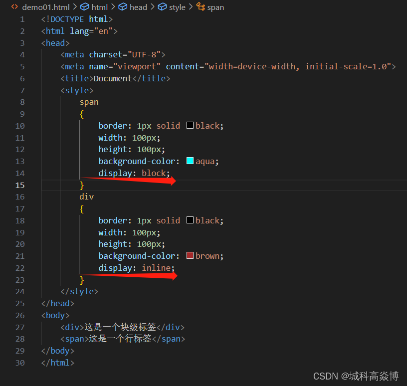
可以将块级元素和内联元素进行相互转换------display
| 属性 | 含义 |
|---|---|
| none | 此元素不会被显示 |
| block | 将元素显示为块级元素 |
| inline | 可以将元素显示为内联元素 |
注意:
隐藏元素的方式:
1.display:none
2.width=0;height=0;
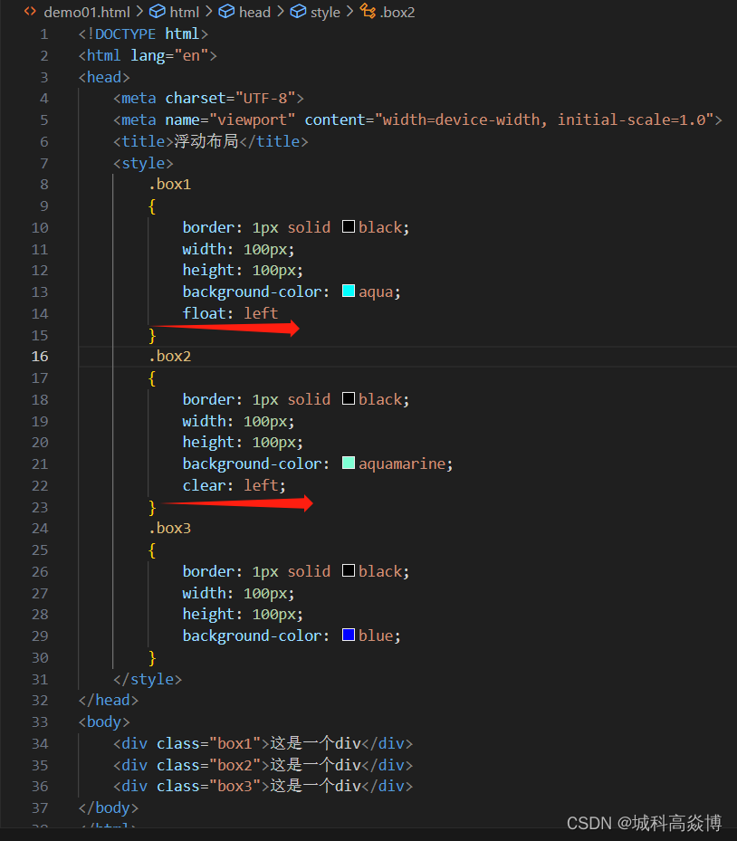
3.浮动布局
通过设置float属性进行布局
| 取值 | 含义 |
|---|---|
| none | 不浮动 |
| left | 左浮(对象向左进行浮动,而后面的内容会流向对象的左侧) |
| right | 右浮(对象向右进行浮动,而后面的内容会流向对象的右侧) |
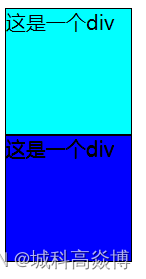
注意:元素浮动之后会影响后面的元素—使用clear属性可以解决这个问题。
| 取值 | 含义 |
|---|---|
| none | 默认值:允许两边都可以有浮动 |
| left | 不允许左边有浮动 |
| right | 不允许右边有浮动 |
| both | 不允许两边有移动 |
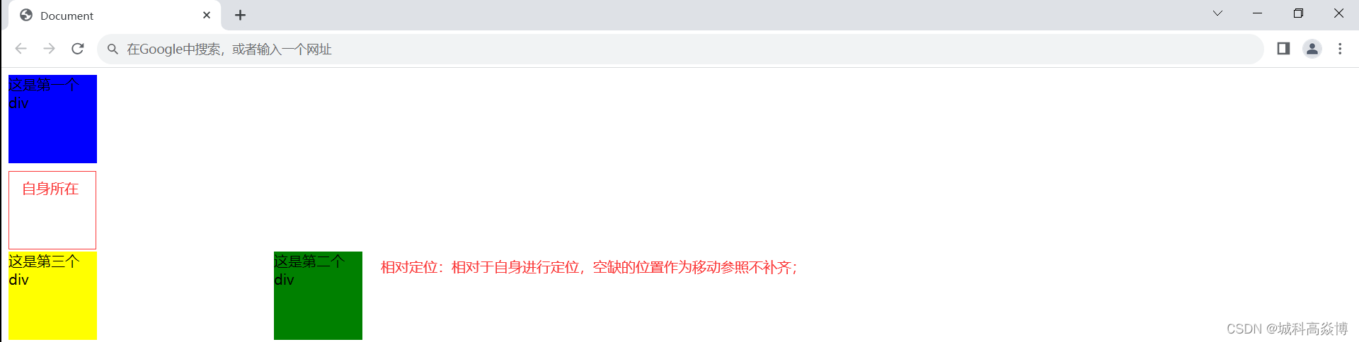
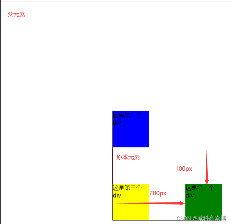
4.定位布局
| 属性 | 含义 |
|---|---|
| static | 静态定位(默认值:没有定位) |
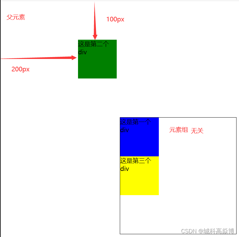
| absolute | 绝对定位:将对象从文档流中分离出来,通过设置left,right,bottom,top四方向值 |
| – | 相对于父级对象进行绝对定位,如果不存在这样的父级对象,则依据body进行定位 |
| relative | 相对定位:对象不从文档流分离出来,通过设置left,right,bottom,top四方向值 |
| – | 相较于自身位置进行定位 |
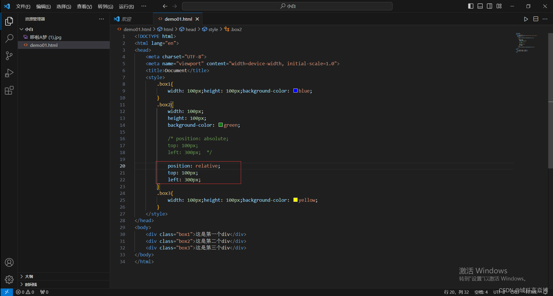
代码展示:
<!DOCTYPE html>
<html lang="en">
<head>
    <meta charset="UTF-8">
    <meta name="viewport" content="width=device-width, initial-scale=1.0">
    <title>Document</title>
    <style>
        .box1{
            width: 100px;height: 100px;background-color: blue;
        }
        .box2{
            width: 100px;
            height: 100px;
            background-color: green;

            position: absolute;
            top: 100px;
            left: 300px;

            /* position: relative;
            top: 100px;
            left: 300px; */
        }
        .box3{
            width: 100px;height: 100px;background-color: yellow;
        }
    </style>
</head>
<body>
    <div class="box1">这是第一个div</div>
    <div class="box2">这是第二个div</div>
    <div class="box3">这是第三个div</div>
</body>
</html>
 效果展示:(绝对定位)
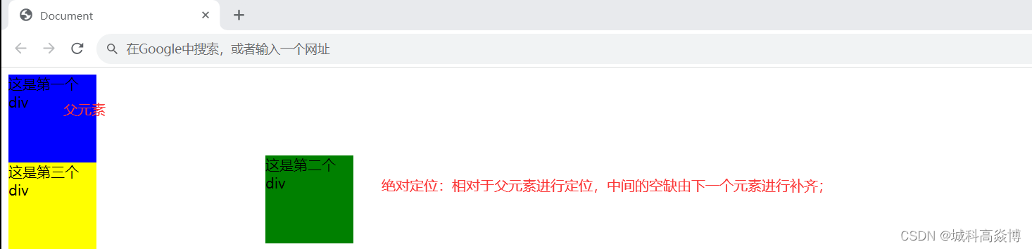
 效果展示:(相对定位)
5.其他属性
5.1
| 属性 | 取值 |
|---|---|
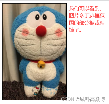
| overflow | visible:默认值(不剪切内容也不添加滚动条); |
| – | auto:在必需时对象才会被剪切或者添加滚动条 |
| – | hidden:不显示超过对象尺寸的内容 |
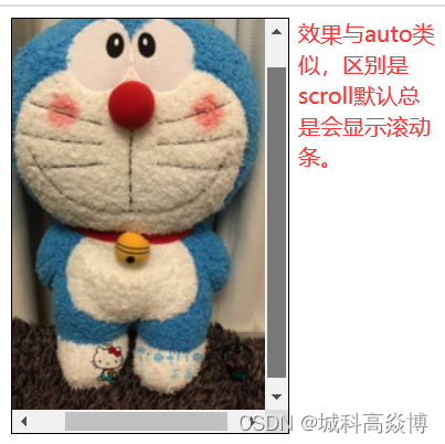
| – | scroll:总显示滚动条 |
代码展示:
<!DOCTYPE html>
<html lang="en">
<head>
    <meta charset="UTF-8">
    <meta name="viewport" content="width=device-width, initial-scale=1.0">
    <title>其他属性</title>
    <style>
        .one{
            border: 1px solid black;
            width: 200px;
            height: 300px;
            overflow: visible;
            /* overflow:auto; */
            /* overflow: hidden; */
            /* overflow: scroll; */

        }
    </style>
</head>
<body>
    <div class="one">
        <img src="../哆啦A梦 (1).jpg">

    </div>
</body>
</html>
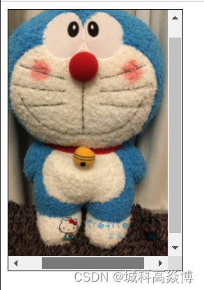
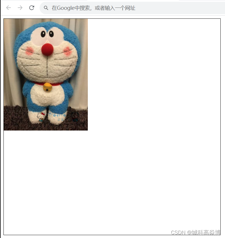
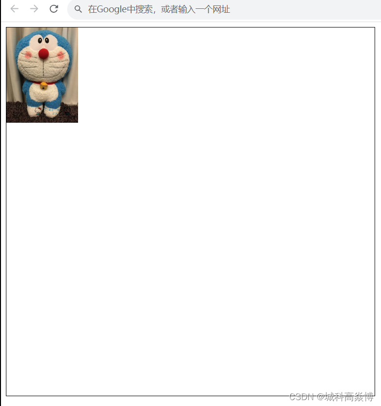
效果展示:
1.visible
2.auto
3.hidden
4.scroll
6.隐藏元素的方式
1.display:none ;
2.width: 0 ; height: 0 ;
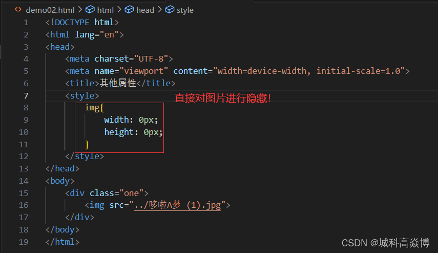
3.overflow: hidden ;
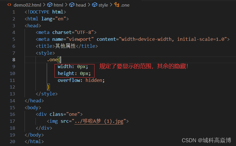
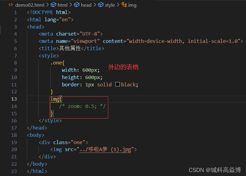
5.2设置或者检索对象的缩放比例
| 属性 | 含义 |
|---|---|
| zoom | normal:默认值(使用对象的原比例) |
| – | number–使用百分比或者无符号的浮点实数1.0/100% |


 1406
1406


 被折叠的 条评论
为什么被折叠?
被折叠的 条评论
为什么被折叠?
 到【灌水乐园】发言


