


给父元素添
4141
/* - flex-start 默认 在主轴的默认对齐方式 */
/* justify-content: flex-start; */
1、flex-direction -- 改变轴的方向
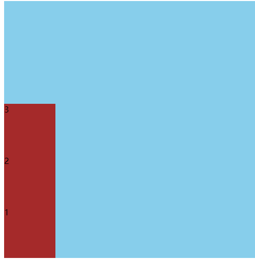
- row 默认值 默认沿着x 轴排版
- row-reverse -- 沿着x 轴右边排版
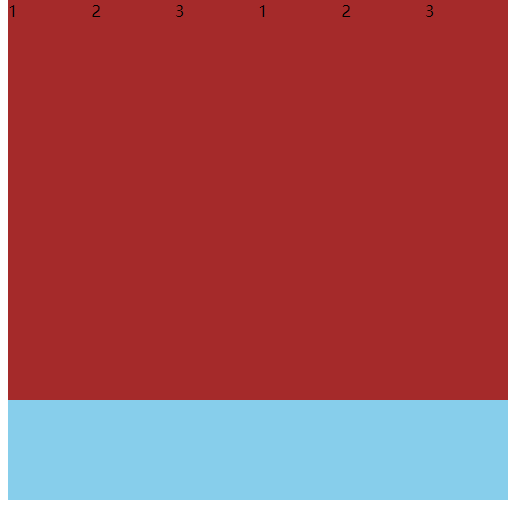
- column -- 沿着y轴从上到下排版
column-reverse --沿着xy轴从下到上排版(反转纵向排列,从后往前排,最后一项排在最上面)
语法:

    <style>

        .main{

            width: 500px;

            height: 500px;

            background: skyblue;

            display: flex;

            /* flex-direction: row; */

            /* flex-direction: row-reverse; */

            /* flex-direction: column; */

            flex-direction: column-reverse;

        }

        .main div{

            width: 100px;

            height: 100px;

            background-color: brown;

        }

    </style>

</head>

结构:

<body>

    <div class="main">

        <div>1</div>

        <div>2</div>

        <div>3</div>

    </div>

</body>
/* flex-direction: row; */ row默认值 默认沿着x 轴排版
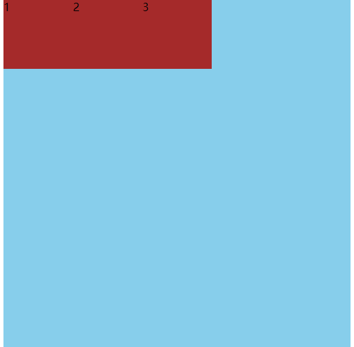
/* flex-direction: row-reverse; */ - row-reverse -- 沿着x 轴右边排版
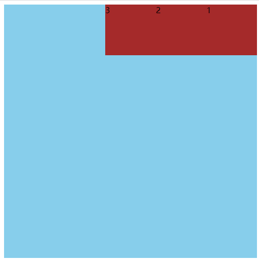
/* flex-direction: column; */ - column -- 沿着y轴从上到下排版
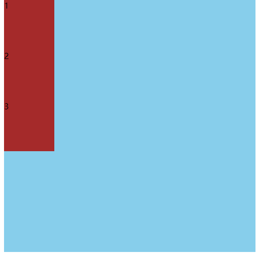
flex-direction: column-reverse; flex-direction: column-reverse;
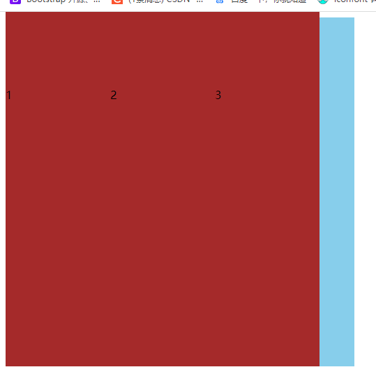
2、flex-wrap 换行与缩写
注意:弹性盒子的宽度是自动变化的,如果不做设置,弹性布局子元素不会溢出,只有在足够多的情况下才可以溢出
取值:
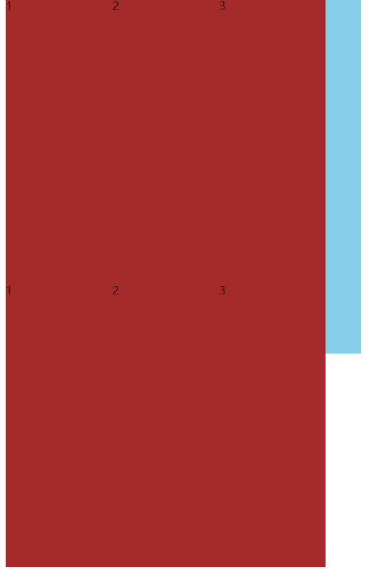
- nowrap 默认值 不换行
- wrap 换行 加入的是两行,会把父元素分为对等的两部分,子元素在每一个部分中都是顶端对齐。依次类推
- wrap-reverse:反转折行
语法:

  <style>

        .main{

            width: 500px;

            height: 500px;

            background: skyblue;

            display: flex;

            flex-wrap: wrap;

        }

        .main div{

            width: 150px;

            height: 400px;

            background-color: brown;

        }

    </style>

</head>

<body>

    <div class="main">

        <div>1</div>

        <div>2</div>

        <div>3</div>

        <div>1</div>

        <div>2</div>

        <div>3</div>

    </div>

</body>
- nowrap 默认值 不换行 flex-wrap: nowrap;
- wrap 换行 flex-wrap: wrap;
- wrap-reverse:反转这行 lex-wrap: wrap-reverse;
2.1 改变轴和换行结合起来使用
.main {
width: 500px;
height: 500px;
background: skyblue;
display: flex;
/* 主轴和换行结合使用 */
flex-direction: column-reverse;
flex-wrap: wrap;
// 注意:并不适合列的自适应
}
简写
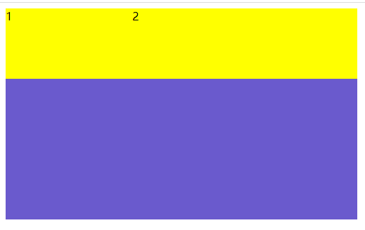
flex-flow: column-reverse wrap;3、justify-content -- 主轴的对齐方式 -- 针对某一个元素
- flex-start 默认 在主轴的默认对齐方式
- flex-end 在主轴的末尾开始对齐
- center 在主轴的中间对齐
- space-round 在主轴上平均分配空间
- space-between 在主轴上的两端有两个元素分别对齐,剩余元素平均分配剩余空间
space-evenly 所有的元素平均分配剩余空间
语法:

 .main {

            width: 500px;

            height: 500px;

            background: darkgoldenrod;

            display: flex;


            /* - flex-start 默认 在主轴的默认对齐方式  */

            /* justify-content: flex-start; */


            /* - flex-end 在主轴的末尾开始对齐  */

            /* justify-content: flex-end; */

               /* - center 在主轴的中间对齐  */

            /* justify-content: center; */

           /* - space-round 在主轴上平均分配空间  */
            /* justify-content: space-around; */

 /* - space-between 在主轴上的两端有两个元素分别对齐,剩余元素平均分配剩余空间 */
            /* justify-content: space-between; */

             /* - space-evenly 所有的元素平均分配剩余空间  */
            justify-content: space-evenly;
        }
        .main div {
            width: 50px;
            height: 50px;
            background: rebeccapurple;
        }
    </style>
  /* - flex-start 默认 在主轴的默认对齐方式  */

            /* justify-content: flex-start; */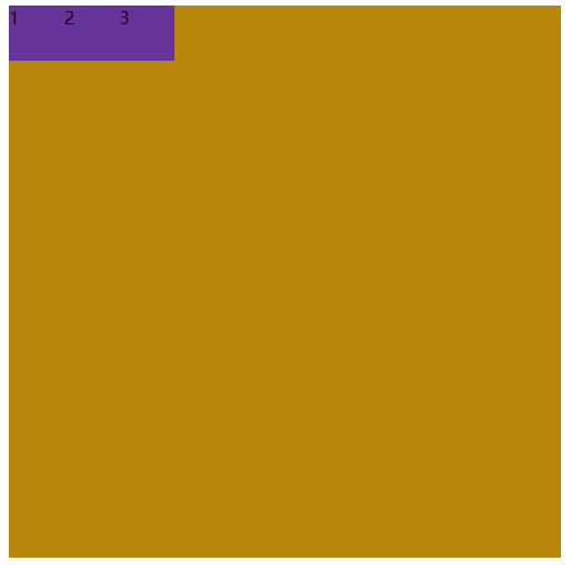
      /* - flex-end 在主轴的末尾开始对齐  */

            /* justify-content: flex-end; */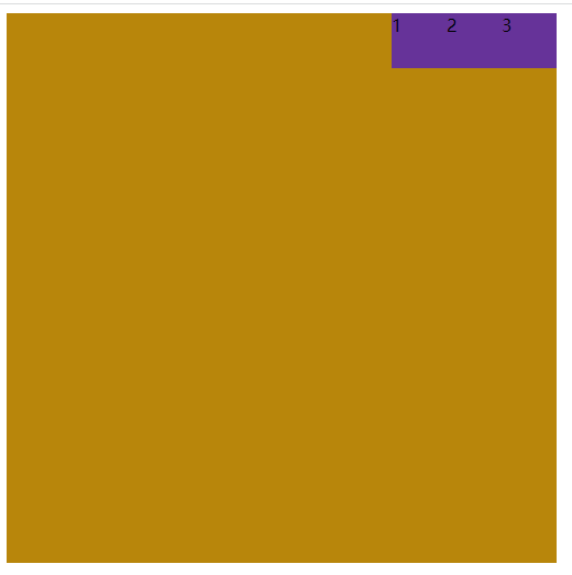
  /* - center 在主轴的中间对齐  */

            /* justify-content: center; */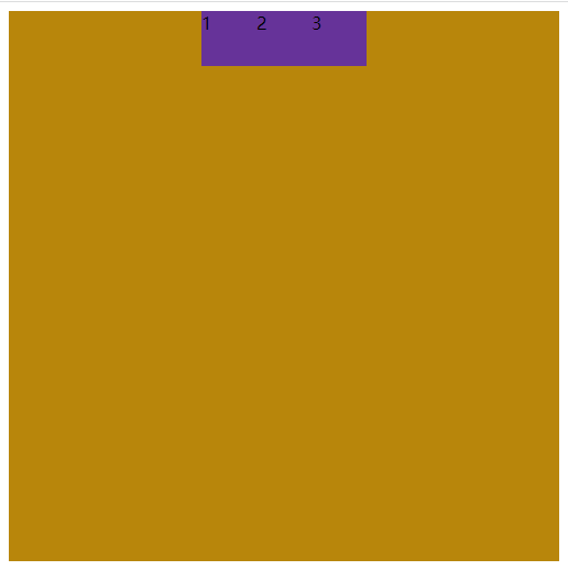
    /* - space-round 在主轴上平均分配空间  */

            /* justify-content: space-around; */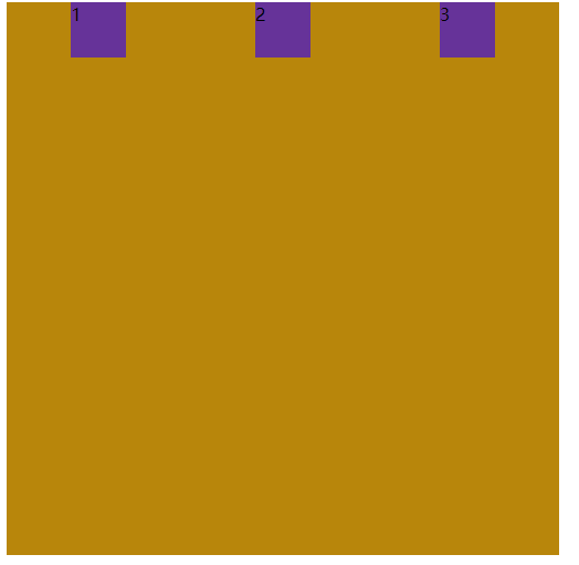
   /* - space-between 在主轴上的两端有两个元素分别对齐,剩余元素平均分配剩余空间 */

            /* justify-content: space-between; */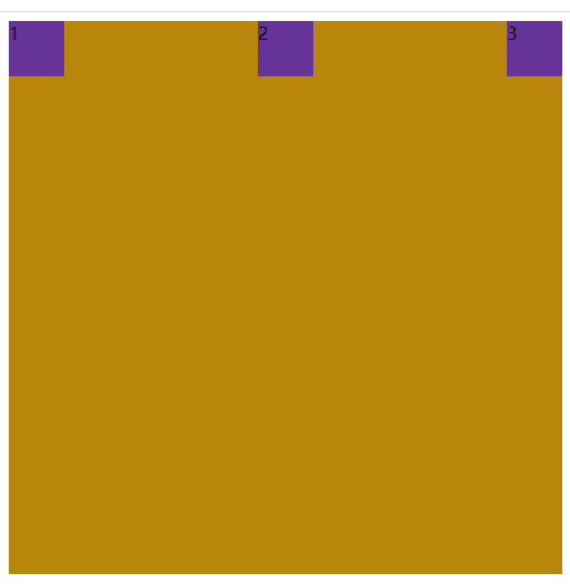
   /* - space-evenly 所有的元素平均分配剩余空间  */

            justify-content: space-evenly;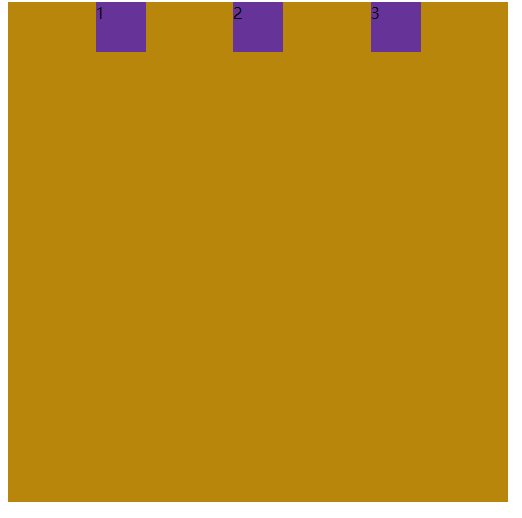
- 交叉轴对齐 -- align-content -- 针对的是整体
- stretch 默认值
- flex-start 在主轴默认对齐方式
- flex-end 在主轴的末尾开始对齐
- center 在主轴的中间对齐
- space-round 在主轴上平均分配空间
- space-between 在主轴上的两端有两个元素分别对齐,剩余元素平均分配剩余空间
- space-evenly 所有的元素平均分配剩余空间
语法:

<style>

        .main {

            width: 500px;

            height: 500px;

            background: darkgoldenrod;

            display: flex;

            flex-wrap: wrap;

            /* 注意:只有一行的情况下align-content是不生效的   对多行排列的方式 */

            /* - stretch  默认值  */

            /* align-content: stretch; */

           /* - flex-start  在主轴默认对齐方式 */
            /* align-content: flex-start; */

            /* - flex-end 在主轴的末尾开始对齐 */
            /* align-content: flex-end; */

           /* - center  在主轴的中间对齐 */
            /* align-content: center; */

          /* - space-round  在主轴上平均分配空间 */
            /* align-content: space-around; */

   /* - space-between 在主轴上的两端有两个元素分别对齐,剩余元素平均分配剩余空间 */
            /* align-content: space-between; */

           /* - space-evenly  所有的元素平均分配剩余空间 */
            align-content: space-evenly;
  }
        .main div {
            width: 100px;
            height: 50px;
            background: rebeccapurple;
        }
    </style>
</head>
结构:
<body>
    <div class="main">
        <div>1</div>
        <div>2</div>
        <div>3</div>
        <div>1</div>
        <div>2</div>
        <div>3</div>
        <div>1</div>
        <div>2</div>
        <div>3</div>
    </div>
</body>
    /* - stretch  默认值  */

            /* align-content: stretch; */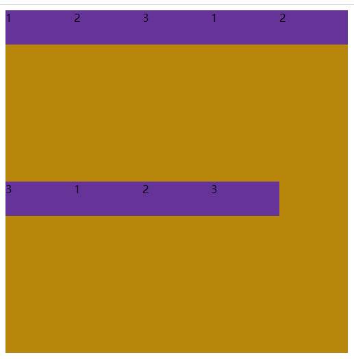
  /* - flex-start  在主轴默认对齐方式 */

            /* align-content: flex-start; */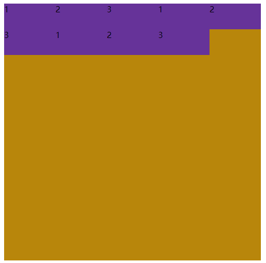
 /* - flex-end 在主轴的末尾开始对齐 */

            /* align-content: flex-end; */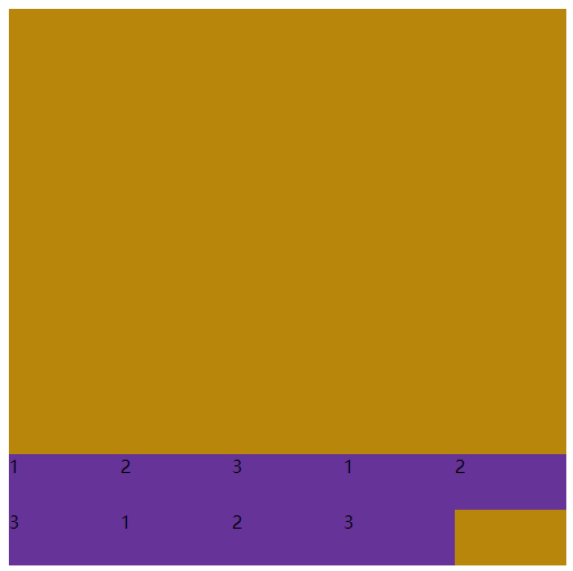
       /* - center  在主轴的中间对齐 */

            /* align-content: center; */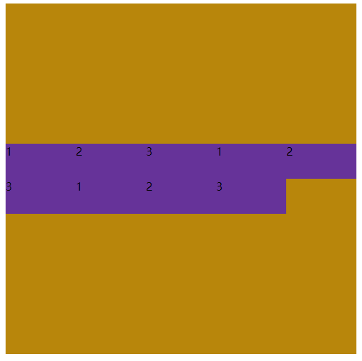
            /* - space-round  在主轴上平均分配空间 */

            /* align-content: space-around; */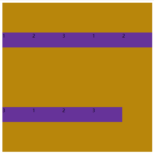
  /* - space-between 在主轴上的两端有两个元素分别对齐,剩余元素平均分配剩余空间 */

            /* align-content: space-between; */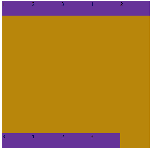
           /* - space-evenly  所有的元素平均分配剩余空间 */

            align-content: space-evenly;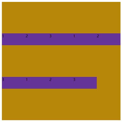
 .main div {

            width: 100px;

            height: 50px;

            background: rebeccapurple;

        }

    </style>

</head>

结构:

<body>

    <div class="main">

        <div>1</div>

        <div>2</div>

        <div>3</div>

        <div>1</div>

        <div>2</div>

        <div>3</div>

        <div>1</div>

        <div>2</div>

        <div>3</div>

    </div>

</body>- algin-items -- 针对行
- stretch 默认值
- flex-start 在主轴默认对齐方式
- flex-end 在主轴的末尾开始对齐
- center 在主轴的中间对齐
- baseline 基线对齐
语法:
<style>
.main {
width: 500px;
border: 1px solid brown;
display: flex;
/* - stretch 默认值 */
/* align-items: stretch; */
/* - flex-start 在主轴默认对齐方式 */
/* align-items: flex-start; */
/* - flex-end 在主轴的末尾开始对齐 */
/* align-items: flex-end; */
/* - center 在主轴的中间对齐 */
/* align-items: center; */
/* - baseline 基线对齐 */
align-items: baseline;
}
</style>
</head>
<body>
<div class="main">
dsdadggg
<img src="../images/1.jpg" alt="" width="100px" height="100px">
</div>
</body>
添加给子元素的属性
1.flex-grow扩展比例
默认值 是 0 , 表示不占用剩余的空白间隙扩展自己的宽度
语法:
1.1只有一个子元素的时候
<style>

        .main{

            width: 500px;

            height: 500px;

            background: gold;

            display: flex;

        }

        .main div{

            width: 100px;

            height: 100px;

            background: blue;


 /* 默认的 不占满剩余的所以空间 */

            /* flex-grow: 0; */


            /* 值为1 占满剩余的所有空间 */

            /* flex-grow: 1; */


           /* 值为小数 如 0.5

            宽度=剩余宽度*0.5 +原来宽度=100+(500-100)*0.5

            */

            flex-grow: 0.5;
    }

    </style>

</head>

<body>

    <div class="main">

        <div>1</div>

    </div>
/* 默认的 不占满剩余的所以空间 */
/* flex-grow: 0; */

/* 值为1 占满剩余的所有空间 */
/* flex-grow: 1; */

/* 值为小数 如 0.5
宽度=剩余宽度*0.5 +原来宽度=100+(500-100)*0.5
*/
flex-grow: 0.5;

/* 当取值大于等于1时 都会沾满整个空间 */
flex-grow: 5;

1.2当有两个子元素的时候
.main2 {

            width: 500px;

            height: 500px;

            background: gold;

            display: flex;

        }
.main2 div:nth-of-type(1){

            width: 200px;

            height: 100px;

            background-color: blueviolet;

          flex-grow: 1;

        }

        .main2 div:nth-of-type(2){

            width: 100px;

            height: 100px;

            background-color: blanchedalmond;

            flex-grow: 1;

        }
不加flex-grow时

- 两个子元素如果 flex-grow值一样(整数) 会平均分配剩余空间
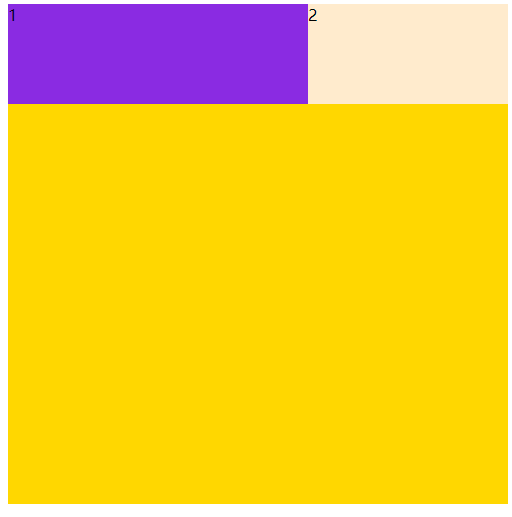
1的宽度:200+(500-100-200)*0.5=300
2的宽度:100+(500-100-200)*0.5=200
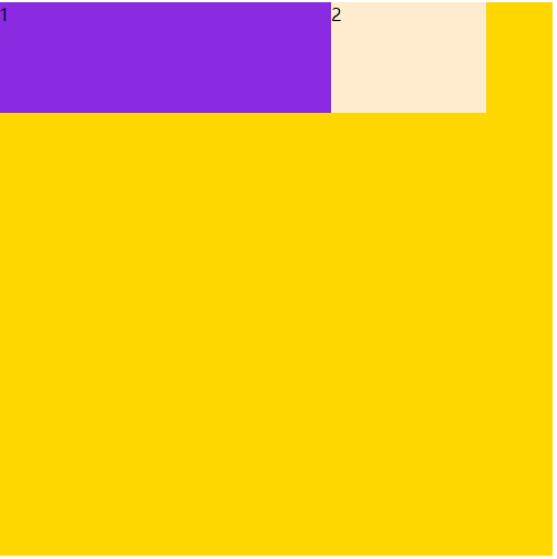
2、如果值不一样 剩余的宽度*flex-grow的参数就是所占用的值
也就是flex-grow的和 就是剩余空间所划分的份数,每个子元素占剩余空间的几分之几
.main2 {

            width: 500px;

            height: 500px;

            background: gold;

            display: flex;


.main2 div:nth-of-type(1){

            width: 200px;

            height: 100px;

            background-color: blueviolet;

            flex-grow: 1;

        }

        .main2 div:nth-of-type(2){

            width: 100px;

            height: 100px;

            background-color: blanchedalmond;

            flex-grow: 3;

        }
1的宽度:200+(500-100-200)* 1/4=250
2的宽度:100+(500-100-200)* 1/4=250
- 如果是小数,会把剩余的空间分成10份 第一个占5份 第二个占2份
.main2 {

            width: 500px;

            height: 500px;

            background: gold;

            display: flex;
}
        .main2 div:nth-of-type(1){

            width: 200px;

            height: 100px;

            background-color: blueviolet;

            flex-grow: 0.5;

        }

        .main2 div:nth-of-type(2){

            width: 100px;

            height: 100px;

            background-color: blanchedalmond;

            flex-grow: 0.2;

        }
2、flex-shrink -- 收缩比列
2.1一个子元素
  <style>

        .main{

            width: 500px;

            height: 500px;

            background-color: aquamarine;

            display: flex;

        }

        .main div{

            width: 600px;

            height: 100px;

            background-color: blueviolet;
}
    </style>

</head>

<body>

    <div class="main">

        <div>1</div>

        </div>

</body>
/* 默认值 自动收缩 和容器大小相同 */
flex-shrink: 1;

/* 取值为0 那就不收缩 */
flex-shrink: 0;

/* 超出父元素宽度与系数相乘 */
flex-shrink: 0.5;
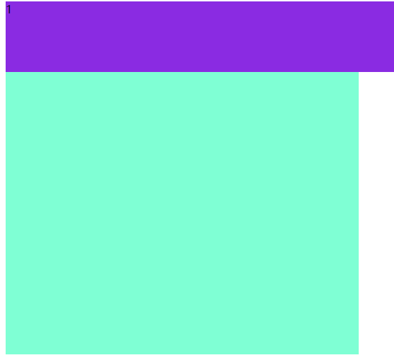
}
2.2两个子元素
1、默认值是 1 的情况下
300 + 400 - 500 -> 200
第一个子元素是300 第二个子元素是400 父元素是 500 超出了 200
当前空间:
300 - 3/7 * 200
400 - 4/7 * 200
 .main2{

            width: 500px;

            height: 300px;

            background-color: slateblue;

            display: flex;

        }
  .main2 div:nth-of-type(1){

            width: 300px;

            height: 100px;

            background-color: yellow;

            flex-shrink: 1;

        }

        .main2 div:nth-of-type(2){

            width: 400px;

            height: 100px;

            background-color: yellow;

            flex-shrink: 1;

        }
 .main2{

            width: 500px;

            height: 300px;

            background-color: slateblue;

            display: flex;

        }

.main2{

            width: 500px;

            height: 300px;

            background-color: slateblue;

            display: flex;

        }

        .main2 div:nth-of-type(1){

            width: 300px;

            height: 100px;

            background-color: yellow;

            flex-shrink: 2;

        }

        .main2 div:nth-of-type(2){

            width: 400px;

            height: 100px;

            background-color: yellow;

            flex-shrink: 1;

        }
当 flex-shrink 参数变成了 2 宽度是 300 这个时候 宽度就变成了 2 * 300 = 600
300 - 6/10*200
400 - 4/10*200
3、flex-basis 以及flex缩写
3.1flex-basis
默认值是auto 指定了flex元素在主轴方向的初始大小
/*
用途:如果没有 flex-direction: column 宽度改成200 水平就是200的宽度 高度是100
如果有 flex-direction: column 高度是200 宽度是 100
如果添加了 flex-basis 就不需要修改宽度和高度值了
*/
.main {

            width: 500px;

            height: 500px;

            background: skyblue;

            display: flex;

            flex-direction: column;

        }

        .main div {

            width: 100px;

            height: 100px;

            background-color: red;

            /* 根据主轴的不同的 宽度和高度的优先级不同 */

            /* flex-basis: 200px; */

        }
3.2flex-basis取值
.main div {

background-color: red;

/* 0% auto 200px 100% */

/* 固定大小 */

/* flex-basis: 200px; */

/* 文字撑开的宽度 */

/* flex-basis: auto; */

/* 最小宽度,文字得竖起来 */

/* flex-basis: 0; */

/* 跟父元素同宽 */

flex-basis: 100%;

}
3.3 flex缩写
flex属性
/*
flex-grow: 1;
flex-shrink: 1;
flex-basis: 0%;
*/
/* flex: 1; */
/*
flex-grow: 0;
flex-shrink: 1;
flex-basis: 0%;
*/
/* flex: 0; */
/*
flex-grow: 1;
flex-shrink: 1;
flex-basis: auto;
*/
/* flex: auto; */
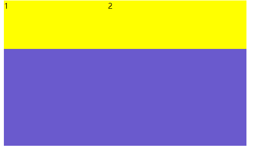
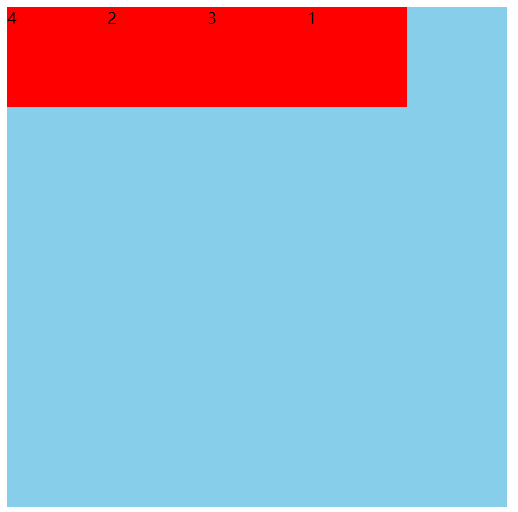
flex: 1 0 50%;4、order
默认值是 0 改变某一个flex子项的排序位置
 <style>

        .main {

    width: 500px;

    height: 500px;

    background: skyblue;

    display: flex;

}


.main div {

    width: 100px;

    height: 100px;

    background-color: red;

}


.main div:nth-of-type(1){

/* 默认值是 0 正数优先级要高 */

            order: 1;

        }

        .main div:nth-of-type(4){

/* 默认值是 0 负数优先级要低 */

            order: -1;

        }


    </style>

</head>

<body>

    <div class="main">

        <div>1</div>

        <div>2</div>

        <div>3</div>

        <div>4</div>

        </div>

</body>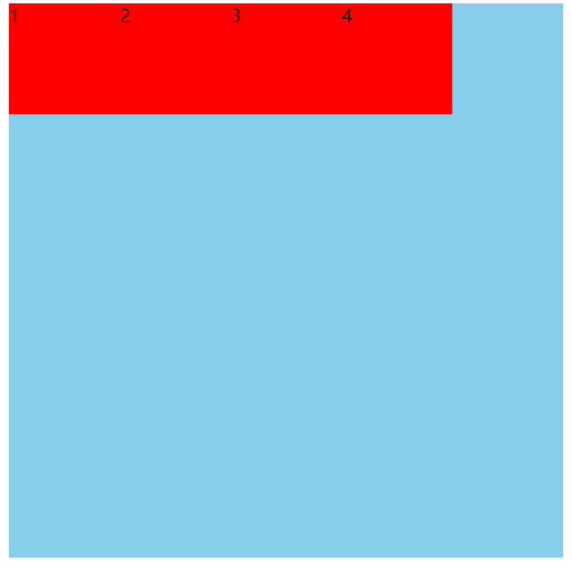
.main div:nth-of-type(1){
/* 默认值是 0 正数优先级要高 */
order: 1;
}
.main div:nth-of-type(4){
/* 默认值是 0 负数优先级要低 */
order: -1;
}
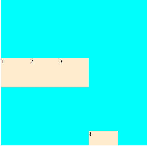
5、align-self --- 针对某一个小元素
默认值是 auto 控制单独某一个flex子项的垂直的对齐.
   <style>

        .main{

            width: 500px;

            height: 500px;

            background-color: aqua;

            display: flex;

            align-items: center;

        }

        .main div{

            width: 100px;

            height: 100px;

            background-color: blanchedalmond;

        }


      .main div:nth-of-type(4){

                height: 50px;

/* 对应的是父元素中的align-items: center的属性值 */

                align-self: flex-end;

            }


    </style>

</head>

<body>

    <div class="main">

        <div>1</div>

        <div>2</div>

        <div>3</div>

        <div>4</div>

        </div>

</body>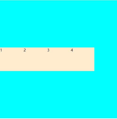
.main div:nth-of-type(4){
height: 50px;
/* 对应的是父元素中的align-items: center的属性值 */
align-self: flex-end;
}


 4601
4601


 被折叠的 条评论
为什么被折叠?
被折叠的 条评论
为什么被折叠?
 到【灌水乐园】发言


