


伪类选择器:
1.作用与优势:
1.作用:根据元素在HTML中的结构关系查找元素
2.优势:减少对于HTML中类的依赖,有利于保持代码的整洁
3.场景:常用于查找某父级选择器中的子元素
2.选择器
| 选择器 | 说明 |
| E:first-child{ } | 匹配父元素中第一个子元素,并且是E元素 |
| E:last-child{ } | 匹配父元素中最后一个子元素,并且是E元素 |
| E:nth-child(n){ } | 匹配父元素中第n个子元素,并且是E元素 |
| E:nth-last-child(n){ } | 匹配父元素中倒数第n个子元素,并且是E元素 |
1.n为:0、1、2、3、4、5、6.........
2.通过n可以组成常见公式
| 功能 | 公式 |
| 偶数 | 2n、even |
| 奇数 | 2n+1、2n-1、odd |
| 找到前5个 | -n+5 |
| 找到从第5个往后 | n+5 |
<!DOCTYPE html>
<html lang="en">
<head>
    <meta charset="UTF-8">
    <meta name="viewport" content="width=device-width, initial-scale=1.0">
    <title>Document</title>
    <style>
        li:nth-child(2n){
            background-color: pink;
        }
        li:first-child{
           background-color: greenyellow;
        }

    </style>
</head>
<body>
    <ul>
        <li>这是第1个li</li>
        <li>这是第2个li</li>
        <li>这是第3个li</li>
        <li>这是第4个li</li>
        <li>这是第5个li</li>
        <li>这是第6个li</li>
        <li>这是第7个li</li>
        <li>这是第8个li</li>
    </ul>

</body>
</html>
伪元素:
伪元素:一般页面中的非主体内容可以使用伪元素
区别:
1.元素:HTML设置的标签
2.伪元素:由CSS模拟出的标签效果
种类:
| 伪元素 | 作用 |
| ::before | 在父类元素内容的最前添加一个伪元素 |
| ::after | 在父元素内容的最后面添加一个伪元素 |
注意点:
1.必须设置content属性才生效
2.伪元素默认是行内元素
<!DOCTYPE html>
<html lang="en">
<head>
    <meta charset="UTF-8">
    <meta name="viewport" content="width=device-width, initial-scale=1.0">
    <title>Document</title>
    <style>
        .father{
            background-color:palevioletred;
            width: 500px;
            height: 500px;

        }
        .father::before{
            content: "哎呦😏";
            color: orange;
            background-color:palegreen;
            width: 300px;
            height: 300px;
            display: block;
        }
        .father::after{
            content: "😄哈哈哈";
            color: yellow;
            background-color: #e9e9e9;
            width: 90px;
            height: 90px;
            display: inline-block;
        }
    </style>
</head>
<body>
    <div class="father">哎😔
    </div>
</body>
</html>
标准流
标准流:又称文档流,是浏览器在渲染显示网页内容时默认采用的一套排版规则,规定了应该以何种方式排列元素
常见的标准流排版规则:
1.块级元素:从上往下,垂直布局,独占一行
2.行内元素 或 行内块元素:从左往右,水平布局,空间不够自动折行
注:浏览器解析行内块或行内标签的时候,如果标签换行书写会产生一个空格的距离
浮动
float:left;float:right; 浮动:
浮动的特点:
1.浮动的元素会脱离标准流(简称:脱标),在标准流中不占位置
(相当于从地面飘到了空中)
2.浮动元素比标准流高出半个级别,可以覆盖标准流中的元素
3.浮动找到浮动,下一个浮动元素会在上一个浮动元素后面左右浮动
4.浮动元素有特殊的显示效果
*一行可以显示多个
*可以设置宽高
注意点:浮动的元素不能通过text-align : center或者margin : 0 auto
浮动标签 顶对齐 如果父级宽度不够 子级自动换行
浮动:在一行排列,宽高生效 浮动后的标签具备行内块的特点
案例:
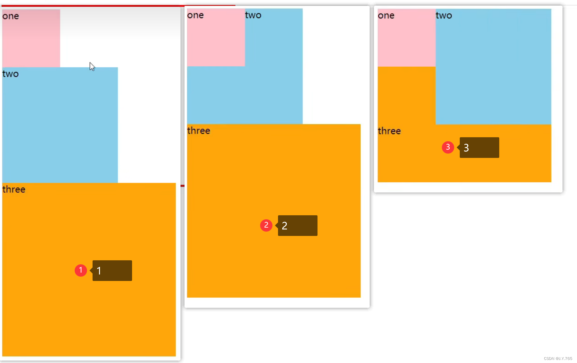
①
<!DOCTYPE html>
<html lang="en">
<head>
    <meta charset="UTF-8">
    <meta name="viewport" content="width=device-width, initial-scale=1.0">
    <title>Document</title>
    <style>
        .one{
            width: 100px;
            height: 100px;
            background-color: pink;
        }
        .two{
            width: 200px;
            height: 200px;
            background-color: skyblue;
        }
        .three{
            width: 300px;
            height: 300px;
            background-color:orange;
        }
    </style>
</head>
<body>
    <div class="one">one</div>
    <div class="two">two</div>
    <div class="three">three</div>
</body>
</html>
②
<!DOCTYPE html>
<html lang="en">
<head>
    <meta charset="UTF-8">
    <meta name="viewport" content="width=device-width, initial-scale=1.0">
    <title>Document</title>
    <style>
        .one{
            width: 100px;
            height: 100px;
            background-color: pink;
            float: left;
        }
        .two{
            width: 200px;
            height: 200px;
            background-color: skyblue;
        }
        .three{
            width: 300px;
            height: 300px;
            background-color:orange;
        }
    </style>
</head>
<body>
    <div class="one">one</div>
    <div class="two">two</div>
    <div class="three">three</div>
</body>
</html>
③
<!DOCTYPE html>
<html lang="en">
<head>
    <meta charset="UTF-8">
    <meta name="viewport" content="width=device-width, initial-scale=1.0">
    <title>Document</title>
    <style>
        .one{
            width: 100px;
            height: 100px;
            background-color: pink;
            float: left;
        }
        .two{
            width: 200px;
            height: 200px;
            background-color: skyblue;
            float: left;
        }
        .three{
            width: 300px;
            height: 300px;
            background-color:orange;
        }
    </style>
</head>
<body>
    <div class="one">one</div>
    <div class="two">two</div>
    <div class="three">three</div>
</body>
</html>
CSS书写顺序:(浏览器执行效率更高)
1.浮动/display
2.盒子模型:margin border padding 宽高背景色
3.文字样式
清除浮动:
含义:清除浮动对其他标签的影响
影响:如果子元素浮动了,此时子元素不能撑开标准流的块级父元素
原因:子元素浮动后脱标→不占位置
目的:需要父元素有高度,从而不影响其他网页元素的布局
清除浮动的方法:
①直接设置父元素的高度
特点:
优点:简单粗暴,方便
缺点:有些布局中不能固定父元素高度,如:新闻列表、京东推荐模块
②额外标签法:
操作:
1.在父元素内容的最后添加一个块级元素
2.给添加块级元素设置clear:both
特点:
缺点:会在页面中添加额外标签,会让HTML结构变得更复杂
③单伪元素清除法
操作:用伪元素替代了额外标签
1.基本写法
 .clearfix::after{
            content: '';
            display: block;
            clear: both;
        }
2.补充写法
 .clearfix::after{
            content: '';
            display: block;
            clear: both;
            height: 0;
            visibility: hidden;
        }
特点:
优点:项目中使用,直接给标签加类即可清除浮动
④双伪元素清除法
.clearfix::before,
         .clearfix::after{
            content: '';
            display: table;

        }
        .clearfix::after{
        clear:both;
        }
优点:项目中使用,直接给标签加类即可清除浮动
⑤给父元素设置overflow:hidden
操作:直接给父元素设置overflow:hidden
特点:方便


 被折叠的 条评论
为什么被折叠?
被折叠的 条评论
为什么被折叠?
 到【灌水乐园】发言


