


第五章 CSS盒模型
5.1盒模型的定义
Web 页面上大部分的元素(特别是块状元素)都可以看作是一个盒子,W3C组织建议把所有网页上的对象都放在一个盒子(box)中,设计者可以通过创建定义来控制这个盒子的各种属性,这些对象包括段落、列表、标题、图片及层。
盒子的结构可以看作一个矩形框,包括边框(border)、外边距(margin)、内边距(padding),以及元素内容(content),元素会在指定的高度和宽度范围内在页面上显示出来。它们之间的关系,如图5-1所示。
一个页面由许多这样的盒子组成,这些盒子层层嵌套,互相影响,设计者在布局网页和定位Web元素时要充分考虑到这些要素,才能更自如地摆弄这些盒子。
而网页元素的定位实际上就是这些大大小小的盒子在页面中的定位,这些盒子在页面中是“浮动”的,当某个块状元素被CSS设置了浮动属性,这个盒子就会移动到上一块级元素所处的行中。要关注的是这些盒子在页面中如何摆放、如何嵌套的问题,而这么多盒子摆在一起,其中盒子尺寸计算,是否浮动等要素都需要关注的。

5.2 CSS元素的高度和宽度
<!DOCTYPE html>
<html>
<head>
<meta charset="utf-8" />
<title>CSS盒模型</title>
<style>
img{
width:200px;
height:200px;
}
*{
margin:0px;
padding:0px;
}
div{
width:200px;
height:200px;
border:10px #f0cccc solid;
/* 外边距 */
margin: 30px;
/* 块级元素外边距合并 */
display: block;
/* 内边距 */
padding: 10px;
}
</style>
</head>
<body>
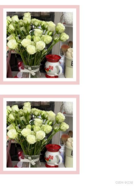
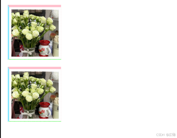
<div><img src="img/罗曼蒂克.jpg"/></div>
<div><img src="img/罗曼蒂克.jpg"/></div>
</body>
</html>
5.2.1 盒模型的宽度
盒模型的宽度=左外边距(margin-left)+左边框(border-left)+左内边距(padding-left)+ 内容宽度(width)+右内边距(padding-right)+右边框(border-right)+右外边距(margin-right)。
5.2.2 盒模型的高度
盒模型的高度=上外边距(margin-top)+上边框(border-top)+上内边距(padding一op)+内容高度(height)+下内边距(padding-bottom)+下边框(border-bottom)+下外边距(margin-bottom)。
盒模型示例
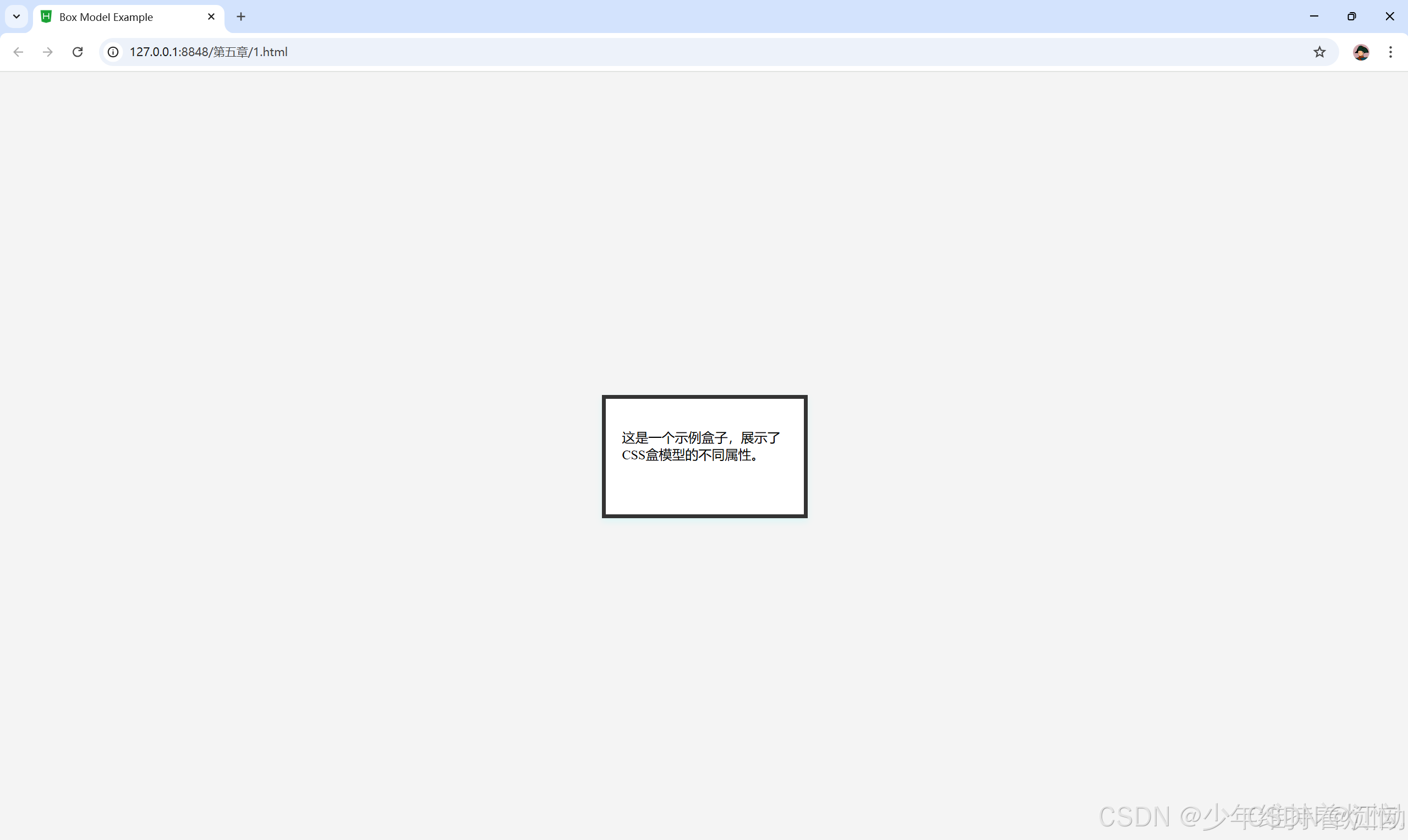
当然,这里是一个内嵌CSS的简单示例,它将创建一个具有明确尺寸、内边距、边框和外边距的盒子:
<!DOCTYPE html>
<html lang="en">
<head>
    <meta charset="UTF-8">
    <meta name="viewport" content="width=device-width, initial-scale=1.0">
    <title>Box Model Example</title>
    <style>
        body {
            margin: 0;
            padding: 0;
            display: flex;
            justify-content: center;
            align-items: center;
            height: 100vh;
            background-color: #f4f4f4;
        }
        .box {
            width: 200px;  /* 内容区域的宽度 */
            height: 100px; /* 内容区域的高度 */
            padding: 20px; /* 内边距 */
            border: 5px solid #333; /* 边框 */
            margin: 30px; /* 外边距 */
            background-color: #fff; /* 背景颜色 */
            box-shadow: 0 4px 8px rgba(0, 0, 0, 0.1); /* 盒阴影 */
        }
    </style>
</head>
<body>
    <div class="box">
        <p>这是一个示例盒子,展示了CSS盒模型的不同属性。</p>
    </div>
</body>
</html>
5.3 边距设置和边框设置
5.3.1 外边距设置
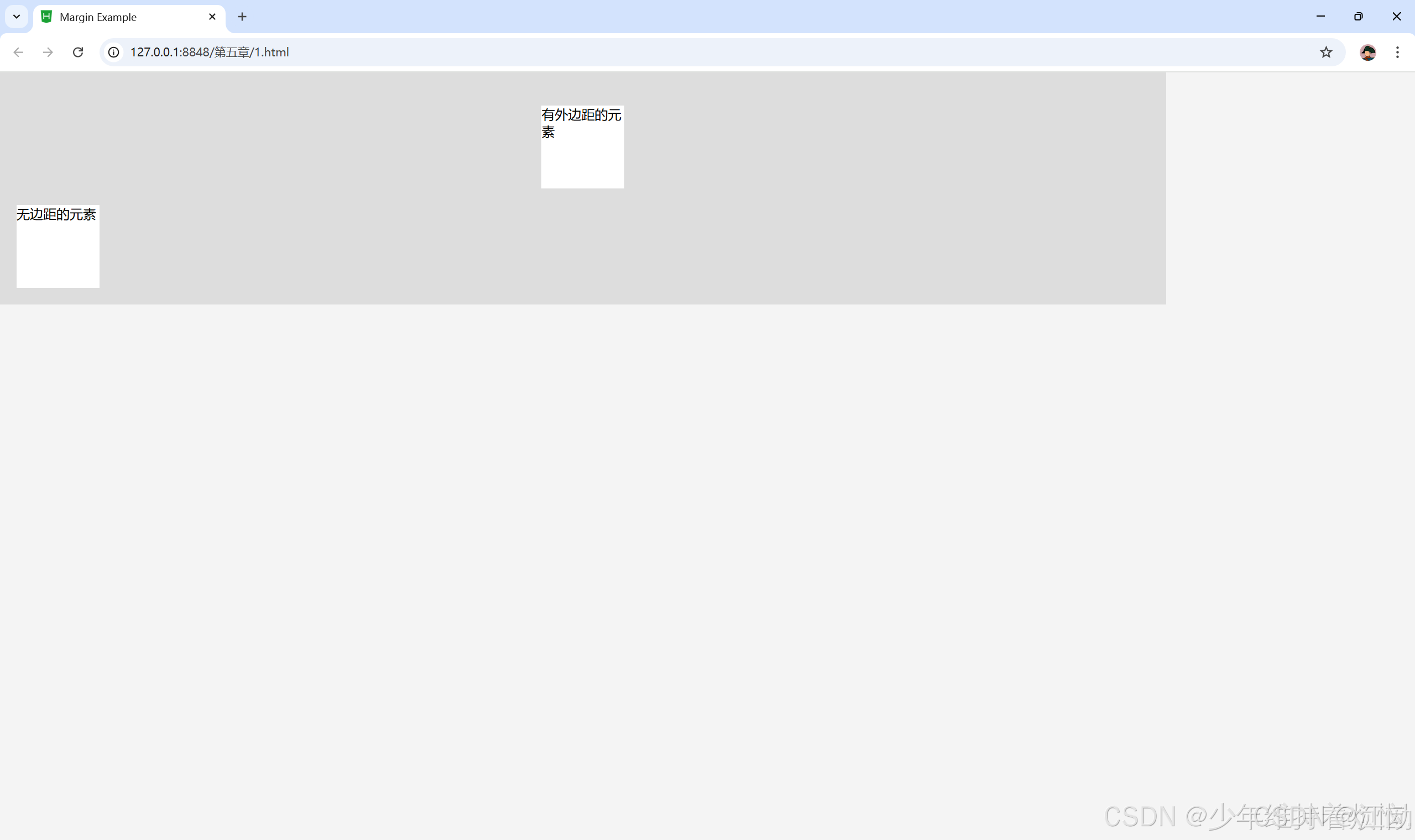
外边距是指元素与元素之间的距离,外边距设置属性,可分别设置margin-top、margin-right、margin-bottom、margin-left,也可以用margin 属性一次性设置所有外边距。
<!DOCTYPE html>
<html lang="en">
<head>
    <meta charset="UTF-8">
    <meta name="viewport" content="width=device-width, initial-scale=1.0">
    <title>Margin Example</title>
    <style>
        body {
            font-family: Arial, sans-serif;
            margin: 0;
            padding: 0;
            background-color: #f4f4f4;
        }
        .container {
            width: 80%;
            background-color: #ddd;
            padding: 20px;
        }
        .element {
            width: 100px;
            height: 100px;
            background-color: #fff;
            margin: 20px auto; /* 自动外边距用于水平居中 */
        }
        .element-no-margin {
            width: 100px;
            height: 100px;
            background-color: #fff;
        }
    </style>
</head>
<body>
    <div class="container">
        <div class="element">有外边距的元素</div>
        <div class="element-no-margin">无边距的元素</div>
    </div>
</body>
</html>
5.3.1.1 上外边距
语法:
<meta name=" description" content=" xxx "/>
5.3.1.2 右外边距
语法:
margin-right:length / percent /auto
5.3.1.3 下外边距
语法:
margin-bottom:length / percent /auto
5.3.1.4 左外边距
语法:
margin-left:length / percent /auto
5.3.1.5 外边距
语法:
margin-length:length / percent /auto
5.3.2 外边距的合并
通常,盒子与盒子之间的外边距相遇会互相影响,必须对margin 属性深入了解,小
精确地控制盒子的位置。
5.3.2.1 行级元素外边距合并
行级元素的盒子相遇,盒子与盒子之间的距离等于两个盒子外边距的总和。
5.3.2.2 块级元素外边距合并
块级元素的盒子相遇,盒子与盒子之间的距离等于两盒子中外边距的较大者。
5.3.3 内边距设置
元素的内边距用来控制边框和内容区之间的空白距离,并非实体,用padding属性表示,类似于HDML中表格单元格的填充属性。内边距(padding)和外边距(margin)很相似,都是透明不可见的,只是内边距和外边距之间还有边框。从语法和用法上来说,内边距的属性与外边距的属性也是类似的,既可以使用复合属性,也可以使用单边属性,padding属性接受 length 值或percent 值,区别于外边距,内边距不可以使用负值。
5.3.4 边框设置
元素外边距内就是元素的边框(border),它是围绕内边距和元素内容的一条或多条线在内边距和外边距之间。边框的四条边分别用border-top、border-right、border-bottom border-left 表示,它们的属性与内外边距的属性也是类似的,既可以使用复合属性,也可以使用单边属性。
边框作为盒模型的某个组成部分,边框的CSS样式设置将直接影响到盒子的尺寸和外观。而通过使用border 属性,可以创建出更佳的边框效果,还可以应用于任何元素。border属性设置通常有3种:样式(border-style)、宽度(border-width)和颜色(border-color)。
5.3.4.1上边框
语法:
border-top:border-style | border-width | border-color
5.3.4.2右边框
语法:
border-right:border-style | border-width | border-color
5.3.4.3下边框
语法:
border-bottom:border-style | border-width | border-color
5.3.4.4 左边框
语法:
border-left:border-style | border-width | border-color
5.3.4.5 边框样式
在CSS中,样式是边框最重要的一个设置,因为如果没有样式,在Web页面边框就不会显示。
bonder-style 是一个复合属性,可以同时取1~4个值,取值方法与外边距相似,边框属性有12个值可选,包括默认(initial)和无边框(none)。

5.3.4.6 边框宽度
在CSS中,宽度是通过border-width 属性来设置边框粗细的。与border-style 属性相同,border-width 也是一个复合属性。设置边框宽度时,可以直接输入length确定长度值,如5px或2cm,但不可以为负值;或者选择系统预设属性值。

5.3.4.7 边框颜色
在CSS中,边框颜色是通过border-color 属性来设置的,该属性可以使用任何类型的颜色值,包括用颜色命名的值、十六进制参数或 RCB 值。但是如果对象的border-style设置为none 或者horder-widh设置为0,本属性将失去作用。
width:200px;
	height:200px;
	border:10px #f0cccc solid;
	/* 外边距 */
	margin: 30px;
	/* 块级元素外边距合并 */
	display: block;
	/* 内边距 */
	padding: 10px;
	/*上边框、右边框、下边框、左边框 */
	border-top:10px #ffc0cd solid;
	border-right:thin #f0cccc dashed;
	border-bottom:medium #00f000 dotted;
	border-left:thick #00ccff double;
5.3.5 新增边框属性
5.3.5.1圆角边框
border-radius:设置边框四个角有弧度成为圆角,需要设置相关参数。
.element {
  border-radius: 10px; /* 所有角的半径 */
  border: 1px solid black;
}
.element {
  border-top-left-radius: 10px; /* 左上角的半径 */
  border-top-right-radius: 20px; /* 右上角的半径 */
  border-bottom-right-radius: 30px; /* 右下角的半径 */
  border-bottom-left-radius: 40px; /* 左下角的半径 */
}
<!DOCTYPE html>
<html lang="en">
<head>
<meta charset="UTF-8">
<meta name="viewport" content="width=device-width, initial-scale=1.0">
<title>Border Example</title>
<style>
body {
font-family: Arial, sans-serif;
margin: 0;
padding: 0;
background-color: #f4f4f4;
}
.element {
width: 150px;
height: 150px;
background-color: #fff;
padding: 20px;
border: 5px solid #333;
border-radius: 10px;
margin: 20px;
text-align: center;
line-height: 150px;
}
</style>
</head>
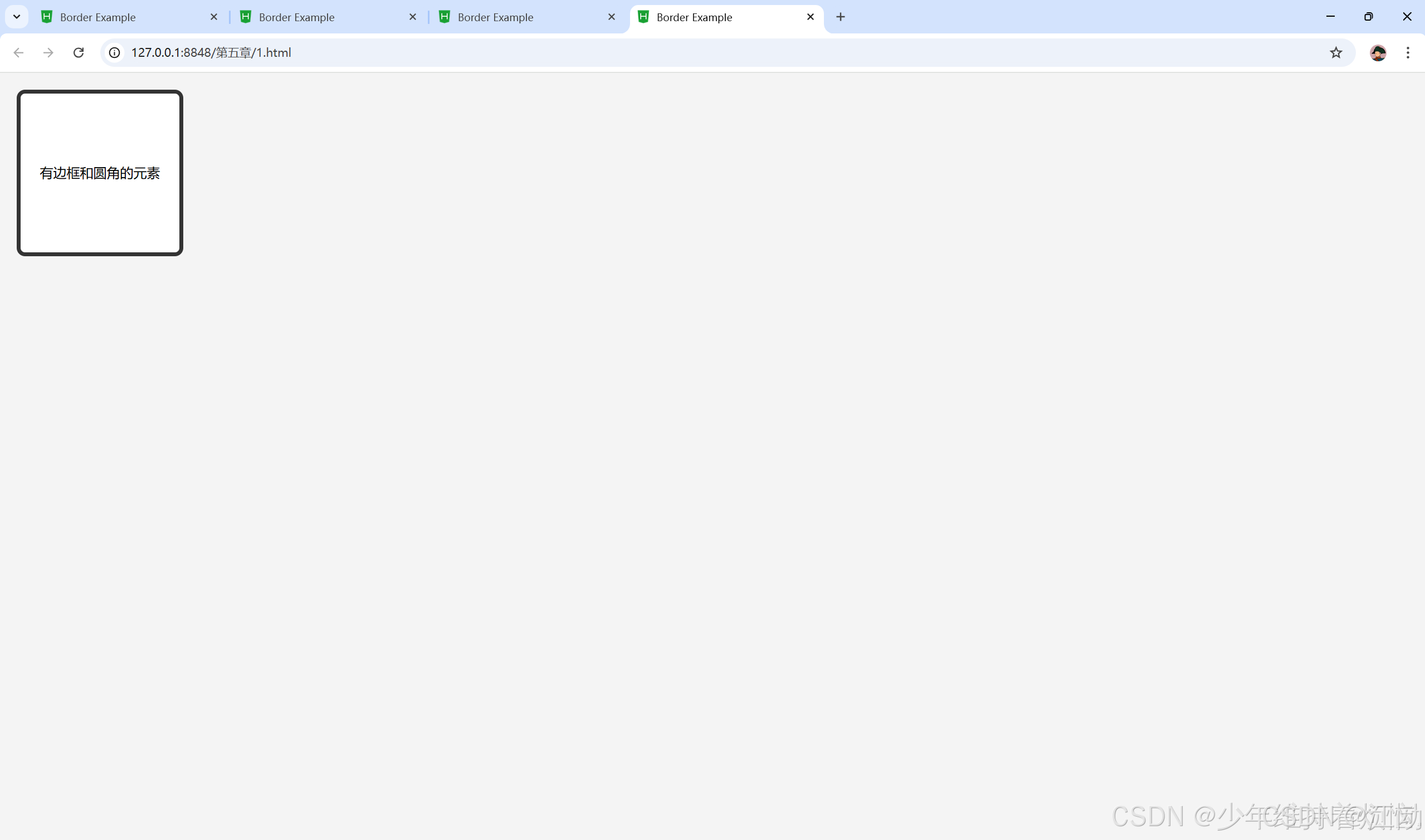
<body>
<div class="element">有边框和圆角的元素</div>
</body>
</html>
5.3.5.2阴影边框
box-shadow:像四个边框添加一到多个阴影,需要设置相关参数。
box-shadow: 10px 10px 35px #f0cccc;
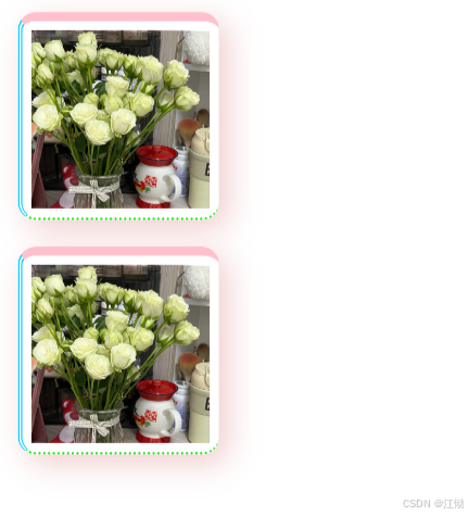
5.3.5.3图片绘制边框
border-image:设置所有边框用图片显示,需要嵌入相关图片,部分浏览器不支持相关属性。
<!DOCTYPE html>
<html>
<head>
<meta charset="utf-8">
<title>示例5.11</title>
<style type="text/css">
div{
margin: 100px;
border: 50px solid lavenderblush;
border-image: url(img/星星.jpg)5 10 round;
}
</style>
</head>
<body>
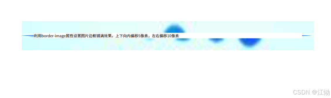
<div>利用border-image属性设置图片边框铺满效果。上下向内偏移5像素,左右偏移10像素</div>
</body>
</html>
5.4 CSS元素的定位
position的属性值有4个:static / relative / absolute / fixed
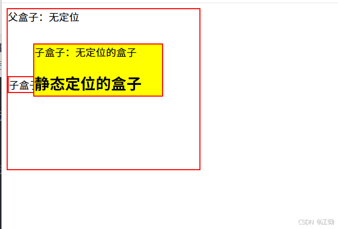
5.4.1 static 定位
static是HTML元素的默认值,不受top,right,bottom和left属性影响,元素出现在正常的文档流中。
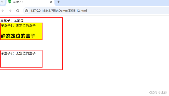
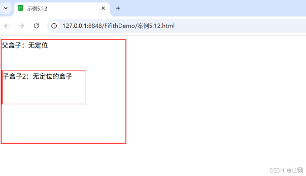
例题5.12 静态代码
<!DOCTYPE html>
<html>
<head>
<meta charset="utf-8">
<title>示例5.12</title>
<style type="text/css">
.father{
border: 2px solid red;
width: 300px;
height: 250px;
}
.son1{
border: 2px double red;
background-color: yellow;
width: 200px;
height: 80px;
position: relative;
/* position:relative相对定位 */
top: 30px;
left: 40px;
}
.son2{
border:2px double red;
width:200px;
height:25px;
margin-top:50px;
}
</style>
</head>
<body>
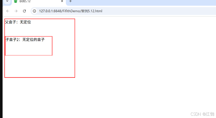
<div class="father">父盒子:无定位
<div class="son1">子盒子:无定位的盒子
<h2>静态定位的盒子</h2>
</div>
<dvi class="son2">子盒子2:无定位
</div>
</div>
</body>
</html>
5.4.2 relative定位
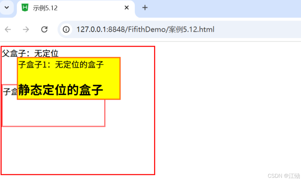
relative不脱离文档流的布局,需要参照父元素的四条边(不是浏览器),设置自身的top、right、bottom和 left属性的参数,从盒子中独立出来浮在上面。相对定位只改变自身的位置,在文档流原先的位置留出空白区域。定位的起始位置为此元素原先在文档流的位置。
position:relative;
	top: 30px;
	left: 40px;

默认相对定位示例代码如下:
<!DOCTYPE html>
<html>
	<head>
		<meta charset="utf-8">
		<title>示例5.12</title>
		<style type="text/css">
			.father{
				border: 2px solid red;
				width: 300px;
				height: 250px;
			}
			.son1{
				border: 2px double red;
				background-color: yellow;
				width: 200px;
				height: 80px;
			}
			.son2{
				border: 2px double red;
				width: 200px;
				height: 80px;
				margin-top: 50px;
			}
		</style>
	</head>
	<body>
		<div class="father">父盒子:无定位
		<div class="son1">子盒子1:无定位的盒子
		<h2>静态定位的盒子</h2>
		</div>
		<div class="son2">子盒子2:无定位的盒子
		</div>
		</div>
	</body>
</html>
5.4.3 absolute定位
absolute 脱离原来文档流的布局,浮在其他盒子上面,独立出来。子盒子原来位置的空间由后面的盒子填充。绝对定位的起始位置为最近已定位的父盒于,如果父盒于投有定位,那么子盒子的起始位置为浏览器,并随着滚动条的移动而改变位置。
position:absolute;
	 top: 30px;
	 left: 40px;
5.4.3.1 相对浏览器绝对定位
position:absolute;
	bottom: 30px;
	right: 40px;
5.4.3.2 相对父盒子绝对定位
position:relative;
5.4.4 fixed定位
fixed 类似于absolute,但在固定定位中,盒子的位置不随着滚动条的移动而改变位置,相当于浏览器窗口是固定不变的。
position:fixed;
	bottom: 30px;
	 right: 40px;
5.5 CSS元素的浮动
5.5.1 盒子的浮动添加
语法:
float:left / right / none
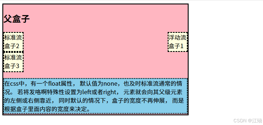
案例 5.17 right 浮动
<!DOCTYPE html>
<html>
	<head>
		<meta charset="utf-8">
		<title></title>
		<style>
			.div{
				width: 500px;
				height:300px;
				border: 3px solid;
				background-color:lightpink;
			}
			.div div{
				width:50px;
				height:50px;
				border:3px dashed;
				background-color:lightyellow;
			}
			.div p{
				border:3px dotted;
				background-color: skyblue;
			}

		</style>
	</head>
	<body>
		<div class="div">
			<h2>父盒子</h2>
			<!-- 添加盒子浮动 -->
		<div  style="float: right;">浮动流盒子1</div>
		<div >标准流盒子2</div>
		<div >标准流盒子3</div>
		<!-- 清楚盒子浮动造成的影响 -->
		<p style="clear: both;">在css中,有一个float属性,
		默认值为none,也及时标准流通常的情况。
		若将发咯啊特殊性设置为left或者right,
		元素就会向其父级元素的左侧或右侧靠近,
		同时默认的情况下,盒子的宽度不再伸展,
		而是根据盒子里面内容的宽度来决定。
		</p >
		</div>
	</body>
</html>
5.5.2 盒子的浮动清除
语法:
clear:left / right / both / none
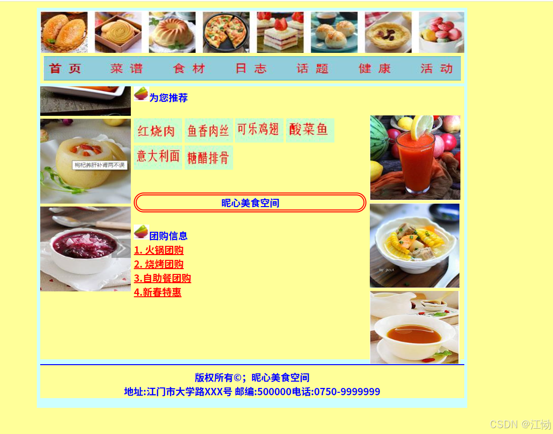
5.6 综合案例——昵心美食空间
<!DOCTYPE html>
<html>
<head>
<meta charset="utf-8" />
<title>昵心美食空间</title>
<style type="text/css">
*{
background-color: #FFFF99;
a{
color: red;
}
.all{
width: 700px;
height:650px;
margin: 10px auto;
padding: 5px;
background-image: url(img/bg1.JPG);
.banner{
width:700px;
height:70px;
}
.menu{
width:690px;
height:40px;
padding:5px;
}
.main{
width:700px;
height:450px;
margin:5px 0px;
position: relative;
}
.left,.right{
width: 150px;
height:440px;
border:Ipx solid #999;
float:left;
}
.middle{
width:384px;
height:450px;
margin: 0px 5px;
float:left;
font-size:20px;
font-family:"楷体";
}
font-weight:700;
color:#0000FF;
.one{
width:380px;
height:155px;
border: Ipx solid #999;
}
.two{
width:255px
height:100px;
border:5px double red;
margin-top:20px;
margin-bottom:20px;
border-radius:25px;
}
.three{
width:380px;
height:135px;
border:Ipx solid #999;
}
. bottom{
width:700px;
height:70px;
}
</style>
</head>
<body>
<div class="all">
<div class=" banner">
<img src="img/banner.jpg" width="700px" height="70px" />
</div>
<div class=" menu">
<img src="img/menu.jpg" width="690px" height="40px" />
</div>
<div class=" main">
<div class="left">
<marquee direction="up">
<img src="img/mm_1.jpg" width="150px" height="140px"/>
<img src="img/mm_2.jpg" width="150px" height="140px" />
<img src="img/mm_3.jpg" width=" 150px" height="140px"/>
</marquee>
</div>
<div class="middle">
<div class="one">
<img src="img/font.jpg" width="25px" height="25px"/>为您推荐
<br><br>
<img src="img/x_1.jpg" width="80px" height="40px"/>
<img src="img/x_2.jpg" width="80px" height="40px"/>
<img src="img/x_3.jpg" width="80px" height="40px"/>
<img src="img/x_4.jpg" width="80px" height="40px"/>
<img src="img/x_5.jpg" width="80px" height="40px"/>
<img src="img/x_6.jpg" width="80px" height="40px"/>
</div>
<center>
<div class=" two">
<hl>昵心美食空间</h1>
</div>
</center>
<div class=" three">
<img src="img/font.jpg" width="25px" height="25px"/>团购信息
<br>
<a href="#">1. 火锅团购</a><br>
<a href="#">2. 烧烤团购</a><br>
<a href="#">3.自助餐团购</a><br>
<a href="#">4.新春特惠</a>
</div>
</div>
<div class="right">
<marquee direction="up" >
<img />
<img src="./img/good_1.jpg" width="150px" height="140px"/>
<img src="img/good_2.jpg" width="148px" height="140px" />
<img src="./img/good_3.jpg" width="148px" height="140px" />
</marquee>
</div>
</div>
<div class ="bottom">
<hr color="#0000FF">
<center style="font—family":'楷体'>版权所有©;昵心美食空间<br/>
地址:江门市大学路XXX号 邮编:500000电话:0750-9999999</center>
</div>
</div>
</body>
</html>


 扫一扫
扫一扫


 393
393

 被折叠的 条评论
为什么被折叠?
被折叠的 条评论
为什么被折叠?
 到【灌水乐园】发言


