


1.训练要点
(1)掌握 ECharts 多图表联动图形的绘制。
(2)掌握 ECharts 加载异步数据。
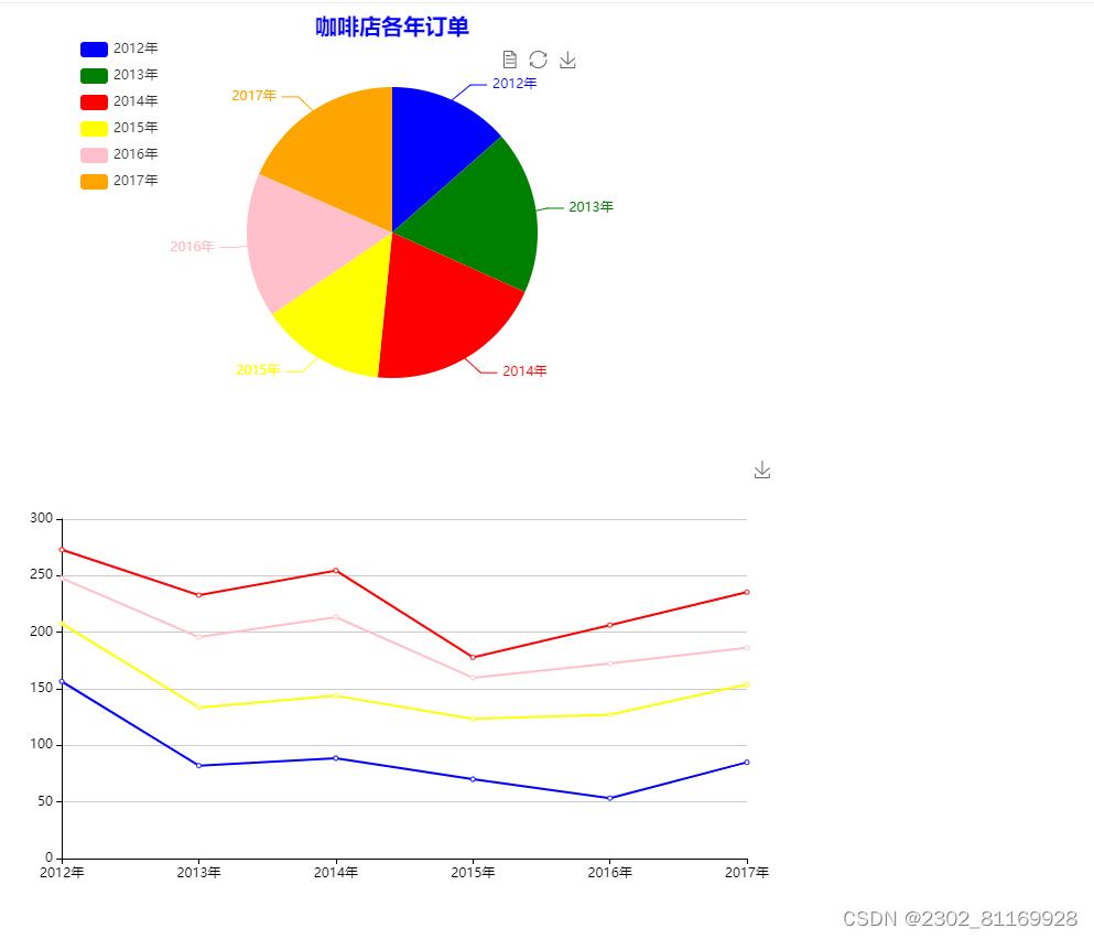
2、需求说明 基于“咖啡店年订单json”数据,绘制饼图与折线图的多图表联动,对咖啡店各年
的订单数据进行分析。
3.实现思路及步骤
(1)在VS Code中创建PieLineChartLinkage.html文件。
(2)绘制饼图与折线图联动图表。首先,在PeLinehartLinkage.html 文件中引入 echarts js 库文件。
其次,准备一个具备大小(weight与 height)的 div容器,并使用init()方法初始化容器。最后设置饼图
与折线图的图表样式后,获取数据、填入数据并显示图表。
数据如下:
{
"data":[
{"value":172.9, "name":"2012年"},{"value":232.8, "name":"2013年"},
{"value":254.5, "name":"2014年"},{"value":177.8, "name":"2015年"},
{"value":206.3, "name":"2016年"},{"value":235.4, "name":"2017年"}
],
"product":["2012年", "2013年", "2014年", "2015年", "2016年", "2017年"],
"values1":[56.5, 82.1, 88.7, 70.1, 53.4, 85.1],
"values2":[51.1, 51.4, 55.1, 53.3, 73.8, 68.7],
"values3":[40.1, 62.2, 69.5, 36.4, 45.2, 32.5],
"values4":[25.2, 37.1, 41.2, 18, 33.9, 49.1],
"names1":"Milk Tea",
"names2":"Matcha Latte",
"names3":"Cheese Cocoa",
"names4":"Walnut Brownie"
}
代码如下
<!DOCTYPE html>
<html>

<head>
    <meta charset="utf-8">
    <!--引入ECharts脚本-->
    <script src="js/echarts.js"></script>
</head>

<body>
    <!---为ECharts准备一个具备大小(宽高)的DOM-->
    <div id="main1" style="width: 700px; height: 400px"></div>
    <div id="main2" style="width: 700px; height: 400px"></div>
    <script type="text/javascript">
        //基于准备好的DOM,初始化ECharts图表
        var myChart1 = echarts.init(document.getElementById("main1"));
        var option1 = {
            title: {  //配置标题组件
                text: '咖啡店各年订单',  //设置主标题
                left: 'center'  ,//设置主次标题都左右居中
                textStyle:{
                  color:'blue',
                  fontSize:'20',
                },
            },
            tooltip: {  //配置提示框组件
                trigger: 'item',
                formatter: "{a} <br/>{b} : {c} ({d}%)"
            },
            legend: {  //配置图例组件
                orient: 'vertical',  //设置垂直排列
                left: 62,  //设置图例左边距
                top: 22,  //设置图例顶边距
                data:["2012年", "2013年", "2014年", "2015年", "2016年", "2017年"]
            },
            toolbox: {  //配置工具箱组件
                show: true,  //设置工具箱组件是否显示
                left: 444,  //设置工具箱左边距
                top: 28,  //设置工具箱顶边距
                feature: {
                    mark: { show: true },
                    dataView: { show: true, readOnly: false },
                    magicType: {
                        show: true,
                        type: ['pie', 'funnel'],
                        option: {
                            funnel: {
                                x: '25%',
                                width: '50%',
                                funnelAlign: 'left',
                                max: 1548
                            }
                        }
                    },
                    restore: { show: true },
                    saveAsImage: { show: true }
                }
            },
            calculable: true,
            color:['blue', 'green','red', 'yellow','pink',"orange"],
            series: [  //配置数据系列组件
                {
                    name:"订单量",
                    type: 'pie',
                    radius : '66%',  //设置半径
                    //radius: ['45%', '75%'],
                    clockWise: true,
                    data: [  //设置数据的具体值
                    {"value":172.9, "name":"2012年"},{"value":232.8, "name":"2013年"},
                    {"value":254.5, "name":"2014年"},{"value":177.8, "name":"2015年"},
                    {"value":206.3, "name":"2016年"},{"value":235.4, "name":"2017年"}
                    ]
                }
            ]
        };

        var myChart2 = echarts.init(document.getElementById("main2"));
                option2 = {
                tooltip: {
                    trigger: 'axis'
                },
                legend: {
                    data: ["2012年", "2013年", "2014年", "2015年", "2016年", "2017年"]
                },
                grid: {
                    left: '3%',
                    right: '4%',
                    bottom: '3%',
                    containLabel: true
                },
                toolbox: {
                    feature: {
                    saveAsImage: {}
                    }
                },
                xAxis: {
                    type: 'category',
                    boundaryGap: false,
                    axisLine:{lineStyle:{color:'black'}},
                    data: ["2012年", "2013年", "2014年", "2015年", "2016年", "2017年"]
                },
                yAxis: {
                    type: 'value',
                    axisLine:{lineStyle:{color:'black'}},
                },
                color:['blue', 'yellow',"pink", 'red'],
                series: [
                    {
                    name: 'Milk Tea',
                    type: 'line',
                    stack: 'Total',
                    data: [156.5, 82.1, 88.7, 70.1, 53.4, 85.1]
                    },
                    {
                    name: 'Matcha Latte',
                    type: 'line',
                    stack: 'Total',
                    data: [51.1, 51.4, 55.1, 53.3, 73.8, 68.7]
                    },
                    {
                    name: 'Cheese Cocoa',
                    type: 'line',
                    stack: 'Total',
                    data: [40.1, 62.2, 69.5, 36.4, 45.2, 32.5]
                    },
                    {
                    name: 'Walnut Brownie',
                    type: 'line',
                    stack: 'Total',
                    data: [25.2, 37.1, 41.2, 18, 33.9, 49.1]
                    },

                ]
                };


        myChart1.setOption(option1);   //为mychart1对象加载数据
        myChart2.setOption(option2);   //为mychart2对象加载数据
        //多图表联动配置方法1:分别设置每个ECharts对象的group值
        myChart1.group = 'group1';
        myChart2.group = 'group1';
        echarts.connect('group1');
          //使用刚指定的配置项和数据显示图表
     myChart.setOption(option);
    </script>
</body>

</html>
代码展示
设置每个ECharts对象为相同的group值,并通过在调用ECharts对象的connect方法时,传入group值,从而使用多个ECharts对象建立联动关系
        myChart1.setOption(option1);   //为mychart1对象加载数据
        myChart2.setOption(option2);   //为mychart2对象加载数据
        //多图表联动配置方法1:分别设置每个ECharts对象的group值
        myChart1.group = 'group1';
        myChart2.group = 'group1';
        echarts.connect('group1');
          //使用刚指定的配置项和数据显示图表


 751
751


 被折叠的 条评论
为什么被折叠?
被折叠的 条评论
为什么被折叠?
 到【灌水乐园】发言


