


Matplotlib
Matplotlib 是Python中类似 MATLAB 的绘图工具,熟悉 MATLAB 也可以很快的上手 Matplotlib
1. 认识Matploblib
1.1 Figure
在任何绘图之前,我们需要一个Figure对象,可以理解成我们需要一张画板才能开始绘图。
import matplotlib.pyplot as plt
fig = plt.figure()
plt.show()
效果:
 如图所示,一张白纸
1.2 Axes
在拥有Figure对象之后,在作画前我们还需要轴,没有轴的话就没有绘图基准,所以需要添加Axes。也可以理解成为真正可以作画的纸。
import matplotlib.pyplot as plt
fig = plt.figure()
fig = plt.figure()
ax = fig.add_subplot(111)
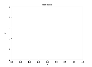
ax.set(xlim=[0.5, 4.5], ylim=[-2,8], title='example',
ylabel='Y',
xlabel='X')
plt.show()效果:
当
ax = fig.add_subplot(221)
对于上面的fig.add_subplot(111)就是添加Axes的,参数的解释的在画板的第1行第1列的第一个位置生成一个Axes对象来准备作画。也可以通过fig.add_subplot(2, 2, 1)的方式生成Axes,前面两个参数确定了面板的划分,例如 2, 2会将整个面板划分成 2 * 2 的方格,第三个参数取值范围是 [1, 2*2] 表示第几个Axes。
例子
import matplotlib.pyplot as plt
fig = plt.figure()

fig = plt.figure()
ax = fig.add_subplot(221)
ax.set(xlim=[0.5, 4.5], ylim=[-2,8], title='example',
       ylabel='Y',
       xlabel='X')
ax1 = fig.add_subplot(222)
ax2 = fig.add_subplot(223)
plt.show()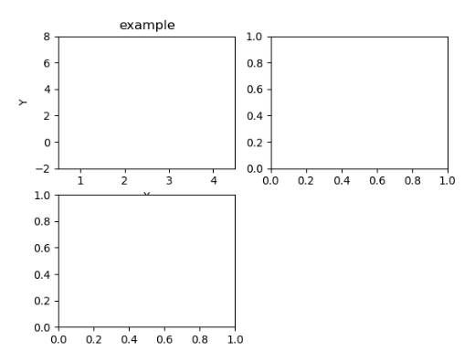
更简单的方法
import matplotlib.pyplot as plt
fig = plt.figure()

fir, axes = plt.subplots(nrows=2, ncols=2)
axes[0,0].set(title='左上')
axes[0,1].set(title='右上')
axes[1,0].set(title='左下')
axes[1,1].set(title='右下')
plt.show()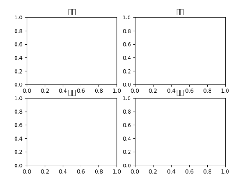
汉字乱码了 没显示出来
fig 还是我们熟悉的画板, axes 成了我们常用二维数组的形式访问,这在循环绘图时,额外好用。
2. 基本绘图2D
2.1 线
plot()函数画出一系列的点,并且用线将它们连接起来。看下例子:
import numpy as np
fig = plt.figure()
ax1 = fig.add_subplot((221))
ax2 = fig.add_subplot((222))
ax3 = fig.add_subplot((223))
x = np.linspace(0, np.pi)
y_sin = np.sin(x)
y_cos = np.cos(x)

ax1.plot(x, y_sin)
ax2.plot(x, y_sin, 'go--', linewidth=3, markersize=10)
ax3.plot(x, y_cos, color='b', marker='+', linestyle='dashed')
plt.show()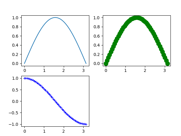
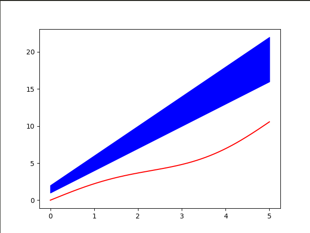
关键字参数绘图
x = np.linspace(0,5,200)
data_obj = {
       'x':x,
       'y1':3 * x + 1,
       'y':4 * x + 2,
       'mean':0.4 * x * np.cos(x) + 2 * x
}
fig, ax = plt.subplots()
ax.fill_between('x',"y1","y",color="b",data=data_obj)
ax.plot('x', 'mean', color='r', data=data_obj)
plt.show()
2.2 散点图
只画点,但是不用线连接起来。
x = np.arange(10)
y = np.random.randn(10)
plt.scatter(x, y, color='g', marker='*')
plt.show()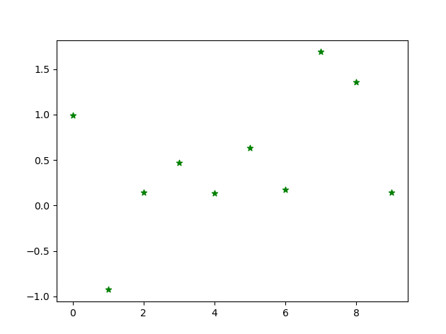
2.3 条形图
条形图分两种,一种是水平的,一种是垂直的,见下例子:
np.random.seed(1)
x = np.arange(10)
y = np.random.randn(10)

fig, axes = plt.subplots(nrows=1, ncols=2, figsize=plt.figaspect(1./2))

vert = axes[0].bar(x, y, color='lightblue', align='center')
horiz = axes[1].barh(x, y, color='lightblue', align='center')

axes[0].axhline(0, color='grey', linewidth=2)
axes[0].axvline(0, color='grey', linewidth=2)
plt.show()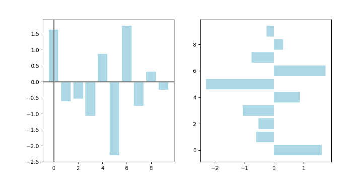


 215
215

 被折叠的 条评论
为什么被折叠?
被折叠的 条评论
为什么被折叠?
 到【灌水乐园】发言


