


以下是为小白准备的超详细css伪元素教程,包含可以直接在浏览器中运行的完整 HTML+CSS 代码,保证看完就懂
一、什么是伪元素?
伪元素 就像魔法一样,可以不修改 HTML 结构,用 CSS 给元素添加额外的装饰内容。比如在文字前面加个图标,或者在按钮后面加个箭头。
二、最简单的例子 🌰
示例1:给标题加小箭头
<!DOCTYPE html>
<html>
<head>
<style>
/* CSS 代码 */
h1::after {
content: "→"; /* 必须写content属性 */
color: red;
margin-left: 10px;
}
</style>
</head>
<body>
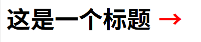
<h1>这是一个标题</h1>
</body>
</html>
效果: 标题后面会出现红色箭头 →
三、最常用的两个伪元素
1. ::before - 在元素前面加内容
2. ::after - 在元素后面加内容
四、实际应用案例 🛠️
案例1:带图标的按钮
<!DOCTYPE html>
<html>
<head>
<style>
.btn {
padding: 10px 20px;
background: #4CAF50;
color: white;
border: none;
position: relative; /* 必须设置定位 */
}
/* 在按钮前面加图标 */
.btn::before {
content: "⭐"; /* 这里放图标 */
margin-right: 8px;
}
/* 在按钮后面加箭头 */
.btn::after {
content: "➡️";
margin-left: 8px;
}
</style>
</head>
<body>
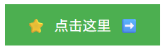
<button class="btn">点击这里</button>
</body>
</html>
效果: ⭐点击这里➡️
案例2:好看的提示框
<!DOCTYPE html>
<html>
<head>
<style>
.tooltip {
position: relative;
display: inline-block;
border-bottom: 1px dotted black; /* 下划线 */
cursor: help;
}
/* 鼠标悬停时显示提示文字 */
.tooltip:hover::after {
content: "这里是提示内容哦~";
position: absolute;
left: 0;
top: 100%;
background: black;
color: white;
padding: 5px;
border-radius: 4px;
}
</style>
</head>
<body>
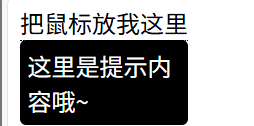
<div class="tooltip">把鼠标放我这里</div>
</body>
</html>
效果: 鼠标悬停在文字上时显示提示框
五、必须使用伪元素的场景 🔑
示例:动态进度条
<!DOCTYPE html>
<html>
<head>
<style>
.progress {
width: 200px;
height: 20px;
background: #eee;
border-radius: 10px;
margin: 20px;
}
/* 进度条填充部分 */
.progress::before {
content: ""; /* 必须有content */
display: block;
width: 75%; /* 进度百分比 */
height: 100%;
background: #2196F3;
border-radius: 10px;
}
</style>
</head>
<body>
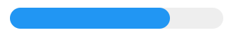
<div class="progress"></div>
</body>
</html>
效果: 蓝色的进度条填充到75%
六、常见问题 ❓
Q1:为什么我的伪元素不显示?
- 检查是否写了
content: "";(就算是空的也要写) - 检查是否应用在正确的元素上(如
<img>不支持伪元素)
Q2:伪元素可以点击吗?
不能,伪元素是虚拟的,无法被点击或选中。
如果还有不明白的,欢迎留言提问!


 扫一扫
扫一扫


 322
322

 被折叠的 条评论
为什么被折叠?
被折叠的 条评论
为什么被折叠?
 到【灌水乐园】发言


