


.backgroundColor(Color.Pink)
}
@Entry
@Component
struct FancyUse {
@State heightVlaue: number = 100
// 定义在组件内的@Styles封装的样式
@Styles fancy() {
.width(200)
.height(this.heightVlaue)
.backgroundColor(Color.Yellow)
.onClick(() => {
this.heightVlaue = 200
})
}
build() {
Column({ space: 10 }) {
// 使用全局的@Styles封装的样式
Text(‘FancyA’)
.globalFancy ()
.fontSize(30)
// 使用组件内的@Styles封装的样式
Text(‘FancyB’)
.fancy()
.fontSize(30)
}
}
}
复制


#### @Extend装饰器:定义扩展组件样式


在前文的示例中,可以使用@Styles用于样式的扩展,在@Styles的基础上,我们提供了@Extend,用于扩展原生组件样式。


###### 语法
@Extend(UIComponentName) function functionName { … }
复制


###### 用规则


* 和@Styles不同,@Extend仅支持定义在全局,不支持在组件内部定义。
* 和@Styles不同,@Extend支持封装指定的组件的私有属性和私有事件和预定义相同组件的@Extend的方法。
// @Extend(Text)可以支持Text的私有属性fontColor
@Extend(Text) function fancy () {
.fontColor(Color.Red)
}
// superFancyText可以调用预定义的fancy
@Extend(Text) function superFancyText(size:number) {
.fontSize(size)
.fancy()
}
复制


* 和@Styles不同,@Extend装饰的方法支持参数,开发者可以在调用时传递参数,调用遵循TS方法传值调用。
// xxx.ets
@Extend(Text) function fancy (fontSize: number) {
.fontColor(Color.Red)
.fontSize(fontSize)
}
@Entry
@Component
struct FancyUse {
build() {
Row({ space: 10 }) {
Text(‘Fancy’)
.fancy(16)
Text(‘Fancy’)
.fancy(24)
}
}
}
复制


* @Extend装饰的方法的参数可以为function,作为Event事件的句柄。
@Extend(Text) function makeMeClick(onClick: () => void) {
.backgroundColor(Color.Blue)
.onClick(onClick)
}
@Entry
@Component
struct FancyUse {
@State label: string = ‘Hello World’;
onClickHandler() {
this.label = ‘Hello ArkUI’;
}
build() {
Row({ space: 10 }) {
Text(${this.label})
.makeMeClick(this.onClickHandler.bind(this))
}
}
}
复制


* @Extend的参数可以为状态变量,当状态变量改变时,UI可以正常的被刷新渲染。
@Extend(Text) function fancy (fontSize: number) {
.fontColor(Color.Red)
.fontSize(fontSize)
}
@Entry
@Component
struct FancyUse {
@State fontSizeValue: number = 20
build() {
Row({ space: 10 }) {
Text(‘Fancy’)
.fancy(this.fontSizeValue)
.onClick(() => {
this.fontSizeValue = 30
})
}
}
}
复制


##### 使用场景


以下示例声明了3个Text组件,每个Text组件均设置了fontStyle、fontWeight和backgroundColor样式。
@Entry
@Component
struct FancyUse {
@State label: string = ‘Hello World’
build() {
Row({ space: 10 }) {
Text(${this.label})
.fontStyle(FontStyle.Italic)
.fontWeight(100)
.backgroundColor(Color.Blue)
Text(${this.label})
.fontStyle(FontStyle.Italic)
.fontWeight(200)
.backgroundColor(Color.Pink)
Text(${this.label})
.fontStyle(FontStyle.Italic)
.fontWeight(300)
.backgroundColor(Color.Orange)
}.margin(‘20%’)
}
}
复制


@Extend将样式组合复用,示例如下。
@Extend(Text) function fancyText(weightValue: number, color: Color) {
.fontStyle(FontStyle.Italic)
.fontWeight(weightValue)
.backgroundColor(color)
}
复制


通过@Extend组合样式后,使得代码更加简洁,增强可读性。
@Entry
@Component
struct FancyUse {
@State label: string = ‘Hello World’
build() {
Row({ space: 10 }) {
Text(${this.label})
.fancyText(100, Color.Blue)
Text(${this.label})
.fancyText(200, Color.Pink)
Text(${this.label})
.fancyText(300, Color.Orange)
}.margin(‘20%’)
}
}
复制


#### stateStyles:多态样式


@Styles和@Extend仅仅应用于静态页面的样式复用,stateStyles可以依据组件的内部状态的不同,快速设置不同样式。这就是我们本章要介绍的内容stateStyles(又称为:多态样式)。


##### 概述


stateStyles是属性方法,可以根据UI内部状态来设置样式,类似于css伪类,但语法不同。ArkUI提供以下四种状态:


* focused:获焦态。
* normal:正常态。
* pressed:按压态。
* disabled:不可用态。


##### 使用场景


###### 基础场景


下面的示例展示了stateStyles最基本的使用场景。Button处于第一个组件,默认获焦,生效focused指定的粉色样式。按压时显示为pressed态指定的黑色。如果在Button前再放一个组件,使其不处于获焦态,就会生效normal态的黄色。
@Entry
@Component
struct StateStylesSample {
build() {
Column() {
Button(‘Click me’)
.stateStyles({
focused: {
.backgroundColor(Color.Pink)
},
pressed: {
.backgroundColor(Color.Black)
},
normal: {
.backgroundColor(Color.Yellow)
}
})
}.margin(‘30%’)
}
}
复制
**图1**获焦态和按压态

###### @Styles和stateStyles联合使用
以下示例通过@Styles指定stateStyles的不同状态。
@Entry
@Component
struct MyComponent {
@Styles normalStyle() {
.backgroundColor(Color.Gray)
}
@Styles pressedStyle() {
.backgroundColor(Color.Red)
}
build() {
Column() {
Text(‘Text1’)
.fontSize(50)
.fontColor(Color.White)
.stateStyles({
normal: this.normalStyle,
pressed: this.pressedStyle,
})
}
}
}
复制
**图2**正常态和按压态

###### 在stateStyles里使用常规变量和状态变量
stateStyles可以通过this绑定组件内的常规变量和状态变量。
@Entry
@Component
struct CompWithInlineStateStyles {
@State focusedColor: Color = Color.Red;
normalColor: Color = Color.Green
build() {
Button(‘clickMe’).height(100).width(100)
.stateStyles({
normal: {
.backgroundColor(this.normalColor)
},
focused: {
.backgroundColor(this.focusedColor)
}
})
.onClick(() => {
this.focusedColor = Color.Pink
})
.margin(‘30%’)
}
}
复制
Button默认获焦显示红色,点击事件触发后,获焦态变为粉色。
**图3**点击改变获焦态样式

---
最后,为了能让大家更好的去学习提升鸿蒙 (Harmony OS) 开发技术,小编连夜整理了一份30个G**纯血版**学习资料(含**视频**、**电子书**、**学习文档**等)以及一份在Github上持续爆火霸榜的《纯血版华为鸿蒙 (Harmony OS)开发手册》(共计890页),希望对大家有所帮助。
## 纯血版鸿蒙 HarmonyOS 4.0 视频学习资料


需要以上视频学习资料小伙伴
请点击→[纯血版全套鸿蒙HarmonyOS学习资料]( )
---
## 《纯血版华为鸿蒙 (Harmony OS)开发手册》
这份手册涵盖了当前鸿蒙 (Harmony OS) 开发技术必掌握的核心知识点
**自我介绍一下,小编13年上海交大毕业,曾经在小公司待过,也去过华为、OPPO等大厂,18年进入阿里一直到现在。**
**深知大多数HarmonyOS鸿蒙开发工程师,想要提升技能,往往是自己摸索成长或者是报班学习,但对于培训机构动则几千的学费,着实压力不小。自己不成体系的自学效果低效又漫长,而且极易碰到天花板技术停滞不前!**
**因此收集整理了一份《2024年HarmonyOS鸿蒙开发全套学习资料》,初衷也很简单,就是希望能够帮助到想自学提升又不知道该从何学起的朋友,同时减轻大家的负担。**
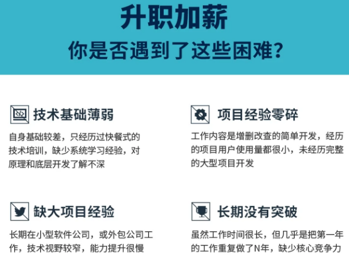
**既有适合小白学习的零基础资料,也有适合3年以上经验的小伙伴深入学习提升的进阶课程,基本涵盖了95%以上HarmonyOS鸿蒙开发知识点,真正体系化!**
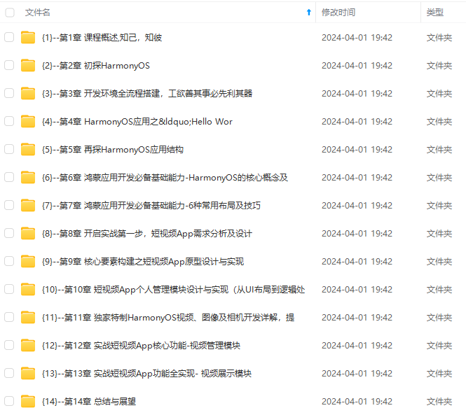
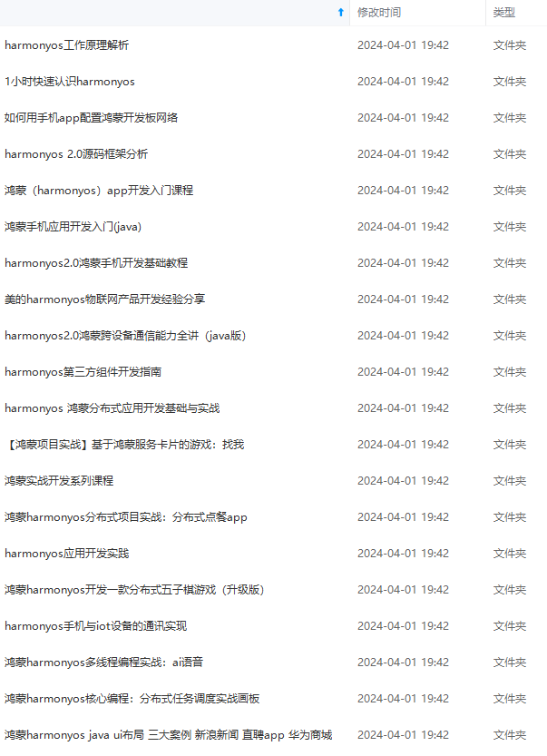
**由于文件比较大,这里只是将部分目录大纲截图出来,每个节点里面都包含大厂面经、学习笔记、源码讲义、实战项目、讲解视频,并且会持续更新**
**如果你觉得这些内容对你有帮助,可以添加VX:vip204888 (备注鸿蒙获取)**

**一个人可以走的很快,但一群人才能走的更远。不论你是正从事IT行业的老鸟或是对IT行业感兴趣的新人,都欢迎扫码加入我们的的圈子(技术交流、学习资源、职场吐槽、大厂内推、面试辅导),让我们一起学习成长!**
)]
[外链图片转存中...(img-2UQ9XYNH-1712921748343)]
[外链图片转存中...(img-0FvDXxWL-1712921748343)]
**既有适合小白学习的零基础资料,也有适合3年以上经验的小伙伴深入学习提升的进阶课程,基本涵盖了95%以上HarmonyOS鸿蒙开发知识点,真正体系化!**
**由于文件比较大,这里只是将部分目录大纲截图出来,每个节点里面都包含大厂面经、学习笔记、源码讲义、实战项目、讲解视频,并且会持续更新**
**如果你觉得这些内容对你有帮助,可以添加VX:vip204888 (备注鸿蒙获取)**
[外链图片转存中...(img-vHIuJkCB-1712921748344)]
**一个人可以走的很快,但一群人才能走的更远。不论你是正从事IT行业的老鸟或是对IT行业感兴趣的新人,都欢迎扫码加入我们的的圈子(技术交流、学习资源、职场吐槽、大厂内推、面试辅导),让我们一起学习成长!**


 被折叠的 条评论
为什么被折叠?
被折叠的 条评论
为什么被折叠?
 到【灌水乐园】发言


