


css:
*{
margin:0;
padding:0;
}
.top{
width:100%;
height:100px;
}
.top i{
font-size: 24px;
}
.top-left{
width:20%;
height:100%;
float:left;
text-align: center;
line-height: 100px;
position: relative;
}
.top-left .cls5{
position: absolute;
left:40px;
}
.top-middle{
width:50%;
height:100%;
float:left;
text-align: center;
line-height: 100px;
position:relative;
}
.top-middle .cls1{
position: absolute;
left:30px;
}
.top-middle .cls2{
position: absolute;
left:60px;
}
.top-middle .cls3{
position: absolute;
right:500px;
}
.top-middle .container{
width:300px;
height:40px;
border:1px solid whitesmoke;
border-radius: 10px;
position:absolute;
left:100px;
top:30px;
text-align: center;
line-height: 40px;
}
.top-middle .container .cls4{
position: absolute;
left:20px;
}
.top-right{
width:30%;
height:100%;
float:right;
}
.top-right ul{
list-style: none;
text-align: center;
height:100px;
line-height:100px ;
}
.top-right ul li{
float:right;
margin:0 20px 0 20px;
}
.bottom{
width:100%;
height:100px;
margin-top:710px;
}
.bottom i{
font-size: 24px;
}
.bottom-left{
width:20%;
height:100px;
line-height: 100px;
float:left;
text-align: center;
}
.bottom-left ul{
list-style: none;
}
.bottom-left ul li{
float:left;
margin:0 30px 0 30px;
}
.bottom-mid{
width:50%;
height:100px;
line-height: 100px;
float:left;
}
.bottom-mid ul{
list-style: none;
}
.bottom-mid ul li{
float:left;
margin: auto 50px;
}
.bot-mid-top{
width:100%;
height:60px;
text-align: center;
line-height: 50px;
}
.bot-mid-top .clf1{
margin-left:250px;
}
.bot-mid-bot{
width:100%;
height:40px;
line-height: 40px;
}
.bot-mid-bot .item{
width:80%;
border:1px solid #333;
border-radius: 3px;
height:9px;
margin-top:12px;
margin-left:100px;
}
.bottom-right{
width:30%;
height:100px;
line-height: 100px;
float:left;
}
.bottom-right ul{
list-style: none;
}
.bottom-right ul li{
float:left;
margin:0 30px 0 30px;
}
.bottom-right ul .clf2{
margin-left:200px;
}
js:
let audioArr = []
function removeClass(e) {
let key = document.querySelector(div[data-key="${e.keyCode})
let audio = document.querySelector(audio[data-key="${e.keyCode}"])
key.classList.remove(‘playing’)
audioArr.push(audio)
}
function playAudio(e) {
let key = document.querySelector(div[data-key="${e.keyCode})
let audio = document.querySelector(audio[data-key="${e.keyCode}"])
key.classList.add(‘playing’)
//audio.currentTime = 0; // 每次播放之后都使音频播放进度归零
if (!audio) return;
audio.play()
}
window.addEventListener(‘keydown’, e => playAudio(e))
window.addEventListener(‘keyup’, e => removeClass(e))
const btn = document.getElementById(‘btn’)
function Play() {
const self=this
const item1=setInterval(function(){
self.i++
console.log(self.i)
audioArr[self.i-2].play()
if(self.i>audioArr.length){
clearInterval(item1)
}
}, 200);
}
let obj={
i:1
}
function bind(){
Play.call(obj)
}
btn.addEventListener(“click”,bind)
---
## 2.图片自动消失
>
> 一张图片,在其右上角放置一个div
>
>
> ,分别得到那个元素,在div中插入数字
>
>
> 开启一个定时器,每隔一段时间减一。
>
>
> 直到为0.图片消失
>
>
>
yy3.小轮播图
放置三张图片,移动到那个图片,
改变他的偏移量。
*{
	padding:0;
	margin:0;
	}
body,html{
	width:100%;
	 overflow:hidden;
	}
#wrap1{
	width:100%;
	position:absolute;
	bottom:0;
	left:0;
	text-align: center;
	}
#wrap1>img{
	width:64px;
	}
</style>
</head>
<body>
	<div id="wrap1">
		<img src="img/1.png" />
		<img src="img/2.png" />
		<img src="img/3.png" />
		<img src="img/4.png" />
		<img src="img/5.png" />
	</div>
<script type="text/javascript">
	window.onload=function(){
		var r=320
		var imgNodes=document.querySelectorAll("#wrap1>img")
		document.onmousemove=function(ev){
		ev=ev||event
		for(var i=0;i<imgNodes.length;i++){
var a= imgNodes[i].getBoundingClientRect().top+imgNodes[i].offsetHeight/2-ev.clientY
var b= imgNodes[i].getBoundingClientRect().right+ imgNodes[i].offsetWidth/2-ev.clientX
	var c=Math.sqrt(a*a+b*b)
			if(c>=r){
					c=r
					}
				 imgNodes[i].style.width=128-c*0.2+'px'
					}
				}
			}
</script>
4.旋转音乐盒
旋转音乐盒
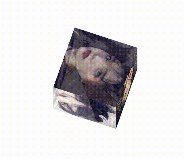
放置六张图片,将他们绝对定位。
根据所学css来对每一张图片进行定位
然后就是当点击哪一个图片时,播放
对应的音频音乐。
css:
*{
padding:0;
margin:0;
}
.cube{
width:200px;
height:200px;
position: relative;
margin:200px auto;
//使效果呈现3d效果
transform-style: preserve-3d;
animation: rotate 30s infinite linear;
}
@keyframes rotate{
from{
transform:rotateX(0deg) rotateY(0deg);
}
to{
transform: rotateX(360deg) rotateY(360deg);
}
}
html{
//屏幕与我们的视距


**网上学习资料一大堆,但如果学到的知识不成体系,遇到问题时只是浅尝辄止,不再深入研究,那么很难做到真正的技术提升。**
**[需要这份系统化资料的朋友,可以戳这里获取](https://bbs.csdn.net/topics/618545628)**
**一个人可以走的很快,但一群人才能走的更远!不论你是正从事IT行业的老鸟或是对IT行业感兴趣的新人,都欢迎加入我们的的圈子(技术交流、学习资源、职场吐槽、大厂内推、面试辅导),让我们一起学习成长!**
X(0deg) rotateY(0deg);
}
to{
transform: rotateX(360deg) rotateY(360deg);
}
}
html{
//屏幕与我们的视距
[外链图片转存中...(img-f9gz5yRS-1714695763008)]
[外链图片转存中...(img-4Qmmmk8i-1714695763008)]
**网上学习资料一大堆,但如果学到的知识不成体系,遇到问题时只是浅尝辄止,不再深入研究,那么很难做到真正的技术提升。**
**[需要这份系统化资料的朋友,可以戳这里获取](https://bbs.csdn.net/topics/618545628)**
**一个人可以走的很快,但一群人才能走的更远!不论你是正从事IT行业的老鸟或是对IT行业感兴趣的新人,都欢迎加入我们的的圈子(技术交流、学习资源、职场吐槽、大厂内推、面试辅导),让我们一起学习成长!**


 被折叠的 条评论
为什么被折叠?
被折叠的 条评论
为什么被折叠?
 到【灌水乐园】发言


