


transform: rotateY(0deg) translateZ(470px);
//第二个图片
transform: rotateY(120deg) translateZ(470px);
//第三个图片
transform: rotateY(240deg) translateZ(470px);
💳 动画设置:
我共设置了两个动画,一个是控制整体在刷新页面时从左上角移动到中心再保持不动,第二个就是图片整体的旋转动画
 section{
            transform: translate(-50% -50%);
            transform-style: preserve-3d;
            animation: rotate 8s linear infinite;
        }
 section:hover{
            animation-play-state: paused;
        }
  @keyframes move{
             0%{
                translate: translate(-1000px ,-1000px);
             }
             100%{
                transform: translate(0,100px);
             }
        }
        @keyframes rotate{
            0%{
                transform: rotateX(-7deg) rotateY(0);
            }
            100%{
                transform:rotateX(-7deg) rotateY(360deg);
            }
        }
💳 主要代码:
@keyframes move{
             0%{
                translate: translate(-1000px ,-1000px);
             }
             100%{
                transform: translate(0,100px);
             }
        }
        @keyframes rotate{
            0%{
                transform: rotateX(-7deg) rotateY(0);
            }
            100%{
                transform:rotateX(-7deg) rotateY(360deg);
            }
        }
        section div:nth-child(1){
            -webkit-box-reflect: below 5px linear-gradient(transparent,rgba(0,0,0,.3));
            transform: translateZ(470px);
            background-image: url(./img/1.jpg);
        }
        section div:nth-child(2){
            -webkit-box-reflect: below 5px linear-gradient(transparent,rgba(0,0,0,.3));
            transform: rotateY(45deg) translateZ(470px);
            background-image: url(./img/2.png);
        }
        section div:nth-child(3){
            -webkit-box-reflect: below 5px linear-gradient(transparent,rgba(0,0,0,.3));
            transform: rotateY(90deg) translateZ(470px);
            background-image: url(./img/3.png);
        }
        section div:nth-child(4){
            -webkit-box-reflect: below 5px linear-gradient(transparent,rgba(0,0,0,.3));
            transform: rotateY(135deg) translateZ(470px);
            background-image: url(./img/4.gif);
        }
        section div:nth-child(5){
            -webkit-box-reflect: below 5px linear-gradient(transparent,rgba(0,0,0,.3));
            transform: rotateY(180deg) translateZ(470px);
            background-image: url(./img/5.webp);
        }
        section div:nth-child(6){
            -webkit-box-reflect: below 5px linear-gradient(transparent,rgba(0,0,0,.3));
            transform: rotateY(225deg) translateZ(470px);
            background-image: url(./img/6.webp);
        }
        section div:nth-child(7){
            -webkit-box-reflect: below 5px linear-gradient(transparent,rgba(0,0,0,.3));
            transform: rotateY(270deg) translateZ(470px);
            background-image: url(./img/7.jpg);
        }
        section div:nth-child(8){
            -webkit-box-reflect: below 5px linear-gradient(transparent,rgba(0,0,0,.3));
            transform: rotateY(315deg) translateZ(470px);
            background-image: url(./img/8.png);
        }
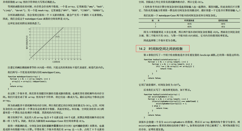
最后
编程基础的初级开发者,计算机科学专业的学生,以及平时没怎么利用过数据结构与算法的开发人员希望复习这些概念为下次技术面试做准备。或者想学习一些计算机科学的基本概念,以优化代码,提高编程技能。这份笔记都是可以作为参考的。
开源分享:【大厂前端面试题解析+核心总结学习笔记+真实项目实战+最新讲解视频】


 470
470


 被折叠的 条评论
为什么被折叠?
被折叠的 条评论
为什么被折叠?
 到【灌水乐园】发言


