


最后,面试前该准备哪些资源复习?
其实客户端开发的知识点就那么多,面试问来问去还是那么点东西。所以面试没有其他的诀窍,只看你对这些知识点准备的充分程度。so,出去面试时先看看自己复习到了哪个阶段就好。
这里再分享一下我面试期间的复习路线:(以下体系的复习资料是我从各路大佬收集整理好的)
《Android开发七大模块核心知识笔记》


《960全网最全Android开发笔记》

《379页Android开发面试宝典》
历时半年,我们整理了这份市面上最全面的安卓面试题解析大全
包含了腾讯、百度、小米、阿里、乐视、美团、58、猎豹、360、新浪、搜狐等一线互联网公司面试被问到的题目。熟悉本文中列出的知识点会大大增加通过前两轮技术面试的几率。
《507页Android开发相关源码解析》
只要是程序员,不管是Java还是Android,如果不去阅读源码,只看API文档,那就只是停留于皮毛,这对我们知识体系的建立和完备以及实战技术的提升都是不利的。
真正最能锻炼能力的便是直接去阅读源码,不仅限于阅读各大系统源码,还包括各种优秀的开源库。
网上学习资料一大堆,但如果学到的知识不成体系,遇到问题时只是浅尝辄止,不再深入研究,那么很难做到真正的技术提升。
一个人可以走的很快,但一群人才能走的更远!不论你是正从事IT行业的老鸟或是对IT行业感兴趣的新人,都欢迎加入我们的的圈子(技术交流、学习资源、职场吐槽、大厂内推、面试辅导),让我们一起学习成长!
除此之外,RelativeLayout.LayoutParams还继承了ViewGroup.MarginLayoutParams,因此RelativeLayout布局容器中每个子组件也可以指定ViewGroup.MarginLayoutParams所支持的各XML属性。
不设置相对位置(重叠在一起)
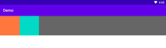
<RelativeLayout xmlns:android=“http://schemas.android.com/apk/res/android”
android:layout_width=“match_parent”
android:layout_height=“match_parent”>
<View
android:id=“@+id/view_top_1”
android:layout_width=“match_parent”
android:layout_height=“100dp”
android:background=“@color/color_666666”/>
<View
android:id=“@+id/view_top_2”
android:layout_width=“200dp”
android:layout_height=“100dp”
android:background=“@color/teal_200”/>
<View
android:id=“@+id/view_top_3”
android:layout_width=“100dp”
android:layout_height=“100dp”
android:background=“@color/color_FF773D”/>
设置相对位置,未出现重叠

<RelativeLayout xmlns:android=“http://schemas.android.com/apk/res/android”
android:layout_width=“match_parent”
android:layout_height=“match_parent”>
<View
android:id=“@+id/view_top_1”
android:layout_width=“match_parent”
android:layout_height=“100dp”
android:background=“@color/color_666666”/>
<View
android:id=“@+id/view_top_2”
android:layout_width=“200dp”
android:layout_below=“@id/view_top_1”
android:layout_height=“100dp”
android:background=“@color/teal_200”/>
<View
android:id=“@+id/view_top_3”
android:layout_width=“100dp”
android:layout_below=“@id/view_top_2”
android:layout_height=“100dp”
android:background=“@color/color_FF773D”/>
<View
android:id=“@+id/view_top_4”
android:layout_width=“100dp”
android:layout_below=“@id/view_top_2”
android:layout_toRightOf=“@id/view_top_3”
android:layout_height=“100dp”
android:background=“@color/purple_500”/>
三、网格布局(GridLayout)
GridLayout把这个容器划分成rows×columns个网格,每个网格可以放一个组件。 除此之外,也可以设置一个组件横跨多少列、一个组件纵跨多少行(支持跨行和跨列以及每个单元格组内的任意对齐形式)。
GridLayout提供了setColumnCount(int)和setRowCount(int)方法来控制该网络的列数和行数。
GridLayout的XML属性和相关方法说明
XML属性 | 相关方法 | 说明 |
android:alignmentMode | setAlignmentMode(int) | 当设置为 alignMargins 时,会导致在视图的外边界之间进行对齐,由其边距定义。 |
android:columnCount | setColumnCount(int) | 自动定位子项时要创建的最大列数。 |
android:columnOrderPreserved | setColumnOrderPreserved (boolean) | 设置为 true 时,强制列边界以与列索引相同的顺序出现。 |
android:orientation | setOrientation(int) | 布局期间不使用方向属性。 |
android:rowCount | setRowCount(int) | 自动定位子项时要创建的最大行数。 |
android:rowOrderPreserved | setRowOrderPreserved(boolean) | 设置为 true 时,强制行边界以与行索引相同的顺序出现。 |
android:useDefaultMargins | setUseDefaultMargins(boolean) | 当设置为 true 时,告诉 GridLayout 在视图的布局参数中未指定任何边距时使用默认边距。 |
GridLayout**.LayoutParams**
为了控制GridLayout布局容器中各子组件的布局分布,GridLayout提供了一个内部类:GridLayout.LayoutParams,该类提供了大量的XML属性来控制GridLayout布局容器中子组件的布局分布。
GridLayout**.LayoutParams里设的XML属性和相关方法说明**
XML属性 | 相关方法 | 说明 |
android:layout_column | 界定此视图占用的单元格组左侧的列边界。 | |
android:layout_columnSpan | 列跨度:界定此视图占用的单元格组的左右边界之间的差异。 | |
android:layout_columnWeight | 在多余空间分配期间应分配给此视图的水平空间的相对比例。 | |
android:layout_gravity | setGravity(int) | 重力指定组件应如何放置在其单元组中。 |
android:layout_row | 界定此视图占据的单元格组顶部的行边界。 | |
android:layout_rowSpan | 行跨度:界定此视图占据的单元格组的顶部和底部边界之间的差异。 | |
android:layout_rowWeight | 在多余空间分配期间应分配给此视图的垂直空间的相对比例。 |

<GridLayout xmlns:android=“http://schemas.android.com/apk/res/android”
android:layout_width=“wrap_content”
android:layout_height=“wrap_content”
android:columnCount=“4”
android:rowCount=“5”>
<Button
android:id=“@+id/one”
android:text=“1” />
<Button
android:id=“@+id/two”
android:text=“2” />
<Button
android:id=“@+id/three”
android:text=“3” />
<Button
android:id=“@+id/devide”
android:text=“/” />
<Button
android:id=“@+id/four”
android:text=“4” />
<Button
android:id=“@+id/five”
android:text=“5” />
<Button
android:id=“@+id/six”
android:text=“6” />
<Button
android:id=“@+id/multiply”
android:text=“×” />
<Button
android:id=“@+id/seven”
android:text=“7” />
<Button
android:id=“@+id/eight”
android:text=“8” />
<Button
android:id=“@+id/nine”
android:text=“9” />
<Button
android:id=“@+id/minus”
android:text=“-” />
<Button
android:id=“@+id/zero”
android:layout_columnSpan=“2”
android:layout_gravity=“fill”
android:text=“0” />
<Button
android:id=“@+id/point”
android:text=“.” />
<Button
android:id=“@+id/plus”
android:layout_rowSpan=“2”
android:layout_gravity=“fill”
android:text=“+” />
<Button
android:id=“@+id/equal”
android:layout_columnSpan=“3”
android:layout_gravity=“fill”
android:text=“=” />
这样的布局用LinearLayout也能做,但是相对麻烦一点,所以在适当的时候时候使用GridLayout就非常的有必要了。而且你可能注意到了,子组件中并没有指定android:layout_width和android:layout_height属性。这是因为这两个属性的默认值都是LayoutPrams.WRAP_COUNTENT,而在此,我们希望使用的就是LayoutPrams.WRAP_COUNTENT,所以就没必要指定了。GridLayout和LinaerLayout十分相似,所以将LinaerLayout替换为GridLayout也相当简单。
四、表格布局(TableLayout)
TableLayout继承了LinerarLayout,因此它的本质依然是线性布局管理器。表格采用行、列的形式来管理UI组件,TableLayout并不需要明确地声明包含多少行、多少列,而是通过TableRow、其他组件来控制表格的行数和列数。
每次向TableLayout中添加TableRow,该TableRow就是一个表格行,TableRow也是容器,因此它也可以不断的添加其他组件,每添加一个子组件该表格就增加一列。
如果直接向TableLayout添加组件,那么这个组件将直接占一行。
在TableLayout中、列的宽度由该列最宽的那个单元格决定,整个TableLayout的宽度取决于父容器的宽度(默认占满父容器)
在TableLayout中,可以为单元格设置的三种行为方式:
Collapsed:如果某列被设为Collapsed,那么该列所有单元格都会被隐藏。
Shrinkable:如果某列被设为Shrinkable,那么该列所有单元格的宽度可以被收缩,以保证该变革能适应父容器的宽度。
Stretchable:如果某列被设为Stretchable,那么该列所有单元格的宽度可以被拉伸,以保证组件能完全填充满表格空余空间。
TableLayout继承了LinerarLayout,因此它完全可以支持LinerarLayout所支持的XML属性。初次之外还支持下面的XML属性。
TableLayout的常用XML属性和相关方法********说明
XML属性 | 相关方法 | 说明 |
android:collapseColumns | setColumnCollapsed(int,boolean) | 要折叠的列的从零开始的索引。 |
android:shrinkColumns | setShrinkAllColumns(boolean) | 要收缩的列的从零开始的索引。 |
android:stretchColumns | setStretchAllColumns(boolean) | 要拉伸的列的从零开始的索引。 |

<LinearLayout xmlns:android=“http://schemas.android.com/apk/res/android”
android:layout_width=“match_parent”
android:layout_height=“match_parent”
android:layout_margin=“10dp”
android:orientation=“vertical”>
<TableLayout
android:layout_width=“match_parent”
android:layout_height=“wrap_content”
android:shrinkColumns=“1”
android:stretchColumns=“2”>
<Button
android:layout_width=“match_parent”
android:layout_height=“wrap_content”
android:text=“顶层大佬” />
<Button
android:layout_width=“match_parent”
android:layout_height=“wrap_content”
android:text=“不变按钮” />
<Button
android:layout_width=“match_parent”
android:layout_height=“wrap_content”
android:layout_marginLeft=“10dp”
android:text=“收缩按钮” />
<Button
android:layout_width=“match_parent”
android:layout_height=“wrap_content”
android:layout_marginLeft=“10dp”
android:text=“拉伸按钮” />
<TableLayout
android:layout_width=“match_parent”
android:layout_height=“wrap_content”
android:collapseColumns=“0”
android:stretchColumns=“2”>
<Button
android:layout_width=“match_parent”
android:layout_height=“wrap_content”
android:text=“高层大佬” />
<Button
android:layout_width=“match_parent”
android:layout_height=“wrap_content”
android:text=“隐藏按钮” />
<Button
android:layout_width=“match_parent”
android:layout_height=“wrap_content”
android:layout_marginLeft=“10dp”
android:text=“不变按钮” />
<Button
android:layout_width=“match_parent”
android:layout_height=“wrap_content”
android:layout_marginLeft=“10dp”
android:text=“拉伸按钮” />
五、帧布局(FrameLayout)
FrameLayout将控件以栈的形势堆叠起来,最近添加进去的控件绘制在最顶部。FrameLayout为每个加入其中的组件创建一个空白的区域(称为一帧),每个子组件占据一帧,这些帧都会根据gravity属性执行自动对齐。
FrameLayout常用的XML属性和相关方法说明
XML属性 | 相关方法 | 说明 |
android:foregroundGravity | setForegroundGravity(int) | 定义要应用于前景可绘制对象的重力。 |
android:measureAllChildren | setMeasureAllChildren(boolean) | 确定测量时是测量所有子项还是仅测量处于可见或不可见状态的子项。 |
FrameLayout包含的子元素也受到FrameLayout.LayoutParams的控制,因此它所包含的子元素也可以指定android:layout_gravity。

<FrameLayout xmlns:android=“http://schemas.android.com/apk/res/android”
android:layout_width=“match_parent”
android:layout_height=“match_parent”>
<TextView
android:layout_width=“wrap_content”
android:layout_height=“wrap_content”
android:layout_gravity=“center”
android:width=“280dp”
android:height=“280dp”
android:text=“1”
android:background=“@color/color_FF773D”/>
<TextView
android:layout_width=“wrap_content”
android:layout_height=“wrap_content”
android:layout_gravity=“center”
android:width=“240dp”
android:text=“2”
android:height=“240dp”
android:background=“@color/color_188FFF”/>
<TextView
android:layout_width=“wrap_content”
android:layout_height=“wrap_content”
android:layout_gravity=“center”
android:width=“200dp”
android:text=“3”
android:height=“200dp”
android:background=“@color/color_ff0000”/>
<TextView
android:layout_width=“wrap_content”
android:layout_height=“wrap_content”
android:layout_gravity=“center”
android:width=“160dp”
android:height=“160dp”
android:text=“4”
android:background=“@color/teal_700”/>
<TextView
android:layout_width=“wrap_content”
android:layout_height=“wrap_content”
android:layout_gravity=“center”
android:width=“120dp”
android:height=“120dp”
android:text=“5”
android:background=“@color/teal_200”/>
将xml中的几个android:text=""去掉,通过代码进行颜色变化,可实现霓虹灯效果。
六****、绝对布局(AbsoluteLayout)****
因为灵活性太差,在API Level 3中被废弃。在实际使用中你需要为所有子组件指定x,y坐标。它的直接子类是WebView。
七、其他(约束布局ConstraintLayout******)******
将该库作为依赖项添加到app/ build.gradle文件中,
dependencies {
implementation “androidx.constraintlayout:constraintlayout:2.0.4”
// To use constraintlayout in compose
implementation “androidx.constraintlayout:constraintlayout-compose:1.0.0-alpha06”
}
ConstraintLayout允许您以灵活的方式定位和调整子组件的大小。 它与RelativeLayout类似,所有的视图都是根据兄弟视图和父布局之间的关系来布局的,但是它比RelativeLayout更灵活,并且更易于在Android Studio的布局编辑器中使用。
ConstraintLayout的所有功能都可以直接从布局编辑器的可视化工具中使用,因为布局API和布局编辑器是专门为对方构建的。 所以你可以使用ConstraintLayout完全通过拖放操作来构建你的布局,而不是编辑XML。
请注意,约束中不能有循环依赖。
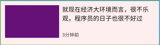
<androidx.constraintlayout.widget.ConstraintLayout xmlns:android=“http://schemas.android.com/apk/res/android”
xmlns:app=“http://schemas.android.com/apk/res-auto”
android:id=“@+id/activity_main”
android:layout_width=“match_parent”
android:layout_height=“match_parent”
android:background=“#11ff0000”>
<TextView
android:id=“@+id/tv1”
android:layout_width=“140dp”
android:layout_height=“86dp”
android:layout_marginStart=“12dp”
android:layout_marginTop=“12dp”
android:background=“#617”
app:layout_constraintLeft_toLeftOf=“parent”
app:layout_constraintTop_toTopOf=“parent” />
<TextView
android:id=“@+id/tv2”
android:layout_width=“0dp”
android:layout_height=“wrap_content”
android:layout_marginStart=“8dp”
android:layout_marginEnd=“12dp”
android:text=“就现在经济大环境而言,很不乐观,程序员的日子也很不好过”
android:textColor=“#000000”
android:textSize=“16dp”
app:layout_constraintLeft_toRightOf=“@id/tv1”
app:layout_constraintRight_toRightOf=“parent”
app:layout_constraintTop_toTopOf=“@id/tv1” />
<TextView
android:layout_width=“wrap_content”
android:layout_height=“wrap_content”
android:layout_marginStart=“8dp”
android:layout_marginTop=“12dp”
android:text=“3分钟前”
android:textColor=“#333”
android:textSize=“12dp”
app:layout_constraintBottom_toBottomOf=“@id/tv1”
app:layout_constraintLeft_toRightOf=“@id/tv1” />
</androidx.constraintlayout.widget.ConstraintLayout>
tv1设置了://父布局的左上角
app:layout_constraintLeft_toLeftOf=“parent”
app:layout_constraintTop_toTopOf=“parent”
tv2设置了:tv2在tv1的右侧,tv2的右侧和父布局对其,tv2和tv1顶部对齐;
资源分享
- 最新大厂面试专题
这个题库内容是比较多的,除了一些流行的热门技术面试题,如Kotlin,数据库,Java虚拟机面试题,数组,Framework ,混合跨平台开发,等

- 对应导图的Android高级工程师进阶系统学习视频
最近热门的,NDK,热修复,MVVM,源码等一系列系统学习视频都有!

网上学习资料一大堆,但如果学到的知识不成体系,遇到问题时只是浅尝辄止,不再深入研究,那么很难做到真正的技术提升。
一个人可以走的很快,但一群人才能走的更远!不论你是正从事IT行业的老鸟或是对IT行业感兴趣的新人,都欢迎加入我们的的圈子(技术交流、学习资源、职场吐槽、大厂内推、面试辅导),让我们一起学习成长!
=“@id/tv1”
app:layout_constraintLeft_toRightOf=“@id/tv1” />
</androidx.constraintlayout.widget.ConstraintLayout>
tv1设置了://父布局的左上角
app:layout_constraintLeft_toLeftOf=“parent”
app:layout_constraintTop_toTopOf=“parent”
tv2设置了:tv2在tv1的右侧,tv2的右侧和父布局对其,tv2和tv1顶部对齐;
资源分享
- 最新大厂面试专题
这个题库内容是比较多的,除了一些流行的热门技术面试题,如Kotlin,数据库,Java虚拟机面试题,数组,Framework ,混合跨平台开发,等
[外链图片转存中…(img-80jF468z-1715730782059)]
- 对应导图的Android高级工程师进阶系统学习视频
最近热门的,NDK,热修复,MVVM,源码等一系列系统学习视频都有!
[外链图片转存中…(img-RqneAzn1-1715730782059)]
网上学习资料一大堆,但如果学到的知识不成体系,遇到问题时只是浅尝辄止,不再深入研究,那么很难做到真正的技术提升。
一个人可以走的很快,但一群人才能走的更远!不论你是正从事IT行业的老鸟或是对IT行业感兴趣的新人,都欢迎加入我们的的圈子(技术交流、学习资源、职场吐槽、大厂内推、面试辅导),让我们一起学习成长!


 被折叠的 条评论
为什么被折叠?
被折叠的 条评论
为什么被折叠?
 到【灌水乐园】发言


