


return roundButtonDrawable;
}
}
attr代码如下:
<?xml version="1.0" encoding="utf-8"?>2、自定义Button,设置GradientDrawable为背景
因为GradientDrawable是shape标签的具体代码实现,所以,如果我们想通过GradientDrawable来实现圆角等功能需求的话,需要把上一步骤中我们自定义的GradientDrawable来作为button的background,具体代码如下:
/**
-
@author xiaoman
-
可以设置背景色、指定圆角、描边的宽度和颜色
*/
public class RoundButton extends AppCompatTextView {
private RoundButtonDrawable roundButtonDrawable;
public RoundButton(Context context) {
super(context);
init(context, null, 0);
}
public RoundButton(Context context, AttributeSet attrs) {
super(context, attrs, R.attr.RoundButtonStyle);
init(context, attrs, R.attr.RoundButtonStyle);
}
public RoundButton(Context context, AttributeSet attrs, int defStyleAttr) {
super(context, attrs, defStyleAttr);
init(context, attrs, defStyleAttr);
}
private void init(Context context, AttributeSet attrs, int defStyleAttr) {
roundButtonDrawable = RoundButtonDrawable.fromAttrSet(context, attrs, defStyleAttr);
ViewHelperUtils.setBackgroundKeepingPadding(this, roundButtonDrawable);
}
/**
-
设置背景颜色
-
@param color
*/
@Override
public void setBackgroundColor(int color) {
roundButtonDrawable. setColor(color);
}
/**
-
设置描边的宽度和颜色
-
@param width
-
@param color
*/
public void setStrokeData(int width, int color) {
roundButtonDrawable.setStrokeData(width, color);
}
/**
-
设置描边颜色
-
@param color
*/
public void setStrokeColors(int color) {
roundButtonDrawable.setStrokeColor(color);
}
/**
-
设置四个角的半径
-
@param radius
*/
public void setRadius(int radius){
roundButtonDrawable.setCornerRadius(radius);
}
/**
-
设置 每一个角的半径
-
@param topLeftRadius 左上角半径
-
@param topRightRadius 右上角半径
-
@param bottomLeftRadius 右下角半径
-
@param bottomRightRadius 左下角半径
*/
public void setEachCornerRadius(int topLeftRadius,int topRightRadius,int bottomLeftRadius,int bottomRightRadius){
float[] radius = new float[]{
topLeftRadius, topLeftRadius,
topRightRadius, topRightRadius,
bottomRightRadius, bottomRightRadius,
bottomLeftRadius, bottomLeftRadius
};
roundButtonDrawable. setCornerRadii(radius);
}
/**
-
设置渐变
-
@param gradientType 渐变类型
-
@param orientation 渐变方向
-
@param colors 渐变颜色
*/
public void setGradient(int gradientType, GradientDrawable.Orientation orientation, int[] colors){
roundButtonDrawable.setGradientType(gradientType);
roundButtonDrawable.setOrientation(orientation);
roundButtonDrawable.setColors(colors);
}
public static void setBackgroundKeepingPadding(View view, Drawable drawable) {
int[] padding = new int[]{view.getPaddingLeft(), view.getPaddingTop(), view.getPaddingRight(), view.getPaddingBottom()};
view.setBackground(drawable);
view.setPadding(padding[0], padding[1], padding[2], padding[3]);
}
}
3、在xml布局文件中直接引用自定义的button
<?xml version="1.0" encoding="utf-8"?><androidx.constraintlayout.widget.ConstraintLayout xmlns:android=“http://schemas.android.com/apk/res/android”
xmlns:app=“http://schemas.android.com/apk/res-auto”
xmlns:tools=“http://schemas.android.com/tools”
android:layout_width=“match_parent”
android:layout_height=“match_parent”
tools:context=“.MainActivity”>
<com.ztk.demo.uitool.widget.RoundButton
android:id=“@+id/bt”
android:layout_width=“300dp”
android:layout_height=“wrap_content”
android:text=“Hello World!”
android:padding=“10dp”
app:radius=“30dp”
app:bgColor=“@color/colorAccent”
android:textColor=“#ffffff”
android:gravity=“center_horizontal”
android:layout_marginTop=“60dp”
app:layout_constraintLeft_toLeftOf=“parent”
app:layout_constraintRight_toRightOf=“parent”
app:layout_constraintTop_toTopOf=“parent” />
<com.ztk.demo.uitool.widget.RoundButton
android:id=“@+id/bt2”
android:layout_width=“300dp”
android:layout_height=“wrap_content”
android:text=“”
android:padding=“10dp”
app:topLeftRadius=“10dp”
app:bgColor=“@color/colorPrimary”
android:textColor=“#ffffff”
android:gravity=“center_horizontal”
android:layout_marginTop=“30dp”
app:layout_constraintTop_toBottomOf=“@+id/bt”
app:layout_constraintLeft_toLeftOf=“parent”
app:layout_constraintRight_toRightOf=“parent” />
<com.ztk.demo.uitool.widget.RoundButton
android:id=“@+id/bt3”
android:layout_width=“300dp”
android:layout_height=“wrap_content”
android:text=“”
android:padding=“10dp”
app:radius=“30dp”
app:strokeColor=“@color/colorAccent”
app:strokeWidth=“2dp”
app:bgColor=“@color/colorPrimary”
android:textColor=“#ffffff”
android:gravity=“center_horizontal”
android:layout_marginTop=“30dp”
app:layout_constraintTop_toBottomOf=“@+id/bt2”
app:layout_constraintLeft_toLeftOf=“parent”
app:layout_constraintRight_toRightOf=“parent” />
</androidx.constraintlayout.widget.ConstraintLayout>
也可以通过代码动态设置:
public class MainActivity extends AppCompatActivity {
@Override
protected void onCreate(Bundle savedInstanceState) {
super.onCreate(savedInstanceState);
setContentView(R.layout.activity_main);
RoundButton bt = findViewById(R.id.bt);
bt.setRadius(50);
// bt.setStrokeColors(ContextCompat.getColor(this,R.color.colorPrimary));
bt.setBackgroundColor(ContextCompat.getColor(this,R.color.colorPrimary));
// bt.setEachCornerRadius(50,0,0,0);
// bt.setStrokeData(6,ContextCompat.getColor(this,R.color.colorPrimary));
// int[] colors ={ContextCompat.getColor(this,R.color.colorPrimary) , ContextCompat.getColor(this,R.color.colorAccent), ContextCompat.getColor(this,R.color.white)};
最后
自我介绍一下,小编13年上海交大毕业,曾经在小公司待过,也去过华为、OPPO等大厂,18年进入阿里一直到现在。
深知大多数初中级Android工程师,想要提升技能,往往是自己摸索成长,自己不成体系的自学效果低效漫长且无助。
因此我收集整理了一份《2024年Android移动开发全套学习资料》,初衷也很简单,就是希望能够帮助到想自学提升又不知道该从何学起的朋友,同时减轻大家的负担。
既有适合小白学习的零基础资料,也有适合3年以上经验的小伙伴深入学习提升的进阶课程,基本涵盖了95%以上Android开发知识点!不论你是刚入门Android开发的新手,还是希望在技术上不断提升的资深开发者,这些资料都将为你打开新的学习之门
如果你觉得这些内容对你有帮助,需要这份全套学习资料的朋友可以戳我获取!!
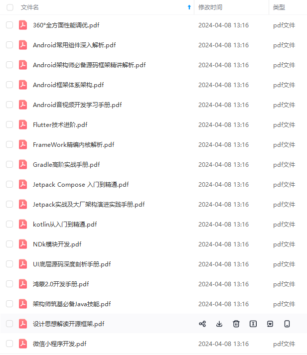
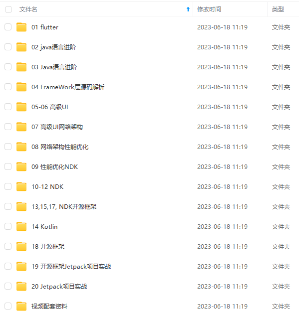
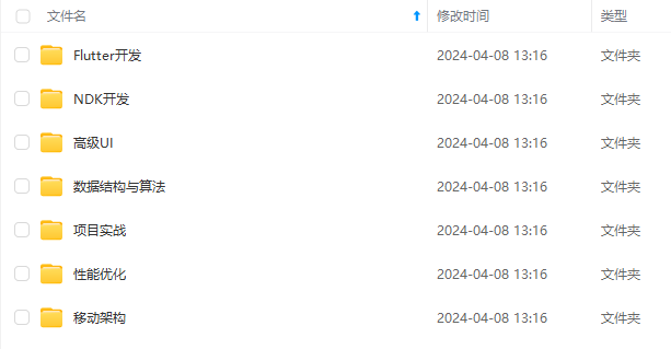
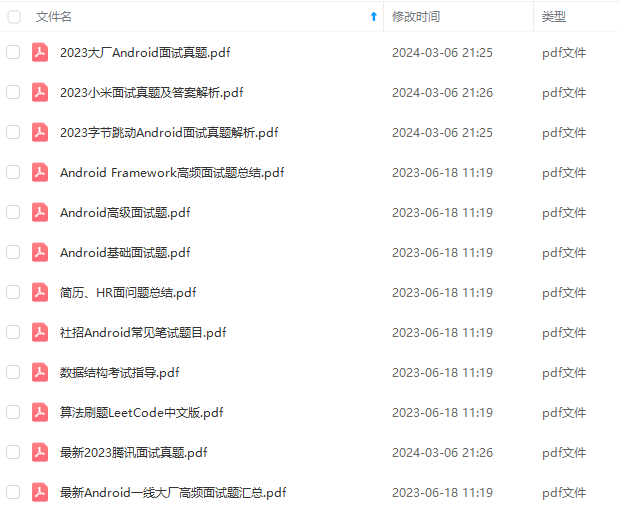
由于文件比较大,这里只是将部分目录截图出来,每个节点里面都包含大厂面经、学习笔记、源码讲义、实战项目、讲解视频,并且会持续更新!
存中…(img-rwoYTM1d-1715392441338)]
[外链图片转存中…(img-9EOiGVrX-1715392441340)]
[外链图片转存中…(img-sgJNXSCJ-1715392441341)]
[外链图片转存中…(img-4tjnCd48-1715392441342)]
既有适合小白学习的零基础资料,也有适合3年以上经验的小伙伴深入学习提升的进阶课程,基本涵盖了95%以上Android开发知识点!不论你是刚入门Android开发的新手,还是希望在技术上不断提升的资深开发者,这些资料都将为你打开新的学习之门
如果你觉得这些内容对你有帮助,需要这份全套学习资料的朋友可以戳我获取!!
由于文件比较大,这里只是将部分目录截图出来,每个节点里面都包含大厂面经、学习笔记、源码讲义、实战项目、讲解视频,并且会持续更新!


 扫一扫
扫一扫


 被折叠的 条评论
为什么被折叠?
被折叠的 条评论
为什么被折叠?
 到【灌水乐园】发言


