结构文件
<!DOCTYPE html>
<html lang="zh-CN">
<head>
<meta charset="UTF-8">
<meta name="viewport" content="width=device-width, initial-scale=1.0">
<title>母亲节快乐!</title>
<link rel="stylesheet" href="./css/styles.css">
</head>
<body>
<!-- 登录表单 -->
<div class="login-container">
<h2>专属登录</h2>
<form id="loginForm">
<div class="form-group">
<label for="username">用户名:</label>
<input type="text" id="username" required>
</div>
<div class="form-group">
<label for="password">密码:</label>
<input type="password" id="password" required>
</div>
<button type="submit">登录</button>
<p id="errorMsg" class="error"></p>
</form>
</div>
<!-- 主内容(默认隐藏) -->
<div class="main-content" style="display: none;">
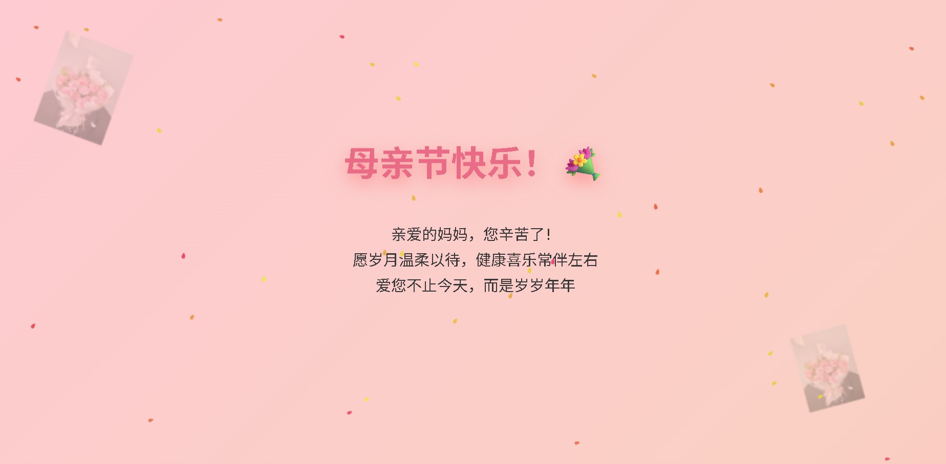
<h1 class="title">母亲节快乐!💐</h1>
<p class="wishes">亲爱的妈妈,您辛苦了!<br>愿岁月温柔以待,健康喜乐常伴左右<br>爱您不止今天,而是岁岁年年</p>
<!-- 花饰背景 -->
<div class="flower-decoration"></div>
<div class="flower-decoration"></div>
<audio id="motherMusic" src="./MP3 jpg/mather.mp3" loop></audio>
</div>
<script src="./js/scripts.js"></script>
</body>
</html>
样式文件
/* 全局选择器,选择所有元素 */
* {
    /* 将外边距设置为0,去除元素默认的外边距 */
    margin: 0;
    /* 将内边距设置为0,去除元素默认的内边距 */
    padding: 0;
    /* 将盒模型设置为 border-box,使元素的 padding 和 border 不会影响其宽度和高度 */
    box-sizing: border-box;
}

/* 选择 body 元素 */
body {
    /* 设置最小高度为视口高度的100%,确保页面内容至少占满整个视口高度 */
    min-height: 100vh;
    /* 使用线性渐变设置背景颜色,从 #ff9a9e 到 #fad0c4 到 #ffc8d8 到 #ffe3e3 */
    background: linear-gradient(-45deg, #ff9a9e, #fad0c4, #ffc8d8, #ffe3e3);
    /* 设置背景大小为 400% 400% */
    background-size: 400% 400%;
    /* 应用名为 gradient 的动画,持续时间为 15 秒,动画函数为 ease,无限循环 */
    animation: gradient 15s ease infinite;
    /* 将 body 设置为 flex 容器 */
    display: flex;
    /* 设置 flex 方向为列 */
    flex-direction: column;
    /* 使子元素在水平方向上居中对齐 */
    align-items: center;
    /* 使子元素在垂直方向上居中对齐 */
    justify-content: center;
    /* 隐藏超出 body 范围的内容 */
    overflow: hidden;
    /* 设置左右内边距为 1rem */
    padding: 0 1rem;
}

/* 定义名为 gradient 的动画 */
@keyframes gradient {
    /* 动画的起始状态,背景位置在 0% 50% */
    0% { background-position: 0% 50%; }
    /* 动画到 50% 时的状态,背景位置在 100% 50% */
    50% { background-position: 100% 50%; }
    /* 动画的结束状态,背景位置回到 0% 50% */
    100% { background-position: 0% 50%; }
}

/* 选择类名为 title 的元素 */
.title {
    /* 设置字体大小为 3.5rem */
    font-size: 3.5rem;
    /* 设置文本颜色为 #e96b86 */
    color: #e96b86;
    /* 设置文本阴影,模糊半径为 20px,颜色为 rgba(255,150,150,0.8) */
    text-shadow: 0 0 20px rgba(255,150,150,0.8);
    /* 设置元素底部外边距为 2rem */
    margin-bottom: 2rem;
    /* 应用名为 bounce3D 的动画,持续时间为 1.5 秒,动画函数为 ease,无限循环 */
    animation: bounce3D 1.5s ease infinite;
    /* 设置 3D 变换的样式 */
    transform-style: preserve-3d;
}

/* 定义名为 bounce3D 的动画 */
@keyframes bounce3D {
    /* 动画的起始状态和结束状态,垂直方向上没有位移,X 轴旋转 0 度,文本阴影为 0 0 20px rgba(255,150,150,0.8) */
    0%, 100% {
        transform: translateY(0) rotateX(0deg);
        text-shadow: 0 0 20px rgba(255,150,150,0.8);
    }
    /* 动画到 50% 时的状态,垂直方向上位移 -30px,X 轴旋转 20 度,文本阴影为 0 15px 30px rgba(255,100,100,0.6) */
    50% {
        transform: translateY(-30px) rotateX(20deg);
        text-shadow: 0 15px 30px rgba(255,100,100,0.6);
    }
}

/* 选择类名为 wishes 的元素 */
.wishes {
    /* 设置字体大小为 1.5rem */
    font-size: 1.5rem;
    /* 设置文本颜色为 #333 */
    color: #333;
    /* 设置文本水平居中对齐 */
    text-align: center;
    /* 设置行高为 2.5rem */
    line-height: 2.5rem;
    /* 设置元素上下外边距为 2rem */
    margin: 2rem 0;
    /* 应用名为 textGlow 的动画,持续时间为 3 秒,动画函数为 ease-in-out,无限循环 */
    animation: textGlow 3s ease-in-out infinite;
}

/* 定义名为 textGlow 的动画 */
@keyframes textGlow {
    /* 动画的起始状态和结束状态,透明度为 0.9 */
    0%, 100% { opacity: 0.9; }
    /* 动画到 50% 时的状态,透明度为 1,文本阴影为 0 0 10px rgba(255,200,200,0.5) */
    50% { opacity: 1; text-shadow: 0 0 10px rgba(255,200,200,0.5); }
}

/* 选择类名为 confetti 的元素 */
.confetti {
    /* 设置定位为绝对定位 */
    position: absolute;
    /* 设置元素宽度为 16px */
    width: 16px;
    /* 设置元素高度为 16px */
    height: 16px;
    /* 使用 HSL 颜色模式设置背景颜色,色调由自定义属性 --hue 决定,饱和度为 80%,明度为 60% */
    background: hsl(calc(var(--hue) * 1deg), 80%, 60%);
    /* 使用 clip-path 属性裁剪元素,这里使用了一个路径来定义形状 */
    clip-path: path('M2.5 1C1.12 1 0 2.12 0 3.5c0 2.88 2.5 5.5 2.5 5.5s2.5-2.62 2.5-5.5c0-1.38-1.12-2.5-2.5-2.5z');
    /* 应用名为 confettiFall 的动画,持续时间为 4 秒,动画函数为 linear,无限循环 */
    animation: confettiFall 4s linear infinite;
    /* 声明元素的 transform 属性可能会发生变化,提示浏览器进行优化 */
    will-change: transform;
}

/* 定义名为 confettiFall 的动画 */
@keyframes confettiFall {
    /* 动画的起始状态,垂直方向上在视口高度以上,旋转 0 度,缩放 0.8,透明度为 0.9 */
    0% {
        transform: translateY(-100vh) rotate(0deg) scale(0.8);
        opacity: 0.9;
    }
    /* 动画到 50% 时的状态,垂直方向上在视口内,旋转 180 度,缩放 1.2,透明度为 1 */
    50% {
        transform: translateY(0) rotate(180deg) scale(1.2);
        opacity: 1;
    }
    /* 动画的结束状态,垂直方向上在视口高度以下,旋转 360 度,缩放 0.8,透明度为 0.7 */
    100% {
        transform: translateY(100vh) rotate(360deg) scale(0.8);
        opacity: 0.7;
    }
}

/* 媒体查询,当屏幕宽度小于等于 600px 时应用以下样式 */
@media (max-width: 600px) {
    /* 选择类名为 title 的元素,设置字体大小为 2rem */
   .title {
        font-size: 2rem;
    }

    /* 选择类名为 wishes 的元素,设置字体大小为 1rem,行高为 2rem */
   .wishes {
        font-size: 1rem;
        line-height: 2rem;
    }

    /* 选择类名为 confetti 的元素,设置宽度为 12px,高度为 12px */
   .confetti {
        width: 12px;
        height: 12px;
    }
}

/* 选择类名为 flower-decoration 的元素 */
.flower-decoration {
    /* 设置定位为绝对定位 */
    position: absolute;
    /* 设置元素宽度为 150px */
    width: 150px;
    /* 设置元素高度为 150px */
    height: 150px;
    /* 设置背景为图片,路径为 '../MP3 jpg/1.jpg',不重复,背景大小为包含 */
    background: url('../MP3 jpg/1.jpg') no-repeat;
    background-size: contain;
    /* 设置透明度为 0.3 */
    opacity: 0.3;
    /* 使用滤镜模糊 1px */
    filter: blur(1px);
    /* 设置元素的 z-index 为 -1,使其在其他元素之后显示 */
    z-index: -1;
}

/* 选择类名为 flower-decoration 的第一个元素 */
.flower-decoration:nth-of-type(1) {
    /* 设置元素的顶部位置为视口高度的 10% */
    top: 10%;
    /* 设置元素的左侧位置为视口宽度的 5% */
    left: 5%;
    /* 设置元素旋转 20 度 */
    transform: rotate(20deg);
}
/* 选择类名为 flower-decoration 的第二个元素 */
.flower-decoration:nth-of-type(2) {
    /* 设置元素的顶部位置为视口高度的 70% */
    top: 70%;
    /* 设置元素的右侧位置为视口宽度的 8% */
    right: 8%;
    /* 设置元素旋转 -15 度 */
    transform: rotate(-15deg);
    /* 设置元素宽度为 120px */
    width: 120px;
    /* 设置元素高度为 120px */
    height: 120px;
}

/* 选择类名为 login-container 的元素 */
.login-container {
    /* 设置背景颜色为白色透明度为 0.95 的 rgba 颜色 */
    background: rgba(255,255,255,0.95);
    /* 设置内边距为 2.5rem */
    padding: 2.5rem;
    /* 设置元素的边框半径为 20px */
    border-radius: 20px;
    /* 设置盒子阴影,水平偏移 0,垂直偏移 10px,模糊半径 30px,阴影颜色为 rgba(255,150,150,0.2) */
    box-shadow: 0 10px 30px rgba(255,150,150,0.2);
    /* 设置最大宽度为 450px */
    max-width: 450px;
    /* 设置宽度为视口宽度的 90% */
    width: 90%;
    /* 应用名为 formBreathe 的动画,持续时间为 5 秒,动画函数为 ease-in-out,无限循环 */
    animation: formBreathe 5s ease-in-out infinite;
}

/* 定义名为 formBreathe 的动画 */
@keyframes formBreathe {
    /* 动画的起始状态和结束状态,缩放为 0.98 */
    0%, 100% { transform: scale(0.98); }
    /* 动画到 50% 时的状态,缩放为 1.02 */
    50% { transform: scale(1.02); }
}

/* 选择类名为 form-group 的元素 */
.form-group {
    /* 设置元素底部外边距为 1.5rem */
    margin-bottom: 1.5rem;
}

/* 选择类名为 form-group 的元素内的 label 元素 */
.form-group label {
    /* 设置为块级元素 */
    display: block;
    /* 设置元素底部外边距为 0.5rem */
    margin-bottom: 0.5rem;
    /* 设置文本颜色为 #e96b86 */
    color: #e96b86;
    /* 设置字体粗细为 bold */
    font-weight: bold;
}

/* 选择类名为 form-group 的元素内的 input 元素 */
.form-group input {
    /* 设置宽度为 100% */
    width: 100%;
    /* 设置内边距为 0.8rem */
    padding: 0.8rem;
    /* 设置边框为 2px 实线,颜色为 #fad0c4 */
    border: 2px solid #fad0c4;
    /* 设置边框半径为 5px */
    border-radius: 5px;
    /* 设置字体大小为 1rem */
    font-size: 1rem;
}

/* 选择类名为 form-group 的元素内的 input 元素在获得焦点时的样式 */
.form-group input:focus {
    /* 去除默认的轮廓线 */
    outline: none;
    /* 设置边框颜色为 #e96b86 */
    border-color: #e96b86;
}

/* 选择 button 元素 */
button {
    /* 设置宽度为 100% */
    width: 100%;
    /* 设置内边距为 0.8rem */
    padding: 0.8rem;
    /* 设置背景颜色为 #e96b86 */
    background: #e96b86;
    /* 设置文本颜色为白色 */
    color: white;
    /* 去除边框 */
    border: none;
    /* 设置边框半径为 5px */
    border-radius: 5px;
    /* 设置字体大小为 1rem */
    font-size: 1rem;
    /* 设置鼠标指针样式为 pointer,显示为手形 */
    cursor: pointer;
}

/* 选择 button 元素在鼠标悬停时的样式 */
button:hover {
    /* 设置背景颜色为 #ff9a9e */
    background: #ff9a9e;
}

/* 选择类名为 error 的元素 */
.error {
    /* 设置文本颜色为 #ff4444 */
    color: #ff4444;
    /* 设置元素顶部外边距为 1rem */
    margin-top: 1rem;
    /* 设置文本水平居中对齐 */
    text-align: center;
}

/* 选择类名为 main-content 的元素 */
.main-content {
    /* 设置宽度为 100% */
    width: 100%;
    /* 设置文本水平居中对齐 */
    text-align: center;
}
JS文件
// 生成心形彩纸动画的函数
function createConfetti() {
    // 创建一个div元素作为彩纸
    const confetti = document.createElement('div');
    // 为彩纸元素添加confetti类,应用CSS中定义的样式
    confetti.classList.add('confetti');
    // 设置彩纸的水平位置,随机出现在视口宽度范围内
    confetti.style.left = Math.random() * 100 + 'vw';
    // 随机生成彩纸颜色的色相值,80%概率生成红色系,20%概率生成紫色系
    const hue = Math.random() < 0.8 ? Math.random() * 50 + 10 : Math.random() * 20 + 340;
    // 设置自定义属性--hue,用于CSS中控制彩纸颜色
    confetti.style.setProperty('--hue', hue);
    // 随机设置彩纸的动画持续时间,范围在3-6秒之间
    confetti.style.animationDuration = Math.random() * 3 + 3 + 's';
    // 将彩纸元素添加到页面主体中
    document.body.appendChild(confetti);

    // 设置定时器,6秒后移除彩纸元素,避免页面元素过多影响性能
    setTimeout(() => confetti.remove(), 6000);
}

// 每60毫秒调用一次createConfetti函数,持续生成彩纸
setInterval(createConfetti, 60);

// 预设的登录凭证,用于验证用户输入
alert('用户名: mom\n密码: 520')
const VALID_USER = {
    username: 'mom',  // 正确的用户名
    password: '520'   // 正确的密码
};

// 为登录表单添加提交事件监听器
document.getElementById('loginForm').addEventListener('submit', (e) => {
    // 阻止表单的默认提交行为,避免页面刷新
    e.preventDefault();

    // 获取用户名输入框的值并去除首尾空格
    const username = document.getElementById('username').value.trim();
    // 获取密码输入框的值并去除首尾空格
    const password = document.getElementById('password').value.trim();
    // 获取错误消息显示元素
    const errorMsg = document.getElementById('errorMsg');

    // 验证用户名和密码是否为空
    if (!username || !password) {
        // 如果为空,显示错误消息并终止函数执行
        errorMsg.textContent = '请填写用户名和密码';
        return;
    }

    // 验证用户名和密码是否与预设凭证匹配
    if (username !== VALID_USER.username || password !== VALID_USER.password) {
        // 如果不匹配,显示错误消息并终止函数执行
        errorMsg.textContent = '用户名或密码错误';
        return;
    }

    // 如果验证通过,清除错误消息
    errorMsg.textContent = '';
    // 隐藏登录表单容器
    document.querySelector('.login-container').style.display = 'none';
    // 显示主内容区域
    document.querySelector('.main-content').style.display = 'block';

    // 获取音乐元素
    const audio = document.getElementById('motherMusic');
    // 尝试自动播放音乐
    audio.play().catch(err => {
        // 由于浏览器自动播放政策,可能需要用户交互后才能播放
        console.log('点击页面后播放音乐');
    });
});
效果图


 扫一扫
扫一扫


 5386
5386

 被折叠的 条评论
为什么被折叠?
被折叠的 条评论
为什么被折叠?
 到【灌水乐园】发言


