


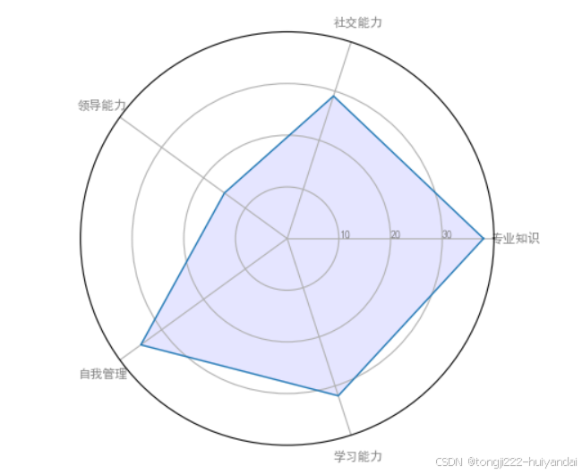
1.雷达图
import matplotlib.pyplot as plt#用于绘图
import pandas as pd#用于数据处理和分析
from math import pi#提供圆周率 π 的值

plt.rcParams['font.sans-serif'] = ['SimHei']  # 指定默认字体为SimHei
plt.rcParams['axes.unicode_minus'] = False  # 解决保存图像时负号'-'显示为方块的问题

# Set data
df = pd.DataFrame({
'group': ['A','B','C','D'],
'专业知识': [38, 1.5, 30, 4],
'社交能力': [29, 10, 9, 34],
'领导能力': [15, 39, 23, 24],
'自我管理': [35, 31, 33, 14],
'学习能力': [32, 15, 32, 14]
})#创建一个包含四组数据(A、B、C、D)的 DataFrame,每组数据有五个指标:专业知识、社交能力、领导能力、自我管理和学习能力

# number of variable
categories=list(df)[1:]#包含所有指标名称(去掉第一列 group)
N = len(categories)#是指标的数量,这里是 5

# We are going to plot the first line of the data frame.
# But we need to repeat the first value to close the circular graph:
values=df.loc[0].drop('group').values.flatten().tolist()#获取第一组数据(A 组)的所有指标值,并转换为列表
values += values[:1]#将第一个值添加到列表末尾,以闭合雷达图的圆形
values

# What will be the angle of each axis in the plot? (we divide the plot / number of variable)
angles = [n / float(N) * 2 * pi for n in range(N)]#计算每个指标的角度,使它们均匀分布在圆周上
angles += angles[:1]#将第一个角度添加到列表末尾,以闭合雷达图的圆形

# Initialise the spider plot
ax = plt.subplot(111, polar=True)#创建一个极坐标图子图 ax,用于绘制雷达图

# Draw one axe per variable + add labels
plt.xticks(angles[:-1], categories, color='grey', size=8)#在每个角度位置绘制指标名称,颜色为灰色,字号为 8

# Draw ylabels
ax.set_rlabel_position(0)#设置径向标签的位置为 0 度
plt.yticks([10,20,30], ["10","20","30"], color="grey", size=7)#在径向上绘制刻度线,分别为 10、20 和 30,颜色为灰色,字号为 7
plt.ylim(0,40)#设置径向范围从 0 到 40

# Plot data
ax.plot(angles, values, linewidth=1, linestyle='solid')#使用线条连接各个指标值,形成雷达图的轮廓

# Fill area
ax.fill(angles, values, 'b', alpha=0.1)#填充雷达图内部区域,颜色为蓝色,透明度为 0.1

# Show the graph
plt.show()#显示生成的雷达图
#这段代码的作用是生成并显示一个雷达图(也称为蜘蛛图或极坐标图),展示四组数据(A、B、C、D)在五个指标(专业知识、社交能力、领导能力、自我管理和学习能力)上的表现。雷达图中的每个组用不同的颜色表示,通过填充区域和线条清晰地展示了各组之间的差异
运行结果:
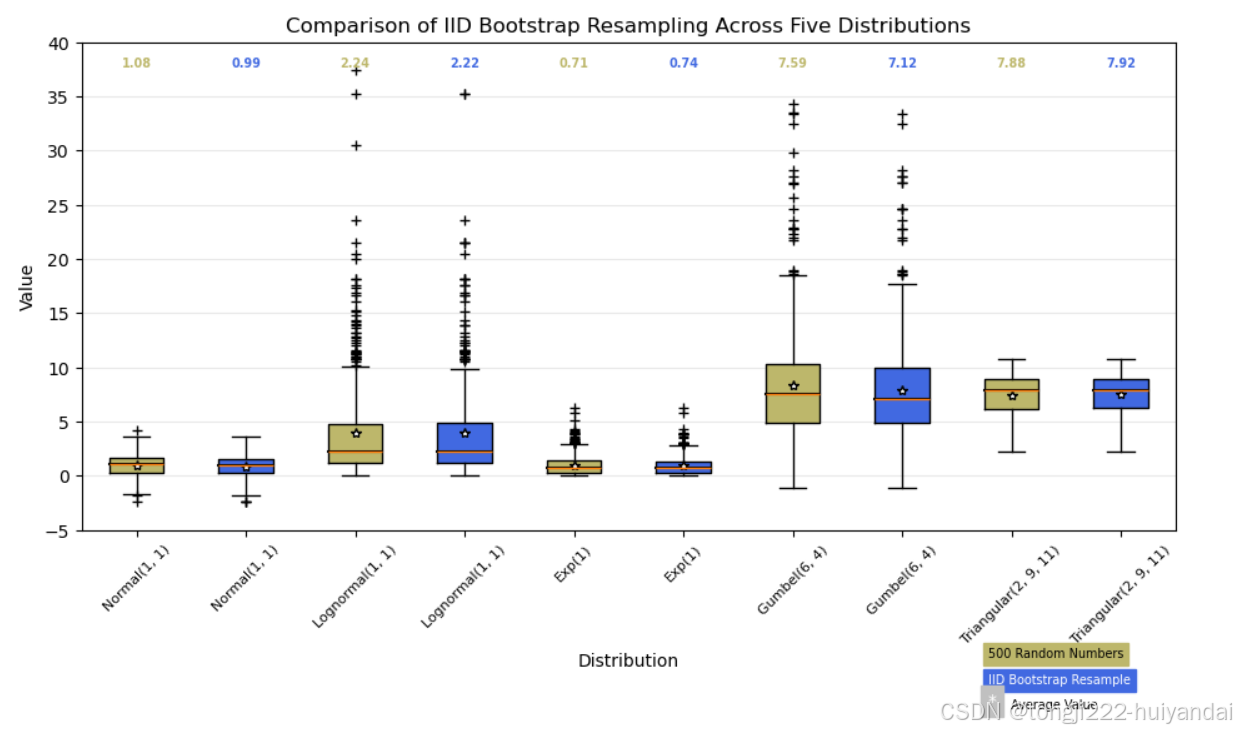
2.箱线图
import matplotlib.pyplot as plt#用于绘图
import numpy as np#用于数值计算和数组操作
from matplotlib.patches import Polygon#用于在图表中绘制多边形(在这里用于填充箱线图的箱子)

random_dists = ['Normal(1, 1)', 'Lognormal(1, 1)', 'Exp(1)', 'Gumbel(6, 4)',
                'Triangular(2, 9, 11)']#是一个包含五种不同概率分布名称的列表
N = 500#是每个分布生成的随机样本数量,这里是 500

#生成随机数据
norm = np.random.normal(1, 1, N)#正态分布,均值为 1,标准差为 1
logn = np.random.lognormal(1, 1, N)#对数正态分布,尺度参数为 1,形状参数为 1
expo = np.random.exponential(1, N)#指数分布,尺度参数为 1
gumb = np.random.gumbel(6, 4, N)#极值分布(Gumbel 分布),位置参数为 6,规模参数为 4
tria = np.random.triangular(2, 9, 11, N)#三角分布,左边界为 2,模式为 9,右边界为 11

# Generate some random indices that we'll use to resample the original data生成自助法重采样索引
# arrays. For code brevity, just use the same random indices for each array
bootstrap_indices = np.random.randint(0, N, N)#生成一个长度为 N 的随机整数数组 bootstrap_indices,这些整数在 0 到 N-1 之间
data = [
    norm, norm[bootstrap_indices],
    logn, logn[bootstrap_indices],
    expo, expo[bootstrap_indices],
    gumb, gumb[bootstrap_indices],
    tria, tria[bootstrap_indices],
]#data 列表包含每种分布的原始数据及其自助法重采样的数据

fig, ax1 = plt.subplots(figsize=(10, 6))#创建一个图形对象 fig 和一个子图对象 ax1,设置图形大小为 10x6 英寸
fig.canvas.manager.set_window_title('A Boxplot Example')#设置窗口标题为 "A Boxplot Example"
fig.subplots_adjust(left=0.075, right=0.95, top=0.9, bottom=0.25)#调整子图的位置和大小,使其更美观

bp = ax1.boxplot(data, notch=False, sym='+', vert=True, whis=1.5)
plt.setp(bp['boxes'], color='black')
plt.setp(bp['whiskers'], color='black')
plt.setp(bp['fliers'], color='red', marker='+')
#使用 boxplot 函数绘制箱线图,设置参数如下:
#notch=False: 不使用凹槽。
#sym='+': 异常点用加号表示。
#vert=True: 箱线图垂直显示。
#whis=1.5: 箱须延伸到距离四分位数 1.5 倍四分位距的地方。
#设置箱体、箱须和异常点的颜色和样式。

# Add a horizontal grid to the plot, but make it very light in color
# so we can use it for reading data values but not be distracting
ax1.yaxis.grid(True, linestyle='-', which='major', color='lightgrey',
               alpha=0.5)#在 y 轴方向添加水平网格线,颜色为浅灰色,透明度为 0.5

ax1.set(
    axisbelow=True,  # Hide the grid behind plot objects
    title='Comparison of IID Bootstrap Resampling Across Five Distributions',
    xlabel='Distribution',
    ylabel='Value',
)
#设置图表的属性:
#axisbelow=True: 网格线位于图形元素下方。
#title: 图表标题。
#xlabel: x 轴标签。
#ylabel: y 轴标签

# Now fill the boxes with desired colors填充箱体并绘制中位数线
box_colors = ['darkkhaki', 'royalblue']#
num_boxes = len(data)#
medians = np.empty(num_boxes)#
for i in range(num_boxes):
    box = bp['boxes'][i]
    box_x = []
    box_y = []
    for j in range(5):
        box_x.append(box.get_xdata()[j])
        box_y.append(box.get_ydata()[j])
    box_coords = np.column_stack([box_x, box_y])
    # Alternate between Dark Khaki and Royal Blue
    ax1.add_patch(Polygon(box_coords, facecolor=box_colors[i % 2]))
    # Now draw the median lines back over what we just filled in
    med = bp['medians'][i]
    median_x = []
    median_y = []
    for j in range(2):
        median_x.append(med.get_xdata()[j])
        median_y.append(med.get_ydata()[j])
        ax1.plot(median_x, median_y, 'k')
    medians[i] = median_y[0]
    # Finally, overplot the sample averages, with horizontal alignment
    # in the center of each box
    ax1.plot(np.average(med.get_xdata()), np.average(data[i]),
             color='w', marker='*', markeredgecolor='k')
#定义两种箱体颜色:darkkhaki 和 royalblue。
#3遍历每个箱体,获取其坐标并填充颜色。
#绘制中位数线,并在其上方绘制平均值标记(白色星号,黑色边缘)

# Set the axes ranges and axes labels设置 x 轴和 y 轴范围及标签
ax1.set_xlim(0.5, num_boxes + 0.5)#
top = 40#
bottom = -5#
ax1.set_ylim(bottom, top)#
ax1.set_xticklabels(np.repeat(random_dists, 2),
                    rotation=45, fontsize=8)
#设置 x 轴和 y 轴的范围
#设置 x 轴标签为重复的分布名称,并旋转 45 度以提高可读性

# Due to the Y-axis scale being different across samples, it can be
# hard to compare differences in medians across the samples. Add upper
# X-axis tick labels with the sample medians to aid in comparison
# (just use two decimal places of precision)添加上部 x 轴标签
pos = np.arange(num_boxes) + 1
upper_labels = [str(round(s, 2)) for s in medians]
weights = ['bold', 'semibold']
for tick, label in zip(range(num_boxes), ax1.get_xticklabels()):
    k = tick % 2
    ax1.text(pos[tick], .95, upper_labels[tick],
             transform=ax1.get_xaxis_transform(),
             horizontalalignment='center', size='x-small',
             weight=weights[k], color=box_colors[k])
#计算每个箱体的中位数值,并将其格式化为两位小数。
#在每个箱体上方添加中位数值标签,使用不同的字体粗细和颜色

# Finally, add a basic legend添加图例
fig.text(0.80, 0.08, f'{N} Random Numbers',
         backgroundcolor=box_colors[0], color='black', weight='roman',
         size='x-small')
fig.text(0.80, 0.045, 'IID Bootstrap Resample',
         backgroundcolor=box_colors[1],
         color='white', weight='roman', size='x-small')
fig.text(0.80, 0.015, '*', color='white', backgroundcolor='silver',
         weight='roman', size='medium')
fig.text(0.815, 0.013, ' Average Value', color='black', weight='roman',
         size='x-small')
#在图表右侧添加文本说明:
#原始数据的数量
#自助法重采样的数据
#平均值标记的含义

plt.show()
#显示生成的箱线图
运行结果:
心得体会:
今天学习了雷达图和箱线图的数据可视化知识,感觉收获满满。
雷达图就像一个蜘蛛网,每个轴代表一个维度,把各个维度的数据连起来,就能直观看到整体情况。比如在分析员工综合能力时,通过雷达图能一眼看出谁是“全能型”选手,谁又是“偏科生”。不过雷达图也有局限,维度太多会乱,数据差异大也容易看不清。
箱线图则是把数据的集中趋势和离散程度都展示出来。箱体范围是四分位间距,能体现数据中间50%的分布,线是中位数,须是极值范围。它能帮我们快速发现数据的偏态、离群值。像分析考试成绩,箱线图能轻松找出异常高分或低分。
学完后我意识到,数据可视化就是用合适的图表把数据内涵直观展现出来,雷达图和箱线图只是其中两种工具。以后碰到数据相关问题,我会先思考数据特点和分析目的,再选择合适的可视化方式,让数据“说话”更清晰。


 被折叠的 条评论
为什么被折叠?
被折叠的 条评论
为什么被折叠?
 到【灌水乐园】发言


