


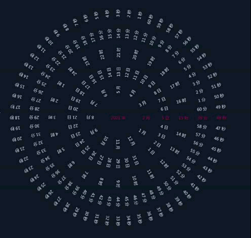
要实现一个时钟罗盘,可以使用HTML、CSS和JavaScript来完成。下面是一个简单的前端代码示例:
HTML代码:
<!DOCTYPE html>
<html>
<head>
  <title>时钟罗盘</title>
  <link rel="stylesheet" type="text/css" href="style.css">
</head>
<body>
  <div class="clock">
    <div class="hour-hand"></div>
    <div class="minute-hand"></div>
    <div class="second-hand"></div>
  </div>

  <script src="script.js"></script>
</body>
</html>
CSS代码(style.css):
.clock {
  width: 200px;
  height: 200px;
  border-radius: 50%;
  border: 2px solid black;
  position: relative;
  margin: 100px auto;
}

.hand {
  position: absolute;
  background-color: black;
  transform-origin: bottom center;
  transition-timing-function: cubic-bezier(.09,.02,.28,1);
}

.hour-hand {
  width: 6px;
  height: 60px;
  top: 70px;
  left: 97px;
}

.minute-hand {
  width: 4px;
  height: 80px;
  top: 50px;
  left: 98px;
}

.second-hand {
  width: 2px;
  height: 90px;
  top: 40px;
  left: 99px;
}
JavaScript代码(script.js):
function rotateClockHands() {
  const date = new Date();
  const hours = date.getHours();
  const minutes = date.getMinutes();
  const seconds = date.getSeconds();

  const hourHand = document.querySelector('.hour-hand');
  const minuteHand = document.querySelector('.minute-hand');
  const secondHand = document.querySelector('.second-hand');

  const hourRotation = (hours * 30) + (minutes / 2);
  const minuteRotation = (minutes * 6) + (seconds / 10);
  const secondRotation = seconds * 6;

  hourHand.style.transform = `rotate(${hourRotation}deg)`;
  minuteHand.style.transform = `rotate(${minuteRotation}deg)`;
  secondHand.style.transform = `rotate(${secondRotation}deg)`;
}

setInterval(rotateClockHands, 1000);
这个时钟罗盘会根据当前的时间,动态地将时针、分针和秒针旋转到相应的位置。你可以将上述代码保存为HTML、CSS和JavaScript文件,然后在浏览器中打开HTML文件,就可以看到时钟罗盘的效果了。


 1521
1521

 被折叠的 条评论
为什么被折叠?
被折叠的 条评论
为什么被折叠?
 到【灌水乐园】发言


