


通过上一篇文章的学习,我们知道了HTML是一种文本标记语言,也认识了其内部重要的几个结构代码,而今天我要介绍的是HTML中的定位,属性为:position属性(包含static,relative,absolute,fixed)。其作用则在于控制元素在页面中的定位方式。可以调整整体的美观感,
---接下来我会将以上的知识点进行介绍说明;
-
Static:
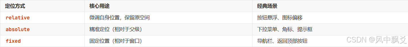
其实非常好理解,就是默认值(默认按照排列的顺序展示),其元素按正常文档流排列。但无法通过 top、left 等属性调整位置。
-
Relative:
即相对定位,元素相对于其正常位置进行偏移,但不会影响到其他元素。会保留原始位置,不会脱离正常的文档流。具体情况见下方代码可知:
.box {
  position: relative;
  top: 20px;
  left: 30px;
}释义:假若将top(顶部)值设置为20px(px为像素值),则其设置位置在顶部下方原位置的像素值位置,可以设置负数数值,移动位置相反。若将left(左边)值设置为30px(px为像素值),则其设置位置在左方原位置的像素值位置,可以设置负数数值,移动位置也会相反。
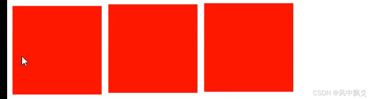
场景模拟 壹 :
属性值:
.hover>div {
  position: relative; /* 必须设置 */
  transition: 0.5s; /* 过渡动画 */
}

.div>div:hover {
   /*margin:20px;*/
  top: 10px; /* 向上移动5像素 */

}
生效代码块:
<div></div>
		<div class="box">
			<div></div>
			<div class="aa"></div>
			<div></div>
		</div>
最终效果呈现:(鼠标移动时显示动画效果:过渡(参考手机商城时鼠标移动到手机图片上显示微放大效果(雏形)))
-
Absolute:
即绝对定位,元素相对于最近的定位祖先元素(非static定位)进行定位,脱离文档流。原有位置会被其他元素所占据。随着滚动条的上下滑动,始终固定在指定位置。按照父级元素的位置进行定位,但是父级的元素状态得是相对定位(relative)或者绝对定位(absolute)
.parent {
  position: relative;
}
.child {
  position: absolute;
  right: 0;
  bottom: 0;
}释义:right: 0 表示子元素的右侧边界与父容器的右侧内边距边界对齐。bottom: 0 表示子元素的底部边界与父容器的底部内边距边界对齐。
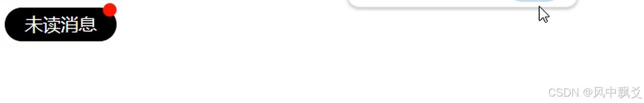
场景模拟 贰 :
属性值:
.box{
				position: relative;
			}
			.yuan{
				height: 30px;
				width: 100px;
				line-height: 30px;
				background-color: black;
				color: white;
				text-align: center;
				border-radius: 20px;
				position: relative;
			}
			.aa{
				height: 12px;
				width: 12px;
				background-color: red;
				border-radius: 50%;
				position: absolute;
				top: -4px;
				right: 4px;
			}
生效代码块:
     <div class="box">
			<div></div>
			<div class="aa"></div>
			<div></div>
		</div> -->
		<!-- <div class="yuan">
			未读消息
			<div class="aa"></div>
		</div>
最终效果呈现: (图标角标(小红点)参考软件未读消息效果)
场景模拟 叁 :
属性值:
            .nav>div{
				display: inline-block;
				position: relative;
			}
			.menu{
				display: none;
				position: absolute;
			}
			.nav>div:hover .menu{
				display: block;
				left: 10px;
				cursor: pointer;
			}
			.menu>div:hover{
				background-color: blue;
				color: white;
				font-weight: bold;
			}
生效代码块:
       <div class="nav">
			<div>My question
				<div class="menu">
				<div>question one</div>
				<div>question two</div>
				<div>question three</div>
				</div>
			</div>
			<div> My question
				<div class="menu">
				<div>question one</div>
				<div>question two</div>
				<div>question three</div>
				</div>
			</div>
			<div>My question
				<div class="menu">
				<div>question one</div>
				<div>question two</div>
				<div>question three</div>
				</div>
			</div>
		</div>
最终效果呈现:(下拉菜单栏)
-
Fixed:
即固定定位,脱离文档流,不会占据原始位置,随着滚动条上下滑动,始终固定在指定的位置,常用于导航栏或者弹窗等功能。
.header {
  position: fixed;
  top: 0;
  width: 100%;
}释义:width(宽度值100%)其意思是你的屏幕有多大,那么这个宽度则会根据你屏幕大小来适应合适的大小。
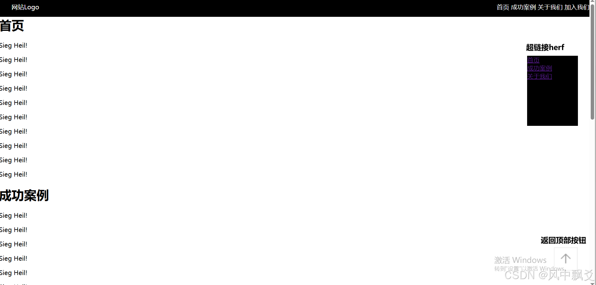
场景模拟 肆 :
属性值:
.top{
				height: 50px;
				width: 100%;
				background: black;
				color: white;
				line-height: 50px;
				position: fixed;
				top: 0;
			}
			.left{
				float: left;
				text-indent: 2em;
			}
			.right{
				float: right;
			}
			body{
				margin: 0px;
			}
			.info{
				width: 130px;
				height: 180px;
				background-color: black;
				color: white;
				position: fixed;
				top: 150px;
				right: 30px;
			}
			.back{
				position: fixed;
				bottom: 40px;
				right: 30px;
			}
生效代码块:
<div class="back">
		<a href="#d1">
			<img src="img/BQ.png" alt="" />
		</a>
		</div>
		<div class="info">
			<div><a href="#d1">首页</a></div>
			<div><a href="#d2">成功案例</a></div>
			<div><a href="#d3">关于我们</a></div>
		</div>
		<div class="top">
			<div class="left">网站Logo</div>
			<div class="right">
				<span>首页</span>
				<span>成功案例</span>
				<span>关于我们</span>
				<span>加入我们</span>
			</div>
		</div>
		<div>
			<h1  style="margin-top:50px;" id="d1">首页</h1>
			<p>Sieg Heil!</p>
			<p>Sieg Heil!</p>
			<p>Sieg Heil!</p>
			<p>Sieg Heil!</p>
			<p>Sieg Heil!</p>
			<p>Sieg Heil!</p>
			<p>Sieg Heil!</p>
			<p>Sieg Heil!</p>
			<p>Sieg Heil!</p>
			<p>Sieg Heil!</p>
			<h1 id="d2">成功案例</h1>
			<p>Sieg Heil!</p>
			<p>Sieg Heil!</p>
			<p>Sieg Heil!</p>
			<p>Sieg Heil!</p>
			<p>Sieg Heil!</p>
			<p>Sieg Heil!</p>
			<p>Sieg Heil!</p>
			<p>Sieg Heil!</p>
			<p>Sieg Heil!</p>
			<p>Sieg Heil!</p>
			<h1 id="d3">关于我们</h1>
			<p>Sieg Heil!</p>
			<p>Sieg Heil!</p>
			<p>Sieg Heil!</p>
			<p>Sieg Heil!</p>
			<p>Sieg Heil!</p>
			<p>Sieg Heil!</p>
			<p>Sieg Heil!</p>
			<p>Sieg Heil!</p>
			<p>Sieg Heil!</p>
			<p>Sieg Heil!</p>
			<h1 id="d4">加入我们</h1>
			<p>Sieg Heil!</p>
			<p>Sieg Heil!</p>
			<p>Sieg Heil!</p>
			<p>Sieg Heil!</p>
			<p>Sieg Heil!</p>
			<p>Sieg Heil!</p>
			<p>Sieg Heil!</p>
			<p>Sieg Heil!</p>
			<p>Sieg Heil!</p>
			<p>Sieg Heil!</p>
		</div>
最终效果呈现:(固定导航栏以及返回顶部按钮)
应用场景:
总结:希望以上知识点能对你有一定的帮助,同时非常感谢各位大佬的点赞和支持,咱们下一篇不见不散


 扫一扫
扫一扫


 被折叠的 条评论
为什么被折叠?
被折叠的 条评论
为什么被折叠?
 到【灌水乐园】发言


