


css概述
定义:Cascading style 层叠样式表,简称样式
作用:美化页面
css与html属性的使用原则
html属性:代码不能充裕,只对一个元素生效
代码没有维护性
css:代码有一定的重用性,提升可维护性
但是重用性没有做到极致,后期使用Scss做到极致
w3c建议我们尽量使用css的方式替代html属性
除非特有的属性,css没有的语法才是用html属性
css参考手册可以看到很多属性和没说的东西比如光标
css语法
样式声明
样式属性:值; 样式属性:值;样式属性:值;
eg:color:red; 文本颜色
background-color:red; 背景颜色
font-size:16px; 字号大小
使用css的方式
内联样式,行内样式
在元素的style属性中,编写样式
缺点:css不能重用
内联样式默认优先级最高
<!DOCTYPE html>
<html>
<head>
<meta charset="utf-8">
<title></title>
</head>
<body>
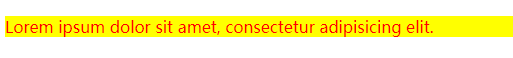
<!-- 内联样式 -->
<p style="color: red;background-color: yellow;">Lorem ipsum dolor sit amet, consectetur adipisicing elit.</p>
</body>
</html>内部样式
选择器{样式声明;}
选择器就是一个条件,控制页面中哪些元素可以使用当前的样式
<!DOCTYPE html>
<html>
<head>
<meta charset="utf-8">
<title></title>
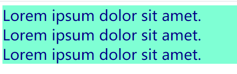
<style>
div{
font-size: 30px;
color:darkblue;
background-color: aquamarine;
}
</style>
</head>
<body>
<!-- 内部样式 -->
<div>Lorem ipsum dolor sit amet.</div>
<div>Lorem ipsum dolor sit amet.</div>
<div>Lorem ipsum dolor sit amet.</div>
</html>
外部样式
单独创建一个css文件
在html引用css文件
rel 定义当前文档与被拦截文档之间的关系
href 定义被链接文档的位置
type 规定被链接文档的mine类型

<!DOCTYPE html>
<html>
<head>
<meta charset="utf-8">
<title></title>
<link rel="stylesheet" href="my.css"/>
</head>
<body>
<!-- 外部样式 -->
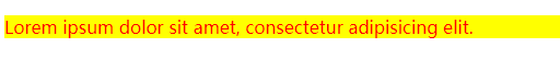
<h4>Lorem ipsum dolor sit amet, consectetur.</h4>
</html>
h4{
	color:gold;
	background-color: coral;
}
css特性
继承性
我们只关注文本样式的继承
后代元素可以使用父元素的文本样式
a标签不继承文本颜色
层叠型
为一个标签定义多个样式规则,如果样式属性不冲突,都会作用到这个标签上
优先级
内联样式 高
内部和外部样式谁离标签的直线距离越短,就选择哪个。 中
浏览器样式 低
默认情况下,f12中样式是按照默认优先级顺序从上往下显示
调整优先级
!important 优先级最高,高于内联
必须在值和分号之间
div{
color:red !important;
}
注意:内联样式不允许设置!important
css背景
css背景颜色 background-color
css的颜色值有3种方式定义,16进制,rgb(255,0,0),颜色名称

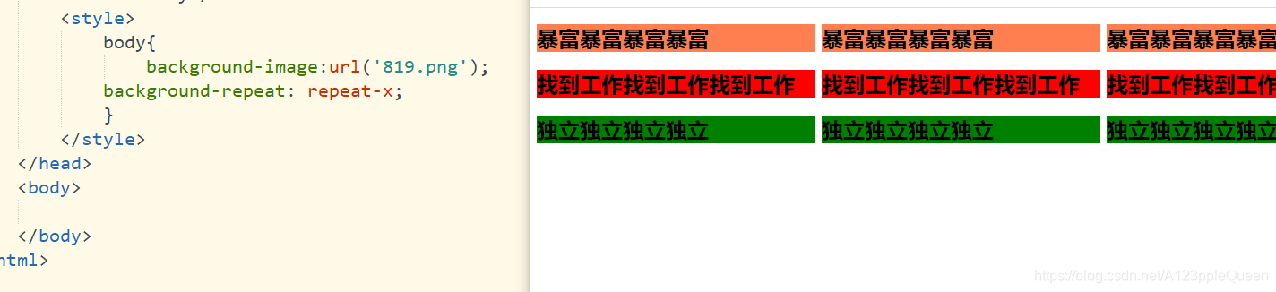
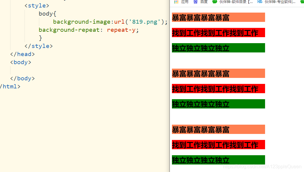
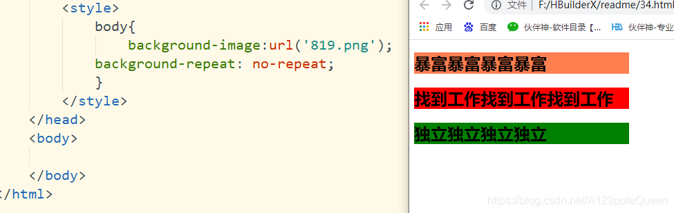
css背景图像 background-image
background-image:url(' ') 默认为平铺重复,覆盖整个页面

平铺
background-image:url(' ');
background-repeat:有四个值,repeat全部平铺
repeat-x 水平方向平铺
repeat-y 垂直方向平铺
no-repeat 不平铺
背景图片位置
background-position:它的值可以是 top right left bottom

背景图片是否固定
background-attachment: fixed 图片不动,文字会随着你的滑动而滑动
inherit 图片和文字一起滑动
initial 图片和文字一起滑动
local 图片和文字一起滑动
scroll 图片和文字一起滑动
unset 图片和文字一起滑动
这里还不够准确,等以后再做区分

背景属性的简写
直接写background ,然后属性值按顺序写就行,属性根据需要使用
background-color
background-image
background-repeat
background-attchment
background-position

text-文本
文本颜色 color
文本颜色值有3种方式定义,16进制,rgb(255,0,0),颜色名称

文本的对齐方式 text-align
text-align的值有center right left justify
其中justify多用于多行文字对齐,它的每一行展开宽度相等,左右外边距对齐

文本修饰 text-decoration
text-decoration:none 删除下划线
text-decoration:overline 上划线
text-decoration:line-through 划线
text-decoration:underline 下划线

文本转换
指定文本的大写 小写字母
text-transform: uppercase 全大写
lowercase; 全小写
capitalize; 首字母大写
none ;默认,定义带有小写字母和大写字母的标准的文本
inherit 从父元素中集成

文本缩进
用于指定文本的第一行的缩进

字符间距 letter-spacing

行高 line-height

元素的垂直对齐方式 vertical-align
vertical-align:baseline 默认,元素放值在父元素的基线上
sub 垂直对齐文本的下标
super 垂直对齐文本的上标
top 把元素的顶端与行中最高元素的顶端对齐
text-top 把元素的顶端与父元素字体的顶端对齐
middle 把此元素放置在父元素的中部
bottom 使元素及其后代元素的底部与整齐的底部对齐
text-bottom 把元素的底端与父元素的底端对齐
length 将元素升高或降低指定的高度,可以是负数
% 使用line-height属性的百分比值来排列次元素,允许使用负值
inherit 规定从父元素继承vertical-align属性的值
这个以后说,现在的做法不对 我现在做的效果完全是错的
文字阴影 text-shadow
text-shadow:水平阴影(h-shadow) 垂直阴影(v-shadow) 模糊距离(blur)阴影颜色(color)

文本是否换行 white-space
white-space:nowrap 不换行
段字之间的空间 word-spacing
word-spacing:20px
unicode-bidi

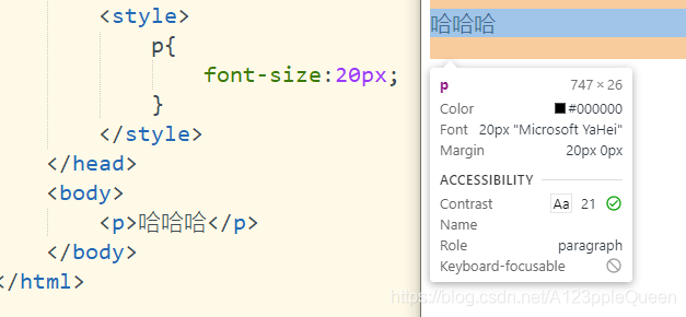
字体font
字体样式 font-style
font-style:normal 正常
italic;斜体

字体大小 font-size
h1-h6表示标题,p表示段落
字体大小的值可以是绝对或相对的大小
绝对大小:设置一个指定大小的文本
不允许用户在所有浏览器中改变大小
确定了输出的物理尺寸时绝对大小很有用
相对大小
相对于周围的元素来设置大小
允许用户在浏览器中改变文字大小
设置字体大小像素
不指定一个字体的大小,浏览器默认为16px
这种方式虽然可以通过缩放浏览器调整文本大小,但是这种调整的不仅仅是文本,还有整个页面
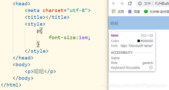
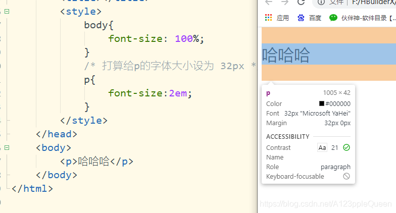
设置字体大小em
1em=16px
使用em单位,可以在所有浏览器中调整文本大小,但是好像在ie浏览器中,会比正常的尺寸更大或更小
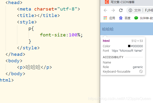
使用百分比和em组合调整文字大小
100%=16px
在所有浏览器中,可以显示相同的文本大小,并允许所有浏览器缩放文本的大小
css字型
css中,有两种类型的字体系列名称。
通用字体系列 -拥有相似外观的字体系统组合。eg:Serif /Monospace
特定字体系列-一个特定的字体系列。eg:Times/courier
css字体 font-family
font-family属性应该设置几个字体名称作为备用,如果浏览器不支持第一种,它会自动尝试备用的字体
字体系列的名称超过一个字,必须用引号。eg:font-family:"宋体"

font-variant 所有小写字母会被转换成大写字母但是会比正常的大小字母小
font-variant: normal 默认值
samll-caps 显示小写的大写字母
inherit 从父元素继承

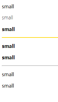
font-weight 字体粗细
font-weight:normal 默认值 = 400
bold 粗体 =700
bolder 更粗
lighter 更细
inherit 继承
数字值 100 200 300 400 500 600 700 800 900
<!DOCTYPE html>
<html>
<head>
<meta charset="utf-8">
<title></title>
<style>
.one{
font-weight: lighter;
}
.two{
/* =700 */
font-weight: bold;
}
.five{
font-weight:700;
}
.three{
font-weight: bolder;
}
.four{
font-weight:400;
}
.six{
/* 400px */
font-weight:normal;
}
.gh{
height:2px;
background-color: #FFD700;
border: 0;
}
</style>
</head>
<body>
<p>small</p>
<p class="one">small</p>
<p class="three">small</p>
<hr class="gh"/>
<p class="two">small</p>
<p class="five">small</p>
<!-- 这两的大小一样 -->
<hr/>
<p class="six">small</p>
<p class="four">small</p>
</body>
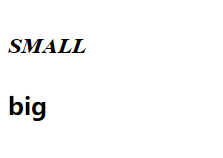
</html>font简写
顺序 font-style
font-variant
font-weight
font-size/line-height
font-family
<!DOCTYPE html>
<html>
	<head>
		<meta charset="utf-8">
		<title></title>
		<style>
       p{
		   /* 全写 */
		   font:italic small-caps bold 30px Times,serif;
	   }
	   h2{
		   font:italic bold;
	   }
		</style>
	</head>
	<body>
		<p>small</p>
		<h2>big</h2>
	</body>
</html>
css链接 link vistied hover active
链接的样式,可以用于任何css属性,如颜色,字体,背景等
a:link --正常,未访问过的链接
a:visited 用户已访问过的链接
a:hover 当用户鼠标放在链接上时
a:active 链接被点击的那一刻
注意:当在一起使用的时候,也有顺序,link visted hover(hover必须这这两个后面) active(必须在hover后面)
视频之后补链接
<!DOCTYPE html>
<html>
	<head>
		<meta charset="utf-8">
		<title></title>
		<style>
			a:link{
				/* 未访问过  */
				color:red;
			}
			a:visited{
				/* 已访问 */
				color:blueviolet;
			}
			a:hover{
				/* 鼠标移动到链接上 */
				color:green;
			}
			a:active{
               /*鼠标点击时  */
			   color:coral;
			}
		</style>
	</head>
	<body>
      <a href="http//:www.baidu.com">百度一下</a>
	</body>
</html>
删除链接中的下划线
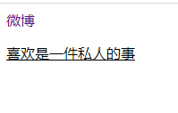
text-decoration:none 可以删除链接中的下划线
text-decoration:underline 添加下划线
<!DOCTYPE html>
<html>
	<head>
		<meta charset="utf-8" />
		<title></title>
 	<style>
			a{
				text-decoration: none;
			}
			p{
				text-decoration: underline;
			}
			</style>
	</head>
	<body>
		<a href="http://www.weibo.com">微博</a>
		<p>喜欢是一件私人的事</p>
	</body>
</html>
为链接设置背景色
<!DOCTYPE html>
<html>
	<head>
		<meta charset="utf-8" />
		<title></title>
 	<style>
			a:link{
				/* 未访问时 */
				background-color: orange;
			}
			a:visited{
				/* 已访问 */
				background-color: cornflowerblue;
			}
			a:hover{
				/* 鼠标移动到链接上 */
				background-color:crimson;
			}
			a:active{
				/* 鼠标点击时 */
				background-color: blueviolet;
			}
			</style>
	</head>
	<body>
		<a href="http://www.sogou.com">搜狗</a>
		<p>喜欢是一件私人的事</p>
	</body>
</html>
css列表 有序 无序列表 ------对我是个难点
ul 无序列表 ol 有序列表
默认情况下,列表ol/ul还设有内外边距,可用margin:0 padding:0来清除
list-style-type 去掉项目符号/更改符号
list-style-type 针对的是ol/ul元素,而不是li元素
list-style-type:none; 去掉符号
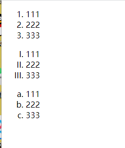
有序列表 ol
list-style-type:decimal ; 阿拉伯数字 1、2...... 默认值
lower-roman; 小写罗马数字· ⅰ、ⅱ、ⅲ.....
upper-roman; 大写罗马数字 Ⅰ、Ⅱ、Ⅲ....
lower-alpha 小写英文字母 a、b、c.....
upper-alpha 大写英文字母 A、B、C....
<!DOCTYPE html>
<html>
<head>
<meta charset="utf-8">
<title></title>
<style>
ol.f{
list-style-type: decimal;
}
ol.d{
list-style-type: upper-roman;
}
ol.e{
list-style-type: lower-alpha;
}
</style>
</head>
<body>
<!-- 有序列表 -->
<ol class="f">
<li>111</li>
<li>222</li>
<li>333</li>
</ol>
<ol class="d">
<li>111</li>
<li>222</li>
<li>333</li>
</ol>
<ol class="e">
<li>111</li>
<li>222</li>
<li>333</li>
</body>
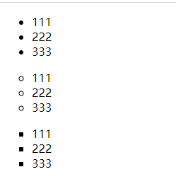
</html>无序列表 ul
list-style-type:disc 实心圆
circle 空心圆
square 正方形
<!DOCTYPE html>
<html>
	<head>
		<meta charset="utf-8">
		<title></title>
		<style>
		ul.f{
			/* 实心圆 */
			list-style-type: disc;
		}
		ul.d{
			/* 空心圆 */
			list-style-type: circle;
		}
		ul.e{
			list-style-type: square;
		}

		</style>
	</head>

	<body>
	<!-- 有序列表 -->
	<ul class="f">
	<li>111</li>
	<li>222</li>
	<li>333</li>
	</ul>

	<ul class="d">
	<li>111</li>
	<li>222</li>
	<li>333</li>
	</ul>

	<ul class="e">
	<li>111</li>
	<li>222</li>
	<li>333</li>
	</ul>
	</body>
</html>
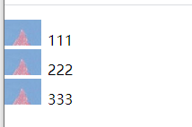
list-style-image 把图像设为列表标志
list-style-image:url(' ');
<!DOCTYPE html>
<html>
	<head>
		<meta charset="utf-8">
		<title></title>
		<style>
		ul{
			list-style-image:url(img/50.png) ;
		}
		</style>
	</head>

	<body>
	<!-- 有序列表 -->
	<ul >
	<li>111</li>
	<li>222</li>
	<li>333</li>
	</ul>

	</body>
</html>
list-style-position 设置列表标志的位置
inside
outside 默认值
inherit 继承
不懂这个,我做出来的效果是一样的
list-style简写
顺序如下
list-style-type
list-style-position
list-style-image
简写写在一起好像其实也没起作用
css表格
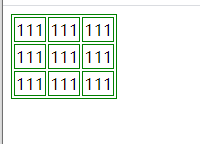
给表格指定边框
table,tr,td{
border:1px solid green;
}
<!DOCTYPE html>
<html>
	<head>
		<meta charset="utf-8">
		<title></title>
		<style>
	  table,tr,td{
		  border:1px solid green;
	  }
		</style>
	</head>

	<body>
	<table>
		<tr>
			<td>111</td>
			<td>111</td>
			<td>111</td>
		</tr>
		<tr>
			<td>111</td>
			<td>111</td>
			<td>111</td>
		</tr>
		<tr>
			<td>111</td>
			<td>111</td>
			<td>111</td>
		</tr>
	</table>
	</body>
</html>
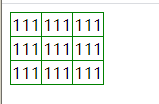
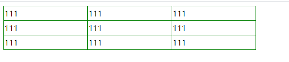
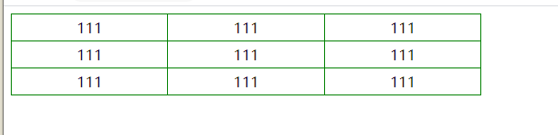
合并边框间隙 border-collapsse
border-collapsse:collapse
<!DOCTYPE html>
<html>
	<head>
		<meta charset="utf-8">
		<title></title>
		<style>
	  table,tr,td{
		  border:1px solid green;
	  }
	  table{
		  border-collapse: collapse;
	  }
		</style>
	</head>

	<body>
	<table>
		<tr>
			<td>111</td>
			<td>111</td>
			<td>111</td>
		</tr>
		<tr>
			<td>111</td>
			<td>111</td>
			<td>111</td>
		</tr>
		<tr>
			<td>111</td>
			<td>111</td>
			<td>111</td>
		</tr>
	</table>
	</body>
</html>
表格宽高
table{
宽
}
tr{
高
}
<!DOCTYPE html>
<html>
	<head>
		<meta charset="utf-8">
		<title></title>
		<style>
	  table,tr,td{
		  border:1px solid green;
	  }
	  table{
		  border-collapse: collapse;
		  /* 定义表格宽 */
		  width:40%;
	  }
	  tr{
		  /* 定义表格高 */
		  height:30px;
	  }
		</style>
	</head>

	<body>
	<table>
		<tr>
			<td>111</td>
			<td>111</td>
			<td>111</td>
		</tr>
		<tr>
			<td>111</td>
			<td>111</td>
			<td>111</td>
		</tr>
		<tr>
			<td>111</td>
			<td>111</td>
			<td>111</td>
		</tr>
	</table>
	</body>
</html>
表格文字水平对齐
text-align:left/right/center
<!DOCTYPE html>
<html>
	<head>
		<meta charset="utf-8">
		<title></title>
		<style>
	  table,tr,td{
		  border:1px solid green;
	  }
	  table{
		  border-collapse: collapse;
		  width:40%;
	  }
	  tr{
		  height:30px;
	  }
	  td{
		  /* 文字水平居中 */
		  text-align: center;
	  }
    </style>
	</head>

	<body>
	<table>
		<tr>
			<td>111</td>
			<td>111</td>
			<td>111</td>
		</tr>
		<tr>
			<td>111</td>
			<td>111</td>
			<td>111</td>
		</tr>
		<tr>
			<td>111</td>
			<td>111</td>
			<td>111</td>
		</tr>
	</table>
	</body>
</html>
表格文字垂直对齐
vertical-align:top bottom center

<!DOCTYPE html>
<html>
	<head>
		<meta charset="utf-8">
		<title></title>
		<style>
	  table,tr,td{
		  border:1px solid green;
	  }
	  table{
		  border-collapse: collapse;
		  width:40%;
	  }
	  tr{
		  height:60px;
	  }
	  td{
		  text-align: center;
		    /* 文字垂直方向靠上 */
		  vertical-align: top;
	  }
    </style>
	</head>

	<body>
	<table>
		<tr>
			<td>111</td>
			<td>111</td>
			<td>111</td>
		</tr>
		<tr>
			<td>111</td>
			<td>111</td>
			<td>111</td>
		</tr>
		<tr>
			<td>111</td>
			<td>111</td>
			<td>111</td>
		</tr>
	</table>
	</body>
</html>
表格填充
用tr/td填充

<!DOCTYPE html>
<html>
	<head>
		<meta charset="utf-8">
		<title></title>
		<style>
	  table,tr,td{
		  border:1px solid green;
	  }
	  table{
		  border-collapse: collapse;
		  width:40%;
	  }
	  tr{
		  height:60px;
	  }
	  td{
		  text-align: center;
		 vertical-align: bottom;
		  /* 填充让垂直的效果失效 */
		  padding:30px;

	  }
    </style>
	</head>

	<body>
	<table>
		<tr>
			<td>111</td>
			<td>111</td>
			<td>111</td>
		</tr>
		<tr>
			<td>111</td>
			<td>111</td>
			<td>111</td>
		</tr>
		<tr>
			<td>111</td>
			<td>111</td>
			<td>111</td>
		</tr>
	</table>
	</body>
</html>
表格颜色
背景颜色 bacground-color
字体颜色 color

<!DOCTYPE html>
<html>
	<head>
		<meta charset="utf-8">
		<title></title>
		<style>
	  table,tr,td{
		  border:1px solid green;
	  }
	  table{
		  border-collapse: collapse;
		  width:40%;
	  }
	  tr{
		  /* 设置行背景颜色 紫色*/
		  /* 字体颜色橙色 */
		  background-color: #8A2BE2;
		  color:orange;
		  height:60px;
	  }
	  td{
		  text-align: center;
		 vertical-align: bottom;
		  padding:30px;

	  }
    </style>
	</head>

	<body>
	<table>
		<tr>
			<td>111</td>
			<td>111</td>
			<td>111</td>
		</tr>
		<tr>
			<td>111</td>
			<td>111</td>
			<td>111</td>
		</tr>
		<tr>
			<td>111</td>
			<td>111</td>
			<td>111</td>
		</tr>
	</table>
	</body>
</html>
css盒子模型(box Model)
所有html元素都可以看做盒子
css盒模型本质就是一个盒子,封装了周围的html元素,包括边距,边框,填充,内容
margin 外边距 清除边框外的区域,外边距是透明的
boder 边框 围绕在内边距和内容外的边框
padding 内边距 清除内容周围的区域,内边距时透明的
content 盒子内容,显示文本和图像
当指定一个css元素的宽高时,这只代表设置了内容的宽高。
所有完整元素的大小,还有添加内边距 边框和外边距。
浏览器兼容问题
根据w3c规范,元素内容的孔家是由width属性设置的,二内容周围的padding和border值另外计算。
但是在怪异盒模型下,浏览器的width不是内容的宽,而是内容和内边距和边框宽之和。
所有虽然能通过box-sizing来解决,但最好还是直接规避。也就是,不要给元素添加具有指定宽度的内边距,而是尝试将内边距或外边距添加到元素的父元素和子元素。
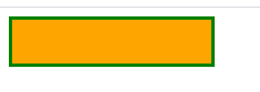
边框 border
border-style 设置边框的样式(虚线、实线...)
border-style :none 无边框
dotted 点线边框
dash 虚线边框
solid 实线边框
double 两个边框。----两个边框的宽度和border-width的值相同(不懂)
groove 3D沟槽边框。 效果取决于边框的颜色值
ridge 3d脊边框。效果取决于边框的颜色值
inset 3d嵌入边框 效果取决于边框的颜色值
outset 3d突出边框 效果取决于边框的颜色值
hidden 隐藏边框
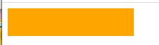
<!DOCTYPE html>
<html>
	<head>
		<meta charset="utf-8">
		<title></title>
		<style>
		div{
			width:180px;
			height: 40px;
			background-color: #FFA500;
			border-style:none;
		}
		</style>
	</head>
	<body>
	<div></div>
	</body>
</html>
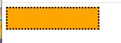
<!DOCTYPE html>
<html>
	<head>
		<meta charset="utf-8">
		<title></title>
		<style>
		div{
			width:180px;
			height: 40px;
			background-color: #FFA500;
			border-style:dotted;
		}
		</style>
	</head>
	<body>
	<div></div>
	</body>
</html>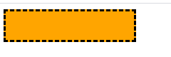
<!DOCTYPE html>
<html>
	<head>
		<meta charset="utf-8">
		<title></title>
		<style>
		div{
			width:180px;
			height: 40px;
			background-color: #FFA500;
			border-style:dashed;
		}
		</style>
	</head>
	<body>
	<div></div>
	</body>
</html>
<!DOCTYPE html>
<html>
<head>
<meta charset="utf-8">
<title></title>
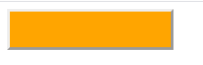
<style>
div{
width:180px;
height: 40px;
background-color: #FFA500;
border-style:solid;
}
</style>
</head>
<body>
<div></div>
</body>
</html>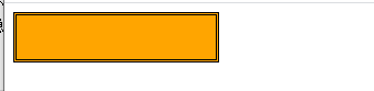
<!DOCTYPE html>
<html>
	<head>
		<meta charset="utf-8">
		<title></title>
		<style>
		div{
			width:180px;
			height: 40px;
			background-color: #FFA500;
			border-style:double;
		}
		</style>
	</head>
	<body>
	<div></div>
	</body>
</html>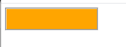
<!DOCTYPE html>
<html>
	<head>
		<meta charset="utf-8">
		<title></title>
		<style>
		div{
			width:180px;
			height: 40px;
			background-color: #FFA500;
			border-style:groove;
		}
		</style>
	</head>
	<body>
	<div></div>
	</body>
</html>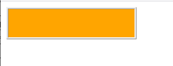
<!DOCTYPE html>
<html>
	<head>
		<meta charset="utf-8">
		<title></title>
		<style>
		div{
			width:180px;
			height: 40px;
			background-color: #FFA500;
			border-style:ridge;
		}
		</style>
	</head>
	<body>
	<div></div>
	</body>
</html>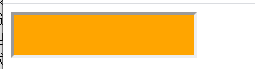
<!DOCTYPE html>
<html>
	<head>
		<meta charset="utf-8">
		<title></title>
		<style>
		div{
			width:180px;
			height: 40px;
			background-color: #FFA500;
			border-style:inset;
		}
		</style>
	</head>
	<body>
	<div></div>
	</body>
</html>
<!DOCTYPE html>
<html>
	<head>
		<meta charset="utf-8">
		<title></title>
		<style>
		div{
			width:180px;
			height: 40px;
			background-color: #FFA500;
			border-style:outset;
		}
		</style>
	</head>
	<body>
	<div></div>
	</body>
</html>
<!DOCTYPE html>
<html>
<head>
<meta charset="utf-8">
<title></title>
<style>
div{
width:180px;
height: 40px;
background-color: #FFA500;
border-style:hidden;
}
</style>
</head>
<body>
<div></div>
</body>
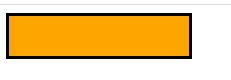
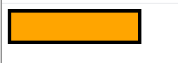
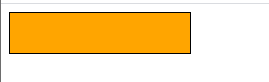
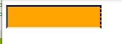
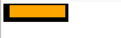
</html>边框宽度 border-width
边框宽度的值有两种,一种是长度值,单位可以是px,em等
一种是关键词 thick medium(默认值) thin
<!DOCTYPE html>
<html>
	<head>
		<meta charset="utf-8">
		<title></title>
		<style>
		div{
			width:180px;
			height: 40px;
			background-color: #FFA500;
			border-style:solid;
			border-width:5px;
		}
		</style>
	</head>
	<body>
	<div></div>
	</body>
</html>
<!DOCTYPE html>
<html>
	<head>
		<meta charset="utf-8">
		<title></title>
		<style>
		div{
			width:180px;
			height: 40px;
			background-color: #FFA500;
			border-style:solid;
			border-width:5em;
		}
		</style>
	</head>
	<body>
	<div></div>
	</body>
</html>
<!DOCTYPE html>
<html>
	<head>
		<meta charset="utf-8">
		<title></title>
		<style>
		div{
			width:180px;
			height: 40px;
			background-color: #FFA500;
			border-style:solid;
			border-width:thick;
		}
		</style>
	</head>
	<body>
	<div></div>
	</body>
</html>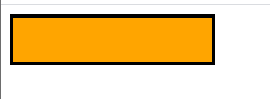
<!DOCTYPE html>
<html>
	<head>
		<meta charset="utf-8">
		<title></title>
		<style>
		div{
			width:180px;
			height: 40px;
			background-color: #FFA500;
			border-style:solid;
			border-width:medium;
		}
		</style>
	</head>
	<body>
	<div></div>
	</body>
</html>
<!DOCTYPE html>
<html>
	<head>
		<meta charset="utf-8">
		<title></title>
		<style>
		div{
			width:180px;
			height: 40px;
			background-color: #FFA500;
			border-style:solid;
			border-width:thin;
		}
		</style>
	</head>
	<body>
	<div></div>
	</body>
</html>
边框颜色 border-color
边框颜色的值可以用颜色名red rgb值 rgb(255,0,0) HEX--16进制 #ff000
border-color必须和border-style一起使用才会有效果
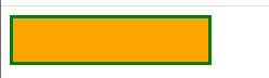
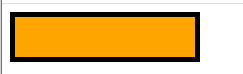
<!DOCTYPE html>
<html>
	<head>
		<meta charset="utf-8">
		<title></title>
		<style>
		div{
			width:180px;
			height: 40px;
			background-color: #FFA500;
			 border-style:solid;
			border-color: #008000;
		}
		</style>
	</head>
	<body>
	<div></div>
	</body>
</html>
单独为边框设置样式--边框样式 实线、虚线....
border-top-style 设置上边框样式
border-right-style 设置右边框样式
border-bottom-style 设置下边框样式
border-left-style 设置左边框样式
<!DOCTYPE html>
<html>
	<head>
		<meta charset="utf-8">
		<title></title>
		<style>
		div{
			width:180px;
			height: 40px;
			background-color: #FFA500;
			border-top-style:solid;
			border-right-style: dashed;
			border-left-style: double;
			border-bottom-style:inset;
		}
		</style>
	</head>
	<body>
	<div></div>
	</body>
</html>
单独为边框设置样式----边框宽度
border-top-width
border-right-width
border-bottom-width
border-left-width
<!DOCTYPE html>
<html>
	<head>
		<meta charset="utf-8">
		<title></title>
		<style>
		div{
			width:180px;
			height: 40px;
			background-color: #FFA500;
			border-style:solid;
			border-top-width:5px;
			border-right-width:10px;
			border-bottom-width:15px;
			border-left-width:20px;
		</style>
	</head>
	<body>
	<div></div>
	</body>
</html>
单独为边框设置样式----边框颜色
border-color
<!DOCTYPE html>
<html>
<head>
<meta charset="utf-8">
<title></title>
<style>
div{
width:180px;
height: 40px;
background-color: #FFA500;
border-style:solid;
border-color:red green #FF0000 #6495ED;
}
</style>
</head>
<body>
<div></div>
</body>
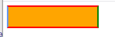
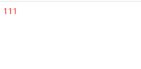
</html>边框1-4个值的区别
四个值 四个方向都有设置
三个值 上边框 左右边框 下边框
二个值 上下边框 左右边框
1个值 四个方向都是一个值
<!DOCTYPE html>
<html>
	<head>
		<meta charset="utf-8">
		<title></title>
		<style>
		div{
			width:180px;
			height: 40px;
			background-color: #FFA500;
			border-style:solid solid solid solid;
			border-width:5px 10px 9px 10px;
			border-color: green skyblue indianred yellow;
		</style>
	</head>
	<body>
	<div></div>
	</body>
</html>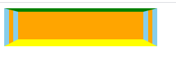
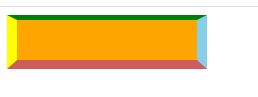
<!DOCTYPE html>
<html>
	<head>
		<meta charset="utf-8">
		<title></title>
		<style>
		div{
			width:180px;
			height: 40px;
			background-color: #FFA500;
			border-style:solid double solid;
			border-width:5px 20px 10px;
			border-color: green skyblue  yellow;
		</style>
	</head>
	<body>
	<div></div>
	</body>
</html>
<!DOCTYPE html>
<html>
	<head>
		<meta charset="utf-8">
		<title></title>
		<style>
		div{
			width:180px;
			height: 40px;
			background-color: #FFA500;
			border-style:solid double ;
			border-width:5px 10px;
			border-color: green skyblue  ;
		</style>
	</head>
	<body>
	<div></div>
	</body>
</html>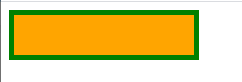
<!DOCTYPE html>
<html>
	<head>
		<meta charset="utf-8">
		<title></title>
		<style>
		div{
			width:180px;
			height: 40px;
			background-color: #FFA500;
			border-style:solid;
			border-width:5px;
			border-color: #008000;
		</style>
	</head>
	<body>
	<div></div>
	</body>
</html>
边框简写
顺序border-width
border-style
border-color
<!DOCTYPE html>
<html>
	<head>
		<meta charset="utf-8">
		<title></title>
		<style>
		div{
			width:180px;
			height: 40px;
			background-color: #FFA500;
			border:3px solid green;
		</style>
	</head>
	<body>
	<div></div>
	</body>
</html>
css轮廓 outline
轮廓是绘制与元素周围的一条线,位于边框边缘的外围,可以突出元素
轮廓属性可指定元素轮廓的样式、颜色、宽度。
outline不占空间,不会增加额外的width/height,也不会让浏览器渲染时reflow/repaint
简写
outline: 颜色 实线/虚线... 宽度
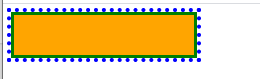
<!DOCTYPE html>
<html>
	<head>
		<meta charset="utf-8">
		<title></title>
		<style>
		div{
			width:180px;
			height: 40px;
			background-color: #FFA500;
			border:3px solid green;
			outline:blue dotted 4px;
		</style>
	</head>
	<body>
	<div></div>
	</body>
</html>
outline-color 轮廓颜色
颜色值有 颜色名 16进制 rgb
outline-style 轮廓样式
值跟边框值一样
outline-width 轮廓宽度
值跟边框一样,两种值
margin 外边距
margin可以清除外边框元素区域。
margin没有背景颜色,是完全透明的。
margin可以单独改变元素的上下左右边距。
margin值
margin有3种值。
margin:auto 设置浏览器边距,依赖于浏览器,一般居中
length 固定值,单位可以是px/em等,值也可以为负,重叠的内容
百分比
<!DOCTYPE html>
<html>
	<head>
		<meta charset="utf-8">
		<title></title>
		<style>
		div{
			margin:auto;
			width: 200px;
			height:200px;
			border:1px solid #008000;
			}
		</style>
	</head>
	<body>
	<div></div>
	</body>
</html>
margin单边外边距
margin-top
margin-bottom
margin-right
margin-left
margin1-4个值
margin:xx xx xx xx;
<!DOCTYPE html>
<html>
	<head>
		<meta charset="utf-8">
		<title></title>
		<style>
		div{
			margin:10px 10px 20px 10px;
			width: 200px;
			height:200px;
			border:1px solid #008000;
			}
		</style>
	</head>
	<body>
	<div></div>
	</body>
</html>
margin:xx xx xx; 上 左右 下

<!DOCTYPE html>
<html>
	<head>
		<meta charset="utf-8">
		<title></title>
		<style>
		div{
			margin:10px 20px 10px;
			width: 200px;
			height:200px;
			border:1px solid #008000;
			}
		</style>
	</head>
	<body>
	<div></div>
	</body>
</html>
margin:xx xx; 上下 左右

<!DOCTYPE html>
<html>
	<head>
		<meta charset="utf-8">
		<title></title>
		<style>
		div{
			margin:40px 10px;
			width: 200px;
			height:200px;
			border:1px solid #008000;
			}
		</style>
	</head>
	<body>
	<div></div>
	</body>
</html>
margin:xx;

<!DOCTYPE html>
<html>
	<head>
		<meta charset="utf-8">
		<title></title>
		<style>
		div{
			margin:40px ;
			width: 200px;
			height:200px;
			border:1px solid #008000;
			}
		</style>
	</head>
	<body>
	<div></div>
	</body>
</html>
padding 填充
备注:之后可以修改一下例子 用两个div来展示,中间那个有背景色
填充,定义元素边框与元素内容之间的空间,即上下左右的内边距
当元素的padding被填充的内边距被清除的时候,所释放的内容将会受到元素背景颜色的填充--不是很懂
padding值
padding:length 固定单位,单位可以是px/em
百分比
padding 单边内边距
padding-top
padding-right
padding-bottom
padding-left
padding1-4个值
padding:xx xx xx xx

<!DOCTYPE html>
<html>
	<head>
		<meta charset="utf-8">
		<title></title>
		<style>
		div{
			padding:40px 10px 30px 20px ;
			width: 200px;
			height:200px;
			border:1px solid #008000;
			}
		</style>
	</head>
	<body>
	<div></div>
	</body>
</html>
padding: xx xx xx; 上 左右 下

<!DOCTYPE html>
<html>
	<head>
		<meta charset="utf-8">
		<title></title>
		<style>
		div{
			padding:40px 10px 30px  ;
			width: 200px;
			height:200px;
			border:1px solid #008000;
			}
		</style>
	</head>
	<body>
	<div></div>
	</body>
</html>
padding: xx xx;上下 左右

<!DOCTYPE html>
<html>
	<head>
		<meta charset="utf-8">
		<title></title>
		<style>
		div{
			padding:40px 10px;
			width: 200px;
			height:200px;
			border:1px solid #008000;
			}
		</style>
	</head>
	<body>
	<div></div>
	</body>
</html>
padding:xx; 上下左右都是一个值

<!DOCTYPE html>
<html>
<head>
<meta charset="utf-8">
<title></title>
<style>
div{
padding:40px;
width: 200px;
height:200px;
border:1px solid #008000;
}
</style>
</head>
<body>
<div></div>
</body>
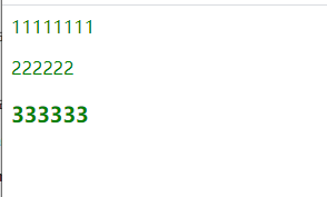
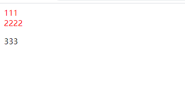
</html>分组选择器
样式相同的代码可以用它,用逗号隔开。
<!DOCTYPE html>
<html>
<head>
<meta charset="utf-8">
<title></title>
<Style>
div,p,h3{
color:green;
}
</Style>
</head>
<body>
<div>11111111</div>
<p>222222</p>
<h3>333333</h3>
</body>
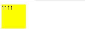
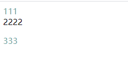
</html>尺寸Dimension
尺寸允许你控制元素的高度和宽度,也允许你增加行间距。
height: 设置元素高度。
lie-height:设置行高。
max-height:设置元素最大高度。
min-height:设置元素最小高度。
width:设置元素宽度。
max-width:设置元素的最大宽度。
min-width:设置元素的最小宽度。
<!DOCTYPE html>
<html>
	<head>
		<meta charset="utf-8">
		<title></title>
		<Style>
		div{
			min-height: 80px;
			max-width: 80px;
			background-color: yellow;
		}
		</Style>
	</head>
	<body>
		<div>1111</div>
	</body>
</html>
display Visibility
display设置一个元素如何显示 none隐藏 block/inline/block-inline 显示
visibility设置一个元素是可见还是隐藏 hidden隐藏 visible 显示
display可以设置元素是块级元素还是内联元素或者为行内块元素。
注意:display的none的隐藏不仅是页面不可看见,他本身也不见了。而visibility的隐藏只是页面不可见,但是他还在原来的位置。
定位 position
position有5个值。static
fixed
relative
absolute
sticky
确认是哪种类型后,通过top left right bottom 来定位。
fixed relative absolute 让元素的位置和文档流无关,不占据空间
static定位
遵循正常文档流对象。
fixed定位
元素的位置相对于浏览器窗口是固定的,就算浏览器滚动它的位置也不会变。
fixed定位的元素和其他元素重叠。

<!DOCTYPE html>
<html>
	<head>
		<meta charset="utf-8">
		<title></title>
		<Style>
	      div{
			 position: fixed;
			  top:40px;
			  right:8px;
			  background-color: green;
		  }
		</Style>
	</head>
	<body>
	Lorem ipsum dolor sit amet, consectetur adipisicing elit. Possimus inventore illo voluptatum debitis vero beatae rem sit temporibus dolorem quidem. Neque pariatur rerum praesentium quas veritatis odit quibusdam distinctio optio inventore atque dolorem culpa adipisci labore velit perspiciatis id illum? Neque deleniti dolores explicabo ipsa quisquam architecto ea? Veritatis quae omnis minima corporis sunt vitae architecto voluptates ipsam modi facilis eum dignissimos ratione? Earum impedit eius natus excepturi nemo temporibus sint ipsum officia atque modi aliquam accusamus asperiores nihil quis qui fugiat tempore repudiandae praesentium voluptate nobis hic mollitia quisquam veritatis itaque ab maxime aperiam adipisci nam tempora id accusantium.
	Lorem ipsum dolor sit amet, consectetur adipisicing elit. Possimus inventore illo voluptatum debitis vero beatae rem sit temporibus dolorem quidem. Neque pariatur rerum praesentium quas veritatis odit quibusdam distinctio optio inventore atque dolorem culpa adipisci labore velit perspiciatis id illum? Neque deleniti dolores explicabo ipsa quisquam architecto ea? Veritatis quae omnis minima corporis sunt vitae architecto voluptates ipsam modi facilis eum dignissimos ratione? Earum impedit eius natus excepturi nemo temporibus sint ipsum officia atque modi aliquam accusamus asperiores nihil quis qui fugiat tempore repudiandae praesentium voluptate nobis hic mollitia quisquam veritatis itaque ab maxime aperiam adipisci nam tempora id accusantium.
	<div>我不会动喔</div>
	</body>
</html>
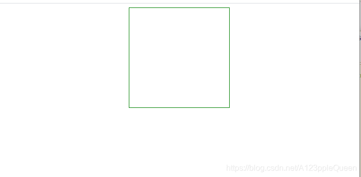
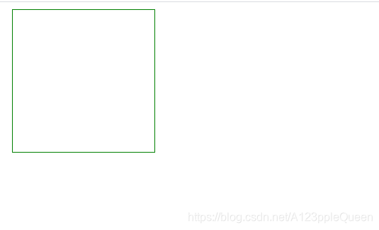
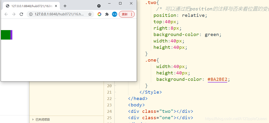
relative定位
相对于自己原本的位置进行上下左右活动
移动相对定位元素,他原本所占的空间不会改变,看图二图三对比
这个可以作为absolute的父元素来使用

<!DOCTYPE html>
<html>
	<head>
		<meta charset="utf-8">
		<title></title>
		<Style>
	      div{
			  /* 可以通过把position的注释与否来看位置的变化 */
			 position: relative;
			 top:40px;
			 right:8px;
			 background-color: green;
			 width:40px;
			 height:40px;
		  }
		</Style>
	</head>
	<body>
	<div></div>
	</body>
</html>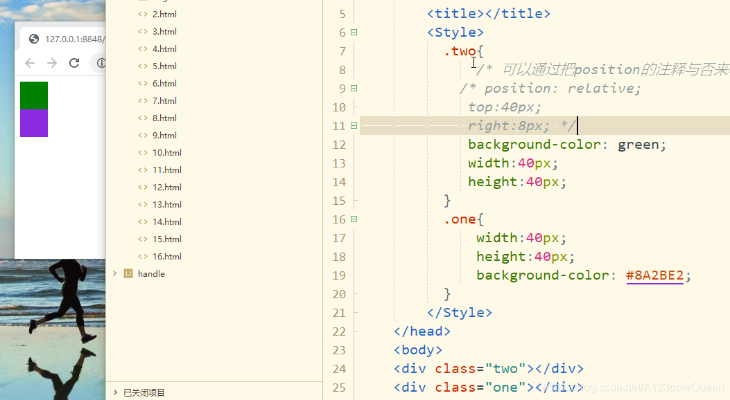
<!DOCTYPE html>
<html>
	<head>
		<meta charset="utf-8">
		<title></title>
		<Style>
	      .two{
			  /* 可以通过把position的注释与否来看位置的变化 */
			 position: relative;
			 top:40px;
			 right:8px;
			 background-color: green;
			 width:40px;
			 height:40px;
		  }
		  .one{
			  width:40px;
			  height:40px;
			  background-color: #8A2BE2;
		  }
		</Style>
	</head>
	<body>
	<div class="two"></div>
	<div class="one"></div>
	</body>
</html>
absolute定位
绝对定位的位置相对于最近的已定位的父元素,如果元素没有已经定位的父元素,那么他的位置相对于html
fabsolute定位的元素和其他元素重叠。
父级元素位置的影响和relative的联合使用可以在扩展扩展,之后做

<!DOCTYPE html>
<html>
<head>
<meta charset="utf-8">
<title></title>
<Style>
.two{
position: absolute;
top:40px;
left:8px;
background-color: green;
width:100px;
height:100px;
}
</Style>
</head>
<body>
<div class="two"></div>
<div class="one"></div>
</body>
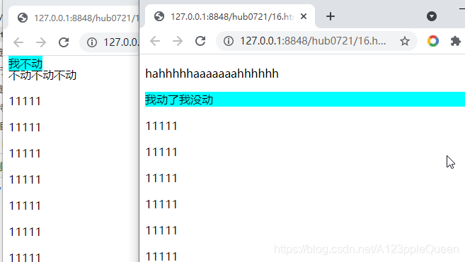
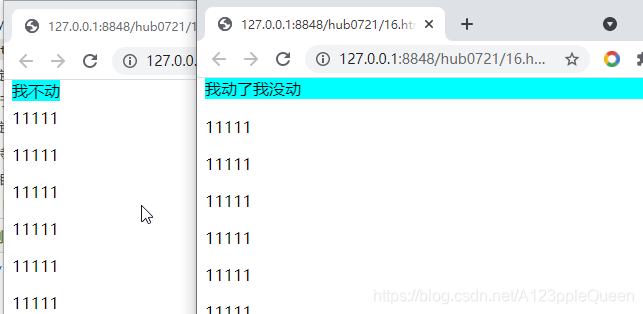
</html>sticky定位
基于用户的滚动位置来定位,从用户滚动的哪个位置开始实现效果。
它定位表现是在跨越特定的值前为相对定位,之后为固定定位。
<!DOCTYPE html>
<html>
	<head>
		<meta charset="utf-8">
		<title></title>
		<Style>
	      .two{
			  /* 这两个页面之间只有position的值不一样,一个是fixed,一个是sticky */
			  position: sticky;
			  top:0px;
			  background-color: #00FFFF;
		  }
		  p{display: block;}
		</Style>
	</head>
	<body>
	<p>hahhhhhaaaaaaahhhhhh</p>
	<div class="two">我动了我没动</div>
	<p>11111</p>
	<p>11111</p>
	<p>11111</p>
	<p>11111</p>
	<p>11111</p>
	<p>11111</p>
	<p>11111</p>
	<p>11111</p>
	<p>11111</p>
	<p>11111</p>
	<p>11111</p>
	<p>11111</p>
	<p>11111</p>
	<p>11111</p>
	<p>11111</p>
	<p>11111</p>
	<p>11111</p>
	<p>11111</p>
	<p>11111</p>
	<p>11111</p>
	<p>11111</p>
	<p>11111</p>
	<p>11111</p>
	<p>2222222</p>
	<p>2222222</p>
	<p>2222222</p>
	<p>2222222</p>
	<p>2222222</p>
	<p>2222222</p>
	<p>2222222</p>
	<p>2222222</p>
	<p>2222222</p>
	<p>2222222</p>
	</body>
</html>
重叠元素-堆叠顺序z-index
元素的定位于文档流无关,所以他们可以覆盖页面上的其他元素
和position一起使用才有效。
z-index属性指定了一个元素的堆叠顺序。
一个元素可以有正数或负数的堆叠顺序
具有更高堆叠顺序的元素总在较低堆叠元素的前面
如果两个定位元素重叠,没有指定的z-index,最后定位在html代码中的元素将被显示在最前面。

<!DOCTYPE html>
<html>
	<head>
		<meta charset="utf-8">
		<title></title>
	</head>
	<body>
		<style>
		div{
			width: 200px;
			height:200px;
		}
		.one{
			background-color: #00FFFF;
			width: 200px;
			height:200px;
			position: absolute;
			top:40px;
			/* 让绿色div在前 */
			z-index:-1;
		}
		.two{
			background-color: darkgreen;
			width: 100px;
			height:100px;
		}
		</style>
		<div class="one"></div>
		<div class="two"></div>
	</body>
</html>
positon的其他知识
clip
算了暂时先不写
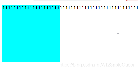
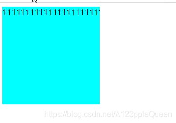
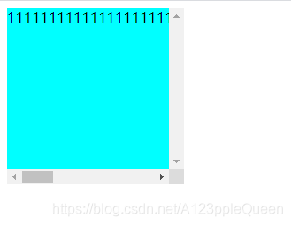
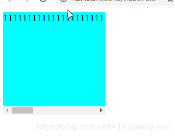
overflow 布局
用于控制内容溢出元素框时显示的方式
overflow只工作在指定高度的块元素上。
overflow visible 默认值。内容不会被修剪,会呈现在元素框之外
hidden 内容会被修剪,并且其他内容不可见
scroll 内容会被修剪,但有滚动条可查看
auto 如果内容被修剪,有滚动条可查看
inherit 从父元素上继承该属性
<!DOCTYPE html>
<html>
<head>
<meta charset="utf-8">
<title></title>
</head>
<body>
<style>
div{
width: 200px;
height:200px;
background-color: #00FFFF;
/* <!-- overflow的值分别为visible/ hidden/sroll/auto--> */
overflow: auto;
}
</style>
<div class="one">111111111111111111111111111111111111111111111111111111111111111111111111111111111111</div>
</body>
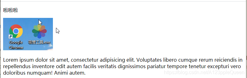
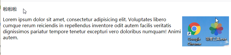
</html>float 浮动
float:指定一个元素是否可以浮动
css的浮动,会让元素向左或右移动,其周围的元素也会重新排列。
浮动,往往作用于图像,但它在布局时一样非常有用.
元素怎样浮动
元素的水平方向浮动,意味着元素只能左右移动而不能上下移动。
一个浮动元素会尽量向左或向右移动,直到它的外边缘碰到包含框或另外一个浮栋框的边框为止。
浮动之后的元素会围绕它。浮动之前的元素不会受到影响。
<!DOCTYPE html>
<html>
	<head>
		<meta charset="utf-8">
		<title></title>
		<style>
		img{
			float: right;
		}
		</style>
	</head>
	<p>啦啦啦</p>
	<img src="img/3.png">
	<p>	Lorem ipsum dolor sit amet, consectetur adipisicing elit. Voluptates libero cumque rerum reiciendis in repellendus inventore odit autem facilis veritatis dignissimos pariatur tempore tenetur excepturi vero doloribus numquam! Animi autem.</p>
	</body>
</html>
空间够时相邻,不够就往下跑
图片宽高一致时
<!DOCTYPE html>
<html>
	<head>
		<meta charset="utf-8">
		<title></title>
		<style>
		img{
			float: left;
			width:300px;
			height: 300px;
		}
		</style>
	</head>
	<img src="img/11.png">
	<img src="img/22.png">
	<img src="img/33.png">
	<img src="img/44.png">
	</body>
</html>
图片宽高不一致时
<!DOCTYPE html>
<html>
	<head>
		<meta charset="utf-8">
		<title></title>
		<style>
		img{
			float: left;
		}
		</style>
	</head>
	<img src="img/2.png">
	<img src="img/3.png">
	<img src="img/5.png">
	<img src="img/6.png">
	</body>
</html>
清除浮动 clear
元素浮动后,周围的元素会重新排列,为了避免这种情况,使用clear属性
clear属性指定元素两侧不能出现浮动元素
目前照着做的例子没看出区别,之后补
css对齐--水平垂直居中对齐
元素居中对齐
要水平居中对齐一个元素(如div),可以使用margin:auto
设置到元素的宽度将防止他溢出到容器的边缘
元素通过指定宽度。并将两边的空外边距平均分配
注意:如果没有设置width属性或设置100%,居中对齐不起作用

<!DOCTYPE html>
<html>
	<head>
		<meta charset="utf-8">
		<title></title>
	</head>
	<style>
	div{
		margin: auto;
		width:200px;
		height:200px;
		background-color: #008000;
	}
	</style>
	<body>
		<div></div>
	</body>
</html>
文本居中对齐
text-align:center
<!DOCTYPE html>
<html>
	<head>
		<meta charset="utf-8">
		<title></title>
	</head>
	<style>
	div{
		width:100px;
		height:20px;
		border:1px solid #008000;
		text-align:center;
	}
	</style>
	<body>
		<div>11111</div>
	</body>
</html>
图片居中对齐
让图片居中对齐,使用margin:auto,并把它放到块元素中。
<!DOCTYPE html>
<html>
	<head>
		<meta charset="utf-8">
		<title></title>
	</head>
	<style>
	img{
		margin: auto;
		display: block;
	}
	</style>
	<body>
		<img src="img/3.png"/>
	</body>
</html>
很明显我对这句话有理解偏差,不然
<!DOCTYPE html>
<html>
<head>
<meta charset="utf-8">
<title></title>
</head>
<style>
div{
width:400px;
border:1px solid red;
}
img{
margin: auto;
width:100px;
}
</style>
<body>
<div>
<img src="img/3.png"/>
</div>
</body>
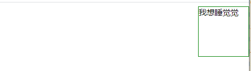
</html>左对齐,右对齐使用定位方式position
使用position:absolute 属性来对齐元素
绝对定位元素会被从正常流中删除,并且能够交叠元素
使用position来对齐元素时,通常body元素会设置margin和padding。这样可以避免在不同的浏览器中出现可见的差异。
<!DOCTYPE html>
<html>
	<head>
		<meta charset="utf-8">
		<title></title>
	</head>
	<style>
	div{
		position: absolute;
		right:0;
		width:100px;
		height:100px;
		border:1px solid #008000;
	}
	</style>
	<body>
		<div>
			我想睡觉觉
		</div>
	</body>
</html>
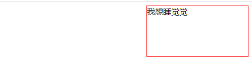
左对齐,右对齐使用浮动方式--float
float属性也可以对齐元素
对齐元素时,对body元素的外边距和内边距进行预定义是一个好主意,这样可以避免在不同浏览器中出现差异。
注意:如果子元素的高度大于父元素,且子元素设置了浮动,那么子元素将溢出,这时,你可以使用clearFix(清除浮动)来解决该问题。
可以在父元素上添加overfow:auto;来解决子元素溢出的问题.
<!DOCTYPE html>
<html>
<head>
<meta charset="utf-8">
<title></title>
</head>
<style>
div{
float:right;
width:200px;
height: 100px;
border:1px solid red;
}
</style>
<body>
<div>
我想睡觉觉
</div>
</body>
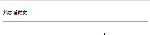
</html>垂直居中对齐---padding
头部顶部使用 padding--文字用的,因为。。。
<!DOCTYPE html>
<html>
	<head>
		<meta charset="utf-8">
		<title></title>
	</head>
	<style>
	div{
		padding:20px 0;
		border:1px solid lightcoral;
	}
	</style>
	<body>
		<div>
			我想睡觉觉
		</div>
	</body>
</html>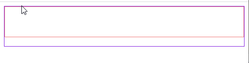
<!DOCTYPE html>
<html>
<head>
<meta charset="utf-8">
<title></title>
</head>
<style>
.two{
padding:20px 0;
border:1px solid lightcoral;
height:20px;
}
.one{
border:1px solid blueviolet;
height:80px;
}
</style>
<body>
<div class="one">
<div class="two"></div>
</div>
</body>
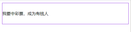
</html>垂直居中-line-height
文字用的,line-height的值和高度一样就垂直居中了
<!DOCTYPE html>
<html>
	<head>
		<meta charset="utf-8">
		<title></title>
	</head>
	<style>

	.one{
		border:1px solid blueviolet;
		height:80px;
		line-height: 80px;
	}
	</style>
	<body>
		<div class="one">
		我要中彩票,成为有钱人
		</div>
	</body>
</html>
垂直居中--positon + transform
transform 属性向元素应用 2D 或 3D 转换。该属性允许我们对元素进行旋转、缩放、移动或倾斜
translate()方法,根据左(X轴)和顶部(Y轴)位置给定的参数,从当前元素位置移动。

<!DOCTYPE html>
<html>
<head>
<meta charset="utf-8">
<title></title>
<style>
.center {
    height: 200px;
    position: relative;
    border: 3px solid green;
}

.center p {
    margin: 0;
    position: absolute;
    top: 50%;
    left: 50%;
    transform: translate(-50%, -50%);
}
</style>
</head>
<body>
css组合选择符---选择器
后代选择器 空格分开
父元素 后代元素
作用到最后面的后代元素
<!DOCTYPE html>
<html>
	<head>
		<meta charset="utf-8">
		<title></title>
		<style>
		div p span{
			color:red;
		}
		div p{
			color:green;
		}
		</style>
	</head>
	<body>
	<div>
		<p>
			2222
			<span>3333</span>
		</p>
	</div>
	</body>
</html>
子元素选择器 >分开
只能直接子元素
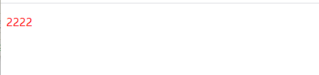
<!DOCTYPE html>
<html>
<head>
<meta charset="utf-8">
<title></title>
<style>
div>p{
color:red;
}
</style>
</head>
<body>
<div>
<p>
2222
</p>
</div>
</body>
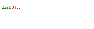
</html>相邻兄弟选择器 +分开
同一个父元素下,挨着的两人。
作用到后面的元素
<!DOCTYPE html>
<html>
<head>
<meta charset="utf-8">
<title></title>
<style>
p+span{
color:goldenrod;
}
</style>
</head>
<body>
<div>
<p>
2222
</p>
<span>4444</span>
</div>
</body>
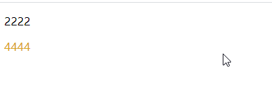
</html>普通/后续兄弟选择器 ~波浪号分开
选取元素之后的相邻兄弟元素

<!DOCTYPE html>
<html>
	<head>
		<meta charset="utf-8">
		<title></title>
		<style>
	div~p{
		color: blueviolet;
	}
		</style>
	</head>
	<body>
	<div>
		<p>11111111</p>
		<p>222222</p>
	</div>
	<p>333333333</p>
	<p>44444</p>
	</body>
</html>
伪类 伪类选择器
css伪类用来添加一些选择器的特殊效果。
这块太多太乱,之后写
anchor伪类
:link 未访问的链接
:visited 已访问的链接
:hover 鼠标悬浮的链接
:active 鼠标单击的链接
顺序也是这样排的
之后补效果
:first-child
:nth-child(n)
:last-child
:only-child
:focus
:before
:after
:not(selector)
:empty
这里的伪元素太多,之后补,现在先写部分
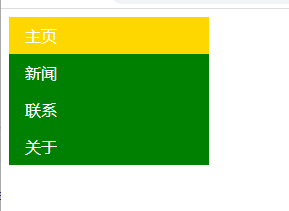
css导航栏
导航栏基本都是一个链接列表,使用ul li
导航栏的前提条件:删除列表自带的边距、填充、符号
ul{
list-style-type:none;
margin: 0;
padding:0
}
垂直导航栏
通过a标签建立一个垂直的导航栏
通过hover让鼠标移动到选项上修改背景颜色
通过active选中某一项
<!DOCTYPE html>
<html>
	<head>
		<meta charset="utf-8">
		<title></title>
		<style>
	ul{
		list-style-type:none;
		margin: 0;
		padding:0;
		width:200px;
		background-color: #008000;
	}
	li a{
		/* display:block显示块元素的链接,让整体变为可点击链接区域,允许指定宽度 */
		display: block;
		color:white;
		padding: 8px 16px;
		text-decoration: none;
	}
	li a.active{
		background-color: gold;
		color: white;
	}
	li a:hover:not(.active){
		background-color: yellowgreen;
		color: white;
	}
		</style>
	</head>
	<body>
	<ul>
		<li><a class="active"  href="#home">主页</a></li>
		<li><a href="#news">新闻</a></li>
		<li><a href="#news">联系</a></li>
		<li><a href="#news">关于</a></li>
	</ul>
	</body>
</html>
全屏高度固定的导航条

<!DOCTYPE html>
<html>
	<head>
		<meta charset="utf-8">
		<title></title>
		<style>
  body{
		margin: 0;
	}
	ul{
		list-style-type:none;
		margin: 0;
		padding:0;
		width:200px;
		background-color: #008000;
		position: fixed;
		height: 100%;
		overflow: auto;
	}
	li a{
		/* display:block显示块元素的链接,让整体变为可点击链接区域,允许指定宽度 */
		display: block;
		color:white;
		padding: 8px 16px;
		text-decoration: none;
	}
	li a.active{
		background-color: gold;
		color: white;
	}
	li a:hover:not(.active){
		background-color: yellowgreen;
		color: white;
	}
	div{
		margin-left: 25%;
		padding: 1px 16px;
		height: 1000px;
	}
		</style>
	</head>
	<body>
	<ul>
		<li><a class="active"  href="#home">主页</a></li>
		<li><a href="#news">新闻</a></li>
		<li><a href="#news">联系</a></li>
		<li><a href="#news">关于</a></li>
	</ul>
	<div>
		<h2>祝福我们很快成为有钱人</h2>
		<h3>是做梦还是现实</h3>
		<p>假设每年你能挣钱到一千万,恭喜你离富有不远了。假设每年你只能挣到一百万,恭喜你在加把劲,努努力。假设每年你只能挣到一万,恭喜你离破产不远啦</p>
		<p>挣钱...</p>
		<p>挣钱...</p>
		<p>挣钱...</p>
		<p>挣钱...</p>
		<p>挣钱...</p>
	</div>
	</body>
</html>
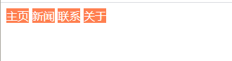
水平导航栏
有2种方法,内联或浮动
内联
display:inline
<!DOCTYPE html>
<html>
	<head>
		<meta charset="utf-8">
		<title></title>
		<style>
	ul{
		list-style-type:none;
		margin: 0;
		padding:0;

	}
	li {
		display: inline;
	}
	a{
		text-decoration: none;
		background-color: coral;
		color: white;
	}
		</style>
	</head>
	<body>
	<ul>
		<li><a class="active"  href="#home">主页</a></li>
		<li><a href="#news">新闻</a></li>
		<li><a href="#news">联系</a></li>
		<li><a href="#news">关于</a></li>
	</ul>
	</body>
</html>
浮动
float:left
<!DOCTYPE html>
<html>
	<head>
		<meta charset="utf-8">
		<title></title>
		<style>
	ul{
		list-style-type:none;
		margin: 0;
		padding:0;
		overflow: hidden;
		background-color: blueviolet;
	}
	li {
		float: left;
	}
	li a{
		display: block;
		color: white;
		text-align: center;
		padding: 14px 16px;
		text-decoration: none;
	}
	li a:hover{
		background-color: cornflowerblue;
	}
		</style>
	</head>
	<body>
	<ul>
		<li><a class="active"  href="#home">主页</a></li>
		<li><a href="#news">新闻</a></li>
		<li><a href="#news">联系</a></li>
		<li><a href="#news">关于</a></li>
	</ul>
	</body>
</html>
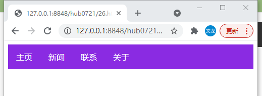
固定水平导航栏
头部
ul { position: fixed;
top: 0;
width: 100%;
}
顶部
ul { position: fixed;
bottom: 0;
width: 100%;
}

<!DOCTYPE html>
<html>
	<head>
		<meta charset="utf-8">
		<title></title>
		<style>
	ul{
		list-style-type:none;
		margin: 0;
		padding:0;
		overflow: hidden;
		background-color: blueviolet;
		position: fixed;
		top:0;
		width: 100%;
	}
	li {
		float: left;
	}
	li a{
		display: block;
		color: white;
		text-align: center;
		padding: 14px 16px;
		text-decoration: none;
	}
	li a:hover{
		background-color: cornflowerblue;
	}
	.active{
		background-color: cadetblue;
	}
	div{
		padding: 20px;
		margin-top: 30px;
		background-color: darkseagreen;
		height: 1500px;
	}
		</style>
	</head>
	<body>
	<ul>
		<li><a class="active"  href="#home">主页</a></li>
		<li><a href="#news">新闻</a></li>
		<li><a href="#news">联系</a></li>
		<li><a href="#news">关于</a></li>
	</ul>
	<div>
		<h1>今天挣钱目标是一个亿</h1>
		<h2>今天已工作了2300小时</h2>
		<h2>到现在为止负债十亿,今天还有1000小时就结束了,下个小时开始每小时进账二十亿</h2>
		<p>Some money Some money </p>
		<p>Some money Some money </p>
		<p>Some money Some money </p>
		<p>Some money Some money </p>
		<p>Some money Some money </p>
		<p>Some money Some money </p>
		<p>Some money Some money </p>
		<p>Some money Some money </p>
		<p>Some money Some money </p>
	</div>
	</body>
</html>
css下拉菜单
鼠标移动上去后显示下拉菜单
下拉菜单的思路就是把隐藏的菜单和显示的文字放在一个容器里

<!DOCTYPE html>
<html>
	<head>
		<meta charset="utf-8">
		<title></title>
		<style>
		.dropcontent{
			position: relative;
			display: inline-block;
		}
	    .dropmenu{
			  display: none;
			  position: absolute;
			  background-color:lightcyan;
			  min-width: 160px;
			  box-shadow: 0px 8px 16px 0px rgba(0,0,0,0.2);
			  padding: 12px 16px;
		}
		.dropcontent:hover .dropmenu{
			display: block;
		}
		p{
			font-size: 20px;
			color: cadetblue;
		}
		</style>
	</head>
	<body >
	<div class="dropcontent">
	<p>今日菜单有</p>
	<div class="dropmenu">
		<p>长面包</p>
		<p>短面包</p>
		<p>圆面包</p>
		<p>夹心面包</p>
		<p>一切热食一个月前已售完(米粉、炒饭...)</p>
	</div>
	</div>
	</body>
</html>
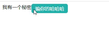
css提示工具 Tooltip
基础提示框
元素父子关系,然后隐藏和展示
<!DOCTYPE html>
<html>
	<head>
		<meta charset="utf-8">
		<title></title>
		<style>
		.tooltip{
			position: relative;
			display: inline-block;
		}
		.tooltip .tooltiptext{
			visibility: hidden;
			width:120px;
			background-color: lightseagreen;
			color:#fff;
			text-align: center;
			padding:5px 0;
			border-radius: 6px;
			position: absolute;
			z-index:1;
		}
		.tooltip:hover .tooltiptext{
			visibility: visible;
		}
		</style>
	</head>
	<body >
 <div class="tooltip">我有一个秘密
 <span class="tooltiptext">骗你的哈哈哈</span>
 </div>
	</body>
</html>
箭头提示框
用CSS 伪元素 ::after 及 content 属性为提示工具创建一个小箭头标志,箭头是由边框组成的,但组合起来后提示工具像个语音信息框
<!DOCTYPE html>
<html>
<head>
<meta charset="utf-8">
<title></title>
</head>
<style>
.tooltip {
position: relative;
display: inline-block;
}
.tooltip .tooltiptext {
visibility: hidden;
width: 120px;
background-color:green;
color: #fff;
text-align: center;
border-radius: 6px;
padding: 5px 0;
position: absolute;
z-index: 1;
top: 150%;
left: 50%;
margin-left: -60px;
}
.tooltip .tooltiptext::after {
content: "";
position: absolute;
bottom: 100%;
left: 50%;
margin-left: -5px;
/* border-width 规定了箭头大小,如果要修改它,margin-left的值也需要修改 ,箭头才能居中*/
border-width: 5px;
border-style: solid;
/* border-color 将内容转换为箭头 */
border-color: transparent transparent green transparent;
}
.tooltip:hover .tooltiptext {
visibility: visible;
}
</style>
<body style="text-align:center;">
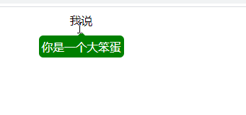
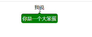
<div class="tooltip">我说
<span class="tooltiptext">你是一个大笨蛋</span>
</div>
</body>
</html>箭头提示框淡入效果
利用了css3 transition 属性和opacity属性
<!DOCTYPE html>
<html>
<head>
<meta charset="utf-8">
<title></title>
</head>
<style>
.tooltip {
    position: relative;
    display: inline-block;
}

.tooltip .tooltiptext {
    visibility: hidden;
    width: 120px;
    background-color:green;
    color: #fff;
    text-align: center;
    border-radius: 6px;
    padding: 5px 0;
    position: absolute;
    z-index: 1;
    top: 150%;
    left: 50%;
    margin-left: -60px;
	/* 淡入效果 4秒内从0%到100%显示*/
	/* opacity:0  提示文本常态下不可见 */
	opacity:0;
	transition: opacity 4s;
}

.tooltip .tooltiptext::after {
    content: "";
    position: absolute;
    bottom: 100%;
    left: 50%;
    margin-left: -5px;
    border-width: 5px;
    border-style: solid;
    border-color: transparent transparent green transparent;
}

.tooltip:hover .tooltiptext {
    visibility: visible;
	/* 淡入效果 这也需要写 */
	/* 设置触发动作,hover值为4,就触发淡入效果 */
	opacity: 4;
}
</style>
<body style="text-align:center;">

<div class="tooltip">我说
  <span class="tooltiptext">你是一个大笨蛋</span>
</div>

</body>
</html>
css图片廊
就是float ,值得学习的是它的包裹关系 ,就是四个一样的包裹关系然后浮动
css图片廊
<!DOCTYPE html>
<html>
<head>
<meta charset="utf-8">
<title></title>
</head>
<style>
div.img{
margin:5px;
border:1px solid #ccc;
float:left;
width:180px;
}
div.img:hover{
border:1px solid gold;
}
div.img img{
width:100%;
height:auto;
}
div.desc{
padding:15px;
text-align: center;
}
</style>
<body>
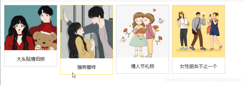
<div class="responsive">
<div class="img">
<img src="img/2.webp" width="500px" height="500px">
<div class="desc">大头贴情侣照</div>
</div>
</div>
<div class="responsive">
<div class="img">
<img src="img/3.webp" width="500px" height="500px">
<div class="desc">强势壁咚</div>
</div>
</div>
<div class="responsive">
<div class="img">
<img src="img/5.webp" width="500px" height="500px">
<div class="desc">情人节礼物</div>
</div>
</div>
<div class="responsive">
<div class="img">
<img src="img/6.jpg" width="500px" height="500px">
<div class="desc">女性朋友不止一个</div>
</div>
</div>
</body>
</html>响应式图片廊
<!DOCTYPE html>
<html>
<head>
<meta charset="utf-8">
<title></title>
</head>
<style>
div.img{
	border:1px solid coral;
}
div.img:hover{
	border:1px solid gold;
}
div.img img{
	width:100%;
	height:auto;
}
div.desc{
	padding:15px;
	text-align: center;
}
*{
	box-sizing: border-box;
}
.responsive{
	padding:0 6px;
	float: left;
	width: 24.99999%;
}
@media only screen and(max-width:700px){
	.responsive{
		width: 49.99999%;
		margin: 6px 0;
	}
}
@media only screen and(max-width:500px){
	.responsive{
		width: 100%;
	}
}

.clearfix:after{
	content: "";
	display: table;
	clear: both;
}
</style>
<body>
<div class="responsive">
	<div class="img">
		<img src="img/2.webp" width="500px" height="500px">
		<div class="desc">大头贴情侣照</div>
	</div>
</div>
<div class="responsive">
	<div class="img">
		<img src="img/3.webp" width="500px" height="500px">
		<div class="desc">强势壁咚</div>
	</div>
</div>
<div class="responsive">
	<div class="img">
		<img src="img/5.webp" width="500px" height="500px">
		<div class="desc">情人节礼物</div>
	</div>
</div>
<div class="responsive">
	<div class="img">
		<img src="img/6.jpg" width="500px" height="500px">
		<div class="desc">女性朋友不止一个</div>
	</div>
</div>
<!-- 这里添加了 -->
<div class="clearfix"></div>
</body>
</html>
css图像透明、不透明
css3中属性透明度是 opacity
Opacity属性值从0.0- 1.0。值越小,使得元素更加透明。
IE8和早期版本使用滤镜:alpha(opacity= x)。 x可以采取的值是从0 - 100。较低的值,使得元素更加透明。
图像的透明度--悬停效果

<!DOCTYPE html>
<html>
<head>
<meta charset="utf-8">
<title></title>
</head>
<style>
/* opacity属性 常于:hover选择器一起使用 */
img{
	opacity: 0.4;
	/* 适用 IE8 及其更早版本 */
       /* 不写filter也不影响 */
	filter: alpha(opacity=40);
}
img:hover{
	opacity: 1.0;
	filter: alpha(opacity=100);
}
</style>
<body>
<img src="img/11.webp" width="500px">
<img src="img/9.webp">
</body>
</html>
透明盒子中的文字

<!DOCTYPE html>
<html>
<head>
<meta charset="utf-8">
<title></title>
</head>
<style>
div.background{
	width:400px;
	height:250px;
	background: url(img/11.jpg) repeat;
	border:2px solid blueviolet;
}
div.transbox{
	width:300px;
	hieght:180px;
	margin:30px 50px;
	background-color: white;
	border:1px solid royalblue;
	opacity: 0.7;
}
div.transbox p{
	margin: 30px 40px;
	font-weight: bold;
	color:crimson;
}
</style>
<div class="background">
	<div class="transbox">
<p>刘梅----我可以进来吗?<br/>
刘星---不可以<br/>
夏雨---你怎么不让妈妈进来<br/>
刘星---不让她进来她呆会还会进来<br/>
    门开了——<br/>
</p>
	</div>
</div>
</body>
</html>
css图像拼合技术
图像拼合就是单个图像的集合。
有许图像的网页需要很长的时间来加载和生成多个服务器的请求
使用图像平和会降低服务器的请求数量,并节省带宽。
这个原理应该是这样的:
在body放需要加载的图片,在样式里放一张图片,这一张图片上每个加载图片都有
把2个图像拼成一个图像
<!DOCTYPE html>
<html>
<head>
<meta charset="utf-8">
<title></title>
</head>
<style>
img.hua1{
	width: 699px;
	height: 447px;
	/* 0 0 表示的是图像的位置 */
	background:url(img/2116.png) 0 0;
}
img.hua2{
	width:784px;
	height:682px;
	/* 这个才是页面展示的图像 */
	background:url(img/2116.png) -91px 0;
}
</style>

<body>
	<!-- 这里的src只鼎原了一个小的透明图像 -->
	<img class="hua1" src="img/828.png"><br/><br/>
	<img class="hua2" src="img/856.png">
</body>
</html>
图像拼接---创建一个导航列表
这个错了

<!DOCTYPE html>
<html>
<head>
<meta charset="utf-8">
<title></title>
</head>
<style>
#navlist{
	position: relative;
}
#navlist li{
	margin:0;
	padding:0;
	list-style: none;
	position: absolute;
	top:0;
}
/* #navlist li,#navlist a{
	height: 388px;
	display: block;
} */
#navlist li{
	height: 388px;
	display: block;
}
#home{
	left:0px;
	width:300px;
}
#home{
	background: url('img/430.png') 0 0;
}
#prev{
	left:100px;
	width:300px;
}
#prev{
	background:url('img/430.png') -300px 0;
}
#next{
	left:200px;
	width:300px;
}
#next{
	background: url('img/430.png') -600px 0;
}
</style>

<body>
	<ul id="navlist">
		<!-- <li id="home"><a href="/"></a></li>
		<li id="prev"><a href="/css/"></a></li>
		<li id="next"><a href="/css/"></a></li> -->
		<li id="home"></li>
		<li id="prev"></li>
		<li id="next"></li>
	</ul>
</body>
</html>
图像拼合---悬停效果
暂时就不做了,因为上一个错了。
css媒体类型
媒体类型允许你指的文件在不同的媒体呈现。
媒体类型
一些媒体属性只设计了某些媒体。eg:voice-family属性专为听觉用户代理。
@media规则
@media规则允许在相同的样式表下为不同媒体设置不同的样式.
all 用于所有的媒体设备
screen 用于电脑显示器
print 用于打印机
.....
css属性选择器
具有特定属性的HTML元素样式不仅仅有id选择器 类选择器 标签选择器 还有属性选择器。
属性选择器 [ ]
<!DOCTYPE html>
<html>
<head>
<meta charset="utf-8">
<title></title>
</head>
<style>
[title]{
	color:red;
}
</style>

<body>
	<div title="cute">111</div>
</body>
</html>
属性和值选择器
<!DOCTYPE html>
<html>
<head>
<meta charset="utf-8">
<title></title>
</head>
<style>
[title=cute]{
	color:red;
}
</style>

<body>
	<div title="cute">111</div>
	<span title="cute">2222</span>
	<p title="cool">333</p>
</body>
</html>
包含值得属性选择器 ~=
<!DOCTYPE html>
<html>
<head>
<meta charset="utf-8">
<title></title>
</head>
<style>
[title~=cool]{
color:cadetblue;
}
</style>
<body>
<div title="cute cool">111</div>
<span title="cute">2222</span>
<p title="cool">333</p>
</body>
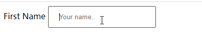
</html>css表单
用css渲染表单

<!DOCTYPE html>
<html>
<head>
<meta charset="utf-8">
<title></title>
</head>
<style>
input[type=text],select{
	width:100%;
	padding:12px 20px;
	margin: 8px 0;
	display: inline-block;
	border: 1px solid #ccc;
	border-radius: 4px;
	box-sizing: border-box;
}
input[type=submit]{
	width:100%;
	background-color: #4CAF50;
	color: white;
	padding: 14px 20px;
	margin:8px 0;
	border:none;
	border-radius: 4px;
	cursor: pointer;
}
input[type=submit]:hover{
	background-color: #45a049;
}
div{
	border-radius: 5px;
	background-color: #f2f2f2;
	padding: 20px;
}
</style>

<body>
	<form action="/">
		<label for="fname">First Name</label>
		<input type="text" id="fname" name="firstname" placeholder="Your name..">
		<label for="lname">Last Name</label>
		<input type="text" id="lname" name="lastname" placeholder="your last name..."
		<label for="country">country</label>
		<select id="country" name="country">
			<option vaule="australia">Australia</option>
			<option value="canada">Canada</option>
			<option value="usa">USA</option>
		</select>
		<input type="submit" value="submit">
	</form>
</body>
</html>
输入框样式
使用width属性设置输入框的宽度
input{
width:100%;
}
输入框填充
padding属性可以在输入框中添加内边距
输入框边框
border属性可以修改input边框的大小或颜色
border-radius 属性可以给input添加圆角
输入框颜色
background-color 属性设置输入框背景颜色
color属性修改文本颜色
输入框聚焦--自带蓝色轮廓
输入框自带的蓝色轮廓,可以通过设置input样式为outline:none ;来忽略效果。
:focus 选择器设置输入框在获取焦点时的样式。----不能直接设置,必须先用了 outline: none;,不然边框是黑色
<style>
input[type=text]{
	padding:12px 20px;
	outline: none;
}
</style>
<body>
	<form action="/">
		<label for="fname">First Name</label>
		<input type="text" id="fname" name="firstname" placeholder="Your name..">
</body>
</html>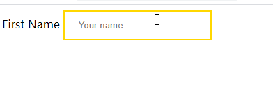
<!DOCTYPE html>
<html>
<head>
<meta charset="utf-8">
<title></title>
</head>
<style>
input[type=text]{
padding:12px 20px;
outline: none;
}
input[type=text]:focus{
border:2px solid gold;
}
</style>
<body>
<form action="/">
<label for="fname">First Name</label>
<input type="text" id="fname" name="firstname" placeholder="Your name..">
</body>
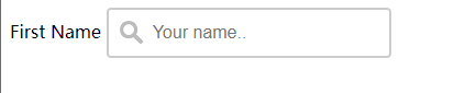
</html>输入框图标
在输入框中添加图标,可以用background-image和background-position属性。
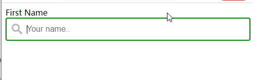
<!DOCTYPE html>
<html>
<head>
<meta charset="utf-8">
<title></title>
</head>
<style>
input[type=text] {
  width: 100%;
  box-sizing: border-box;
  border: 2px solid #ccc;
  border-radius: 4px;
  font-size: 16px;
  background-color: white;
  background-image: url('https://static.runoob.com/images/mix/searchicon.png');
  background-position: 10px 10px;
  background-repeat: no-repeat;
  padding: 12px 20px 12px 40px;
  outline: none;
}
input[type=text]:focus{
	border:2px solid #008000;
}
</style>
<body>
	<form action="/">
		<label for="fname">First Name</label>
		<input type="text" id="fname" name="firstname" placeholder="Your name..">
</body>
</html>
带动画的搜索框
transition 属性
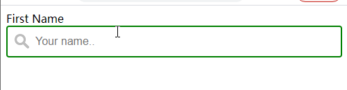
<!DOCTYPE html>
<html>
<head>
<meta charset="utf-8">
<title></title>
</head>
<style>
input[type=text] {
box-sizing: border-box;
border: 2px solid #ccc;
border-radius: 4px;
font-size: 16px;
background-color: white;
background-image: url('https://static.runoob.com/images/mix/searchicon.png');
background-position: 10px 10px;
background-repeat: no-repeat;
padding: 12px 20px 12px 40px;
outline: none;
transition: width 0.4s ease-in-out;
}
input[type=text]:focus{
border:2px solid #008000;
width:100%;
}
</style>
<body>
<form action="/">
<label for="fname">First Name</label>
<input type="text" id="fname" name="firstname" placeholder="Your name..">
</body>
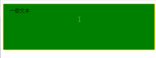
</html>文本框textarea样式
resize属性禁用文本框重置大小功能
<!DOCTYPE html>
<html>
<head>
<meta charset="utf-8">
<title></title>
</head>
<style>
textarea{
	width: 100%;
	 height: 150px;
	 padding: 12px 20px;
	 box-sizing: border-box;
	 border: 2px solid gold;
	 border-radius: 4px;
	 background-color: green;
	 font-size: 16px;
	 resize: none;
}
</style>
<body>
	<form>
		<textarea>一些文本</textarea>
		</form>
</body>
</html>
响应式表单--这个效果不对,以后修改

<!DOCTYPE html>
<html>
<head>
<meta charset="utf-8">
<title></title>
</head>
<style>
*{
	box-sizing: border-box;
}
input[type=text],select,textarea{
	width:100%;
	padding:12px;
	border:1px solid #ccc;
	border-radius:4px;
	resize:vertical;
}
label{
	padding:12px 12px 12px 0;
	display: inline-block;
}
input[type=submit]{
	background-color: #4CAF50;
	color: white;
	padding: 12px 20px;
	border: none;
	border-radius: 4px;
	cursor: pointer;
	float: right;
}
input[type=submit]:hover{
	background-color: #45ao49;
}
.container{
	border-radius: 5px;
	background-color: #f2f2f2;
	padding:20px;
}
.col-25{
	float: left;
	width:25%;
	margin-top: 6px;
}
.col-75{
	float: left;
	width:75%;
	margin-top: 6px;
}
/* 清除浮动 */
.row:after{
	content:"",
	display:table;
	clear: both;
}
/* 响应式布局layout - 在屏幕宽度小于600px时,设置为上下堆叠元素 */
@media screen and (max-width:600px){
	.col-25,.col-75,input[type=submit]{
		width:100%;
		margin-top:0;
	}
}
input
</style>
<body>
	<div class="container">
		<form action="">
			<div class="row">
				<div class="col-25">
					<label for="fname">First Name</label>
				</div>
				<div class="col-75">
					<input type="text" id="fname"  name="firstname" placeholder="Your name...">
				</div>
			</div>
			<!-- 2 -->
			<div class="row">
				<div class="col-25">
					<label for="lname">Last Name</label>
				</div>
				<div class="col-75">
					<input type="text" id="fname"  name="firstname" placeholder="Your name...">
				</div>
			</div>
			<!-- 3 -->
			<div class="row">
				<div class="col-25">
					<label for="country">Country</label>
				</div>
				<div class="col-75">
					<select id="country" name="country">
						<option value="australia">Australia</option>
						<option value="canada">Canada</option>
						<option value="usa">Usa</option>
					</select>
				</div>
			</div>
			<!-- 4 -->
			<div class="row">
				<div class="col-25">
					<label for="subject">Subject</label>
				</div>
				<div class="col-75">
					<textarea id="subject" name="subject" placeholder="write something.." style="height:200px"></textarea>
				</div>
			</div>
			<!-- 5 -->
			<div class="row">
				<input type="submit" value="Submit">
			</div>
		</form>
	</div>
</body>
</html>
css计数器
css计数器通过一个变量来设置,根据规则递增变量
计数器属性
content 使用::before ::after 伪元素来插入自动生成的内容
counter-increment 递增一个值或多个值
counter-reset 创建或重置一个或多个计数器
使用计数器自动编号
css计数器根据规则来递增变量
css计数器使用到以下几个属性
counter-reset 创建/重置计数器
counter-increment 递增变量
coutent 插入生成的内容
counter() /counters() 函数 -将计数器的值添加到元素
要使用css计数器,得先用counter-reset创建:

<!DOCTYPE html>
<html>
<head>
<meta charset="utf-8">
<title></title>
</head>
<style>
body{
	counter-reset: section;
}
h2::before{
	counter-increment: section;
	content: "Section" counter(section)":";
}
</style>
<body>
	<!-- 区别就是这些生成页面后前面多了section: -->
	<!-- 而且哪个数值 1 2 3是递增的 -->
	<h1>使用css计数器</h1>
	<h2>HTML教程</h2>
	<h2>CSS教程</h2>
	<h2>javascript教程</h2>
</body>
</html>
嵌套计数器
除了平常的还可以用于列表中,列表的子元素会自动创建,使用 counters() 函数

<!DOCTYPE html>
<html>
<head>
<meta charset="utf-8">
<title></title>
</head>
<style>
body{
	 /* 创建计数器 */
	counter-reset: section;
	color:coral;
}
h1{
	/* 创建计数器 */
	counter-reset: subsection;
}
h1::before{
	counter-increment: section;
	content:"Section" counter(section)".";
}
h2::before{
		/* counter-increment递增变量*/
		/* content插入生成的内容  counter 将计数器的值添加到元素 */
	counter-increment: subsection;
	content: counter(section)"." counter(subsection)" ";
}
</style>
<body>
	<h1>HTML教程</h1>
	<h2>CSS教程</h2>
	<h2>javascript教程</h2>

	<h1>Scripting教程</h1>
	<h2>JavaScript教程</h2>
	<h2>VBScript教程</h2>

	<h1>XML教程</h1>
	<h2>XML教程</h2>
	<h2>XSL教程</h2>
</body>
</html>

<!DOCTYPE html>
<html>
<head>
<meta charset="utf-8">
<title></title>
</head>
<style>
ol{
	counter-reset: section;
	list-style-type: none;
	color: blueviolet;
}
li::before{
	counter-increment: section;
	/* 这里加了s */
	content: counters(section,".")" ";
}
</style>
<body>
	<ol>
		<li>item</li>
		<li>item
		<ol>
		<li>1111</li>
		<li>222</li>
		<li>3333</li>
		<ol>
			<li>aaa</li>
			<li>bbb</li>
			<li>ccc</li>
		</ol>
		</ol>
		</li>
	</ol>

	<ol>
		<li>hahahah</li>
		<li>lalalal</li>
	</ol>
</body>
</html>
css网页布局
网页布局
网页布局有很多种方式,一般分以下几个部分:头部区域、菜单导航区域、内容区域、底部区域

头部区域 header
菜单导航区域 topNav
内容区域
内容区域一般有三种形式:
1列 一般用于移动端
2列 一般用于平板设备
3列 一般用于pc桌面设备

响应式布局---效果又没对

<!DOCTYPE html>
<html>
<head>
<meta charset="utf-8">
<title></title>
<style>
*{
	box-sizing: border-box;
}
body{
	margin: 0;
}
/* 头部样式 */
.header{
	background-color: #f1f1f1;
	padding:20px;
	text-align: center;
}

/* 导航条 */
.topnav {
	overflow: hidden;
	background-color: #333;
}

/* 导航链接 */
.topnav a{
	float:left;
	display: block;
	color:#f2f2f2;
	text-align: center;
	padding:14px 16px;
	text-decoration: none;
}
/* 链接-修改颜色 */
.topnav a:hover{
	background-color: #ddd;
	color:black;
}
/* 创建三个相等的列 */
.column{
	float:left;
	width:33.33%;
}
/* 列后清除浮动 */
.row:after{
	content:"";
	display: table;
	clear: both;
}
/* 响应式布局 --- 小于600px时改为上下布局 */
@media screen and (max-width:600px){
	.column{
		width:100%;
	}
}
</style>
</head>
<body>
<div class="header">
	<h1>头部区域</h1>
</div>
<div class="topnav">
	<a href="#">链接</a>
	<a href="#">链接</a>
	<a href="#">链接</a>
</div>
<div class="row">
	<div class="column">
		<h2>第一列</h2>
		<p>只要学不死,就往死里学---只要学不死,就往死里学---只要学不死,就往死里学---只要学不死,就往死里学</p>
	</div>
</div>
<div class="row">
	<div class="column">
		<h2>第二列</h2>
		<p>只要学不死,就往死里学---只要学不死,就往死里学---只要学不死,就往死里学---只要学不死,就往死里学</p>
	</div>
</div>
<div class="row">
	<div class="column">
		<h2>第三列</h2>
		<p>只要学不死,就往死里学---只要学不死,就往死里学---只要学不死,就往死里学---只要学不死,就往死里学</p>
	</div>
</div>
</body>
</html>
不相等的列-----效果也没做出来
不相等的列一般都是在中间部分设置内容区域,左右两侧做些导航相关内容,三列宽加起来100%

<!DOCTYPE html>
<html>
<head>
<meta charset="utf-8">
<title></title>
<style>
*{
	box-sizing: border-box;
}
body{
	margin: 0;
}
/* 头部样式 */
.header{
	background-color: #f1f1f1;
	padding:20px;
	text-align: center;
}

/* 导航条 */
.topnav {
	overflow: hidden;
	background-color: #333;
}

/* 导航链接 */
.topnav a{
	float:left;
	display: block;
	color:#f2f2f2;
	text-align: center;
	padding:14px 16px;
	text-decoration: none;
}
/* 链接-修改颜色 */
.topnav a:hover{
	background-color: #ddd;
	color:black;
}
/* 创建三个不相等的列 */
.column{
	float:left;
	padding:10px;
}
/* 左右两侧宽度 */
.column.side{
	width:25%;
}
/* 中间区域宽度 */
.column.middle{
	width:50%;
}
/* 列后清除浮动 */
.row:after{
	content:"";
	display: table;
	clear: both;
}
/* 响应式布局 --- 小于600px时改为上下布局 */
@media screen and (max-width:600px){
	.column.side, .column.middle{
		width:100%;
	}
}
</style>
</head>
<body>
<div class="header">
	<h1>头部区域</h1>
</div>
<div class="topnav">
	<a href="#">链接</a>
	<a href="#">链接</a>
	<a href="#">链接</a>
</div>

<div class="row">
	<div class="column side">
		<h2>左侧栏</h2>
		<p>只要学不死,就往死里学</p>
	</div>
</div>
<div class="row">
	<div class="column middle">
		<h2>主区域</h2>
		<p>只要学不死,就往死里学---只要学不死,就往死里学---只要学不死,就往死里学---只要学不死,就往死里学</p>
	</div>
</div>
<div class="row">
	<div class="column side">
		<h2>右侧栏</h2>
		<p>只要学不死,就往死里学</p>
	</div>
</div>
</body>
</html>
底部区域 footer----效果也不对
<!DOCTYPE html>
<html>
	<head>
		<meta charset="utf-8">
		<title></title>
		<style>
		*{
			box-sizing: border-box;
		}
		body{
			font-family: Arial;
			padding:10px;
			background:#f1f1f1;
		}
		/* 头部标题 */
		.header{
			padding:30px;
			text-align: center;
			background: white;
		}
		.header h1{
			font-size:50px;
		}
		/* 导航条 */
		.topnav a{
			float:left;
			display: block;
			color:#f2f2f2;
			text-align: center;
			padding: 14px 16px;
			text-decoration: none;
		}
		/* 链接颜色修改 */
	     .topnav a:hover{
			 background-color: #ddd;
			 color: black;
		 }
		 /* 创建两列 */、
		 /* Left column */
		 .leftcolumn{
			 float:left;
			 width:75%;
		 }
		 /* 右侧栏 */
		 .rightcolumn{
			 float:left;
			 width:25%;
			 background-color: #f1f1f1;
			 padding-left: 20px;
		 }
		 /* 图像部分 */
		 .fakeimg{
			 background-color: #aaa;
			 width:100%;
			 padding:20px;
		 }
		 /* 文章卡片效果 */
		 .card{
			 background-color: white;
			 padding:20px;
			 margin-top: 20px;
		 }
		 /* 列后面清除浮动 */
		 .row:after{
			 content:"";
			 display: table;
			 clear:both;
		 }
		 /* 底部 */
		 .footer{
			 padding:20px;
			 tetx-align:center;
			 background: #ddd;
			 margin-top: 20px;
		 }
		 /* 响应式布局--屏幕尺寸小于800px时,两列布局改为上下布局 */
		 @media screen and (max-width:800px){
			 .leftcolumn,.rightcolumn{
				 width:100%;
				 padding:0;
			 }
		 }
		 /* 响应式布局--屏幕尺寸小于400px时,导航等布局改为上下布局 */
		 @media screen and  (ma-width:400px){
			 .topnav a{
				 float:none;
				 width:100%;
			 }
		 }
		</style>
	</head>
	<body>
		<div class="header">
			<h1>我的网页</h1>
		</div>
		<div class="topnav">
			<a href="#">链接</a>
			<a href="#">链接</a>
			<a href="#">链接</a>
			<a href="#" style="float:right">链接</a>
		</div>

		<div class="row">
			<div class="leftcolumn">
				<div class="card">
					<h2>文章标题</h2>
					<h5>2019年4月17日</h5>
					<div class="fakeing" style="height:200px;">图片</div>
					<p>一些文本...</p>
					<P>好好学习,天天向上啦啦啦啦啦绿啦绿绿绿绿绿绿绿绿绿绿绿啦啦啦啦啦啦</P>
				</div>
				<div class="card">
					<h2>文章标题</h2>
					<h5>2019年4月17日</h5>
					<div class="fakeing" style="height:200px;">图片</div>
					<p>一些文本...</p>
					<P>好好学习,天天向上啦啦啦啦啦绿啦绿绿绿绿绿绿绿绿绿绿绿啦啦啦啦啦啦</P>
				</div>
				<div class="card">
					<h3>热门文章</h3>
					<div class="fakeing"><p>图片</p></div>
					<div class="fakeing"><p>图片</p></div>
					<div class="fakeing"><p>图片</p></div>
				</div>
				<div class="card">
					<h3>关注我</h3>
					<p>一些文本</p>
				</div>
			</div>
		</div>
		<div class="footer">
			<h2>底部区域</h2>
		</div>
	</body>
</html>
css !important
什么是!important?
css中的important规则用于增加样式的权重。
!important与优先级无关,但它与最终的结果直接相关,使用一个!important规则时,此声明将覆盖任何其他声明。

<!DOCTYPE html>
<html>
	<head>
		<meta charset="utf-8">
		<title></title>
		<style>
	  p{
		  background-color: red !important;
	  }
	  .cute{
		  background-color: gray;
	  }
	  #cool{
		  background-color: blue;
	  }
		</style>
	</head>
	<body>
		<p>111111</p>
		<p class="cute">222222</p>
		<p id="cool">333333</p>
	</body>
</html>
注意
使用!important 是一个坏习惯,应该尽量避免,因为它破坏了样式表中的固有级联规则,让调试bug更困难了。
当两条相互冲突的带有!important规则的声明被应用到相同的元素上时,更大优先级的声明被采用。
优先考虑使用样式规则的优先级来解决问题,而不是!important
只有在需要覆盖全站或外部css的特定页面使用!important
永远不要在插件中使用!important
永远不要在全站范围的css代码中使用!important
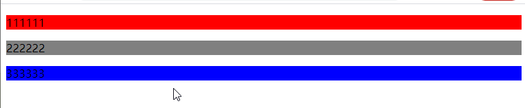
<!DOCTYPE html>
<html>
	<head>
		<meta charset="utf-8">
		<title></title>
		<style>
	  p{
		  background-color: red !important;
	  }
	  .cute{
		  background-color: gray !important;
	  }
	  #cool{
		  background-color: blue !important;
	  }
		</style>
	</head>
	<body>
		<p>111111</p>
		<p class="cute">222222</p>
		<p id="cool">333333</p>
	</body>
</html>
何时使用!important
在网站设定一个全站样式的css样式可以使用!important

<!DOCTYPE html>
<html>
	<head>
		<meta charset="utf-8">
		<title></title>
		<style>
	 .button{
		 background-color: #8c8c8c !important;
		 color:white !important;
		 padding:5px !important;
		 border: 1px solid black !important;
	 }
	 #myDiv a{
		 /* 这里的样式会改变button的样式,因此在button按钮中加!important 就不会改变了 */
		 color: red;
		 background-color: yellow;
	 }
		</style>
	</head>
	<body>
	<p>标准按钮 <a class="button" href="/css/">css教程</a></p>
	<div id="myDiv">
		<p>div中的一个链接<a href="/html/">HTML教程</a></p>
		<p>div中的链接按钮<a href="/html/" class="button">HTML教程</a></p>
	</div>
	</body>
</html>
css学完学什么
css扩展 css实例 css参考手册 css3教程
学习javascript
css实例
css3
css用于控制网页的样式和布局
css3参考手册 css属性参考手册 css3浏览器支持情况 css选择器参考手册 css颜色参考手册
css3边框
border-radius 圆角边框
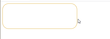
<!DOCTYPE html>
<html>
	<head>
		<meta charset="utf-8">
		<title></title>
		<style>
		div{
			width:300px;
			height:100px;
			border-radius: 25px;
			border: 1px solid  goldenrod;
		}
		</style>
	</head>
	<body>
		<div></div>
	</body>
</html>
box-shadow 盒阴影
box-shadow: 上下阴影位置 左右阴影位置 阴影模糊范围多大 阴影颜色

<!DOCTYPE html>
<html>
	<head>
		<meta charset="utf-8">
		<title></title>
		<style>
		div{
			width:300px;
			height:100px;
			border-radius: 25px;
			border: 1px solid  goldenrod;
			box-shadow: 20px 40px 30px greenyellow;
		}
		</style>
	</head>
	<body>
		<div></div>
	</body>
</html>
border-image 边界图片--用图像做边框
border-image:url(图片) 数值--改变图片本身的内容(重复) 数值--改变图片本身的内容(拉伸) 图像是重复还是拉伸(round/strech)
用法:边框颜色设置透明,然后直接放图
图片显示多少跟你设置的边框宽度有关系
应该是,错了概不负责

<!DOCTYPE html>
<html>
	<head>
		<meta charset="utf-8">
		<title></title>
		<style>
		div{
			width:300px;
			height:100px;
			border:30px  solid transparent;
			border-image:url(./img/2.webp) 240 30 round;
		}
		</style>
	</head>
	<body>
		<div></div>
	</body>
</html>
<!DOCTYPE html>
<html>
	<head>
		<meta charset="utf-8">
		<title></title>
		<style>
		div{
			width:300px;
			height:100px;
			border:30px  solid transparent;
			border-image:url(./img/2.webp) 240 30 stretch;
		}
		</style>
	</head>
	<body>
		<div></div>
	</body>
</html>
border-radius属性 没有写重
边框圆角

<!DOCTYPE html>
<html>
	<head>
		<meta charset="utf-8">
		<title></title>
		<style>
		div{
			width:300px;
			height:100px;
			border:1px  solid green;
	        border-radius: 25px;
		}
		</style>
	</head>
	<body>
		<div></div>
	</body>
</html>
背景颜色圆角
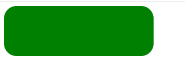
<!DOCTYPE html>
<html>
	<head>
		<meta charset="utf-8">
		<title></title>
		<style>
		div{
			width:300px;
			height:100px;
			background-color: #008000;
	        border-radius: 25px;
		}
		</style>
	</head>
	<body>
		<div></div>
	</body>
</html>
背景图片圆角
<!DOCTYPE html>
<html>
	<head>
		<meta charset="utf-8">
		<title></title>
		<style>
		div{
			width:300px;
			height:100px;
	    	background-image: url(img/11.jpg);
	        border-radius: 25px;
		}
		</style>
	</head>
	<body>
		<div></div>
	</body>
</html>
border-radius 几个值得区别
border-radius:xx xx xx xx; 1左上角 2右上角 3 右下角 4左下角
border-radius:xx xx xx ; 1 左上角 2 右上角左下角 3 右下角
border-radius:xx xx; 1左上角右下角 右上角左下角
border-radius:四个角相同
四个角的写法
border-top-left-radius 左上角
border-top-right-radius右上角
border-bottom-right-radius 右下角
border-bottom-left-radius 左下角
css背景
background-image 添加背景图片
不同的背景图片用用逗号隔开,所有图片中显示在最顶端的为第一张
可以给不同的图片设置多个不同的属性

<!DOCTYPE html>
<html>
	<head>
		<meta charset="utf-8">
		<title></title>
		<style>
.cool{
			width:800px;
			height:700px;
			background-color: #000000;
			background-image: url(img/2.webp),url(img/11.jpg);
		    background-repeat: no-repeat,repeat;
			background-position:left top;
}
		</style>
	</head>
	<body>
		<div class="cool"></div>
	</body>
</html>
第2种写法没有出现
<!DOCTYPE html>
<html>
	<head>
		<meta charset="utf-8">
		<title></title>
		<style>
		div{
			width:800px;
			height:800px;
	    	background-image: url(img/11.jpg)right bottom no-repeat,url(img/2.webp) left top repeat;
		}
		</style>
	</head>
	<body>
		<div></div>
	</body>
</html>
background-size 背景图片大小
它指定背景图片大小。css3以前,背景图片大小有图像的实际大小决定。
CSS3中可以指定背景图片,让我们重新在不同的环境中指定背景图片的大小。您可以指定像素或百分比大小。
指定的大小是相对于父元素的宽度和高度的百分比的大小。
伸展背景图像完全填充内容区域
<!DOCTYPE html>
<html>
	<head>
		<meta charset="utf-8">
		<title></title>
		<style>
		body{
			background-image: url(img/11.jpg);
			background-repeat: no-repeat;
			background-size: 80px 60px;
		}
		</style>
	</head>
	<body>
		<div></div>
	</body>
</html>
<!DOCTYPE html>
<html>
	<head>
		<meta charset="utf-8">
		<title></title>
		<style>
		div{
			width:700px;
			height:700px;
			background-image: url(img/33.jpg);
			background-repeat: no-repeat;
			background-size: 100% 100%;
		}
		</style>
	</head>
	<body>
		<div></div>
	</body>
</html>
background-origin
background-origin 属性指定了背景图像的位置区域。
content-box, padding-box,和 border-box区域内可以放置背景图像。
background-clip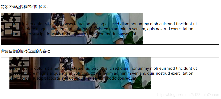
<!DOCTYPE html>
<html>
<head>
<meta charset="utf-8">
<title></title>
<style>
div
{
	border:1px solid black;
	padding:35px;
	background-image:url(img/2.jpg);
	background-repeat:no-repeat;
	background-position:left;
}
#div1
{
	background-origin:border-box;
}
#div2
{
	background-origin:content-box;
}
</style>
</head>
<body>

<p>背景图像边界框的相对位置:</p>
<div id="div1">
Lorem ipsum dolor sit amet, consectetuer adipiscing elit, sed diam nonummy nibh euismod tincidunt ut laoreet dolore magna aliquam erat volutpat. Ut wisi enim ad minim veniam, quis nostrud exerci tation ullamcorper suscipit lobortis nisl ut aliquip ex ea commodo consequat.
</div>

<p>背景图像的相对位置的内容框:</p>
<div id="div2">
Lorem ipsum dolor sit amet, consectetuer adipiscing elit, sed diam nonummy nibh euismod tincidunt ut laoreet dolore magna aliquam erat volutpat. Ut wisi enim ad minim veniam, quis nostrud exerci tation ullamcorper suscipit lobortis nisl ut aliquip ex ea commodo consequat.
</div>

</body>
</html>
background-clip 属性
背景剪裁属性是从指定位置开始绘制。
它有2个值,目前来看。padding-box content-box
没有看出用了它有什么用

<!DOCTYPE html>
<html>
<head>
<meta charset="utf-8">
<title></title>
<style>
div{
	border:3px solid blueviolet;
	background-color: #008000;
	padding:30px;
	background-clip: content-box;
}
.one{
	border:3px solid blueviolet;
	background-color: #008000;
     padding:30px;
}
</style>
</head>
<body>
<div>你爱我,我爱你,蜜雪冰城甜蜜蜜</div>
<div class="one">You love me I love you Mixue ice cream and tea</div>
</body>
</html>
css3渐变
之前写了
css3文本效果
text-shadow 文本阴影
text-shadow 水平阴影 垂直阴影 模糊的距离 阴影的颜色
<!DOCTYPE html>
<html>
<head>
<meta charset="utf-8">
<title></title>
<style>
 h2{
	 text-shadow: 20px 10px 30px gold;
	 color:lightgreen;
 }
</style>
</head>
<body>
<h2>蜜雪冰城YYDS</h2>
</body>
</html>
可以在::before 和::after两个伪元素中添加阴影效果

<!DOCTYPE html>
<html>
<head>
<meta charset="utf-8">
<title></title>
<style>
 div{
	 position:relative;
	 box-shadow: 1px 2px 4px rgba(255,255,0,0.9);
	 padding:10px;
	 background-color: darkcyan;
 }
 div img{
	  width: 100%;
	 border:1px solid greenyellow;
	 border-style: inset;
 }
 div::after{
	 content:"",
	 position:absolute;
	 z-index: -1;
	 box-shadow: 0 15px 20px rgba(255,255,0,0.9);
	 width: 70%;
	 left:15%;
	 height:100px;
	 bottom:0;
 }
</style>
</head>
<body>
<div>
	<img src="img/2.webp">
</div>
</body>
</html>
阴影的使用特例是卡片效果
Text Overflow 文本溢出
text-overflow:ellipsis 多余的以....代替
text-overflow:clip 裁剪
text-overflow:'自定义字符串' 这个效果在火狐下才有
并且文本的溢出需要结合另外两个一起使用才有效overflow:hidden;white-space:nowrap;
<!DOCTYPE html>
<html>
<head>
<meta charset="utf-8">
<title></title>
<style>
.one{
	text-overflow: ellipsis;
	white-space:nowrap;
	overflow:hidden;
	width:200px;
	height:20px;
	border:1px solid #008000;
}
.two{
	text-overflow:clip;
	white-space:nowrap;
	overflow:hidden;
	width:150px;
	height:20px;
	border:1px solid #008000;
}
.three{
	text-overflow: "--";
	white-space:nowrap;
	overflow:hidden;
	width:200px;
	height:20px;
	border:1px solid #008000;
}
</style>
</head>
<body>
<div>
<p class="one">上班摸鱼一时爽,一直摸鱼一直爽</p>
<p class="two">“躺平”是为了更好的出发</p>
<p class="three">高高兴兴上班来 平平安安回家去</p>
</div>
</body>
</html>
文本换行 word-wrap
<title></title>
<style>
.one{
	word-wrap: break-word;
	border:1px solid #008000;
	width:70px;
}
</style>
</head>
<body>
<div>
<p class="one">This paragraph contains a very long word</p>
</div>
</body>
</html>
word-break 单词拆分换行
不是很懂目的

<!DOCTYPE html>
<html>
<head>
<meta charset="utf-8">
<title></title>
<style>
.one{
	word-break: keep-all;
	border:1px solid #008000;
	width:70px;
}
</style>
</head>
<body>
<div>
<p class="one">This paragraph contains assssssssss very long word</p>
</div>
</body>
</html>
之后的内容以后写
css3字体 font-face
在font-face中,你首先需要定义字体名称,然后指向字体文件
如果为html元素使用字体,通过font-family属性引用字体的名称
@font-face{
font-family:字体名称
src:url() 字体文件url
}
//找不到字体
<!DOCTYPE html>
<html>
<head>
<meta charset="utf-8">
<title>菜鸟教程(runoob.com)</title>
<style>
@font-face
{
	font-family: myFirstFont;
	src: url('Sansation_Light.ttf')
		,url('Sansation_Light.eot');
}
div
{
	font-family:myFirstFont;
}
</style>
</head>
<body>
<div>wuwuuwuuuwu</div>
</body>
</html>
之后写
css 2D转换
css 3D转换
css3过渡
css3动画
css3多列
css3可以将文本内容设计成像报纸一样的多列布局
column-count 创建多列
column-count:x x是几,就是几列
<!DOCTYPE html>
<html>
<head>
<meta charset="utf-8">
<title>菜鸟教程(runoob.com)</title>
<style>
 div{
	column-count:4;
 }

</style>
</head>
<body>
<div>Lorem ipsum dolor sit amet, consectetur adipisicing elit. Nostrum ut aspernatur sit excepturi aliquid commodi assumenda eveniet asperiores labore sunt voluptatibus officia doloribus iusto beatae aperiam. Nisi odio beatae repellat incidunt amet laboriosam iure natus deleniti aspernatur placeat ducimus similique voluptatum fugit esse animi veniam quasi cum maxime ex molestiae?</div>
</body>
</html>
column-gap 指定了列与列之间的间隙
<!DOCTYPE html>
<html>
<head>
<meta charset="utf-8">
<title>菜鸟教程(runoob.com)</title>
<style>
 div{
	column-count:4;
	column-gap: 20px;
 }

</style>
</head>
<body>
<div>Lorem ipsum dolor sit amet, consectetur adipisicing elit. Nostrum ut aspernatur sit excepturi aliquid commodi assumenda eveniet asperiores labore sunt voluptatibus officia doloribus iusto beatae aperiam. Nisi odio beatae repellat incidunt amet laboriosam iure natus deleniti aspernatur placeat ducimus similique voluptatum fugit esse animi veniam quasi cum maxime ex molestiae?</div>
</body>
</html>
column-rule-style 指定了列与列之家的边框样式
<!DOCTYPE html>
<html>
<head>
<meta charset="utf-8">
<title>菜鸟教程(runoob.com)</title>
<style>
 div{
	column-count:4;
	column-gap: 20px;
	column-rule-style: dotted;
 }

</style>
</head>
<body>
<div>Lorem ipsum dolor sit amet, consectetur adipisicing elit. Nostrum ut aspernatur sit excepturi aliquid commodi assumenda eveniet asperiores labore sunt voluptatibus officia doloribus iusto beatae aperiam. Nisi odio beatae repellat incidunt amet laboriosam iure natus deleniti aspernatur placeat ducimus similique voluptatum fugit esse animi veniam quasi cum maxime ex molestiae?</div>
</body>
</html>
column-rule-width 指定了两列的边框厚度
<!DOCTYPE html>
<html>
<head>
<meta charset="utf-8">
<title>菜鸟教程(runoob.com)</title>
<style>
 div{
	column-count:4;
	column-gap: 20px;
	column-rule-style: dotted;
	column-rule-width: 5px;
 }

</style>
</head>
<body>
<div>Lorem ipsum dolor sit amet, consectetur adipisicing elit. Nostrum ut aspernatur sit excepturi aliquid commodi assumenda eveniet asperiores labore sunt voluptatibus officia doloribus iusto beatae aperiam. Nisi odio beatae repellat incidunt amet laboriosam iure natus deleniti aspernatur placeat ducimus similique voluptatum fugit esse animi veniam quasi cum maxime ex molestiae?</div>
</body>
</html>
column-rule-color 指定了两列的边框颜色
<!DOCTYPE html>
<html>
<head>
<meta charset="utf-8">
<title>菜鸟教程(runoob.com)</title>
<style>
 div{
	column-count:4;
	column-gap: 20px;
	column-rule-style: dotted;
	column-rule-width: 5px;
	column-rule-color: coral;
 }

</style>
</head>
<body>
<div>Lorem ipsum dolor sit amet, consectetur adipisicing elit. Nostrum ut aspernatur sit excepturi aliquid commodi assumenda eveniet asperiores labore sunt voluptatibus officia doloribus iusto beatae aperiam. Nisi odio beatae repellat incidunt amet laboriosam iure natus deleniti aspernatur placeat ducimus similique voluptatum fugit esse animi veniam quasi cum maxime ex molestiae?</div>
</body>
</html>
column-rule 是column-rule-* 所有属性的简写
<!DOCTYPE html>
<html>
<head>
<meta charset="utf-8">
<title>菜鸟教程(runoob.com)</title>
<style>
 div{
	column-count:4;
	column-gap: 20px;
	column-rule: 5px dotted red;
 }

</style>
</head>
<body>
<div>Lorem ipsum dolor sit amet, consectetur adipisicing elit. Nostrum ut aspernatur sit excepturi aliquid commodi assumenda eveniet asperiores labore sunt voluptatibus officia doloribus iusto beatae aperiam. Nisi odio beatae repellat incidunt amet laboriosam iure natus deleniti aspernatur placeat ducimus similique voluptatum fugit esse animi veniam quasi cum maxime ex molestiae?</div>
</body>
</html>
column-span 指定元素跨多少列
标题用的多
alll 跨了所有列
<!DOCTYPE html>
<html>
<head>
<meta charset="utf-8">
<title>菜鸟教程(runoob.com)</title>
<style>
 div{
	column-count:4;
	column-gap: 20px;
	column-rule: 5px dotted red;
 }
h2{
	column-span: all;
	text-align: center;
}
</style>
</head>
<body>
	<h2>quite</h2>
<div>Lorem ipsum dolor sit amet, consectetur adipisicing elit. Nostrum ut aspernatur sit excepturi aliquid commodi assumenda eveniet asperiores labore sunt voluptatibus officia doloribus iusto beatae aperiam. Nisi odio beatae repellat incidunt amet laboriosam iure natus deleniti aspernatur placeat ducimus similique voluptatum fugit esse animi veniam quasi cum maxime ex molestiae?</div>
</body>
</html>
column-width 指定列的宽度
<!DOCTYPE html>
<html>
<head>
<meta charset="utf-8">
<title>菜鸟教程(runoob.com)</title>
<style>
 div{
	column-count:4;
	column-gap: 20px;
	column-rule: 5px dotted red;
	column-width: 80px;
 }

</style>
</head>
<body>
<div>Lorem ipsum dolor sit amet, consectetur adipisicing elit. Nostrum ut aspernatur sit excepturi aliquid commodi assumenda eveniet asperiores labore sunt voluptatibus officia doloribus iusto beatae aperiam. Nisi odio beatae repellat incidunt amet laboriosam iure natus deleniti aspernatur placeat ducimus similique voluptatum fugit esse animi veniam quasi cum maxime ex molestiae?</div>
</body>
</html>
columns是column-width column-count 的简写
column-fill 指定如何填充列
css3用户界面
在css3中,增加了新的用户特性来调整元素尺寸,框尺寸,外边框
resizing 调整尺寸
它指定一个元素是否应该由用户去调整大小

<!DOCTYPE html>
<html>
<head>
<meta charset="utf-8">
<title>菜鸟教程(runoob.com)</title>
<style>
 div{
	border:2px solid #008000;
	width:200px;
	resize: both;
    overflow: auto;
 }

</style>
</head>
<body>
<div>Lorem ipsum dolor sit amet, consectetur adipisicing elit. </div>
</body>
</html>
bos-sizing 定义适应某个区域的具体内容
就是盒子模型
outline-offset 外形修饰
对轮廓进行偏移,并在超出边框边缘的位置绘制轮廓
轮廓与边框有两点不同:
轮廓不占空间
轮廓可能是个非矩形
outline与outline-offset 一起用
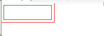
<!DOCTYPE html>
<html>
<head>
<meta charset="utf-8">
<title>菜鸟教程(runoob.com)</title>
<style>
 div{
	border:2px solid #008000;
	width:200px;
	height: 60px;
	outline: 2px solid #FF0000;
	outline-offset: 10px;
 }
</style>
</head>
<body>
<div> </div>
</body>
</html>
剩下的之后写
css3图片
缩略图---好像就是点击图片后,之后显示的就是一张图片一个网页
border属性创建缩略图


<a target="_blank" href="img/88.jpeg">
<img src="img/88.jpeg">
</a>精髓,其他都可以不写
<!DOCTYPE html>
<html>
<head>
<meta charset="utf-8">
<title></title>
<style>
 a{
	 display: inline-block;
	 border: 1px solid #FFFF00;
	 border-radius: 5px;
	 transition: 0.3s;
 }

</style>
</head>
<body>
<a target="_blank" href="img/88.jpeg">
	<img src="img/88.jpeg">
</a>
</body>
</html>
响应式图片
响应式图片会自动适配各种尺寸的屏幕
如果需要自由缩放图片,图片放大的尺寸不大于其原始的最大值
img{
max-width: 100%;
height: auto;
}
图片文本
可以通过position来定位
图片滤镜
filter属性为元素添加可视效果 例如模糊与饱和度
filter blur (px)高斯模糊
grayscale(%) 将图像转为灰度图像
opacity(%) 转化图片透明度
contrast(%) 调整图像的对比度
brightness(%) 看起来更亮或更暗
等 这些在css属性滤镜属性里
<!DOCTYPE html>
<html>
<head>
<meta charset="utf-8">
<title></title>
<style>
img{
	filter:grayscale(50%);

}
</style>
</head>
<body>
<a target="_blank" href="img/88.jpeg" >
	<img src="img/88.jpeg">
</a>
</body>
</html>
图片模态 Modal
这个感觉跟缩略图很像,不过用了js


<!DOCTYPE html>
<html>
<head>
<meta charset="utf-8">
<title></title>
<style>
#myimg{
	border-radius: 5px;
	cursor: pointer;
	transition: 0.3s;
}
#myimg:hover{
	opacity: 0.7;
}
.modal{
	display: none;
	position: fixed;
	z-index:1;
	padding-top: 100px;
	left:0;
	top:0;
	width:100%;
	height:100%;
	overflow: auto;
	background-color: rgb(0,0,0);
	background-color: rgba(0,0,0,0.9);
}
.modal-content{
	margin: auto;
	display: block;
	width:80%;
	max-width: 700px;
}
#caption{
	margin: auto;
	display: block;
	width:80%;
	max-width: 700px;
	text-align: center;
	color: #ccc;
	padding:10px 0;
	height: 150px;
}
.modal-content,#caption{
	animation-name:zoom;
	animation-duration: 0.6s;

}
@keyframes zoom{
	from{transform: scale(0.1);}
	to{transform: scale(1);}
}
.close{
    position: absolute;
	top:15px;
	right:35px;
	color: #f1f1f1;
	font-size: 40px;
	font-weight: bold;
	transition: 0.3s;

}
.close:hover,.close:focus{
	color: red;
	text-decoration: none;
	cursor: pointer;
}
@media only screen and (max-width:700px){
	.modal-content{
		width:100%;
	}
}
</style>
</head>
<body>
<img id="myimg" src="img/11.jpg" width="300px" height="300px">
<div id="myModel" class="modal">
	<span class="close">X</span>
	<img class="modal-content" id="img01">
	<div id="caption"></div>
</div>
<script>
//获取模态窗口
var modal=document.getElementById('myModel');
//获取图片模态框,alt属性做为图片弹出中文本描述
var img=document.getElementById('myimg');
var modalImg=document.getElementById('img01');
var captionText=document.getElementById("caption");
img.onclick=function(){
	modal.style.display="block";
	modalImg.src=this.src;
	modalImg.alt=this.alt;
	captionText.innerHTML=this.alt;
}
//获取span元素,设置关闭模态框按钮
var span =document.getElementsByClassName('close')[0];
//点击<span>元素上的x 关闭模态框
span.onclick=function(){
	modal.style.display="none";
}
</script>
</body>
</html>
css3按钮
background-color 设置按钮颜色
<!DOCTYPE html>
<html>
<head>
<meta charset="utf-8">
<title></title>
<style>
button{
	background-color: #BDB76B;
	border-radius: 5px;
	border:none;
	width:70px;
	height:40px;

}
</style>
</head>
<body>
<button>糖果</button>
</body>
</html>
font-size 设置按钮文字大小

<!DOCTYPE html>
<html>
<head>
<meta charset="utf-8">
<title></title>
<style>
button{
	background-color: #BDB76B;
	border-radius: 5px;
	border:none;
    font-size: 20px;

}
</style>
</head>
<body>
<button>糖果</button>
</body>
</html>
border-radius 设置按钮圆角大小
<!DOCTYPE html>
<html>
<head>
<meta charset="utf-8">
<title></title>
<style>
button{
	background-color: #BDB76B;
	border-radius: 5px;
	border:none;
    font-size: 20px;

}
</style>
</head>
<body>
<button>糖果</button>
</body>
</html>
border 边框颜色
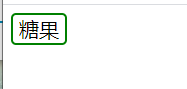
<!DOCTYPE html>
<html>
<head>
<meta charset="utf-8">
<title></title>
<style>
button{
	background-color: white;
	border-radius: 5px;
	border:2px solid green;
    font-size: 20px;

}
</style>
</head>
<body>
<button>糖果</button>
</body>
</html>
鼠标悬停
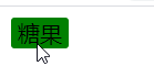
<!DOCTYPE html>
<html>
<head>
<meta charset="utf-8">
<title></title>
<style>
button{
	background-color: white;
	border-radius: 5px;
	border:2px solid green;
/* 他可以设置hover效果的速度 */
        font-size: 20px;
	transition-duration: 0.4s;
}
button:hover{
	background-color: #008000;
	border:2px solid white;
}
</style>
</head>
<body>
<button>糖果</button>
</body>
</html>
按钮阴影 box-shadow
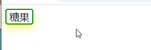
<!DOCTYPE html>
<html>
<head>
<meta charset="utf-8">
<title></title>
<style>
button{
	background-color: white;
	border-radius: 5px;
	border:2px solid green;
    font-size: 20px;
    box-shadow:0 8px 16px 0 rgba(255,255,0,0.5);
}

</style>
</head>
<body>
<button>糖果</button>
</body>
</html>
禁用按钮
可以使用opacity属性为按钮增加透明度,看起来类似disable属性效果
添加cursor属性并设置not-allowed设置禁用图片
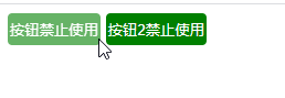
<!DOCTYPE html>
<html>
	<head>
		<meta charset="utf-8">
		<title></title>
		<style>
		.button{
			background-color: green;
			border: none;
			color:white;
			text-align: center;
			display: inline-block;
			border-radius: 4px;
			padding: 6px 2px;
		}
		.disabled{
			/* 给这个不能用的按钮加个颜色 */
			opacity: 0.6;
		}
		</style>
	</head>
	<body>
		<button class="button disabled">按钮禁止使用</button>
		<button class="button ">按钮2禁止使用</button>
	</body>
</html>
按钮宽度
按钮宽度一般由文本内容觉得。可以使用width属性设置按钮宽度。
值可以是固定值,也可以是百分比。
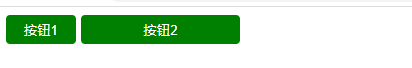
<!DOCTYPE html>
<html>
	<head>
		<meta charset="utf-8">
		<title></title>
		<style>
		button{
			background-color: green;
			border: none;
			color:white;
			text-align: center;
			display: inline-block;
			border-radius: 4px;
			padding: 6px 2px;
		}
		.button1{
			width: 70px;
		}
		.button2{
			width:10%;
		}
		</style>
	</head>
	<body>
		<button class="button1">按钮1</button>
		<button class="button2">按钮2</button>
	</body>
</html>
按钮组
移除外边距并添加float:left
<!DOCTYPE html>
<html>
	<head>
		<meta charset="utf-8">
		<title></title>
		<style>
		button{
			background-color: green;
			border: none;
			color:white;
			text-align: center;
			display: inline-block;
			border-radius: 4px;
			padding: 6px 6px;
			float: left;
		}

		</style>
	</head>
	<body>
		<button class="button1">按钮1</button>
		<button class="button2">按钮2</button>
		<button class="button3">按钮3</button>
		<button class="button4">按钮4</button>
	</body>
</html>
按钮动画
<!DOCTYPE html>
<html>
	<head>
		<meta charset="utf-8">
		<title></title>
		<style>
		button{
			background-color: green;
			border: none;
			color:white;
			text-align: center;
			display: inline-block;
			border-radius: 4px;
			padding: 10px 40px;
			float: left;
			transition: all 0.5s;
		}
		button span{
			display: inline-block;
			position: relative;
			transition: 0.5s;
		}
		button span:after{
			content: '❀❀';
			position: absolute;
			opacity: 0;
			top:0,
			right:-20px;
			transition: 0.5s;
			color: coral;
		}
		button:hover span{
			padding-right: 40px;
		}
		button:hover span:after{
			opacity: 1;
			right: 0;
		}
		</style>
	</head>
	<body>
		<button class="button1">
			<span>按钮</span></button>
	</body>
</html>
我很美效果没出来
<!DOCTYPE html>
<html>
	<head>
		<meta charset="utf-8">
		<title></title>
		<style>
		button{
			position: relative;
			background-color: green;
			border: none;
			color:white;
			text-align: center;
			display: inline-block;
			border-radius: 4px;
			padding: 10px 40px;
			transition-duration: 0.5s;
			text-decoration: none;
			overflow: hidden;
		}
		button :after{
			content: '';
			background-color: coral;
			display: block;
			position: absolute;
			padding-top: 300%;
			padding-left: 350%;
			margin-top: -120%;
			margin-left: -20px!important;
			opacity: 0;
			transition: all 0.8s;
		}
		button:active:after{
			padding:0;
			margin: 0;
			opacity: 1;
			transition: 0s;
		}

		</style>
	</head>
	<body>
		<button>我很美</button>
	</body>
</html>
<!DOCTYPE html>
<html>
	<head>
		<meta charset="utf-8">
		<title></title>
		<style>
		button{
			position: relative;
			background-color: green;
			border: none;
			color:white;
			text-align: center;
			display: inline-block;
			border-radius: 4px;
			padding: 10px 40px;
			transition-duration: 0.5s;
			text-decoration: none;
			overflow: hidden;
			box-shadow: 0 9px cornflowerblue;
		}
		button :hover{
			background-color: #FFFF00;
		}
		button:active{
			background-color:#FFFF00;
			box-shadow: 0 5px papayawhip;
			transform: translateY(4px);
		}

		</style>
	</head>
	<body>
		<button>我最美</button>
	</body>
</html>
css3分页
分页骨架
如果你的网站有很多个页面。可以使用分页为每个页面做导航。
<!DOCTYPE html>
<html>
	<head>
		<meta charset="utf-8">
		<title></title>
		<style>
	    ul.pagination{
			display: inline-block;
			padding: 0;
			margin: 0;
		}
		ul.pagination li{
			display: inline;
		}
		ul.pagination li a{
			color: black;
			float: left;
			padding: 8px 16px;
			text-decoration: none;
		}
		</style>
	</head>
	<body>
	<ul class="pagination">
		<li><a href="#"><<</a></li>
		<li><a href="#">1</a></li>
		<li><a class="active" href="#">2</a></li>
		<li><a href="#">3</a></li>
		<li><a href="#">4</a></li>
		<li><a href="#">5</a></li>
		<li><a href="#">6</a></li>
		<li><a href="#">7</a></li>
		<li><a href="#">>></a></li>
	</ul>
	</body>
</html>
鼠标悬停过渡-----效果未完成 2也应该是亮着的
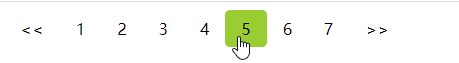
<!DOCTYPE html>
<html>
	<head>
		<meta charset="utf-8">
		<title></title>
		<style>
	    ul.pagination{
			display: inline-block;
			padding: 0;
			margin: 0;
		}
		ul.pagination li{
			display: inline;
		}
		ul.pagination li a{
			color: black;
			float: left;
			padding: 8px 16px;
			text-decoration: none;
			border-radius: 5px;
                        transition: background-color .3s;
		}
		//鼠标悬停
		/* 这个又失效了,不知道为什么 */
	 ul.pagination li a.active{
		background-color: green;
		border-radius: 5px;
		}

		ul.pagination li a:hover:not(.active){
			background-color: yellowgreen;
		}
		</style>
	</head>
	<body>
	<ul class="pagination">
		<li><a href="#"><<</a></li>
		<li><a href="#">1</a></li>
		<li><a class="active" href="#">2</a></li>
		<li><a href="#">3</a></li>
		<li><a href="#">4</a></li>
		<li><a href="#">5</a></li>
		<li><a href="#">6</a></li>
		<li><a href="#">7</a></li>
		<li><a href="#">>></a></li>
	</ul>
	</body>
</html>
边框分页
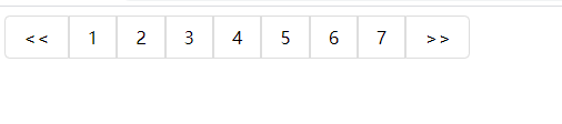
<!DOCTYPE html>
<html>
	<head>
		<meta charset="utf-8">
		<title></title>
		<style>
	    ul.pagination{
			display: inline-block;
			padding: 0;
			margin: 0;
		}
		ul.pagination li{
			display: inline;
		}
		ul.pagination li a{
			color: black;
			float: left;
			padding: 8px 16px;
			text-decoration: none;
			transition: background-color .3s;
			border: 1px solid #ddd;
		}
		//鼠标悬停
		/* 这个又失效了,不知道为什么 */
	 ul.pagination li a.active{
		background-color: green;
		}

		ul.pagination li a:hover:not(.active){
			background-color: yellowgreen;
		}
		.pagination li:first-child a {
		    border-top-left-radius: 5px;
		    border-bottom-left-radius: 5px;
		}

		.pagination li:last-child a {
		    border-top-right-radius: 5px;
		    border-bottom-right-radius: 5px;
		}
		</style>
	</head>
	<body>
	<ul class="pagination">
		<li><a href="#"><<</a></li>
		<li><a href="#">1</a></li>
		<li><a class="active" href="#">2</a></li>
		<li><a href="#">3</a></li>
		<li><a href="#">4</a></li>
		<li><a href="#">5</a></li>
		<li><a href="#">6</a></li>
		<li><a href="#">7</a></li>
		<li><a href="#">>></a></li>
	</ul>
	</body>
</html>
分页间隔
用margin属性为每个页码添加空格
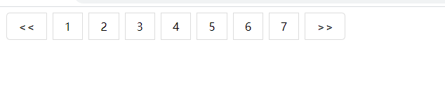
<!DOCTYPE html>
<html>
	<head>
		<meta charset="utf-8">
		<title></title>
		<style>
	    ul.pagination{
			display: inline-block;
			padding: 0;
			margin: 0;
		}
		ul.pagination li{
			display: inline;
		}
		ul.pagination li a{
			color: black;
			float: left;
			padding: 8px 16px;
			text-decoration: none;
			transition: background-color .3s;
			border: 1px solid #ddd;
			/* 添加间隔 */
			margin: 0 4px;
		}
		//鼠标悬停
		/* 这个又失效了,不知道为什么 */
	 ul.pagination li a.active{
		background-color: green;
		}

		ul.pagination li a:hover:not(.active){
			background-color: yellowgreen;
		}
		.pagination li:first-child a {
		    border-top-left-radius: 5px;
		    border-bottom-left-radius: 5px;
		}

		.pagination li:last-child a {
		    border-top-right-radius: 5px;
		    border-bottom-right-radius: 5px;
		}
		</style>
	</head>
	<body>
	<ul class="pagination">
		<li><a href="#"><<</a></li>
		<li><a href="#">1</a></li>
		<li><a class="active" href="#">2</a></li>
		<li><a href="#">3</a></li>
		<li><a href="#">4</a></li>
		<li><a href="#">5</a></li>
		<li><a href="#">6</a></li>
		<li><a href="#">7</a></li>
		<li><a href="#">>></a></li>
	</ul>
	</body>
</html>
分页居中
可以在包含它的元素容器上添加text-align:center
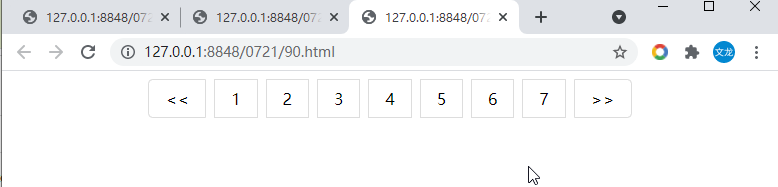
<!DOCTYPE html>
<html>
	<head>
		<meta charset="utf-8">
		<title></title>
		<style>
		body{
			text-align: center;
		}
	    ul.pagination{
			display: inline-block;
			padding: 0;
			margin: 0;
		}
		ul.pagination li{
			display: inline;
		}
		ul.pagination li a{
			color: black;
			float: left;
			padding: 8px 16px;
			text-decoration: none;
			transition: background-color .3s;
			border: 1px solid #ddd;
			/* 添加间隔 */
			margin: 0 4px;
		}
		//鼠标悬停
		/* 这个又失效了,不知道为什么 */
	 ul.pagination li a.active{
		background-color: green;
		}

		ul.pagination li a:hover:not(.active){
			background-color: yellowgreen;
		}
		.pagination li:first-child a {
		    border-top-left-radius: 5px;
		    border-bottom-left-radius: 5px;
		}

		.pagination li:last-child a {
		    border-top-right-radius: 5px;
		    border-bottom-right-radius: 5px;
		}
		</style>
	</head>
	<body>
	<ul class="pagination">
		<li><a href="#"><<</a></li>
		<li><a href="#">1</a></li>
		<li><a class="active" href="#">2</a></li>
		<li><a href="#">3</a></li>
		<li><a href="#">4</a></li>
		<li><a href="#">5</a></li>
		<li><a href="#">6</a></li>
		<li><a href="#">7</a></li>
		<li><a href="#">>></a></li>
	</ul>
	</body>
</html>
面包导航

<!DOCTYPE html>
<html>
	<head>
		<meta charset="utf-8">
		<title></title>
		<style>
		ul.breadcrum{
			padding:8px 16px;
			list-style: none;
			background-color: #eee;
		}
		ul.breadcrum li{
			display: inline;
		}
		ul.breadcrum li+li::before{
			padding: 8px;
			color: black;
			content: "/\00a0";
		}
		ul.breadcrum li a{
			color: green;
		}
		</style>
	</head>
	<body>
	<ul class="breadcrum">
		<li><a href="#">首页</a></li>
		<li><a href="#">前端</a></li>
		<li><a href="#">HTML教程</a></li>
		<li>HTML段落</a></li>
	</ul>
	</body>
</html>
css3弹性盒子
弹性盒子是css3的一种新的布局模式。
当页面需要适应不同的屏幕大小以及设备类型时确保元素拥有恰当的行为的布局方式。
引入弹性布局模型的目的是提供一种更加有效的方式来对一个容器中的子元素进行排列、对齐和分配空白空间。
css3弹性盒子内容
弹性盒子由弹性容器和弹性子元素组成。
弹性容器:flex container
弹性子元素 flex item
弹性容器设置display属性值为flex或inline-flex将其定义为弹性容器。
弹性容器内包含了一个或多个弹性子元素。
弹性容器外及弹性子元素内是正常渲染的。
弹性盒子只定义了弹性子元素如何在弹性容器内布局。
弹性子元素通常在弹性盒子内一行显示。
默认每个容器只有一行。

<!DOCTYPE html>
<html>
	<head>
		<meta charset="utf-8">
		<title></title>
		<style>
	.container{
		display: flex;
		width:600px;
		height: 200px;
		background-color: chocolate;
	}
	.item{
		background-color: coral;
		width: 100px;
		height: 100px;
		/* 这里的margin用来分开子div */
		margin: 10px;
	}
		</style>
	</head>
	<body>
	<div class="container">
		<div class="item"></div>
		<div class="item"></div>
		<div class="item"></div>
	</div>
	</body>
</html>
flex-direction属性决定子元素的排列方向 是横着排还是竖着排
写在父元素css中
row 左对齐 默认排列方式 横排
row-reverse 右对齐 横排
column 上对齐 竖排
column-reverse 下对齐 竖排
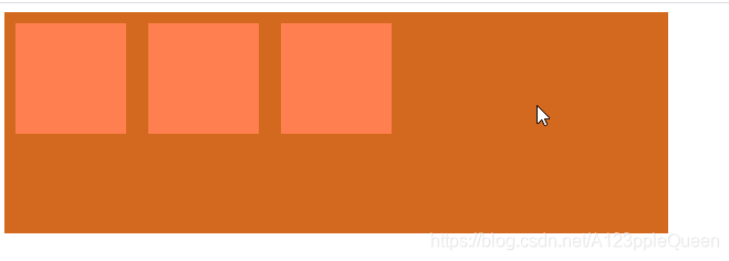
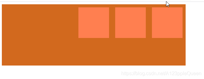
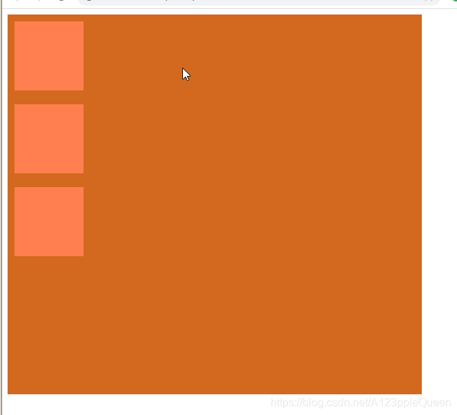
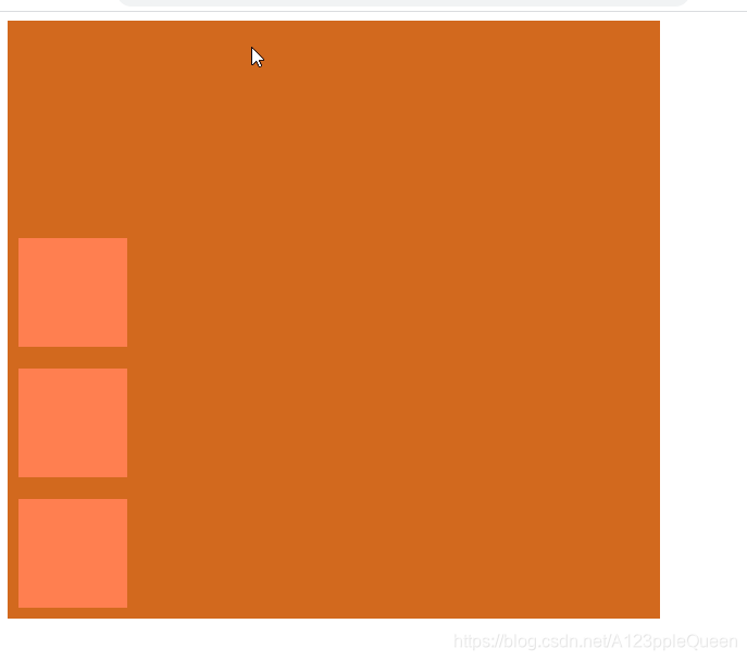
<!DOCTYPE html>
<html>
	<head>
		<meta charset="utf-8">
		<title></title>
		<style>
	.container{
		display: flex;
		width:600px;
		/* height:300px */
		height: 550px;
		background-color: chocolate;
		/* flex-direction: row;
		flex-direction: row-reverse;
		flex-direction: column; */
		flex-direction: column-reverse;
	}
	.item{
		background-color: coral;
		width: 100px;
		height: 100px;
		/* 这里的margin用来分开子div */
		margin: 10px;
	}
		</style>
	</head>
	<body>
	<div class="container">
		<div class="item"></div>
		<div class="item"></div>
		<div class="item"></div>
	</div>
	</body>
</html>
justify-content 定义弹性项沿着弹性容器的主轴线(main axis)对齐。
flex-start 向
弹性项目向行头紧挨着填充。第一个的main-strat外边距线被放在该行的main-strat边线,后面的依次平齐摆放
flex-end
弹性项目向行尾紧挨着填充。第一个的main-strat外边距线被放在该行的main-end边线,后面的依次平齐摆放
center
弹性项目居中紧挨着填充。(如果剩余的自由空间是负的,则弹性项目将在两个方向上同时溢出)。
space-between
弹性项目平均的分布在该行上,如果剩余空间为负或者只有一个弹性项,则该值等同于flex-start。否则,第一个的main-strat外边距线被放在该行的main-end边线对齐,最后一个的main-
strat外边距线被放在该行的main-end边线对齐,剩余的弹性项分布在该行上,相邻项目间隔相等。
space-around
弹性项目平均的分布在该行上,两边留有一半的间隔空间。如果剩余空间为负或者只有一个弹性项,则该值等于center.否则,弹性项目沿该行分布,且彼此间隔相等。同时首尾两边和弹性容器之间留有一半的间隔。
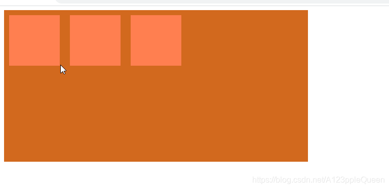
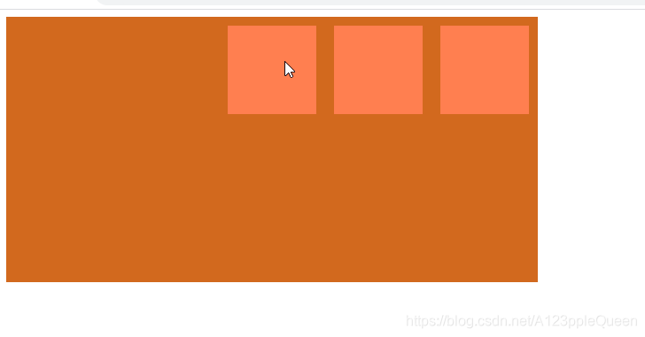
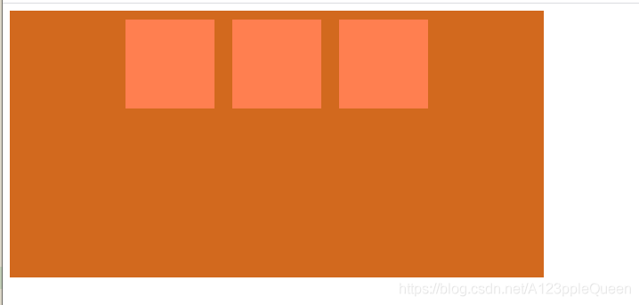
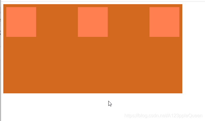
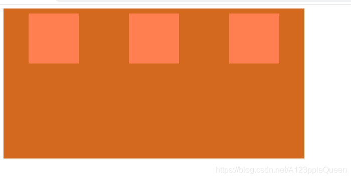
<!DOCTYPE html>
<html>
	<head>
		<meta charset="utf-8">
		<title></title>
		<style>
	.container{
		display: flex;
		width:600px;
		height: 300px;
		background-color: chocolate;
		/* justify-content: flex-start; */
	   /* justify-content: flex-end; */
    	/* justify-content:center; */
    	/* justify-content: space-between; */
		justify-content: space-around;
	}
	.item{
		background-color: coral;
		width: 100px;
		height: 100px;
		/* 这里的margin用来分开子div */
		margin: 10px;
	}
		</style>
	</head>
	<body>
	<div class="container">
		<div class="item"></div>
		<div class="item"></div>
		<div class="item"></div>
	</div>
	</body>
</html>
align-items属性 弹性盒子元素在侧轴(纵轴)方向上的对齐方式。
flex-start 弹性盒子元素的侧轴/纵轴起始位置的边界紧靠住该行的侧轴起始边界。
flex-end 弹性盒子元素的侧轴/纵轴起始位置的边界紧靠住该行的侧轴结束边界。
center 弹性盒子元素在该行的侧轴/纵轴上居中放置。如果该行的尺寸小于弹性盒子元素的尺寸,则向两个方向溢出相同的长度
baseline 弹性盒子元素的行内轴与侧轴为同一条,则改值与flex-start等效。其他情况下,改值与基线对齐。
stretch 如果指定侧轴大小的属性值为auto,则其值会使项目的边距盒的尺寸尽可能接近所在行的尺寸,但同时会遵守min/max-width/height属性的限制
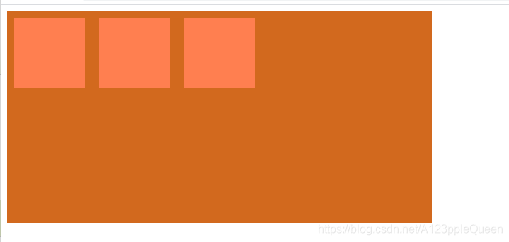
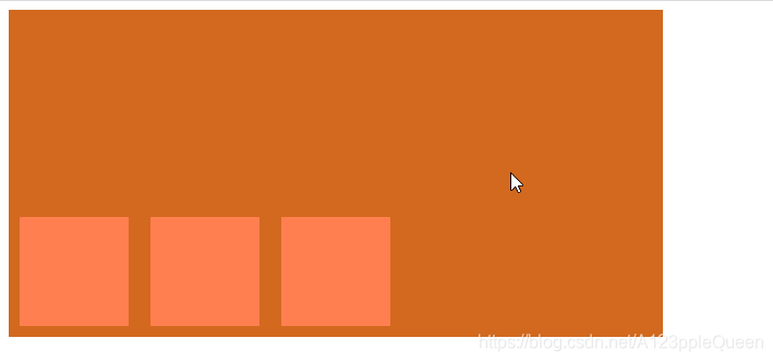
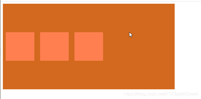
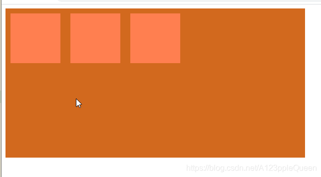
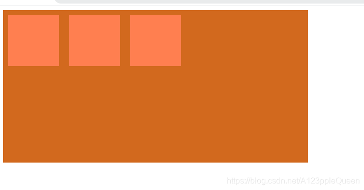
flex-wrap属性 是否换行
flex-wrap属性用于指定弹性盒子的子元素换行方式
no-wrap 默认,弹性容器为单行。该情况下弹性子项可能会溢出容器
wrap 弹性容器为多行。该情况下弹性子项目溢出的部分会被放置到新行,子项内部会发生断行。
wrap-reverse --反转wrap排列
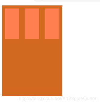
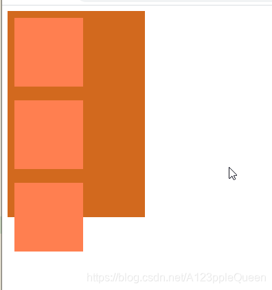
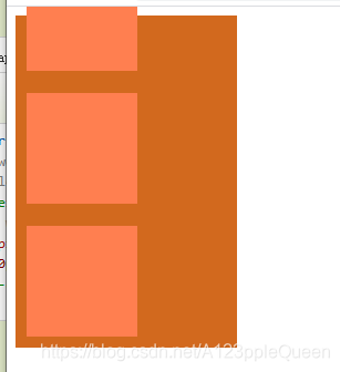
<!DOCTYPE html>
<html>
	<head>
		<meta charset="utf-8">
		<title></title>
		<style>
	.container{
		display: flex;
		width:200px;
		height: 300px;
		background-color: chocolate;
		/* flex-wrap: nowrap; */
		/* flex-wrap: wrap; */
		flex-wrap: wrap-reverse;
	}
	.item{
		background-color: coral;
		width: 100px;
		height: 100px;
		/* 这里的margin用来分开子div */
		margin: 10px;
	}
		</style>
	</head>
	<body>
	<div class="container">
		<div class="item"></div>
		<div class="item"></div>
		<div class="item"></div>
	</div>
	</body>
</html>
align-content属性 多行交叉轴的对齐
align-content属性用于修改flex-wrap属性的行为。类似于align-items,但他不是设置弹性子元素的对齐,而是设置各个行的对齐。
stretch 默认。各行将会伸展以占用剩余的空间
flex-start 各行向弹性盒容器的起始位置堆叠
flex-end 各行向弹性盒容器的结束位置堆叠
center 各行向弹性盒容器的中间位置堆叠
space-between 各行向弹性盒容器中平均分布
space-around 各行在弹性盒容器中平均分布,两端保留子元素与子元素之间间距大小的一半。
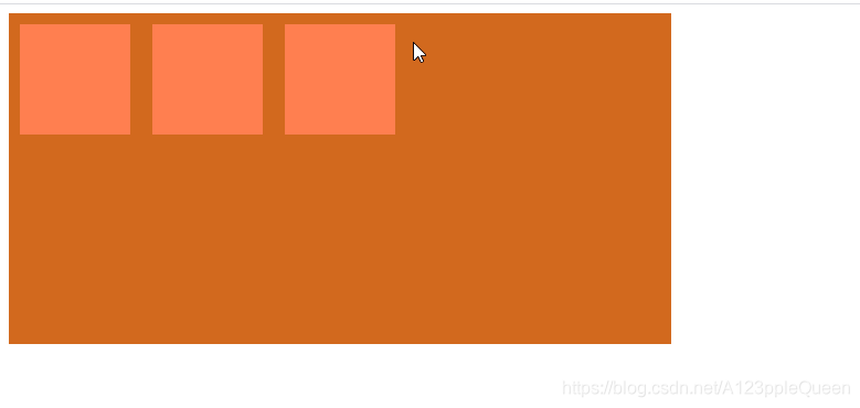
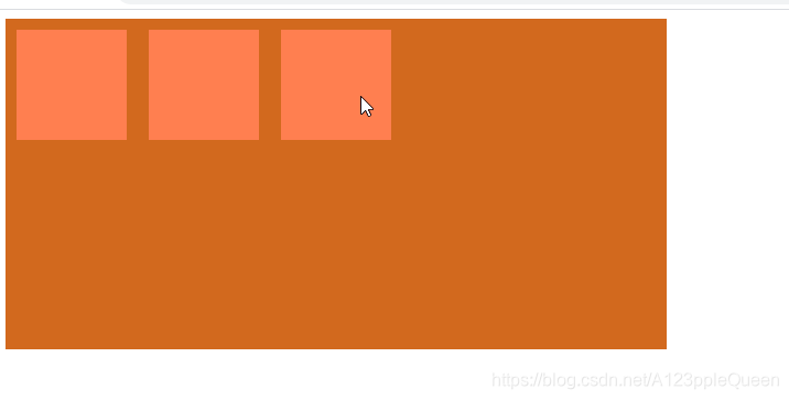
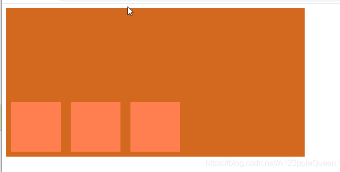
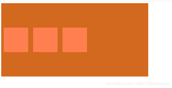
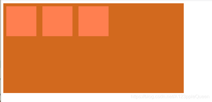
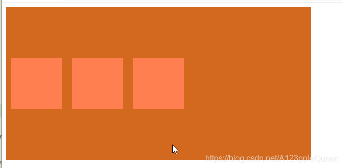
<!DOCTYPE html>
<html>
	<head>
		<meta charset="utf-8">
		<title></title>
		<style>
	.container{
		display: flex;
		width:600px;
		height: 300px;
		background-color: chocolate;
	    flex-wrap: wrap;
		/* 	align-content: stretch; */
		/* align-content: flex-start; */
		/* 	align-content: flex-end; */
		/* 	align-content: center; */
		/* align-content: space-between; */
		 align-content: space-around;
	}
	.item{
		background-color: coral;
		width: 100px;
		height: 100px;
		/* 这里的margin用来分开子div */
		margin: 10px;
	}
		</style>
	</head>
	<body>
	<div class="container">
		<div class="item"></div>
		<div class="item"></div>
		<div class="item"></div>
	</div>
	</body>
</html>
弹性子元素属性
排序 order
order属性设置弹性容器子元素属性
用整数值来定义排列顺序,数值小的排在前面。可以为负值。
一个值时,推荐用-1

<!DOCTYPE html>
<html>
	<head>
		<meta charset="utf-8">
		<title></title>
		<style>
	.container{
		display: flex;
		width:600px;
		height: 300px;
		background-color: chocolate;
	    flex-wrap: wrap;
	}
	.item{
		background-color: coral;
		width: 100px;
		height: 100px;
		/* 这里的margin用来分开子div */
		margin: 10px;
	}
	/* 属性选择器 class有几个值时,用~=才有效 =无效 */
	[class~=two]{
		/* 一个值时 用-1 */
		order:-1;
	}
		</style>
	</head>
	<body>
	<div class="container">
		<div class="item">11</div>
		<div class="item two" >22</div>
		<div class="item">33</div>
	</div>
	</body>
</html>
弹性盒子margin auto没写
align-self 弹性元素自身在侧轴/纵轴方向上的对齐方式
auto 如果align-self的值为auto,那么计算值为元素的父元素的align-item值,如果没有父元素,计算值就为stretch
flex-start 弹性盒子元素的侧轴/纵轴起始位置的边界紧靠住该行的侧轴起始边界。
flex-end 弹性盒子元素的侧轴/纵轴起始位置的边界紧靠住该行的侧轴结束边界。
center 弹性盒子元素在该行的侧轴/纵轴上居中放置。如果该行的尺寸小于弹性盒子元素的尺寸,则向两个方向溢出相同的长度
baseline弹性盒子元素的行内轴与侧轴为同一条,则改值与flex-start等效。其他情况下,改值与基线对齐。
stretch 如果指定侧轴大小的属性值为auto,则其值会使项目的边距盒的尺寸尽可能接近所在行的尺寸,但同时会遵守min/max-width/height属性的限制

<!DOCTYPE html>
<html>
	<head>
		<meta charset="utf-8">
		<title></title>
		<style>
	.container{
		display: flex;
		width:900px;
		height: 300px;
		background-color: chocolate;
	    flex-wrap: wrap;
	}
	.item{
		background-color: coral;
		width: 100px;
		height: 100px;
		/* 这里的margin用来分开子div */
		margin: 10px;
	}
	.item11{
		align-self:flex-start ;
	}
	.item22{
		align-self:flex-end ;
	}
	.item33{
		align-self:center ;
	}
	.item44{
		align-self:baseline ;
	}
	.item55{
		align-self:stretch ;
	}
	.item66{
		align-self:auto ;
	}
		</style>
	</head>
	<body>
	<div class="container">
		<div class="item item11"> flex-start </div>
		<div class="item item22"> flex-end</div>
		<div class="item item33"> center</div>
		<div class="item item44"> baseline</div>
		<div class="item item55"> stretch</div>
		<div class="item item66"> auto</div>
	</div>
	</body>
</html>
flex 属性用于指定弹性子元素如何分配空间
flex属性是 flex-grow flex-shrink flex-basis 的简写,默认值为0 1 auto
flex-grow 定义子元素的放大比例
flex-shrink 定义子元素的缩小比例
flex-basis 定义子元素的宽度
auto 计算值为1 1 auto

<!DOCTYPE html>
<html>
	<head>
		<meta charset="utf-8">
		<title></title>
		<style>
	.container{
		display: flex;
		width:900px;
		height: 300px;
		background-color: chocolate;
	    flex-wrap: wrap;
	}
	.item{
		background-color: coral;
		width: 100px;
		height: 100px;
		/* 这里的margin用来分开子div */
		margin: 10px;
	}
	.item11{
		flex:auto;
	}
	.item22{
		flex:auto;
	}
	.item33{
		flex:auto;
	}

		</style>
	</head>
	<body>
	<div class="container">
		<div class="item item11"></div>
		<div class="item item22"></div>
		<div class="item item33"> </div>

	</div>
	</body>
</html>
initial 计算值为0 1 auto

<!DOCTYPE html>
<html>
	<head>
		<meta charset="utf-8">
		<title></title>
		<style>
	.container{
		display: flex;
		width:900px;
		height: 300px;
		background-color: chocolate;
	    flex-wrap: wrap;
	}
	.item{
		background-color: coral;
		width: 100px;
		height: 100px;
		/* 这里的margin用来分开子div */
		margin: 10px;
	}
	.item11{
		flex:initial;
	}
	.item22{
		flex:initial;
	}
	.item33{
		flex:initial;
	}

		</style>
	</head>
	<body>
	<div class="container">
		<div class="item item11"></div>
		<div class="item item22"></div>
		<div class="item item33"> </div>
	</div>
	</body>
</html>
none 计算值为0 0 auto

<!DOCTYPE html>
<html>
	<head>
		<meta charset="utf-8">
		<title></title>
		<style>
	.container{
		display: flex;
		width:900px;
		height: 300px;
		background-color: chocolate;
	    flex-wrap: wrap;
	}
	.item{
		background-color: coral;
		width: 100px;
		height: 100px;
		/* 这里的margin用来分开子div */
		margin: 10px;
	}
	.item11{
		flex:none;
	}
	.item22{
		flex:none;
	}
	.item33{
		flex:none;
	}
		</style>
	</head>
	<body>
	<div class="container">
		<div class="item item11"></div>
		<div class="item item22"></div>
		<div class="item item33"> </div>
	</div>
	</body>
</html>
inherit 从父元素继承

<!DOCTYPE html>
<html>
	<head>
		<meta charset="utf-8">
		<title></title>
		<style>
	.container{
		display: flex;
		width:900px;
		height: 300px;
		background-color: chocolate;
	    flex-wrap: wrap;
	}
	.item{
		background-color: coral;
		width: 100px;
		height: 100px;
		/* 这里的margin用来分开子div */
		margin: 10px;
	}
	.item11{
		flex:inherit;
	}
	.item22{
		flex:inherit;
	}
	.item33{
		flex:inherit;
	}
		</style>
	</head>
	<body>
	<div class="container">
		<div class="item item11"></div>
		<div class="item item22"></div>
		<div class="item item33"> </div>
	</div>
	</body>
</html>
<!DOCTYPE html>
<html>
	<head>
		<meta charset="utf-8">
		<title></title>
		<style>
	.container{
		display: flex;
		width:900px;
		height: 300px;
		background-color: chocolate;
	    flex-wrap: wrap;
	}
	.item{
		background-color: coral;
		width: 100px;
		height: 100px;
		/* 这里的margin用来分开子div */
		margin: 10px;
	}
	.item11{
		flex:2;
	}
	.item22{
		flex:1;
	}
	.item33{
		flex:2;
	}
		</style>
	</head>
	<body>
	<div class="container">
		<div class="item item11"></div>
		<div class="item item22"></div>
		<div class="item item33"> </div>
	</div>
	</body>
</html>
flex属性是 flex-grow flex-shrink flex-basis的语法糖--简写
flex-flow 是 flex-direction flex-wrap的语法糖
css3多媒体查询
css3多媒体查询继承了css2多媒体类型的所有思想,取消了查找设备的类型,css根据设置自适应显示。
媒体查询可以检测的事情
viewport(视窗)的宽度与高度
设备的宽度与高度
朝向(智能手机横屏,竖屏)
分辨率
多媒体查询语法
多媒体查询由多种媒体类型组成,可以包含一个或多个表达式,表达式根据条件是否成立返回true/false
@media not|only mediatype and (expressions){
css代码
}not 排除掉某些特定的设备。eg;@media not print(非打印设备)
only 用来定某种特别的媒体类型。
all 所有设备
css3多媒体类型
all 用于所有多媒体类型设备
print 用于打印机
screen 用于电脑屏幕,平板,智能手机等
speech 用于屏幕阅读器
css3 @media查询
css3多媒体查询简单例子


<!DOCTYPE html>
<html>
	<head>
		<meta charset="utf-8">
		<title></title>
		<style>
		body{
			background-color: pink;
		}
		@media screen and (max-width:600px){
			body{
				background-color: plum;
			}
		}
		</style>
	</head>
	<body>
		<div>发工资!!!!!!!!!!!!!!!!!</div>
	</body>
</html>


<!DOCTYPE html>
<html>
<head>
<meta name="viewport" content="width=device-width, initial-scale=1.0">
<meta charset="utf-8">
<title></title>
<style>
div{
	background-color: yellow;
	padding: 20px;
}
@media screen and (max-width:600px) {
	div{
		display: none;
	}
}
</style>
</head>
<body>

<div></div>
</body>
</html>
css3多媒体查询实例
1.原代码

<!DOCTYPE html>
<html>
	<head>
		<meta charset="utf-8">
		<title></title>
		<style>
		ul{
			list-style-type:none;
		}
		ul li a{
			color:green;
			text-decoration: none;
			padding: 3px;
			display: block;
		}
		</style>
	</head>
	<body>
		<ul>
			<!--  在 HTML 中我们可以使用带 data- 前缀的属性来存储信息。  -->
			<li><a data-email="johndoe@example.come" href="mailto:johndoe@example.come">johe doe</a></li>
			<li><a data-email="marymoe@example.come" href="mailto:marymoe@example.come">mary moe</a></li>
		</ul>
	</body>
</html>
2. 宽在520-699px时,添加邮箱图标。
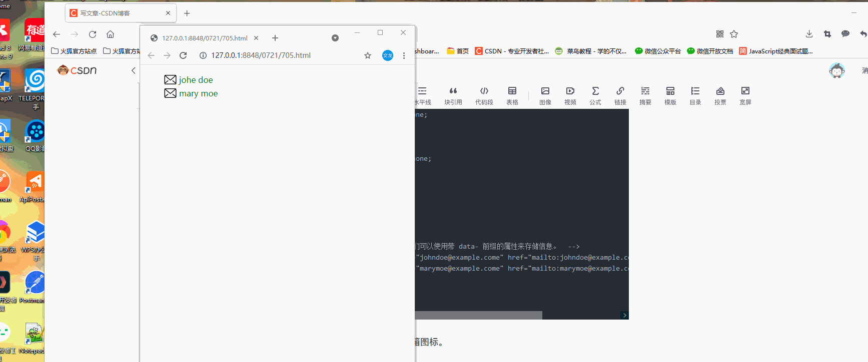
<!DOCTYPE html>
<html>
	<head>
		<meta charset="utf-8">
		<title></title>
		<style>
		ul{
			list-style-type:none;
		}
		ul li a{
			color:green;
			text-decoration: none;
			padding: 3px;
			display: block;
		}
		@media screen and (max-width:699px) and (min-width:520px){
			ul li a{
				padding-left: 30px;
			    background: url(img/888.png) left center no-repeat;
			    background-size: 25px;
			}
		}
		</style>
	</head>
	<body>
		<ul>
			<!--  在 HTML 中我们可以使用带 data- 前缀的属性来存储信息。  -->
			<li><a data-email="johndoe@example.come" href="mailto:johndoe@example.come">johe doe</a></li>
			<li><a data-email="marymoe@example.come" href="mailto:marymoe@example.come">mary moe</a></li>
		</ul>
	</body>
</html>
3.700 到 1000px - 添加文本前缀信息
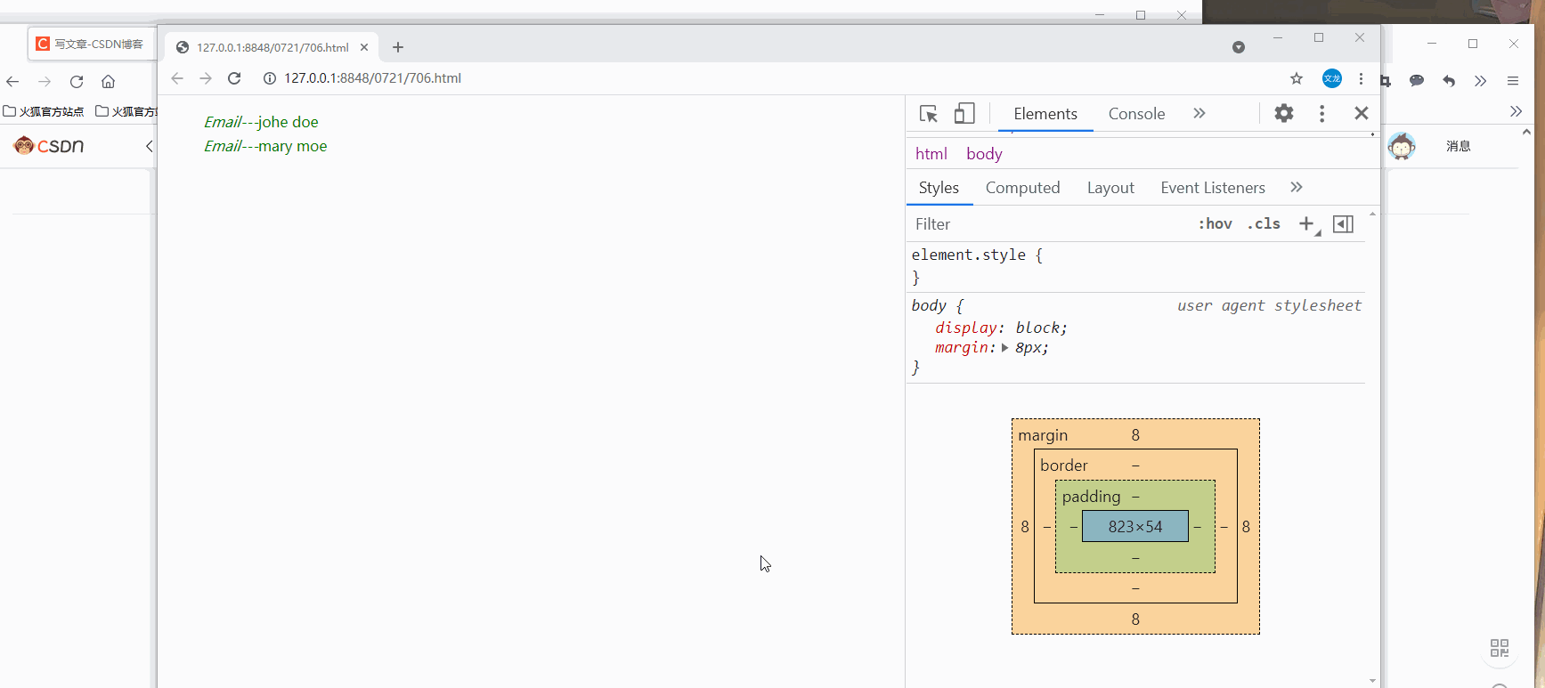
<!DOCTYPE html>
<html>
	<head>
		<meta charset="utf-8">
		<title></title>
		<style>
		ul{
			list-style-type:none;
		}
		ul li a{
			color:green;
			text-decoration: none;
			padding: 3px;
			display: block;
		}
		@media screen and (max-width:699px) and (min-width:520px){
			ul li a{
				padding-left: 30px;
				background: url(img/888.png) left center no-repeat;
				background-size: 25px;
			}
		}
		@media screen and (max-width:1000px) and (min-width:700px){
			ul li a::before{
				content: "Email---";
				font-style: italic;
				color:"#666666"
			}
		}
		</style>
	</head>
	<body>
		<ul>
			<!--  在 HTML 中我们可以使用带 data- 前缀的属性来存储信息。  -->
			<li><a data-email="johndoe@example.come" href="mailto:johndoe@example.come">johe doe</a></li>
			<li><a data-email="marymoe@example.come" href="mailto:marymoe@example.come">mary moe</a></li>
		</ul>
	</body>
</html>
4.大于 1001px 宽度 - 添加邮件地址

响应式web设计---viewport
什么是viewport
viewport是用户网页的可视区域。
手机浏览器是把页面放在一个虚拟的窗口中,通常这个虚拟窗口比屏幕宽,这样就不用把每个网页挤到没有很小的窗口中,用户可以通过平移和缩放来看网页的不同部分。
设置viewport
一个常用的针对移动网页优化过的页面的viewPort meta 标签大致如下
<meta name="viewport" content="width=device-width",initial-scale=1.0">
width:控制viewport的大小,可以指定值。宽度
height:控制viewport的大小,可以指定值。高度
initial-sacle:初始缩放比例,也是当页面第一次load的时候缩放比例
maximun-scale:允许用户缩放到的最大比例
minimun-scale:允许用户缩放到的最小比例
user-scalable:用户是否可以手动缩放
给的例子我觉得没有区别啊,从效果来看
响应式web设计---网格视图
什么是网格视图
很多网页是基于网格设计的,这说明网页是按列来布局的。
响应式网格视图通常是12列,宽度为100%,在浏览器窗口大小调整时会自动伸缩
创建响应式网格视图
首先设置所有的html元素为box-sizing:border-box,确保边距和边框包含在元素的宽度和高度间。
*{
box-sizing:border-box;
}
简单响应式案列
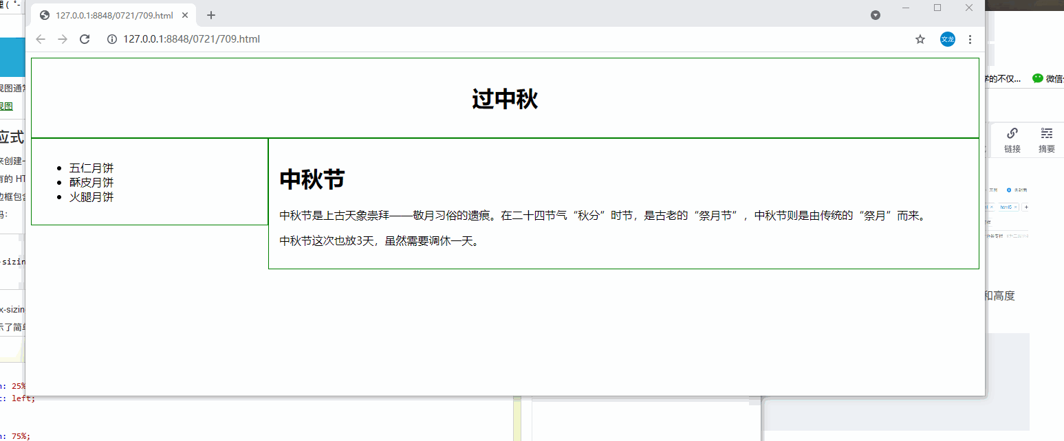
<!DOCTYPE html>
<html>
	<head>
		<meta charset="utf-8">
		<title></title>
		<style>
		*{
			box-sizing: border-box;
		}
		.header{
			border:1px solid green;
			padding: 15px;
			text-align: center;
		}
		.menu{
			width: 25%;
			float: left;
			padding: 15px;
			border: 1px solid green;
		}
		.main{
			width: 75%;
			float: left;
			padding: 15px;
			border:1px solid green;
		}
		</style>
	</head>
	<body>
		<div class="header">
			<h1>过中秋</h1>
		</div>
		<div class="menu">
			<ul>
				<li>五仁月饼</li>
				<li>酥皮月饼</li>
				<li>火腿月饼</li>
			</ul>
		</div>
		<div class="main">
			<h1>中秋节</h1>
			<p>中秋节是上古天象崇拜——敬月习俗的遗痕。在二十四节气“秋分”时节,是古老的“祭月节”,中秋节则是由传统的“祭月”而来。</p>
			<p>中秋节这次也放3天,虽然需要调休一天。</p>
		</div>
	</body>
</html>
网格系统响应式网页
12列的网格系统可以更好的控制响应式网页。
计算每列的百分比:100%12列=8.33%
在每列中,指定class,class=col- ,用来定义有几个span
.col-1 {width:8.33%}
.col-2 {width:16.66%}
.col-3 {width:25%}
.col-4 {width:33.33%}
.col-5 {width:41.66%}
.col-6 {width:50%}
.col-7 {width:58.33%}
.col-8 {width:66.66%}
.col-9 {width:75%}
.col-10 {width:83.33%}
.col-11 {width:91.66%}
.col-12 {width:100%}
网格系统响应式网页案列---兴奇的css样式写法
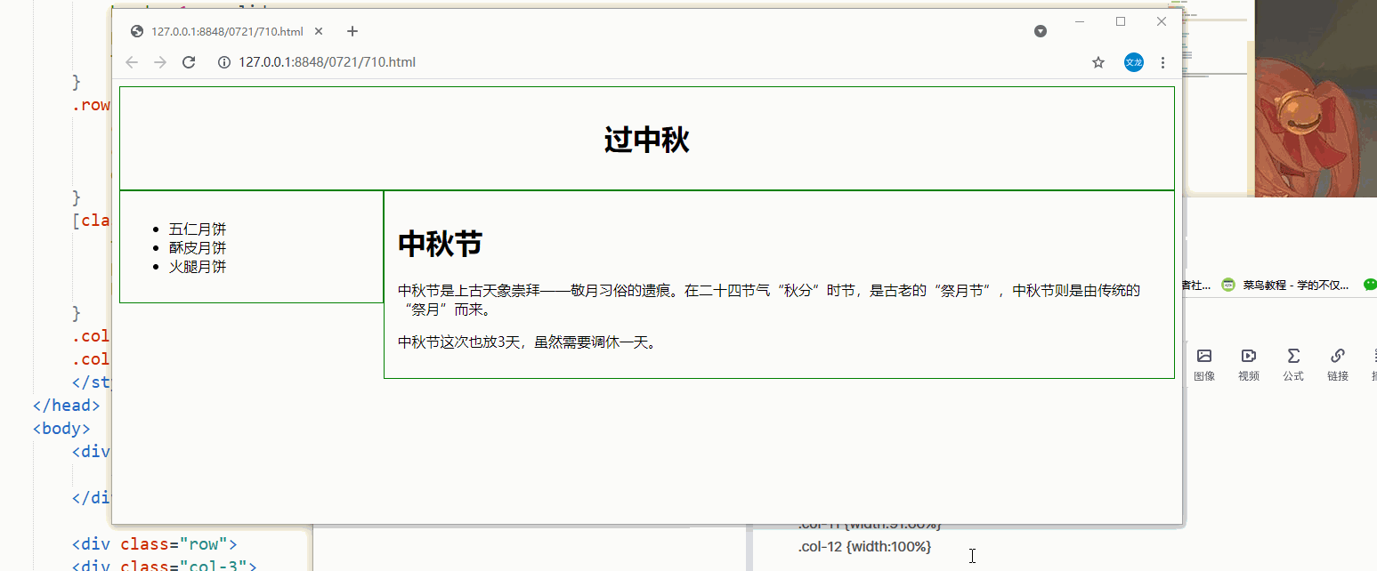
<!DOCTYPE html>
<html>
	<head>
		<meta name="viewport" content="width=device-width, initial-scale=1.0">
		<meta charset="utf-8">
		<title></title>
		<style>
		*{
			box-sizing: border-box;
		}
		.header{
			border:1px solid green;
			padding: 15px;
			text-align: center;
		}
		.row:after{
			content: "";
			clear: both;
			display: block;
		}
		[class*="col-"]{
			float: left;
			padding: 15px;
			border: 1px solid green;
		}
		.col-3{width: 25%}
		.col-9{width:75%}
		</style>
	</head>
	<body>
		<div class="header">
			<h1>过中秋</h1>
		</div>

		<div class="row">
		<div class="col-3">
			<ul>
				<li>五仁月饼</li>
				<li>酥皮月饼</li>
				<li>火腿月饼</li>
			</ul>
		</div>

		<div class="col-9">
			<h1>中秋节</h1>
			<p>中秋节是上古天象崇拜——敬月习俗的遗痕。在二十四节气“秋分”时节,是古老的“祭月节”,中秋节则是由传统的“祭月”而来。</p>
			<p>中秋节这次也放3天,虽然需要调休一天。</p>
		</div>
		</div>
	</body>
</html>
响应式web设计---媒体查询----这里的例子需要常看
使用@media查询,针对不同的媒体类型定义不同的样式。
添加 断点---利用媒体查询写新的页面布局
使用行和列来制作网页,它是响应式的,但是在小屏幕上并不能有友好的展示。
所以可以利用媒体查询来添加断点,不同断点有不同的效果。
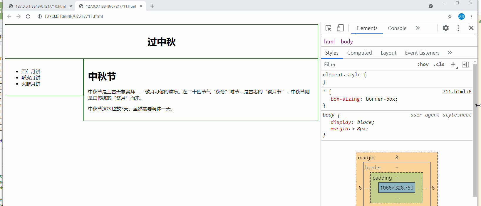
<!DOCTYPE html>
<html>
	<head>
		<meta name="viewport" content="width=device-width, initial-scale=1.0">
		<meta charset="utf-8">
		<title></title>
		<style>
		*{
			box-sizing: border-box;
		}
		.header{
			border:1px solid green;
			padding: 15px;
			text-align: center;
		}
		.row:after{
			content: "";
			clear: both;
			display: block;
		}
		[class*="col-"]{
			float: left;
			padding: 15px;
			border: 1px solid green;
		}
		.col-3{width: 25%}
		.col-9{width:75%}
		/* 断点就是可以利用媒体查询写新的页面布局 */
		@media only screen and (max-width:768px){
			[class*="col-"]{
				width: 100%;
			}
		}
		</style>
	</head>
	<body>
		<div class="header">
			<h1>过中秋</h1>
		</div>

		<div class="row">
		<div class="col-3">
			<ul>
				<li>五仁月饼</li>
				<li>酥皮月饼</li>
				<li>火腿月饼</li>
			</ul>
		</div>

		<div class="col-9">
			<h1>中秋节</h1>
			<p>中秋节是上古天象崇拜——敬月习俗的遗痕。在二十四节气“秋分”时节,是古老的“祭月节”,中秋节则是由传统的“祭月”而来。</p>
			<p>中秋节这次也放3天,虽然需要调休一天。</p>
		</div>
		</div>
	</body>
</html>
为移动端优先设计
移动端优先设计意味着设计桌面和其他设备时优先考虑移动端的设计。
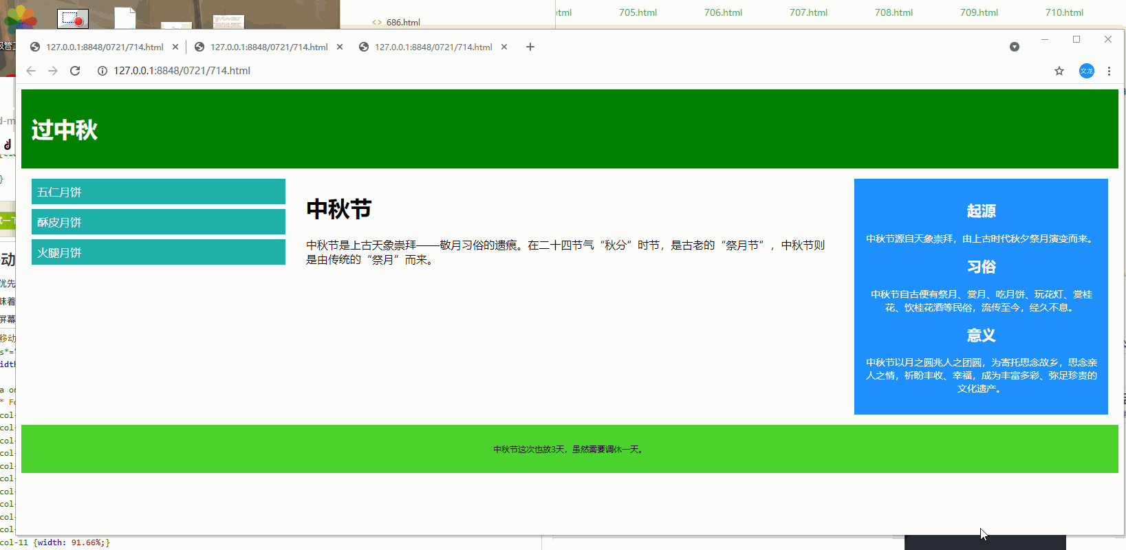
<!DOCTYPE html>
<html>
	<head>
		<meta name="viewport" content="width=device-width, initial-scale=1.0">
		<meta charset="utf-8">
		<title></title>
		<style>
		*{
			box-sizing: border-box;
		}
		.row:after{
			content: "";
			clear: both;
			display: block;
		}
		[class*="col-"]{
		 float:left;
		 padding:15px;
		}
		.header{
			padding: 15px;
			color:whitesmoke;
			background-color: #008000;
		}
		.menu ul{
			list-style-type:none;
			margin:0;
			padding:0;
		}
		.menu li{
			padding: 8px;
			margin-bottom: 7px;
			background-color: lightseagreen;
			color:whitesmoke;
		}
		.menu li:hover{
			background-color: chartreuse;
		}
		.aside{
			padding: 15px;
			text-align: center;
			font-size: 14px;
			background-color: #1E90FF;
			color:whitesmoke;
		}
		.footer{
			text-align: center;
			font-size: 12px;
			padding: 15px;
			background-color: #4DD22E;
		}
			/* for desktop */
			.col-1{width:8.33%;}
			.col-2{width:16.66%;}
			.col-3{width:25%;}
			.col-4{width:33.33%;}
			.col-5{width:41.66%;}
			.col-6{width:50%;}
			.col-7{width:58.33%;}
			.col-8{width:66.66%;}
			.col-9{width:75%;}
			.col-10{width:83.33%;}
			.col-11{width:91.66%;}
			.col-12{width:100%;}

			@media only screen and (max-width:768px){
				/* for mobile phones */
				[class*="col-"]{
					width: 100%;
				}
		}
		</style>
	</head>
	<body>
		<div class="header">
			<h1>过中秋</h1>
		</div>

		<div class="row">
		<div class="col-3 menu">
			<ul>
				<li>五仁月饼</li>
				<li>酥皮月饼</li>
				<li>火腿月饼</li>
			</ul>
		</div>

		<div class="col-6">
			<h1>中秋节</h1>
			<p>中秋节是上古天象崇拜——敬月习俗的遗痕。在二十四节气“秋分”时节,是古老的“祭月节”,中秋节则是由传统的“祭月”而来。</p>
			</div>
			<div class="col-3 right">
				<div class="aside">
					<h2>起源</h2>
					<p>中秋节源自天象崇拜,由上古时代秋夕祭月演变而来。</p>
					<h2>习俗</h2>
					<p>中秋节自古便有祭月、赏月、吃月饼、玩花灯、赏桂花、饮桂花酒等民俗,流传至今,经久不息。</p>
					<h2>意义</h2>
					<p>中秋节以月之圆兆人之团圆,为寄托思念故乡,思念亲人之情,祈盼丰收、幸福,成为丰富多彩、弥足珍贵的文化遗产。</p>
				</div>
			</div>
			</div>
			<div class="footer">
				<p>中秋节这次也放3天,虽然需要调休一天。</p>
			</div>
	</body>
</html>
案列:在屏幕为600px时添加媒体查询,并设置新的样式(屏幕大于600px但小于768px)
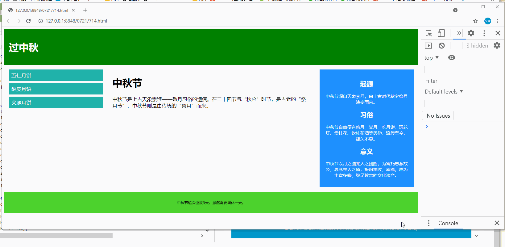
<!DOCTYPE html>
<html>
	<head>
		<meta name="viewport" content="width=device-width, initial-scale=1.0">
		<meta charset="utf-8">
		<title></title>
		<style>
		*{
			box-sizing: border-box;
		}
		.row:after{
			content: "";
			clear: both;
			display: block;
		}
		[class*="col-"]{
		 float:left;
		 padding:15px;
		}
		.header{
			padding: 15px;
			color:whitesmoke;
			background-color: #008000;
		}
		.menu ul{
			list-style-type:none;
			margin:0;
			padding:0;
		}
		.menu li{
			padding: 8px;
			margin-bottom: 7px;
			background-color: lightseagreen;
			color:whitesmoke;
		}
		.menu li:hover{
			background-color: chartreuse;
		}
		.aside{
			padding: 15px;
			text-align: center;
			font-size: 14px;
			background-color: #1E90FF;
			color:whitesmoke;
		}
		.footer{
			text-align: center;
			font-size: 12px;
			padding: 15px;
			background-color: #4DD22E;
		}

		/* for mobile phones */
		[class*="col-"]{
			width: 100%;
		}

		/* 注意两组类样式是相同的,但名称不同 (col- 和 col-m-): */
		/* 针对桌面设备:
          第一和第三部分跨越 3 列。中间部分跨域 6 列。

         针对平板设备:
         第一跨域 3列,第二部分跨越 9 列,第三部分跨域 12 列: */
		@media only screen and (min-width:600px){
		/*for tablets---这是??  */
			.col-m-12{width:8.33%;}
			.col-m-2{width:16.66%;}
			.col-m-3{width:25%;}
			.col-m-4{width:33.33%;}
			.col-m-5{width:41.66%;}
			.col-m-6{width:50%;}
			.col-m-7{width:58.33%;}
			.col-m-8{width:66.66%;}
			.col-m-9{width:75%;}
			.col-m-10{width:83.33%;}
			.col-m-11{width:91.66%;}
			.col-m-12{width:100%;}
		}
			@media only screen and (min-width:768px){
			/* for desktop */
			.col-1{width:8.33%;}
			.col-2{width:16.66%;}
			.col-3{width:25%;}
			.col-4{width:33.33%;}
			.col-5{width:41.66%;}
			.col-6{width:50%;}
			.col-7{width:58.33%;}
			.col-8{width:66.66%;}
			.col-9{width:75%;}
			.col-10{width:83.33%;}
			.col-11{width:91.66%;}
			.col-12{width:100%;}
			}

		</style>
	</head>
	<body>
		<div class="header">
			<h1>过中秋</h1>
		</div>

		<div class="row">
		<div class="col-3 col-m-3 menu">
			<ul>
				<li>五仁月饼</li>
				<li>酥皮月饼</li>
				<li>火腿月饼</li>
				<li>鲜花月饼</li>
			</ul>
		</div>

		<div class="col-6 col-m-9">
			<h1>中秋节</h1>
			<p>中秋节是上古天象崇拜——敬月习俗的遗痕。在二十四节气“秋分”时节,是古老的“祭月节”,中秋节则是由传统的“祭月”而来。</p>
			</div>
			<div class="col-3 col-m-12">
				<div class="aside">
					<h2>起源</h2>
					<p>中秋节源自天象崇拜,由上古时代秋夕祭月演变而来。</p>
					<h2>习俗</h2>
					<p>中秋节自古便有祭月、赏月、吃月饼、玩花灯、赏桂花、饮桂花酒等民俗,流传至今,经久不息。</p>
					<h2>意义</h2>
					<p>中秋节以月之圆兆人之团圆,为寄托思念故乡,思念亲人之情,祈盼丰收、幸福,成为丰富多彩、弥足珍贵的文化遗产。</p>
				</div>
			</div>
			</div>
			<div class="footer">
				<p>中秋节这次也放3天,虽然需要调休一天。</p>
			</div>
	</body>
</html>
方向:横屏/竖屏
结合css媒体查询,可以创建适应不同设备的方向(横屏landscape/竖屏portrait等)的布局。
orientation:portrait | landscape
portrait:指定输出设备中的页面可见区域高度大于或等于宽度
landscape 除portait值情况外,都是landscape
案例:横屏颜色为紫色
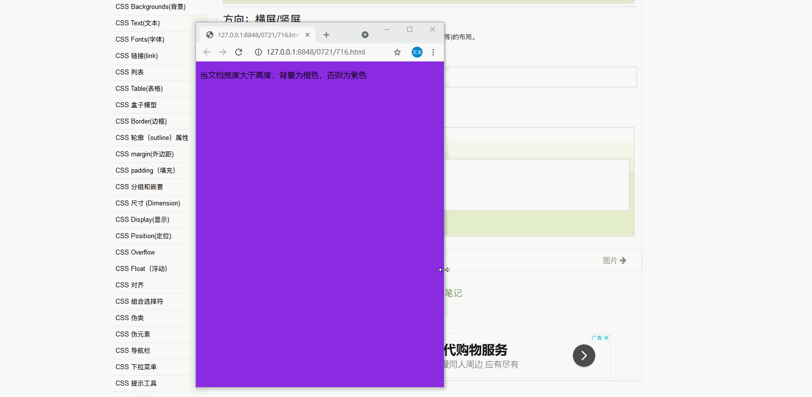
<!DOCTYPE html>
<html>
	<head>
		<meta charset="utf-8">
		<title></title>
		<style>
		body{
			background-color: blueviolet;
		}
		/* landscape横屏  宽度大于高度 */
		@media only screen and (orientation:landscape){
			body{
				background-color: orangered;
			}
		}
		</style>
	</head>
	<body>
		<p>当文档宽度大于高度,背景为橙色,否则为紫色</p>
	</body>
</html>
响应式we设计---图片
width属性
如果width属性设置为100%,图片会根据上下范围实现响应功能。
<!DOCTYPE html>
<html>
	<head>
		<meta charset="utf-8">
		<title></title>
		<style>
		img{
			width: 100%;
			height: auto;
		}
		</style>
	</head>
	<body>
		<img src="img/45.jpeg" width="460" height="345">
	</body>
</html>
max-width属性
max-width属性设置为100%,图片永远不会大于其原始大小
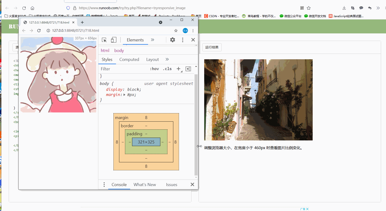
<!DOCTYPE html>
<html>
	<head>
		<meta name="viewport" content="width=device-width, initial-scale=1.0">
		<meta charset="utf-8">
		<title></title>
		<style>
		img{
			max-width:100%;
			height:auto;
		}
		</style>
	</head>
	<body>
		<img src="img/46.jpeg" width="700" height="700">
	</body>
</html>
案例:在网页上添加图片
<!DOCTYPE html>
<html>
	<head>
		<meta name="viewport" content="width=device-width, initial-scale=1.0">
		<meta charset="utf-8">
		<title></title>
		<style>
		*{
			box-sizing: border-box;
		}
		img{
			width: 100%;
			height: auto;
		}
		.row:after{
			content: "";
			clear: both;
			display: block;
		}
		[class*="col-"]{
		 float:left;
		 padding:15px;
		}
		.header{
			padding: 15px;
			color:whitesmoke;
			background-color: #008000;
		}
		.menu ul{
			list-style-type:none;
			margin:0;
			padding:0;
		}
		.menu li{
			padding: 8px;
			margin-bottom: 7px;
			background-color: lightseagreen;
			color:whitesmoke;
		}
		.menu li:hover{
			background-color: chartreuse;
		}
		.aside{
			padding: 15px;
			text-align: center;
			font-size: 14px;
			background-color: #1E90FF;
			color:whitesmoke;
		}
		.footer{
			text-align: center;
			font-size: 12px;
			padding: 15px;
			background-color: #4DD22E;
		}

		/* for mobile phones */
		[class*="col-"]{
			width: 100%;
		}

		/* 注意两组类样式是相同的,但名称不同 (col- 和 col-m-): */
		/* 针对桌面设备:
          第一和第三部分跨越 3 列。中间部分跨域 6 列。

         针对平板设备:
         第一跨域 3列,第二部分跨越 9 列,第三部分跨域 12 列: */
		@media only screen and (min-width:600px){
		/*for tablets---这是??  */
			.col-s-1{width:8.33%;}
			.col-s-2{width:16.66%;}
			.col-s-3{width:25%;}
			.col-s-4{width:33.33%;}
			.col-s-5{width:41.66%;}
			.col-s-6{width:50%;}
			.col-s-7{width:58.33%;}
			.col-s-8{width:66.66%;}
			.col-s-9{width:75%;}
			.col-s-10{width:83.33%;}
			.col-s-11{width:91.66%;}
			.col-s-12{width:100%;}
		}
			@media only screen and (min-width:768px){
			/* for desktop */
			.col-1{width:8.33%;}
			.col-2{width:16.66%;}
			.col-3{width:25%;}
			.col-4{width:33.33%;}
			.col-5{width:41.66%;}
			.col-6{width:50%;}
			.col-7{width:58.33%;}
			.col-8{width:66.66%;}
			.col-9{width:75%;}
			.col-10{width:83.33%;}
			.col-11{width:91.66%;}
			.col-12{width:100%;}
			}

		</style>
	</head>
	<body>
		<div class="header">
			<h1>过中秋</h1>
		</div>

		<div class="row">
		<div class="col-3 col-s-3 menu">
			<ul>
				<li>五仁月饼</li>
				<li>酥皮月饼</li>
				<li>火腿月饼</li>
				<li>鲜花月饼</li>
			</ul>
		</div>

		<div class="col-6 col-s-9">
			<h1>中秋节</h1>
			<p>中秋节是上古天象崇拜——敬月习俗的遗痕。在二十四节气“秋分”时节,是古老的“祭月节”,中秋节则是由传统的“祭月”而来。</p>
			<img src="img/815.jpg" width="550" height="309">
			</div>
			<div class="col-3 col-s-12">
				<div class="aside">
					<h2>起源</h2>
					<p>中秋节源自天象崇拜,由上古时代秋夕祭月演变而来。</p>
					<h2>习俗</h2>
					<p>中秋节自古便有祭月、赏月、吃月饼、玩花灯、赏桂花、饮桂花酒等民俗,流传至今,经久不息。</p>
					<h2>意义</h2>
					<p>中秋节以月之圆兆人之团圆,为寄托思念故乡,思念亲人之情,祈盼丰收、幸福,成为丰富多彩、弥足珍贵的文化遗产。</p>
				</div>
			</div>
			</div>
			<div class="footer">
				<p>中秋节这次也放3天,虽然需要调休一天。</p>
			</div>
	</body>
</html>
背景图片
背景图片可以响应调整大小或缩放
1.background-size:contain 背景图片按比例自适应内容区域,图片保持其比例不变
2.background-size:100% 100% 背景图片将延展覆盖整个区域
3.background-size:cover 把背景图像扩展至足够大,让背景图像完全覆盖背景区域。注意,改属性保持了图片的比例因此背景图像的某些部分无法显示在背景定位区域中。
<!DOCTYPE html>
<html>
	<head>
		<meta charset="utf-8">
		<title></title>
		<style>
		div{
			width: 100%;
			height: 380px;
			background-image: url(img/564.jpeg);
			background-repeat: no-repeat;
			background-size: contain;
			border:1px solid cornflowerblue;
		}
		</style>
	</head>
	<body>
		<div></div>
	</body>
</html>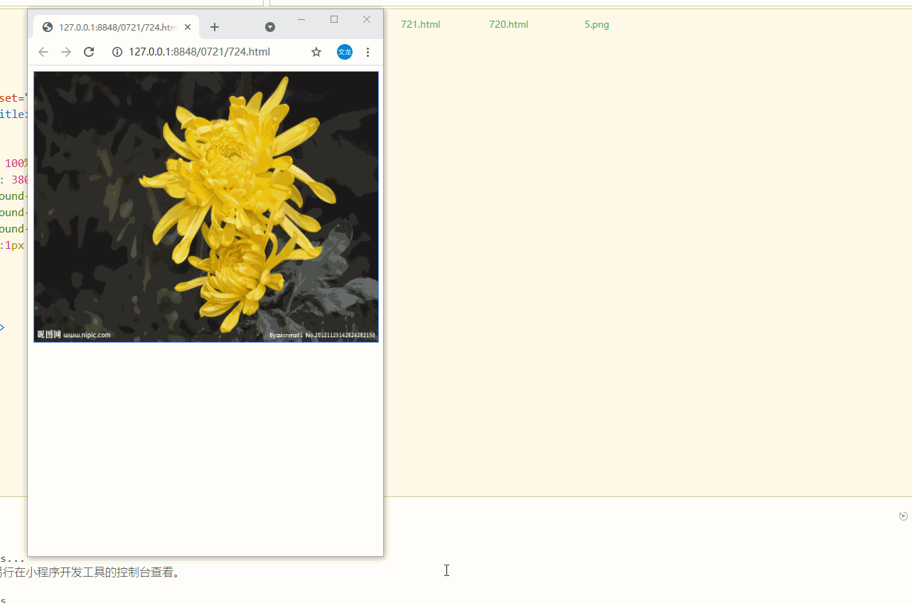
<!DOCTYPE html>
<html>
	<head>
		<meta charset="utf-8">
		<title></title>
		<style>
		div{
			width: 100%;
			height: 380px;
			background-image: url(img/564.jpeg);
			background-repeat: no-repeat;
			background-size: 100% 100%;
			border:1px solid cornflowerblue;
		}
		</style>
	</head>
	<body>
		<div></div>
	</body>
</html>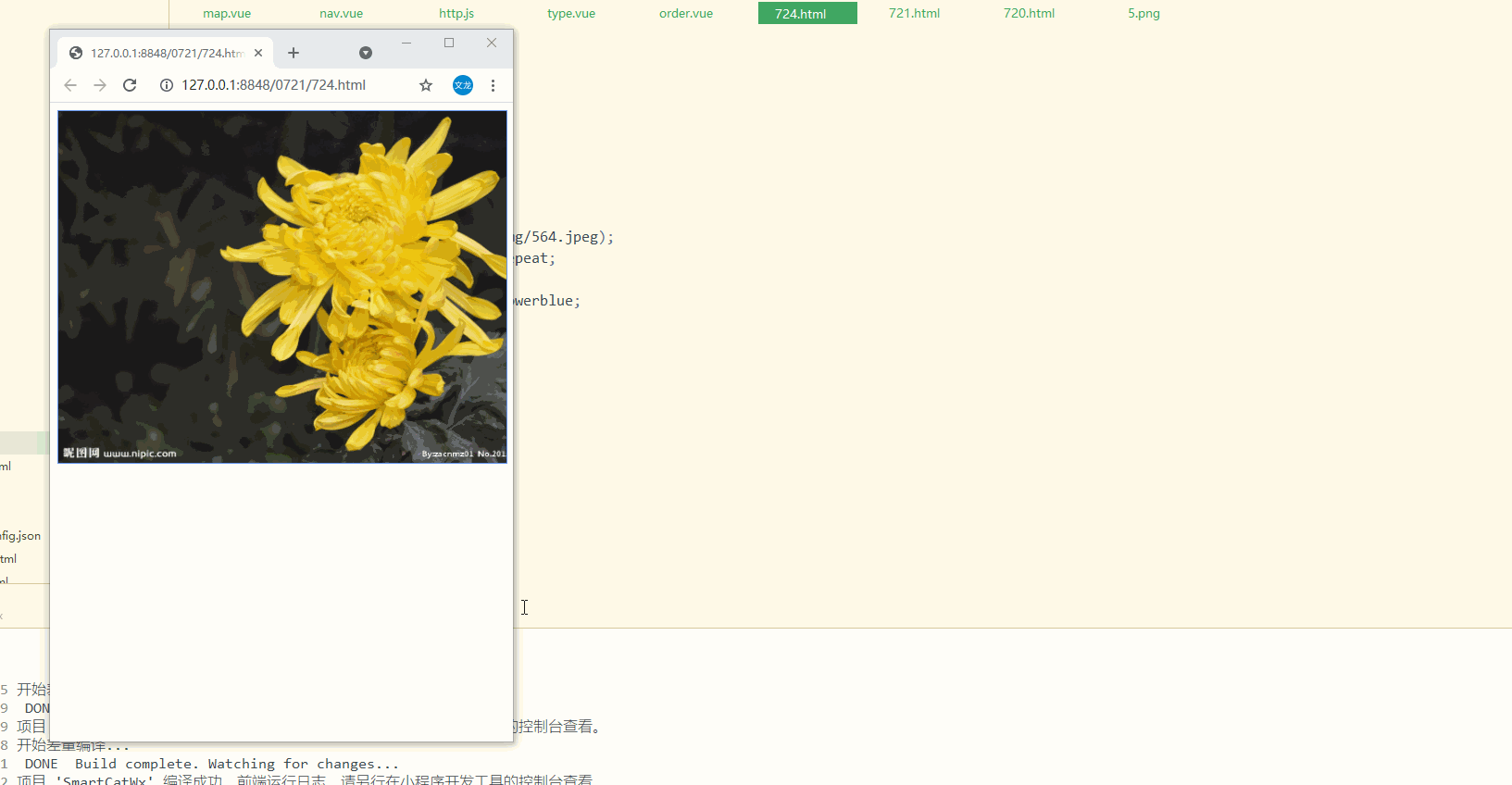
<!DOCTYPE html>
<html>
	<head>
		<meta charset="utf-8">
		<title></title>
		<style>
		div{
			width: 100%;
			height: 380px;
			background-image: url(img/564.jpeg);
			background-repeat: no-repeat;
			background-size: cover;
			border:1px solid cornflowerblue;
		}
		</style>
	</head>
	<body>
		<div></div>
	</body>
</html>
不同设备显示不同图片
大尺寸图片可以放在大屏幕上,但小屏幕上却不能显示。而且小屏幕加载大图片,还会影响加载速度。
可以使用媒体查询,在不同设备显示不同图片
<!DOCTYPE html>
<html>
	<head>
		<meta charset="utf-8">
		<title></title>
		<style>
		/* <700px */
		body{
			background-color: no-repeat;
			background-image: url(img/33.jpg);
		}
		/*>=700  */
		@media  only screen and (min-width:700px) {
			body{
				background-image: url(img/564.jpeg);
			}

		}
		</style>
	</head>
	<body>
	</body>
</html>
min-device-width
使用媒体查询的min-device-width替代min-width属性,它将检测设备宽度而不是浏览器宽度。浏览器大小重置时,图片大小不会改变。
<!DOCTYPE html>
<html>
	<head>
		<meta charset="utf-8">
		<title></title>
		<style>
		/* <400px */
		body{
			background-color: no-repeat;
			background-image: url(img/33.jpg);
		}
		/*>=400  手机宽度都比较小*/
		@media  only screen and (min-device-width:400px) {
			body{
				background-image: url(img/564.jpeg);
			}

		}
		</style>
	</head>
	<body>
	</body>
</html>
html5 picture---可以设置多张图片
<picture>
<source srcset="xxxx.jpg/jif.." media="(max-width):xxpx">
<source srcset="xxx...">
</picture>
srcset 必写,定义图片资源
media 可选
不支持picture元素的浏览器可以定义img元素来替代
<!DOCTYPE html>
<html>
	<head>
		<meta charset="utf-8">
		<title></title>
	</head>
	<body>
		<picture>
			<source srcset="img/33.jpg" media="(max-width:700px)">
			<source srcset="img/564.jpeg" >
			<img src="img/564.jpeg" alt="flower" style="width:auto">
		</picture>
	</body>
</html>
响应式web设计---视频video
width属性
width属性设置为100%,视频播放器会根据屏幕大小自动调整比例
这种情况下视频的宽可以大于原始尺寸

<!DOCTYPE html>
<html>
	<head>
		<meta charset="utf-8">
		<title></title>
		<style>
		video{
			width:100%;
			height: auto;
		}
		</style>
	</head>
	<body>
		<video width="960" controls>
			<source src="111.mp4" type="video/mp4">
		</video>
	</body>
</html>
max-width属性
把max-wdith属性设置为100%,视频播放器会根据屏幕自动调整比例,但不会超过其原始大小
案例:在网页中添加视频
视频根据div区域大小自动调整并占满整个div区域
<!DOCTYPE html>
<html>
	<head>
		<meta name="viewport" content="width=device-width, initial-scale=1.0">
		<meta charset="utf-8">
		<title></title>
		<style>
		*{
			box-sizing: border-box;
		}
		video{
			width: 100%;
			height: auto;
		}
		.row:after{
			content: "";
			clear: both;
			display: block;
		}
		[class*="col-"]{
		 float:left;
		 padding:15px;
		}
		.header{
			padding: 15px;
			color:whitesmoke;
			background-color: #008000;
		}
		.menu ul{
			list-style-type:none;
			margin:0;
			padding:0;
		}
		.menu li{
			padding: 8px;
			margin-bottom: 7px;
			background-color: lightseagreen;
			color:whitesmoke;
		}
		.menu li:hover{
			background-color: chartreuse;
		}
		.aside{
			padding: 15px;
			text-align: center;
			font-size: 14px;
			background-color: #1E90FF;
			color:whitesmoke;
		}
		.footer{
			text-align: center;
			font-size: 12px;
			padding: 15px;
			background-color: #4DD22E;
		}

		/* for mobile phones */
		[class*="col-"]{
			width: 100%;
		}

		/* 注意两组类样式是相同的,但名称不同 (col- 和 col-m-): */
		/* 针对桌面设备:
          第一和第三部分跨越 3 列。中间部分跨域 6 列。

         针对平板设备:
         第一跨域 3列,第二部分跨越 9 列,第三部分跨域 12 列: */
		@media only screen and (min-width:600px){
		/*for tablets---这是??  */
			.col-s-1{width:8.33%;}
			.col-s-2{width:16.66%;}
			.col-s-3{width:25%;}
			.col-s-4{width:33.33%;}
			.col-s-5{width:41.66%;}
			.col-s-6{width:50%;}
			.col-s-7{width:58.33%;}
			.col-s-8{width:66.66%;}
			.col-s-9{width:75%;}
			.col-s-10{width:83.33%;}
			.col-s-11{width:91.66%;}
			.col-s-12{width:100%;}
		}
			@media only screen and (min-width:768px){
			/* for desktop */
			.col-1{width:8.33%;}
			.col-2{width:16.66%;}
			.col-3{width:25%;}
			.col-4{width:33.33%;}
			.col-5{width:41.66%;}
			.col-6{width:50%;}
			.col-7{width:58.33%;}
			.col-8{width:66.66%;}
			.col-9{width:75%;}
			.col-10{width:83.33%;}
			.col-11{width:91.66%;}
			.col-12{width:100%;}
			}

		</style>
	</head>
	<body>
		<div class="header">
			<h1>过中秋</h1>
		</div>

		<div class="row">
		<div class="col-3 col-s-3 menu">
			<ul>
				<li>五仁月饼</li>
				<li>酥皮月饼</li>
				<li>火腿月饼</li>
				<li>鲜花月饼</li>
			</ul>
		</div>

		<div class="col-6 col-s-9">
			<h1>中秋节</h1>
			<p>中秋节是上古天象崇拜——敬月习俗的遗痕。在二十四节气“秋分”时节,是古老的“祭月节”,中秋节则是由传统的“祭月”而来。</p>
			<video width="960" controls>
				<source src="111.mp4" type="video/mp4">
			</video>
			</div>
			<div class="col-3 col-s-12">
				<div class="aside">
					<h2>起源</h2>
					<p>中秋节源自天象崇拜,由上古时代秋夕祭月演变而来。</p>
					<h2>习俗</h2>
					<p>中秋节自古便有祭月、赏月、吃月饼、玩花灯、赏桂花、饮桂花酒等民俗,流传至今,经久不息。</p>
					<h2>意义</h2>
					<p>中秋节以月之圆兆人之团圆,为寄托思念故乡,思念亲人之情,祈盼丰收、幸福,成为丰富多彩、弥足珍贵的文化遗产。</p>
				</div>
			</div>
			</div>
			<div class="footer">
				<p>中秋节这次也放3天,虽然需要调休一天。</p>
			</div>
	</body>
</html>
css函数
只写了一些
calc()
动态计算长度值
calc(expression) expression --必须,一个数学表达式,结果将采用运算后的返回值
注意:运算符前后都需保留一个空格。eg:width:calc(100% - 10px)
任何长度值都可以使用calc()函数继续计算
calc()函数支持+ - * /运算
calc()函数使用标准的数学运算优先级规则
案列:使用calc()函数计算div元素的宽度

<!DOCTYPE html>
<html>
	<head>
		<meta charset="utf-8">
		<title></title>
		<style>
		div{
			position: absolute;
			left:50px;
			width:calc(100% - 100px);
			border:1px solid #87CEEB;
			background-color: yellow;
			padding: 5px;
			text-align: center;
		}
		</style>
	</head>
	<body>
		<div>div左右有50px缝隙</div>
	</body>
</html>
attr()
返回选择元素的属性值
attr(attrbute-name) attrbute-name 必须,html元素属性名
<!DOCTYPE html>
<html>
	<head>
		<meta charset="utf-8">
		<title></title>
		<style>
		a:after{
			content:"("attr(href)")";
			}
		</style>
	</head>
	<body>
		<a href="http://wwww.baidu.com">百度一下</a>
	</body>
</html>
var()
用于插入自定义的属性值,如果一个属性在多处被使用,该方法很有用
var(custom-property-name,value)
custom-property-name 必需,自定义属性名称,必需以--开头
value 可选,备用值,在属性不存在的时候使用
案列1
定义一个名为--main-bg-color的属性,染色使用var()函数调用该属性
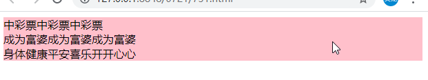
<!DOCTYPE html>
<html>
	<head>
		<meta charset="utf-8">
		<title></title>
		<style>
		:root{
			--main-bg-color:pink;
		}
		#b1{
			background-color: var(--main-bg-color);
		}
		#b2{
			background-color: var(--main-bg-color);
		}
		#b3{
			background-color: var(--main-bg-color);
		}
		</style>
	</head>
	<body>
		<div id="b1">中彩票中彩票中彩票</div>
		<div id="b2">成为富婆成为富婆成为富婆</div>
		<div id="b3">身体健康平安喜乐开开心心</div>
	</body>
</html>
案列2:
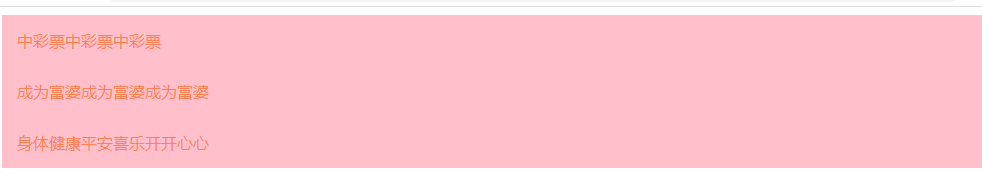
<!DOCTYPE html>
<html>
<head>
<meta charset="utf-8">
<title></title>
<style>
:root{
--main-bg-color:pink;
--main-txt-color: coral;
--main-padding: 15px;
}
#b1{
background-color: var(--main-bg-color);
color:var(--main-txt-color);
padding:var(--main-padding);
}
#b2{
background-color: var(--main-bg-color);
color:var(--main-txt-color);
padding:var(--main-padding);
}
#b3{
background-color: var(--main-bg-color);
color:var(--main-txt-color);
padding:var(--main-padding);
}
</style>
</head>
<body>
<div id="b1">中彩票中彩票中彩票</div>
<div id="b2">成为富婆成为富婆成为富婆</div>
<div id="b3">身体健康平安喜乐开开心心</div>
</body>
</html>


 被折叠的 条评论
为什么被折叠?
被折叠的 条评论
为什么被折叠?
 到【灌水乐园】发言


