


昨天本来以为自己什么都懂了,结果一做题就显出原形。
1
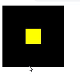
<!DOCTYPE html>
<html>
	<head>
		<meta charset="utf-8">
		<title></title>
		<style>
		.container{
			width: 200px;
			height: 200px;
			background-color: #000000;
			display: flex;
			justify-content: center;
			align-items: center;
		}
		.c{
			width: 100px;
			height: 100px;
			background-color: yellow;
		}
		</style>
	</head>
	<body>
		<div class="container">
			<div class="c"></div>
		</div>
	</body>
</html>
2
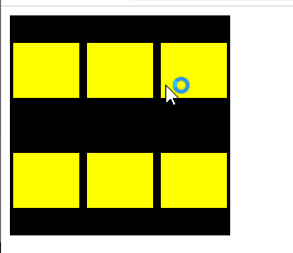
<!DOCTYPE html>
<html>
	<head>
		<meta charset="utf-8">
		<title></title>
		<style>
		.container{
			width: 200px;
			height: 200px;
			background-color: #000000;
			display: flex;
			flex-flow: row wrap;
			justify-content: space-around;
			align-items: center;
		}
		.c{
			width: 60px;
			height: 50px;
			background-color: yellow;
		}
		</style>
	</head>
	<body>
		<div class="container">
			<div class="c"></div>
			<div class="c"></div>
			<div class="c"></div>
			<div class="c"></div>
			<div class="c"></div>
			<div class="c"></div>
		</div>
	</body>
</html>
3-------*
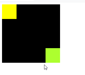
<!DOCTYPE html>
<html>
	<head>
		<meta charset="utf-8">
		<title></title>
		<style>
		.container{
			width: 200px;
			height: 200px;
			background-color: #000000;
			display: flex;
			justify-content:space-between;
		/* 	align-items: flex-start; */
		}
		.c{
			width: 50px;
			height: 50px;
			background-color: yellow;
		}
		.d{
			width: 50px;
			height: 50px;
			background-color: greenyellow;
		 	align-self: flex-end;
		}
		</style>
	</head>
	<body>
		<div class="container">
			<div class="c"></div>
			<div class="d"></div>
		</div>
	</body>
</html>
4
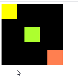
<!DOCTYPE html>
<html>
	<head>
		<meta charset="utf-8">
		<title></title>
		<style>
		.container{
			width: 200px;
			height: 200px;
			background-color: #000000;
			display: flex;
			justify-content:space-between;
		}
		.c{
			width: 50px;
			height: 50px;
			background-color: yellow;
		}
		.d{
			width: 50px;
			height: 50px;
			background-color: greenyellow;
		 	align-self: center;
		}
		.f{
			width: 50px;
			height: 50px;
			background-color: coral;
		 	align-self: flex-end;
		}
		</style>
	</head>
	<body>
		<div class="container">
			<div class="c"></div>
			<div class="d"></div>
			<div class="f"></div>
		</div>
	</body>
</html>
5

<!DOCTYPE html>
<html>
	<head>
		<meta charset="utf-8">
		<title></title>
		<style>
		.container{
			width: 280px;
			height: 300px;
			background-color: #000000;
			display: flex;
			flex-wrap: wrap;
			justify-content:space-between;
		}
		.c{
			width: 100px;
			height: 100px;
			background-color: yellow;
		}
		.d{
			width: 100px;
			height: 100px;
			background-color: greenyellow;
		}
		.f{
			width: 100px;
			height: 100px;
			background-color: coral;
		 	align-self: flex-end;
		}
		.g{
			width: 100px;
			height: 100px;
			background-color: gold;
		 	align-self: flex-end;

		}
		</style>
	</head>
	<body>
		<div class="container">
			<div class="c"></div>
			<div class="d"></div>
			<div class="f"></div>
			<div class="g"></div>
		</div>
	</body>
</html>
6

<!DOCTYPE html>
<html>
	<head>
		<meta charset="utf-8">
		<title></title>
		<style>
		.container{
			width: 400px;
			height: 400px;
			/* 绿色 */
			background-color: #008000;
			display: flex;
			justify-content: center;
			align-items: center;
		}
		.father{
			width: 200px;
			height: 200px;
			/* 色 */
			background-color:dodgerblue;
			display: flex;
			justify-content: flex-end;
			align-items: flex-end;
		}
	    .son{
			width: 50px;
			height: 50px;
			/* 咖啡色 */
			background-color: chocolate;
		}
		</style>
	</head>
	<body>
		<div class="container">
			<div class="father">
				<div class="son"></div>
			</div>
		</div>
	</body>
</html>
7.-----*
如果父元素不设置宽高,那么设置display:flex就无用-------这段话不确定,因为8是有效的
不懂这个


<!DOCTYPE html>
<html>
	<head>
		<meta charset="utf-8">
		<title></title>
		<style>
		.container{
			width: 400px;
			height: 400px;
			/* 绿色 */
			background-color: #008000;
			display: flex;
			justify-content: center;
			align-items: center;
		}
		.father{
			width: 200px;
			height: 200px;
			/* 色 */
			background-color:dodgerblue;
			display: flex;
			justify-content: flex-end;
			align-items: flex-end;
		}
	    .son{
			/* 这段代码的不同造成了两种效果 */
			/* width: 100px;
			height: 100px; */
			 /* 咖啡色 */
			background-color: chocolate;
			display: flex;
			justify-content: flex-end;
		}
		.fg{
			width: 50px;
			height: 50px;
			background-color: #00FFFF;
		}
		</style>
	</head>
	<body>
		<div class="container">
			<div class="father">
				<div class="son">
					<div class="fg"></div>
				</div>
			</div>
		</div>
	</body>
</html>
8-----*

<!DOCTYPE html>
<html>
	<head>
		<meta charset="utf-8">
		<title></title>
		<style>
		.container{
			width: 300px;
			height: 300px;
			background-color: #000000;
			display: flex;
			justify-content:space-between;
		}
		.item{
			width: 80px;
			height: 80px;
			background-color: #1E90FF;
			border: 1px solid green;
		}
		.first,.three{
			display: flex;
			flex-direction: column;
			justify-content: space-between;
		}
		.second{
			align-self: center;
		}
		</style>
	</head>
	<body>
		<div class="container">
		  <div class="first">
		    <div class="item"> </div>
		    <div class="item"> </div>
		  </div>
		   <div class="second">
		    <div class="item"> </div>
		  </div>
		    <div class="three">
		    <div class="item"> </div>
		    <div class="item"> </div>
		  </div>
		</div>
	</body>
</html>
9------*

<!DOCTYPE html>
<html>
	<head>
		<meta charset="utf-8">
		<title></title>
		<style>
		.container{
		  width: 300px;
		  height: 300px;
		  background-color: skyblue;
		  display: flex;
		  justify-content: space-between;
		}
		.item{
		  width: 80px;
		  height: 80px;
		  background-color: blue;
		  border: 1px solid green;
		}
		.first,.three{
		  display: flex;
		  flex-direction: column;
		  justify-content: space-between;
		}
		</style>
	</head>
	<body>
		<div class="container">
		  <div class="first">
		    <div class="item"> </div>
		    <div class="item"> </div>
			<div class="item"> </div>
		  </div>
		    <div class="three">
		    <div class="item"> </div>
		    <div class="item"> </div>
			<div class="item"> </div>
		  </div>
		</div>
	</body>
</html>
前面这几道都是参考下面这篇文章仿写的
不知道文章链接在哪,我收藏里有,作者是北极光之夜。
10 两栏布局 左边宽度固定,右边自适应

<!DOCTYPE html>
<html>
	<head>
		<meta charset="utf-8">
		<title></title>
		<style>
		.container{
		  width: 1000px;
		  height: 300px;
		  background-color: skyblue;
		  display: flex;
		}
       .container div{
		   width: 300px;
		   height: 300px;
	   }
	   .one{
		   background-color: #008000;
	   }
	   .two{
		   background-color: #1E90FF;
		   flex: auto;
	   }
		</style>
	</head>
	<body>
		<div class="container">
		 <div class="one"></div>
		 <div class="two"></div>
		</div>
	</body>
</html>
11.三栏布局 两边宽度固定,中间自适应

<!DOCTYPE html>
<html>
	<head>
		<meta charset="utf-8">
		<title></title>
		<style>
		.container{
		  width: 1000px;
		  height: 300px;
		  background-color: skyblue;
		  display: flex;
		}
       .container div{
		   width: 200px;
		   height: 300px;
	   }
	   .one{
		   background-color: #008000;
	   }
	   .two{
		   background-color: #1E90FF;
		    flex:auto;
	   }
	   .three{
		   background-color: yellowgreen;
	   }
		</style>
	</head>
	<body>
		<div class="container">
		 <div class="one"></div>
		 <div class="two"></div>
		 <div class="three"></div>
		</div>
	</body>
</html>
12.三栏等分布局

<!DOCTYPE html>
<html>
	<head>
		<meta charset="utf-8">
		<title></title>
		<style>
		.container{
		  width: 1000px;
		  height: 300px;
		  background-color: skyblue;
		  display: flex;
		  justify-content: space-between;
		}
       .container div{
		   width: 400px;
		   height: 300px;
	   }
	   .one{
		   background-color: #008000;
	   }
	   .two{
		   background-color: #1E90FF;
	   }
	   .three{
		   background-color: yellowgreen;
	   }
		</style>
	</head>
	<body>
		<div class="container">
		 <div class="one"></div>
		 <div class="two"></div>
		 <div class="three"></div>
		</div>
	</body>
</html>
13.元素水平垂直居中

<!DOCTYPE html>
<html>
	<head>
		<meta charset="utf-8">
		<title></title>
		<style>
		.container{
		  width: 1000px;
		  height: 300px;
		  background-color: skyblue;
		  display: flex;
		  justify-content: center;
		  align-items: center;
		}
      .one {
		   width: 300px;
		   height: 300px;
		   text-align: center;
		   line-height: 300px;
	   }
	   .two{
		   flex:auto;
	   }
		</style>
	</head>
	<body>
		<div class="container">
		 <h3 class="one">学习</h3>
		 <p class="two">
			 哈哈哈哈哈哈哈哈哈哈哈哈哈<br/>
			 或或或或或或或或或或或或或<br/>
			 啦啦啦啦啦啦啦啦啦啦啦啦啦<br/>
			 啦啦啦啦啦啦啦啦啦啦啦啦啦<br/>
			 哟哟哟哟哟哟哟哟哟哟哟哟哟<br/>
		 </p>
		</div>
	</body>
</html>
14圣杯布局----*
好像明白了如何嵌套flex 之后请看6 7 8和这和练习联合起来

<!DOCTYPE html>
<html>
	<head>
		<meta charset="utf-8">
		<title></title>
		<style>
		.container{
		  width: 1000px;
		  height: 400px;
		  background-color: skyblue;
		  display: flex;
		  flex-direction: column;
		  justify-content: space-between;
		}
      .one{
		  background-color: #008000;
		  width: 1000px;
		  height: 100px;
	  }
	 .two{
		 background-color: cadetblue;
		 width: 1000px;
		 display: flex;
		 flex-direction: row;
		 justify-content: space-between;
	 }
	 .a,.c{
		 width: 200px;
		 background-color: #1E90FF;
		 height: 200px;
	 }
	 .b{
		 flex:auto;
		 background-color: pink;
	 }
	  .five{
		  background-color: greenyellow;
		  width: 1000px;
		  height: 100px;
	  }

		</style>
	</head>
	<body>
		<div class="container">
		<div class="one"></div>
		<div class="two">
			<div class="a"></div>
			<div class="b"></div>
			<div class="c"></div>
		</div>
		<div class="five"></div>
		</div>
	</body>
</html>
这几个仿写的是 努力飞翔的小菜鸟 flex布局实现各种布局效果
15.一个提问题
从提问题那拿过来的


<!DOCTYPE html>
<html>
	<head>
		<meta charset="utf-8">
		<title></title>
		<style>
		html,body{
			width: 970px;
			height: 570px;
		}
		/* 第一部分 */
		/* 第一部分布局代码 */
		.header{
			display: flex;
			justify-content: space-around;
			margin-bottom: 10px;
		}
		.footer{
			background-color: pink;
		}
		.logo{
			width: 270px;
			height: 80px;
			background-color: red;
		}
		.language{
			width: 137px;
			height: 30px;
			background-color: greenyellow;
			margin-bottom: 10px;
		}
		.nav{
			width: 680px;
			height: 42px;
			background-color: greenyellow;
		}
		/* 第一部分布局代码 */
		.greenYellow{
			display: flex;
			flex-direction: column;
			align-items: flex-end;
		}
		/* 第二部分 */
		 .ad{
			width: 310px;
			height: 435px;
			background-color: #4169E1;
			margin-right: 10px;
		}
		.news{
			width: 450px;
			height:240px;
			background-color: gold;
			margin-bottom: 10px;
		}
		.info{
			width: 450px;
			height: 110px;
			background-color: gold;
			margin-bottom: 10px;
		}
		.hot{
			width: 450px;
			height: 30px;
			background-color: gold;
			margin-bottom: 10px;
		}
		.gallary{
			width: 190px;
			height: 400px;
			background-color: pink;
		}
		.link{
			width:650px;
			height:25px;
			background-color: #008000;
		}
		.content{
			display: flex;
			justify-content: space-around;
			margin-bottom: 10px;
		}
		.orangePinkGreen{
			display: flex;
			justify-content: space-between;
		}
		.orange{
			display: flex;
			flex-direction: column;
			align-items: center;
		}
		.orangePink{
			display: flex;
			justify-content: space-between;
		}
		/* 第三部分 */
		.footer{
			width: 970px;
			height: 35px;
			background-color: skyblue;
		}
		</style>
	</head>
	<body>
		<div class="header">
			<div class="logo"></div>
			<div class="greenYellow">
				<div class="language"></div>
				<div class="nav"></div>
			</div>
		</div>
		<div class="content">
			<div class="ad"></div>
			<div class="orangePinkGreen">
				<div class="orangePinkGreen2">
				<div class="orangePink">
				<div class="orange">
					<div class="news"></div>
					<div class="info"></div>
					<div class="hot"></div>
				</div>
				<div class="gallary"></div>
				</div>
				<div class="link"></div>
			</div>
			</div>
		</div>
		<div class="footer"></div>
	</body>
</html>


 737
737


 被折叠的 条评论
为什么被折叠?
被折叠的 条评论
为什么被折叠?
 到【灌水乐园】发言


