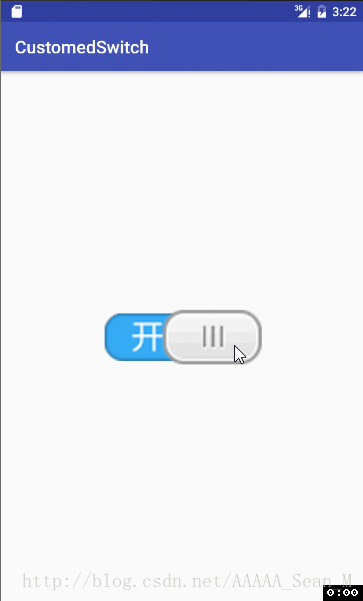
一、效果:
二、解析:
(1)自定义类继承View
/**
* 自定义开关
* Created by Sean on 2017/1/30.
*/
public class ToggleView extends View {
private Bitmap switchBackgroundBitmap;
private Bitmap slideButtonBitmap;
private Paint paint;
private boolean mSwitchState = false;
private float currentX;
private boolean isTouchMode;
public ToggleView(Context context) {
super(context);
init();
}
public ToggleView(Context context, AttributeSet attrs) {
super(context, attrs);
init();
}
public ToggleView(Context context, AttributeSet attrs, int defStyleAttr) {
super(context, attrs, defStyleAttr);
init();
}
/**
* 初始化画笔
*/
private void init() {
paint = new Paint();
}
}
(2)自定义属性,拷贝包名的全路径到xml文件中
<?xml version="1.0" encoding="utf-8"?>
<resources>
    <declare-styleable name="ToggleView">
        <attr name="switch_background" format="reference"/>
        <attr name="slide_button" format="reference"/>
        <attr name="switch_state" format="boolean"/>
    </declare-styleable>
</resources>
<?xml version="1.0" encoding="utf-8"?>
<RelativeLayout xmlns:android="http://schemas.android.com/apk/res/android"
    xmlns:tools="http://schemas.android.com/tools"
    xmlns:sean="http://schemas.android.com/apk/res/com.project.codingma.customedswitch"
    android:id="@+id/activity_main"
    android:layout_width="match_parent"
    android:layout_height="match_parent"
    android:paddingBottom="@dimen/activity_vertical_margin"
    android:paddingLeft="@dimen/activity_horizontal_margin"
    android:paddingRight="@dimen/activity_horizontal_margin"
    android:paddingTop="@dimen/activity_vertical_margin"
    tools:context=".MainActivity">

    <com.project.codingma.customedswitch.ToggleView
        android:layout_width="wrap_content"
        android:layout_height="wrap_content"
        android:id="@+id/toggleView"
        android:layout_centerInParent="true"
        sean:switch_background="@drawable/switch_background"
        sean:switch_state="false"
        sean:slide_button="@drawable/slide_button"/>
</RelativeLayout>
(3)找到相关控件,初始化信息
public ToggleView(Context context, AttributeSet attrs) {
super(context, attrs);
init();
String namespace = "http://schemas.android.com/apk/res/com.project.codingma.customedswitch";
int switchBackgroundRescource = attrs.getAttributeResourceValue(namespace,"switch_background",-1);
int slideButtonResource = attrs.getAttributeResourceValue(namespace,"slide_button",-1);
mSwitchState = attrs.getAttributeBooleanValue(namespace,"switch_state",false);
setSwitchBackgroundResource(switchBackgroundRescource);
setSlideButtonResource(slideButtonResource);
}
/**
     * 设置滑块图片
     * @param slideButtonResource 滑块背景图
     */
    private void setSlideButtonResource(int slideButtonResource) {
        slideButtonBitmap= BitmapFactory.decodeResource(getResources(),slideButtonResource);
    }

    /**
     * 设置背景图
     * @param switchBackgroundRescource 背景图资源
     */
    private void setSwitchBackgroundResource(int switchBackgroundRescource) {
        switchBackgroundBitmap = BitmapFactory.decodeResource(getResources(),switchBackgroundRescource);
    }
(4)测量自定义控件的大小
@Override
    protected void onMeasure(int widthMeasureSpec, int heightMeasureSpec) {
        setMeasuredDimension(switchBackgroundBitmap.getWidth(),switchBackgroundBitmap.getHeight());
    }
(5)绘制图像
@Override
protected void onDraw(Canvas canvas) {
canvas.drawBitmap(switchBackgroundBitmap,0,0,paint);
if(isTouchMode){
float newLeft = currentX - slideButtonBitmap.getWidth() / 2.0f;
int maxLeft = switchBackgroundBitmap.getWidth() - slideButtonBitmap.getWidth();
if(newLeft < 0){
newLeft = 0;
}else if (newLeft > maxLeft) {
newLeft = maxLeft;
}
canvas.drawBitmap(slideButtonBitmap, newLeft, 0, paint);
}else {
if(mSwitchState){
int newLeft = switchBackgroundBitmap.getWidth() - slideButtonBitmap.getWidth();
canvas.drawBitmap(slideButtonBitmap, newLeft, 0, paint);
}else {
canvas.drawBitmap(slideButtonBitmap, 0, 0, paint);
}
}
(6)设置触摸事件
@Override
public boolean onTouchEvent(MotionEvent event) {
switch (event.getAction()){
case MotionEvent.ACTION_DOWN:
isTouchMode=true;
currentX=event.getX();
break;
case MotionEvent.ACTION_MOVE:
currentX=event.getX();
break;
case MotionEvent.ACTION_UP:
isTouchMode=false;
currentX=event.getX();
float center = switchBackgroundBitmap.getWidth()/2.0f;
boolean state = currentX>center;
mSwitchState = state;
break;
default:
break;
}
invalidate();
return true;
源码地址:https://github.com/codingma/CustomizedSwitch


 扫一扫
扫一扫
 1027
1027

 被折叠的 条评论
为什么被折叠?
被折叠的 条评论
为什么被折叠?
 到【灌水乐园】发言


