


方法一(定位):
1、父元素position:relative
2、子元素position:absolute ,元素设置上下左右都为零值,margin设为auto
div{
    width: 100px;
    height: 100px;
    background-color: rgb(187, 111, 111);
    position: relative;}

p{
    width:50px;
    height:50px;
    background-color:#fff;
    position:absolute;
    left:0;
    right:0;
    top:0;
    bottom:0;
    margin:auto
}
方法二(定位):
1、父元素position:relative
2、子元素position:absolute ,left:50%;top:50%;margin-left:-25px;margin-top:-25px;
 div{
    width: 100px;
    height: 100px;
    background-color: rgb(187, 111, 111);
    position: relative;
}

p{
    width: 50px;
    height: 50px;
    background-color: #fff;
    position:absolute;
    top:50%;
    left: 50%;
    margin-left: -25px;
    margin-top: -25px;
}
方法三(定位+平移(常用))
1、父元素position:relative
2、子元素position:absolute ,left:50%;top:50%;transform:translate(-50%,-50%)
 div{
    width: 100px;
    height: 100px;
    background-color: rgb(187, 111, 111);
    position: relative;
 }

p{
    width: 50px;
    height: 50px;
    background-color: #fff;
    position:absolute;
    top:50%;
    left: 50%;
    transform:translate(-50%,-50%)   /* translate(水平平移,垂直平移) -50%代表自身大小的一半*/        }
方法四(vertical-align):
补充知识:
vertical-align 属性设置一个元素的垂直对齐方式。
该属性定义行内元素的基线相对于该元素所在行的基线的垂直对齐。允许指定负长 度值和百分比值。这会使元素降低而不是升高。在表单元格中,这个属性会设置单 元格框中的单元格内容的对齐方式。
 所在行的基线的垂直对齐
结构:
<div class="box">

    <p class="small"></p>
    <span>aaa</span>   /* 注意:保险期间 在子元素后面加span空标签 */

</div>
1.子元素:转为行内块元素 、在子元素后面加span标签(防止文件压缩后空格没有(空格也算文本))
再设置vertical-align:middle;(目的不以基线对齐 ,将元素以中部对齐)
注意:保险期间 在子元素后面加span空标签;
2.父元素:设置line-height
代码演示:
div{
            width: 200px;
            height: 200px;
            background-color: rgb(187, 111, 111);
            line-height: 200px;    /* 父元素设置行高 垂直居中 */
            text-align: center;       /* 文本水平居中 */
            margin: 200px auto;
        }

p{

            display: inline-block; /* 设置为行内块 vertical-align起作用*/
            width: 50px;
            height: 50px;
            background-color: rgb(63, 41, 182);
            vertical-align: middle;    /* 规定子元素 在父元素中处于中间 */


}
效果:
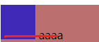
子元素没有设置vertical-align:middle时 以基线对齐:

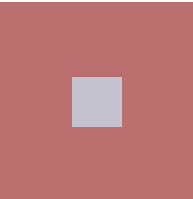
子元素设置vertical-align:middle后 子元素在父元素正中部 :

方法五(弹性盒子(移动端常用))
补充知识:弹性盒 flex
弹性盒子没有真正意义上的x轴/y轴 (默认x轴为主轴方向)
| 设置父元素上 | |
|---|---|
| flex-direction:改主轴方向 | row 默认为水平向右 column 垂直向下 row-reverse 水平向左 column-reverse垂直向上 |
| flex-wrap 换行 | nowrap默认不换行 、wrap换 |
| justify-content 主轴对齐方式 | flex-start 默认在主轴方向起点位置对齐 flex-end 在主轴方向终点位置对齐 center 中间 space-between 将空白区域平分在子项目之间 space-around 将空白区域环绕在子项目两边 |
| align-items 当行交叉轴对齐方式 | stretch 默认拉伸 (盒子高度不写 默认拉伸至父元素大小) flex-start 子项目在其所在行的起始位置摆放 flex-end 子项目在其所在行的结束位置摆放 center 中间 |
| align-content:多行交叉轴对齐方式 | flex-start 默认在所在行起点位置对齐 flex-end 在所在行终点位置对齐 center 中间
space-between 将空白区域平分在子项目之间
space-around 将空白区域环绕在子项目两边 |
| 设置在子项目上 | |
|---|---|
| align-self交叉轴齐方式 | stretch 默认拉伸
flex-start 子项目在其所在行的起始位置摆放
flex-end 子项目在其所在行的结束位置摆放 |
| order :num num越大排序越后 | 写了order的,属性值越小的在越前面;
没写order的属性值默认为零,order可以写负值。 |
| flex:number在父元素主轴方向的比份 | 数字 |
| flex-shrink: 0/1;子元素压缩 | 0---不压缩; 1---压缩; |
代码:
 div{
            display: flex;
            width: 200px;
            height: 200px;
            background-color: rgb(187, 111, 111);
            margin: 200px auto;
            justify-content: center; /* 默认水平方向为主轴  主轴方向中间对齐*/
            align-items: center;
        }
        p{

            width: 50px;
            height: 50px;
            background-color: rgb(196, 194, 207);


        }
效果:
方法六(网格布局)grid
代码:
div{
            display: grid;
            width: 100px;
            height: 100px;
            background-color: rgb(187, 111, 111);
            margin: 200px auto;
            grid-template-columns: 1fr 1fr 1fr;
            grid-template-rows: 1fr 1fr 1fr;
            /* 给网格中每个单元格命名 */
            grid-template-areas:"a b c"
                        "e f g"
                        "i o p" ;

        }
        p{
            grid-area: f;  /*将该元素注入中间的单元格中*/
            width: 50px;
            height: 50px;
            background-color: rgb(196, 194, 207);
         }


 2万+
2万+


 被折叠的 条评论
为什么被折叠?
被折叠的 条评论
为什么被折叠?
 到【灌水乐园】发言


