


前言
为了实现安卓中的侧滑菜单布局效果,通过查找鸿蒙的布局控件,发现SideBarContainer控件有点像,但是使用中发现并不是很符合我们的UI交互效果,因此我在鸿蒙中通过自定义布局的方式实现,本文主要介绍该自定义控件如何使用、SideBarContainer原生控件如何使用,后面会介绍如何通过自定义实现侧滑菜单布局。
DeVEcoStudio版本如下:
"minAPIVersion": 9,
"targetAPIVersion": 9,
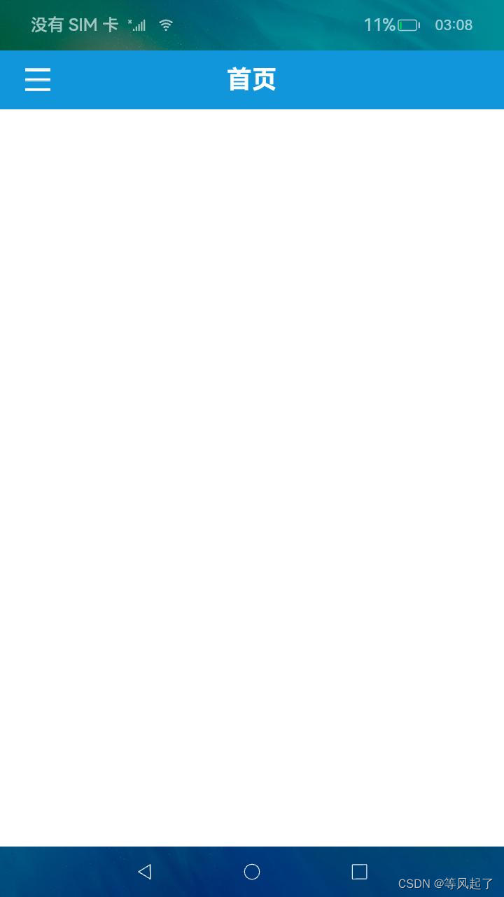
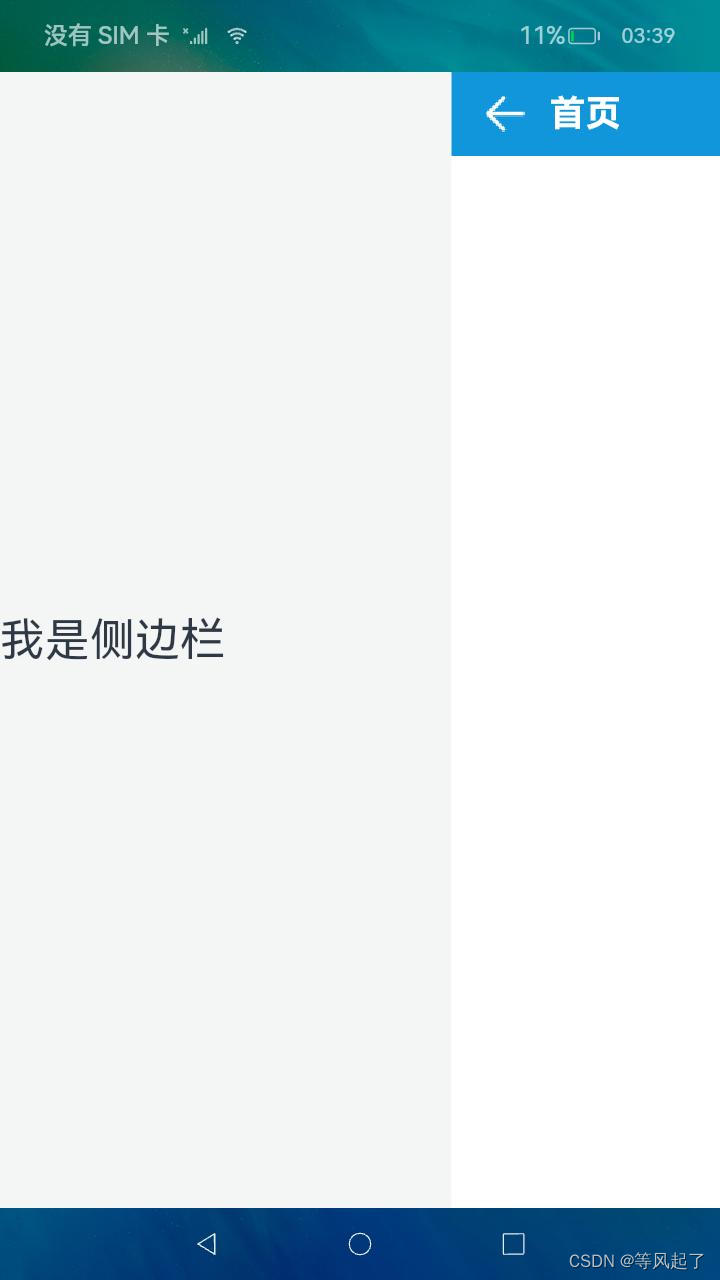
控件效果

如何使用
1、DrawerLayout.har包的引用
DrawerLayout.har下载地址:https://download.csdn.net/download/Abner_Crazy/88864397
在entry下的main目录下新建libs目录将下载完成的DrawerLayout.har拷贝到该目录,然后在oh-package.json5文件中添加对DrawerLayout.har的引用
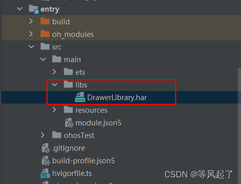
oh-package.json5文件
{
  "license": "",
  "devDependencies": {},
  "author": "",
  "name": "entry",
  "description": "Please describe the basic information.",
  "main": "",
  "version": "1.0.0",
  "dependencies": {
    "@app/DrawerLibrary": "file:./src/main/libs/DrawerLibrary.har"
  }
}
2、调用DrawerLayout布局
import { DrawerController, DrawerLayout } from '@app/DrawerLibrary'

@Entry
@Component
struct Index {
   @State controller: DrawerController = new DrawerController()
   @State isShowSideBar: boolean = false

   @Builder
   leftView() {
      Text('我是侧边栏').fontSize(30)
   }

   @Builder
   rightView() {
      Column() {
         RelativeContainer() {
            Image(this.isShowSideBar ? $r('app.media.drawer_select') : $r('app.media.drawer_normal'))
               .width(32)
               .height(32)
               .id('imageDrawer')
               .margin({ left: 20 })
               .alignRules({
                  center: { anchor: '__container__', align: VerticalAlign.Center },
                  left: { anchor: '__container__', align: HorizontalAlign.Start }
               })
               .onClick(() => {
                  if (this.isShowSideBar) {
                     this.controller.hideSideBar()
                  } else {
                     this.controller.showSideBar()
                  }
               })

            Text('首页')
               .fontSize(24)
               .fontColor(Color.White)
               .fontWeight(FontWeight.Bold)
               .id("textTitle")
               .alignRules({
                  center: { anchor: '__container__', align: VerticalAlign.Center },
                  middle: { anchor: '__container__', align: HorizontalAlign.Center }
               })
         }
         .backgroundColor('#1296db')
         .width('100%')
         .height(56)
      }.width('100%')
      .height('100%')
   }

   build() {
      Stack() {
         DrawerLayout({
            isShowSideBar: this.isShowSideBar,
            controller: this.controller,
            leftView: () => this.leftView(),
            rightView: () => this.rightView()
         })
      }.width('100%')
      .height('100%')
   }
}
DrawerLayout参数解释:
| 属性 | 是否必须 | 描述 |
| isShowSideBar | 是 | 侧边栏是否显示 |
| controller | 是 | 布局控制器,有两个方法: showSideBar():显示侧边栏 hideSideBar():隐藏侧边栏 |
| leftView | 是 | 左侧侧边栏的布局 |
| rightView | 是 | 右侧内容的布局 |
| sideBarWidth | 否 | 左侧侧边栏的宽度 |
鸿蒙原生侧边栏布局使用介绍
SideBarContainer控件官方介绍:sidebarcontainer介绍

1、SideBarContainer调用
@Entry
@Component
struct Index {
   @State isShowSideBar: boolean = false

   @Builder
   leftView() {
      Text('我是侧边栏').fontSize(30)
   }

   @Builder
   rightView() {
      Column() {
         RelativeContainer() {
            Image(this.isShowSideBar ? $r('app.media.drawer_select') : $r('app.media.drawer_normal'))
               .width(32)
               .height(32)
               .id('imageDrawer')
               .margin({ left: 20 })
               .alignRules({
                  center: { anchor: '__container__', align: VerticalAlign.Center },
                  left: { anchor: '__container__', align: HorizontalAlign.Start }
               })
               .onClick(() => {
                  this.isShowSideBar = !this.isShowSideBar
               })

            Text('首页')
               .fontSize(24)
               .fontColor(Color.White)
               .fontWeight(FontWeight.Bold)
               .id("textTitle")
               .alignRules({
                  center: { anchor: '__container__', align: VerticalAlign.Center },
                  middle: { anchor: '__container__', align: HorizontalAlign.Center }
               })
         }
         .backgroundColor('#1296db')
         .width('100%')
         .height(56)
      }.width('100%')
      .height('100%')
   }

   build() {
      Stack() {
         SideBarContainer(SideBarContainerType.Embed) {
            this.leftView()

            this.rightView()
         }
         .showSideBar(this.isShowSideBar)
         .showControlButton(false) //是否显示控制按钮
         .sideBarWidth(300)
         .maxSideBarWidth(300)
         .onChange((value: boolean) => {
            console.info('status:' + value)
         })
      }.width('100%')
      .height('100%')
   }
}
2、控件效果:


 345
345


 被折叠的 条评论
为什么被折叠?
被折叠的 条评论
为什么被折叠?
 到【灌水乐园】发言


