


1、CSS3新增选择器
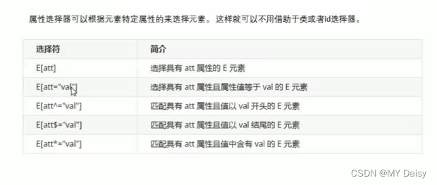
- 属性选择器,权重为10
- 结构伪类选择器,权重为10
- 伪元素选择器,权重为10
1.1 属性选择器
用属性选择器可以不用借助类或id选择器
语法:
正则表达式:^表示开头,$表示结尾,*表示任意
/*标签名[属性名]*/
input[value]{
	color:pink
}
/*标签名[属性=属性名] ---重要 */
input[type=text]{
	color:red;
}
/* 标签名[属性名^=属性值开头字符] */
div[class^=icon]{
	color:red;
	}
/* 标签名[属性名$="aa" */
div[class$=data]{
    color: blue;
 }
/* 标签名[属性名*="aa" */
div[class*="va"]{
    color: blueviolet;
    font-size: 30px;
}
<!DOCTYPE html>
<html lang="en">
<head>
<meta charset="UTF-8">
<meta http-equiv="X-UA-Compatible" content="IE=edge">
<meta name="viewport" content="width=device-width, initial-scale=1.0">
<title>Document</title>
<style>
/* 必须是input,且同时有value属性 */
input[value]{
color: red;
}
input[type=tel]{
color: red;
}
div[class^=icon]{
color: red;
}
div[class$=data]{
color: blue;
}
div[class*="va"]{
color: blueviolet;
font-size: 30px;
}
</style>
</head>
<body>
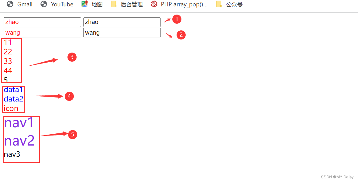
<!-- 1用属性选择器可以不用借助类或id选择器 -->
<input type="text" value="请输入用户名">
<input type="text" name="" id="">
<br>
<!-- 2用属性选择器可以选属性=属性值的元素 -->
<input type="tel">
<input type="email">
<!-- 3属性选择器可以选择属性值开头的某些元素 -->
<div class="icon1">11</div>
<div class="icon2">22</div>
<div class="icon3">33</div>
<div class="icon4">44</div>
<div>5</div>
<!-- 4属性选择器可以选择以某个属性值结尾的某些元素 -->
<div class="icon-data">data1</div>
<div class="icon-data">data2</div>
<div class="icon-icon">icon</div>
<!-- 5属性选择器可以选择属性值中含有某个值的元素 -->
<div class="navass">nav1</div>
<div class="navabb">nav2</div>
<div class="nav">nav3</div>
</body>
</html>
1.2 结构伪类选择器
权重是10
主要根据文档结构选择元素,常用于选择父级选择器里的子元素
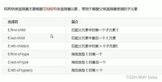
语法:
/*1、父标签名 子标签名:first-child,
表示如果第一个子标签是li才进行选择
如果不写li子标签名,就直接渲染第一个子元素*/
ul li:first-child{
        background-color: green;
}
/*2、父标签名 子标签名:last-child*/
ul li:last-child{
       background-color: blueviolet;
}
/*3、父标签名 子标签名:nth-child(n)*/
ul li:nth-child(2){
       background-color: skyblue;
}
/*4、父标签名 子标签名:first-of-type,
表示如果第一个子标签是li才进行选择
如果不写li子标签名,就直接渲染第一个子元素*/
ul li:first-of-type{
        background-color: green;
}
/*5、父标签名 子标签名:last-of-type*/
ul li:last-of-type{
       background-color: blueviolet;
}
/*6、父标签名 子标签名:nth-of-type(n)*/
ul li:nth-of-type(2){
       background-color: skyblue;
}
选择符说明:
1、nth-child(n)
选择某个父元素的一个或多个特定的子元素。
- n可以是数字(从1开始)
- n可以是公式:n从0开,变量名必须是n,不能是其他字母
| 公式 | 含义 |
|---|---|
| n | 全部元素 |
| 2n | 偶数 |
| 2n+1 | 奇数 |
| 5n | 选择第5、10、15…给元素 |
| n+5 | 从第5个(包含第5个)开始到最后一个 |
| -n+5 | 前5个,包含第5个 |
n可以是关键字(even-偶数,odd-奇数)
2、nth-of-type(n)
选择某个父元素的一个或多个特定的子元素。
- n可以是数字(从1开始)
- n可以是公式:n从0开,变量名必须是n,不能是其他字母
| 公式 | 含义 |
|---|---|
| n | 全部元素 |
| 2n | 偶数 |
| 2n+1 | 奇数 |
| 5n | 选择第5、10、15…给元素 |
| n+5 | 从第5个(包含第5个)开始到最后一个 |
| -n+5 | 前5个,包含第5个 |
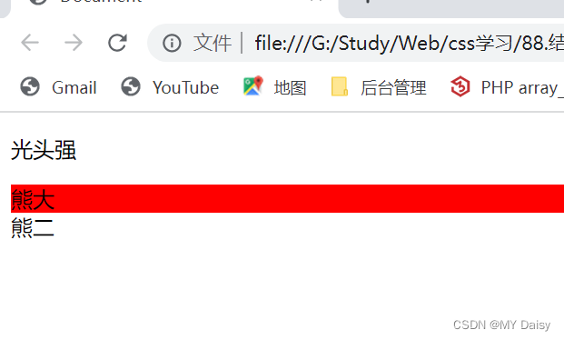
3、nth-child和nth-of-type的区别
<!DOCTYPE html>
<html lang="en">
<head>
    <meta charset="UTF-8">
    <meta http-equiv="X-UA-Compatible" content="IE=edge">
    <meta name="viewport" content="width=device-width, initial-scale=1.0">
    <title>Document</title>
    <style>
        section div:nth-child(1){
            color: red;
        }
        section div:nth-of-type(1){
            background-color: red;
        }
    </style>
</head>
<body>
    <section>
        <p>光头强</p>
        <div>熊大</div>
        <div>熊二</div>
    </section>
</body>
</html>
1、nth-child将所有盒子排列序号,
执行的时候首先看:nth-child(1),本示例是p,然后看样式选择的是div才进行渲染,p!=div,所以不会渲染
2、nth-of-type将**指定**子元素的盒子排列序号,
执行的时候首先看div:,示例中有两个div熊大、熊二;
然后再看nth-of-type(1),选择第1个指定的子元素进行渲染
练习:
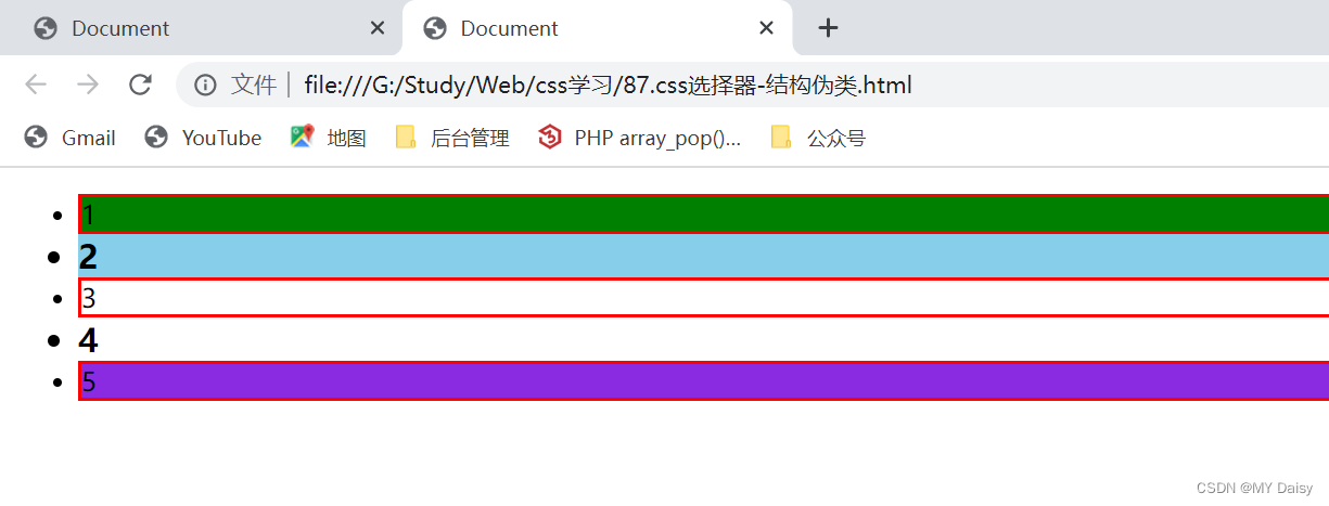
1、nth-child
<!DOCTYPE html>
<html lang="en">
<head>
    <meta charset="UTF-8">
    <meta http-equiv="X-UA-Compatible" content="IE=edge">
    <meta name="viewport" content="width=device-width, initial-scale=1.0">
    <title>Document</title>
    <style>
        /* 1、ul中第一个li背景色改为绿色 */
        ul li:first-child{
            background-color: green;
        }
        /* 2、ul中最后一个li背景改为紫色 */
        ul li:last-child{
            background-color: blueviolet;
        }
        /* 3、ul中第2个li背景改为蓝色 */
        ul li:nth-child(2){
            background-color: skyblue;
        }
        /* 4、ul中偶数li字体加粗变大 */
        ul li:nth-child(even){
            font-size: 20px;
            font-weight: 700;
        }
        /* 5、ul中奇数加上边框red */
        ul li:nth-child(2n+1){
            border: 2px red solid;
        }
    </style>
</head>
<body>
    <ul>
        <li>1</li>
        <li>2</li>
        <li>3</li>
        <li>4</li>
        <li>5</li>
    </ul>
</body>
</html>
2、nth-of type
<!DOCTYPE html>
<html lang="en">
<head>
    <meta charset="UTF-8">
    <meta http-equiv="X-UA-Compatible" content="IE=edge">
    <meta name="viewport" content="width=device-width, initial-scale=1.0">
    <title>Document</title>
    <style>
        section div:nth-of-type(1){
            background-color: red;
        }
    </style>
</head>
<body>
    <section>
        <p>光头强</p>
        <div>熊大</div>
        <div>熊二</div>
    </section>
</body>
</html>
1.3 伪元素选择器
1.3.1 伪元素选择器语法
伪元素选择器可以帮助我们利用CSS创建新标签元素,而不需要HTML标签,从而简化HTML结构
| 选择符 | 简介 |
|---|---|
| ::before | 在元素内部前面插入内容 |
| ::after | 在元素内部后面插入内容 |
- 使用before和after会创建一个元素,但是属于行内元素
- 新创建的这个元素在文档树中是找不到的(就是f12检查不到),所以称为伪元素
- 语法
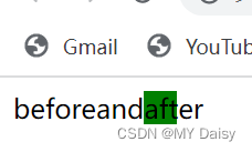
element::before{
	content:'before';
}
- before和after必须有content属性
- before在父元素内的前面创建元素,after在父元素内容后面插入元素
- 伪元素选择器和标签选择器权重是1
<!DOCTYPE html>
<html lang="en">
<head>
    <meta charset="UTF-8">
    <meta http-equiv="X-UA-Compatible" content="IE=edge">
    <meta name="viewport" content="width=device-width, initial-scale=1.0">
    <title>Document</title>
    <style>
        div::before{
            content: 'before';
        }
        div::after{
            content: 'after';
            background-color: red;
            display: inline-block;
            width: 20px;
            height: 20px;
            background-color: green;
        }
    </style>
</head>
<body>
    <div>and</div>
</body>
</html>
1.3.2 伪元素选择器使用场景
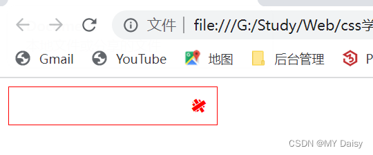
(1)伪元素字体图标
<!DOCTYPE html>
<html lang="en">

<head>
    <meta charset="UTF-8">
    <meta http-equiv="X-UA-Compatible" content="IE=edge">
    <meta name="viewport" content="width=device-width, initial-scale=1.0">
    <title>Document</title>
    <style>
        @font-face {
            font-family: 'icomoon';
            src: url('fonts/icomoon.eot?f89dt3');
            src: url('fonts/icomoon.eot?f89dt3#iefix') format('embedded-opentype'),
                url('fonts/icomoon.ttf?f89dt3') format('truetype'),
                url('fonts/icomoon.woff?f89dt3') format('woff'),
                url('fonts/icomoon.svg?f89dt3#icomoon') format('svg');
            font-weight: normal;
            font-style: normal;
            font-display: block;
        }

        div {
            position: relative;
            width: 200px;
            height: 35px;
            border: red solid 1px;
        }

        div::after {
            position: absolute;
            top:10px;
            right:10px;
            font-family: 'icomoon';
            content: '\e901';
            font-size: 14px;
            color: red;
        }
    </style>
</head>

<body>
    <div></div>
</body>

</html>
(2)仿土豆遮罩效果
<!DOCTYPE html>
<html lang="en">
<head>
    <meta charset="UTF-8">
    <meta http-equiv="X-UA-Compatible" content="IE=edge">
    <meta name="viewport" content="width=device-width, initial-scale=1.0">
    <title>Document</title>
    <style>
        *{
            margin: 0;
            padding: 0;
        }
        .box{
            margin: 30px auto;
            width: 444px;
            height: 300px;
            background-color: pink;
            position: relative;
        }
        img{
            width: 100%;
            height:100%;
        }
        .box::before{
            content: '';
            display: none;
            position:absolute;
            top:0;
            left: 0;
            width: 100%;
            height: 100%;
            background: rgba(0, 0, 0, 0.4) url(../images/arr.png) no-repeat center;
        }
        /* 鼠标经过box这个盒子时,就让里面的before遮罩层显示出来 */
        .box:hover::before{
            display: block;
        }

    </style>
</head>
<body>
    <div class="box">
        <img src="../images/tudou.jpg" alt="">
    </div>
</body>
</html>

(3)伪元素清除浮动
- 父级添加after伪元素–额外标签法的升级
.clearfix::after{
	content:"";//伪元素必须写的属性
	display:block;//清除浮动插入的元素必须是块级元素
	height:0;//不用看见这个元素标签
	clear:both;//核心代码清除浮动
	// 不用看见这个元素,不会脱标,如果用display:none就会脱标
	visibility:hidden;
}
- 父级添加双伪元素
.clearfix::after,
.clearfix::before{
	content:"";//伪元素必须写的属性
	display:table;//转为块级元素,并且一行显示
}
.clearfix::after{
	clear:both;


 538
538


 被折叠的 条评论
为什么被折叠?
被折叠的 条评论
为什么被折叠?
 到【灌水乐园】发言


