


一: 点击div跳转新页面.
不要用<router-link :to="..."></router-link>包裹div,而是给div绑定点击事件,再用$route.push()方法做路由跳转。

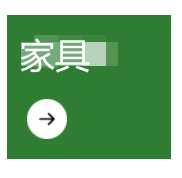
例子:
<div class="flex-grow w-40 h-36 ml-4 pl-5 pt-6 text-xl text-white" style="background-color: #2e7d32" @click="$router.push({name:'Furniture'})">
	<p class="font-semibold">家具</p>
	<div class="mt-8">
		<!-- 箭头 -->
		<img src="@/assets/img/home-arrow.png" alt="" class="w-10 h-10">
	</div>
</div>
二、列表元素自适应屏幕宽度展示
用div包裹列表,给它设置flex和flex-wrap(自动换行),内部小div设置宽高,用padding做内部的元素定位(注意此时盒模型为IE盒模型,元素padding和border值都算在元素的宽高内),图片直接使用img标签(不需要在外面包裹div)设置宽高。
如果要每行固定显示两个元素,用style="width: calc(50% - 1rem);"来设置内部每个小div的宽度为一半少一点,注意这时候要看清楚每个div的margin,margin会撑开盒子导致一行放不下两个。
如图:


<body>
    <link href="https://unpkg.com/tailwindcss@^2/dist/tailwind.min.css" rel="stylesheet">

    <div class="flex flex-wrap">
        <div class="flex-grow w-40 h-36 ml-4 mt-4 pl-5 pt-6 bg-black">
            <p class="text-red-700">家具</p>
            <img src="./img/arrow.png" alt="" class="w-10 h-10 mt-8">
        </div>
        <div class="flex-grow w-40 h-36 ml-4 mt-4 mr-4 pl-5 pt-6 bg-blue-300">
            <p>家具</p>
            <img src="./img/arrow.png" alt="" class="w-10 h-10 mt-8">
        </div>
        <div class="flex-grow w-40 h-36 ml-4 mt-4 pl-5 pt-6 bg-black">
            <p class="text-red-700">家具</p>
            <img src="./img/arrow.png" alt="" class="w-10 h-10 mt-8">
        </div>
        <div class="flex-grow w-40 h-36 ml-4 mr-4 mt-4 pl-5 pt-6 bg-blue-300">
            <p>家具</p>
            <img src="./img/arrow.png" alt="" class="w-10 h-10 mt-8">
        </div>
    </div>
</body>
三、可以任意拖动的组件
一般做页面上的联系我们按钮,可以随意拖动,并且会自动停靠在屏幕左右。

使用移动端的touchstart, touchmove和touchend来完成相应功能。
更便携的有可使用的组件:sc-suspension。使用npm或yarn安装:
npm i sc-suspension


 122
122


 被折叠的 条评论
为什么被折叠?
被折叠的 条评论
为什么被折叠?
 到【灌水乐园】发言


