


背景
最初方案是使用dataV中的大屏自适应组件,后续发现dataV在不同显示器分辨率下的效果会不一致导致图表内容错位等问题;后续查找资料重新写自适应。
组件封装
resizeMixin.js
// * 默认缩放值
const scale = {
    width: '1',
    height: '1',
};

// * 设计稿尺寸(px)
const baseWidth = 2560;
const baseHeight = 1440;

// * 需保持的比例(默认16:9)
const baseProportion = parseFloat((baseWidth / baseHeight).toFixed(5));

export default {
    data() {
        return {
            drawTiming: null,
        };
    },
    mounted() {
        this.calcRate();
        window.addEventListener('resize', this.resize);
    },
    beforeDestroy() {
        window.removeEventListener('resize', this.resize);
    },
    methods: {
        calcRate() {
            const appRef = this.$refs['appRef'];
            if (!appRef) return;
            // 当前宽高比
            const currentRate = parseFloat(
                (window.innerWidth / window.innerHeight).toFixed(5)
            );
            if (appRef) {
                // if (currentRate > baseProportion) {
                //     // 表示更宽
                //     scale.width = (
                //         (window.innerHeight * baseProportion) /
                //         baseWidth
                //     ).toFixed(5);
                //     scale.height = (window.innerHeight / baseHeight).toFixed(5);
                //     appRef.style.transform = `scale(${scale.width}, ${scale.height})`;
                // } else {
                    // 表示更高
                    scale.height = (
                        window.innerWidth /
                        baseProportion /
                        baseHeight
                    ).toFixed(5);
                    scale.width = (window.innerWidth / baseWidth).toFixed(5);
                    appRef.style.transform = `scale(${scale.width}, ${scale.height})`;
                // }
            }
        },
        resize() {
            clearTimeout(this.drawTiming);
            this.drawTiming = setTimeout(() => {
                this.calcRate();
            }, 200);
        },
    },
};
页面使用
js:
import resizeMixin from "@/utils/resizeMixin";

export default {
  mixins: [resizeMixin],

  data() {
    return {}
  },
  ......
}
div:
<template>
  <div class="pane" ref="appRef">
  ......
   </div>
</template>
css:
.pane {
  /*// 设计稿宽高*/
  width: 2560px;
  height: 1440px;
  /*// 盒子水平垂直居中*/
  position: fixed;
  top: 0;
  left: 0;
  transform-origin: left top;
  transform: translate(-50%, -50%);
  overflow: hidden;
}
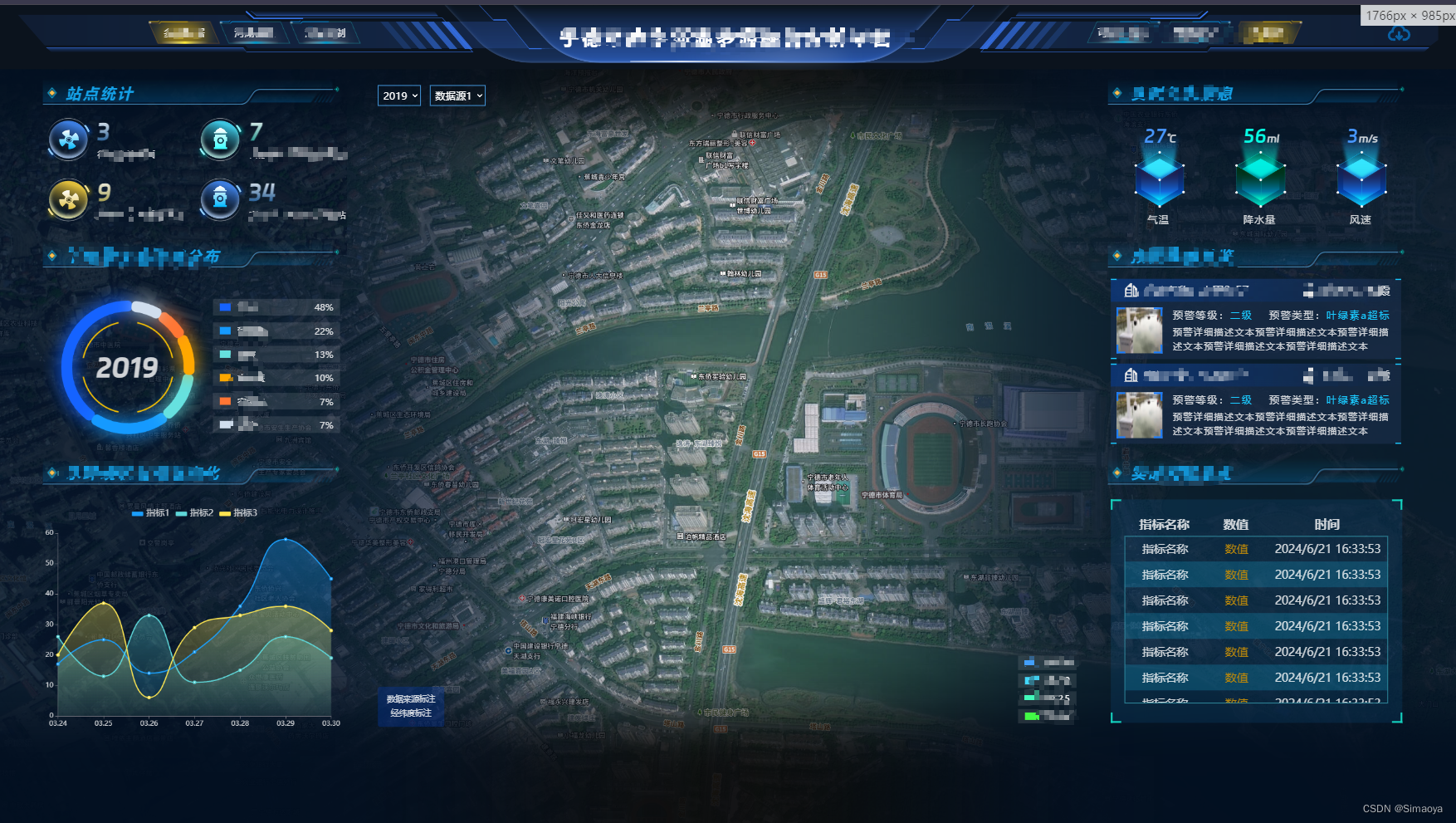
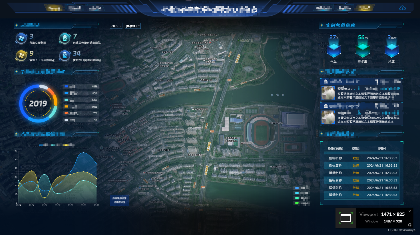
效果图:


 被折叠的 条评论
为什么被折叠?
被折叠的 条评论
为什么被折叠?
 到【灌水乐园】发言


