


Android初体验UI篇——四种基本布局
四种基本布局
一个丰富的界面由许许多多的控件组成,为了控件有条不紊地摆放在界面里,我们就借助布局来实现,布局是一个可以放置控件的容器,他可以按照你的意向来调整控件位置,从未编写出更精美的界面。当然,除了放置控件外,布局也可以嵌套布局,从而完成较为复杂的界面实现。
线性布局(LinearLayout)
LinearLayout,线性布局,是一种较为常用的布局。如其名,线性布局会将它所包含的控件在线性方向(可横向,可竖向)依次排列。我们可以通过android:orientation这个属性来指定排列方向:vertical是垂直方向排列,horizontal是水平方向排列。
现在我们通过代码来看看这个属性:
<?xml version="1.0" encoding="utf-8"?>
<LinearLayout xmlns:android="http://schemas.android.com/apk/res/android"
    android:layout_width="match_parent"
    android:layout_height="match_parent"
    android:orientation="vertical">

    <Button
        android:id="@+id/btn_1"
        android:layout_width="wrap_content"
        android:layout_height="wrap_content"
        android:text="Button 1"/>

    <Button
        android:id="@+id/btn_2"
        android:layout_width="wrap_content"
        android:layout_height="wrap_content"
        android:text="Button 2"/>

    <Button
        android:id="@+id/btn_3"
        android:layout_width="wrap_content"
        android:layout_height="wrap_content"
        android:text="Button 3"/>

</LinearLayout>
我们将排列方向设置为垂直方向,每个Button的宽度高度都设置为wrap_content,下面我们来看看效果:

然后我们将android:orientation改为horizontal:
android:orientation="horizontal"
效果图如下:

这里我们还需要注意,当我们排列方向是vertical时,我们的控件高度不能为match_parent,同理,当我们排列方向是horizontal时,我们的控件宽度不能为match_parent。
除此之外,为了更方便我们排列我们的控件,还有一个属性andoid:layout_gravity,它可以指定控件在布局内的对齐方式,以下是这个属性的可选值:

下面我们通过编写代码来深层体会这些属性值:
<?xml version="1.0" encoding="utf-8"?>
<LinearLayout xmlns:android="http://schemas.android.com/apk/res/android"
    android:layout_width="match_parent"
    android:layout_height="match_parent"
    android:orientation="horizontal">

    <Button
        android:id="@+id/btn_1"
        android:layout_gravity="top"
        android:layout_width="wrap_content"
        android:layout_height="wrap_content"
        android:text="Button 1"/>

    <Button
        android:id="@+id/btn_2"
        android:layout_gravity="center_vertical"
        android:layout_width="wrap_content"
        android:layout_height="wrap_content"
        android:text="Button 2"/>

    <Button
        android:id="@+id/btn_3"
        android:layout_gravity="bottom"
        android:layout_width="wrap_content"
        android:layout_height="wrap_content"
        android:text="Button 3"/>

</LinearLayout>
首先我们将排列方向改为水平方向,然后btn_1的属性值为top也就是顶部对齐,btn_2的是属性值是center_vertical也就是竖直方向的最中间,btn_3的属性只是bottom是底部对齐。
为了便捷的设置控件大小,LinearLayout还有一个andoid:layout_weight属性,它可以按权重比来设置控件大小,我们还是来通过代码讲解吧:
<?xml version="1.0" encoding="utf-8"?>
<LinearLayout xmlns:android="http://schemas.android.com/apk/res/android"
    android:layout_width="match_parent"
    android:layout_height="match_parent"
    android:orientation="horizontal">

    <Button
        android:id="@+id/btn_1"
        android:layout_width="0dp"
        android:layout_height="wrap_content"
        android:layout_weight="1"
        android:text="Button 1"/>

    <Button
        android:id="@+id/btn_2"
        android:layout_width="0dp"
        android:layout_height="wrap_content"
        android:layout_weight="1"
        android:text="Button 2"/>

    <Button
        android:id="@+id/btn_3"
        android:layout_width="0dp"
        android:layout_height="wrap_content"
        android:layout_weight="1"
        android:text="Button 3"/>

</LinearLayout>
效果如下图:

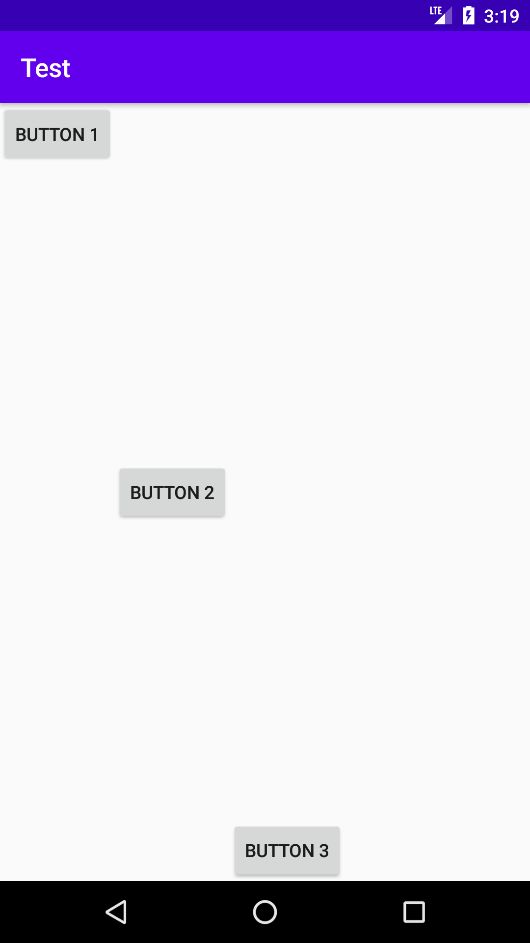
可以清楚的看见,每个Button的宽度都相同,那是因为他们的权重都是1,当他们三个权重相加后,每个人占的都是1,所以也就相同了
现在我们在将btn_1的layout_weight改为2,这时btn_1就占1/2,btn_2就占1/4,btn_3就占1/4;
<?xml version="1.0" encoding="utf-8"?>
<LinearLayout xmlns:android="http://schemas.android.com/apk/res/android"
    android:layout_width="match_parent"
    android:layout_height="match_parent"
    android:orientation="horizontal">

    <Button
        android:id="@+id/btn_1"
        android:layout_width="0dp"
        android:layout_height="wrap_content"
        android:layout_weight="2"
        android:text="Button 1"/>

    <Button
        android:id="@+id/btn_2"
        android:layout_width="0dp"
        android:layout_height="wrap_content"
        android:layout_weight="1"
        android:text="Button 2"/>

    <Button
        android:id="@+id/btn_3"
        android:layout_width="0dp"
        android:layout_height="wrap_content"
        android:layout_weight="1"
        android:text="Button 3"/>

</LinearLayout>
效果图如下:

相对布局(RelativeLayout)
RelativeLayout,相对布局,也是一种非常常用的布局。它与线性布局相比较更为随意,它可以通过相对定位的方式让控件出现在布局的任何位置。
我们通过实践来体会一下吧:
<?xml version="1.0" encoding="utf-8"?>
<RelativeLayout xmlns:android="http://schemas.android.com/apk/res/android"
    android:layout_width="match_parent"
    android:layout_height="match_parent">

    <Button
        android:id="@+id/btn_1"
        android:layout_width="wrap_content"
        android:layout_height="wrap_content"
        android:layout_alignParentLeft="true"
        android:layout_alignParentTop="true"
        android:text="Button 1"/>

    <Button
        android:id="@+id/btn_2"
        android:layout_width="wrap_content"
        android:layout_height="wrap_content"
        android:layout_alignParentTop="true"
        android:layout_alignParentRight="true"
        android:text="Button 2"/>

    <Button
        android:id="@+id/btn_3"
        android:layout_width="wrap_content"
        android:layout_height="wrap_content"
        android:layout_centerInParent="true"
        android:text="Button 3"/>

    <Button
        android:id="@+id/btn_4"
        android:layout_width="wrap_content"
        android:layout_height="wrap_content"
        android:layout_alignParentBottom="true"
        android:layout_alignParentLeft="true"
        android:text="Button 4"/>

    <Button
        android:id="@+id/btn_5"
        android:layout_width="wrap_content"
        android:layout_height="wrap_content"
        android:layout_alignParentRight="true"
        android:layout_alignParentBottom="true"
        android:text="Button 5"/>

</RelativeLayout>
效果图如下:

上面的这些代码应该很好理解,因为属性的名字就已经说明了他们的作用,button1和父布局左上角对齐,button2和父布局右上角对齐,button3在父布局中心显示,button4和父布局左下角对齐,button5和父布局右下角对齐。
除了上面这些属性,还有
android:layout_above控制一个控件位于另一个控件的上方
android:layout_below控制一个控件位于另一个控件的下方
android:layout_toRightOf控制一个控件位于另一个控件的右侧
android:layout_toLeftOf控制一个控件位于另一个控件的左侧
我们不妨来体验一下:
<?xml version="1.0" encoding="utf-8"?>
<RelativeLayout xmlns:android="http://schemas.android.com/apk/res/android"
    android:layout_width="match_parent"
    android:layout_height="match_parent">

    <Button
        android:id="@+id/btn_1"
        android:layout_width="wrap_content"
        android:layout_height="wrap_content"
        android:layout_above="@id/btn_3"
        android:layout_toLeftOf="@id/btn_3"
        android:text="Button 1"/>

    <Button
        android:id="@+id/btn_2"
        android:layout_width="wrap_content"
        android:layout_height="wrap_content"
        android:layout_above="@id/btn_3"
        android:layout_toRightOf="@id/btn_3"
        android:text="Button 2"/>

    <Button
        android:id="@+id/btn_3"
        android:layout_width="wrap_content"
        android:layout_height="wrap_content"
        android:layout_centerInParent="true"
        android:text="Button 3"/>

    <Button
        android:id="@+id/btn_4"
        android:layout_width="wrap_content"
        android:layout_height="wrap_content"
        android:layout_below="@id/btn_3"
        android:layout_toLeftOf="@id/btn_3"
        android:text="Button 4"/>

    <Button
        android:id="@+id/btn_5"
        android:layout_width="wrap_content"
        android:layout_height="wrap_content"
        android:layout_below="@id/btn_3"
        android:layout_toRightOf="@id/btn_3"
        android:text="Button 5"/>

</RelativeLayout>
效果图如下:

RelativeLAyout还有另一组相对于控件进行定位的属性:
android:layout_alignLeft控制一个控件与另一个控件两者左边缘对齐
android:layout_alignRight控制一个控件与另一个控件两者右边缘对齐
android:layout_alignTop控制一个控件与另一个控件两者上边缘对齐
android:layout_alignBottom控制一个控件与另一个控件两者下边缘对齐
帧布局(FrameLayout)
FrameLayout,帧布局,它与前面两者相比简单不少,因此应用他的地方也很少。这种布局没有很方便的定位方式,所有的控件都会默认摆放在布局的左上角。
我们做个小实践吧:
<?xml version="1.0" encoding="utf-8"?>
<FrameLayout xmlns:android="http://schemas.android.com/apk/res/android"
    android:layout_width="match_parent"
    android:layout_height="match_parent">

    <ImageView
        android:layout_width="wrap_content"
        android:layout_height="wrap_content"
        android:src="@mipmap/ic_launcher"/>

    <TextView
        android:layout_width="wrap_content"
        android:layout_height="wrap_content"
        android:text="Hello World!"
        android:textSize="20sp"/>

</FrameLayout>
效果图如下:

我们可以看到TextView叠加在了ImageView上,这样就降低了界面的美观,所以帧布局在一般情况下我们很少使用。
百分比布局
该布局已被弃用,更推荐使用其他布局。


 3591
3591

 被折叠的 条评论
为什么被折叠?
被折叠的 条评论
为什么被折叠?
 到【灌水乐园】发言


