


Button.tsx
import React, { Component } from "react"
import "./index.scss"
import classnames from "classnames"
type ButtonType = "default" | "primary" | "secondary" | "success" | "error"
type ButtonStyle = "outlined" | "container"
type ButtonSize = "small" | "normal" | "large"
type ButtonShape = "circle" | "square"

interface Props {
	type?: ButtonType
	variant?: ButtonStyle
	size?: ButtonSize
	children?: string
	disabled?: Boolean
	shape?: ButtonShape
	onClick?: () => void
}

export default class Button extends Component<Props> {
	static defaultProps = {
		type: "default",
		variant: "container",
		size: "normal",
		disabled: "false",
		shape: "square",
	}

	render() {
		const { type, onClick, variant, size, disabled, shape } = this.props
		const btnClassName = classnames({
			"button ": true,
			[`button-${type}-${variant}`]: true,
			[`button-${size}`]: true,
			[`button-disabled-${disabled}`]: true,
			[`button-${shape}`]: true,
		})
		return (
			<button className={btnClassName} onClick={onClick}>
				{this.props.children}
			</button>
		)
	}
}
Button.scss(注意引用顺序)
@import "btn-type.scss";

.button {
	line-height: 1.5715;
	margin: 0 5px;
	position: relative;
	display: flex;
	align-items: center;
	font-weight: 400;
	white-space: nowrap;
	text-align: center;
	// border: 1px solid transparent;
	cursor: pointer;
	transition: all 0.3s cubic-bezier(0.645, 0.045, 0.355, 1);

	padding: 6px 12px;
	font-size: 15px;
	border-radius: 10px;
}

@import "btn-size.scss";
@import "btn-disable.scss";
@import "btn-shape.scss";
btn-type.scss
/* 按钮默认样式 */
.button-default-outlined {
	color: #000000d9;
	border-color: #d9d9d9;
	background: #fff;
	&:hover{
		color: #40a9ff;
		border-color: #40a9ff;
	}
}
.button-default-container{
	color: #000000d9;
	border-color: #949292;
	background: #f0f0f0;
	&:hover{
		color: #40a9ff;
		border-color: #40a9ff;
	}
}

/* 按钮主样式 */
.button-primary-outlined {
	color: #40a9ff;
	border-color: #40a9ff;
	// background: #40a9ff;
	&:hover{
        color: #40a9ff;
		border-color: #0095ff;
		background: #edf7ff;
	}
}
.button-primary-container {
	color: #fff;
	border-color: #40a9ff;
	background: #40a9ff;
	&:hover{
		border-color: #69c0ff;
		background: #69c0ff;
	}
}

/* secondary样式 */
.button-secondary-container {
	color: #fff;
	border-color: #f36d2e;
	background: #ff8640f3;
	&:hover{
		color: #fff;
		border-color: #fd3300;
		background: #f36d2e;
	}
}
.button-secondary-outlined {
	color: #ff9456;
	border-color: #ff9456;
	// background: #ff8640f3;
	&:hover{
		color: #fa813b;
		border-color: #fd3300;
		background: #fff6eff3;
	}
}
.button-success-outlined {
	color: #2d9c00;
	border-color: #2d9c00;
	// background: #ff8640f3;
	&:hover{
		color: #237c00;
		border-color: #2d9b01d7;
		background: #ebfae5;
	}
}
.button-success-container {
	color: #fff;
	border-color: #2d9c00;
	background: #2d9c00;
	&:hover{
		color: #fff;
		border-color: #31ad00;
		background: #31ad00;
	}
}
.button-error-outlined {
	color: rgb(175, 0, 0);
	border-color: rgb(175, 0, 0);
	// background: #fff;
	&:hover{
		color: rgba(187, 0, 0, 0.76);
		border-color: #ff0000;
		background: rgb(252, 229, 229);
	}
}
.button-error-container {
	color: #fff;
	border-color: rgb(175, 0, 0);
	background: rgb(175, 0, 0);
	&:hover{
		color: #fff;
		border-color: rgb(223, 0, 0);
		background: rgb(158, 19, 19);
	}
}
btn-size.scss
.button{
    &-small{
        font-size: 14px;
        padding:1px 10px;
    }
}
.button{
    &-large{
        font-size: 20px;
        padding:10px 20px;
    }
}
btn-shape.scss
.button-circle {
	padding: 0;
	min-width: 46px;
	min-height: 46px;
	font-size: 16px;
	display: flex;
	justify-content: center;
	align-items: center;
	overflow: hidden;
	border-radius: 50%;
	word-break: break-all;
}
btn-disabled.scss
.button-disabled-true{
    color:#47474783;
    border-color: #e5e5e5;
    background: #e5e5e5;
    cursor: not-allowed;
    &:hover{
        color:#47474783;
        border-color: #e5e5e5;
        background: #e5e5e5;
    }
}
Modal.scss
.modal {
	visibility: hidden;
	display: flex;
	align-items: center;
	justify-content: center;
	position: fixed;
	left: 0;
	top: 0;
	right: 0;
	bottom: 0;
}
.modal-mask {
	position: fixed;
	left: 0;
	top: 0;
	right: 0;
	bottom: 0;
	background: rgba(0, 0, 0, 0.45);
	z-index: 100;
	transition: all 0.4s ease-in-out;
	opacity: 0;
}
.modal-box {
	box-sizing: border-box;
	position: relative;
	z-index: 101;
	width: 520px;
	background: #fff;
	border-radius: 5px;
	transition: all 0.3s ease-in-out;
	opacity: 0;
	transform: scale(0.7);
}
.modal-visible {
	visibility: visible;
}
.modal-visible .modal-mask {
	opacity: 1;
}
.modal-visible .modal-box {
	opacity: 1;
	transform: scale(1);
}
.modal-head {
	border-bottom: 1px solid #f0f0f0;
	padding: 16px 24px;
	display: flex;
	align-items: center;
	justify-content: space-between;
	color: #333;
	font-size: 16px;
	font-weight: 500;
}
.modal-close {
	cursor: pointer;
	opacity: 0.7;
}
.modal-close:hover {
	opacity: 1;
}
.modal-body {
	padding: 24px;
	font-size: 14px;
	color: #333;
	line-height: 1.6em;
}
.modal-footer {
	border-top: 1px solid #f0f0f0;
	padding: 10px 16px;
	display: flex;
	align-items: center;
	justify-content: flex-end;
}
.modal-footer > * {
	margin-left: 10px;
}
Modal.tsx
import React from "react"
import "./index.scss"
interface Props {
	visible: boolean
	title: string
	children: string
	footer: React.ReactNode
	onClose: () => void
}

export default class Modal extends React.Component<Props> {
	render() {
		let closeBtn = (
			<svg viewBox="64 64 896 896" focusable="false" data-icon="close" width="1em" height="1em" fill="currentColor" aria-hidden="true" className="modal-close" onClick={this.props.onClose}>
				<path d="M563.8 512l262.5-312.9c4.4-5.2.7-13.1-6.1-13.1h-79.8c-4.7 0-9.2 2.1-12.3 5.7L511.6 449.8 295.1 191.7c-3-3.6-7.5-5.7-12.3-5.7H203c-6.8 0-10.5 7.9-6.1 13.1L459.4 512 196.9 824.9A7.95 7.95 0 00203 838h79.8c4.7 0 9.2-2.1 12.3-5.7l216.5-258.1 216.5 258.1c3 3.6 7.5 5.7 12.3 5.7h79.8c6.8 0 10.5-7.9 6.1-13.1L563.8 512z"></path>
			</svg>
		)

		return (
			<div className={this.props.visible ? "modal modal-visible" : "modal"}>
				<div className="modal-mask" onClick={this.props.onClose} />
				<div className="modal-box">
					<div className="modal-head">
						<span>{this.props.title}</span>
						{closeBtn}
					</div>
					<div className="modal-body">{this.props.children}</div>
					<div className="modal-footer">{this.props.footer}</div>
				</div>
			</div>
		)
	}
}
测试一下:
import React, { Component } from "react"
import Button from "../../components/Button"
import Modal from "../../components/Modal"
interface State {
visible: boolean
}
export default class index extends Component {
state: State = {
visible: false,
}
showModal = () => {
console.log(111111111)
this.setState({
visible: true,
})
}
closeModal = () => {
this.setState({
visible: false,
})
}
render() {
return (
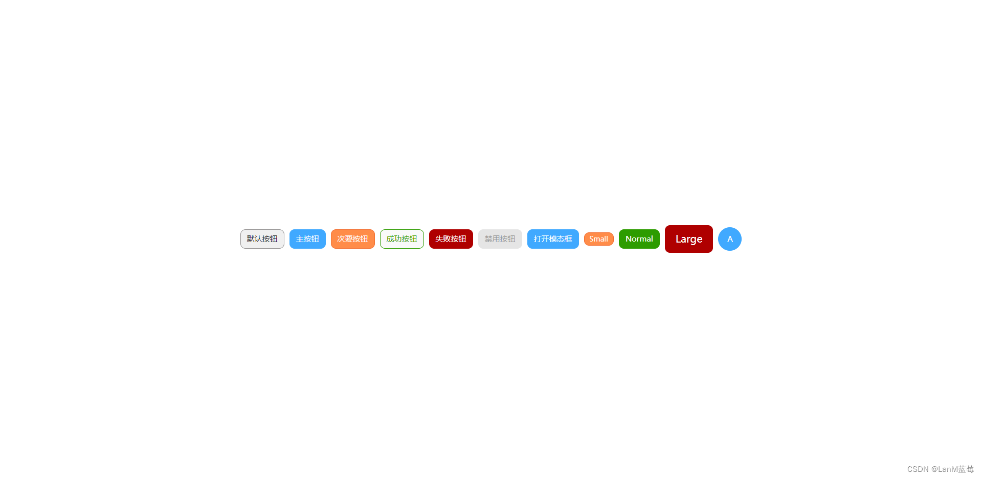
<div style={{ display: "flex", alignItems: "center" }}>
<Button>默认按钮</Button>
<Button type="primary">主按钮</Button>
<Button type="secondary" variant="container">
次要按钮
</Button>
<Button type="success" variant="outlined">
成功按钮
</Button>
<Button type="error">失败按钮</Button>
<Button type="primary" disabled={true}>
禁用按钮
</Button>
<Button type="primary" variant="container" onClick={this.showModal}>
打开模态框
</Button>
<Button type="secondary" size="small">
Small
</Button>
<Button type="success" size="normal">
Normal
</Button>
<Button type="error" size="large">
Large
</Button>
<Button type="primary" shape="circle">
A
</Button>
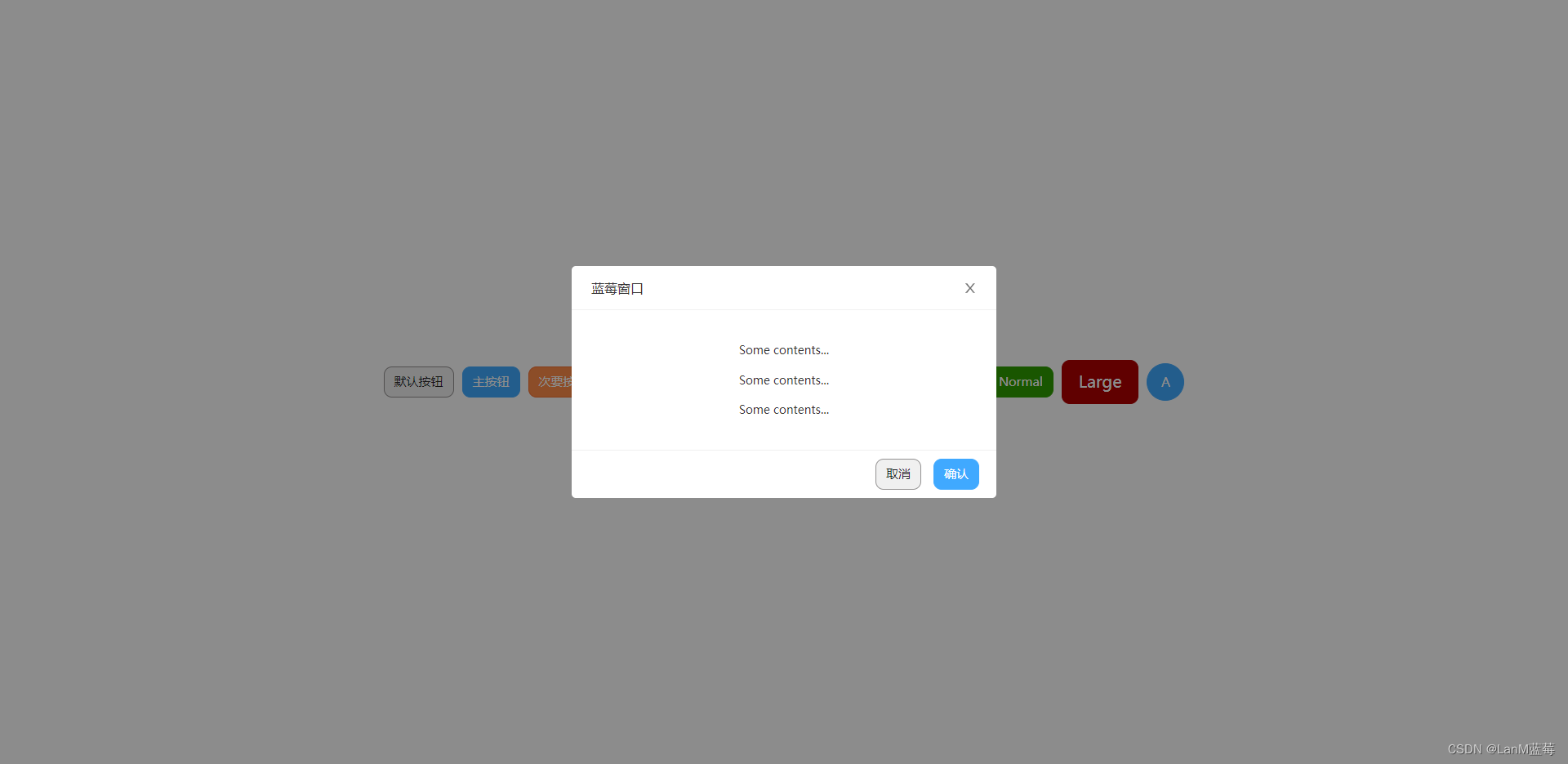
<Modal
visible={this.state.visible}
title="蓝莓窗口"
// 实现关闭窗口的逻辑
onClose={this.closeModal}
footer={[
// 实现关闭窗口的逻辑
<Button key="cancel" onClick={this.closeModal}>
取消
</Button>,
// 实现关闭窗口的逻辑
<Button key="ok" onClick={this.closeModal} type="primary">
确认
</Button>,
]}
>
<p>Some contents...</p>
<p>Some contents...</p>
<p>Some contents...</p>
</Modal>
</div>
)
}
}
效果:


 604
604


 被折叠的 条评论
为什么被折叠?
被折叠的 条评论
为什么被折叠?
 到【灌水乐园】发言


