


本系列教程目录:Vue3+Element Plus全套学习笔记-目录大纲
第2章 Element Plus
ElementUI 是一个基于 Vue 2.0 的前端 UI 组件库,主要用于快速构建网站和应用的界面。它由饿了么前端团队开发并维护,提供了一套丰富的、高质量的 Vue 组件,旨在帮助开发者快速搭建出美观、功能丰富的 Web 应用界面。
由于 Vue 3 的发布,ElementUI 的团队也推出了 Element Plus,这是 ElementUI 的 Vue 3 版本,提供了与 Vue 3 兼容的 UI 组件库。Element Plus 保留了 ElementUI 的核心特性和设计哲学,并在此基础上进行了改进和扩展,以更好地支持 Vue 3 的新特性。
Element UI中文版官方地址(基于Vue2):https://element.eleme.cn/#/zh-CN
Element Plus中文版官方地址(基于Vue3):https://element-plus.org/zh-CN/#/zh-CN
Element Plus官网如下:
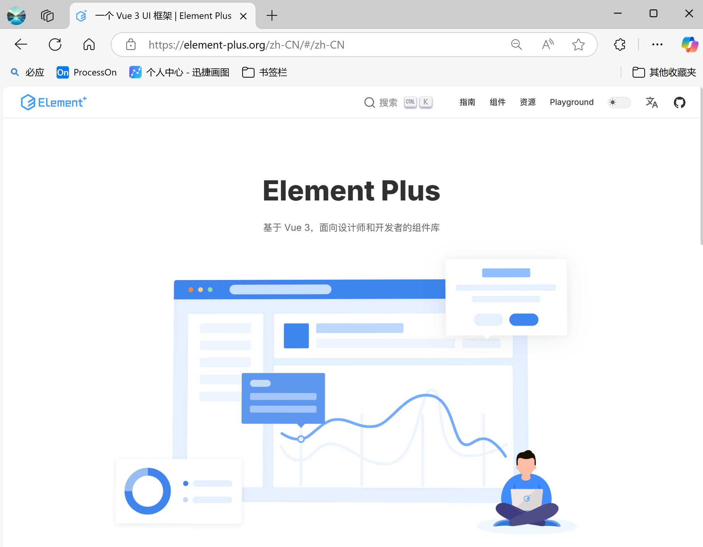
Element Plus官网的案例非常全面且详细,我们在使用Element Plus时更多的是参考官网中的案例。我们本次按照笔记来学习更多是学习如何学习官网,以及官网中的顺序,即先学什么再学什么。
2.1 搭建Element Plus环境
2.1.1 内联方式
Element Plus是基于Vue3的一个UI组件库,因此使用Element Plus必须要先引入Vue3。
搭建Element Plus可以参考官网:https://element-plus.org/zh-CN/guide/installation.html
如果采用传统的开发方式而非组件化开发,我们可以通过内联的方式来引入相关依赖:
<head>
  <!-- Import style -->
  <link
    rel="stylesheet"
    href="//cdn.jsdelivr.net/npm/element-plus/dist/index.css"
  />
  <!-- Import Vue 3 -->
  <script src="//cdn.jsdelivr.net/npm/vue@3"></script>

  <!-- Import component library -->
  <script src="//cdn.jsdelivr.net/npm/element-plus"></script>

</head>
我们尝试编写一个用户注册的表单页面:
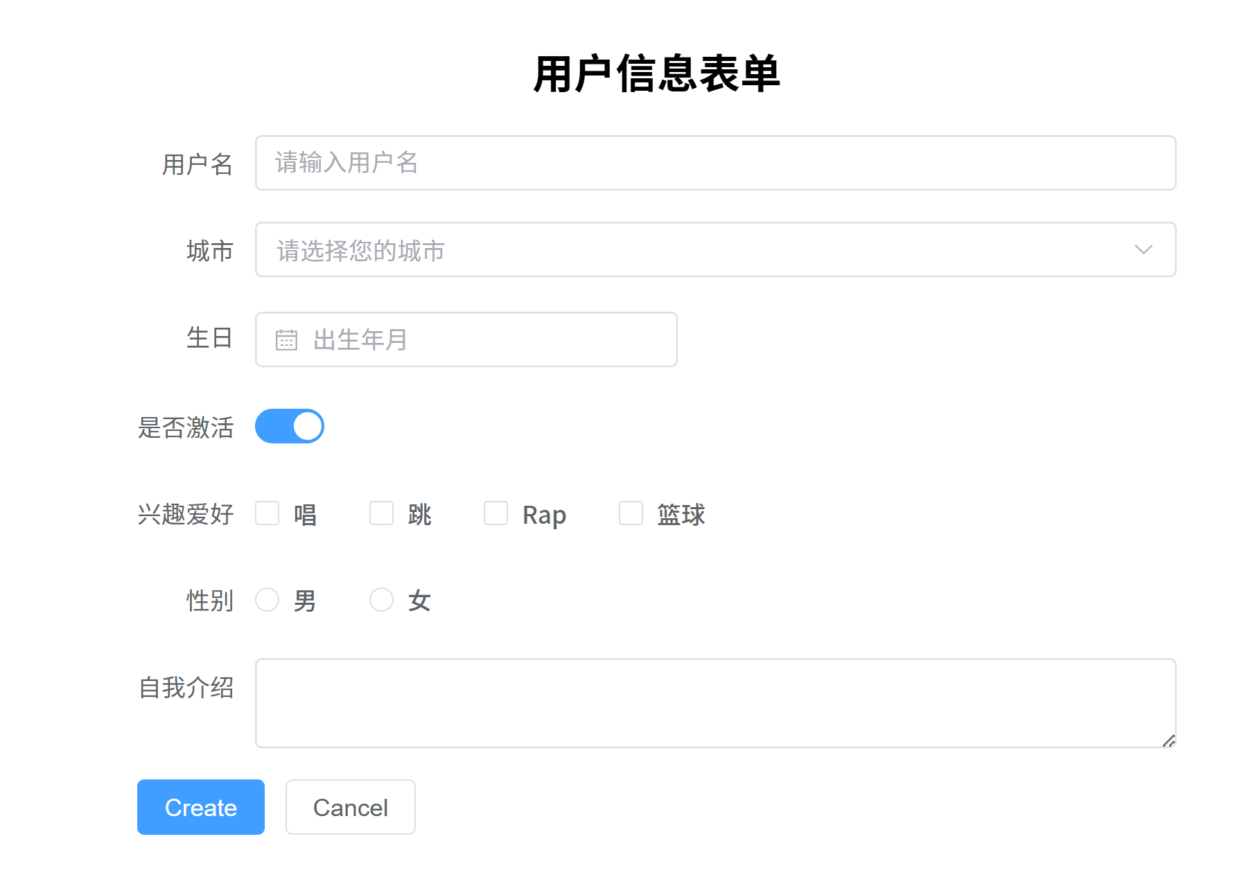
代码如下:
<head>
    <!-- Import style -->
    <link
            rel="stylesheet"
            href="//cdn.jsdelivr.net/npm/element-plus/dist/index.css"
    />
    <!-- Import Vue 3 -->
    <script src="//cdn.jsdelivr.net/npm/vue@3"></script>

    <!-- Import component library -->
    <script src="//cdn.jsdelivr.net/npm/element-plus"></script>

    <meta charset="UTF-8">
</head>

<body>
<div id="app">
    <div style="width: 600px;margin: 50px auto;">
        <h2 style="text-align: center">{{ message }}</h2>

        <el-form :model="form" label-width="auto" style="max-width: 600px;">
            <el-form-item label="用户名">
                <el-input v-model="form.name" placeholder="请输入用户名"/>
            </el-form-item>

            <el-form-item label="城市">
                <el-select v-model="form.region" placeholder="请选择您的城市">
                    <el-option label="南昌" value="Nanchang"></el-option>

                    <el-option label="郑州" value="郑州"></el-option>

                    <el-option label="济南" value="济南"></el-option>

                    <el-option label="合肥" value="合肥"></el-option>

                </el-select>

            </el-form-item>

            <el-form-item label="生日">
                <el-col :span="11">
                    <el-date-picker
                            v-model="form.birthday"
                            type="date"
                            placeholder="出生年月"
                            style="width: 100%"
                    />
                </el-col>

            </el-form-item>


            <el-form-item label="是否激活">
                <el-switch v-model="form.isActive"/>
            </el-form-item>


            <el-form-item label="兴趣爱好">
                <el-checkbox-group v-model="form.hobbies">
                    <el-checkbox value="1" name="type">
                        唱
                    </el-checkbox>

                    <el-checkbox value="2" name="type">
                        跳
                    </el-checkbox>

                    <el-checkbox value="3" name="type">
                        Rap
                    </el-checkbox>

                    <el-checkbox value="4" name="type">
                        篮球
                    </el-checkbox>

                </el-checkbox-group>

            </el-form-item>


            <el-form-item label="性别">
                <el-radio-group v-model="form.sex">
                    <el-radio value="0">男</el-radio>

                    <el-radio value="1">女</el-radio>

                </el-radio-group>

            </el-form-item>


            <el-form-item label="自我介绍">
                <el-input v-model="form.desc" type="textarea"/>
            </el-form-item>


            <el-form-item>
                <el-button type="primary" @click="onSubmit">Create</el-button>

                <el-button>Cancel</el-button>

            </el-form-item>

        </el-form>

    </div>

</div>

<script>
    // 导入 createApp, ref, reactive等函数
    const { createApp, ref, reactive } = Vue;

    const App = {
        setup() {
            // 使用 ref 处理基本类型
            const message = ref("用户信息表单");

            // 使用 reactive 处理对象类型
            const form = reactive({
                name: "",
                region: "",
                birthday: "",
                isActive: true,
                hobbies: [],
                sex: "",
                desc: "",
            });

            // 定义方法
            const onSubmit = () => {
                console.log(form);
            };

            // 暴露数据和方法给模板
            return {
                message,
                form,
                onSubmit,
            };
        }
    };

    // 创建 Vue 实例
    const app = createApp(App);
    // 完整注册 ElementPlus
    app.use(ElementPlus);
    app.mount("#app");
</script>

</body>
2.1.2 组件开发方式
Element Plus绝多大数的应用场景都是采用组件开发方式。采用组件开发方式首先我们需要创建一个Vue组件的项目,我们利用Vite脚手架来帮我们快速搭建一个组件式的Vue的项目。
(1)创建一个Vite脚手架
npm create vite
(2)进入项目,安装依赖
cd .\vite-project
npm install
(3)安装Element Plus依赖
npm install element-plus --save
(4)在脚手架的main.js中导入Element Plus组件和相关样式
import { createApp } from 'vue'

// 导入ElementPlus组件
import ElementPlus from 'element-plus'

// 导入ElementPlus样式
import 'element-plus/dist/index.css'

// 导入App组件
import App from './App.vue'

// 创建Vue实例
const app = createApp(App)
app.use(ElementPlus)       // 使用ElementPlus组件
app.mount('#app')
(5)编写一个Vue组件页面
<script setup>
// 导入 ref 和 reactive
import { ref, reactive } from "vue";
// 使用 ref 处理基本类型
const message = ref("用户信息表单");

// 使用 reactive 处理对象类型
const form = reactive({
  name: "",
  region: "",
  birthday: "",
  isActive: true,
  hobbies: [],
  sex: "",
  desc: "",
});

// 定义方法
const onSubmit = () => {
  console.log(form);
};
</script>

<template>
  <div style="width: 600px;margin: 50px auto;">
    <h2 style="text-align: center">{{ message }}</h2>

    <el-form :model="form" label-width="auto" style="max-width: 600px;">
      <el-form-item label="用户名">
        <el-input v-model="form.name" placeholder="请输入用户名"/>
      </el-form-item>

      <el-form-item label="城市">
        <el-select v-model="form.region" placeholder="请选择您的城市">
          <el-option label="南昌" value="Nanchang"></el-option>

          <el-option label="郑州" value="郑州"></el-option>

          <el-option label="济南" value="济南"></el-option>

          <el-option label="合肥" value="合肥"></el-option>

        </el-select>

      </el-form-item>

      <el-form-item label="生日">
        <el-col :span="11">
          <el-date-picker
              v-model="form.birthday"
              type="date"
              placeholder="出生年月"
              style="width: 100%"
          />
        </el-col>

      </el-form-item>

      <el-form-item label="是否激活">
        <el-switch v-model="form.isActive"/>
      </el-form-item>

      <el-form-item label="兴趣爱好">
        <el-checkbox-group v-model="form.hobbies">
          <el-checkbox value="1" name="type">
            唱
          </el-checkbox>

          <el-checkbox value="2" name="type">
            跳
          </el-checkbox>

          <el-checkbox value="3" name="type">
            Rap
          </el-checkbox>

          <el-checkbox value="4" name="type">
            篮球
          </el-checkbox>

        </el-checkbox-group>

      </el-form-item>

      <el-form-item label="性别">
        <el-radio-group v-model="form.sex">
          <el-radio value="0">男</el-radio>

          <el-radio value="1">女</el-radio>

        </el-radio-group>

      </el-form-item>

      <el-form-item label="自我介绍">
        <el-input v-model="form.desc" type="textarea"/>
      </el-form-item>

      <el-form-item>
        <el-button type="primary" @click="onSubmit">Create</el-button>

        <el-button>Cancel</el-button>

      </el-form-item>

    </el-form>

  </div>

</template>
2.2 Container 布局容器
Container 布局容器官方文档:https://element-plus.org/zh-CN/component/container.html
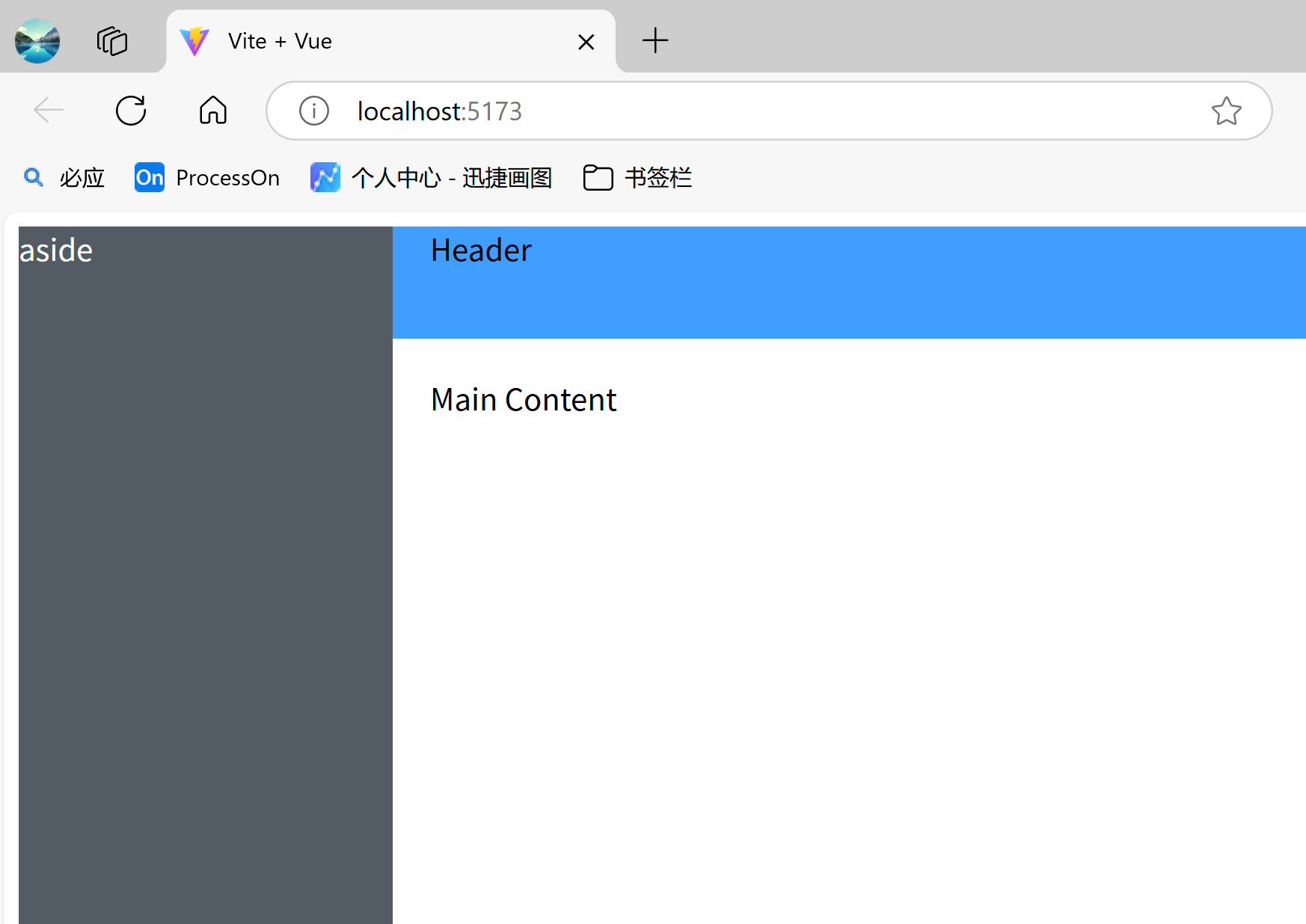
Container 布局容器提供快速搭建页面基础布局的能力,适用于常见的管理后台布局场景(头部 + 侧边栏 + 主内容区 + 底部)
Element Plus的Container组件包括如下:
<el-container>:外层容器(可嵌套)<el-header>:顶部容器<el-aside>:侧边栏容器<el-main>:主内容容器<el-footer>:底部容器
Container整体使用 Flex 布局实现,在使用时父容器需要设置高度(推荐设置 height: 100vh),子组件按顺序排列,可通过嵌套实现复杂布局。
下面是一个常见的经典布局方式:
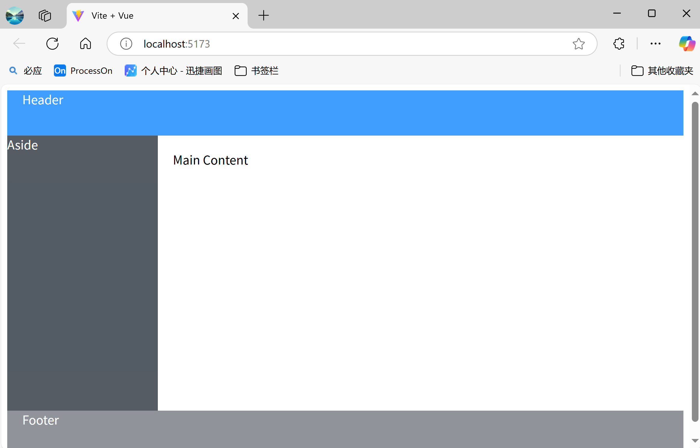
代码如下:
<template>
  <el-container style="height: 100vh">
    <el-header style="background: #409EFF; color: white">Header</el-header>

    <el-container>
      <el-aside width="200px" style="background: #545c64; color: white">
        Aside
      </el-aside>

      <el-main>Main Content</el-main>

    </el-container>

    <el-footer style="background: #909399; color: white">Footer</el-footer>

  </el-container>

</template>
使用了Element Plus相关的标签时,会默认添加一些额外的样式(如宽高、内外边距、浮动等),这样就不需要我们来添加一些基础样式了。
上下布局:
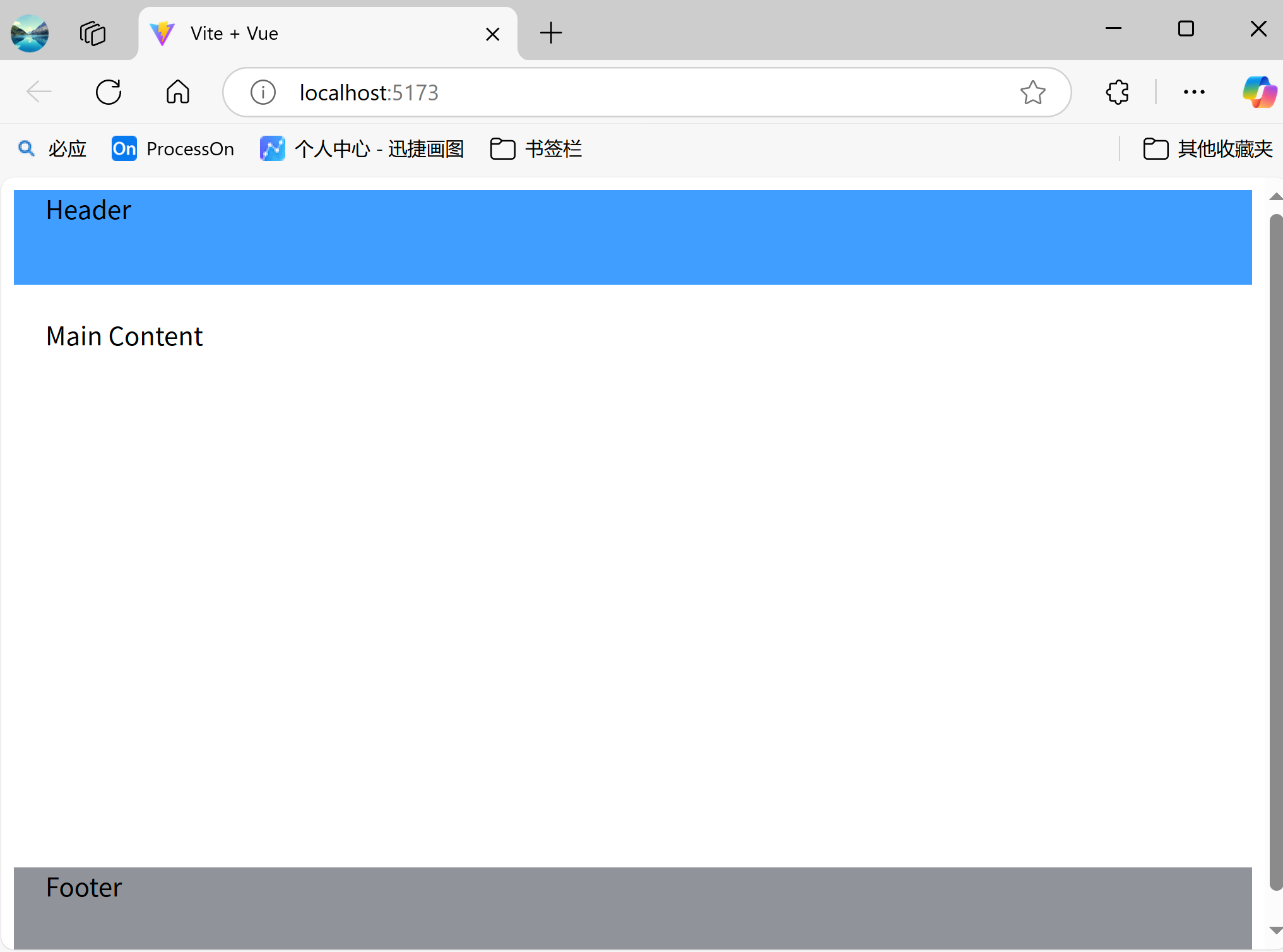
代码如下:
<el-container style="height: 100vh">
  <el-header style="background: #409EFF">Header</el-header>

  <el-main>Main Content</el-main>

  <el-footer style="background: #909399">Footer</el-footer>

</el-container>
侧边栏布局:
代码:
<!-- 侧边栏布局 -->
<el-container style="height: 100vh">
  <el-aside width="200px" style="background: #545c64">
    Navigation Menu
  </el-aside>

  <el-container>
    <el-header style="background: #409EFF">Header</el-header>

    <el-main>Main Content</el-main>

  </el-container>

</el-container>
嵌套布局:
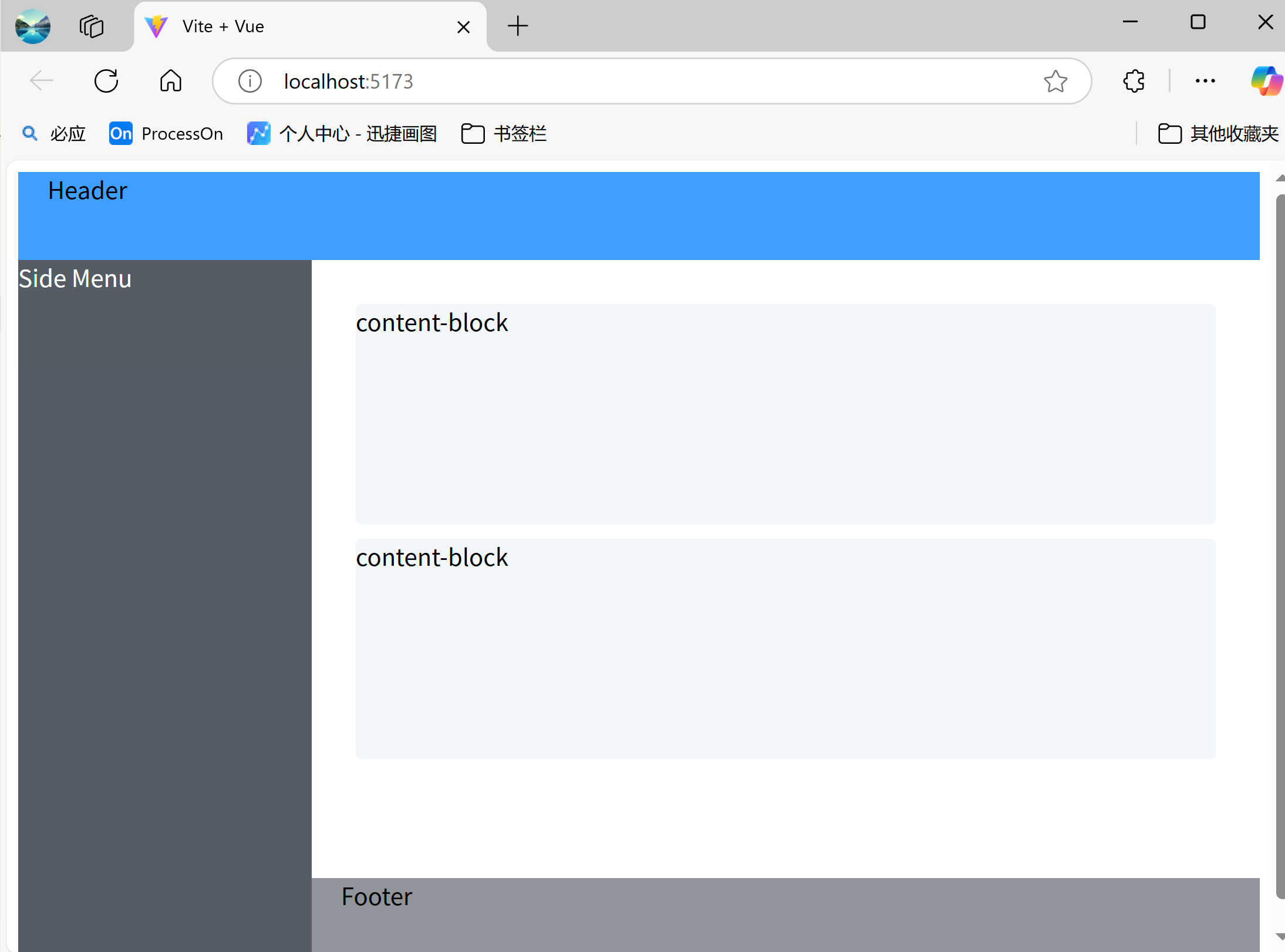
代码如下:
<template>
  <!-- 复杂嵌套布局 -->
  <el-container style="height: 100vh">
    <el-header style="background: #409EFF">Header</el-header>

    <el-container>
      <el-aside width="200px" style="background: #545c64; color: white">Side Menu</el-aside>

      <el-container direction="vertical">
        <el-main style="padding: 20px">
          <div class="content-block">content-block</div>

          <div class="content-block">content-block</div>

        </el-main>

        <el-footer style="background: #909399">Footer</el-footer>

      </el-container>

    </el-container>

  </el-container>

</template>

<style scoped>
.content-block {
  height: 200px;
  margin: 10px;
  background: #f5f7fa;
  border-radius: 4px;
}
</style>
2.3 Layout 布局
Layout 布局是基于 Flex 的栅格系统,通过基础的 24 分栏,迅速简便地创建布局。用于快速构建响应式页面布局(类似 Bootstrap 的栅格系统)。适用于需要灵活分栏的页面结构,如表单、卡片排列、内容区块划分等场景。
Layout 组件默认使用 Flex 布局,不需要手动设置 type="flex"。它将整行分为24个基本单位(分为24列),列的基本单位为1,最多24个,最少0个。提供响应式断点设计(支持 xs, sm, md, lg, xl 五种屏幕尺寸)
Layout 组件的和核心就两个:
<el-row>:行容器(相当于 Flex 容器)<el-col>:列容器(相当于 Flex 子项)
2.3.1 Layout基本使用
(1)基本使用
效果:
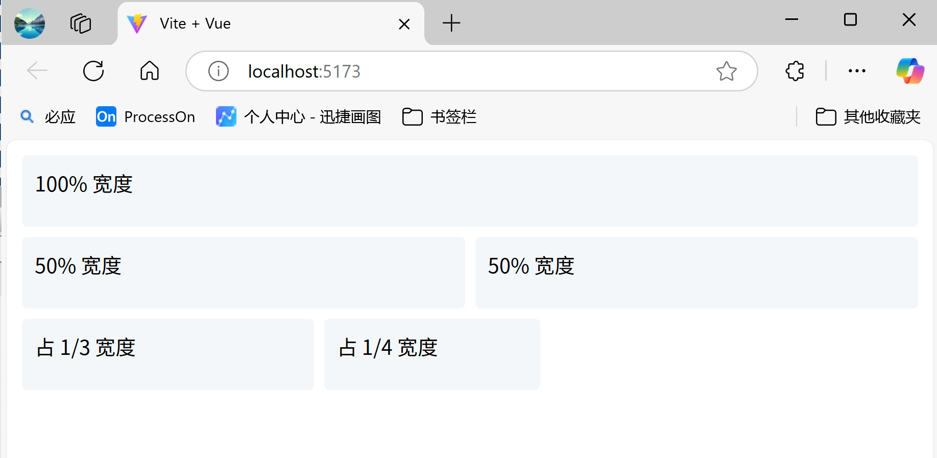
代码:
<template>
  <el-row>
    <el-col :span="24"><div class="grid-content">100% 宽度</div></el-col>
  </el-row>
  <el-row>
    <el-col :span="12"><div class="grid-content">50% 宽度</div></el-col>
    <el-col :span="12"><div class="grid-content">50% 宽度</div></el-col>
  </el-row>
</template>

<style>
.grid-content {
  background: #f5f7fa;
  border-radius: 4px;
  min-height: 36px;
  margin: 4px;
  padding: 10px;
}
</style>
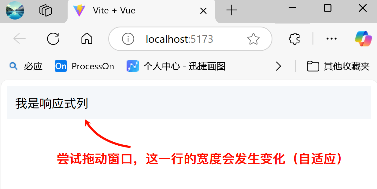
(2)响应式
Layout 支持 5 种响应式尺寸:
| 属性 | 屏幕范围 |
|---|---|
xs | <768px |
sm | ≥768px |
md | ≥992px |
lg | ≥1200px |
xl | ≥1920px |
示例代码:
  <!-- xs手机端:占满整行 -->
  <!-- sm平板:占 50% -->
  <!-- md桌面:占 1/3 -->
  <!-- lg大屏:占 1/4 -->
  <el-col :xs="24" :sm="12" :md="8" :lg="6" style="background-color:#f5f7fa;padding: 10px">
    我是响应式列
  </el-col>
效果如下:
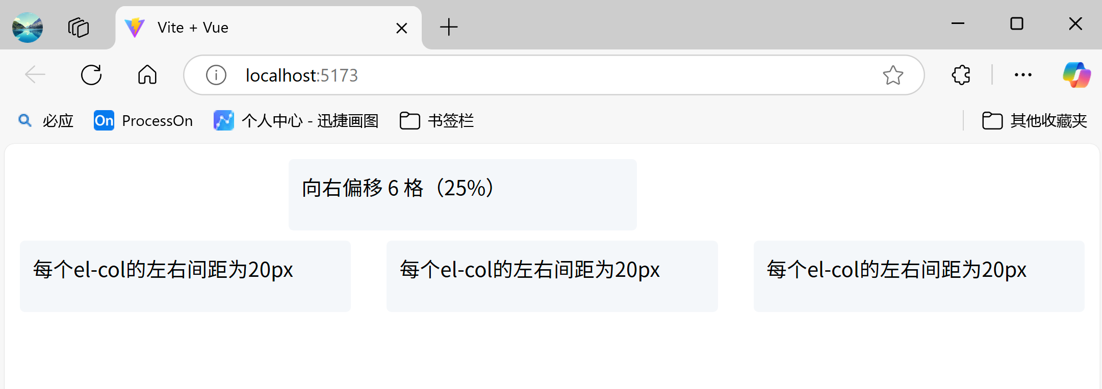
(3)列偏移与间距控制
通过 :offset 属性控制左侧偏移量,
<el-col :span="8" :offset="6"> <!-- 向右偏移 6 格(25%) -->
通过 :gutter 属性设置列间距(单位 px):
<el-row :gutter="20"> <!-- 每列左右各 10px 间距 -->
示例代码:
<el-row>
  <!-- 向右偏移 6 格(25%) -->
  <el-col :span="8" :offset="6"><div class="grid-content">向右偏移 6 格(25%)</div></el-col>

</el-row>

<el-row :gutter="20">
<!--   每个el-col的左右间距为20px(左边和右边各10px)   -->
  <el-col :span="8" ><div class="grid-content">每个el-col的左右间距为20px</div></el-col>

  <el-col :span="8" ><div class="grid-content">每个el-col的左右间距为20px</div></el-col>

  <el-col :span="8" ><div class="grid-content">每个el-col的左右间距为20px</div></el-col>

</el-row>
效果如下:
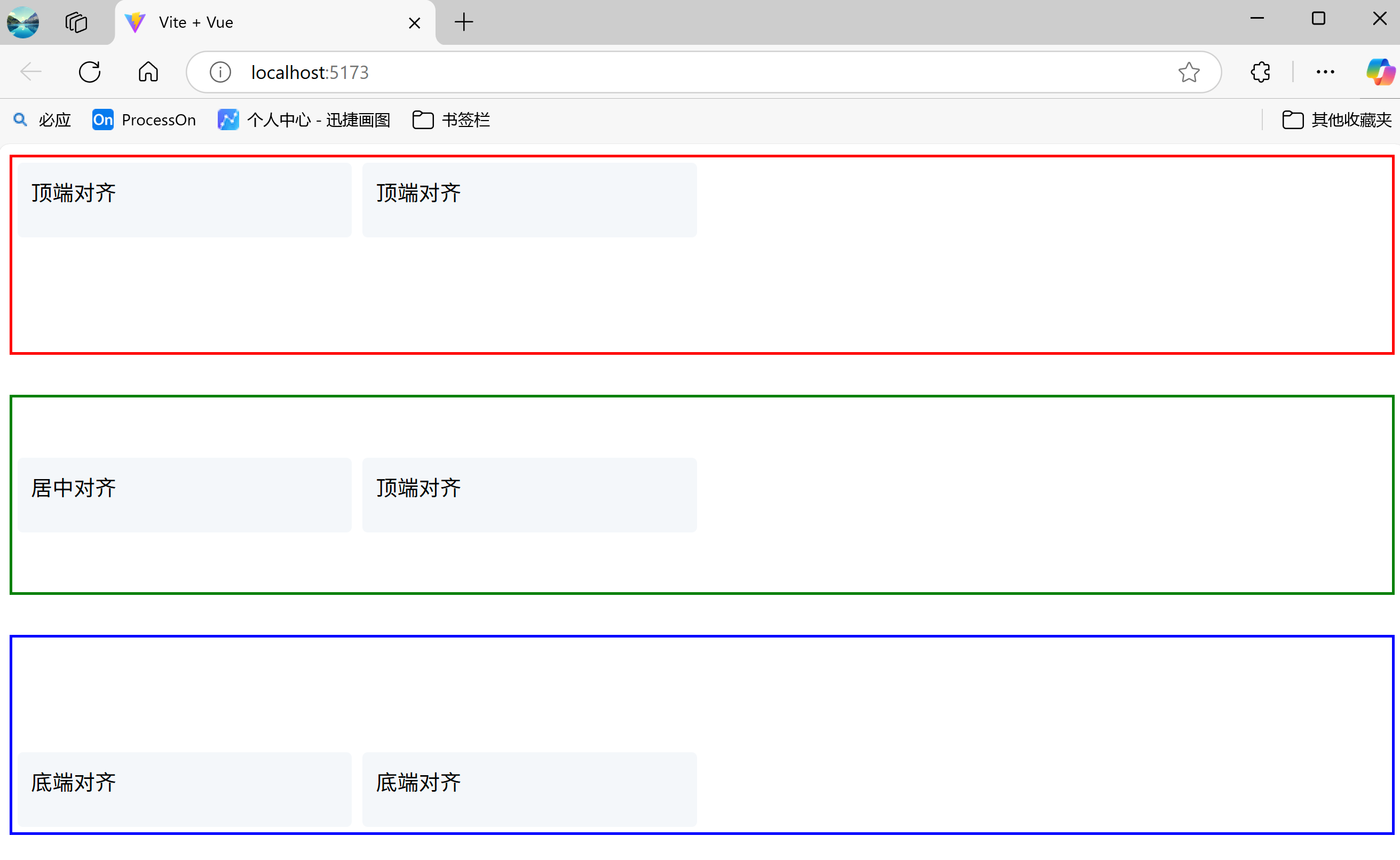
(5)对其方式
通过 justify 和 align 控制布局对齐:
<!-- 水平对齐方式 -->
<el-row justify="start|end|center|space-around|space-between">

<!-- 垂直对齐方式 -->
<el-row align="top|middle|bottom">
示例代码:
<el-row justify="start">
  <el-col :span="6"><div class="grid-content">左对齐</div></el-col>

  <el-col :span="6"><div class="grid-content">左对齐</div></el-col>

  <el-col :span="6"><div class="grid-content">左对齐</div></el-col>

</el-row>

<el-row justify="center">
  <el-col :span="6"><div class="grid-content">水平对齐</div></el-col>

  <el-col :span="6"><div class="grid-content">水平对齐</div></el-col>

  <el-col :span="6"><div class="grid-content">水平对齐</div></el-col>

</el-row>

<el-row justify="end">
  <el-col :span="6"><div class="grid-content">右对齐</div></el-col>

  <el-col :span="6"><div class="grid-content">右对齐</div></el-col>

  <el-col :span="6"><div class="grid-content">右对齐</div></el-col>

</el-row>

<el-row justify="space-between">
  <el-col :span="6"><div class="grid-content">分散对齐-左对齐</div></el-col>

  <el-col :span="6"><div class="grid-content">分散对齐-左对齐</div></el-col>

  <el-col :span="6"><div class="grid-content">分散对齐-左对齐</div></el-col>

</el-row>

<el-row justify="space-around">
  <el-col :span="6"><div class="grid-content">分散对齐-居中对齐</div></el-col>

  <el-col :span="6"><div class="grid-content">分散对齐-居中对齐</div></el-col>

  <el-col :span="6"><div class="grid-content">分散对齐-居中对齐</div></el-col>

</el-row>

<el-row justify="space-evenly">
  <el-col :span="6"><div class="grid-content">分散对齐-右对齐</div></el-col>

  <el-col :span="6"><div class="grid-content">分散对齐-右对齐</div></el-col>

  <el-col :span="6"><div class="grid-content">分散对齐-右对齐</div></el-col>

</el-row>
效果如下:
示例代码:
<el-row align="top" style="height: 150px;border:2px solid red;">
  <el-col :span="6"><div class="grid-content">顶端对齐</div></el-col>

  <el-col :span="6"><div class="grid-content">顶端对齐</div></el-col>

</el-row>

<el-row align="middle" style="height: 150px;border:2px solid green;margin:30px 0;">
  <el-col :span="6"><div class="grid-content">居中对齐</div></el-col>

  <el-col :span="6"><div class="grid-content">顶端对齐</div></el-col>

</el-row>

<el-row align="bottom" style="height: 150px;border:2px solid blue;">
  <el-col :span="6"><div class="grid-content">底端对齐</div></el-col>

  <el-col :span="6"><div class="grid-content">底端对齐</div></el-col>

</el-row>
效果如下:
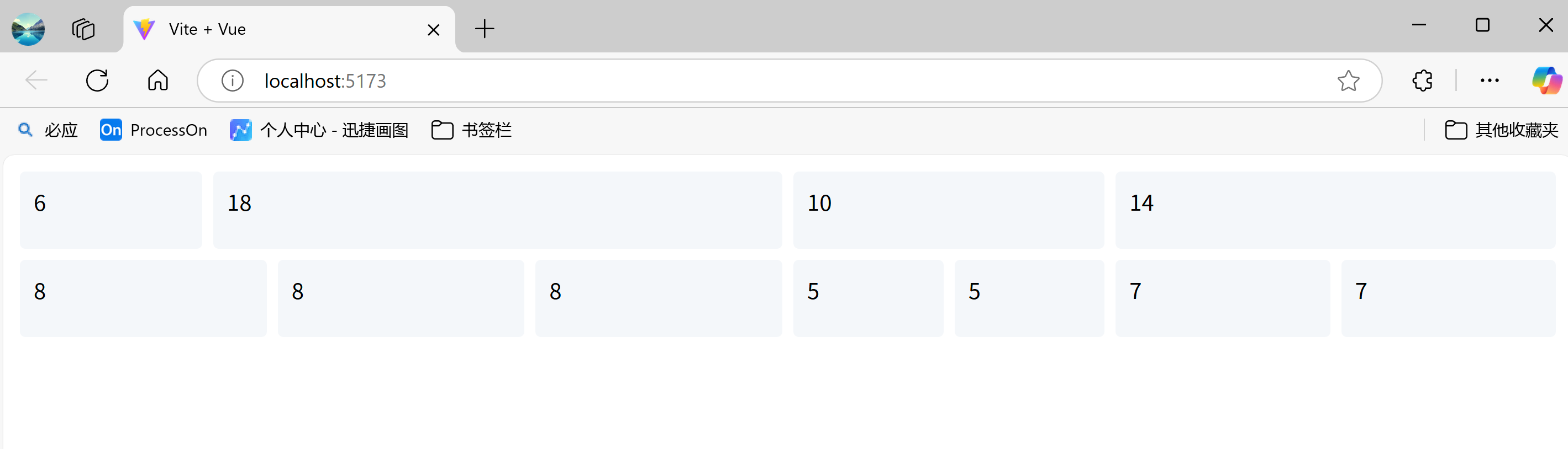
2.3.2 经典布局案例
(1)嵌套布局
示例代码:
<el-row>
  <el-col :span="12">
    <el-row>
      <el-col :span="6"><div class="grid-content">6</div></el-col>

      <el-col :span="18"><div class="grid-content">18</div></el-col>

    </el-row>

  </el-col>

  <el-col :span="12">
    <el-row>
      <el-col :span="10"><div class="grid-content">10</div></el-col>

      <el-col :span="14"><div class="grid-content">14</div></el-col>

    </el-row>

  </el-col>

</el-row>

<el-row>
  <el-col :span="12">
    <el-row>
      <el-col :span="8"><div class="grid-content">8</div></el-col>

      <el-col :span="8"><div class="grid-content">8</div></el-col>

      <el-col :span="8"><div class="grid-content">8</div></el-col>

    </el-row>

  </el-col>

  <el-col :span="12">
    <el-row>
      <el-col :span="5"><div class="grid-content">5</div></el-col>

      <el-col :span="5"><div class="grid-content">5</div></el-col>

      <el-col :span="7"><div class="grid-content">7</div></el-col>

      <el-col :span="7"><div class="grid-content">7</div></el-col>

    </el-row>

  </el-col>

</el-row>
效果如下:
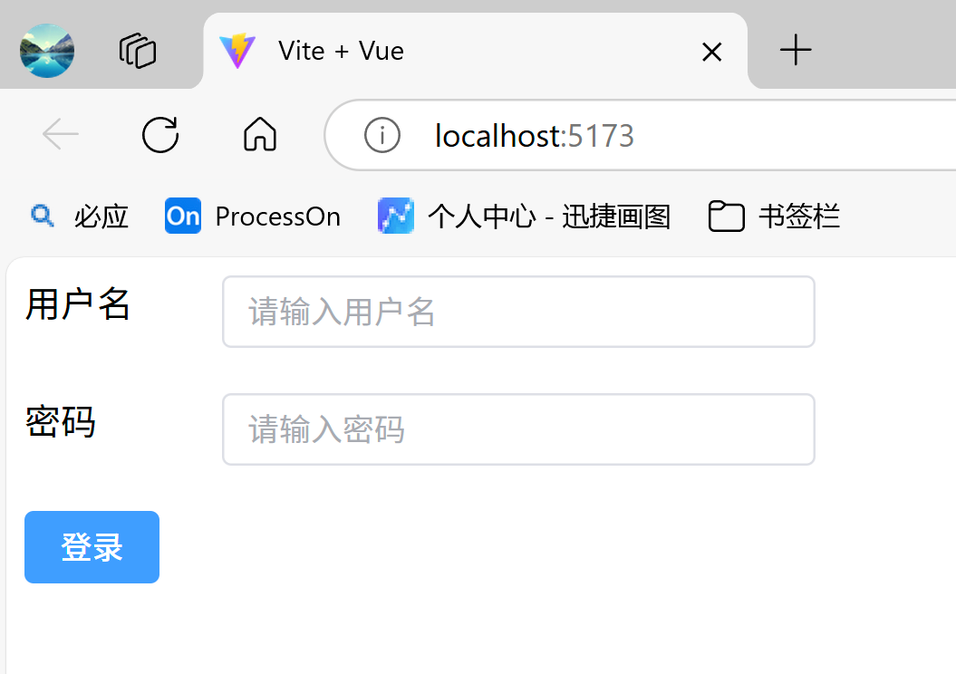
(2)表单布局
示例代码:
<el-row>
  <el-col :span="2">
      用户名
  </el-col>

  <el-col :span="6">
    <el-input placeholder="请输入用户名"/>
  </el-col>

</el-row>

<el-row style="margin:20px 0">
  <el-col :span="2">
    密码
  </el-col>

  <el-col :span="6">
    <el-input type="password" placeholder="请输入密码"/>
  </el-col>

</el-row>

<el-row>
  <el-col :span="3">
    <button type="button" class="el-button el-button--primary">登录</button>

  </el-col>

</el-row>
效果如下:
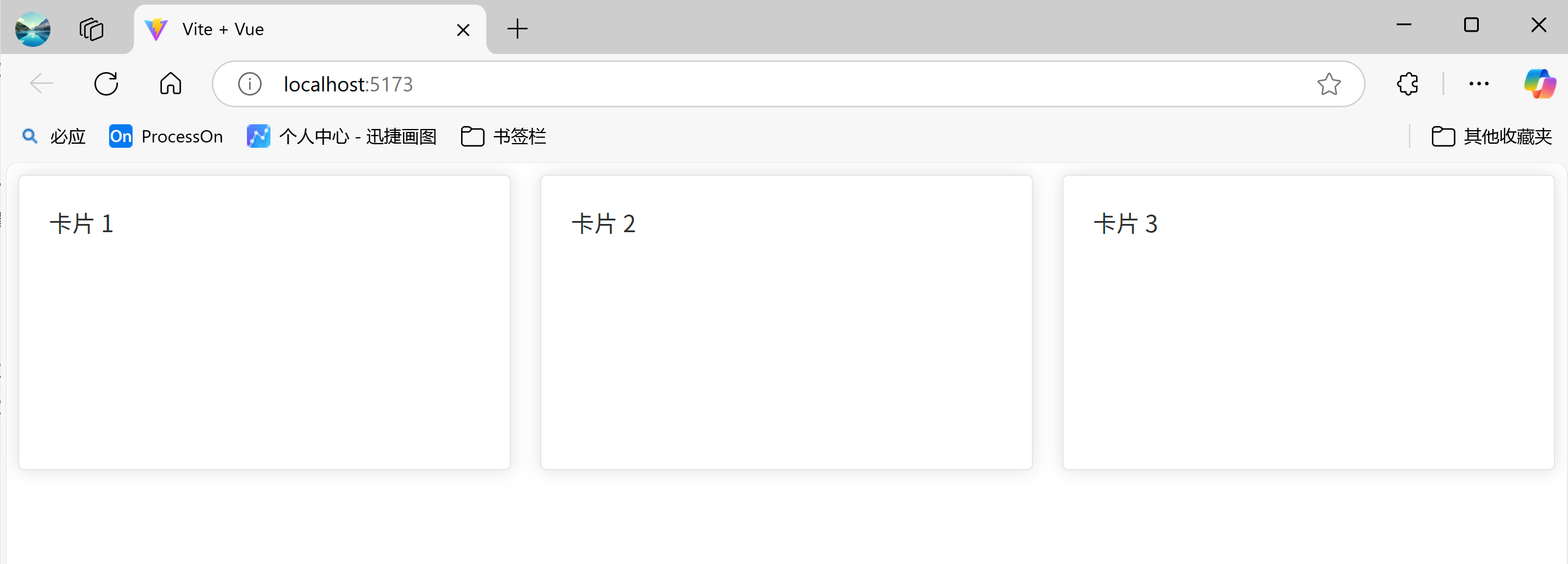
(3)响应式卡片布局
示例代码:
<el-row :gutter="20">
  <el-col
      v-for="n in 4"
      :key="n"
      :xs="24"
      :sm="12"
      :md="8"
      :lg="6"
  >
    <el-card class="card-item">卡片 {{ n }}</el-card>

  </el-col>

</el-row>
效果如下:
2.4 基本组件
2.4.1 文本、色彩、间距
- 色彩:Element Plus 为了避免视觉传达差异,使用一套特定的调色板来规定颜色,为你所搭建的产品提供一致的外观视觉感受。
Element Plus 中大致规范了如下几种色彩,这些色彩可以供我们后续在各种地方,如按钮,文本,背景、链接等地方使用。
primary:#409EFF
Success:#67C23A
Info:#909399
Warning:#E6A23C
Danger:#F56C6C
在可以使用颜色值的地方,如color,background-color等,都可以使用这些颜色值来快速选择自己想要的颜色,如:
color: var(--el-color-primary);
color: var(--el-color-success);
color: var(--el-color-info);
color: var(--el-color-warning);
color: var(--el-color-danger);
- 文本(el-text):通过
<el-text>标签来包裹一段小文本- 由
type属性来选择 Text 的类型,如primary、Success等 - 使用
size属性配置尺寸,可选的尺寸大小有:large,default或small,分别对应8px、12px和16px的间距。 默认的间距大小为small,也就是8px。
- 由
- 间距(el-space):通过这个组件来给组件之间提供统一的间距。
- 使用
direction来控制布局的方式- vertical:垂直布局
- horizontal:水平布局
- 通过调整
size的值来控制间距的大小,使用内置的small、default、large来设置间距大小 - 在 水平 (horizontal) 模式下,通过使用
wrap(布尔类型)来控制自动换行行为。
- 使用
效果:
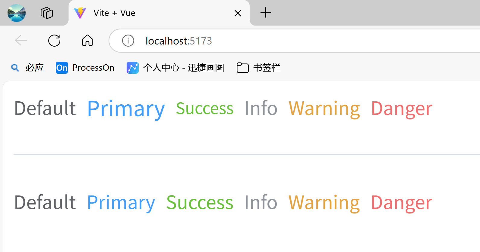
示例代码:
<template>
  <el-space direction="horizontal" size="large">
    <el-text size="small">Default</el-text>

    <el-text type="primary" size="large">Primary</el-text>

    <el-text type="success">Success</el-text>

    <el-text type="info">Info</el-text>

    <el-text type="warning">Warning</el-text>

    <el-text type="danger">Danger</el-text>

  </el-space>

</template>
2.4.2 按钮、链接、图标
- 按钮(el-button):使用
type、plain、round和circle来定义按钮的样式。- type:按钮的样式,如primary、success等
- plain:空心按钮(默认为实心按钮)
- round:半圆按钮
- circle:全圆按钮
- disabled:禁用按钮
- 链接(el-link):常规标签,通过type设置标签的样式,如primary、success等
- disabled:禁用链接
- underline:true为下划线,false为取消下划线
- 图标(el-icon):Element Plus 提供了一套常用的图标集合。
图标官网链接:https://element-plus.org/zh-CN/component/icon.html
图标样式大全:https://element-plus.org/zh-CN/component/icon.html#icon-collection
(1)先安装相关依赖
npm install @element-plus/icons-vue
(2)导入所有图标并进行全局注册
// 导入ElementPlus图标
import * as ElementPlusIconsVue from '@element-plus/icons-vue'

// 创建Vue实例
const app = createApp(App)

// 注册ElementPlus图标
for (const [key, component] of Object.entries(ElementPlusIconsVue)) {
    app.component(key, component)
}
效果:
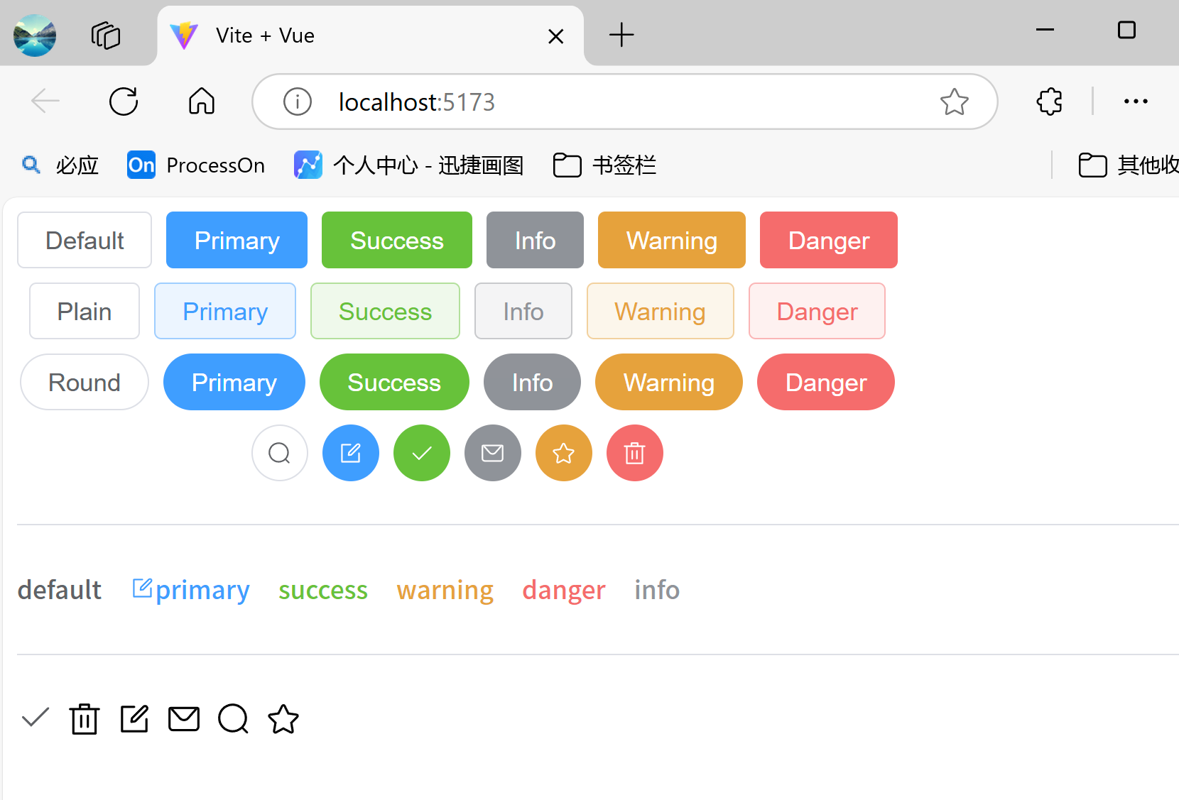
示例代码:
<template>

  <!-- 按钮 -->
  <el-space direction="vertical">
    <el-space>
      <el-button>Default</el-button>

      <el-button type="primary">Primary</el-button>

      <el-button type="success">Success</el-button>

      <el-button type="info">Info</el-button>

      <el-button type="warning">Warning</el-button>

      <el-button type="danger">Danger</el-button>

    </el-space>


    <el-space>
      <el-button plain>Plain</el-button>

      <el-button type="primary" plain>Primary</el-button>

      <el-button type="success" plain>Success</el-button>

      <el-button type="info" plain>Info</el-button>

      <el-button type="warning" plain>Warning</el-button>

      <el-button type="danger" plain>Danger</el-button>

    </el-space>

    <el-space>
      <el-button round>Round</el-button>

      <el-button type="primary" round>Primary</el-button>

      <el-button type="success" round>Success</el-button>

      <el-button type="info" round>Info</el-button>

      <el-button type="warning" round>Warning</el-button>

      <el-button type="danger" round>Danger</el-button>

    </el-space>

    <el-space>
      <el-button :icon="Search" circle/>
      <el-button type="primary" :icon="Edit" circle/>
      <el-button type="success" :icon="Check" circle/>
      <el-button type="info" :icon="Message" circle/>
      <el-button type="warning" :icon="Star" circle/>
      <el-button type="danger" :icon="Delete" circle/>

    </el-space>

  </el-space>

  <!-- 分割线 -->
  <el-divider/>

  <!-- 链接 -->
  <el-space size="large">
    <el-link href="https://element-plus.org" target="_blank">default</el-link>

    <el-link type="primary" :icon="Edit">primary</el-link>

    <el-link type="success">success</el-link>

    <el-link type="warning">warning</el-link>

    <el-link type="danger">danger</el-link>

    <el-link type="info">info</el-link>

  </el-space>

  <!-- 分割线 -->
  <el-divider/>

  <!-- 图标 -->
  <el-space>
    <el-text>
      <el-icon :size="20">
        <Check/>
      </el-icon>

    </el-text>

    <el-icon :size="20">
      <Delete/>
    </el-icon>

    <el-icon :size="20">
      <Edit/>
    </el-icon>

    <el-icon :size="20">
      <Message/>
    </el-icon>

    <el-icon :size="20">
      <Search/>
    </el-icon>

    <el-icon :size="20">
      <Star/>
    </el-icon>

  </el-space>

</template>

<script lang="ts" setup>
// 导入图标
import {
  Check,
  Delete,
  Edit,
  Message,
  Search,
  Star,
} from '@element-plus/icons-vue'
</script>
2.4.3 切换主题
<template>
  <div class="hello">
    <h1>{{ msg }}</h1>

    <div>
      <el-switch v-model="isDark" @change="toggleDark"/>
    </div>

  </div>

</template>

<script setup>
// 导入主题相关函数
import { useDark, useToggle } from "@vueuse/core";
let msg = "Hello Vue 3 + Element Plus";

// 主题色
const isDark = useDark();

// 切换主题色,传入需要切换的主题
const toggleDark = useToggle(isDark);
</script>

<style scoped>
</style>
2.5 常用组件
2.5.1 消息提示组件
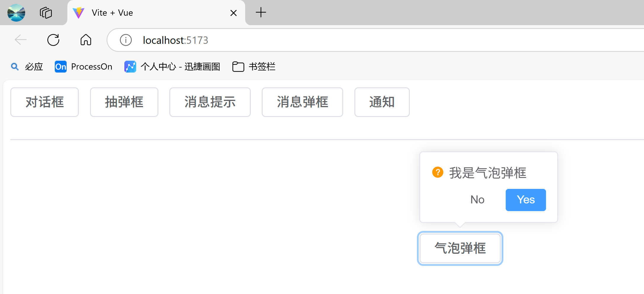
Element Plus的消息提示的组件有非常多,常见的有对话框、抽屉、消息提示、消息弹框、通知、气泡弹框等,详情查看Element Plus官网关于Feedback 反馈组件的详细描述。
- 对话框:使用
<el-dialog>标签预先定义一个对话框,通过v-model属性来控制该对话框是否要显示,true为显示,false为隐藏 - 抽屉:使用
<el-drawer>标签预先定义一个抽屉框,通过v-model属性来控制该抽屉框是否要显示。默认设置是从右至左打开 30% 浏览器宽度。 你可以通过传入对应的direction和size属性来修改这一默认行为。 - 消息提示:使用ElMessage对象来弹出一个消息提示框,通过type属性用来显示「成功(success)、警告(warning)、消息(info)、错误(error)」类的操作反馈。
- 消息弹框:使用ElMessageBox对象来定义一个消息弹框,提供了alert、confirm和prompt用于模拟系统自带的这三种弹框。同样支持type属性来定义消息弹框的类型。
- 气泡弹框:使用
<el-popconfirm>标签来定义一个气泡弹框- 使用
title属性来设置点击参考元素时显示的信息 - 由
placement属性决定 Popconfirm 的位置: 该属性值格式为:[方向]-[对齐位置],可供选择的四个方向分别是top、left、right、bottom,可供选择的三种对齐方式分别是start、end、null,默认的对齐方式为null。 以placement="left-end"为例,气泡确认框会显示在悬停元素的左侧,且提示信息的底部与悬停元素的底部对齐。
- 使用
效果:
示例代码:
<script setup>
import {ElMessage, ElMessageBox, ElNotification} from "element-plus";

import { ref } from 'vue';

let dialogVisible = ref(false);
let drawerVisible = ref(false);
const openMessage = () => {
  ElMessage({
    showClose: true,
    message: 'This is a message.',
    type: 'warning'
  })
}

const openNotify = () => {
  ElNotification({
    title: '这是一条通知',
    message: '这是一条通知的消息',
    type: 'info'
  })
}

const openAlert = () => {
  ElMessageBox.prompt('这是一条消息弹框', '标题', {
    confirmButtonText: '确定',
    cancelButtonText: '取消',
    type: 'warning'
  }).then(() => {
    console.log('点击了确定');
  }).catch(() => {
    console.log('点击了取消');
  });
}
</script>

<template>
  <!-- 定义一个对话框 -->
  <el-dialog v-model="dialogVisible" title="自定义的对话框" width="500">
    <h1>这里可以参与布局</h1>

    <template #footer>
      <div class="dialog-footer">
        <el-button type="primary" @click="dialogVisible = false">确认</el-button>

        <el-button @click="dialogVisible = false">取消</el-button>

      </div>

    </template>

  </el-dialog>

  <!-- 定义一个抽屉 -->
  <el-drawer title="抽屉" v-model="drawerVisible" :direction="'btt'" size="50%">
    <h1>这里可以参与布局</h1>

    <span slot="footer" class="drawer-footer">
      <el-button @click="drawerVisible = false">取 消</el-button>

      <el-button type="primary" @click="drawerVisible = false">确 定</el-button>

    </span>

  </el-drawer>

  <el-button @click="dialogVisible = true">对话框</el-button>

  <el-button @click="drawerVisible = true">抽弹框</el-button>

  <el-button @click="openMessage">消息提示</el-button>

  <el-button @click="openAlert">消息弹框</el-button>

  <el-button @click="openNotify">通知</el-button>

  <el-divider />

  <div style="width:200px;height: 200px;margin:100px auto" >
    <el-popconfirm title="我是气泡弹框" placement="top-start">
      <template #reference>
        <el-button>气泡弹框</el-button>

      </template>

    </el-popconfirm>

  </div>

</template>
2.5.2 表单组件
表单(<el-form>)包含输入框, 单选框, 下拉选择, 多选框等用户输入的组件。使用表单,您可以收集、验证和提交数据。
最基础的表单包括各种输入表单项,比如input、select、radio、checkbox等。在每一个 form 组件中,<el-form-item>代表一个表单项,在该标签中填写具体的表单项组件。
表单常用属性:
- model:表单绑定的数据
- inline:是否为行内表单,默认为false
- label-position:表单域标签的位置,可选值有’left’ | ‘right’ | ‘top’,默认值为right
- label-width:表单项的宽度,auto为自适应。
- label-position:表单项的对齐方式,有left、right、top
1)表单组件的使用
效果:
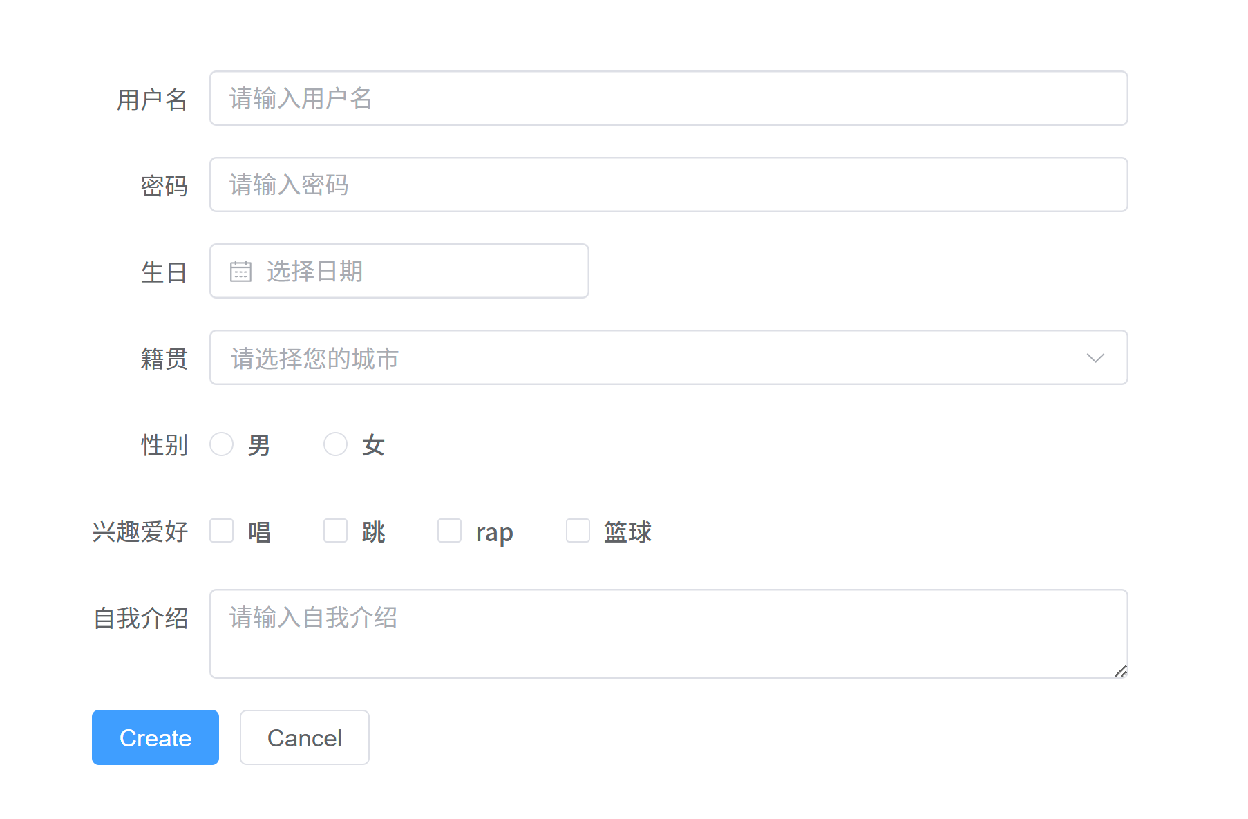
示例代码:
<template>
  <div style="width:600px;margin: 100px auto;">
    <el-form :model="user" label-width="auto" style="max-width: 600px">

      <el-form-item label="用户名">
        <el-input v-model="user.username" placeholder="请输入用户名"/>
      </el-form-item>

      <el-form-item label="密码">
        <el-input type="password" v-model="user.password" placeholder="请输入密码"/>
      </el-form-item>

      <el-form-item label="生日">
        <el-date-picker v-model="user.birthday" type="date" placeholder="选择日期"/>
      </el-form-item>

      <el-form-item label="籍贯">
        <el-select v-model="user.address" placeholder="请选择您的城市">
          <el-option label="合肥" value="hefei"/>
          <el-option label="南昌" value="nanchang"/>
          <el-option label="长沙" value="changsha"/>
          <el-option label="武汉" value="wuhan"/>
        </el-select>

      </el-form-item>

      <el-form-item label="性别">
        <el-radio-group v-model="user.gender">
          <el-radio label="male" value="male">男</el-radio>

          <el-radio label="female" value="female">女</el-radio>

        </el-radio-group>

      </el-form-item>

      <el-form-item label="兴趣爱好">
        <el-checkbox-group v-model="user.interests">
          <el-checkbox label="chang">唱</el-checkbox>

          <el-checkbox label="tiao">跳</el-checkbox>

          <el-checkbox label="rap">rap</el-checkbox>

          <el-checkbox label="lanqiu">篮球</el-checkbox>

        </el-checkbox-group>

      </el-form-item>

      <el-form-item label="自我介绍">
        <el-input type="textarea" v-model="user.desc" placeholder="请输入自我介绍"/>
      </el-form-item>

      <el-form-item>
        <el-button type="primary" @click="onSubmit">Create</el-button>

        <el-button>Cancel</el-button>

      </el-form-item>

    </el-form>

  </div>


</template>

<script setup>
import {reactive} from 'vue'

// do not use same name with ref
const user = reactive({
  username: '',
  password: '',
  birthday: '',
  address: '',
  gender: '',
  interests: [],
  desc: ''
});

// 提交事件
const onSubmit = () => {
  console.log(user)
}
</script>
2)行内表单
效果:
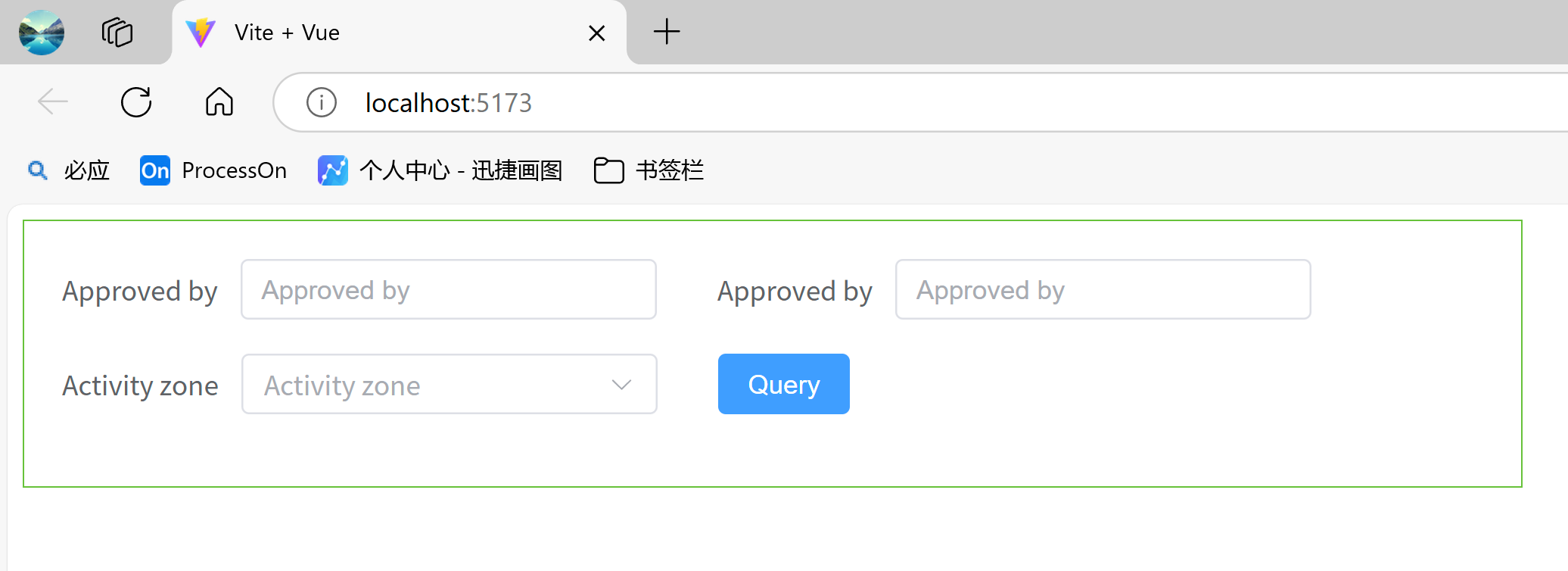
示例代码:
<template>
    <el-row>
      <el-col :span="14" style="padding:20px;border: 1px solid var(--el-color-success);">
        <el-form :model="formInline" inline class="demo-form-inline">

          <el-form-item label="Approved by">
            <el-input v-model="formInline.user" placeholder="Approved by" clearable />
          </el-form-item>

          <el-form-item label="Approved by">
            <el-input v-model="formInline.user" placeholder="Approved by" clearable />
          </el-form-item>

          <el-form-item label="Activity zone">
            <el-select v-model="formInline.region" placeholder="Activity zone" clearable>
              <el-option label="Zone one" value="shanghai" />
              <el-option label="Zone two" value="beijing" />
            </el-select>

          </el-form-item>

          <el-form-item>
            <el-button type="primary">Query</el-button>

          </el-form-item>

        </el-form>

      </el-col>

    </el-row>

</template>

<script lang="ts" setup>
import { reactive } from 'vue'

const formInline = reactive({
  user: '',
  region: ''
})

</script>

<style>
.demo-form-inline .el-input {
  --el-input-width: 220px;
}

.demo-form-inline .el-select {
  --el-select-width: 220px;
}
</style>
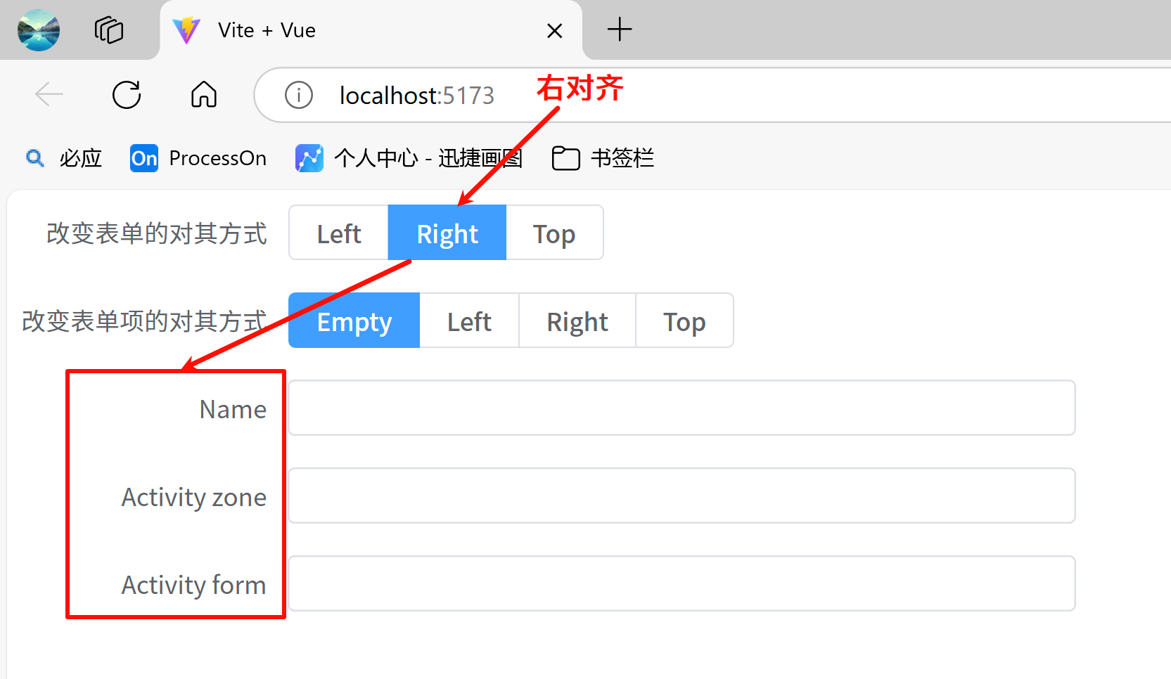
3)对其方式
我们可以分别设置<el-form>和<el-form-item>的 label-position 属性来调整表单项的对其方式,如果<el-form-item>为空则使用<el-form>的对其方式。
label-position 属性可选值为 top、left, 当设为 top 时标签会置于表单域的顶部。
效果:
示例代码:
<template>
  <el-form :label-position="labelPosition"
           label-width="auto"
           :model="formLabelAlign"
      style="max-width: 600px">

    <el-form-item label="改变表单的对其方式" label-position="right">
      <el-radio-group v-model="labelPosition" aria-label="label position">
        <el-radio-button value="left">Left</el-radio-button>

        <el-radio-button value="right">Right</el-radio-button>

        <el-radio-button value="top">Top</el-radio-button>

      </el-radio-group>

    </el-form-item>

    <el-form-item label="改变表单项的对其方式" label-position="right">
      <el-radio-group v-model="itemLabelPosition">
        <el-radio-button value="">Empty</el-radio-button>

        <el-radio-button value="left">Left</el-radio-button>

        <el-radio-button value="right">Right</el-radio-button>

        <el-radio-button value="top">Top</el-radio-button>

      </el-radio-group>

    </el-form-item>

    <el-form-item label="Name" :label-position="itemLabelPosition">
      <el-input v-model="formLabelAlign.name"/>
    </el-form-item>

    <el-form-item label="Activity zone" :label-position="itemLabelPosition">
      <el-input v-model="formLabelAlign.region"/>
    </el-form-item>

    <el-form-item label="Activity form" :label-position="itemLabelPosition">
      <el-input v-model="formLabelAlign.type"/>
    </el-form-item>

  </el-form>

</template>

<script lang="ts" setup>
import {reactive, ref} from 'vue'

const labelPosition = ref('right')
const itemLabelPosition = ref('')

const formLabelAlign = reactive({
  name: '',
  region: '',
  type: '',
})
</script>
4)校验规则
Form 组件提供了表单验证的功能,只需为 rules 属性传入约定的验证规则,并将 form-Item 的 prop 属性设置为需要验证的特殊键值即可。
效果:
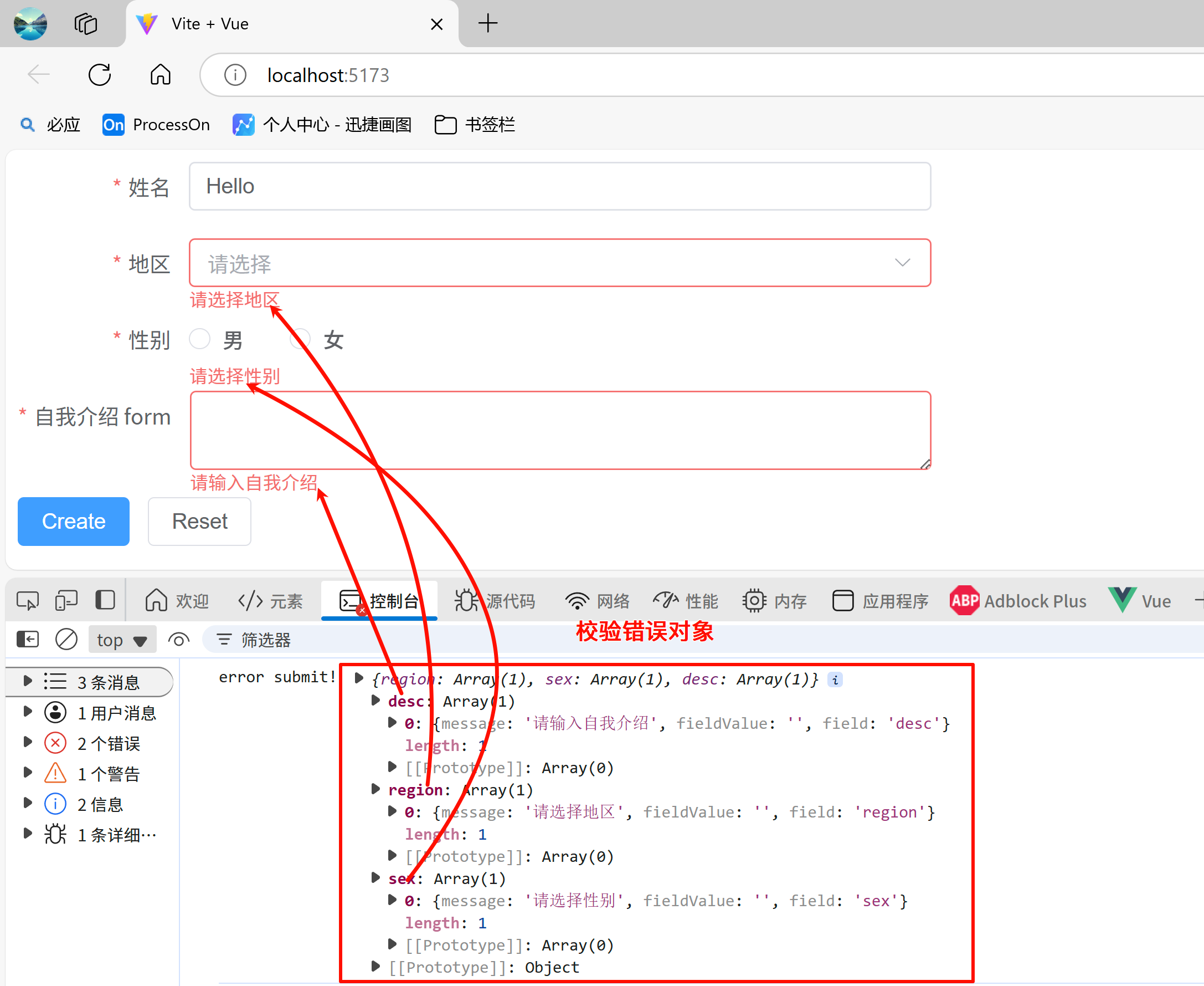
示例代码:
<template>
  <el-form ref="ruleFormRef" style="max-width: 600px" :model="ruleForm" :rules="rules" label-width="auto">

    <el-form-item label="姓名" prop="name">
      <el-input v-model="ruleForm.name"/>
    </el-form-item>

    <el-form-item label="地区" prop="region">
      <el-select v-model="ruleForm.region" placeholder="请选择">
        <el-option label="洛阳" value="luoyang"/>
        <el-option label="商丘" value="shangqiu"/>
      </el-select>

    </el-form-item>

    <el-form-item label="性别" prop="sex">
      <el-radio-group v-model="ruleForm.sex">
        <el-radio value="male">男</el-radio>

        <el-radio value="female">女</el-radio>

      </el-radio-group>

    </el-form-item>

    <el-form-item label="自我介绍 form" prop="desc">
      <el-input v-model="ruleForm.desc" type="textarea"/>
    </el-form-item>

    <el-form-item>
      <el-button type="primary" @click="submitForm(ruleFormRef)">
        Create
      </el-button>

      <el-button @click="resetForm(ruleFormRef)">Reset</el-button>

    </el-form-item>

  </el-form>

</template>

<script lang="ts" setup>
import {reactive, ref} from 'vue'
import {FormInstance} from "element-plus";

// 表单校验实例对象
const ruleFormRef = ref()

const ruleForm = reactive({
  name: 'Hello',
  region: '',
  sex: '',
  desc: ''
})

const rules = reactive({
  name: [
    {required: true, message: '请输入名称', trigger: 'blur'},
    {min: 3, max: 5, message: '长度必须在3~5个字符', trigger: 'blur'},
  ],
  region: [
    {
      required: true,
      message: '请选择地区',
      trigger: 'change',
    },
  ],
  sex: [
    {
      required: true,
      message: '请选择性别',
      trigger: 'change',
    },
  ],
  desc: [
    {required: true, message: '请输入自我介绍', trigger: 'blur'},
  ],
})

// 表单提交校验
const submitForm = async (formEl: FormInstance | undefined) => {

  if (!formEl) return
  await formEl.validate((valid, fields) => {
    if (valid) {

      // 表单提交成功
      console.log('submit!')
    } else {

      // 表单提交失败
      console.log('error submit!', fields)
    }
  })
}

// 重置表单校验
const resetForm = (formEl: FormInstance | undefined) => {
  if (!formEl) return
  formEl.resetFields()
}

</script>
2.5.3 数据展示组件
1)走马灯、折叠面板
- 走马灯:在有限空间内,循环播放同一类型的图片、文字等内容
结合使用 el-carousel 和 el-carousel-item 标签就得到了一个走马灯。 每一个页面的内容是完全可定制的,把你想要展示的内容放在 el-carousel-item 标签内。 默认情况下,在鼠标 hover 底部的指示器时就会触发切换。 通过设置 trigger 属性为 click,可以达到点击触发的效果。
效果:
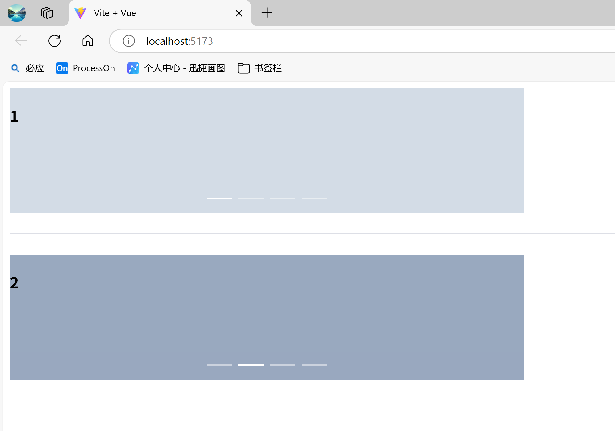
示例代码:
<template>
  <el-row>

    <el-col :span="12">
    <!--   定义走马灯, 触发方式默认为hover -->
      <el-carousel height="150px">
        <el-carousel-item v-for="item in 4" :key="item">
          <h3>{{ item }}</h3>

        </el-carousel-item>

      </el-carousel>

    </el-col>

  </el-row>

  <el-divider />

  <el-row>
    <el-col :span="12">
      <!--   定义走马灯, 触发方式改为click  -->
      <el-carousel trigger="click" height="150px">
        <el-carousel-item v-for="item in 4" :key="item">
          <h3>{{ item }}</h3>

        </el-carousel-item>

      </el-carousel>

    </el-col>

  </el-row>

</template>

<style scoped>
.el-carousel__item:nth-child(2n) {
  background-color: #99a9bf;
}

.el-carousel__item:nth-child(2n + 1) {
  background-color: #d3dce6;
}
</style>
- 折叠面板:通过折叠面板收纳内容区域。
通过el-collapse标签定义一个完整的折叠面板,el-collapse-item标签定义折叠面板中的每一项内容,每个el-collapse-item都可以独立布局任意想要的内容。
可以通过 accordion 属性来设置是否以手风琴模式显示(每次只能展开一个面板)。
效果:
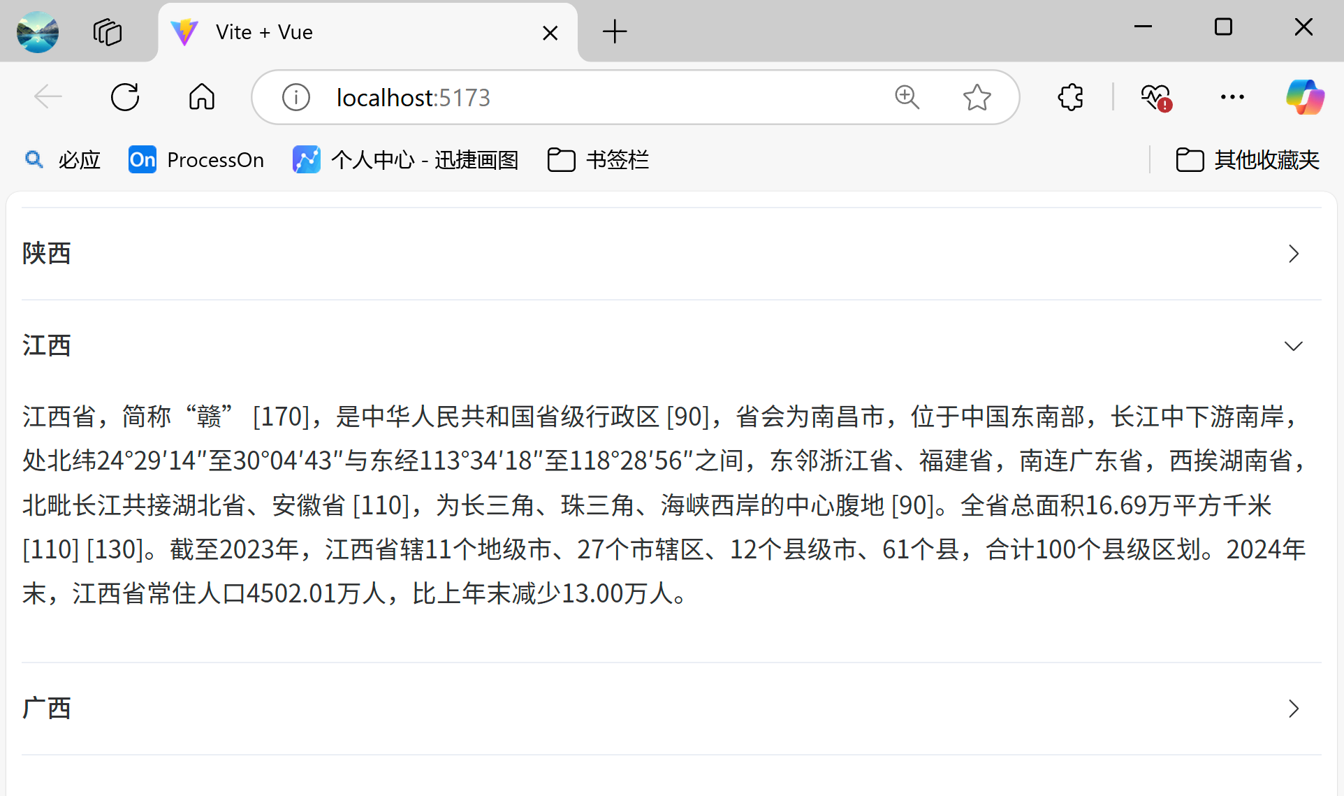
示例代码:
<template>
  <div class="demo-collapse">
    <!--
      定义折叠面板
      @change="handleChange": js回调函数,当折叠面板状态改变时触发
      v-model="activeNames": 绑定当前激活的折叠面板,数组类型,可以绑定多个折叠面板
      -->
    <el-collapse v-model="activeNames" @change="handleChange">
      <el-collapse-item title="江西" name="1">
        <div>
          江西省,简称“赣” [170],是中华人民共和国省级行政区 [90],省会为南昌市,位于中国东南部,长江中下游南岸,处北纬24°29′14″至30°04′43″与东经113°34′18″至118°28′56″之间,东邻浙江省、福建省,南连广东省,西挨湖南省,北毗长江共接湖北省、安徽省 [110],为长三角、珠三角、海峡西岸的中心腹地 [90]。全省总面积16.69万平方千米 [110] [130]。截至2023年,江西省辖11个地级市、27个市辖区、12个县级市、61个县,合计100个县级区划。2024年末,江西省常住人口4502.01万人,比上年末减少13.00万人。
        </div>

      </el-collapse-item>

      <el-collapse-item title="福建" name="2">
        <div>
          福建省,简称闽,中华人民共和国省级行政区,省会福州市,地处中国东南沿海,东北与浙江省毗邻,西北与江西省接界,西南与广东省相连,东南隔台湾海峡与台湾省相望;全省地势西北高,东南低,呈依山傍海态势,境内山地、丘陵面积约占全省总面积的90%;属亚热带季风气候;全省陆地面积12.4万平方千米,海域面积13.6万平方千米。截至2023年末,福建省辖9个地级市。 [55]截至2024年末,福建省常住人口4193万人。 [147]
        </div>

      </el-collapse-item>

      <el-collapse-item title="河北" name="3">
        <div>
          河北省(Hebei Province [291]),简称“冀”,中华人民共和国省级行政区,省会石家庄,位于北纬36°05′-42°40′,东经113°27′-119°50′之间,地处华北,漳河以北,东临渤海、内环京津。东南部、南部衔山东、河南两省,西倚太行山与山西省为邻,西北与内蒙古自治区交界,东北部与辽宁接壤。 [1]海岸线长487千米,总面积18.88万平方千米。截至2024年3月,河北辖11个设区市;167个县(市、区),其中,市辖区49个、县级市21个、县91个、自治县6个。 [2]省政府位于石家庄市长安区裕华东路113号。 [79]2024年末常住人口7378万人。 [2] [357]方言有北京官话、冀鲁官话、东北官话 [349]、中原官话 [350]、晋语。 [209]
        </div>

      </el-collapse-item>

    </el-collapse>

  </div>

</template>

<script lang="ts" setup>
import { ref } from 'vue'

// 默认让2面板激活
const activeNames = ref(['2'])
const handleChange = (val) => {
  // 打印当前激活的折叠面板
  console.log(val)
}
</script>
2)表格、分页、无限滚动
- 表格:使用
el-table标签定义表格,el-table-column定义表格中的某一列。表格的数据来源于:date属性。当el-table元素中注入data对象数组后,在el-table-column中用prop属性来对应对象中的键名即可填入数据,用label属性来定义表格的列名。 可以使用width属性来定义列宽。- stripe: 设置为
true, 表格将会带有斑马纹(各行换色)。 - border:设置为
true, 表格将会带有边框 - row-class-name:该属性可以为 Table 中的某一行添加 class, 这样就可以自定义每一行的样式了。
- show-overflow-tooltip:为
true时多余的内容会在 hover 时以 tooltip 的形式显示出来。 - height:只要在
el-table元素中定义了height属性,即可实现固定表头的表格,而不需要额外的代码。 - fixed :
el-table-column标签的属性,如果为true, 列将被左侧固定. 它还接受传入字符串,left 或 right,表示左边固定还是右边固定。 - :default-sort:给
el-table指定排序列,以及排序的顺序(升序/降序),在el-table-column给指定列加上sortable属性,表示该列要排序。
- stripe: 设置为
Tips:表格的样式非常丰富多样,更多表格样式可以参考官网:https://element-plus.org/zh-CN/component/table.html
效果:
示例代码:
<template>
  <div>
    <!-- 操作按钮 -->
    <div class="mb-4">
      <el-button @click="toggleAll">全选/取消</el-button>

      <el-button @click="reverseSelect">反选</el-button>

      <el-button @click="clearSelect">不选</el-button>

    </div>

    <!-- 表格 -->
    <el-table border stripe width="100%" height="200"
              :default-sort="{ prop: 'age', order: 'descending' }"
              ref="tableRef"
              :data="tableData"
              @selection-change="handleSelectionChange"
    >

      <el-table-column type="selection" width="55" />
      <el-table-column prop="name" label="姓名" width="120" fixed/>
      <el-table-column prop="age" label="年龄" width="120" sortable/>
      <el-table-column prop="sex" label="性别" width="120"/>
      <el-table-column prop="country" label="国籍" width="120"/>
      <el-table-column prop="province" label="省份" width="120"/>
      <el-table-column prop="city" label="城市" width="120"/>
      <el-table-column prop="address" label="address" width="240" show-overflow-tooltip/>
    </el-table>

  </div>

</template>

<script setup lang="ts">
import { ref } from 'vue'

interface TableItem {
  id: number
  name: string
  age: number
}

// 表格数据
const tableData = ref<TableItem[]>([
  { id: 1, name: '小灰', age: 18,sex:"男",country:"中国",province:"江西省",city:"南昌市",address:"江西省南昌市西湖区八一大道洪城西路永安街128号" },
  { id: 2, name: '小蓝', age: 25,sex:"女",country:"中国",province:"江西省",city:"南昌市",address:"江西省南昌市东湖区南昌大道洪城西路永安街128号" },
  { id: 3, name: '小绿', age: 20,sex:"男",country:"中国",province:"江西省",city:"南昌市",address:"江西省南昌市新建区井冈山大道洪城西路永安街128号" },
  { id: 4, name: '小明', age: 22,sex:"男",country:"中国",province:"江西省",city:"南昌市",address:"江西省南昌市青山湖区赣州大道洪城西路永安街128号" },
  { id: 5, name: '小龙', age: 17,sex:"男",country:"中国",province:"江西省",city:"南昌市",address:"江西省南昌市红谷滩区抚生大道洪城西路永安街128号" },
  { id: 6, name: '小紫', age: 23,sex:"女",country:"中国",province:"江西省",city:"南昌市",address:"江西省南昌市进贤县进贤大道洪城西路永安街128号" },
])

// 存储选中的数据
const selectedRows = ref<TableItem[]>([])

// 表格实例对象
const tableRef = ref()

// 处理选中变化
const handleSelectionChange = (val: TableItem[]) => {
  selectedRows.value = val
}

// 全选/取消
const toggleAll = () => {
  tableRef.value?.toggleAllSelection()
}

// 反选
const reverseSelect = () => {
  // 遍历表格数据
  tableData.value.forEach(row => {
    // 如果当前行未选中,则选中。如果选中,则取消选中
    tableRef.value?.toggleRowSelection(row, !isSelected(row))
  })
}

// 清空选择
const clearSelect = () => {
  tableRef.value?.clearSelection()
}

// 判断是否选中
const isSelected = (row: TableItem) => {
  return selectedRows.value.some(item => item.id === row.id)
}
</script>
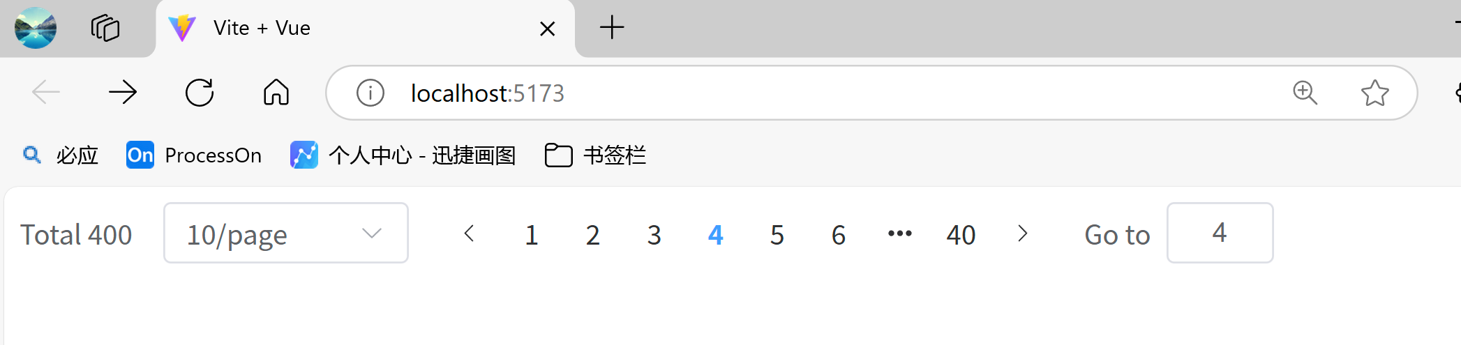
- 分页:分页组件使用
el-pagination标签。layout:表示分页组件所需的元素。prev(上一页按钮),next(下一页按钮),pager(分页列表),jumper(跳转),total(总页数),sizes(页大小下拉框):total指定分页组件的总记录数:page-size:页大小,默认为10:page-sizes:设置页大小下拉框的值:pager-count:默认情况下,当总页数超过 7 页时,Pagination 会折叠多余的页码按钮。 通过pager-count属性可以设置最大页码按钮数。background:设置带有背景的分页disabled:禁用分页组件
效果:
示例代码:
<template>

  <el-pagination
      :current-page="currentPage"
      :page-size="pageSize"
      :page-sizes="[10, 20, 30, 40]"
      layout="total, sizes, prev, pager, next, jumper"
      :total="400"
      @size-change="handleSizeChange"
      @current-change="handleCurrentChange"
      @next-click="handleNextClick"
      @prev-click="handlePrevClick"
  />
</template>

<script setup>

import { ref } from 'vue';
let currentPage = ref(1);
let pageSize = ref(10);

const handleSizeChange = (size) => {
  pageSize.value = size;
  console.log('handleSizeChange',size);
};

const handleCurrentChange = (page) => {
  currentPage.value = page;
  console.log('handleCurrentChange',page);
};

const handleNextClick = (page) => {
  console.log('handleNextClick',currentPage.value);
};

const handlePrevClick = (page) => {
  console.log('handlePrevClick',currentPage.value);
};

</script>
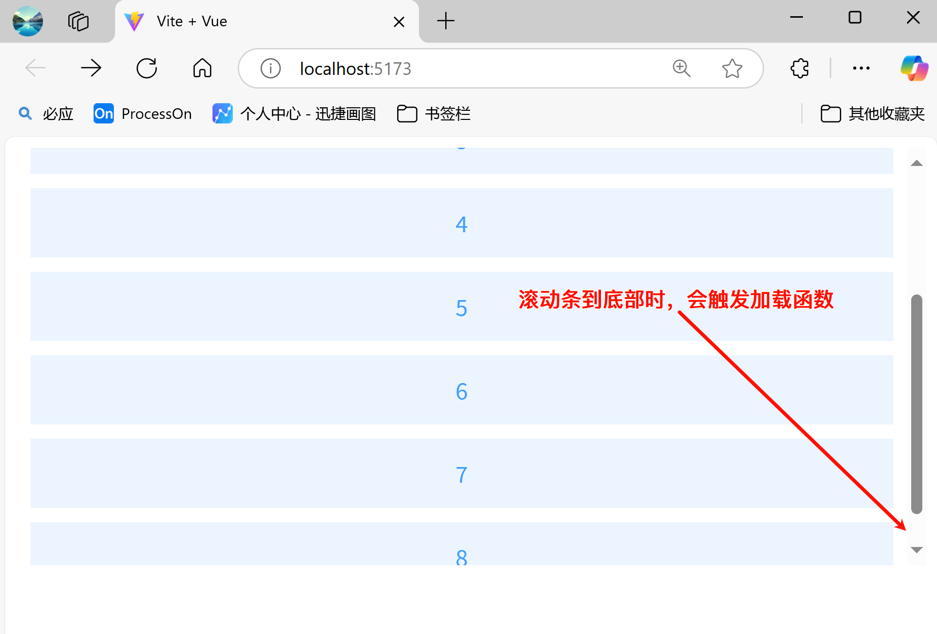
- 无限滚动:在容器上加上
v-infinite-scroll属性并赋值相应的加载方法,滚动至底部时,触发该方法,加载更多数据
官网:https://element-plus.org/zh-CN/component/infinite-scroll.html
效果:
示例代码:
<template>
  <ul v-infinite-scroll="load" class="infinite-list" style="overflow: auto">
    <li v-for="i in count" :key="i" class="infinite-list-item">{{ i }}</li>

  </ul>

</template>

<script lang="ts" setup>
import { ref } from 'vue'
const count = ref(0)

// 当滚动条到底部时触发(如果元素不能达到滚动条底部则默认触发该方法来加载更多数据)
const load = () => {
  count.value += 2
  console.log('load more',count.value)
}
</script>

<style>
.infinite-list {
  height: 300px;
  padding: 0;
  margin: 0;
  list-style: none;
}
.infinite-list .infinite-list-item {
  display: flex;
  align-items: center;
  justify-content: center;
  height: 50px;
  background: var(--el-color-primary-light-9);
  margin: 10px;
  color: var(--el-color-primary);
}
.infinite-list .infinite-list-item + .list-item {
  margin-top: 10px;
}
</style>
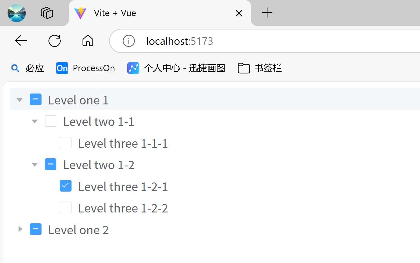
3)树形组件
树形组件使用el-tree组件,通过绑定:data属性来展示树形结构。默认情况下,:data属性中label为树节点的名称,children为该树节点的子节点。我们也可以通过:props属性来更改,例如后端返回的树节点名称为deptName,children为userList等。
常用属性如下:
- show-checkbox:设置树组件可选
- :default-expanded-keys:默认展开的节点
- :default-checked-keys:默认选中的节点
- default-expand-all:展开所有节点
- accordion:手风琴模式
- @node-click:节点点击事件
效果:
示例代码:
<template>

  <el-tree style="max-width: 600px"
           show-checkbox
           ref="treeRef"
           :default-expanded-keys="[1,7]"
           :default-checked-keys="[5,8]"
           :props="defaultProps"
           :data="data"
           @node-click="handleNodeClick"
  />
</template>

<script lang="ts" setup>

// 定义树形结构中的属性
interface Tree {
  id: number,
  treeName: string,
  treeList?: Tree[]
}

const defaultProps = {
  children: 'treeList',
  label: 'treeName',
}

// 节点点击事件
const handleNodeClick = (data: Tree) => {
  console.log('label:', data.treeName)
}

const data: Tree[] = [
  {
    id: 1,
    treeName: 'Level one 1',
    treeList: [
      {
        id: 2,
        treeName: 'Level two 1-1',
        treeList: [
          {
            id: 3,
            treeName: 'Level three 1-1-1',
          },
        ],
      },
      {
        id: 4,
        treeName: 'Level two 1-2',
        treeList: [
          {
            id: 5,
            treeName: 'Level three 1-2-1',
          },
          {
            id: 6,
            treeName: 'Level three 1-2-2',
          },
        ],
      },
    ],
  },
  {
    id: 7,
    treeName: 'Level one 2',
    treeList: [
      {
        id: 8,
        treeName: 'Level two 2-1',
        treeList: [
          {
            id: 9,
            treeName: 'Level three 2-1-1',
          },
          {
            id: 10,
            treeName: 'Level three 2-1-2',
          },
        ],
      },
      {
        id: 11,
        treeName: 'Level two 2-2',
        treeList: [
          {
            id: 12,
            treeName: 'Level three 2-2-1',
          },
        ],
      },
    ],
  }
]
</script>
4)时间线、进度条
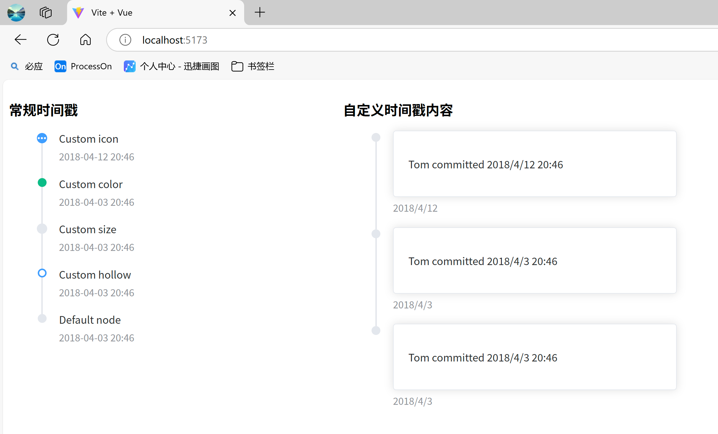
- 时间线:使用
el-timeline组件来定义一个时间线,el-timeline-item组件定义时间线中的每一个子项。Timeline 可拆分成多个按照时间戳(:timestamp)排列的活动, 时间戳是其区分于其他控件的重要特征。- :timestamp:时间戳,用于区分每一个子项。
- :icon:子项的图标
- :type:子项的类型,有’primary’ | ‘success’ | ‘warning’ | ‘danger’ | 'info’等类型
- :size:子项的大小,有’normal’ | ‘large’,默认为normal
- :hollow:是否空心点,默认为false
- placement:时间戳位置,有’top’ | ‘bottom’,默认为top
效果:
示例代码:
<template>


  <el-row>
    <el-col :span="8">
      <h3>常规时间戳</h3>

      <el-timeline style="max-width: 600px">
        <el-timeline-item
            v-for="(activity, index) in activities"
            :key="index"
            :icon="activity.icon"
            :type="activity.type"
            :color="activity.color"
            :size="activity.size"
            :hollow="activity.hollow"
            :timestamp="activity.timestamp"
        >
          {{ activity.content }}
        </el-timeline-item>

      </el-timeline>

    </el-col>


    <!--  自定义时间戳内容  -->
    <el-col :span="8">
      <h3>自定义时间戳内容</h3>

      <el-timeline style="max-width: 600px">
        <el-timeline-item timestamp="2018/4/12" placement="bottom">
          <el-card>
            <p>Tom committed 2018/4/12 20:46</p>

          </el-card>

        </el-timeline-item>

        <el-timeline-item timestamp="2018/4/3" placement="bottom">
          <el-card>
            <p>Tom committed 2018/4/3 20:46</p>

          </el-card>

        </el-timeline-item>

        <el-timeline-item timestamp="2018/4/3" placement="bottom">
          <el-card>
            <p>Tom committed 2018/4/3 20:46</p>

          </el-card>

        </el-timeline-item>

      </el-timeline>

    </el-col>

  </el-row>

</template>

<script lang="ts" setup>
import {MoreFilled} from '@element-plus/icons-vue'
import type {TimelineItemProps} from 'element-plus'

interface ActivityType extends Partial<TimelineItemProps> {
  content: string
}

const activities: ActivityType[] = [
  {
    content: 'Custom icon',
    timestamp: '2018-04-12 20:46',
    size: 'large',
    type: 'primary',
    icon: MoreFilled,
  },
  {
    content: 'Custom color',
    timestamp: '2018-04-03 20:46',
    color: '#0bbd87',
  },
  {
    content: 'Custom size',
    timestamp: '2018-04-03 20:46',
    size: 'large',
  },
  {
    content: 'Custom hollow',
    timestamp: '2018-04-03 20:46',
    type: 'primary',
    hollow: true,
  },
  {
    content: 'Default node',
    timestamp: '2018-04-03 20:46',
  },
]
</script>
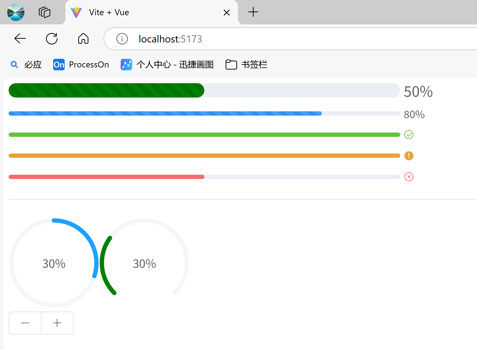
- 进度条:使用
el-Progress组件可以定义一个进度条,设置percentage属性表示进度条对应的百分比,该属性必填,并且必须在0-100的范围内。 你可以通过设置format来自定义文字显示的格式。:format:一个函数,当进度条的percentage值发生变化时触发,返回值为该进度条的显示的值。:text-inside:进度条显示文字内置在进度条内(仅type为 ‘line’ 时可用),默认值为false:stroke-width: 进度条的宽度,默认值为6status:进度条的状态,可选值:‘success’ | ‘exception’ | ‘warning’:color:自定义进度条的颜色type:进度条的类型,可选值:‘line’ | ‘circle’ | ‘dashboard’,默认值为linestriped:设置条纹进度条striped-flow:来使条纹流动起来duration:控制动画进度条速度和条纹进度条流动速度,默认为3,数值越小越快
效果:
示例代码:
<template>
  <div class="demo-progress">
    <el-progress :percentage="50" color="green" :stroke-width="20" striped striped-flow :duration="20"/>
    <el-progress :percentage="80" :format="format" striped striped-flow :duration="5"/>
    <el-progress :percentage="100" status="success" />
    <el-progress :percentage="100" status="warning" />
    <el-progress :percentage="50" status="exception" />

    <el-divider />

    <el-progress type="circle" :percentage="percentage" />
    <el-progress type="dashboard" :percentage="percentage" color="green" />

    <div>
      <el-button-group>
        <el-button :icon="Minus" @click="decrease" />
        <el-button :icon="Plus" @click="increase" />
      </el-button-group>

    </div>

  </div>

</template>

<script lang="ts" setup>

import {Minus, Plus} from "@element-plus/icons-vue";
import {ref} from "vue";

const format = (percentage) => (percentage === 100 ? 'Full' : `${percentage}%`)

const percentage = ref(30)

const increase = () => {
  percentage.value += 10
  if (percentage.value > 100) {
    percentage.value = 100
  }
}
const decrease = () => {
  percentage.value -= 10
  if (percentage.value < 0) {
    percentage.value = 0
  }
}

</script>

<style scoped>
.demo-progress .el-progress--line {
  margin-bottom: 15px;
  max-width: 600px;
}
</style>
5)描述列表
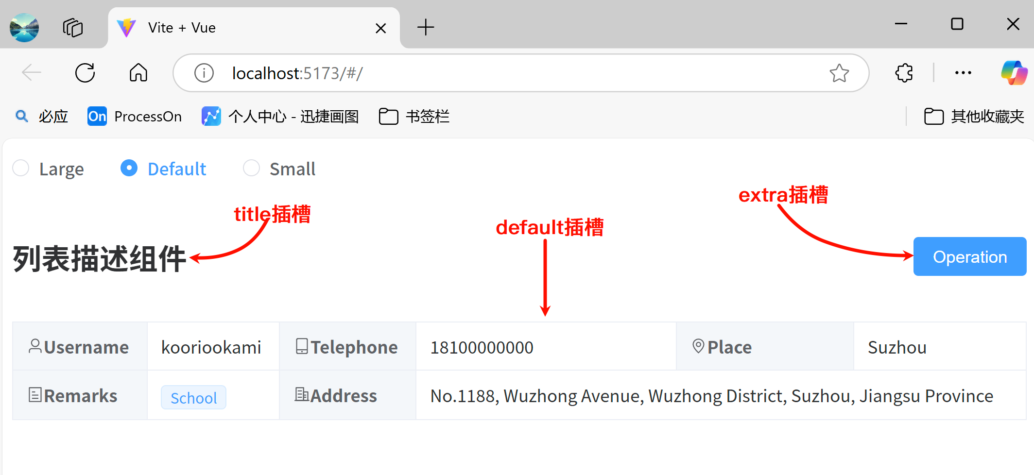
使用el-descriptions组件可以定义一个描述列表,el-descriptions-item组件定义描述列表的子项。描述列表将以列表形式展示多个字段。
el-descriptions组件相关属性:border:描述列表是否带有边框,默认为falsecolumn:一行中含有多少个el-descriptions-item,默认为3direction:排列的方向,可选值有:‘vertical’ | ‘horizontal’,默认为horizontalsize:列表的尺寸,可选值有’’ | ‘large’ | ‘default’ | ‘small’title:标题文本,显示在左上方(等同于title插槽)extra:操作区文本,显示在右上方(等同于extra插槽)label-width:每一列的标签宽度
el-descriptions-item组件属性:label:标签文本内容width:列的宽度min-width:列的最小宽度,与width的区别是width是固定的,min-width会把剩余宽度按比例分配给设置了min-width的列(如无border,宽度包含标签与内容)label-width:列标签宽,如果未设置,它将与列宽度相同。 比Descriptions的label-width优先级高align:列的内容对齐方式,可选值有’left’ | ‘center’ | ‘right’,默认为leftlabel-align:列的标签对齐方式,若不设置该项,则使用内容的对齐方式
官网:https://element-plus.org/zh-CN/component/descriptions.html
效果:
示例代码:
<template>
  <el-radio-group v-model="size">
    <el-radio value="large">Large</el-radio>

    <el-radio value="default">Default</el-radio>

    <el-radio value="small">Small</el-radio>

  </el-radio-group>

  <el-descriptions class="margin-top" :column="3" :size="size" border direction="horizontal">
    <!--  使用title插槽  -->
    <template #title>
      <h2>列表描述组件</h2>

    </template>

    <!-- 使用extra插槽  -->
    <template #extra>
      <el-button type="primary">Operation</el-button>

    </template>

    <!-- 默认使用default插槽   -->
    <el-descriptions-item>
      <template #label>
        <div class="cell-item">
          <el-icon>
            <user />
          </el-icon>

          Username
        </div>

      </template>

      kooriookami
    </el-descriptions-item>

    <el-descriptions-item>
      <template #label>
        <div class="cell-item">
          <el-icon>
            <iphone />
          </el-icon>

          Telephone
        </div>

      </template>

      18100000000
    </el-descriptions-item>

    <el-descriptions-item>
      <template #label>
        <div class="cell-item">
          <el-icon>
            <location />
          </el-icon>

          Place
        </div>

      </template>

      Suzhou
    </el-descriptions-item>

    <el-descriptions-item>
      <template #label>
        <div class="cell-item">
          <el-icon>
            <tickets />
          </el-icon>

          Remarks
        </div>

      </template>

      <el-tag size="small">School</el-tag>

    </el-descriptions-item>

    <el-descriptions-item>
      <template #label>
        <div class="cell-item">
          <el-icon>
            <office-building />
          </el-icon>

          Address
        </div>

      </template>

      No.1188, Wuzhong Avenue, Wuzhong District, Suzhou, Jiangsu Province
    </el-descriptions-item>


  </el-descriptions>

</template>

<script setup lang="ts">
import { computed, ref } from 'vue'
import {
  Iphone,
  Location,
  OfficeBuilding,
  Tickets,
  User,
} from '@element-plus/icons-vue'
import type { ComponentSize } from 'element-plus'

const size = ref<ComponentSize>('default')

</script>

<style scoped>
.cell-item {
  display: flex;
  align-items: center;
}
.margin-top {
  margin-top: 20px;
}
</style>
2.5.4 导航组件
1)固定、锚点
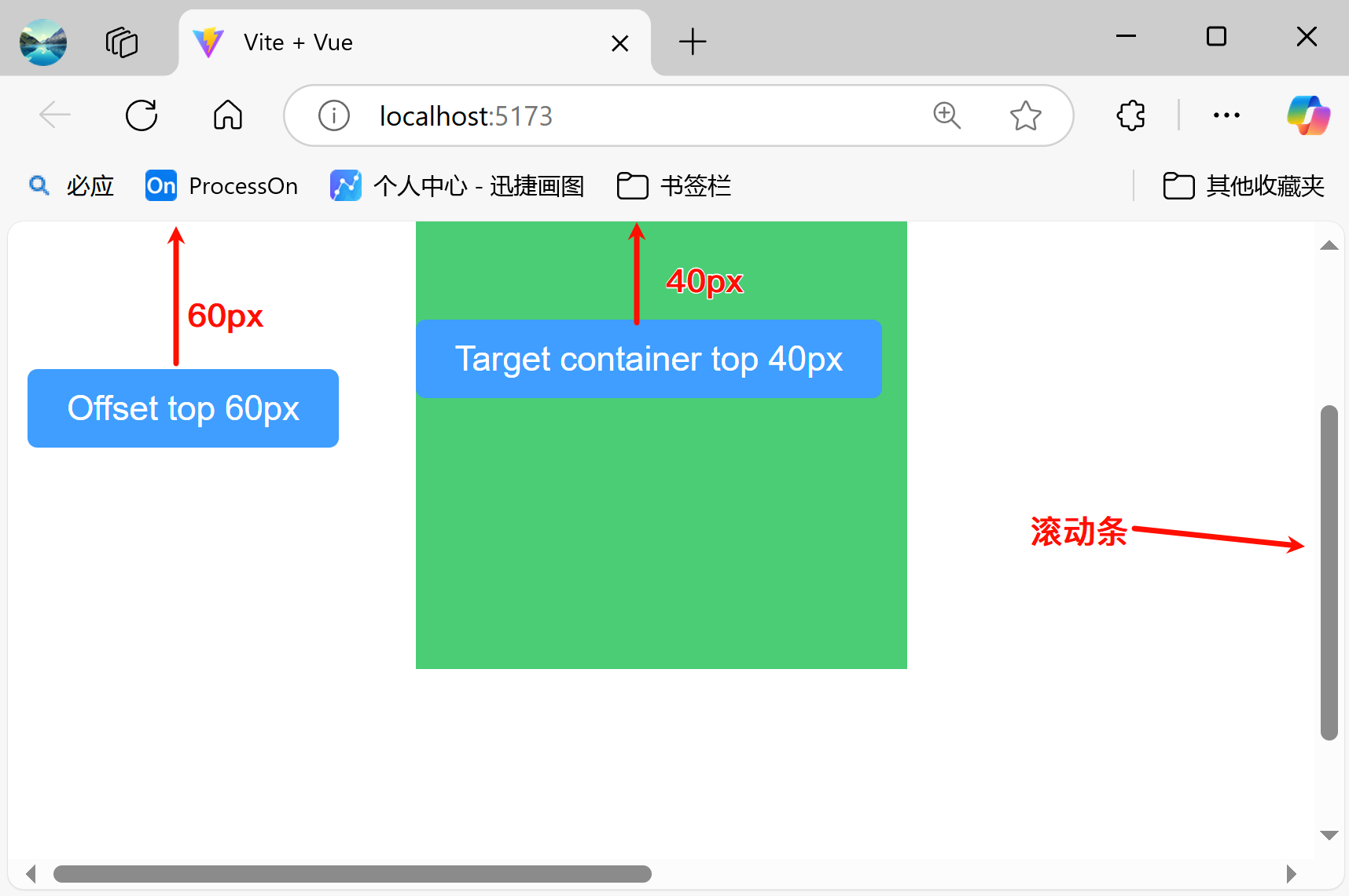
- 固定:使用
el-affix组件可以固定某一块区域offset:改变吸顶距离,默认值为 0。target:让固定组件始终保持在指定容器内, 超过范围则隐藏。position:改变固定位置,可选值为’top’ | ‘bottom’,默认值为top。z-index:改变固定组件的层叠顺序。
效果:
示例代码:
<template>
  <div style="height: 150vh;">
    <el-affix :offset="150">
      <el-button type="primary">Offset top 120px</el-button>

    </el-affix>

    <div class="affix-container">
      <el-affix position="top" target=".affix-container" :offset="80">
        <el-button type="primary">Target container top</el-button>

      </el-affix>

    </div>

  </div>

</template>

<style>
.affix-container {
  position: relative;
  margin:50px auto;
  width: 500px;
  height: 500px;
  background-color: #4ACD76;
}
</style>

<script setup>
</script>
- 锚点:使用
el-anchor组件可以定义一组锚点,el-anchor-link组件定义某个锚点,使用href属性来链接到具体的锚点位置。direction:锚点的排列方式,可选值有’vertical’ | ‘horizontal’,默认为vertical:offset:设置链接到锚点时,该锚点与顶部的偏移量,默认为0duration:设置容器滚动持续时间,单位为毫秒。默认为300type:设置锚点类型,可选值有’default’ | ‘underline’,默认为default
官网:https://element-plus.org/zh-CN/component/anchor.html#anchor-api
效果:
示例代码:
<template>

  <!-- 定义锚点 -->
 <el-affix :offset="20">
   <el-anchor :offset="100" direction="horizontal" :duration="1000">
     <el-anchor-link href="#button" title="按钮"></el-anchor-link>

     <el-anchor-link href="#link" title="链接"></el-anchor-link>

     <el-anchor-link href="#icon" title="图标"></el-anchor-link>

   </el-anchor>

 </el-affix>

  <el-row>
    <el-col :span="24">
      <div id="button"  class="box">
        <h2>按钮</h2>

        <el-button type="primary">主要按钮</el-button>

        <el-button type="success">成功按钮</el-button>

        <el-button type="info">信息按钮</el-button>

        <el-button type="warning">警告按钮</el-button>

        <el-button type="danger">危险按钮</el-button>

      </div>

    </el-col>

  </el-row>

  <el-row>
    <el-col :span="24">
      <div id="link" class="box">
        <h2>链接</h2>

        <el-space>
          <el-link href="#">普通链接</el-link>

          <el-link type="primary" href="#">主要链接</el-link>

          <el-link type="success" href="#">成功链接</el-link>

          <el-link type="info" href="#">信息链接</el-link>

          <el-link type="warning" href="#">警告链接</el-link>

          <el-link type="danger" href="#">危险链接</el-link>

        </el-space>

      </div>

    </el-col>

  </el-row>

  <el-row>
    <el-col :span="24"  class="box">
      <div id="icon">
        <h2>图标</h2>

        <el-space>
          <el-icon><Check /></el-icon>

          <el-icon><Delete /></el-icon>

          <el-icon><Edit /></el-icon>

          <el-icon><Message /></el-icon>

          <el-icon><Search /></el-icon>

          <el-icon><Star /></el-icon>

        </el-space>

      </div>

    </el-col>

  </el-row>

</template>

<script lang="ts" setup>
// 导入图标
import {
  Check,
  Delete,
  Edit,
  Message,
  Search,
  Star,
} from '@element-plus/icons-vue'
</script>

<style>

.box{
  margin-top:10px;
  height: 100vh;
  border: 1px solid #ccc;
}
</style>
2)面包屑、页头
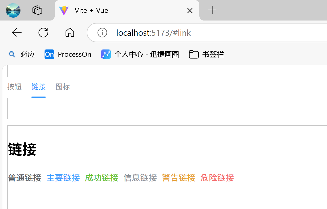
- 面包屑:使用
el-breadcrumb组件定义一组面包屑,el-breadcrumb-item定义面包屑的每一个子项。separator:面包屑子项之间的分隔符, 默认值为 ‘/’。separator-class:可使用相应的iconfont作为分隔符,注意这将使separator失效。
效果:
安装路由:
npm install vue-router
配置路由(在components文件夹下建立index.js):
// 导入VueRouter中的createRouter和createWebHashHistory函数
import {createRouter, createWebHashHistory} from 'vue-router'

// 定义路由表
const routes = [
    {path: '/test01', component: () => import('../components/04_导航组件/breadcrumb_test01.vue')},
    {path: '/test02', component: () => import('../components/04_导航组件/breadcrumb_test02.vue')},
]

// 创建路由实例
const router = createRouter({
    history: createWebHashHistory(),
    routes: routes
})

// 导出路由
export default router
在main.js下配置:
import router from "./components/router.js";
...
app.use(router)        // 使用vue-router组件
示例代码:
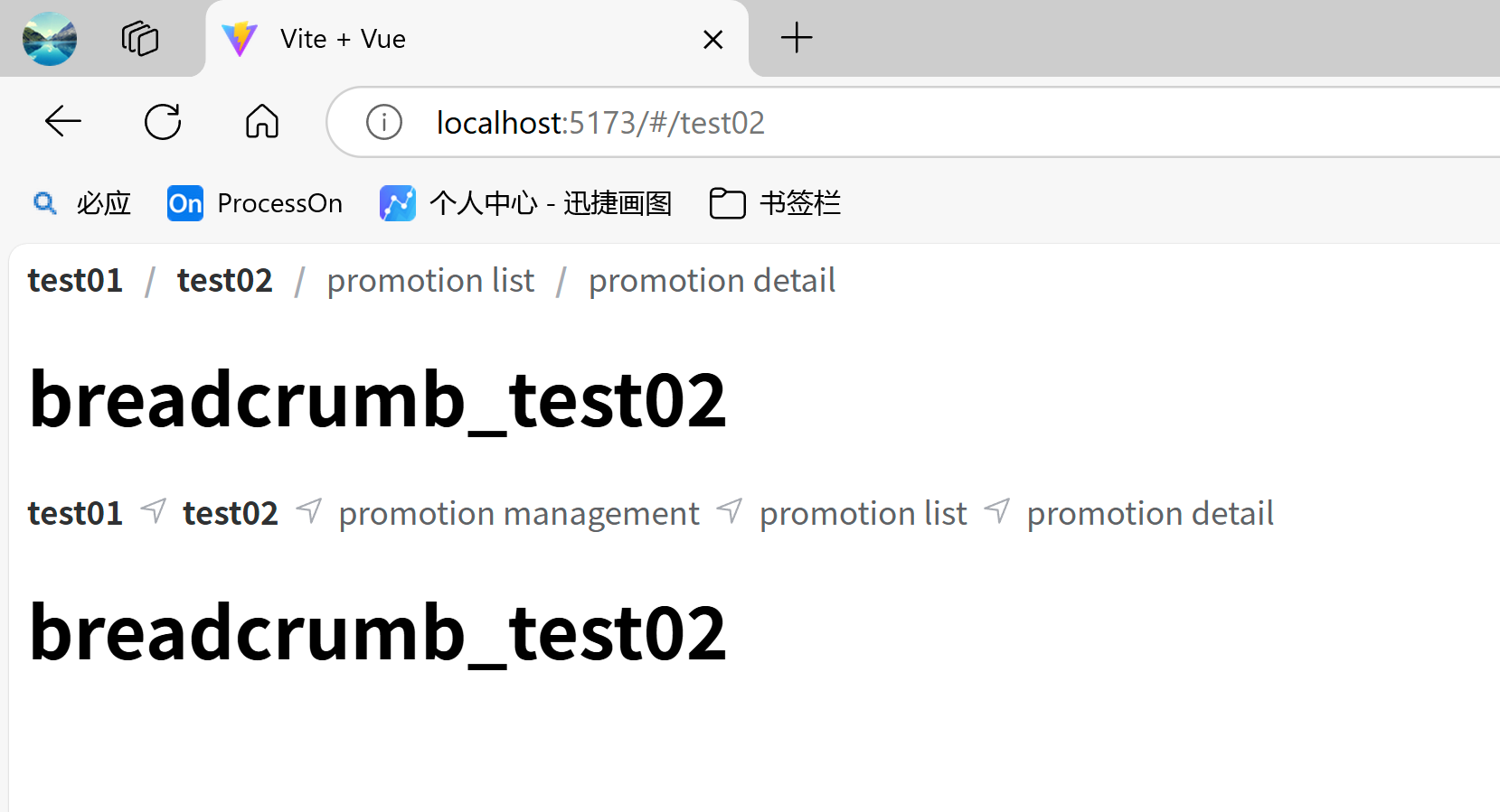
<template>

  <el-row>
    <el-col :span="24">
      <el-breadcrumb separator="/">
        <!--   路由跳转     -->
        <el-breadcrumb-item :to="{ path: '/test01' }">test01</el-breadcrumb-item>

        <el-breadcrumb-item :to="{ path: '/test02' }">test02</el-breadcrumb-item>

        <el-breadcrumb-item>promotion list</el-breadcrumb-item>

        <el-breadcrumb-item>promotion detail</el-breadcrumb-item>

      </el-breadcrumb>

      <!--  定义路由视图,渲染当前路由匹配到的组件    -->
      <router-view />
    </el-col>

  </el-row>

  <el-row>
    <el-col :span="24">
      <el-breadcrumb :separator-icon="Position">
        <!--   路由跳转     -->
        <el-breadcrumb-item :to="{ path: '/test01' }">test01</el-breadcrumb-item>

        <el-breadcrumb-item :to="{ path: '/test02' }">test02</el-breadcrumb-item>

        <el-breadcrumb-item>promotion management</el-breadcrumb-item>

        <el-breadcrumb-item>promotion list</el-breadcrumb-item>

        <el-breadcrumb-item>promotion detail</el-breadcrumb-item>

      </el-breadcrumb>

      <!--  定义路由视图,渲染当前路由匹配到的组件    -->
      <router-view/>
    </el-col>

  </el-row>

</template>

<script setup>
// 导入图标
import {Position} from "@element-plus/icons-vue";
</script>
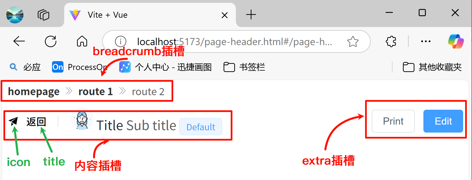
- 页头:如果页面的路径比较简单,推荐使用页头组件而非面包屑组件。页头组件使用
el-page-header,页头中存在很多插槽,这些插槽决定了内容在页头组件中渲染的位置。- 属性:
:icon:页头的图标(等同于icon插槽)title:页头的标题(等同于title插槽)content:页头的内容(等同于content插槽)
- 插槽:
content:内容显示在页头的中间extra:内容显示在页头的右边breadcrumb:内容显示在页头的顶部default:内容显示在页头的底部
- 属性:
官网:https://element-plus.org/zh-CN/component/page-header.html
效果:
3)菜单
菜单:使用el-menu组件定义一组菜单,el-menu-item组件定义菜单项,el-sub-menu组件定义子菜单。菜单项与子菜单可以通过index属性来其分配id。这样就可以通过:default-active属性指定默认激活的菜单项。
- 菜单(el-menu)属性:
- mode:菜单的展示模式,可选值有’horizontal’ | ‘vertical’,默认值为vertical
- default-active:页面加载时默认激活菜单的 index
- close-on-click-outside:单击外部时是否折叠菜单,默认为false
- show-timeout:菜单出现前的延迟,默认为300
- hide-timeout:菜单消失前的延迟,默认为300
- background-color:菜单的背景颜色
- text-color:菜单的文字颜色
- active-text-color:活动菜单项的文本颜色
- 菜单(el-menu)的事件:
- select:菜单激活回调
- open:sub-menu 展开的回调
- close:sub-menu 收起的回调
- 子菜单(el-menu-item)组件的常用属性:
- index:该子菜单的唯一标识
- disabled:是否禁用
- expand-close-icon:父菜单展开且子菜单关闭时的图标,
expand-close-icon和expand-open-icon需要一起配置才能生效 - expand-open-icon:父菜单展开且子菜单打开时的图标,
expand-open-icon和expand-close-icon需要一起配置才能生效
- 子菜单(el-menu-item)组件存在两个插槽:
- default:自定义子菜单中的内容
- title:自定义子菜单的标题
- 子菜单项(el-menu-item)组件的常用属性:
- index:唯一标志
- route:Vue Route 路由位置参数
- disabled:是否禁用
- 子菜单项(el-menu-item)的事件:
- click:点击菜单项时回调函数, 参数为菜单项实例
效果:
示例代码:
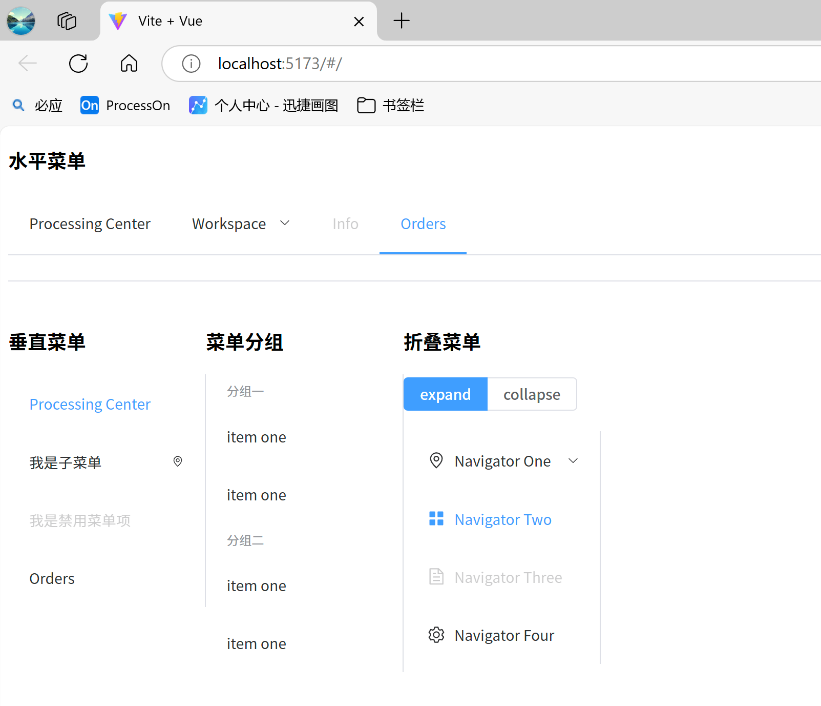
<template>

  <h3>水平菜单</h3>

  <!-- 水平菜单 -->
  <el-menu :default-active="activeIndex" class="el-menu-demo" mode="horizontal" @select="handleSelect" >
    <el-menu-item index="1">Processing Center</el-menu-item>

    <el-sub-menu index="2">
      <template #title>Workspace</template>

      <el-menu-item index="2-1">item one</el-menu-item>

      <el-menu-item index="2-2">item two</el-menu-item>

      <el-menu-item index="2-3">item three</el-menu-item>

      <el-sub-menu index="2-4">
        <template #title>item four</template>

        <el-menu-item index="2-4-1">item one</el-menu-item>

        <el-menu-item index="2-4-2">item two</el-menu-item>

        <el-menu-item index="2-4-3">item three</el-menu-item>

      </el-sub-menu>

    </el-sub-menu>

    <el-menu-item index="3" disabled>Info</el-menu-item>

    <el-menu-item index="4" @click="handleClick">Orders</el-menu-item>

  </el-menu>

  <el-divider/>

  <el-row>
    <el-col :span="4">
      <h3>垂直菜单</h3>

      <el-menu :default-active="activeIndex" class="el-menu-demo" mode="vertical" @select="handleSelect">
        <el-menu-item index="1">Processing Center</el-menu-item>

        <el-sub-menu index="2" :expand-close-icon="Location" :expand-open-icon="Setting">
          <template #title>我是子菜单</template>

          <el-menu-item index="2-1">item one</el-menu-item>

          <el-sub-menu index="2-4">
            <template #title>item four</template>

            <el-menu-item index="2-4-1">item one</el-menu-item>

          </el-sub-menu>

        </el-sub-menu>

        <el-menu-item index="3" disabled>我是禁用菜单项</el-menu-item>

        <el-menu-item index="4">Orders</el-menu-item>

      </el-menu>

    </el-col>

    <el-col :span="4">
      <h3>菜单分组</h3>

      <el-menu :default-active="activeIndex" class="el-menu-demo" mode="vertical" @select="handleSelect">
        <el-menu-item-group title="分组一">
          <el-menu-item index="1-1">item one</el-menu-item>

          <el-menu-item index="1-2">item one</el-menu-item>

        </el-menu-item-group>

        <el-menu-item-group title="分组二">
          <el-menu-item index="2-1">item one</el-menu-item>

          <el-menu-item index="2-2">item one</el-menu-item>

        </el-menu-item-group>

      </el-menu>

    </el-col>

    <el-col :span="4">
      <h3>折叠菜单</h3>

      <el-radio-group v-model="isCollapse" style="margin-bottom: 20px">
        <el-radio-button :value="false">expand</el-radio-button>

        <el-radio-button :value="true">collapse</el-radio-button>

      </el-radio-group>

      <el-menu default-active="2" class="el-menu-vertical-demo" :collapse="isCollapse" @open="handleOpen" @close="handleClose">
        <el-sub-menu index="1">
          <template #title>
            <el-icon>
              <location/>
            </el-icon>

            <span>Navigator One</span>

          </template>

          <el-menu-item index="1-1">item one</el-menu-item>

          <el-menu-item index="1-2">item two</el-menu-item>

        </el-sub-menu>

        <el-menu-item index="2">
          <el-icon>
            <Menu/>
          </el-icon>

          <template #title>Navigator Two</template>

        </el-menu-item>

        <el-menu-item index="3" disabled>
          <el-icon>
            <document/>
          </el-icon>

          <template #title>Navigator Three</template>

        </el-menu-item>

        <el-menu-item index="4">
          <el-icon>
            <setting/>
          </el-icon>

          <template #title>Navigator Four</template>

        </el-menu-item>

      </el-menu>

    </el-col>

  </el-row>

</template>

<script lang="ts" setup>
import {ref} from 'vue'
import {Document, Location, Setting,Menu} from "@element-plus/icons-vue";

const isCollapse = ref(true)
const activeIndex = ref('1')

const handleClick = (menuItem) => {
  console.log('menuItem: ',menuItem)
}
// 当点击了菜单项时触发
const handleSelect = (key: string, keyPath: string[]) => {
  console.log('key', key, ' keyPath', keyPath)
}

// 当打开子菜单时触发
const handleOpen = (key: string) => {
  console.log('open', key)
}

// 当关闭子菜单时触发
const handleClose = (key: string) => {
  console.log('close', key)
}
</script>
4)下拉菜单
一个完整的下拉菜单包含下拉菜单按钮、下拉菜单项、下拉菜单子项三个组件。使用el-dropdown组件定义一组完整下拉菜单控件,el-dropdown-menu组件定义下拉菜单项,el-dropdown-menu组件定义一个下拉菜单子项。
el-dropdown组件属性如下:- type:菜单按钮类型,仅在
split-button为 true 的情况下有效。可选值有'default' | 'primary' | 'success' | 'warning' | 'info' | 'danger' | 'text' - split-button:下拉触发元素呈现为按钮组,默认为false
- placement:菜单弹出的位置,可选值有’top’ | ‘top-start’ | ‘top-end’ | ‘bottom’ | ‘bottom-start’ | ‘bottom-end’,默认为bottom
- trigger:触发下拉菜单的行为,可选值有’hover’ | ‘click’ | ‘contextmenu’,默认为hover
- type:菜单按钮类型,仅在
el-dropdown组件具备如下插槽:- default:下拉菜单的内容。
- dropdown:下拉列表,通常是
<el-dropdown-menu>组件
el-dropdown组件的事件:
| 事件名 | 说明 | 类型 |
|---|---|---|
| click | split-button 为 true 时,点击el-dropdown组件时的回调 | Function |
| command | 当下拉项被点击时触发 | Function |
| visible-change | 当下拉菜单出现/消失时触发器, 当它出现时, 参数将是 true, 否则将是 false | Function |
el-dropdown组件的插槽:
| 插槽名 | 说明 | 子标签 |
|---|---|---|
| default | 下拉菜单的内容。 注意:必须是有效的 html DOM 元素(例如 <span>、<button> 等) | — |
| dropdown | 下拉列表,通常是 <el-dropdown-menu> 组件 | Dropdown-Menu |
效果:
示例代码:
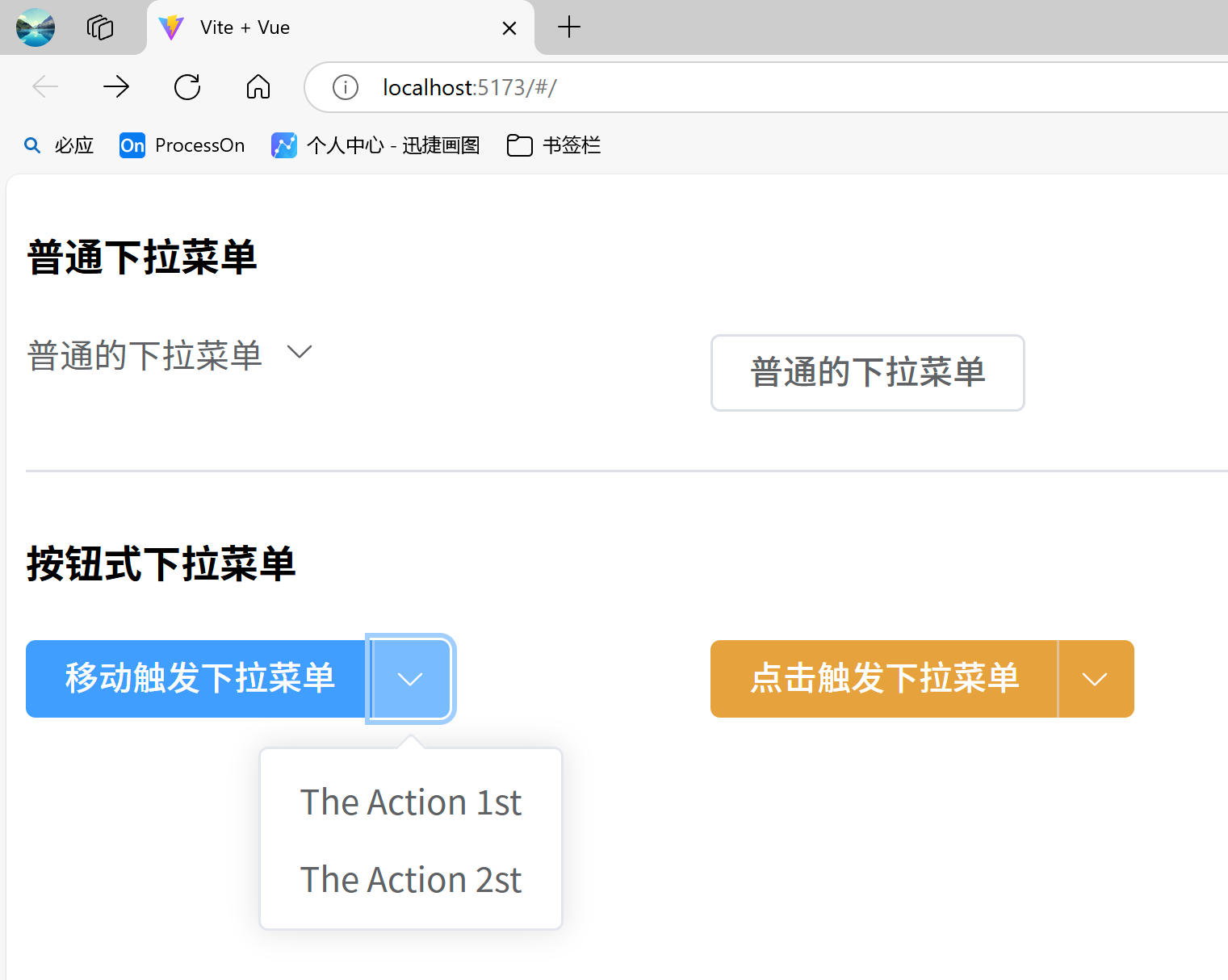
<template>
  <h4>普通下拉菜单</h4>

  <el-row>
    <el-col :span="6">
      <el-dropdown type="success" @command="handleCommand" @visible-change="visibleChange">
        <span class="el-dropdown-link">
          普通的下拉菜单
          <el-icon class="el-icon--right">
            <arrow-down/>
          </el-icon>

        </span>

        <template #dropdown>
          <el-dropdown-menu>
            <el-dropdown-item>Action 1</el-dropdown-item>

            <el-dropdown-item>Action 2</el-dropdown-item>

            <el-dropdown-item disabled>Action 4</el-dropdown-item>

            <el-dropdown-item divided>Action 5</el-dropdown-item>

          </el-dropdown-menu>

        </template>

      </el-dropdown>

    </el-col>

    <el-col :span="6">
      <el-dropdown placement="bottom" @command="handleCommand" @visible-change="visibleChange">
        <el-button>普通的下拉菜单</el-button>

        <template #dropdown>
          <el-dropdown-menu>
            <el-dropdown-item>The Action 1st</el-dropdown-item>

            <el-dropdown-item>The Action 2st</el-dropdown-item>

            <el-dropdown-item>The Action 3st</el-dropdown-item>

          </el-dropdown-menu>

        </template>

      </el-dropdown>

    </el-col>

  </el-row>

  <el-divider/>

  <h4>按钮式下拉菜单</h4>

  <el-row>
    <el-col :span="6">
      <el-dropdown split-button type="primary" @click="handleClick" @visible-change="visibleChange">
        <template #default>
          移动触发下拉菜单
        </template>

        <template #dropdown>
          <el-dropdown-menu>
            <el-dropdown-item>The Action 1st</el-dropdown-item>

            <el-dropdown-item>The Action 2st</el-dropdown-item>

          </el-dropdown-menu>

        </template>

      </el-dropdown>

    </el-col>

    <el-col :span="6">
      <el-dropdown split-button trigger="click" type="warning" @click="handleClick" @visible-change="visibleChange">
        <template #default>
          点击触发下拉菜单
        </template>

        <template #dropdown>
          <el-dropdown-menu>
            <el-dropdown-item>The Action 1st</el-dropdown-item>

            <el-dropdown-item>The Action 2st</el-dropdown-item>

          </el-dropdown-menu>

        </template>

      </el-dropdown>

    </el-col>

  </el-row>

</template>

<script lang="ts" setup>
import {ArrowDown} from '@element-plus/icons-vue'

// 下拉菜单的显示隐藏
const visibleChange = (val: boolean) => {
  // console.log('visibleChange',val)
}

// 当下拉项被点击时触发
const handleCommand = () => {
  console.log('handleCommand')
}

// 当按钮式下拉菜单被点击时触发
const handleClick = () => {
  console.log('handleClick')
}
</script>
5)步骤条
使用el-steps组件定义一一个步骤条,el-step组件定义步骤条中的每一个步骤,可根据实际应用场景设定步骤,步骤不得少于 2 步。
el-stops组件的常用属性有::active:步骤条绑定的编号,设置当前激活步骤。步骤默认编号从0开始,通过控制该编号的变化可以让步骤条的步骤前进或者后退。space:每个 step 的间距,不填写将自适应间距。 支持百分比。direction: 显示方向,可选值有’vertical’ | ‘horizontal’,默认为horizontalprocess-status:设置当前步骤的状态,可选值有’wait’ | ‘process’ | ‘finish’ | ‘error’ | ‘success’,默认为processfinish-status:设置结束步骤的状态,‘wait’ | ‘process’ | ‘finish’ | ‘error’ | ‘success’,默认值为finishalign-center:是否进行居中对齐,默认falsesimple:是否启用简约风格,默认false
效果:
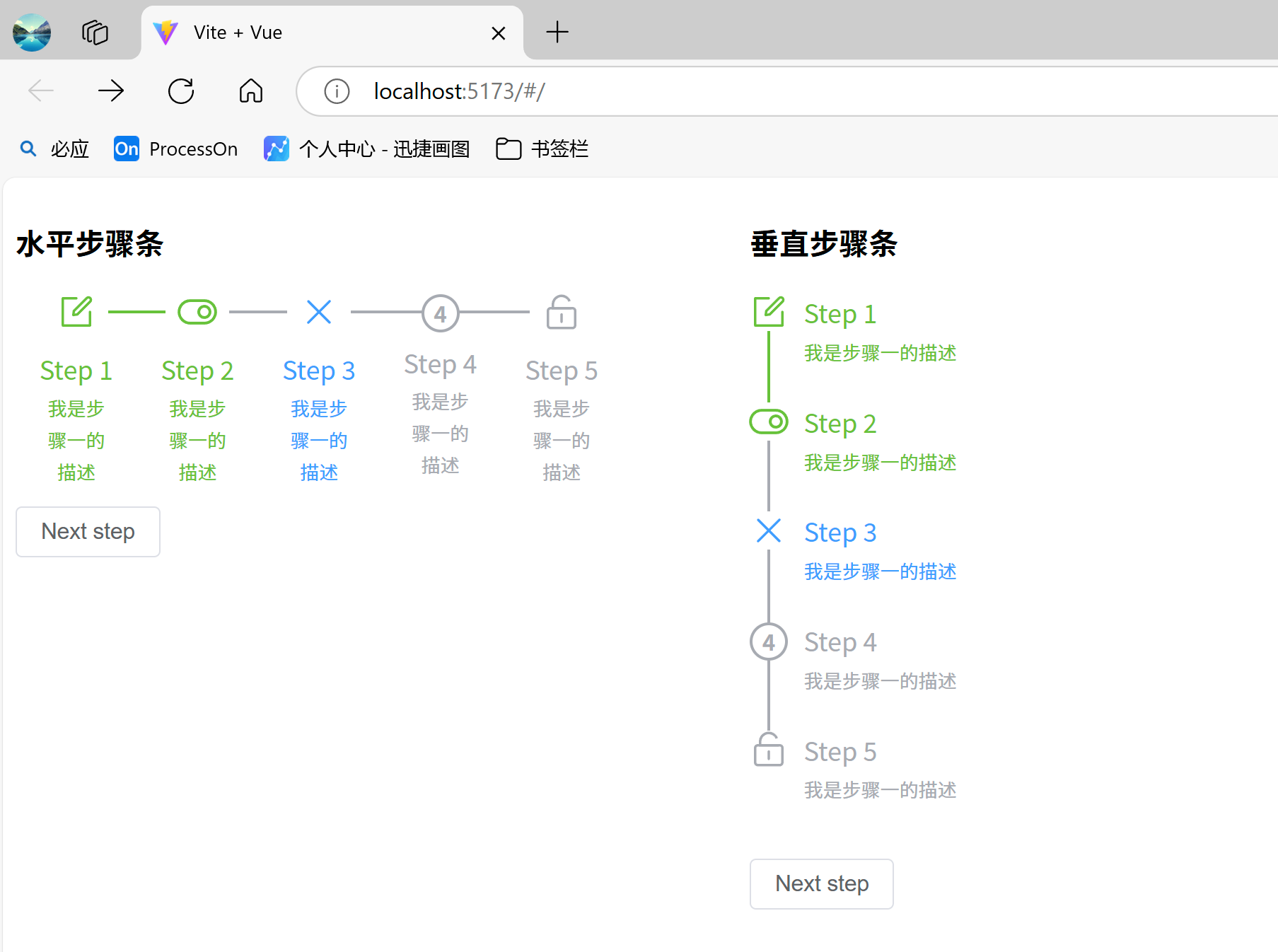
示例代码:
<template>
  <el-row :gutter="80">
    <el-col :span="10">
      <h3>水平步骤条</h3>

      <el-steps  :active="active" align-center
                finish-status="success" :process-status="currProcessStatus">
        <el-step title="Step 1" description="我是步骤一的描述" :icon="Edit"/>
        <el-step title="Step 2" description="我是步骤一的描述" :icon="Open"/>
        <el-step title="Step 3" description="我是步骤一的描述" :icon="Close"/>
        <el-step title="Step 4" description="我是步骤一的描述" :icon="Lock"/>
        <el-step title="Step 5" description="我是步骤一的描述" :icon="Unlock"/>
      </el-steps>

      <el-button style="margin-top: 12px" @click="next">Next step</el-button>

    </el-col>

    <el-col :span="10">
      <h3>垂直步骤条</h3>

      <el-steps  :active="active" align-center direction="vertical"
                 finish-status="success" :process-status="currProcessStatus">
        <el-step title="Step 1" description="我是步骤一的描述" :icon="Edit"/>
        <el-step title="Step 2" description="我是步骤一的描述" :icon="Open"/>
        <el-step title="Step 3" description="我是步骤一的描述" :icon="Close"/>
        <el-step title="Step 4" description="我是步骤一的描述" :icon="Lock"/>
        <el-step title="Step 5" description="我是步骤一的描述" :icon="Unlock"/>
      </el-steps>

      <el-button style="margin-top: 12px" @click="next">Next step</el-button>

    </el-col>

  </el-row>

</template>

<script lang="ts" setup>
import { ref } from 'vue'
import {Close, Edit, House, Open, Position, Search, Unlock} from "@element-plus/icons-vue";

const active = ref(0)

let processStatus = ['wait', 'process', 'finish', 'error', 'success'];
let currProcessStatus = ref(processStatus[0]);
const next = () => {
  // 改变active值, 控制步骤条的进度
  if(active.value === 5){
    active.value = 0
    currProcessStatus.value = processStatus[0]
  }else{
    active.value++;
    currProcessStatus.value = processStatus[active.value]
  }
}
</script>
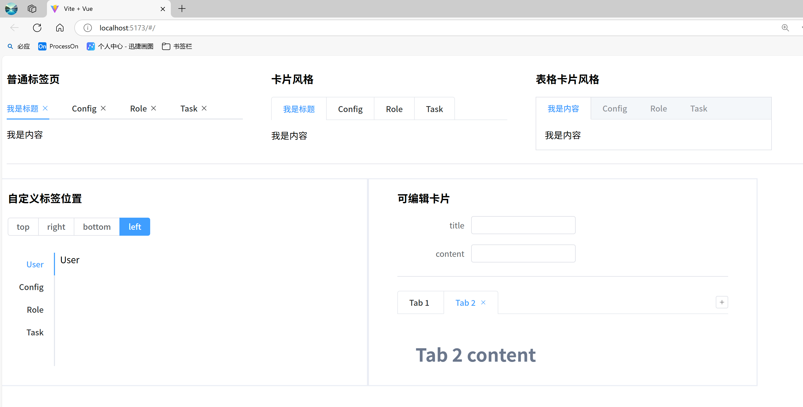
6)标签页
使用el-tabs组件定义一组标签页,el-tab-pane定义标签页对应的面板信息, 默认选中第一个标签页,可以通过 value 属性来指定当前选中的标签页。
el-tabs组件的常用属性如下:
| 属性名 | 说明 | 类型 | Default |
|---|---|---|---|
| v-model | 绑定值,选中选项卡的 name,默认值是第一个 tab 的 name | string / number | — |
| type | 风格类型 | '' / card' / 'border-card' | ‘’ |
| closable | 标签是否可关闭 | boolean | false |
| addable | 标签是否可增加 | boolean | false |
| editable | 标签是否同时可增加和关闭 | boolean | false |
| tab-position | 选项卡所在位置 | 'top' / 'right' / 'bottom' / 'left' | top |
el-tab-pane组件的常用属性:
| 属性名 | 说明 | 类型 | 默认值 |
|---|---|---|---|
| label | 选项卡标题 | string | ‘’ |
| disabled | 是否禁用 | boolean | false |
| name | 与选项卡绑定值 value 对应的标识符,表示选项卡别名。默认值是tab面板的序列号,如第一个 tab 是 0 | string / number | — |
| closable | 标签是否可关闭 | boolean | false |
| lazy | 标签是否延迟渲染 | boolean | false |
效果:
示例代码:
<template>

  <el-row :gutter="50">
    <el-col :span="6">
      <h3>普通标签页</h3>

      <el-tabs v-model="activeName" @tab-click="handleClick" :closable="true">
        <el-tab-pane label="我是标题" name="first">我是内容</el-tab-pane>

        <el-tab-pane label="Config" name="second">Config</el-tab-pane>

        <el-tab-pane label="Role" name="third">Role</el-tab-pane>

        <el-tab-pane label="Task" name="fourth">Task</el-tab-pane>

      </el-tabs>

    </el-col>

    <el-col :span="6">
      <h3>卡片风格</h3>

      <el-tabs v-model="activeName" type="card" @tab-click="handleClick">
        <el-tab-pane label="我是标题" name="first">我是内容</el-tab-pane>

        <el-tab-pane label="Config" name="second">Config</el-tab-pane>

        <el-tab-pane label="Role" name="third">Role</el-tab-pane>

        <el-tab-pane label="Task" name="fourth">Task</el-tab-pane>

      </el-tabs>

    </el-col>

    <el-col :span="6">
      <h3>表格卡片风格</h3>

      <el-tabs v-model="activeName" type="border-card" @tab-click="handleClick">
        <el-tab-pane label="我是内容" name="first">我是内容</el-tab-pane>

        <el-tab-pane label="Config" name="second">Config</el-tab-pane>

        <el-tab-pane label="Role" name="third">Role</el-tab-pane>

        <el-tab-pane label="Task" name="fourth">Task</el-tab-pane>

      </el-tabs>

    </el-col>

  </el-row>

  <el-divider/>

  <el-row :gutter="100">
    <el-col :span="10" style="border: 2px solid #EBEEF5">
      <h3>自定义标签位置</h3>

      <el-radio-group v-model="tabPosition" style="margin-bottom: 30px">
        <el-radio-button value="top">top</el-radio-button>

        <el-radio-button value="right">right</el-radio-button>

        <el-radio-button value="bottom">bottom</el-radio-button>

        <el-radio-button value="left">left</el-radio-button>

      </el-radio-group>

      <el-tabs :tab-position="tabPosition" style="height: 200px">
        <el-tab-pane label="User">User</el-tab-pane>

        <el-tab-pane label="Config">Config</el-tab-pane>

        <el-tab-pane label="Role">Role</el-tab-pane>

        <el-tab-pane label="Task">Task</el-tab-pane>

      </el-tabs>

    </el-col>

    <el-col :span="10" style="border: 2px solid #EBEEF5">
      <h3>可编辑卡片</h3>

      <el-col :span="15">
        <el-form label-width="80px" max-width="100px">
          <el-form-item label="title">
            <el-input v-model="tabObj.title"/>
          </el-form-item>

          <el-form-item label="content">
            <el-input v-model="tabObj.content"/>
          </el-form-item>

        </el-form>

      </el-col>

      <el-divider/>
      <el-tabs
          v-model="editableTabsValue"
          type="card"
          editable
          class="demo-tabs"
          @edit="handleTabsEdit"
      >
        <el-tab-pane
            v-for="item in editableTabs"
            :key="item.name"
            :label="item.title"
            :name="item.name"
        >
          {{ item.content }}
        </el-tab-pane>

      </el-tabs>

    </el-col>

  </el-row>

</template>

<script lang="ts" setup>
import {ref} from 'vue'
import type {TabPaneName, TabsInstance, TabsPaneContext} from 'element-plus'

// 标签位置
const tabPosition = ref<TabsInstance['tabPosition']>('left')

// 当前激活的标签页名称
const activeName = ref('first')

const editableTabsValue = ref('2')
const editableTabs = ref([
  {
    // 标签的标题
    title: 'Tab 1',

    // 标签的名称,在Tabs的name属性中使用
    name: '1',

    // 标签的内容,可以是任意的HTML内容
    content: 'Tab 1 content',
  },
  {
    title: 'Tab 2',
    name: '2',
    content: 'Tab 2 content',
  },
])

const tabObj = ref({
  title: '',
  content: '',
})

// 点击标签页
const handleClick = (tab: TabsPaneContext, event: Event) => {
  console.log(tab.index, tab.paneName, event)
}

/**
 *
 * @param targetName: 当前操作的标签页名称(name)
 * @param action: 标签页操作类型,add或remove
 */
const handleTabsEdit = (
    targetName: TabPaneName | undefined,
    action: 'remove' | 'add'
) => {
  if (action === 'add') {    // 新增标签页

    // 标签页name+1
    editableTabsValue.value = editableTabsValue.value + 1;
    const newTabName = editableTabsValue.value;

    // 新增标签页
    editableTabs.value.push({
      title: tabObj.value.title,
      name: newTabName,
      content: tabObj.value.content,
    })

  } else if (action === 'remove') {       // 删除标签页

    // 当前标签的值
    const tabs = editableTabs.value

    // 当前激活的标签页的名称
    let activeName = editableTabsValue.value

    if (activeName === targetName) {
      tabs.forEach((tab, index) => {
        if (tab.name === targetName) {
          const nextTab = tabs[index + 1] || tabs[index - 1]
          if (nextTab) {
            activeName = nextTab.name
          }
        }
      })
    }

    editableTabsValue.value = activeName
    editableTabs.value = tabs.filter((tab) => tab.name !== targetName)
  }
}
</script>

<style>
.demo-tabs > .el-tabs__content {
  padding: 32px;
  color: #6b778c;
  font-size: 32px;
  font-weight: 600;
}
</style>


 扫一扫
扫一扫


 3763
3763

 被折叠的 条评论
为什么被折叠?
被折叠的 条评论
为什么被折叠?
 到【灌水乐园】发言


