


 本文详细解析了 CSS 中 box-shadow 属性的使用方法及各参数的意义,通过具体实例展示了如何调整阴影的位置、模糊度、扩展半径及颜色等。
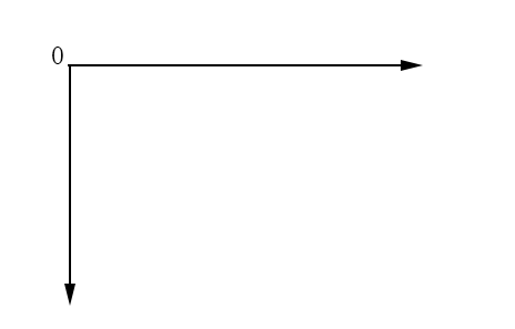
原点为基点,原点左侧为x轴负方向,值为负,右侧为正;原点下方为y轴正方向,值为正,上方为负。
官方用语: box-shadow: 1px 2px 3px 4px #ccc inset;
来分别看一下以上六个值的含义:
1px 从原点开始,沿x轴正方向的长度(倘若为负值,为沿x轴负方向的长度);
2px 从原点开始,沿y轴正方向的长度;(倘若为负值,为沿y轴负方向的长度);
3px 阴影的模糊度,只允许为正值;
4px 阴影扩展半径;
#ccc 阴影颜色;
inset 设置为内阴影(如果不写这个值,默认为外阴影);
以下为完整html页面,效果图在最下面:
<!DOCTYPE html>
<html lang="en">
<head>
    <meta charset="UTF-8">
    <meta name="viewport" content="maximum-scale=1.0,minimum-scale=1.0,user-scalable=0,width=device-width,initial-scale=1.0"/>
    <meta name="format-detection" content="telephone=no,email=no,date=no,address=no">
    <link rel="stylesheet" href="common.css">
    <title>Title</title>
    <style>
        .d1{
            width: 400px;
            height: 160px;
            /*border: 1px dotted #ccc;*/
            margin: 20px auto;
            border-radius: 8px;
            box-shadow: 17px 0px 40px 20px #ff8c1a inset;
        }
        .d2{
            width: 400px;
            height: 160px;
            /*border: 1px dotted #ccc;*/
            margin: 20px auto;
            border-radius: 8px;
            box-shadow: -5px 0px 5px 0px #ff8c1a;
        }
        .d3{
            width: 400px;
            height: 160px;
            /*border: 1px dotted #ccc;*/
            margin: 20px auto;
            border-radius: 8px;
            box-shadow: 10px 10px 5px 0px #ff8c1a;
        }
        .d4{
            width: 400px;
            height: 160px;
            /*border: 1px dotted #ccc;*/
            margin: 40px auto;
            border-radius: 8px;
            box-shadow: 0px 0px 10px 10px #ff8c1a;
        }
        .d6{
            width: 400px;
            height: 160px;
            /*border: 1px dotted #ccc;*/
            margin: 40px auto;
            border-radius: 8px;
            box-shadow: 0px 10px 10px -5px #ff8c1a inset;
        }
        .d6-inner{
            width: 400px;
            height: 160px;
            border-radius: 8px;
            box-shadow: 0px -10px 10px -5px #ff8c1a inset;
        }
    </style>
</head>
<body>
    <div class="d1"></div>
    <div class="d2"></div>
    <div class="d3"></div>
    <div class="d4"></div>
    <div class="d6">
        <div class="d6-inner"></div>
    </div>
</body>
</html>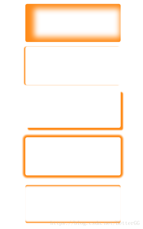


 扫一扫
扫一扫


 471
471

 被折叠的 条评论
为什么被折叠?
被折叠的 条评论
为什么被折叠?
 到【灌水乐园】发言


