


好多时候我们使用Android控件,都不能满足我们的需求,现在先来解决一下自定义样式,比如:星星、单选按钮、多选按钮
转载请标明出处:http://blog.csdn.net/Bingsman/article/details/48269115
来看看实现过程,以单选为例
单选控件自定义样式
(1)新建工程,编写样式,在res/drawable目录下新建一个xml
<selector xmlns:android="http://schemas.android.com/apk/res/android">
    <item
          android:state_enabled="true"
          android:state_checked="true"
          android:drawable="@drawable/radio_choiced" />
    <item
          android:state_enabled="true"
          android:state_checked="false"
          android:drawable="@drawable/radio_choice" />
</selector>
(2)添加控件, 代码如下
<RadioGroup
android:id="@+id/sex"
android:layout_width="wrap_content"
android:layout_height="wrap_content"
android:layout_below="@+id/checkBox1"
android:layout_marginLeft="3dp"
android:orientation="horizontal" >
<RadioButton
android:id="@+id/male"
android:button="@drawable/radiobutton"
android:text="男" />
<RadioButton
android:id="@+id/female"
android:layout_marginLeft="3dp"
android:button="@drawable/radiobutton"
android:checked="true"
android:text="女" />
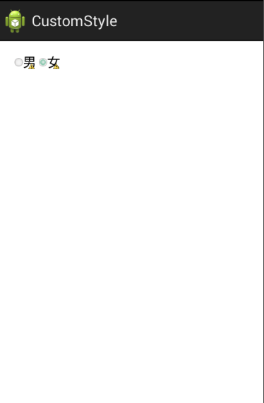
</RadioGroup>效果图:
第二种样式
(1)设计自己的图片
<?xml version="1.0" encoding="utf-8"?>
<selector xmlns:android="http://schemas.android.com/apk/res/android">

    <item android:drawable="@drawable/checkbox1" android:state_checked="true"/>
    <item android:drawable="@drawable/checkbox1" android:state_checked="false"/>
    <item android:drawable="@drawable/checkbox2"/>

</selector>
(2)设计自己的样式
<style name="CustomCheckboxTheme" parent="@android:style/Widget.CompoundButton.CheckBox">
        <item name="android:button">@drawable/checkbox_style</item>
 </style>
(3)布局里继承样式
<CheckBox
android:id="@+id/checkBox1"
style="@style/CustomCheckboxTheme"
android:layout_width="wrap_content"
android:layout_height="wrap_content"
android:layout_alignLeft="@+id/radioButton1"
android:layout_marginLeft="30dp"
android:layout_marginTop="20dp"
android:text="小明"
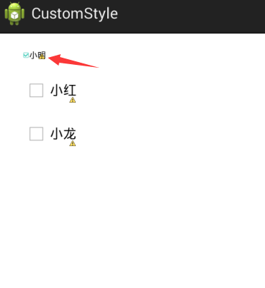
android:textSize="10dp" />效果图:
如果有用,别忘点个赞,不喜勿喷
源码点击下载


 5242
5242


 被折叠的 条评论
为什么被折叠?
被折叠的 条评论
为什么被折叠?
 到【灌水乐园】发言


