hands-on-data-analysis 第二单元 第四节数据可视化
1.简单绘图
1.1.导入库
%matplotlib inline
import numpy as np
import pandas as pd
import matplotlib.pyplot as plt
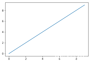
1.2.基本的绘图示例
import numpy as np
data  = np.arange(10)
data
plt.plot(data)
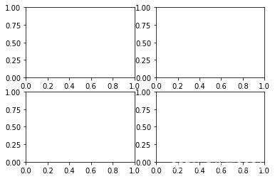
1.3.子图示例
fig = plt.figure()
ax1 = fig.add_subplot(2,2,1)
ax2 = fig.add_subplot(2,2,2)
ax3 = fig.add_subplot(2,2,3)
ax4 = fig.add_subplot(2,2,4)
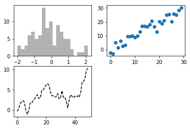
1.4.子图绘图示例
fig = plt.figure()
ax1 = fig.add_subplot(2,2,1)
ax2 = fig.add_subplot(2,2,2)
ax3 = fig.add_subplot(2,2,3)
plt.plot(np.random.randn(50).cumsum(),'k--')
_ = ax1.hist(np.random.randn(100),bins=20,color='k',alpha=0.3)
ax2.scatter(np.arange(30),np.arange(30)+3*np.random.randn(30))
1.5. pyplot.subplots选项
| 参数 | 描述 |
|---|
| nrows | 子图的行数 |
| ncols | 子图的列数 |
| sharex | 所有子图使用相同的x轴刻度(调整xlim会影响所有子图) |
| sharey | 所有子图使用相同的y轴刻度(调整ylim会影响所有子图) |
| subplot_kw | 传入add_subplot的关键字参数字典,用于生成子图 |
| **fig_kw | 在生成图片时使用的额外关键字参数,例如plt.subplot(2,2,figsize(8,6)) |
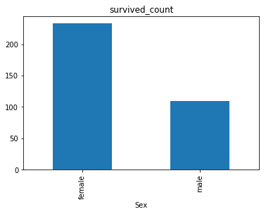
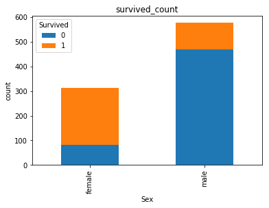
2.可视化展示泰坦尼克号数据集中男女中生存人数分布情况
sex = text.groupby('Sex')['Survived'].sum()
sex.plot.bar()
plt.title('survived_count')
plt.show()
3.可视化展示泰坦尼克号数据集中男女中生存人与死亡人数的比例图
text.groupby(['Sex','Survived'])['Survived'].count().unstack().plot(kind='bar',stacked='True')
plt.title('survived_count')
plt.ylabel('count')
4.可视化展示泰坦尼克号数据集中不同票价的人生存和死亡人数分布情况。
fare_sur = text.groupby(['Fare'])['Survived'].value_counts().sort_values(ascending=False)
fare_sur
fig = plt.figure(figsize=(20, 18))
fare_sur.plot(grid=True)
plt.legend()
plt.show()

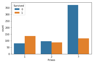
5.可视化展示泰坦尼克号数据集中不同仓位等级的人生存和死亡人员的分布情况
pclass_sur = text.groupby(['Pclass'])['Survived'].value_counts()
pclass_sur
import seaborn as sns
sns.countplot(x="Pclass", hue="Survived", data=text)
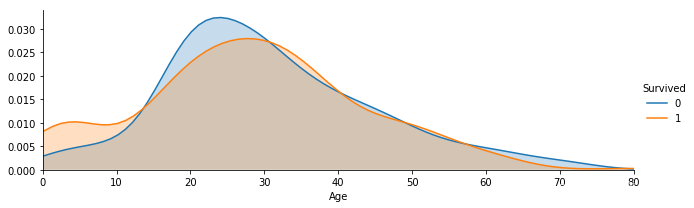
6.可视化展示泰坦尼克号数据集中不同年龄的人生存与死亡人数分布情况
facet = sns.FacetGrid(text, hue="Survived",aspect=3)
facet.map(sns.kdeplot,'Age',shade= True)
facet.set(xlim=(0, text['Age'].max()))
facet.add_legend()
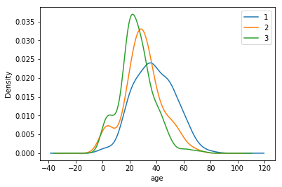
7.可视化展示泰坦尼克号数据集中不同仓位等级的人年龄分布情况。
text.Age[text.Pclass == 1].plot(kind='kde')
text.Age[text.Pclass == 2].plot(kind='kde')
text.Age[text.Pclass == 3].plot(kind='kde')
plt.xlabel("age")
plt.legend((1,2,3),loc="best")


 373
373

 被折叠的 条评论
为什么被折叠?
被折叠的 条评论
为什么被折叠?
 到【灌水乐园】发言


