


Matplotlib 基础知识及实操(一)
一、Matplotlib的两种接口
Matplotlib 提供了两种不同的绘图接口,分别是 MATLAB 风格的接口和面向对象(Object-Oriented)风格的接口。这两种接口都可以用来创建各种类型的图表,但在使用方法和风格上有一些区别。
1.类MATLAB 风格接口:
这是 Matplotlib 最早的接口风格,设计灵感来自 MATLAB 绘图工具。使用该接口,您可以像绘制 MATLAB 图表一样简单地创建和定制图表。这种接口通过 matplotlib.pyplot 模块提供。
import matplotlib.pyplot as plt
import numpy as np
import pandas as pd
%matplotlib inline

#创建画布
plt.figure(figsize=(6,6))
# 创建简单的折线图
x = [1, 2, 3, 4]
y = [10, 5, 8, 3]
plt.plot(x, y)

# 添加标题和标签
plt.title('Simple Line Plot')
plt.xlabel('X-axis')
plt.ylabel('Y-axis')

# 显示图形
plt.show()
2.面向对象风格接口:
这种接口更加面向对象,通过创建 Figure 和 Axes 对象,并在这些对象上调用方法来绘制图表。这种接口更加灵活和强大,特别适合创建复杂的图表和绘图布局。
# 创建 Figure 和 Axes 对象
fig, ax = plt.subplots()

# 在 Axes 对象上绘制折线图
x = [1, 2, 3, 4]
y = [10, 5, 8, 3]
ax.plot(x, y)

# 添加标题和标签
ax.set_title('Simple Line Plot')
ax.set_xlabel('X-axis')
ax.set_ylabel('Y-axis')

# 显示图形
plt.show()
二、如何创建子图
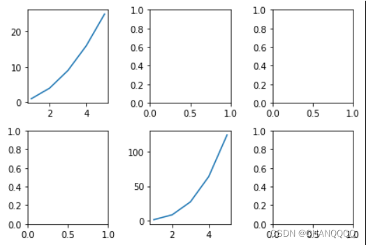
1.plt.subplot()函数
subplot()函数:行、列、子图序号(序号从1开始),适用于类MATLAB 风格接口。
更多请见:https://matplotlib.org/stable/gallery/subplots_axes_and_figures/gridspec_and_subplots.html
x = np.arange(1,6)
y = x**2
y2 = x**3
x,y,y2

plt.figure(figsize=(12,6))

#方法一
for i in range(1,7):
    plt.subplot(2,3,i)
    plt.plot(x,y)
    plt.title(i)

#方法二
plt.figure(figsize=(12,6))
plt.subplot(2,3,1)
plt.title(1)
plt.subplot(2,3,2)
plt.title(2)
plt.subplot(2,3,3)
plt.title(3)
plt.subplot(2,3,4)
plt.title(4)
plt.subplot(2,3,5)
plt.title(5)
plt.subplot(2,3,6)
plt.title(6)

2.plt.subplots()函数
适用于面向对象接口。创建一个完整的子图网格,函数会返回两个值,Figure对象与Axes对象,如果创建的是多子图,可以通过索引来界定是哪一个Axes对象。这里注意,索引是从0始的。
fig,ax = plt.subplots(2,3)
ax[0,0].plot(x,y)
ax[1,1].plot(x,y2)
plt.tight_layout()
三、辅助显示层
注:学会使用方法和参数即可
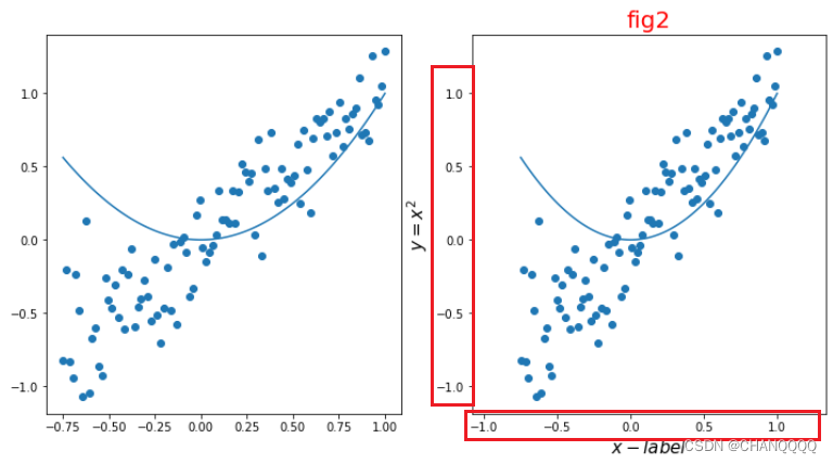
1.标题、坐标轴名称 (label)
1.类MATLAB使用:xlabel()与ylabel()、title()
2.面向对象接口使用:set_xlabel()与set_ylabel()、set_title()
plt.figure(figsize=(12,6))
#绘制子图1
plt.subplot(1,2,1)
plt.scatter(vl1,vl1+0.25*vl2)
plt.plot(vl1,vl1**2)

#绘制子图2
plt.subplot(1,2,2)
plt.scatter(vl1,vl1+0.25*vl2)
plt.plot(vl1,vl1**2)

#添加下x,y坐标和标题
plt.xlabel('$x-label$',fontsize = 15)
plt.ylabel('$y = x^2$',fontsize=15)
plt.title('fig2',fontsize=20,loc='center')
plt.show()

2.轴范围(xilm,ylim)
1.面向对象使用:set_xlim()与set_ylim()
#类MATLAB接口
plt.xlim(-0.25,0.5)
plt.ylim(-0.5,0.5)
2.类MATLAB使用:xlim()与ylim()
#面向对象接口
ax[1].set_xlim(-0.25,0.5)
ax[1].set_ylim(-0.5,0.5)
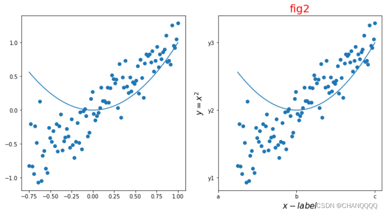
3.刻度(tick)
1.类MATLAB接口中,刻度线与刻度标签在一起使用,通过xticks()与yticks()实现;
plt.xticks([-1,0,1],['a','b','c'],fontsize=15)
plt.yticks([-1,0,1],['y1','y2','y3'],fontsize=15)
2.面向对象使用接口中,刻度线与刻度标签分开使用,刻度线通过set_xticks()与set_yticks()实现,刻度标签使用set_xticklabels()与set_yticklabels()。
ax[1].set_xticks([-1,0,1])
ax[1].set_xticklabels(['a','b','c'])

ax[1].set_yticks([-1,0,1])
ax[1].set_yticklabels(['y1','y2','y3'])
4.网格 (grid)
面向对象接口与类MATLAB接口都使用grid()实现;其中三个参数很重要:alpha设置透明度;ls设置线性型;color是网格颜色。
#类MATLAB接口
plt.grid(color='red',alpha=0.3,ls='--')
#面向对象接口
ax[1].grid(color='red',alpha=0.3,ls='--',lw=1)

5.图例 (legend)
x = np.linspace(0,20,100)

y1 = np.sin(x)
y2 = np.cos(x)

fig,ax=plt.subplots(figsize=(10,5))
ax.plot(x,y1,label='y=sin(x)')
ax.plot(x,y2,label='y=cos(x)')

ax.grid(alpha=0.3,ls='--')
# ax.legend(loc=1,ncol=2,frameon=False)
#loc 图例的位置
ax.legend(loc = 'upper right')

6.标注文本(text)
ax.text(0.5,0.25,'this',ha='center',va='center',fontsize=20)
7.边框线设置(spines)
fig,ax = plt.subplots(figsize=(6,6))
x = np.linspace(-1,1,100)
ax.plot(x,x**3,color='y')

#去除上面和右边边框 → set_color
ax.spines['right'].set_color('none')
ax.spines['top'].set_color('none')
#左边轴位移到中间 → set_position
ax.spines['left'].set_position(('axes',0.5))
ax.spines['left'].set_linewidth(5)
ax.spines['bottom'].set_position(('axes',0.5))
#添加格网
ax.grid(alpha=0.2)
ax.set_title('Y= X^3')
plt.savefig('spines.jpg',dpi=300)

8.双轴图 tiwnx()、tiwny()
Axes 对象提供了tiwnx()、tiwny()方法来生成共享下x,y的双轴对象。
x = np.linspace(0,5,100)
#面向对象
fig,ax = plt.subplots(figsize=(6,6))
ax.plot(x,x**2,color = 'red')
ax.set_xticks([0,2.5,5])   #可以自己设置多个参数
ax.set_xticklabels(['2010','2015','2020'])
ax.set_ylabel('$y=x^2$',fontsize=15)
#用同一个x轴
ax2 = ax.twinx()
ax2.plot(x,x**3)
ax2.set_ylabel('$y=x^3$',fontsize = 15)
plt.show()

官网文档上有更多的实践案例和教程,请查阅:https://matplotlib.org/stable/gallery/index.html
特别鸣谢:立方数据学院提供的教程


 1405
1405


 被折叠的 条评论
为什么被折叠?
被折叠的 条评论
为什么被折叠?
 到【灌水乐园】发言


