


本文翻译自:How to apply multiple transforms in CSS?
Using CSS, how can I apply more than one transform ? 使用CSS,如何应用多个transform ?
Example: In the following, only the translation is applied, not the rotation. 示例:在下面,仅应用平移,而不应用旋转。
li:nth-child(2) {
    transform: rotate(15deg);
    transform: translate(-20px,0px);
}
#1楼
参考:https://stackoom.com/question/jAfD/如何在CSS中应用多个转换
#2楼
You have to put them on one line like this: 您必须将它们放在这样的一行上:
li:nth-child(2) {
    transform: rotate(15deg) translate(-20px,0px);
}
When you have multiple transform directives, only the last one will be applied. 当您有多个转换指令时,将仅应用最后一个。 It's like any other CSS rule. 就像其他任何CSS规则一样。
Keep in mind multiple transform one line directives are applied from right to left . 请记住,从右到左应用了多行转换指令。
This: transform: scale(1,1.5) rotate(90deg); 这: transform: scale(1,1.5) rotate(90deg);
and: transform: rotate(90deg) scale(1,1.5); 和: transform: rotate(90deg) scale(1,1.5);
will not produce the same result: 不会产生相同的结果:
.orderOne, .orderTwo { font-family: sans-serif; font-size: 22px; color: #000; display: inline-block; } .orderOne { transform: scale(1, 1.5) rotate(90deg); } .orderTwo { transform: rotate(90deg) scale(1, 1.5); } <div class="orderOne"> A </div> <div class="orderTwo"> A </div> #3楼
You can apply more than one transform like this: 您可以像这样应用多个转换:
li:nth-of-type(2){
    transform : translate(-20px, 0px) rotate(15deg);
}
#4楼
For example 例如
-webkit-transform: rotateX(-36.09deg) rotateY(-52.71deg) scaleX(1.3) scaleY(1.3) translateY(31px) ;
transform: rotateX(-36.09deg) rotateY(-52.71deg) scaleX(1.3) scaleY(1.3) translateY(31px) ;
-webkit-transform-origin: 50% 50% 0;
transform-origin: 50% 50% 0;
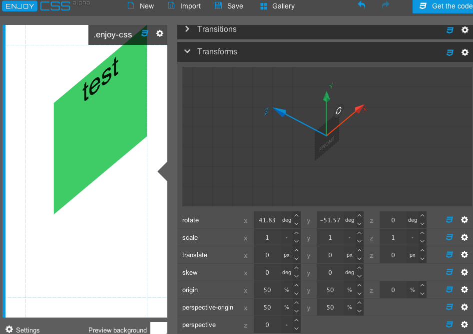
I am using enjoycss tool 我正在使用Enjoycss工具
http://enjoycss.com/5C#transform http://enjoycss.com/5C#transform
it generates css code for required parameters of transform using GUI to generate the transfrom code ;) 它使用GUI生成用于转换所需参数的CSS代码以生成transfrom代码;)
#5楼
I'm adding this answer not because it's likely to be helpful but just because it's true. 我添加此答案不是因为它可能会有所帮助,而是因为它是对的。
In addition to using the existing answers explaining how to make more than one translation by chaining them, you can also construct the 4x4 matrix yourself 除了使用现有的答案来解释如何通过链接来进行多个翻译之外,您还可以自己构建4x4矩阵
I grabbed the following image from some random site I found while googling which shows rotational matrices: 我从谷歌搜索时发现的一些随机位置抓取了以下图像,该图像显示了旋转矩阵:
Rotation around x axis: 绕x轴旋转: 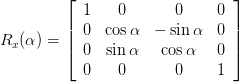
Rotation around y axis: 绕y轴旋转: 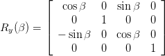
Rotation around z axis: 绕z轴旋转: 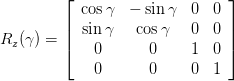
I couldn't find a good example of translation, so assuming I remember/understand it right, translation: 我找不到很好的翻译示例,所以假设我没记错/没错,翻译:
[1 0 0 0]
[0 1 0 0]
[0 0 1 0]
[x y z 1]
See more at the Wikipedia article on transformation as well as the Pragamatic CSS3 tutorial which explains it rather well. 可以在Wikipedia上有关转换的文章以及Pragamatic CSS3教程中找到更多信息,该文章对此进行了很好的解释。 Another guide I found which explains arbitrary rotation matrices is Egon Rath's notes on matrices 我发现的另一本解释任意旋转矩阵的指南是Egon Rath关于矩阵的注释
Matrix multiplication works between these 4x4 matrices of course, so to perform a rotation followed by a translation, you make the appropriate rotation matrix and multiply it by the translation matrix. 当然,矩阵乘法在这4x4矩阵之间起作用,因此要执行旋转后再进行平移,您需要制作适当的旋转矩阵并将其乘以平移矩阵。
This can give you a bit more freedom to get it just right, and will also make it pretty much completely impossible for anyone to understand what it's doing, including you in five minutes. 这可以让您有更多的自由来使它正确无误,也将使任何人(包括您)在五分钟之内几乎完全不可能了解它的工作。
But, you know, it works. 但是,您知道,它有效。
Edit: I just realized that I missed mentioning probably the most important and practical use of this, which is to incrementally create complex 3D transformations via JavaScript, where things will make a bit more sense. 编辑:我刚刚意识到,我错过了提及它的最重要和最实际的用法,即通过JavaScript增量创建复杂的3D转换,这会使事情变得更有意义。
#6楼
A simple way to apply multiple transform is this 应用多重变换的一种简单方法是
li:nth-of-type(2){
    transform : translate(-20px, 0px) rotate(15deg);
}
But also don't forget that you need to add prefix to let it work in all browsers as some browers like safari, IE not support tranform property without prefix. 但也不要忘记,您需要添加前缀以使其在所有浏览器中都能正常工作,因为某些浏览器(例如safari),IE不支持无前缀的tranform属性。
li:nth-of-type(2){
    transform : translate(-20px, 0px) rotate(15deg);
    -webkit-transform : translate(-20px, 0px) rotate(15deg);
}


 5万+
5万+

 被折叠的 条评论
为什么被折叠?
被折叠的 条评论
为什么被折叠?
 到【灌水乐园】发言


