


说起左侧固定,右侧自适应;或者左右固定,中间自适应,大家想到的可能最多的就是通过flex弹性盒布局中的flex:1吧,那么flex:1究竟是什么呢?
flex:1是由flex-grow,flex-shrink与flex-basic组成,那么这三个属性对应的功能又是什么呢?
①flex-grow:代表子元素占弹性盒的比例
 <!-- HTML部分 -->
    <div class="grow">
      <!-- flex-grow占用父元素的比例 -->
      <div class="grow-child1">flex-grow: 2</div>
      <div class="grow-child2">flex-grow: 6</div>
    </div>


/* css部分 */
.grow {
  width: 800px;
  height: 200px;
  background-color: aqua;
  display: flex;
}
.grow-child1 {
  flex-grow: 2;
  background-color: red;
}
.grow-child2 {
  flex-grow: 6;
  background-color: royalblue;
}
效果图:

此时,红色部分和蓝色部分的比例为2:6,也就是分别为200px和800px
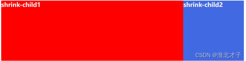
②flex-shrink: 子元素超出父元素宽度后,对应每个子元素的收缩规则
如下代码。超出部分为(800+800-800)px,也就是800px,所以child2为例,超出部分的收缩规则为 800 * 3/(1+3))= 600px,所以child2应收缩600px,所以当前child2的宽度为800-600px = 200px
<!-- HTML部分 -->
    <div class="shrink">
      <div class="shrink-child1">shrink-child1</div>
      <div class="shrink-child2">shrink-child2</div>
    </div>
    <hr />


/* css部分 */
.shrink {
  width: 800px;
  height: 200px;
  background-color: aqua;
  display: flex;
}
.shrink-child1 {
  width: 800px;
  flex-shrink: 1;
  background-color: red;
}
.shrink-child2 {
  width: 800px;
  flex-shrink: 3;
  background-color: royalblue;
}
效果图
③flex-basis:flex-basis当前子弹性盒的尺寸
 <!-- HTML部分 -->
    <div class="basis">
      <div class="basis-child1">basis-child1</div>
      <div class="basis-child2">basis-child2</div>
    </div>
    <hr />

/* css部分 */
.basis {
  width: 800px;
  height: 200px;
  background-color: aqua;
  display: flex;
}
.basis-child1 {
  flex-basis: 80%;
  background-color: red;
}
.basis-child2 {
  width: 100px;
  background-color: royalblue;
}
效果图

(最右侧的是basis盒子的颜色,当前child1宽度为800*0.8 = 640px,child2的宽度为100px,所以child1+child2 < 盒子宽度,所以底层盒子没有填满)
④flex:1是什么?
flex: 1: 自动填充满剩余空间,如果有两个地方设置了flex,按着flex-grow的规则分配剩余空间
什么意思?假设一个flex弹性盒中有三个子元素,child1,child2分别设置了flex:1,flex2,child1宽度固定为200px,那么现在child1的宽度为200px,child2的宽度为600px,child的宽度不变还是200px
<!-- HTML部分 -->
    <div class="flex">
      <div class="flex-child1">flex-child1</div>
      <div class="flex-child2">flex-child3</div>
      <div class="flex-child3">flex-child3</div>
    </div>


/* css部分 */
.flex {
  width: 800px;
  height: 200px;
  background-color: aqua;
  display: flex;
}
.flex-child1 {
  flex: 1;
  background-color: red;
}
.flex-child2 {
  flex: 2;
  /* width: 100px; */
  background-color: royalblue;
}
.flex-child3 {
  width: 200px;
  background-color: sandybrown;
}
效果图

有两个地方设置了flex,按着flex-grow的规则分配剩余空间,此时child1为200px,child2为400px
注意此代码中被注释的width属性,如果同时存在flex:1和width属性,则优先使用flex1,即flex:1优先级大于width
创作不易。如果这篇文章对您有帮助的话,麻烦您点一下赞,谢谢~


 1万+
1万+


 被折叠的 条评论
为什么被折叠?
被折叠的 条评论
为什么被折叠?
 到【灌水乐园】发言


