


小项目:太极
Date: November 18, 2022
太极
知识点:
简要介绍所需关键知识
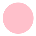
圆角:
用途:为边框设置圆角,若无边框,则会作用到背景上。
这里主要谈谈用百分比:
radius的值是百分比,相当于盒子的宽度和高度的百分比。
举例:
例1 盒子宽高都为100px。border-top-left-radius:50% 就相当于用50px作为半径
构建圆形,此圆形与上左边框的交集,形成圆角。
Code:
<!DOCTYPE html>
<html lang="en">
<head>
    <meta charset="UTF-8">
    <meta http-equiv="X-UA-Compatible" content="IE=edge">
    <meta name="viewport" content="width=device-width, initial-scale=1.0">
    <title>Document</title>
    <style>
        .circle{
            width: 100px;
            height: 100px;
            background-color: pink;

            border-radius: 50%;
            /* 同理:border-radius: 50px;*/
        }
    </style>
</head>
<body>
    <div class="circle"></div>
</body>
</html>
效果:
参考:https://blog.csdn.net/weixin_44137575/article/details/114587752
动画:
@keyframes 规则
概念:
在 @keyframes规则中指定了 CSS 样式,动画将在特定时间逐渐从当前样式更改为新样式。
要使动画生效,必须将动画绑定到某个元素。
语法:
使用简写的 animation属性也可以实现与上例相同的动画效果:
animation: name duration timing-function delay iteration-count direction fill-mode;
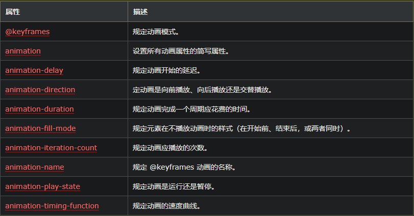
属性:
例子:
<!DOCTYPE html>
<html lang="en">
<head>
    <meta charset="UTF-8">
    <meta http-equiv="X-UA-Compatible" content="IE=edge">
    <meta name="viewport" content="width=device-width, initial-scale=1.0">
    <title>Document</title>
    <style>
        @keyframes example {
            from{
                background-color: red;
            }to{
                background-color: yellow;
            }
        }
        div {
            width: 100px;
            height: 100px;
            background-color: red;
            animation: example 5s linear 2s infinite alternate;
        }
    </style>
</head>
<body>
    <div></div>
</body>
</html>
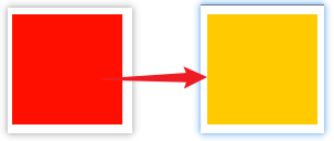
效果:
颜色逐渐变化
参考:https://www.w3school.com.cn/css/css3_animations.asp
整体代码:
<!DOCTYPE html>
<html lang="en">
<head>
    <meta charset="UTF-8">
    <meta http-equiv="X-UA-Compatible" content="IE=edge">
    <meta name="viewport" content="width=device-width, initial-scale=1.0">
    <title>Document</title>
    <style>
        /* 旋转动画设置: */
        @keyframes myAnimation{
            from{
                transform: rotate(0deg);
            }
            to{
                transform: rotate(360deg);
            }
        }
        body{
            background-color: #ccc;
        }
        .taiji{
            width: 0px;
            height: 300px;
            border-radius: 50%;
            border-left: 150px solid white;
            border-right: 150px solid black;
            animation: myAnimation 2s infinite linear;
        }
        .taiji::before,
        .taiji::after{
            width: 50px;
            border: 50px solid white;
            height: 50px;
            border-radius: 50%;
            content: "";
            background-color: black;
            display: block;
            margin-left: -75px;
        }

        .taiji::before{
            border: 50px solid black;
            background-color: white;
        }
    </style>
</head>
<body>
    <div class="taiji"></div>
</body>
</html>
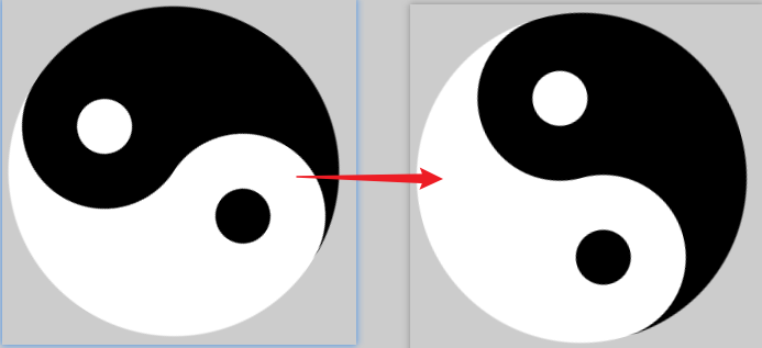
效果:


 3888
3888


 被折叠的 条评论
为什么被折叠?
被折叠的 条评论
为什么被折叠?
 到【灌水乐园】发言


