


【四】CSS之样式属性
1.1 颜色
1.1.1 颜色的表示
- css中针对颜色表达支持三种写法:单词表示法、十六进制表示法和RGB函数表示法。
1.1.2 单词表示法
- 通过英文单词来表达颜色。但是因为计算机中支持的颜色普遍在1677万种颜色左右。
red;  /* 红色 */
yellow;  /* 黄色 */
blue;  /* 蓝色 */
green;  /* 绿色 */
1.1.3 十六进制表示法
- 采用十六进制数值来表达一个颜色。通常格式:
#RRGGBB。- 计算机中所有的颜色都是由屏幕发光来呈现出来的。
- 所以一切的颜色都是基于光的三原色(红、绿、蓝)。
- 每种颜色的发光程度从不亮到最亮之间分成了256个级别,
- 使用十六进制来表达则是00~FF之间,
- 如果使用十进制来表达则是0~255。
#ffffff         /* 白色,红绿蓝三种颜色都发光而且是最亮*/
#000000    /* 黑色,红绿蓝三种颜色都不发光 */
#ff0000     /* 红色,只有红色发光,其他不发光 */
#00ff00     /* 绿色 */
#0000ff     /* 蓝色 */
#ffff00      /* 黄色 */
#ff00ff      /* 紫色 */
#00ffff      /* 青色  */
/* 当 三种光的原色发光程序一样时,如果不是白色与黑色,则属于灰色。*/
#333333   /* 灰色 */
#666666   /* 灰色 */
#999999   /* 灰色 */
#fafafa      /* 灰色 */
#aaaaaa    /* 灰色 */
<!DOCTYPE html>
<html lang="en">
<head>
<meta charset="UTF-8">
<title>Title</title>
<style>
p{
/*color: red; !* 单词表示法 1677W种颜色 *!*/
/*color: #ffffff;*/
/*color: #ff0000;*/
/*color: #00ff00;*/
/*color: #0000ff;*/
/*color: #ffff00; !*红色+绿色=黄色*!*/
/*color: #ff00ff; !*红色+蓝色=紫色*!*/
/*color: #00ffff; !*绿色+蓝色=锭青色*!*/
color: rgb(255,255,255); /*白色 */
color: rgb(0,0,0); /* 黑色 */
color: rgb(255,0,0); /* 红色 */
color: rgb(255,255,0); /* 黄色 */
color: rgb(0,255,0); /* 绿色 */
color: rgb(0,255,255); /* 青色 */
color: rgb(0,0,255); /* 蓝色 */
color: rgb(255,0,255); /* 紫色 */
}
</style>
</head>
<body>
<p>风吹麦浪起,扑面穗生香。金色的麦田里,收割机在麦浪中来回忙碌,一颗颗饱满的麦粒从收割机仓门倾泻而下,源源不断地被送上运粮车,颗粒归仓。</p>
</body>
</html>- opacity:颜色透明度
- rgba:仅仅是设置背景透明,不会影响到内容的透明度
<!DOCTYPE html>
<html lang="en">
<head>
    <meta charset="UTF-8">
    <title>Title</title>
    <style>
    p{
        /*background-color: black;*/
        /*opacity: 0.5;*/
        background-color: rgba(0,0,0,0.5); /* 仅仅是设置背景透明,不会影响到内容的透明度 */
        color: rgba(255,255,255,0.5);
    }
    </style>
</head>
<body>
    <p>风吹麦浪起,扑面穗生香。金色的麦田里,收割机在麦浪中来回忙碌,一颗颗饱满的麦粒从收割机仓门倾泻而下,源源不断地被送上运粮车,颗粒归仓。</p>
</body>
</html>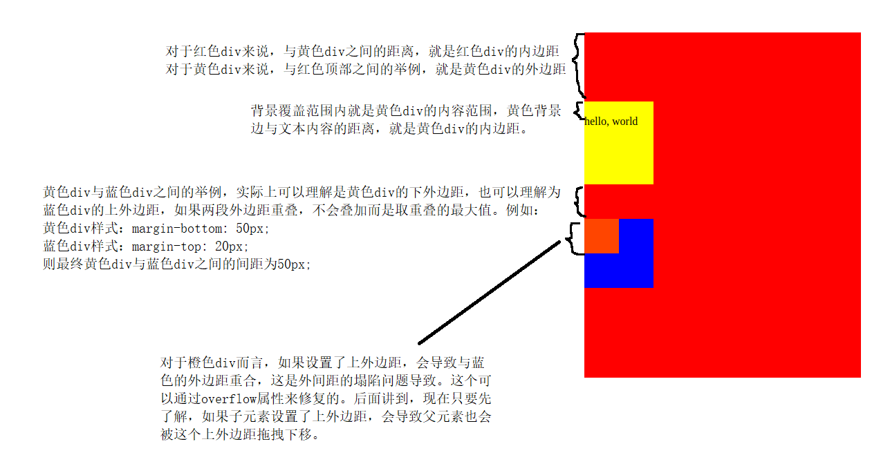
在前端开发中,针对计算机中支持的1677万中颜色,虽然都能实现,
但是因为不同的计算机的屏幕的材质不一样。
所以有时候会存在同一种颜色在不同电脑屏幕下展示效果不一样。
由此衍生了一种web安全颜色(也就是上图photoshop中的web颜色)。
web安全颜色是指代从1677万中颜色中抽取出来的部分能保证在所有屏幕,所有浏览器下显示一致的颜色。
-
十六进制表达法支持简写
#aaaaaa   ---> #aaa
#aabbcc   ---> #abc


#ffffff         /* 白色*/    #fff;
#000000    /* 黑色*/    #000;
#ff0000     /* 红色 */    #f00;
#00ff00     /* 绿色 */    #0f0;
#0000ff     /* 蓝色 */    #00f;
#ffff00      /* 黄色 */     #ff0;
#ff00ff      /* 紫色 */     #f0f;
#00ffff      /* 青色  */    #0ff;
/* 当 三种光的原色发光程序一样时,如果不是白色与黑色,则属于灰色。*/
#333333   /* 灰色 */    #333;
#666666   /* 灰色 */    #666;
#999999   /* 灰色 */    #999;
#fafafa      /* 灰色 */    /* 不能简写 */
#aaaaaa /* 灰色 */ #aaa;- 代码:
<!DOCTYPE html>
<html lang="en">
<head>
    <meta charset="UTF-8">
    <title>Title</title>
    <style>
    p{
        /*color: #ffffff;*/
        /*color: #ff0000;*/
        /*color: #00ff00;*/
        /*color: #0000ff;*/
        /*color: #ffff00;  !*红色+绿色=黄色*!*/
        /*color: #ff00ff;  !*红色+蓝色=紫色*!*/
        color: #00ffff;  /*绿色+蓝色=锭青色*/
    }
    </style>
</head>
<body>
    <p>风吹麦浪起,扑面穗生香。金色的麦田里,收割机在麦浪中来回忙碌,一颗颗饱满的麦粒从收割机仓门倾泻而下,源源不断地被送上运粮车,颗粒归仓。</p>
</body>
</html>
1.1.4 RGB函数表示法
- RGB代表的就是光的三原色。
/* 设置不透明颜色 */
rgb(红色, 绿色, 蓝色);
/* 设置透明颜色 */
rgba(红色, 绿色, 蓝色, 透明度);-
代码:
<!DOCTYPE html>
<html lang="en">
<head>
    <meta charset="UTF-8">
    <title>Title</title>
    <style>
    p{
        color: rgb(255,255,255); /*白色 */
        color: rgb(0,0,0); /* 黑色 */
        color: rgb(255,0,0); /* 红色 */
        color: rgb(255,255,0); /* 黄色 */
        color: rgb(0,255,0); /* 绿色 */
        color: rgb(0,255,255); /* 青色 */
        color: rgb(0,0,255); /* 蓝色 */
        color: rgb(255,0,255); /* 紫色 */
    }
    </style>
</head>
<body>
    <p>风吹麦浪起,扑面穗生香。金色的麦田里,收割机在麦浪中来回忙碌,一颗颗饱满的麦粒从收割机仓门倾泻而下,源源不断地被送上运粮车,颗粒归仓。</p>
</body>
</html>
1.2 颜色属性
| 属性名 | 描述 |
|---|---|
color | 文本内容的颜色 |
opacity | 元素以及内容和子元素的透明度,取值范围:0~1之间的数值。 |
<!DOCTYPE html>
<html lang="en">
<head>
    <meta charset="UTF-8">
    <title>Title</title>
    <style>
    p{
        /*background-color: black;*/
        /*opacity: 0.5;*/
        background-color: rgba(0,0,0,0.5); /* 仅仅是设置背景透明,不会影响到内容的透明度 */
        color: rgba(255,255,255,0.5);
    }
    </style>
</head>
<body>
    <p>风吹麦浪起,扑面穗生香。金色的麦田里,收割机在麦浪中来回忙碌,一颗颗饱满的麦粒从收割机仓门倾泻而下,源源不断地被送上运粮车,颗粒归仓。</p>
</body>
</html>
2 、字体
| 属性名 | 描述 |
|---|---|
font-style | 设置字体是否倾斜 normal:默认值,正常 italic:倾斜。 |
font-family | 设置字体的字体家族【经常和自定义字体@font-face配合使用】 |
font-size | 设置字体的大小 ,支持css中所有的常见尺寸单位,如:rem,%,px |
font-weight | 设置字体的粗细 |
| font | 上面所有字体属性的集体简写方式,常见格式: font: 字体倾斜 字体粗细 字体大小/字体行高 字体家族; font: 字体粗细 字体大小/字体行高 字体家族; font: 字体大小/字体行高 字体家族; |
@font-face {
        font-family: '迷你简卡通';
        url('迷你简卡通_downcc.TTF') format('truetype');
    }
    .p2{
        font-family: '迷你简卡通'; /* 系统内置的无衬线字体,只适用于英文 */
    }
<!DOCTYPE html>
<html lang="en">
<head>
<meta charset="UTF-8">
<title>Title</title>
<style>
@font-face {
font-family: '迷你简卡通';
url('迷你简卡通_downcc.TTF') format('truetype');
}
.p1{
font-style: normal; /* 设置字体不要倾斜 */
}
.p2{
font-family: '迷你简卡通'; /* 系统内置的无衬线字体,只适用于英文 */
}
.p3{
font-size: 16px; /* 谷歌浏览器中默认字体大小为:16像素; */
}
.p3{
font-weight: bold; /* 设置字体加粗 */
}
h1,h2,h3,h4,h5,h6{
font-weight: normal; /* 去除加粗效果 */
}
.p4{
/*font: italic bold 22px/44px "Arial";*/
/*font: bold 22px/44px "Arial";*/
font: 22px/22px "Arial"; /* 不能继续简写了 */
}
</style>
</head>
<body>
<i class="p1">hello,你好</i>
<div >hello,你好</div>
<div class="p2">hello,你好</div>
<div class="p3">hello,你好</div>
<h1>标题标签默认加粗,我们需要去除加粗效果</h1>
<div class="p4">hello,你好</div>
</body>
</html>3 、文本
| 属性名 | 描述 |
|---|---|
| word-break | 单词换行。取值如下: word-break: break-all;,表示保持整行内容结束以后换行。 word-break: break-word;,表示保持以单词整体进行换行。默认值。 |
text-align | 行内元素或元素内部的文本内容的水平对齐方式。 |
| text-align-last | 元素末行内容的水平对齐方式。 |
| word-spacing | 元素内容中单词与单词之间的距离【单词间距】。 |
| letter-spacing | 元素内容中字符与字符之间的距离【字符间距】。 |
text-indent | 元素内容中首行内容的缩进。 |
vertical-align | 行内元素或行内块级元素的垂直对齐方式。 |
line-height | 元素内容的行高,支持所有的常见尺寸单位与font-size的倍数 |
text-decoration | 元素的下划线修饰符 |
text-shadow | 元素的文本内容的阴影或模糊效果。取值如下: none,无阴影。 参数1: 第1个长度值用来设置对象的阴影水平偏移值。可以为负值。 参数2: 第2个长度值用来设置对象的阴影垂直偏移值。可以为负值。 参数3: 如果提供了第3个长度值则用来设置对象的阴影模糊值。不允许负值。 参数4: 设置对象的阴影颜色。 |
<!DOCTYPE html>
<html lang="en">
<head>
    <meta charset="UTF-8">
    <title>Title</title>
    <style>
    div.box1{
        width: 400px;
        height: 200px;
        background-color: red;
        word-break: break-all;
    }
    div.box2{
        text-align: center;
    }
    div.box3{
        text-align: center;
    }
    div.box4{
        text-align-last: center;
    }
    div.box5{
        word-spacing: 100px;
    }
    .box6{
        letter-spacing: 5px;
    }
    .box7{
        text-indent: 2rem;
    }
    .box8 img{
        vertical-align: top;
    }
    input{
        height: 42px;
        vertical-align: top;
    }
    .box10{
        line-height: 2rem;
    }
    .box11, a, del{
        /*text-decoration: underline; !*下划线 *!*/
        /*text-decoration: line-through; !*贯穿线,也叫删除线 *!*/
        /*text-decoration: overline; !*盖帽线,也叫上边线 *!*/
        text-decoration: none; /*没有装饰线 */
    }
    .box12{
        font-size: 36px;
        text-shadow: 2px 2px 5px red;
        /*text-shadow: 2px 2px 5px red, 5px 5px 5px yellow, 7px 7px 5px blue;*/
    }
    </style>
</head>
<body>
<!--    <div class="box1">Flask-SocketIO gives Flask applications access to low latency bi-directional communications between the clients and the server. The client-side application can use any of the SocketIO client libraries in Javascript, Python, C++, Java and Swift, or any other compatible client to establish a permanent connection to the server.</div>-->
<!--    <div class="box2">Flask-SocketIO</div>-->
<!--    <div class="box3"><a href="">百度</a></div>-->
<!--    <div class="box3"><img src="1.gif" alt=""></div>-->
<!--    <div class="box3"><p>这一段很长的内容!!!</p></div>-->
<!--    <div class="box4">Flask-SocketIO gives Flask applications access to low latency bi-directional communications between the clients and the server. The client-side application can use any of the SocketIO client libraries in Javascript, Python, C++, Java and Swift, or any other compatible client to establish a permanent connection to the server.</div>-->
<!--    <div class="box5">hello world</div>-->
<!--    <div class="box6">hello world</div>-->
<!--    <div class="box7">国家统计局15日发布数据显示,5月份我国经济逐步克服疫情不利影响,<br>生产需求逐步恢复,就业物价总体稳定,主要指标边际</div>-->
<!--    <div class="box8">一张图片:<img src="1.gif" alt=""></div>-->
    <div class="box9">账号:<input type="text" name="" placeholder="账号"></div>
    <div class="box10">国家统计局15日发布数据显示,5月份我国经济逐步克服疫情不利影响,<br>生产需求逐步恢复,就业物价总体稳定,主要指标边际</div>
    <div class="box11">国家统计局15日发布数据显示,5月份我国经济逐步克服疫情不利影响,<br>生产需求逐步恢复,就业物价总体稳定,主要指标边际</div>
    <div class="box11"><a href="">百度</a><div>
    <del>删除内容</del>
    <div class="box12">text-shadow</div>

</body>
</html>
4 、尺寸
- 块级元素默认宽度是100%;
| 属性名 | 描述 |
|---|---|
width | 元素的宽度[行内元素是没有宽度高度的] |
min-width | 元素的最小宽度 |
max-width | 元素的最大宽度 |
height | 元素的高度[行内元素是没有宽度高度的] |
min-height | 元素的最小高度 |
| max-height | 元素的最大高度 |
<!DOCTYPE html>
<html lang="en">
<head>
    <meta charset="UTF-8">
    <title>Title</title>
    <style>
    .box1{
        width: 100px;
        height: 100px;
        background-color: red;
        /*transition: background-color .5s ease-in .1s,*/
        /*border-radius .5s ease-in .1s,*/
        /*width .5s ease-in .1s,*/
        /*height .5s ease-in .1s;*/
        transition: all .5s ease-in .1s;
    }
    .box1:hover{
        width: 200px;
        height: 200px;
        border-radius: 100%; /* 圆角效果 */
        background-color: blue;
    }
    .box2{
        background-color: red;
        width: 100%;
        max-width: 1200px; /* 元素的最大宽度 */
        min-width: 640px; /* 元素的最小宽度 */
        min-height: 200px; /* 元素的最小高度 */
    }
    </style>
</head>
<body>
    <div class="box1"></div>
    <div class="box2">
        啊哈哈哈 <br>
        啊哈哈哈 <br>
        啊哈哈哈 <br>
        啊哈哈哈 <br>
        啊哈哈哈 <br>
        啊哈哈哈 <br>
        啊哈哈哈 <br>
        啊哈哈哈 <br>
        啊哈哈哈 <br>
        啊哈哈哈 <br>
        啊哈哈哈 <br>
        啊哈哈哈 <br>

    </div>
</body>
</html>
常见的尺寸单位
| 单位 | 描述 |
|---|---|
px | 绝对长度单位。像素(Pixels)。 |
| em | 相对长度单位。相对于当前元素内文本的字体尺寸。 |
rem | 相对长度单位。相对于根元素(即html元素)font-size计算值的倍数 |
vw | 相对长度单位。相对于视口的宽度,默认情况下CSS的视口被均分为100单位的vw |
vh | 相对长度单位。相对于视口的高度。视口被均分为100单位的vh |
% | 相对长度单位。相对于父级元素的宽度或高度进行设置。其中在部分元素中高度使用使用100%是没有效果的。 |
<!DOCTYPE html>
<html lang="en">
<head>
    <meta charset="UTF-8">
    <title>Title</title>
    <style>
        body{
            margin:0;
        }
    html{
        font-size: 20px;
    }
    div{
        font-size: 16px;
        background-color: red;
    }
    .box1{
        width: 16px;
        height: 16px;
        line-height: 16px;
    }
    .box2{
        width: 1em; /* 1个字符的尺寸 */
        height: 1em;
        line-height: 16px;
    }
    .box3{
        width: 1rem; /* 相对于根元素(即html元素)font-size计算值的倍数 */
        height: 1rem;
        line-height: 16px;
    }
    .box4{
        width: 100vw; /* 把视口纵向切割成左右100分, 1vw就是1份;*/
        height: 100vh; /* 把视口横向切割成上下100分,1vh就是1份;*/
    }
    </style>
</head>
<body>
<!--    <div class="box1">中</div>-->
<!--    <div class="box2">中</div>-->
<!--    <div class="box3">中</div>-->
    <div class="box4">中</div>
</body>
</html>
5 、边距(补白)
-
元素的边距(margin,也叫补白或填充padding)
- 分外边距(外补白)
- 其中外边距是指元素与其他元素之间的空隙
- 内边距(内补白)。
- 内边距是指元素与内容或者元素与子元素之间空隙。
- 分外边距(外补白)
-
关于内边距与外边距的说明:
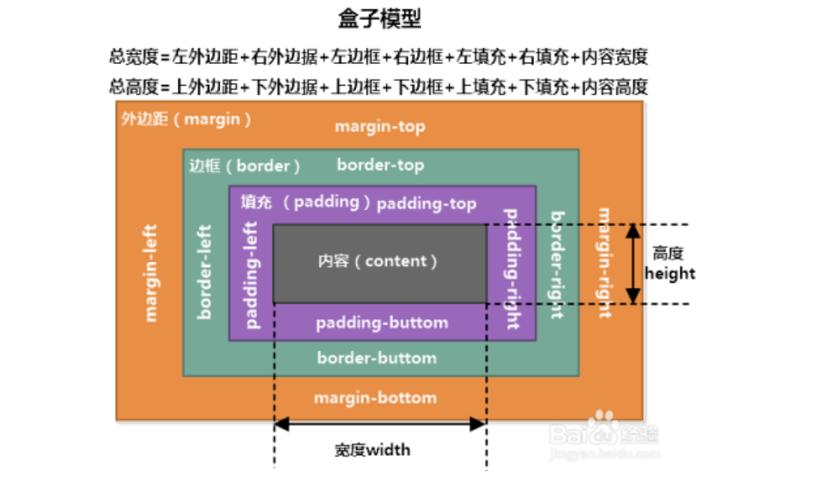
- 在浏览器中,F12调试工具里面elements选项中,提供了一个盒子模型给开发者查看当前元素的外边距、边框、内边距、元素的宽高的模型,这个模型就是盒模型(box model)。
- 基于盒模型,我们可以分析出一个元素具体在网页中的实际占据空间是多少,可以让开发者可以轻松的进行网页排版与布局。
| 属性名 | 描述 |
|---|---|
margin-top | 设置元素的上外边距 |
margin-right | 设置元素的右外边距 |
margin-bottom | 设置元素的下外边距 |
margin-left | 设置元素的左外边距 |
margin | 上面所有外边距属性的集体简写方式。有4种简写方式: 1个属性值。例如:margin: 20px;表示同时设置元素的4个方向的外边距对为20px 2个属性值。例如:margin: 20px 40px;表示设置元素的外边距,上下为20px,左右为40px 3个属性值。例如:margin: 20px 40px 50px;表示设置元素的外边距,上20px,左右40px, 下50px 4个属性值。例如:margin: 10px 20px 30px 40px;表示上10px,右20px,下30px,左40px;【顺时针排列】 |
padding-top | 设置元素的上内边距(也叫补白或填充) |
padding-right | 设置元素的右内边距 |
padding-bottom | 设置元素的下内边距 |
padding-left | 设置元素的左内边距 |
padding | 上面所有内边距属性的集体简写方式。有4种简写方式: 1个属性值。例如:padding: 20px;表示设置元素的4个方向的内边距对为20px 2个属性值。例如:padding: 20px 40px;表示设置元素的内边距,上下为20px,左右为40px 3个属性值。例如:padding: 20px 40px 50px;表示设置元素的内边距,上20px,左右40px, 下50px 4个属性值。例如:padding: 10px 20px 30px 40px;表示上10px,右20px,下30px,左40px;【顺时针排列】 |
基本使用
<!DOCTYPE html>
<html lang="en">
<head>
    <meta charset="UTF-8">
    <title>Title</title>
    <style>
    .box1{
        max-width: 1600px;
        background-color: red;
        margin: 0 auto;
    }
    .box2{
        height: 250px;
        background-color: red;
        /*margin-top: 100px;*/
        /*margin-right: 150px;*/
        /*margin-bottom: 250px;*/
        /*margin-left: 150px;*/
        /*margin: 100px 150px 250px 150px; !* 上面的简写 上 右 下 左 顺时针方向  *!*/
        /*margin: 100px 150px 250px; !* 上面的简写 上 左右 下*!*/
        /*margin: 150px 150px; !* 上面的简写 上下 左右 *!*/
        margin: 150px; /* 上面的简写 四个方向 */
    }
    .box3{
        width: 150px;
        height: 50px;
        background-color: yellow;
        /*padding-top: 50px;*/
        /*padding-right: 50px;*/
        /*padding-bottom: 20px;*/
        /*padding-left: 50px;*/
        /*padding: 50px 50px 20px 50px; !* 上面的简写:上 右 下 左 顺时针方向 *!*/
        /*padding: 50px 50px 20px; !* 上面的简写 上 左右 下 *!*/
        /*padding: 50px 50px; !* 上面的简写 上下 左右 *!*/
        padding: 50px; /* 上面的简写 四个方向 */
    }
    </style>
</head>
<body>
    <div class="box1">
        内容居中
    </div>
    <div class="box2">
        外边距设置
        <div class="box3">
            内边距设置
        </div>
    </div>
    <p>一个普通p标签</p>
</body>
</html>
边距的作用
<!DOCTYPE html>
<html lang="en">
<head>
    <meta charset="UTF-8">
    <title>Title</title>
    <link rel="stylesheet" href="normalize.css">
    <style>
    .box1{
        width: 400px;
        height: 200px;
        background-color: red;
        text-align: center;
    }
    .box2{
        width: 150px;
        height: 50px;
        background-color: yellow;
        margin: 0 auto; /* 设置让子块级元素在父块级元素的内部横向居中 */
    }
    </style>
</head>
<body>
1. 初始化样式,针对列表,h1,p等等HTML元素,在默认情况下存在一些不必要的内外边距,工作中一般会处理掉<br>
<p>p1</p>
<h1>h1</h1>
<ul>
    <li>li-1</li>
    <li>li-2</li>
</ul>
2. 让子块级元素在父块级元素内部居中,子元素如果是一个块级元素,那么子元素会占据父级元素的100宽度,所以子元素设置宽度<br>
<div class="box1">
    <div class="box2">hello</div>
</div>
3. 布局效果 <br>
<hr>
<style>
.today-news{
    width: 440px;
    margin: 50px;
}
.today-news .block-title{
    font-size: 30px;
    color: #0066cc;
    border-bottom: 1px solid #ccccff;
    height: 61px;
}
.today-news .block-title span{
    border-bottom: 5px solid #0066cc;
    padding-bottom: 15px;
}
.today-news .block-title .first-news a{
    color: #333;
    text-decoration: none;
}
.today-news .news-list li{
    line-height: 32px;
}
.today-news .first-news {
    padding: 13px 0 5px;
    font-weight: bold;
}
.today-news a:hover {
    color: #0c82ff;
}
.today-news li .site{
    color: #253e6d;
    font-weight: bold;
}
.today-news li .line{
    padding: 0 5px;
    color: #e9e9e9;
}
</style>
<div class="today-news">
    <h3 class="block-title"><span>今日话题</span></h3>
    <ul class="news-list">
        <li class="first-news"><a href="">国家统计局:5月份国民经济运行呈现恢复势头</a></li>
        <li><a class="site" href="">海外网</a><span class="line">|</span><a class="title" href="">落实“双碳”行动,共建美丽家园</a></li>
        <li><a class="site"  href="">新华网</a><span class="line">|</span><a class="title" href="">这笔钱,你也可能领到!全国总工会最新通知</a></li>
        <li><a class="site"  href="">中国青年网</a><span class="line">|</span><a class="title" href="">过度防疫被通报:疫情防控不松懈不加码</a></li>
        <li><a class="site"  href="">半月谈网</a><span class="line">|</span><a class="title" href="">身在基层却脱离基层,部分干部为何疏离百姓家门</a></li>
        <li><a class="site"  href="">澎湃新闻</a><span class="line">|</span><a class="title" href="">全国铁路6月20日起实行新运行图</a></li>
        <li><a class="site"  href="">中国新闻周刊</a><span class="line">|</span><a class="title" href="">黑土地告急!事关14亿人的饭碗</a></li>
    </ul>
</div>
</body>
</html>
6 、边框
| 属性名 | 描述 |
|---|---|
| border-top-style | 设置元素的上边框类型。常见值如下: none: 无边框。 dotted: 点状轮廓。 dashed: 虚线轮廓。 solid: 实线轮廓 |
| border-right-style | 设置元素的右边框类型。常见值同上。 |
| border-bottom-style | 设置元素的下边框类型。常见值同上。 |
| border-left-style | 设置元素的左边框类型。常见值同上。 |
| border-style | 上面所有边框类型属性的集体简写方式。有4种简写方式,参考margin简写方式。 |
| border-top-color | 设置元素的上边框颜色。 |
| border-right-color | 设置元素的右边框颜色。 |
| border-bottom-color | 设置元素的下边框颜色。 |
| border-left-color | 设置元素的左边框颜色。 |
| border-color | 上面所有边框颜色属性的集体简写方式。有4种简写方式,参考margin简写方式。 |
| border-top-width | 设置元素的上边框宽度。 |
| border-right-width | 设置元素的右边框宽度。 |
| border-bottom-width | 设置元素的下边框宽度。 |
| border-left-width | 设置元素的左边框宽度。 |
| border-width | 上面所有边框宽度属性的集体简写方式。有4种简写方式,参考margin简写方式。 |
border-top | 上边框颜色、类型、宽度的集体简写方式。 |
border-right | 右边框颜色、类型、宽度的集体简写方式。 |
border-bottom | 下边框颜色、类型、宽度的集体简写方式。 |
border-left | 左边框颜色、类型、宽度的集体简写方式。 |
border | 是四个方向的边框颜色、类型、宽度的集体简写方式。 |
border-top-left-radius | 设置元素的左上角圆角效果。值格式有2种: 正圆圆角,例如:border-top-left-radius: 直径长度; 椭圆圆角,例如:border-top-left-radius: 水平方向直径 垂直方向直径; |
border-top-right-radius | 设置元素的右上角圆角效果。值格式同上。 |
border-bottom-right-radius | 设置元素的右下角圆角效果。值格式同上。 |
border-bottom-left-radius | 设置元素的左下角圆角效果。值格式同上。 |
border-radius | 上面所有元素圆角属性的集体简写方式。有4种简写方式,参考margin简写方式。值格式同上。 与上面的区别是椭圆圆角的参数以:水平方向直径/垂直方向直径格式设置。 |
box-shadow | 设置元素的阴影效果。设置方式与text-shadow类似。取值如下: none: 无阴影 参数1:定义元素的阴影水平偏移值。正值,阴影在右边;负值,则阴影在左边 参数2:定义元素的阴影垂直偏移值。正值,阴影在下方;负值,则阴影在上方 参数3:定义元素的阴影模糊值半径。该值越大阴影边缘越模糊,若为0则阴影不模糊。不允许负值 参数4:定义元素的阴影外延值。正值,阴影将向四面扩展;负值,则阴影向里收缩 参数5:定义元素阴影的颜色。如果该值未定义,阴影颜色将默认取当前最近的文本颜色 参数6:inset: 定义元素的阴影类型为内阴影。该值为空时,则元素的阴影类型为外阴影 |
边框的基本使用
<!doctype html>
<html lang="en">
<head>
    <meta charset="UTF-8">
    <title>Document</title>
    <style>
    h1, button{
        width: 200px;
    }
    .box1{
        /* 边框属性 */
        /*分别设置4个方向的边框类型*/
        /*border-top-style: dotted;*/
        /*border-right-style: dashed;*/
        /*border-bottom-style: double;*/
        /*border-left-style: solid;*/

        /*设置上 右 下 左 的边框类型[简写]*/
        /*border-style: dotted dashed double solid;*/
        /*设置 上 左右 下的边框类型*/
        /*border-style: dotted solid double;*/

        /*设置上下 左右的边框类型*/
        /*border-style: double solid;*/

        /*同时设置4个方向的边框类型*/
        border-style: solid;


    }
    .box2{
        /*border-top-style: none;*/
        /*border-right-style: none;*/
        /*border-bottom-style: none;*/
        /*border-left-style: none;*/
        border-style: none;
    }
    .box3{
        border-style: solid;

        /*分别设置4个方向的边框颜色*/
        /*border-top-color: red;*/
        /*border-right-color: blue;*/
        /*border-bottom-color: pink;*/
        /*border-left-color: cyan;*/

        /*简写边框颜色属性*/
        /*!*一次性分别设置4个方向的边框颜色*!*/
        /*border-color: red blue pink cyan;*/
        /*!*设置 上 左右 下的边框颜色*!*/
        /*border-color: red blue pink;*/
        /*!*设置 上下 左右 的边框颜色*!*/
        /*border-color: red blue;*/
        /* 一次性同时设置4个方向的边框颜色 */
        border-color: red;
    }

    .box4{
        border-style: solid;
        border-color: red;
        /*分别设置4个方向的边框宽度*/
        /*border-top-width: 2px;*/
        /*border-right-width: 10px;*/
        /*border-bottom-width: 10px;*/
        /*border-left-width: 10px;*/

        /*!*简写,一次性分别设置4个方向的边框宽度*!*/
        /*border-width: 1px 10px 10px 10px;*/
        /*!*一次性设置上 左右 下 的边框宽度*!*/
        /*border-width: 1px 15px 10px;*/
        /*!*一次性设置 上下 左右的边框宽度*!*/
        /*border-width: 1px 10px;*/
        /*!*一次性同时设置4个方向的边框宽度*!*/
        border-width: 2px;
    }
    .box5{
        /*border-style: solid;*/
        /*border-color: red;*/
        /*border-width: 2px;*/

        /*按方向简写边框宽度,边框类型,边框颜色*/
        /*border-top: 2px double red;*/
        /*border-right: 2px double blue;*/
        /*border-bottom: 5px solid blue;*/
        /*border-left: 5px solid red;*/

        border: 2px solid red;
    }
    </style>
</head>
<body>
<!--    <h1 class="box1">标题</h1>-->
<!--    <button class="box2">按钮</button>-->
<!--    <h1 class="box3">标题</h1>-->
<!--    <h1 class="box4">标题</h1>-->
    <h1 class="box5">标题</h1>
</body>
</html>
边框的实际使用
<!DOCTYPE html>
<html lang="en">
<head>
    <meta charset="UTF-8">
    <title>Title</title>
    <style>
    .search-btn{
        width: 546px;
        margin: 0 auto;
    }
    .search-btn:after{
        content: "";
        display: block;
        clear: both;
        overflow: hidden;
    }
    .search-btn input[type="text"]{
        width: 423px;
        height: 26px;
        padding: 2px 44px 2px 17px; /* 上右下左 */
        border: 2px solid #e2231a;  /* 边框宽度  边框类型 边框颜色 */
        outline: none;
        float: left;
    }
    .search-btn input[type="text"]::placeholder{
        font-size: 12px;
    }
    .search-btn .btn{
        width: 58px;
        height: 34px;
        line-height: 34px;
        background-color: #e1251b;
        outline: none;
        border: none;
        float: left;
    }
    .search-btn .btn img{
        width: 20px;
        height: 20px;
        vertical-align: sub;
    }
    </style>
</head>
<body>
  <div class="search-btn">

      <input type="text" name="" id="" placeholder="家电168热销"><button class="btn"><img src="search.svg" alt=""></button>
  </div>
</body>
</html>
元素基于边框实现图标效果
<!doctype html>
<html lang="en">
<head>
    <meta charset="UTF-8">
    <title>Document</title>
    <style>
    .box1{
        width: 0;
        height: 0;
        border: 26px solid transparent;
        border-top: 26px solid red;
    }
    .box2{
        width: 0;
        height: 0;
        border: 26px solid transparent;
        border-right: 26px solid red;
    }
    .box3{
        width: 0;
        height: 0;
        border: 26px solid transparent;
        border-bottom: 26px solid red;
    }
    .box4{
        width: 0;
        height: 0;
        border: 26px solid transparent;
        border-left: 26px solid red;
    }
    .box5{
        width: 0;
        height: 0;
        border: 26px solid transparent;
        border-left: 26px solid red;
        border-right: 26px solid red;
    }
    .box6{
        width: 0;
        height: 0;
        border: 26px solid transparent;
        border-color: red yellow;
    }
    </style>
</head>
<body>
    <div class="box1"></div>
    <div class="box2"></div>
    <div class="box3"></div>
    <div class="box4"></div>
    <div class="box5"></div>
    <div class="box6"></div>
</body>
</html>
圆角的使用
<!doctype html>
<html lang="en">
<head>
    <meta charset="UTF-8">
    <title>Document</title>
    <style>
    .box1{
        width: 50px;
        height: 50px;
        background-color: red;

        /* 单独设置4个方向的圆角 */
        border-top-left-radius: 5px;
        border-top-right-radius: 5px;
        border-bottom-right-radius: 5px;
        border-bottom-left-radius: 5px;

        /*简写,设置4个方向的圆角*/
        /*border-radius: 10px 10px 10px 10px;*/
        /*设置上 左右 下*/
        border-radius: 10px 20px 10px;
        /*设置 上下 左右*/
        border-radius: 20px 10px;
        /*同时设置4个方向的圆角*/
        border-radius: 50px;
    }
    .box2{
        width: 200px;
        height: 40px;
        background-color: gray;
        border-radius: 20px;
    }
    .box3{
        width: 200px;
        height: 40px;
        background-color: black;
        border-top-left-radius: 50px;
        border-top-right-radius: 10px;
        border-bottom-right-radius: 50px;
        border-bottom-left-radius: 10px;
    }
    .box4{
        /* 椭圆圆角 */
        width: 200px;
        height: 40px;
        background-color: orangered;
        border-top-left-radius: 20px 10px;
        border-top-right-radius: 20px 10px;
        border-bottom-right-radius: 20px 10px;
        border-bottom-left-radius: 20px 10px;
    }
    .box5{
        /* 椭圆圆角 */
        width: 200px;
        height: 40px;
        background-color: orangered;
        border-radius: 50px/25px;
    }
    </style>
</head>
<body>
    <div class="box1"></div>
    <div class="box2"></div>
    <div class="box3"></div>
    <div class="box4"></div>
    <div class="box5"></div>
    <div class="box6"></div>
</body>
</html>
元素的阴影
<!doctype html>
<html lang="en">
<head>
    <meta charset="UTF-8">
    <title>Document</title>
    <style>
    body{
        background-color: #f5f5f5;
    }
    .box1{
        height: 300px;
        width: 234px;
        background-color: white;
        transition: all .2s linear;  /* 过渡样式的设置:从正常状态,切换到伪类状态的过渡效果。 参数1:设置要过渡的样式,all表示所有样式,参数2:完成过渡的持续时间。参数3:完成整个动画的运动轨迹 */
    }
    .box1:hover{
        box-shadow: 0 15px 30px rgba(0,0,0,0.1);
        transform: translate3d(0,-2px,0);
    }
    </style>
</head>
<body>
    <div class="box1">

    </div>
</body>
</html>
7 、背景
| 属性名 | 描述 |
|---|---|
background-color | 设置元素的背景颜色。 |
background-image | 设置元素的背景图片。背景图片与背景颜色同时设置时,则图片覆盖颜色。写法如下: background-image: url("图片路径"); |
background-repeat | 设置元素的背景图片平铺效果。如果没有设置图片,则该属性不起作用。取值如下: repeat-x:横向平铺 repeat-y:纵向平铺 repeat:在横向和纵向平铺 no-repeat:不平铺 round:缩放平铺 space:松散平铺 |
background-size | 设置元素的背景图片的尺寸大小。值有2种设置方式: 1个属性值,表示同时设置背景图片的宽度与高度。 2个属性值,表示单独设置背景图片的宽度与高度。 |
background-position | 设置元素的背景图片的定位效果,以元素左上角为为坐标原点(0,0)进行偏移设置。格式如下: background-position: x轴偏移量 y轴偏移量; |
| background-attachment | 定义元素滚动时背景图片相对于谁固定。取值如下: fixed: 相对于视口固定。 scroll:相对于元素固定,当元素内容滚动时背景图片不会跟着滚动,但会随元素的祖先元素滚动。 local: 相对于元素内容固定,当元素随元素滚动时背景图片也会跟着滚动。 |
background | 上面所有元素背景属性的集体简写方式。书写格式如下: background: 背景颜色 背景图片 平铺方式 x轴偏移 y轴偏移; 顺序可以打乱 |
- 背景定位(黄色矩形为元素,白色为背景图片)

<!DOCTYPE html>
<html lang="en">
<head>
    <meta charset="UTF-8">
    <title>Title</title>
    <style>
    .page{
        width: 100%;
        max-width: 1600px;
        margin: 0 auto;
        height: 500px;

        /*background-color: red;  !* 背景图片被覆盖背景颜色 *!*/
        /*background-image: url("assets/images/3f7f689039c6c5b5cbfb6a4c4cae5079.jpeg");  !*可以是网络路径,也可以是本地路径*!*/
        /*background-repeat: no-repeat; !* 不平铺 *!*/
        /*background-repeat: repeat-y;  !* 垂直平铺,延Y轴平铺 *!*/
        /*background-repeat: repeat-x;  !* 横向平铺,延X轴平铺 *!*/
        /*background-repeat: repeat;  !* 全部平铺,默认值 *!*/

        /*background-size: 100% 100%;  !* 设置背景图片的大小 宽度 高度 *!*/
        /*background-size: 100%;  !* 如果是单独一个参数时,则表示只设置宽度,高度按比例缩放 *!*/
        /*background-size: auto 100%;  !* 表示单独指定高度,宽度按比例缩放 *!*/

        /*背景图片定位:以元素右上角作为原点(0,0)*/
        /*background-position: 100px 100px;*/


        /*background-attachment: fixed;   !*元素的背景图片,相对于窗口固定,元素滚动时,背景图片不会跟着滚动*!*/
        /*background-attachment: scroll;   !*相对于元素固定,当元素内容滚动时背景图片不会跟着滚动*!*/
        /*background-attachment: local;    !*相对于元素固定,当元素内容滚动时背景图片也会跟着滚动*!*/
        /*overflow: scroll; !* 溢出内容的处理方式:scroll表示当内容超出元素本身的高度与高度时,出现滚动条 *!*/

        background: red url("assets/images/3f7f689039c6c5b5cbfb6a4c4cae5079.jpeg") no-repeat 200px 100px;
    }
    </style>
</head>
<body style="height: 3000px;">
    <div class="page">
        hello world;<br>
        hello world;<br>
        hello world;<br>
        hello world;<br>
        hello world;<br>
        hello world;<br>
        hello world;<br>
        hello world;<br>
        hello world;<br>
        hello world;<br>
        hello world;<br>
        hello world;<br>
        hello world;<br>
        hello world;<br>
        hello world;<br>
        hello world;<br>
        hello world;<br>
        hello world;<br>
        hello world;<br>
        hello world;<br>
        hello world;<br>
        hello world;<br>
        hello world;<br>
        hello world;<br>
        hello world;<br>
        hello world;<br>
        hello world;<br>
        hello world;<br>
        hello world;<br>
        hello world;<br>
        hello world;<br>
        hello world;<br>
        hello world;<br>
        hello world;<br>
        hello world;<br>
        hello world;<br>
        hello world;<br>
        hello world;<br>
        hello world;<br>
        hello world;<br>
        hello world;<br>
        hello world;<br>
        hello world;<br>
    </div>
</body>
</html>
8 、界面
| 属性 | 描述 |
|---|---|
| ouline | 外边线 |
| cursor | 鼠标光标在网页中外观形状,常用值:pointer |
| resize | 是否允许用户缩放,调节元素尺寸大小 none: 不允许用户调整元素大小。 both: 用户可以调节元素的宽度和高度。 horizontal: 用户可以调节元素的宽度 vertical: 用户可以调节元素的高度 |
<!DOCTYPE html>
<html lang="en">
<head>
    <meta charset="UTF-8">
    <title>Title</title>
    <style>
    .box{
        width: 200px;
        height: 200px;
        background: red;
        cursor: pointer; /* 爪子 */
    }
    input[type="text"]{
        /*outline: 1px solid red;*/
        outline: none;
    }
    textarea[name="desc"]{
        width: 200px;
        height: 80px;
        resize: none; /* 禁止 */
    }
    </style>
</head>
<body>
<!--    <div class="box"></div>-->
<!--<input type="text"><br>-->
<textarea name="desc" id=""></textarea>
</body>
</html>


 4282
4282


 被折叠的 条评论
为什么被折叠?
被折叠的 条评论
为什么被折叠?
 到【灌水乐园】发言


