


🍻 前言
自从Vue发布了 3x版本后,Element UI 也发布了对应的组件库版本 Element Plus,图标使用上也发生了改变,特意记录下,希望可以帮到大家!
PS:
Element Plus抛弃了字体图标的用法,直接使用了svg的方式。并且需要单独下载
常规用法
下载图标库
ruby
复制代码
# 选择一个你喜欢的包管理器 # NPM npm install @element-plus/icons-vue # Yarn yarn add @element-plus/icons-vue # pnpm pnpm install @element-plus/icons-vue
局部引入
每次使用都需要单独引入,有点麻烦,特别是需要遍历的菜单含有icon的时候(
不推荐)
xml
复制代码
<template> <el-button type="primary">demo</el-button> <el-input :prefix-icon="User" placeholder="请输入用户名"></el-input> <el-input :prefix-icon="Lock" show-password placeholder="请输入密码"></el-input> </template> <script setup lang="ts"> import { User,Lock } from '@element-plus/icons-vue'; </script>
全局引入
现在使用较多的一种方案,可以解决 自动引入时循环图标时无法展示的问题(
推荐)
ts
复制代码
... // main.ts import * as ElementPlusIconsVue from '@element-plus/icons-vue' const app = createApp(App) for (const [key, component] of Object.entries(ElementPlusIconsVue)) { app.component(key, component) } app.mount('#app')
xml
复制代码
<!-- App.vue--> <el-input prefix-icon="User" placeholder="请输入用户名"></el-input> <el-input prefix-icon="Lock" show-password placeholder="请输入密码"></el-input> <!-- <el-icon></el-icon> 可以设置图标大小和颜色 --> <el-icon :size="30"><Edit /></el-icon> <el-icon :size="30" color="teal"><Loading /></el-icon> <Delete />
自动导入
自动导入 不需要下载
@element-plus/icons-vue,也不需要局部/全局导入
安装
ruby
复制代码
# 需要安装两个 antfu @use: https://github.com/antfu 写的插件 # pnpm 安装 pnpm install unplugin-icons unplugin-vue-components -D
配置
ts
复制代码
import { defineConfig } from "vite"; import vue from "@vitejs/plugin-vue"; import AutoImport from "unplugin-auto-import/vite"; import Components from "unplugin-vue-components/vite"; import { ElementPlusResolver } from "unplugin-vue-components/resolvers"; import Icons from "unplugin-icons/vite"; import IconsResolver from "unplugin-icons/resolver"; // https://vitejs.dev/config/ export default defineConfig({ plugins: [ vue(), AutoImport({ // 自动导入vue ref、computed、watch 相关函数 imports: ["vue", "@vueuse/core"], resolvers: [ // 自动导入ElementPlus组件 ElementPlusResolver(), ], }), Components({ dts: "./components.d.ts", // 生成组件类型声明文件,设置为false则不生成 resolvers: [ IconsResolver({ prefix: "i", // 默认为i,设置为false则不显示前缀 enabledCollections: ["ep"], }), ElementPlusResolver(), ], }), Icons({ autoInstall: true, // 是否自动安装对应的图标库,默认为true scale: 1, // 图标缩放,默认为1 defaultStyle: "", // 图标style defaultClass: "", // 图标class compiler: null, // 编译方式,可选值:'vue2', 'vue3', 'jsx' jsx: "react", // jsx风格:'react' or 'preact' }), ], });
使用
xml
复制代码
<!-- prefix-icon="IEpUser"写法无效 自动引入的问题 --> <el-input prefix-icon="IEpUser" placeholder="请输入用户名"></el-input> <el-input placeholder="请输入用户名"> <template #prefix> <el-icon><IEpUser/></el-icon> </template> </el-input> <IEpDelete /> <!-- 或 --> <i-ep-delete />
配置解析
Components配置: 作用就是按需注册,使用组件中使用才会注册。IconsResolver就是主要配置icon的。
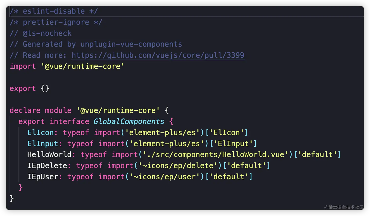
components.d.ts文件:
js
复制代码
# 图标结构 # 它由三部分组成:{prefix}-{collection}-{icon} # prefix:icon的前缀,默认值为'i',可设置成false,如果设置成false,那么组件使用就变成 <ep-edit/> # collection: iconify 唯一name; # icon: 图标名字
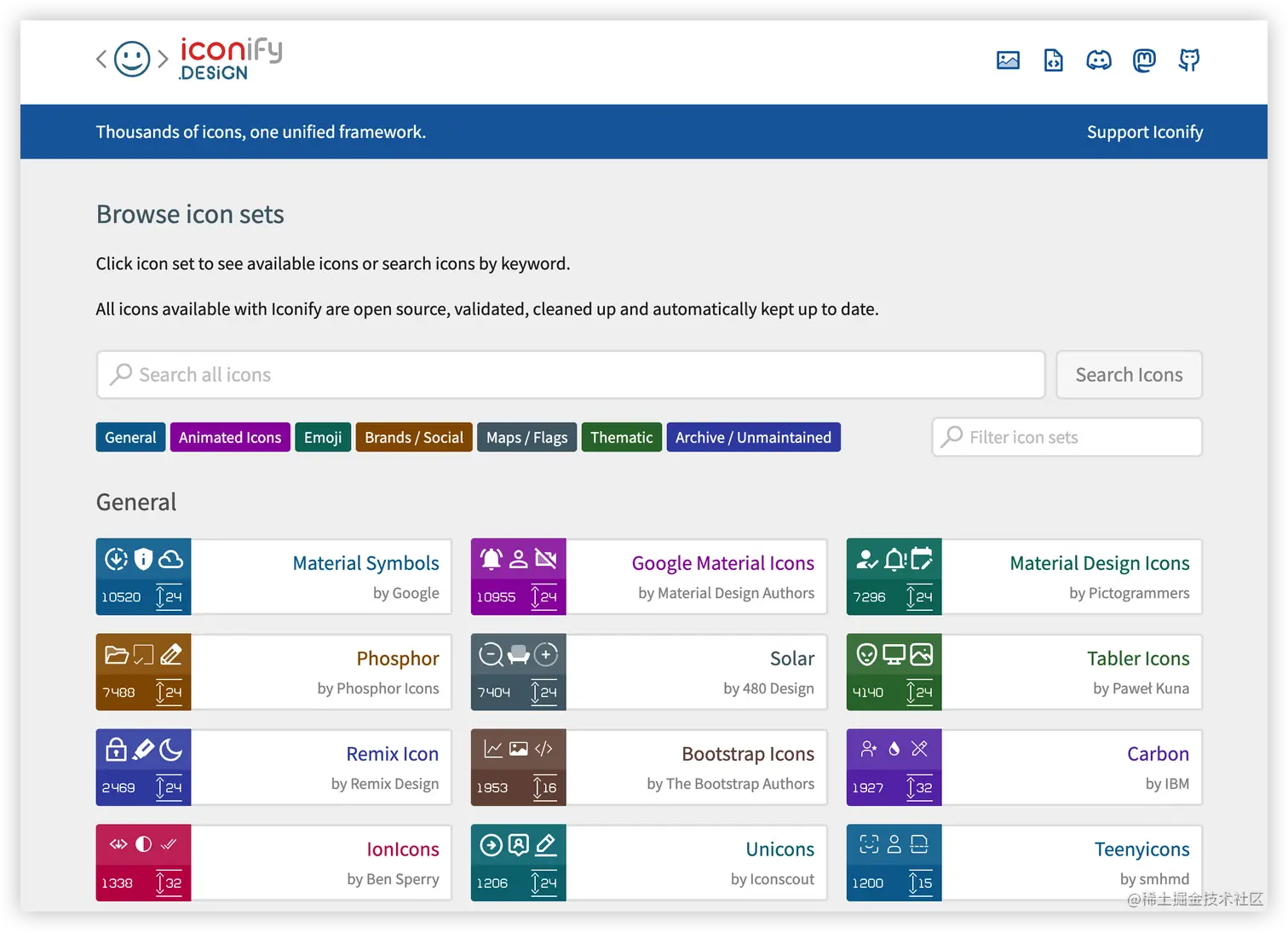
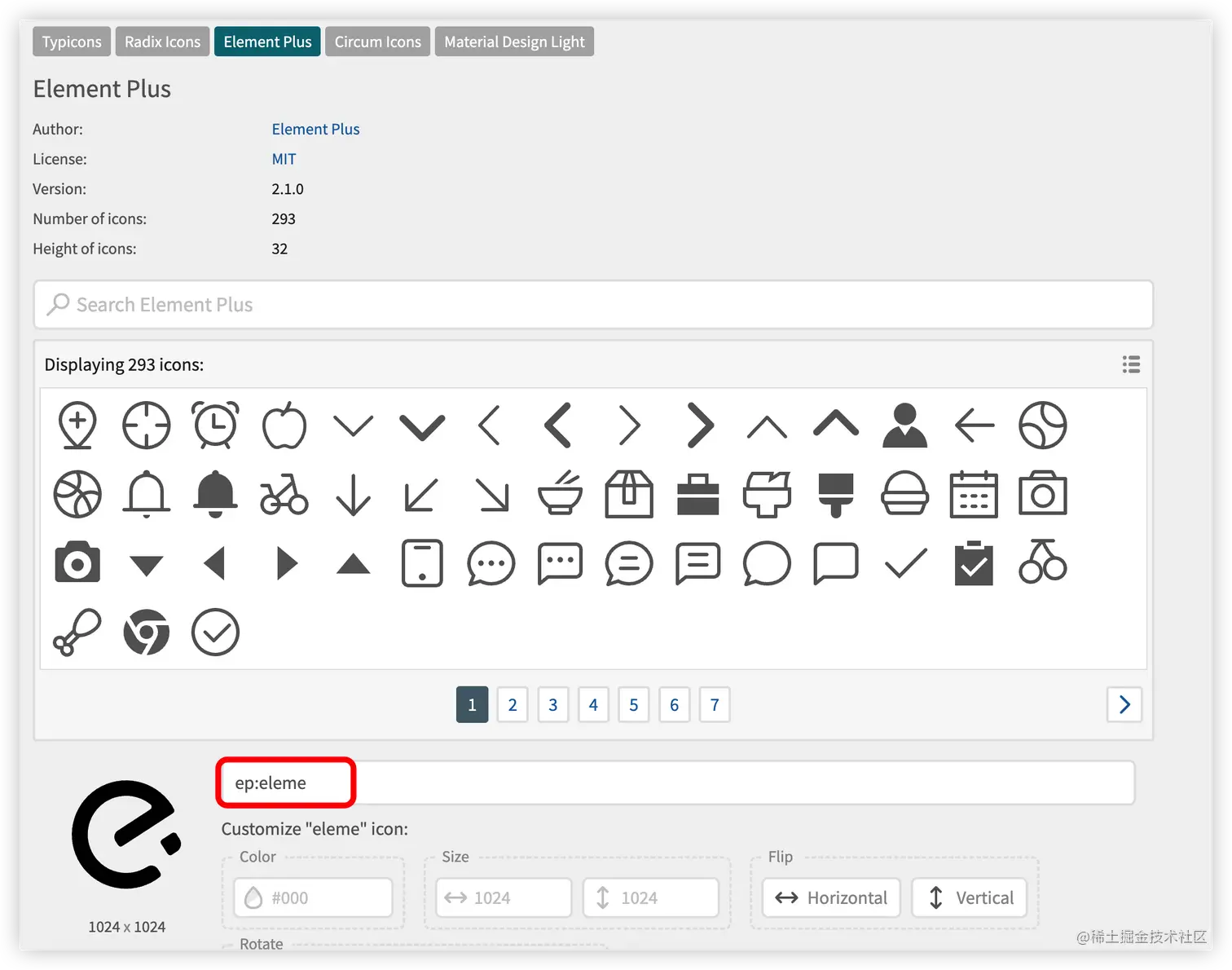
collection对应的是 enabledCollections配置,这里设置的是['ep'],默认是iconify上的所有图标。Iconify支持100多个图标集,上万种图标可随意使用,你能想到的他都有,Iconify是SVG图标
这里enabledCollections配置的ep 表示的是 element-plus 的图标,也可以设置mdi、ant-design,他会自动根据名称在package.json安装对应的SVG图标文件
如果我们想自定义图标格式可以吗?答案是可以的,可以设置别名的方式改变 ep
ts
复制代码
Components({ dts: "./components.d.ts", // 生成组件类型声明文件,设置为false则不生成 resolvers: [ IconsResolver({ prefix: "i", // 默认为i,设置为false则不显示前缀 enabledCollections: ["ep"], alias: { 'icon': "ep", //配置别名 }, }), ElementPlusResolver(), ], }),
使用方法也变为了我们自定义的别名 <i-icon-delete /> 中间的 icon 就是我们上边 alias配置的别名
diff
复制代码
<template> + <i-icon-delete /> </template>
ts
复制代码
Icons({ autoInstall: true })
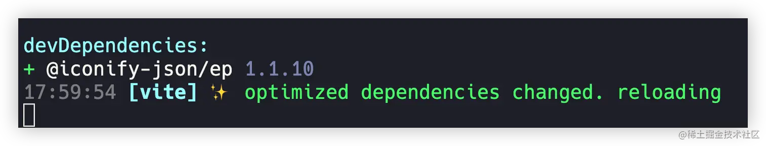
上面的配置表示会自动安装@iconify-json/ep的依赖,设置为true,他就会自动安装。
自动引入存在的问题
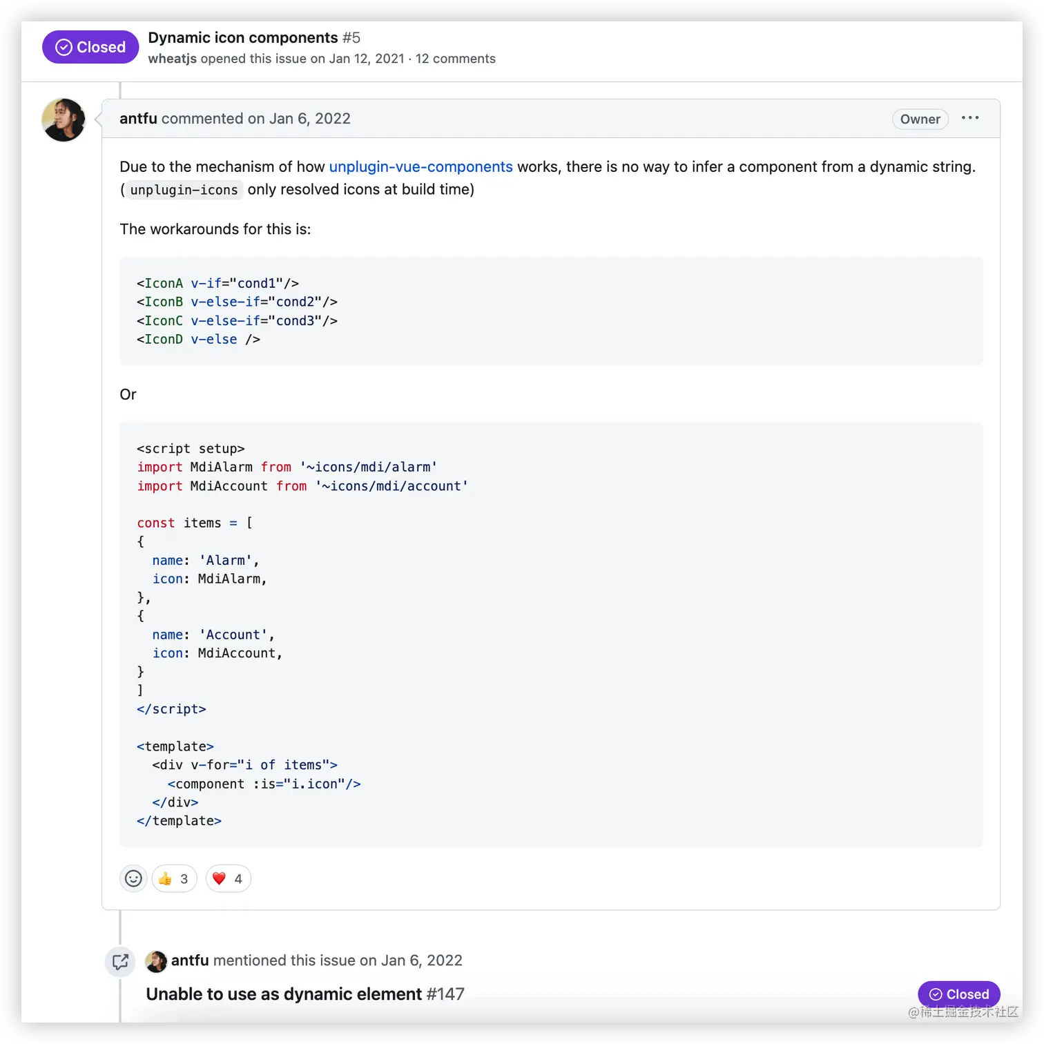
我们在做后台管理的时候肯定有这样的功能: 侧菜单栏,这时候就需要遍历数据,动态展示图标,如果你是像这样写,就会发现图标出不来。对于这个问题,unplugin-icons的作者给出的方案使用也不太方便: 如何动态引入图标issues
无法显示出图标
xml
复制代码
<!-- App.vue --> <template> <div v-for="i in iconList" :key="i.name"> <component :is="i.icon" /> <el-text class="mx-1" type="primary">{{ i.name }}</el-text> </div> </template> <script setup lang="ts"> const iconList = [ { name: "One", icon: 'IEpStar', }, { name: "Two", icon: 'IEpPointer', }, { name: "Three", icon: 'IEpSetting', }, ]; </script>
解决方案一
需要搭配 unplugin-auto-import自动导出插件结合 antfu大佬的方案。unplugin-auto-import 也是使用 vite 最常用的插件之一,它可以帮助我们自动导入 vue的 ref、computed、watch等内置组件。还可以自动导入 ElementPlus 组件和图标组件
但是这种方案我还没想好后台返回的数据应该怎么渲染图标😂
ts
复制代码
// 1. 安装 unplugin-auto-import: pnpm install -D unplugin-auto-import // 2. 修改vite.config.ts import { defineConfig } from "vite"; import vue from "@vitejs/plugin-vue"; import AutoImport from "unplugin-auto-import/vite"; import Components from "unplugin-vue-components/vite"; import { ElementPlusResolver } from "unplugin-vue-components/resolvers"; import Icons from "unplugin-icons/vite"; import IconsResolver from "unplugin-icons/resolver"; // https://vitejs.dev/config/ export default defineConfig({ plugins: [ vue(), AutoImport({ // 自动导入vue ref、computed、watch 相关函数 imports: ["vue", "@vueuse/core"], resolvers: [ // 自动导入ElementPlus组件 ElementPlusResolver(), //主要是在这里配置,可以自动导入使用的图标组件 IconsResolver({ //配置前缀,效果等用于Components中的 prefix componentPrefix: "i", enabledCollections: ["ep"] }) ], }), Components({ dts: "./components.d.ts", // 生成组件类型声明文件,设置为false则不生成 resolvers: [ IconsResolver({ prefix: 'i', // 默认为i,设置为false则不显示前缀 enabledCollections: ["ep"], // alias: { // 'icon': "ep", //配置别名 // }, }), ElementPlusResolver(), ], }), Icons({ autoInstall: true, // 是否自动安装对应的图标库,默认为true scale: 1, // 图标缩放,默认为1 defaultStyle: "", // 图标style defaultClass: "", // 图标class compiler: "vue3", // 编译方式,可选值:'vue2', 'vue3', 'jsx' jsx: "react", // jsx风格:'react' or 'preact' }), ], });
ts
复制代码
// 把 'IEpStar' 字符串改为 组件 <script setup lang="ts"> const iconList = [ { name: "One", icon: IEpStar, }, { name: "Two", icon: IEpPointer, }, { name: "Three", icon: IEpSetting, }, ]; </script> <template> <div v-for="i in iconList" :key="i.name"> <component :is="i.icon" /> <el-text class="mx-1" type="primary">{{ i.name }}</el-text> </div> </template>
解决方案二
使用 iconify的 @iconify/vue
这种方式会Http请求iconify api.iconify.design/ep.json?ico… 图标库,我没找到怎么使用本地下载的@iconify-json/ep
ruby
复制代码
# 1. 安装 pnpm install --save-dev @iconify/vue
ts
复制代码
<script setup lang="ts"> // 2. 组件内导入 // App.vue import { Icon } from '@iconify/vue'; const iconList = [ { name: "One", icon: 'star', }, { name: "Two", icon: 'pointer', }, { name: "Three", icon: 'setting', }, ]; </script>
xml
复制代码
<!-- App.vue 使用 --> <template> <div v-for="i in iconList" :key="i.name"> <Icon :icon="`ep:${i.icon}`" /> <el-text class="mx-1" type="primary">{{ i.name }}</el-text> </div> </template>
解决方案三
直接使用上面的 常规方法 -> 全局导入,这也是现在常见并且比较方便的做法😄。
最终选择
方案一 antfu 大佬升级后如果完美解决了,我应该会使用这种;方案二 我找到能加载本地图标而不是CDN的时候也会去考虑。那现在只能选择方便的 方案三直接使用全局注册的方式了
最后
如果文章对你有帮助,可以 点赞、收藏,如果大家有更好意见或方案,欢迎评论区指出。


 1931
1931


 被折叠的 条评论
为什么被折叠?
被折叠的 条评论
为什么被折叠?
 到【灌水乐园】发言


