《iOS Human Interface Guidelines》——Color and Typography

颜色和排版


颜色增强沟通


在iOS中,颜色帮助指明交互、给予活力、并提供视觉连贯性。内置的app使用了一系列无论从个体上还是整体上看,或者明亮和阴暗的背景下看都很棒的纯净的颜色。


如果你创造了多种自定义颜色,确保他们整体效果良好。比如说,如果蜡笔在你的app风格中是必须的,你需要创造一系列协调的蜡笔色贯穿你的app。


关注颜色在不同环境中的对比。比如说,如果导航栏背景和栏上的按钮标题没有对比度,用户就很难看到这些按钮。一个快速但不科学的检验你的颜色是否有足够的对比度的方法是:在一个不同亮度下的设备上查看你的app,包括太阳天的户外环境。


即使在设备上查看你的app可以帮助你找到一些你需要调整的区域,这仍然取代不了更加客观地得出可靠结果的方式。这种方法包括测定前景和背景颜色亮度的比值。你可以使用在线对比比值计算器或者自己使用符合WCAG 2.0标准的公式来计算去获取这个比值。app中理想的颜色对比值为4.5:1或更高。


当你使用自定义的栏色调时考虑半透明的栏和app内容。如果你需要创造一个匹配特殊颜色的栏色调,比如一个商标中的颜色,你也许需要尝试很多种颜色才能得到想要的结果。一个栏的外观会被iOS提供的半透明效果和app中在栏后方出现的内容共同影响。


API NOTE

使用tintColor属性来设置栏上按钮标题的色调;使用barTintColor属性来设置栏本身的色调。查看UINavigationBar Class Reference,UITabBar Class Reference,UIToolbar Class Reference,和UISearchBar Class Reference来学习更多关于栏的属性。


注意色盲。大部分色盲患者难以区分红色和绿色。测试你的app确保没有任何地方使用红色和绿色作为唯一区分两种状态和值的方式(一些图片编辑软件有工具可以帮助你校验色盲)。一般来说,使用多种方式来显示一个元素的交互是好的方法(查看Interactive Elements Invite Touch学习在iOS中显示交互的内容)。


考虑选择一个主颜色来显示交互和状态。内置的app中的主颜色有备忘录中的黄色和日历中的红色。如果你确定一个主颜色去显示交互和状态,确保app中的其他颜色不与其竞争。


避免对可交互和不可交互的元素使用相同的颜色。颜色是UI元素表示其是否可交互的一种方式。如果可交互和不可交互的元素有了相同的颜色,用户很难知道点击那里。


颜色会沟通,但并不总是你想要的方式。每个人看待颜色都不一样,很多文化也对颜色的意义有不同的定义。花时间去研究你使用的颜色在其他的国家和文化中会被怎样感知。你会想要尽可能地确保你app中的颜色传达合适的信息。


大部分情况下,不要让颜色使用户分心。除非颜色是你app的必要目的,否则让颜色成为一种微妙的优化方式。


好的排版使沟通更清晰


苹果设计了San Francisco系列排版来提供一种贯穿全平台的漂亮的、一致的声音和阅读体验,在iOS 9 之后,San Francisco变成了系统字体。


San Francisco与动态排版(Dynamic Type)携手工作来给你:

  • 在所有用户设置中一系列的自动字体尺寸,包括无障碍设置中提供了最高的识别率的和很好的的阅读体验
  • 每一种字体尺寸都自动调节字母间距(字距)和行高
  • 能够为语义不同的文本块指定不同的文本风格,比如正文注脚标题
  • 对用户做出的文字大小设置进行合适的响应变化(包括无障碍的文字尺寸)


访问 https://developer.apple.com/fonts/下载San Francisco。(注意iOS 9 中San Francisco字体叫SF-UI)当你在你的app中采用San Francisco时,你可以在模拟器 > 设置中调整数值来测试你的app文本在不同尺寸下的表现。

NOTE
如果你使用自定义的字体,仍然可以根据系统设置中的的文本尺寸调整动态排版和比例类型。你的app要对用户改变设置时做出适当的响应。查看Text Styles来学习如何使用文本类型在用户改变文本尺寸设置时确保app得到通知。

San Francisco包括两种视觉尺寸:Text和Display。Text用于低于20点的尺寸,Display用于高于20点的尺寸。当你在你的app中使用San Francisco时,iOS会自动地在Text和Display中切换。

NOTE
如果你使用类似Sketch或Photoshop的应用来创建你的设计,你需要在设置20点以上的类型时切换到Display。iOS会自动地为San Francisco调整建立在字体尺寸上的跟踪值(Tracking value)(跟踪值用来修改某个点尺寸下的字母间距)。Text和Display中每个尺寸的跟踪值分别显示在表10-1和表10-2中。

表10-1 在SF-UI Text中每个尺寸的跟踪值


表10-2 Display中每个尺寸的跟踪值


为了强调某些文本或者创造不同内容部分之间的视觉关系,你可以依靠动态排版支持的语义定义样式,比如标题和正文,或者指定字体宽度,比如纤细和半粗。采用动态排版风格可以简单地传达你内容的意义,但是如果你想要更多对设计的掌控,你也可以对某个特定的文本块设置特定的宽度。(查看UIFont Class Reference学习更多关于调整文本宽度的内容。)

比如说,你也许会想要增加某个文本的宽度来帮助用户了解内容的层级或者吸引他们的注意力到某个特定的单词或短语。或者你想要增加小字体的宽度并减小大字体的宽度来创造一种多个靠近的文本的凝聚感。字体宽度对整体风格和内容表达也具有显著的影响,所以你也许会选择一个特殊的宽度来达到一种特殊的设计目标。

当响应文本尺寸变化时区分优先次序。不同内容对用户的重要性是不同的。当用户选择一种更大的文本尺寸时,他们是想要让他们关心的内容更加易于阅读;他们并不想让屏幕上的每一个单词都变得更大。

比如说,当用户选择一个大的无障碍文本尺寸,邮件会将标题和文本用大的尺寸显示,但不会变化其他重要的文本——比如日期和收件人。


确保自定义字体在每一种风格、不同的尺寸下都是清晰的。一种方法是对iOS在不同尺寸下显示不同字体风格的方式进行模仿。比如:
  • 文本永远不应该小于11点,即使用户选择了特小号的尺寸。相应的,正文风格使用17点作为默认的大尺寸。
  • 一般来说,在每种尺寸设置下,字体尺寸和引导值相差一点。只有两种标题风格例外,它们在特小号、小号和中号下使用相同的字体尺寸、引导值、跟踪值。
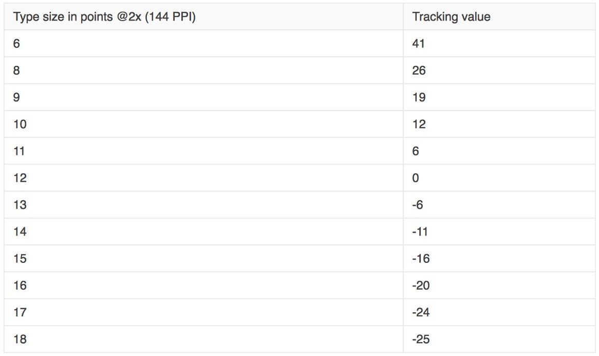
  • 在最小的三种文本尺寸下,跟踪值会相对地大一些;在最大的三种文本尺寸下,跟踪值会相对地紧致一些。
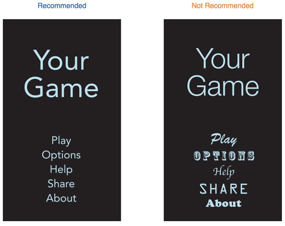
  • 标题和正文风格使用相同的字体尺寸。为了区分正文风格,标题使用了更宽的宽度。
  • 导航栏中的文本使用17点,与正文风格在大号下相同。
  • 文本总是使用常规或中号宽度;它不使用浅或粗体,因为浅和粗体在小号下看起来不好。

一般来说,在你的app中使用单一的字体。混合多种不同的字体会使你的app看起来零散和稀松。相反的,要使用一种字体以及少量的风格和尺寸。


本文翻译自 苹果官方开发文档
  • 0
    点赞
  • 1
    收藏
    觉得还不错? 一键收藏
  • 0
    评论
Introduction Introduction 9 At a Glance 9 Great iOS Apps Embrace the Platform and HI Design Principles 9 Great App Design Begins with Some Clear Definitions 10 A Great User Experience Is Rooted in Your Attention to Detail 10 People Expect to Find iOS Technologies in the Apps They Use 10 All Apps Need at Least Some Custom Artwork 11 Chapter 1 Platform Characteristics 13 The Display Is Paramount, Regardless of Its Size 13 Device Orientation Can Change 14 Apps Respond to Gestures, Not Clicks 14 People Interact with One App at a Time 15 Preferences Are Available in Settings 16 Onscreen User Help Is Minimal 16 Most iOS Apps Have a Single Window 17 Two Types of Software Run in iOS 17 Safari on iOS Provides the Web Interface 18 Chapter 2 Human Interface Principles 21 Aesthetic Integrity 21 Consistency 21 Direct Manipulation 22 Feedback 22 Metaphors 22 User Control 23 Chapter 3 App Design Strategies 25 Create an Application Definition Statement 25 1. List All the Features You Think Users Might Like 25 2. Determine Who Your Users Are 26 3. Filter the Feature List Through the Audience Definition 26 4. Don’t Stop There 26 Design the App for the Device 27 Embrace iOS UI Paradigms 27 Ensure that Universal Apps Run Well on Both iPhone and iPad 28 Reconsider Web-Based Designs 28 Tailor Customization to the Task 29 Prototype and Iterate 31 Chapter 4 Case Studies: Transitioning to iOS 33 From Mail on the Desktop to Mail on iPhone 33 From Keynote on the Desktop to Keynote on iPad 35 From Mail on iPhone to Mail on iPad 38 From a Desktop Browser to Safari on iOS 41 Chapter 5 User Experience Guidelines 47 Focus on the Primary Task 47 Elevate the Content that People Care About 48 Think Top Down 48 Give People a Logical Path to Follow 48 Make Usage Easy and Obvious 49 Use User-Centric Terminology 50 Minimize the Effort Required for User Input 50 Downplay File-Handling Operations 50 Enable Collaboration and Connectedness 51 De-emphasize Settings 52 Brand Appropriately 53 Make Search Quick and Rewarding 53 Entice and Inform with a Well-Written Description 54 Be Succinct 55 Use UI Elements Consistently 55 Consider Adding Physicality and Realism 56 Delight People with Stunning Graphics 57 Handle Orientation Changes 58 Make Targets Fingertip-Size 60 Use Subtle Animation to Communicate 61 Support Gestures Appropriately 62 Ask People to Save Only When Necessary 63 Make Modal Tasks Occasional and Simple 63 Start Instantly 64 Always Be Prepared to Stop 65 Don’t Quit Programmatically 65 If Necessary, Display a License Agreement or Disclaimer 65 For iPad: Enhance Interactivity (Don’t Just Add Features) 66 For iPad: Reduce Full-Screen Transitions 66 For iPad: Restrain Your Information Hierarchy 67 For iPad: Consider Using Popovers for Some Modal Tasks 69 For iPad: Migrate Toolbar Content to the Top 70 Chapter 6 iOS Technology Usage Guidelines 73 iCloud Storage 73 Multitasking 74 Notification Center 76 Printing 80 iAd Rich Media Ads 81 Quick Look Document Preview 87 Sound 88 Understand User Expectations 88 Define the Audio Behavior of Your App 89 Manage Audio Interruptions 93 Handle Media Remote Control Events, if Appropriate 94 VoiceOver and Accessibility 95 Edit Menu 96 Undo and Redo 98 Keyboards and Input Views 99 Location Services 99 Chapter 7 iOS UI Element Usage Guidelines 101 Bars 101 The Status Bar 101 Navigation Bar 102 Toolbar 105 Tab Bar 106 Content Views 108 Popover (iPad Only) 108 Split View (iPad Only) 111 Table View 113 Text View 121 Web View 122 Container View Controller 123 Alerts, Action Sheets, and Modal Views 123 Alert 123 Action Sheet 127 Modal View 130 Controls 133 Activity Indicator 133 Date and Time Picker 133 Detail Disclosure Button 134 Info Button 135 Label 135 Network Activity Indicator 136 Page Indicator 136 Picker 137 5 2011-10-12 | . 2011 Apple Inc. All Rights Reserved. CONTENTS Progress View 138 Rounded Rectangle Button 139 Scope Bar 139 Search Bar 140 Segmented Control 141 Slider 142 Stepper 143 Switch 143 Text Field 144 System-Provided Buttons and Icons 145 Standard Buttons for Use in Toolbars and Navigation Bars 145 Standard Icons for Use in Tab Bars 148 Standard Buttons for Use in Table Rows and Other UI Elements 149 Chapter 8 Custom Icon and Image Creation Guidelines 151 Tips for Designing Great Icons and Images 152 Tips for Creating Great Artwork for the Retina Display 153 Tips for Creating Resizable Images 154 Application Icons 155 Launch Images 157 Small Icons 159 Document Icons 160 Document Icon Specifications for iPhone 160 Document Icon Specifications for iPad 161 Web Clip Icons 163 Icons for Navigation Bars, Toolbars, and Tab Bars 164 Newsstand Icons 166 Document Revision History 169

“相关推荐”对你有帮助么?

  • 非常没帮助
  • 没帮助
  • 一般
  • 有帮助
  • 非常有帮助
提交
评论
添加红包

请填写红包祝福语或标题

红包个数最小为10个

红包金额最低5元

当前余额3.43前往充值 >
需支付:10.00
成就一亿技术人!
领取后你会自动成为博主和红包主的粉丝 规则
hope_wisdom
发出的红包
实付
使用余额支付
点击重新获取
扫码支付
钱包余额 0

抵扣说明:

1.余额是钱包充值的虚拟货币,按照1:1的比例进行支付金额的抵扣。
2.余额无法直接购买下载,可以购买VIP、付费专栏及课程。

余额充值