《iOS Human Interface Guidelines》——3D Touch

3D Touch


3D Touch让iOS 9的用户多了一个交互的维度。在支持的设备上,人们可以通过按压主屏幕上的app图标来快速地选择其特有的操作。在app内,人们可以使用多种压力来获取一个内容的预览、在另一个视图打开内容以及获取相关的操作。(查看Adopting 3D Touch on iPhone来学习更多关于在你的代码中支持3D Touch的内容。)


Peek 和 Pop


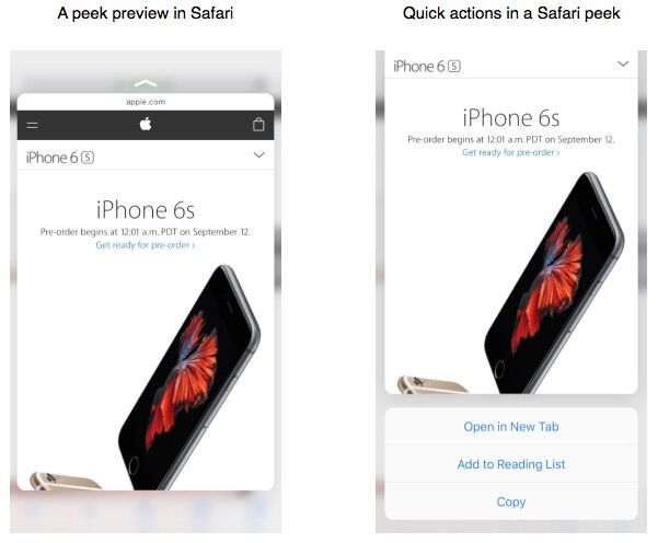
Peek让用户可以在不离开当前环境的情况下预览一个内容以及执行相关的操作。元素通过在轻按时显示一个小的矩形视图(有时称为hint)来表明其支持peek。


peek:

  • 在用户按一个支持peek的元素时显示,在用户手指离开时消失
  • 当用户在peek视图上稍微按深一点时,打开一个元素的详情视图——称为pop
  • 当用户在peek视图上向上滑时,会提供关于元素的快捷操作

当用户轻按屏幕时,支持peek的元素会通过展示一个你提供的矩形视图来暗示有更多的交互可获取。这个视图要够大,这样用户的手指才不会挡住内容,还要够详细,这样用户才能决定是否要按深一点来查看peek视图。

重要
使用peek和pop要贯穿整个app,这点很重要。如果你在一些地方提供peek和pop,而在另一些地方不提供,用户会觉得你的app或者他的设备出了问题。

使用peek来提供元素的一个生动的、内容丰富的预览。peek最好能给用户关于元素足够的信息来补充他们当前的任务。比如说,用户可以使用peek来预览信息中的一个URL对应的网页,这样他们就可以决定他们是否要在Safari中打开网页或者分享链接给他们的朋友。在一个列表视图中,peek给用户展示某一行的详细视图。

为每个peek提供一个pop。即使peek应该给用户大部分他们需要的信息,你也应该始终让用户在决定离开当前任务并关注元素内容的时候可以跳转到pop。pop应该和用户点击元素时获取到的视图一样。

不要为同一个元素同时提供peek和编辑菜单。当同一个元素的两种特性都提供时会变得迷惑。(查看 Edit Menu来学习更多关于编辑菜单的内容。)

在peek内,不要显示看起来像按钮的元素。如果用户松开他们的手指去点击那个看起来像按钮的元素,peek就会消失。

如果合适的话,提供peek快捷操作。在peek内,用户可以通过上滑显示与元素相关的操作。比如说,邮件的peek快捷操作包括回复所有、跟随和移动邮件。不是所有的peek都需要快捷操作,但如果你已经为元素提供了自定义的长按操作,为元素使用peek提供同样的操作代替长按是一个好的做法。(注意网页peek的快捷操作是自动提供的。)

不要将peek作为获取元素特有操作的唯一方式。不是所有设备都支持peek和pop,而且有些用户可能会选择关闭3D Touch功能,所以寻找其他方式来使peek的功能在你的app中可获取是必要的。当你的app运行在旧设备中时,在用户长按元素时让他们获取到与peek快捷操作相同的view是有意义的。


主屏幕快捷操作

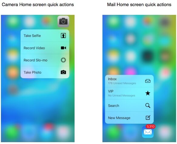
主屏幕快捷操作给了用户一种方便的在主屏幕执行有用的、app特有的操作的方式。


主屏幕快速操作:
  • 当用户使用比长按app图标深一点点的方式点击主屏幕上的图标时出现
  • 展示一个短标题、一个图标以及可选的你提供的子标题
  • 不支持其他自定义内容
  • 当你的app更新时能展示新的信息

使用主屏幕快捷操作提供引人注目的、高价值的任务。比如说,地图可以让用户在不首次打开地图app的情况下搜索他们位置附近的东西或者获取家的方向。每一个app都应该至少提供一个主屏幕快捷操作的有用的任务;你可以提供总共四个快捷操作。

不要使用主屏幕快捷操作来快速导航你的app。如果用户访问你app的重要内容很难或者很花时间,首先修复你app的导航,这样所有的用户都可以受益。然后专注于提供那些深入链接你app或者完成有用的、有创意性任务的主屏幕快捷操作。

不要以用户难以预期的方式改变主屏幕快捷操作。最好基于用户理解的事件或环境改变来更新快捷操作。比如说,基于用户在你app中当前的位置或者最近的操作、事件或者用户设置的改变来更新元素会比较有意义。

不要使用主屏幕快捷操作来作为通知用户的方式。iOS的用户期待通过别的方式来获取app的通知(查看 Notifications来学习这些方式)。

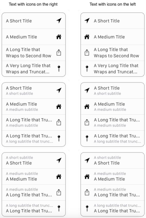
为每个主屏幕快捷操作提供一个简洁的标题(以及可选的子标题)和一个模板图标。标题应该立即显示操作的结果;比如说,“家的方向”,“创建新联系人”和“新信息”。你也可以提供可选的子标题来给用户更多的内容。比如说,邮件在VIP主屏幕快捷操作中使用了子标题来告诉用户他们是否有未读邮件。不要在标题和子标题中包含你的app名称或任何外部信息,并且确保在写文本的时候考虑位置。

保持标题尽可能的短很重要,这可以避免被截断并且能帮助用户快速理解操作。如果你提供子标题,系统会截断太长的标题来适应一行;如果你不包含子标题,系统会将长标题截断显示到第二行去。

你可以从很多系统提供的模板化图标中选择或者你也可以自己创造一个自定义的模板化图标。从 https://developer.apple.com/design/downloads/Quick-Action-Guides.zip下载主屏幕快捷操作图标模板来获取关于图标尺寸、内边距以及位置的指南。查看Template Icons来学习更多关于设计一个模板化图标的内容。

系统会自动在快捷操作列表的左边或右边显示图标,这取决于你的app图标在用户主屏幕上的位置。(无论图标在列表的什么位置,文本都是左对齐且从左读到右的。)这里是一些主屏幕快捷操作的例子,展示了他们的不同显示形式。


本文翻译自 苹果官方开发文档

  • 0
    点赞
  • 2
    收藏
    觉得还不错? 一键收藏
  • 0
    评论
Introduction Introduction 9 At a Glance 9 Great iOS Apps Embrace the Platform and HI Design Principles 9 Great App Design Begins with Some Clear Definitions 10 A Great User Experience Is Rooted in Your Attention to Detail 10 People Expect to Find iOS Technologies in the Apps They Use 10 All Apps Need at Least Some Custom Artwork 11 Chapter 1 Platform Characteristics 13 The Display Is Paramount, Regardless of Its Size 13 Device Orientation Can Change 14 Apps Respond to Gestures, Not Clicks 14 People Interact with One App at a Time 15 Preferences Are Available in Settings 16 Onscreen User Help Is Minimal 16 Most iOS Apps Have a Single Window 17 Two Types of Software Run in iOS 17 Safari on iOS Provides the Web Interface 18 Chapter 2 Human Interface Principles 21 Aesthetic Integrity 21 Consistency 21 Direct Manipulation 22 Feedback 22 Metaphors 22 User Control 23 Chapter 3 App Design Strategies 25 Create an Application Definition Statement 25 1. List All the Features You Think Users Might Like 25 2. Determine Who Your Users Are 26 3. Filter the Feature List Through the Audience Definition 26 4. Don’t Stop There 26 Design the App for the Device 27 Embrace iOS UI Paradigms 27 Ensure that Universal Apps Run Well on Both iPhone and iPad 28 Reconsider Web-Based Designs 28 Tailor Customization to the Task 29 Prototype and Iterate 31 Chapter 4 Case Studies: Transitioning to iOS 33 From Mail on the Desktop to Mail on iPhone 33 From Keynote on the Desktop to Keynote on iPad 35 From Mail on iPhone to Mail on iPad 38 From a Desktop Browser to Safari on iOS 41 Chapter 5 User Experience Guidelines 47 Focus on the Primary Task 47 Elevate the Content that People Care About 48 Think Top Down 48 Give People a Logical Path to Follow 48 Make Usage Easy and Obvious 49 Use User-Centric Terminology 50 Minimize the Effort Required for User Input 50 Downplay File-Handling Operations 50 Enable Collaboration and Connectedness 51 De-emphasize Settings 52 Brand Appropriately 53 Make Search Quick and Rewarding 53 Entice and Inform with a Well-Written Description 54 Be Succinct 55 Use UI Elements Consistently 55 Consider Adding Physicality and Realism 56 Delight People with Stunning Graphics 57 Handle Orientation Changes 58 Make Targets Fingertip-Size 60 Use Subtle Animation to Communicate 61 Support Gestures Appropriately 62 Ask People to Save Only When Necessary 63 Make Modal Tasks Occasional and Simple 63 Start Instantly 64 Always Be Prepared to Stop 65 Don’t Quit Programmatically 65 If Necessary, Display a License Agreement or Disclaimer 65 For iPad: Enhance Interactivity (Don’t Just Add Features) 66 For iPad: Reduce Full-Screen Transitions 66 For iPad: Restrain Your Information Hierarchy 67 For iPad: Consider Using Popovers for Some Modal Tasks 69 For iPad: Migrate Toolbar Content to the Top 70 Chapter 6 iOS Technology Usage Guidelines 73 iCloud Storage 73 Multitasking 74 Notification Center 76 Printing 80 iAd Rich Media Ads 81 Quick Look Document Preview 87 Sound 88 Understand User Expectations 88 Define the Audio Behavior of Your App 89 Manage Audio Interruptions 93 Handle Media Remote Control Events, if Appropriate 94 VoiceOver and Accessibility 95 Edit Menu 96 Undo and Redo 98 Keyboards and Input Views 99 Location Services 99 Chapter 7 iOS UI Element Usage Guidelines 101 Bars 101 The Status Bar 101 Navigation Bar 102 Toolbar 105 Tab Bar 106 Content Views 108 Popover (iPad Only) 108 Split View (iPad Only) 111 Table View 113 Text View 121 Web View 122 Container View Controller 123 Alerts, Action Sheets, and Modal Views 123 Alert 123 Action Sheet 127 Modal View 130 Controls 133 Activity Indicator 133 Date and Time Picker 133 Detail Disclosure Button 134 Info Button 135 Label 135 Network Activity Indicator 136 Page Indicator 136 Picker 137 5 2011-10-12 | . 2011 Apple Inc. All Rights Reserved. CONTENTS Progress View 138 Rounded Rectangle Button 139 Scope Bar 139 Search Bar 140 Segmented Control 141 Slider 142 Stepper 143 Switch 143 Text Field 144 System-Provided Buttons and Icons 145 Standard Buttons for Use in Toolbars and Navigation Bars 145 Standard Icons for Use in Tab Bars 148 Standard Buttons for Use in Table Rows and Other UI Elements 149 Chapter 8 Custom Icon and Image Creation Guidelines 151 Tips for Designing Great Icons and Images 152 Tips for Creating Great Artwork for the Retina Display 153 Tips for Creating Resizable Images 154 Application Icons 155 Launch Images 157 Small Icons 159 Document Icons 160 Document Icon Specifications for iPhone 160 Document Icon Specifications for iPad 161 Web Clip Icons 163 Icons for Navigation Bars, Toolbars, and Tab Bars 164 Newsstand Icons 166 Document Revision History 169

“相关推荐”对你有帮助么?

  • 非常没帮助
  • 没帮助
  • 一般
  • 有帮助
  • 非常有帮助
提交
评论
添加红包

请填写红包祝福语或标题

红包个数最小为10个

红包金额最低5元

当前余额3.43前往充值 >
需支付:10.00
成就一亿技术人!
领取后你会自动成为博主和红包主的粉丝 规则
hope_wisdom
发出的红包
实付
使用余额支付
点击重新获取
扫码支付
钱包余额 0

抵扣说明:

1.余额是钱包充值的虚拟货币,按照1:1的比例进行支付金额的抵扣。
2.余额无法直接购买下载,可以购买VIP、付费专栏及课程。

余额充值