


1.官网
Buttons官网:http://www.bootcss.com/p/buttons/
font awesome icons官网:http://fortawesome.github.io/Font-Awesome/icons/
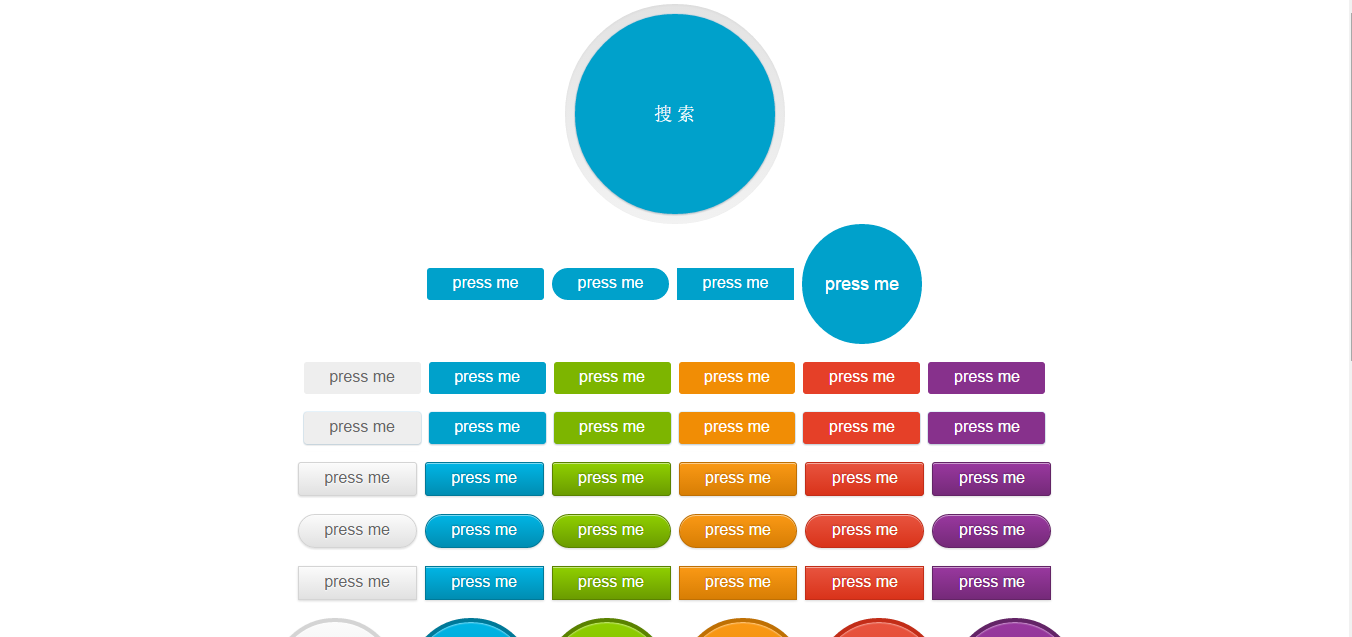
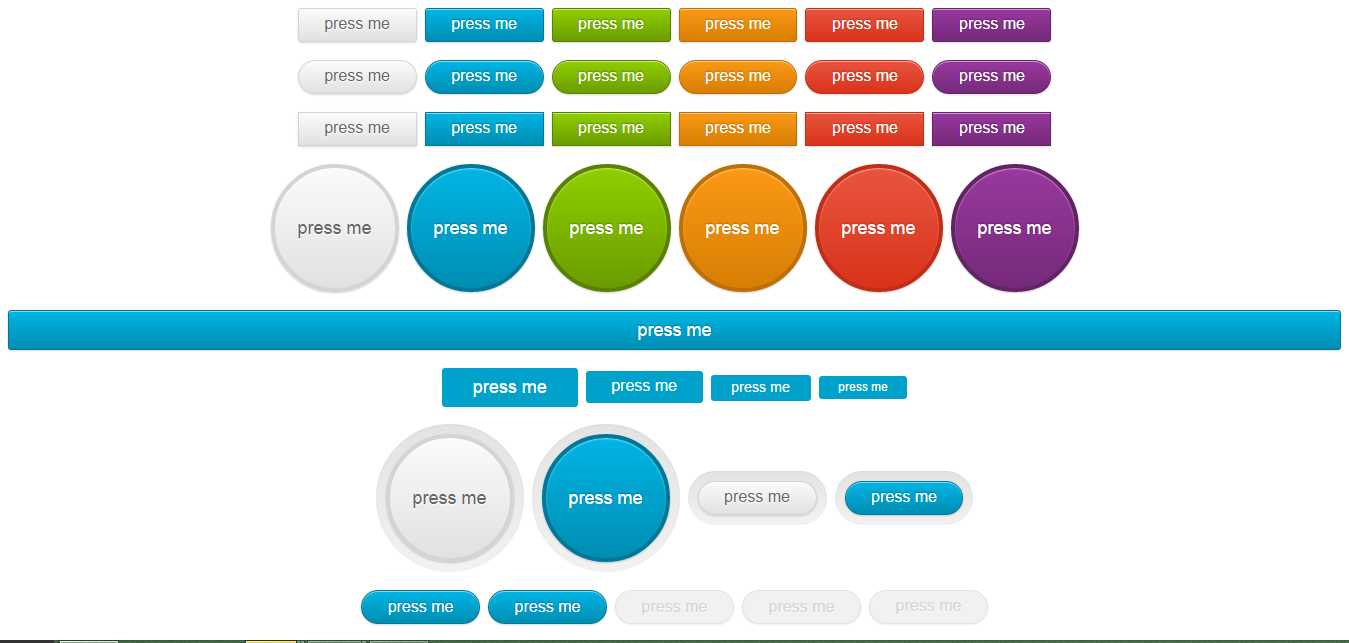
2. 预览效果
3. 示例代码
<!DOCTYPE html>
<html>
<head>
<meta charset="UTF-8">
<link href="fontawesome/css/font-awesome.min.css" rel="stylesheet">
<link href="Buttons/css/buttons.css" rel="stylesheet">
<title>Insert title here</title>
</head>
<body align="center">
	<span class="button-wrap">
		<button type="submit" class="button button-circle button-flat button-flat-primary glow" style="width: 200px; height: 200px;line-height: 200px;">搜 索</button>
	</span>

	<div>
		<a href="#" class="button button-rounded button-flat-primary">press me</a>
		<a href="#" class="button button-pill button-flat-primary">press me</a>
		<a href="#" class="button button-flat-primary">press me</a>
		<a href="#" class="button button-circle button-flat-primary">press me</a>
	</div>
	<br>
	<div>
		<a href="#" class="button button-rounded button-flat"><i class="icon-github"></i></i> press me</a>
		<a href="#" class="button button-rounded button-flat-primary"><i class="icon-refresh"></i> press me</a>
		<a href="#" class="button button-rounded button-flat-action"><i class="icon-cloud"></i> press me</a>
		<a href="#" class="button button-rounded button-flat-highlight"><i class="icon-camera"></i> press me</a>
		<a href="#" class="button button-rounded button-flat-caution"><i class="icon-code"></i> press me</a>
		<a href="#" class="button button-rounded button-flat-royal"><i class="icon-envelope-alt"></i> press me</a>
	</div>
	<br>
	<div>
		<a href="#" class="button glow button-rounded button-flat">press me</a>
		<a href="#" class="button glow button-rounded button-flat-primary">press me</a>
		<a href="#" class="button glow button-rounded button-flat-action">press me</a>
		<a href="#" class="button glow button-rounded button-flat-highlight">press me</a>
		<a href="#" class="button glow button-rounded button-flat-caution">press me</a>
		<a href="#" class="button glow button-rounded button-flat-royal">press me</a>
	</div>
	<br>
	<div>
		<a href="#" class="button button-rounded">press me</a>
		<a href="#" class="button button-rounded button-primary">press me</a>
		<a href="#" class="button button-rounded button-action">press me</a>
		<a href="#" class="button button-rounded button-highlight">press me</a>
		<a href="#" class="button button-rounded button-caution">press me</a>
		<a href="#" class="button button-rounded button-royal">press me</a>
	</div>
	<br>
	<div>
		<a href="#" class="button button-pill">press me</a>
		<a href="#" class="button button-pill button-primary">press me</a>
		<a href="#" class="button button-pill button-action">press me</a>
		<a href="#" class="button button-pill button-highlight">press me</a>
		<a href="#" class="button button-pill button-caution">press me</a>
		<a href="#" class="button button-pill button-royal">press me</a>
	</div>
	<br>
	<div>
		<a href="#" class="button">press me</a>
		<a href="#" class="button button-primary">press me</a>
		<a href="#" class="button button-action">press me</a>
		<a href="#" class="button button-highlight">press me</a>
		<a href="#" class="button button-caution">press me</a>
		<a href="#" class="button button-royal">press me</a>
	</div>
	<br>
	<div>
		<a href="#" class="button button-circle">press me</a>
		<a href="#" class="button button-circle button-primary">press me</a>
		<a href="#" class="button button-circle button-action">press me</a>
		<a href="#" class="button button-circle button-highlight">press me</a>
		<a href="#" class="button button-circle button-caution">press me</a>
		<a href="#" class="button button-circle button-royal">press me</a>
	</div>
	<br>
	<div>
		<a href="#" class="button button-block button-rounded button-primary button-large">press me</a>
	</div>
	<br>
	<div>
		<a href="#" class="button button-rounded button-flat-primary button-large">press me</a>
		<a href="#" class="button button-rounded button-flat-primary">press me</a>
		<a href="#" class="button button-rounded button-flat-primary button-small">press me</a>
		<a href="#" class="button button-rounded button-flat-primary button-tiny">press me</a>
	</div>
	<br>
	<div>
		<span class="button-wrap"><a href="#" class="button button-circle">press me</a></span>
		<span class="button-wrap"><a href="#" class="button button-circle button-primary">press me</a></span>
		<span class="button-wrap"><a href="#" class="button button-pill ">press me</a></span>
		<span class="button-wrap"><a href="#" class="button button-pill button-primary">press me</a></span>
	</div>
	<br>
	<div>
		<input type="submit" value="press me" class="button button-pill button-primary"/>
		<button class="button button-pill button-primary">press me</button>

		<!-- DISABLED BUTTONS -->
		<input  disabled type="submit"  value="press me" class="button button-pill button-primary"/>
		<button disabled class="button  button-pill button-primary">press me</button>
		<a href="#" class="button disabled button-pill button-primary">press me</a>
	</div>
	<br>
	<br>
</body>
</html>


 扫一扫
扫一扫
 1964
1964

 被折叠的 条评论
为什么被折叠?
被折叠的 条评论
为什么被折叠?
 到【灌水乐园】发言


