


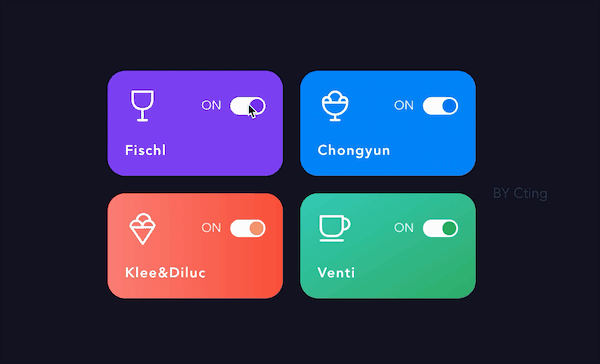
效果图:
代码:
<template>
  <div class="card" :class="isOpen?type:'off'">
    <el-row style="position:relative">
      <i :class="icon" style="font-size: 40px;font-weight: 100" />
      <div style="position: absolute;top: 0;right: 0;padding-top: 10px">
        <ct-switch
          v-model="isOpen"
          :circle-color="isOpen?activeColors[type]:'#fff'"
          active-color="#FDFDFD"
          inactive-color="#8A88B7"
          active-text="ON"
          inactive-text="OFF"
        />
      </div>
    </el-row>
    <el-row style="height: 40px;position: relative">
      <span style="font-size: 16px;font-weight: 600;position: absolute;bottom: 0;left:0;letter-spacing: 1px">{{ name }}</span>
    </el-row>
  </div>
</template>

<script>
import CtSwitch from './ct-switch'
export default {
  name: 'CtCard',
  components: { CtSwitch },
  props: {
    type: {
      type: String,
      default: 'off'
    },
    icon: {
      type: String,
      default: 'el-icon-coffee-cup'
    },
    name: {
      type: String,
      default: 'taitChan'
    }
  },
  data() {
    return {
      isOpen: true,
      activeColors: { success: '#2BAA5D', danger: '#F2946D', primary: '#0077F4', warning: '#7230F9' }
    }
  }
}
</script>

<style scoped>
    .card{
      border-radius: 20px;
      width: 200px;
      height: 120px;
      margin: 0 20px 20px 0;
      display: inline-block;
      padding: 20px;
      color: white;
    }
    .success{
      background-image: linear-gradient(to bottom right, #33C8B4, #2CAD66);
    }
    .primary{
      background-color: #0082F6;
    }
    .danger{
      background-image: linear-gradient(to right, #FA7D74 , #F94E39);
    }
    .warning{
      background-color: #7A40F2;
    }
    .off{
      box-shadow: 0 0  20px rgba(138, 136, 183,0.8);
    }
</style>
开关部分(ct-switch)是由这个改的,改的比较粗糙。


 1135
1135


 被折叠的 条评论
为什么被折叠?
被折叠的 条评论
为什么被折叠?
 到【灌水乐园】发言


