


组件支持自定义设置:
- 滑动输入条最小值(min),默认0
- 滑动输入条最大值(max),默认100
- 滑动输入条初始默认值(initialValue),当 range 为 false 时,使用 number,否则用 [number, number],在未设置value(v-model)时生效,默认[0, 100]
- 滑动输入条在页面中的宽度(width),默认600px
- 是否禁用(disabled),默认false
- 是否双滑块模式(range),默认false
- (v-model)设置当前取值(value),当 range 为 false 时,使用 number,否则用 [number, number]
可以通过鼠标拖动滑块来调整最大最小值,或者直接点击输入条上某个位置,直接切换数值
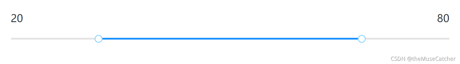
效果图如下:
单滑块模式(:range="false"):

双滑块模式(:range="true"):
①创建滑动输入条组件Slider.vue
<template>
  <div :class="['m-slider', { disabled: disabled }]" ref="slider" :style="`width: ${width}px;`">
    <div class="u-slider-rail" @click.self="onClickPoint"></div>
    <div class="u-slider-track" :class="{trackTransition: transition}" :style="`left: ${left}px; right: auto; width: ${right - left}px;`"></div>
    <div class="u-slider-handle" :class="{handleTransition: transition}" v-if="range" tabindex="0" ref="left" @mousedown="onLeftMouseDown" :style="`left: ${left}px; right: auto; transform: translateX(-50%);`"></div>
    <div class="u-slider-handle" :class="{handleTransition: transition}" tabindex="0" ref="right" @mousedown="onRightMouseDown" :style="`left: ${right}px; right: auto; transform: translateX(-50%);`"></div>
  </div>
</template>
<script>
export default {
  name: 'Slider',
  model: {
    prop: 'value',
    event: 'change'
  },
  props: {
    min: { // 滑动输入条最小值
      type: Number,
      default: 0
    },
    max: { // 滑动输入条最大值
      type: Number,
      default: 100
    },
    initialValue: { // 滑动输入条初始默认值,当 range 为 false 时,使用 number,否则用 [number, number],在未设置value(v-model)时生效
      type: [Number, Array],
      default: () => {
        return [0, 100]
      }
    },
    width: { // 滑动输入条在页面中的宽度
      type: Number,
      default: 600
    },
    disabled: { // 是否禁用
      type: Boolean,
      default: false
    },
    range: { // 是否双滑块模式
      type: Boolean,
      default: false
    },
    value: { // (v-model)设置当前取值,当 range 为 false 时,使用 number,否则用 [number, number]
      type: [Number, Array],
      default: null
    }
  },
  data () {
    return {
      transition: false,
      timer: null,
      left: 0, // 左滑块距离滑动条左端的距离
      right: 0 // 右滑动距离滑动条左端的距离
    }
  },
  computed: {
    scale () {
      return this.width / (this.max - this.min)
    },
    sliderValue () {
      const high = Math.round(this.right / this.scale + this.min)
      if (this.range) {
        const low = Math.round(this.left / this.scale + this.min)
        return [low, high]
      }
      return high
    }
  },
  watch: {
    sliderValue (to) {
      this.$emit('change', to) // 通知v-model值变化
    }
  },
  created () {
    if (this.range) { // 双滑块模式
      const leftVal = (this.value && (this.value[0] === 0 || this.value[0])) ? this.value[0] : this.initialValue[0]
      this.left = (leftVal - this.min) * this.scale
      const rightVal = (this.value && (this.value[1] === 0 || this.value[1])) ? this.value[1] : this.initialValue[1]
      this.right = (rightVal - this.min) * this.scale
    } else {
      const rightVal = this.value ? this.value : (Array.isArray(this.initialValue) ? 100 : this.initialValue)
      this.right = (rightVal - this.min) * this.scale
    }
  },
  methods: {
    onClickPoint (e) { // 点击滑动条,移动滑块
      if (this.transition) {
        clearTimeout(this.timer)
        this.timer = null
      } else {
        this.transition = true
      }
      this.timer = setTimeout(() => {
        this.transition = false
      }, 300)
      // 元素是absolute时,e.layerX是相对于自身元素左上角的水平位置
      var moveX = e.layerX // 鼠标点击位置距离滑动输入条左端的水平距离
      if (this.range) { // 双滑块模式
        if (moveX <= this.left) {
          this.left = moveX
        } else if (moveX >= this.right) {
          this.right = moveX
        } else {
          if ((moveX - this.left) < (this.right - moveX)) {
            this.left = moveX
          } else {
            this.right = moveX
          }
        }
      } else { // 单滑块模式
        this.right = moveX
      }
    },
    onLeftMouseDown () { // 在滚动条上拖动左滑块
      const leftX = this.$refs.slider.getBoundingClientRect().left // 滑动条左端距离屏幕可视区域左边界的距离
      document.onmousemove = (e) => {
        // e.clientX返回事件被触发时鼠标指针相对于浏览器可视窗口的水平坐标
        var moveX = e.clientX - leftX
        if (moveX < 0) {
          this.left = 0
        } else if (moveX >= 0 && moveX <= this.right) {
          this.left = moveX
        } else { // moveX > this.right
          this.left = this.right
          this.onRightMouseDown()
        }
      }
      document.onmouseup = () => {
        document.onmousemove = null
      }
    },
    onRightMouseDown () { // 在滚动条上拖动右滑块
      const leftX = this.$refs.slider.getBoundingClientRect().left // 滑动条左端距离屏幕可视区域左边界的距离
      document.onmousemove = (e) => {
        // e.clientX返回事件被触发时鼠标指针相对于浏览器可视窗口的水平坐标
        console.log(e.clientX)
        var moveX = e.clientX - leftX
        if (moveX > this.width) {
          this.right = this.width
        } else if (this.left <= moveX && moveX <= this.width) {
          this.right = moveX
        } else { // moveX < this.left
          this.right = this.left
          this.onLeftMouseDown()
        }
      }
      document.onmouseup = () => {
        document.onmousemove = null
      }
    }
  }
}
</script>
<style lang="less" scoped>
@themeColor: #1890FF;
.m-slider {
  display: inline-block;
  height: 4px;
  position: relative;
  z-index: 9;
  touch-action: none; // 禁用元素上的所有手势,使用自己的拖动和缩放api
  .u-slider-rail { // 灰色未选择滑动条背景色
    position: absolute;
    z-index: 99;
    height: 4px;
    width: 100%;
    background: #f5f5f5;
    border-radius: 2px;
    cursor: pointer;
    transition: background .3s;
  }
  .u-slider-track { // 蓝色已选择滑动条背景色
    position: absolute;
    z-index: 99;
    background: #91d5ff;
    border-radius: 4px;
    height: 4px;
    cursor: pointer;
    transition: background .3s;
    pointer-events: none;
  }
  .trackTransition {
    transition: left .2s, width .2s, background .3s;
  }
  &:hover {
    .u-slider-rail { // 灰色未选择滑动条背景色
      background: #E3E3E3;
    }
    .u-slider-track { // 蓝色已选择滑动条背景色
      background: @themeColor;
    }
  }
  .u-slider-handle { // 滑块
    position: absolute;
    z-index: 999;
    width: 12px;
    height: 12px;
    top: -6px;
    background: #fff;
    border: 2px solid #91d5ff;
    border-radius: 50%;
    cursor: pointer;
    transition: border-color .3s,box-shadow .6s,transform .3s cubic-bezier(.18,.89,.32,1.28);
    &:focus {
      border-color: @themeColor;
      box-shadow: 0 0 0 5px rgba(24, 144, 255, 0.2);
    }
    &:hover {
      border-color: @themeColor;
    }
  }
  .handleTransition {
    transition: left .2s, border-color .3s,box-shadow .6s,transform .3s cubic-bezier(.18,.89,.32,1.28);
  }
}
.disabled {
  cursor: not-allowed;
  .u-slider-rail {
    pointer-events: none;
  }
  .u-slider-track {
    background: rgba(0, 0, 0, .25);
  }
  .u-slider-handle {
    border-color: rgba(0, 0, 0, .25);
    pointer-events: none;
  }
  &:hover {
    .u-slider-track {
       background: rgba(0, 0, 0, .25);
    }
  }
}
</style>
②在要使用的页面引入:
<div class="m-num">
	<p class="u-num">{{ value[0] }}</p>
	<p class="u-num">{{ value[1] }}</p>
</div>
<NumSlider
    :min="0"
    :max="100"
    :initialValue="[20, 80]"
    :width="1200"
    :disabled="false"
    :range="true"
    v-model="value"
    @change="onChange"
/>
import NumSlider from '@/components/NumSlider'
components: {
    NumSlider
}
data () {
	return {
		value: [20, 80]
	}
}
methods: {
    onChange (val) {
      console.log('change:', val)
    }
}
.m-num {
  min-width: 1200px;
  width: 1200px;
  margin: 0 auto;
  display: flex;
  justify-content: space-between;
  .u-num {
    color: #333;
    font-size: 24px;
  }
}


 2371
2371


 被折叠的 条评论
为什么被折叠?
被折叠的 条评论
为什么被折叠?
 到【灌水乐园】发言


