


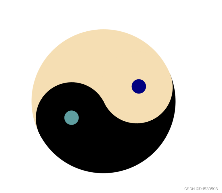
效果展示
具体代码
<!DOCTYPE html>
<html lang="en">
<head>
    <meta charset="UTF-8">
    <title>Title</title>
  <style>
      .div{
          position: absolute;
          animation-name: example ;
          animation-duration: 7s;
          animation-iteration-count: infinite;
          top: 200px;
          left: 500px;
          border: 0px solid saddlebrown;
          width:500px ;
          height: 500px;
      }

      @keyframes example {
          from{
              transform: rotate(0deg);}
         to{
              transform: rotate(360deg);
          }
      }
    .div1{
      width: 250px;
      height: 500px;
      border-radius: 250px 0px 0px 250px;
      background-color: black;
      position: absolute;
      left: 0px;
        z-index: -1;
    }
    .div2{
      width: 250px;
      height: 500px;
        border-radius: 0px 250px 250px 0px;
      background-color: wheat;
      position: absolute;
      left: 250px;
        z-index: -1;
    }
    .div3{
        width: 250px;
        height: 250px;
        position: absolute;
        background-color: black;
        border-radius: 50%;
        left: 118px;
    }
    .div4{
        width: 250px;
        height: 250px;
        position: absolute;
        background-color: wheat;
        border-radius: 50%;
        left: 120px;
        top: 250px;
    }
    .div5{
        width: 50px;
        height: 50px;
        position: absolute;
        background-color: cadetblue;
        border-radius: 50%;
        left:220px;
        top: 100px;
    }
    .div6{
        width: 50px;
        height: 50px;
        position: absolute;
        background-color: navy;
        border-radius: 50%;
        left: 220px;
        top: 358px;
    }

  </style>
</head>
<body>
<div class="div">
<div class="div1">

</div>
<div class="div2">
x
</div>
<div class="div3">

</div>
<div class="div4">

</div><div class="div5">

</div><div class="div6">

</div>
<div class="div7">

</div>
</div>

</body>
</html>
注意事项:
1.有个父元素包围整个太极元素,position使用相对定位,其他子元素的position使用绝对定位
2.太极的整体呈现需要用到 z-index: -1 属性,其中数字越大优先级越高,可以到达覆盖其他元素展示的效果
核心代码:
animation-name: example ;
animation-duration: 7s;
animation-iteration-count: infinite;
@keyframes example {
    from{
        transform: rotate(0deg);}
   to{
        transform: rotate(360deg);
    }
}


 2949
2949


 被折叠的 条评论
为什么被折叠?
被折叠的 条评论
为什么被折叠?
 到【灌水乐园】发言


