


大家好,上一篇文章《分享16个常用的自定义表单组件样式代码片段(上)》给大家分享过 16个常用样式代码片段上半部分,今天分享剩余的 8 个自定义组件样式(注:本篇文章只给出样式部分,有些交互需要借助 JS 实现)。本文尽量用最简单的CSS布局编写,希望对你有所启发,也许你有其他的写法,期待你在评论区的分享。
9、Rating(5星评级)
五星评级查用在服务评价的业务场景如下图所示:

HTML部分
<div class="rating">
  <button class="rating__star">☆</button>
  <button class="rating__star">☆</button>
  <button class="rating__star">☆</button>
  <button class="rating__star">☆</button>
  <button class="rating__star">★</button>
</div>
CSS部分
.rating {
  /* Center the content */
  align-items: center;
  display: flex;
  justify-content: center;

  flex-direction: row-reverse;

  font-size: 32px;
}

.rating__star:hover,
.rating__star:hover ~ .rating__star {
  color: transparent;
}

/*
Make all previous stars selected when hover on a star
Note that we use `flex-direction: row-reverse` on the container
*/
.rating__star:hover:before,
.rating__star:hover ~ .rating__star:before {
  color: #00449e;
  content: "\2605";
  left: 0;
  position: absolute;
}

.rating__star {
  /* Reset styles for button */
  background-color: transparent;
  border: transparent;
  margin: 0 2px;
  padding: 0;

  /* Used to position the hover state */
  position: relative;
}10、Search box(查找)
搜索输入框也很常见,我们会在输入框的最左边或右边显示搜索的图标,如下图所示:

HTML部分
<div class="container">
  <!-- Text input -->
  <input type="text" class="container__input" />

  <!-- Search icon sticks to the left or right -->
  ...
</div>
CSS部分
.container {
  display: flex;

  /* If you want to place the icon before the text input */
  flex-direction: row-reverse;

  /* Border */
  border: 1px solid rgba(0, 0, 0, 0.3);
}

.container__input {
  border-color: transparent;
  /* Take available width */
  flex: 1;
}11、Slider(滑块)
滑块组件也是很常见的组件,比如调整搜索数值的范围,音乐的播放进度等等,如下图所示:

HTML部分
<div class="container">
  <!-- Left side -->
  <!-- Width based on the current value -->
  <div class="container__left" style="width: 20%"></div>

  <!-- Circle -->
  <div class="container__circle"></div>

  <!-- Right side -->
  <div class="container__right"></div>
</div>
CSS部分
.container {
  /* Content is centered horizontally */
  align-items: center;
  display: flex;

  /* Size */
  height: 32px;
}

.container__left {
  height: 2px;

  /* Colors */
  background-color: rgba(0, 0, 0, 0.3);
}

.container__circle {
  /* Size */
  height: 32px;
  width: 32px;

  /* Rounded border */
  border-radius: 9999px;

  /* Colors */
  background-color: rgba(0, 0, 0, 0.3);
}

.container__right {
  /* Take the remaining width */
  flex: 1;
  height: 2px;

  /* Colors */
  background-color: rgba(0, 0, 0, 0.3);
}12、Spin button(上下加减按钮输入框)
如下图所示,按钮旁边一个上下箭头,方便用户调整数值:

HTML部分
<div class="container">
  <!-- Input -->
  <input type="text" class="container__input" />

  <!-- Buttons container -->
  <div class="container__buttons">
    <!-- Up button -->
    <button class="container__button">...</button>

    <!-- Down button -->
    <button class="container__button">...</button>
  </div>
</div>
CSS部分
.container {
  display: flex;

  /* If you want to place the icon before the text input */
  flex-direction: row-reverse;

  /* Border */
  border: 1px solid rgba(0, 0, 0, 0.3);
}

.container__input {
  border-color: transparent;
  /* Take available width */
  flex: 1;
}13、Stepper input(左右加减按钮输入框)
有时候,减号在左边,加号在右边的输入框,方便用户调整数值,也很常见,如下图所示:

HTML部分
<div class="stepper">
  <!-- Minus button -->
  <button class="stepper__button">-</button>

  <!-- Input container -->
  <div class="stepper__content">
    <input type="text" class="stepper__input" />
  </div>

  <!-- Plus button -->
  <button class="stepper__button">+</button>
</div>
CSS部分
.stepper {
  display: flex;

  /* Border */
  border: 1px solid rgba(0, 0, 0, 0.3);

  /* Size */
  height: 32px;
  width: 128px;
}

.stepper__button {
  /* Center the content */
  align-items: center;
  display: flex;
  justify-content: center;

  /* Size */
  width: 32px;
}

.stepper__content {
  flex: 1;
}

.stepper__input {
  /* Take full size of its container */
  height: 100%;
  width: 100%;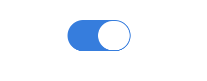
}14、Switch(开关组件)
类似苹果应用相关的开关组件,也是个很常见组件,比如系统配置的业务场景。如下图所示:
HTML部分
<label class="label">
  <input type="checkbox" class="label__input" />

  <!-- Circle -->
  <div class="label__circle"></div>
</label>
CSS部分
.label {
  display: flex;

  /* Rounded border */
  border-radius: 9999px;

  /* Size */
  height: 32px;
  width: 64px;

  /* OFF status */
  background-color: rgba(0, 0, 0, 0.1);
  border: 1px solid rgba(0, 0, 0, 0.3);

  /* ON status */
  background-color: #357edd;
  border: 1px solid #357edd;
  /* Push the circle to the right */
  justify-content: flex-end;
}

.label__input {
  /* Hide the input */
  display: none;
}

.label__circle {
  /* Rounded border */
  border-radius: 9999px;

  /* Size */
  width: 32px;

  background-color: #fff;

  /* OFF status */
  border: 1px solid rgba(0, 0, 0, 0.3);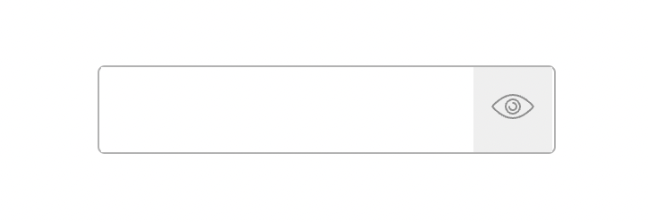
}15、Toggle password visibility(密码显示框)
如下图所示,在密码框右边加上一个按钮,用于显示和隐藏显示当前的密码,如下图所示:
HTML部分
<div class="container">
  <!-- Text input -->
  <input type="text" class="container__input" />

  <!-- Toggle button sticks to the right -->
  <button>...</button>
</div>
CSS部分
.container {
  display: flex;

  /* Border */
  border: 1px solid rgba(0, 0, 0, 0.3);
}

.container__input {
  border-color: transparent;
  /* Take available width */
  flex: 1;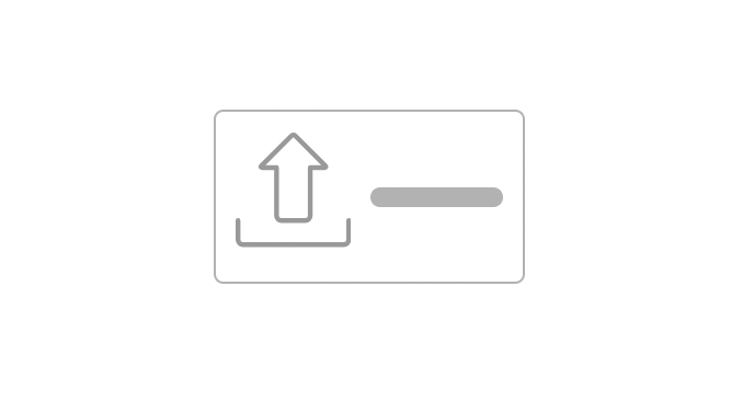
}16、Upload button(上传按钮)
有时候我们需要个性化原生的上传按钮组件,如下图所示,用一个按钮替代:
HTML部分
<div class="container">
  <!-- The real file input -->
  <input type="file" class="container__input" />

  <!-- The upload icon -->
  <div class="container__icon">...</div>

  <!-- The label -->
  ...
</div>
CSS部分
.container {
  /* Used to position the input */
  position: relative;

  /* Center the content */
  align-items: center;
  display: flex;

  /* Border */
  border: 1px solid rgba(0, 0, 0, 0.3);
}

.container__input {
  /* Take the full size */
  height: 100%;
  left: 0;
  position: absolute;
  top: 0;
  width: 100%;

  /* Make it transparent */
  opacity: 0;
}

.container__icon {
  margin-right: 8px;
}
总结
今天的文章就分享到这里,希望今天的分享,对你日常的业务有所帮助, 感谢你的阅读。
内容来源:https://github.com/1milligram/csslayout


 248
248

 被折叠的 条评论
为什么被折叠?
被折叠的 条评论
为什么被折叠?
 到【灌水乐园】发言


