


CSS
一、CSS盒模型
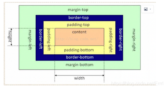
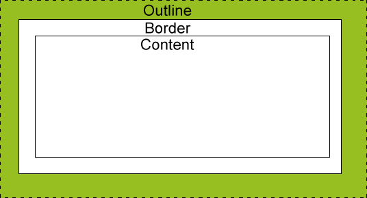
简介:就是用来装页面上的元素的矩形区域。CSS中的盒子模型包括IE盒子模型和标准的W3C盒子模型。
box-sizing(有3个值哦):border-box,padding-box,content-box。
标准盒子模型:
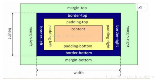
IE的盒子模型:
区别:从图中我们可以看出,这两种盒子模型最主要的区别就是width的包含范围,在标准的盒子模型中,width指content部分的宽度,在IE盒子模型中,width表示content+padding+border这三个部分的宽度,故这使得在计算整个盒子的宽度时存在着差异:
标准盒子模型的盒子宽度:width
IE盒子模型的盒子宽度:左右border+左右padding+width
在CSS3中引入了box-sizing属性,box-sizing:content-box;表示标准的盒子模型,box-sizing:border-box表示的是IE盒子模型
最后,前面我们还提到了,box-sizing:padding-box,这个属性值的宽度包含了左右padding+width
对于标准盒子模型来说,如果想保持一个盒子的真实占有宽度不变,那么加width的时候就要减padding。加padding的时候就要减width。
二、CSS语法
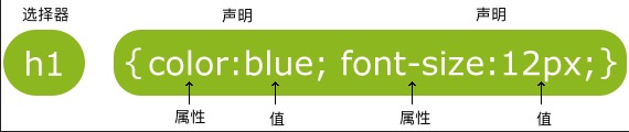
选择器
按照优先级排列,选择器可以分为:
- id选择器(
#myid) - 类选择器(
.myclassname) - 标签选择器(
div,h1,p) - 相邻选择器(
h1+p) - 子选择器(
ul > li) - 后代选择器(
li a) - 通配符选择器(
*) - 属性选择器(
a[rel="external"],input[type="button"]) - 伪类选择器(
a:hover,li:nth-child(n),a:link,li:last-child)
选择器优先级问题以及计算法
优先级顺序:
!important > 行内样式>ID选择器 > 类选择器 > 标签 > 通配符 > 继承 > 浏览器默认属性
注意:同一级别中后写的会覆盖先写的样式
优先级算法:
- 每个规则对应一个初始"四位数":0、0、0、0
- 若是 行内选择符,则加1、0、0、0
- 若是 ID选择符,则加0、1、0、0
- 若是 类选择符/伪类选择符,则分别加0、0、1、0
- 若是 元素选择符,则分别加0、0、0、1
算法:将每条规则中,选择符对应的数相加后得到的”四位数“,从左到右进行比较,大的优先级越高。
举个例子: .polaris span {color:red;}的选择器优先级是0011;而 .polaris 的优先级是0010;浏览器自然会显示红色的字。
扩展知识
怎么提升CSS选择器性能?
1.避免使用标签或 class 选择器限制 id 选择器
/*错误写法*/
.menu-left#newMenuIcon {…}
input#newMenuIcon {...}
/*正确写法*/
#newMenuIcon {...}
因为id选择器是唯一的,若无故再添加匹配项只会增加开销
2.避免使用标签限制 class 选择器
/*错误写法*/
input.menu-left {…}
/*正确写法*/
.menu-left {…}
3.避免使用多层标签选择器。使用 class 选择器替换,减少css查找
/*错误写法*/
treeitem[mailfolder="true"] > treerow > treecell {…}
/*正确写法*/
.treecell-mailfolder {…}
4.避免使用子选择器
/*错误写法*/
treehead treerow treecell {…}
treehead > treerow > treecell {…}
/*正确写法*/
.treecell-header {…}
5.使用继承
/*错误写法*/
#bookmarkMenuItem > .menu-left { list-style-image: url(blah) }
/*正确写法*/
#bookmarkMenuItem { list-style-image: url(blah) }
具体可以查看:https://www.w3cschool.cn/css/css-selector.html
CSS属性
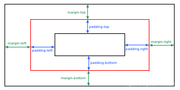
CSS(padding)填充
语法:
.XXX: {padding: 10px 20px 30px 40px;}
表示:
.XXX: {
padding-top: 10px ;
padding-right: 20px ;
padding-bottom: 30px ;
padding-left: 40px ;
}
| 属性 | 说明 |
|---|---|
| padding | 使用简写属性设置在一个声明中的所有填充属性,顺序(上、右、下、左)(上下、左右) |
| padding-bottom | 设置元素的底部填充 |
| padding-left | 设置元素的左部填充 |
| padding-right | 设置元素的右部填充 |
| padding-top | 设置元素的顶部填充 |
实例:
<!DOCTYPE html>
<html>
	<head>
		<meta charset="utf-8">
		<title></title>
        <!-- padidng对所有元素标签均单独起作用,满足css后覆盖前的特点 -->
        <style type="text/css">
            #padding{
                padding: 10px 20px 30px 40px;
                padding-bottom: 10px;
            }
            #padding2{
                padding-top: 25px;
            }
        </style>
	</head>
	<body>
        <span id="padding">123</span>
        <p id="padding2">456</p>
	</body>
</html>
CSS(margin)外边距
语法:
.XXX: {margin: 10px 20px 30px 40px;}
表示:
.XXX: {
margin-top: 10px ;
margin-right: 20px ;
margin-bottom: 30px ;
margin-left: 40px ;
}
| 属性 | 说明 |
|---|---|
| margin | 使用简写属性设置在一个声明中的所有外边距属性,顺序(上、右、下、左)(上下、左右) |
| margin-bottom | 设置元素的底部边距 |
| margin-left | 设置元素的左部边距 |
| margin-right | 设置元素的右部边距 |
| margin-top | 设置元素的顶部边距 |
实例:
<!DOCTYPE html>
<html>
	<head>
		<meta charset="utf-8">
		<title></title>
        <!-- margin特性:
        margin只对行内元素的左、右边距起作用,margin对块元素的上右下左边距均起作用
        margin-top,margin-bottom会重叠且取最大值,margin-left,margin-right不进行重叠 -->
        <style type="text/css">
            /* 行内元素没上下margin */
            #margin{
                margin: 10px 20px 30px 40px;
            }
            /* 块元素上下margin会重叠,且取最大值30px */
            #margin2{
                margin: 25px 10px;
            }
            #margin3{
                margin: 30px 10px;
            }
            /* margin-left,margin-right不进行重叠 */
            div{
                width: 100px;
                height: 100px;
                border: 1px solid red;
                float: left;
                margin: 10px;
            }
            #margin4 {
                margin-bottom: -100px;
            }
        </style>
	</head>
	<body>
        <span id="margin">123</span>
        <p id="margin2">456</p>
        <p id="margin3">789</p>
        <div id="div1"></div>
        <div id="div2"></div>
        <!-- 重叠取100px的负方向 -->
        <p id="margin4">102</p>
        <p>120</p>
	</body>
</html>
CSS(float)浮动
CSS 的 Float(浮动),会使元素向左或向右移动,其周围的元素也会重新排列。
Float(浮动),往往是用于图像,但它在布局时一样非常有用。
语法:
.XXX: {float: left/right;}
| 属性 | 说明 | 值 |
|---|---|---|
| float | 指定一个盒子(元素)是否可以浮动。 | left/right/none/inherit |
实例:
<!DOCTYPE html>
<html>
    <head>
        <meta charset="utf-8">
        <title></title>
        <style type="text/css">
            #div1 {
                background-color: blue;
            }
            /**
            * 此处发现背景颜色消失,#div2也消失。
            * 背景颜色消失的原因是设置了浮动,#div1中两个div都浮到上面去了(设置对象消失了)
            * #div2消失的原因是设置了float的元素不占据文档流的原有位置,而是脱离了文档流,所以
            * #div2占据了设置了float的div位置,简单来说就是被float元素盖住了
            * 因此,想要得到效果就必须清除浮动
            */
            #div1>div {
                width: 100px;
                height: 100px;
                border: 1px solid red;
                float: left;
            }
            #div2{
                width: 100px;
                height: 100px;
                border: 1px solid blue;
            }
        </style>
    </head>
    <body>
        <div id="div1">
            <div></div>
            <div></div>
        </div>
        <div id="div2"></div>
    </body>
</html>
浮动负效应
上述代码情况被称为浮动的负效应,具体可以分为:
1、父系高度坍塌,背景不能显示
由于浮动产生,如果对父级设置了(CSS background背景)CSS背景颜色或CSS背景图片,而父级不能被撑开,所以导致CSS背景不能显示。
2、父系高度坍塌,边框不能撑开
如果父级设置了CSS边框属性(css border),由于子级里使用了float属性,产生浮动,父级不能被撑开,导致边框不能随内容而被撑开。
3、margin padding设置值不能正确显示
由于浮动导致父级子级之间设置了css padding、css margin属性的值不能正确表达。特别是上下边的padding和margin不能正确显示。
4、造成其他元素的显示问题
由于浮动导致元素脱离文档流,其他元素就会占据其位置导致被掩盖造成显示问题。
清除浮动
- 额外标签法(在最后一个浮动标签后,新加一个标签,给其设置clear:both;)(不推荐原因:添加无意义标签,语义化差)
.clear{
	clear: both;
}
<div id="div1">
    <div></div>
    <div></div>
    <div class = “clear”></div>
</div>
- 父级添加overflow属性(父元素添加overflow:hidden)(不推荐:看起来好像很简单,但是存在问题就是当内容增多的时候容易造成不会自动换行导致内容被隐藏掉,无法显示要溢出的元素)
#div1 {
    overflow: hidden;
}
- 使用after伪元素清除浮动(推荐使用)(但是存在兼容问题)
/*伪元素是行内元素,以下是主流浏览器清除浮动方法*/
.clearfix:after{
	content: "";
    display: block;
    height: 0;
    clear:both;   /*清浮关键*/
    visibility: hidden;
}
/*ie6清除浮动的方式*/
.clearfix{
    *zoom: 1;
}
<div id="div1" class=“clearfix”>
    <div></div>
    <div></div>
</div>
- 最佳做法使用before和after双重伪元素清除浮动(推荐使用)
/*伪元素是行内元素,以下是主流浏览器清除浮动方法*/
.clearfix:before,.clearfix:after{
	content: "";
    display: table;
}
.clearfix:after{
	clear:both;   /*清浮关键*/
}
.clearfix{
    *zoom: 1;
}
<div id="div1" class=“clearfix”>
    <div></div>
    <div></div>
</div>
CSS(position)定位
position属性指定了元素的定位类型
语法:
.XXX{position: relative/absolute/static/fixed/sticky}
relative定位
相对定位,顾名思义:相对于自己正常位置定位
语法:
.XXX {
	position:relative;
	top:0px;
	left:0px;
}
absolute定位
绝对定位的元素的位置相对于最近的已定位父元素,如果元素没有已定位的父元素,那么它的位置相对于html
语法:
.XXX {
	position:absolute;
	top:100px;
	left:100px;
}
注意:
absolute 定位使元素的位置与文档流无关,因此不占据空间。
absolute 定位的元素和其他元素重叠。
static定位
HTML 元素的默认值,即没有定位,遵循正常的文档流对象。
静态定位的元素不会受到 top, bottom, left, right影响。
语法:
.XXX {
	position:absolute;
}
fixed定位
元素的位置相对于浏览器窗口是固定位置。
即使窗口是滚动的它也不会移动:
语法:
.XXX {
	position:fixed;
	top:100px;
	left:100px;
}
sticky 定位
sticky 英文字面意思是粘,粘贴,所以可以把它称之为粘性定位。
position: sticky; 基于用户的滚动位置来定位。
粘性定位的元素是依赖于用户的滚动,在 position:relative 与 position:fixed 定位之间切换。
它的行为就像 position:relative; 而当页面滚动超出目标区域时,它的表现就像 position:fixed;,它会固定在目标位置。
元素定位表现为在跨越特定阈值前为相对定位,之后为固定定位。
这个特定阈值指的是 top, right, bottom 或 left 之一,换言之,指定 top, right, bottom 或 left 四个阈值其中之一,才可使粘性定位生效。否则其行为与相对定位相同。
语法:
.XXX {
	position:sticky ;
	top:0;
}
其他的定位属性
| 属性 | 说明 | 值 |
|---|---|---|
| position | 指定元素的定位类型 | relative/absolute/static/fixed/sticky |
| bottom | 定义了定位元素下外边距边界与其包含块下边界之间的偏移。 | auto/length/% |
| top | 定义了定位元素上外边距边界与其包含块上边界之间的偏移。 | auto/length/% |
| left | 定义了定位元素左外边距边界与其包含块左边界之间的偏移。 | auto/length/% |
| right | 定义了定位元素右外边距边界与其包含块右边界之间的偏移。 | auto/length/% |
| z-index | 设置元素的堆叠顺序 | number/auto |
| overflow | 设置当元素的内容溢出其区域时执行的内容 | auto/hidden/scroll |
| cursor | 显示光标移动到指定位置的类型 | auto/pointer |
CSS(display&&visibility)显示
display(显示)
| 属性 | 属性值 | 说明 |
|---|---|---|
| display | none | 脱离文档流,隐藏元素(不占据空间) |
| display | block | 将行内元素转换成块元素,使之具有块元素的特点,img使用display: block会消除空白节点 |
| display | inline | 将块元素转换成行内元素,使之具有行内元素的特点 |
| display | inline-block | 将块元素或行内元素转换成行内块元素,使之既具有行内元素的特点又具有块元素的特点 |
| display | flex | 弹性布局的主要参数,相当于已经清除浮动的float(浮动) |
visibility(可见性)
| 属性 | 属性值 | 说明 |
|---|---|---|
| visibility | visible | 可见 |
| visibility | hidden | 隐藏元素,但是区别于display:none没有脱离文档流,仍然会占据空间 |
| visibility | collapse | 与visibility:hidden作用相同 |
CSS(background)背景
CSS 背景属性用于定义HTML元素的背景。
语法:
.XXX{background:bg-color bg-image position/bg-size bg-repeat bg-origin bg-clip bg-attachment initial / inherit;}
| 属性 | 属性值 | 说明 |
|---|---|---|
| background | bg-color bg-image position/bg-size bg-repeat bg-origin bg-clip bg-attachment initial / inherit | 简写属性,作用是将背景属性设置在一个声明中。 |
| background-color | #…/rgb() | 指定要使用的背景颜色 |
| background-image | url(’’) | 指定要使用的一个或多个背景图像 |
| background-position | left top/right bottom,x% y%,0px 0px | 指定背景图像的位置 |
| background-size | width height(px、%) | 指定背景图片的大小 |
| background-repeat | repeat、no-repeat、repeat-x、repeat-y | 指定如何重复背景图像 |
| background-origin | border-box、padding-box、content-box | 指定背景图像的定位区域 |
| background-clip | border-box、padding-box、content-box | 指定背景图像的绘画(剪切)区域 |
| background-attachment | scroll、fixed、local | 设置背景图像是否固定或者随着页面的其余部分滚动。 |
例子:
.bg{background: #000000 url('img.jpg') 0 0/100px 100px no-repeat}
CSS(border)边框
设置元素边框
语法:
.XXX{border: 1px solid red}
| 属性 | 属性值 | 说明 |
|---|---|---|
| border、border-top、border-right、border-bottom、border-left | border-width、border-style、border-color | 简写,设置全边框边框(遵循上、右、下、左) |
| border-width | thin、thick、length(px) | 指定边框的宽度 |
| border-style | none、dotted、dashed、solid、double、groove、ridge、inset、outset | 指定边框的样式 |
| border-color | #…/rgb() | 指定边框的颜色 |
CSS(text)文本
| 属性 | 属性值 | 说明 |
|---|---|---|
| color | #…/rgb() | 设置文本颜色 |
| direction | ltr(左到右)、rtl(右到左)、继承 | 设置文本方向 |
| letter-spacing | normal、±length(px)、继承 | 设置字符间距 |
| line-height | normal、length(px)、%、继承 | 设置行高 |
| text-decoration | none、underline、overline、继承 | 向文本添加修饰 |
| text-indent | length(px)、%、继承 | 缩进元素中文本的首行饰 |
| text-shadowt | h-shadow(水平阴影的位置。允许负值。)、v-shadow(垂直阴影的位置。允许负值。)、blur(模糊的距离。)、color(阴影颜色) | 设置文本阴影(语法:text-shadow: h-shadow v-shadow blur color;) |
| vertical-align | top、middle、bottom、length(px)、%、继承 | 设置元素的垂直对齐 |
| word-spacing | normal、length(px)、继承 | 设置字间距 |
推荐好文:https://www.zhangxinxu.com/wordpress/2015/08/css-deep-understand-vertical-align-and-line-height/
理解文本线类
CSS(fonts)字体
CSS字体属性定义字体,加粗,大小,文字样式。
| 属性 | 属性值 | 说明 |
|---|---|---|
| font-family | 字体系列 | 指定文本的字体系列 |
| font-size | px、em、%、rem、upx | 指定文本的字体大小 |
| font-style | normal、italic、oblique、继承 | 指定文本的字体样式 |
| font-variant | normal、small-caps(浏览器会显示小型大写字母的字体)、继承 | 以小型大写字体或者正常字体显示文本。 |
| font-weight | normal、bold、bolder、lighter、继承 | 指定字体的粗细。 |
CSS(link)链接
顺序:
L(link)OV(visited)E and H(hover)A(active)TE
例子:
a:link {color:#000000;}      /* 未访问链接*/
a:visited {color:#00FF00;}  /* 已访问链接 */
a:hover {color:#FF00FF;}  /* 鼠标移动到链接上 */
a:active {color:#0000FF;}  /* 鼠标点击时 */
CSS(outline)轮廓
轮廓(outline)是绘制于元素周围的一条线,位于边框边缘的外围,可起到突出元素的作用。
CSS outline 属性规定元素轮廓的样式、颜色和宽度。
重点在于不占据空间
属性、属性值与border类似
三、CSS创建
如何插入样式表?
插入样式表的方法有三种:
外部样式表(External style sheet)
内部样式表(Internal style sheet)
内联样式(Inline style)
外部样式表
<head>
<link rel="stylesheet" type="text/css" href="mystyle.css">
</head>
内部样式表
<!-- 在head中添加style -->
<style>
hr {color:sienna;}
p {margin-left:20px;}
body {background-image:url("images/back40.gif");}
</style>
内联样式
<!-- 在标签中添加style -->
<p style="color:sienna;margin-left:20px">这是一个段落。</p>
样式的优先级问题
(内联样式)Inline style > (内部样式)Internal style sheet >(外部样式)External style sheet > 浏览器默认样式
下文还会继续总结(css布局,BFC,css hack,常规的面试问答),有兴趣的可以继续点击查看


 293
293


 被折叠的 条评论
为什么被折叠?
被折叠的 条评论
为什么被折叠?
 到【灌水乐园】发言


