<template>
<div id="app">
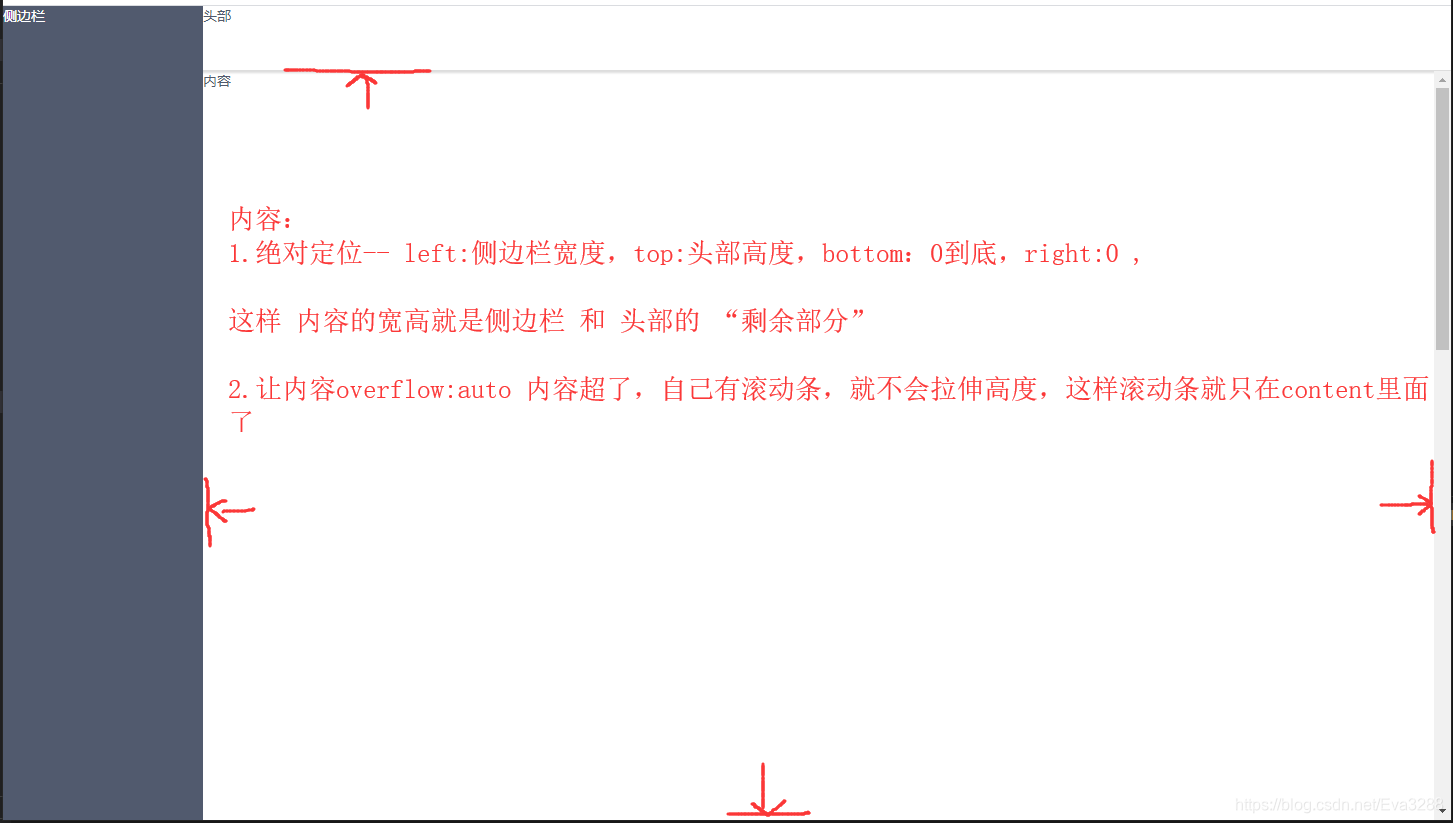
<div class="sider">侧边栏</div>
<div class="header">头部</div>
<div class="content">
内容
<p style='height:2000px;'></p>
111111111111111
</div>
</div>
</template>
<script>
export default {
data () {
return {
};
},
}
</script>
<style scoped>
#app{
height:100%;
height:100%;
}
.sider{
width:200px;
height:100vh;
position:fixed;
background:rgb(81, 90, 110);
color:#fff;
}
.header{
width:100%;
height:64px;
padding-left:200px;
background: #fff;
box-shadow:0 2px 2px 1px #ddd;
}
.content{
position:absolute;
left:200px;
top:65px;
bottom: 0;
right:0;
overflow: auto;
}
</style>


 411
411


 被折叠的 条评论
为什么被折叠?
被折叠的 条评论
为什么被折叠?
 到【灌水乐园】发言


