


过渡的属性介绍:
/*过渡属性*/
/*transition:width 2s,background-color 2s;*/
/*多个属性过渡*/
/*transition: all 2s;*/
/*过渡属性*/
/*transition-property: all;*/
/*过渡持续时间*/
/*transition-duration: 2s;*/
/*运动曲线  ease ease-in ease-out ease-in-out*/
/*transition-timing-function: ease-in-out;*/
/*过渡延迟*/
/*transition-delay:1s;*/
代码如下:
<!DOCTYPE html>
<html>
<head lang="en">
<meta charset="UTF-8">
<title></title>
<style>
body{
margin:0;
padding: 0;
background-color: #f7f7f7;
}
h3{
margin: 0;
padding: 0;
}
.box{
width: 500px;
margin: 0 auto;
}
.list h3{
height: 35px;
line-height: 35px;
padding-left: 30px;
border-bottom: 2px solid #690;
font-size: 14px;
color: #fff;
background: #369;
/*添加过渡属性 全部属性 过渡时间 缓慢运动 延迟运动时间*/
transition: all 0.3s ease 0s;
}
.list .pictxt{
height: 0;
background: orange;
transition: all 0.3s ease 0s;
}
.list h3:hover{
background-color: #036;
}
.list:hover .pictxt{
height: 150px;
}
</style>
</head>
<body>
<div class="box">
<div class="list">
<h3>今日新闻</h3>
<div class="pictxt"></div>
</div>
<div class="list">
<h3>明日新闻</h3>
<div class="pictxt"></div>
</div>
<div class="list">
<h3>昨日回忆</h3>
<div class="pictxt"></div>
</div>
<div class="list">
<h3>前日怀旧</h3>
<div class="pictxt"></div>
</div>
</div>
</body>
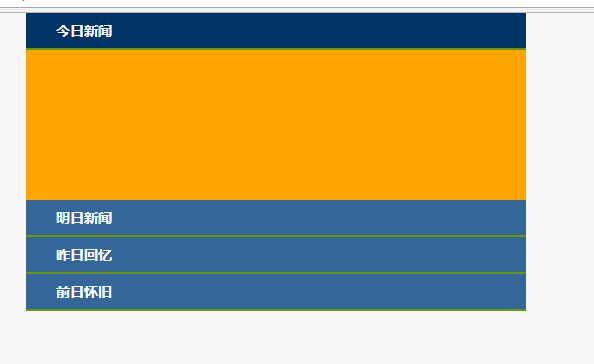
</html>运行结果如下:


 扫一扫
扫一扫
 232
232

 被折叠的 条评论
为什么被折叠?
被折叠的 条评论
为什么被折叠?
 到【灌水乐园】发言


