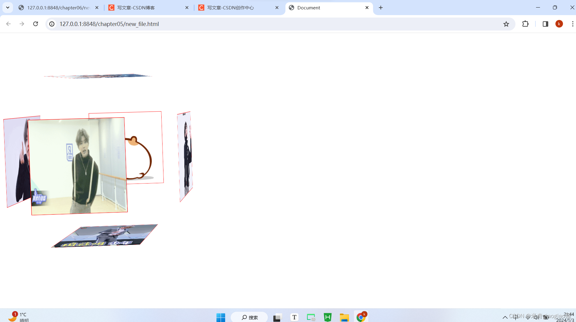
1.制作立体相册
代码:
<!DOCTYPE html>
<html>
	<head>
		<meta charset="UTF-8">
		<meta http-equiv="X-UA-Compatible" content="IE=edge">
		<meta name="viewport" content="width=device-width, initial-scale=1.0">
		<title>Document</title>
		<style>
			body{
				perspective: 1500px;
			}
			@keyframes myAnimation {
				from{
					transform: rotateX(0deg) rotateY(0deg) rotateZ(0deg);
				}
				to{
					transform: rotateX(360deg) rotateY(360deg) rotateZ(360deg);
				}
			}

			.container{
				margin:200px;
				position: relative;
				transform-style: preserve-3d;
				/* animation:myAnimation 5s linear 0s infinite; */
				animation-name: myAnimation;
				animation-duration: 5s;
				animation-timing-function: linear;
				animation-delay: 0s;
				animation-iteration-count: infinite;

			}

			/* .container:hover{
				transform: rotateX(45deg) rotatey(45deg) rotateZ(45deg);
			} */
			.container:hover>img:first-child{
				left: -300px;
			}
			.container:hover>img:nth-child(2){
				top: -300px;
			}
			.container:hover>img:nth-child(3){
				left: 300px;
			}
			.container:hover>img:nth-child(4){
				top: 300px;
			}
			.container:hover>img:nth-child(6){
				transform: translateZ(300px);
			}
			.container:hover>img:nth-child(5){
				transform: translateZ(-100px);
			}
			.container>img{
				width: 200px;
				height: 200px;
				position: absolute;
				border: 1px solid red;
				transition: 1s;
			}
			.container>img:first-child{
				left: -200px;
				transform-origin: right;
				transform: rotateY(90deg);
			}
			.container>img:nth-child(2){
				top:-200px;
				transform-origin: bottom;
				transform:rotateX(-90deg);
			}
			.container>img:nth-child(3){
				left: 200px;
				transform-origin: left;
				transform:rotateY(-90deg)
			}
			.container>img:nth-child(4){
				top: 200px;
				transform-origin: top;
				transform: rotateX(90deg);
			}
			.container>img:nth-child(6){
				transform: translateZ(200px);
			}
		</style>
	</head>
	<body>
		<div class="container">
			<img src="https://5b0988e595225.cdn.sohucs.com/images/20180412/4f89da2205ab44dba781c11e7a0860f1.gif" alt="">
			<img src="https://5b0988e595225.cdn.sohucs.com/images/20180526/1c55b16015b243a8bf406ce9da2952e1.gif" alt="">
			<img src="https://dingyue.ws.126.net/tCeAksgVrguz6lhuWMsvI4sEW3bWlKyyVxywR=THQSePo1553001386806.gif" alt="">
			<img src="https://n.sinaimg.cn/sinacn12/480/w240h240/20180420/d05e-fznefkf5333962.gif" alt="">
			<img src="https://5b0988e595225.cdn.sohucs.com/images/20200320/efac4ea1ca854fdb96be491c767cc272.gif" alt="">
			<img src="https://5b0988e595225.cdn.sohucs.com/images/20180203/fb1d2ec846be4ebb9ac647f4c7d6013a.gif" alt="">
		</div>
		  <audio src="https://ev-sycdn.kuwo.cn/c45ab12a2a2caaad6d95d2e7c573c1cf/659502b9/resource/n3/13/33/3310523721.mp3" autoplay="autopaly" loop>播放</audio>
	</body>
</html>
效果:
2.用CSS的常用样式制作一个炫酷的按钮
代码:
<!DOCTYPE html>
<html>
	<head>
		<meta charset="utf-8">
		<title></title>
		<style>
			div{
				width: 170px;
				height: 50px;
				/* background-color: aqua; */
				font-size: 20px;
				border: 3px solid red;
				text-align: center;
				line-height: 50px;
				border-radius: 15px;
				/* 文字阴影的 1参数是 x轴偏移量  2参数:y轴偏移量 3参:模糊程度 4参:阴影的颜色*/
				/* text-shadow: 5px 5px 0px red, -5px -5px 0px red,-5px 5px 0px red,5px -5px 0px red; */
				transition: 1s;
				background-color: black;
				color: white;
				margin: auto;
			}

			div:hover{
				background-color: white;
				color: black;
				box-shadow:  5px 5px 10px skyblue,
				-5px -5px 10px springgreen,
				 -5px 5px 10px lightgrey,
				  5px -5px 10px darkorange;
			}
		</style>
	</head>
	<body>
		<div>
			来啦!老弟儿
		</div>
	</body>
</html>
效果:


 1万+
1万+


 被折叠的 条评论
为什么被折叠?
被折叠的 条评论
为什么被折叠?
 到【灌水乐园】发言


