


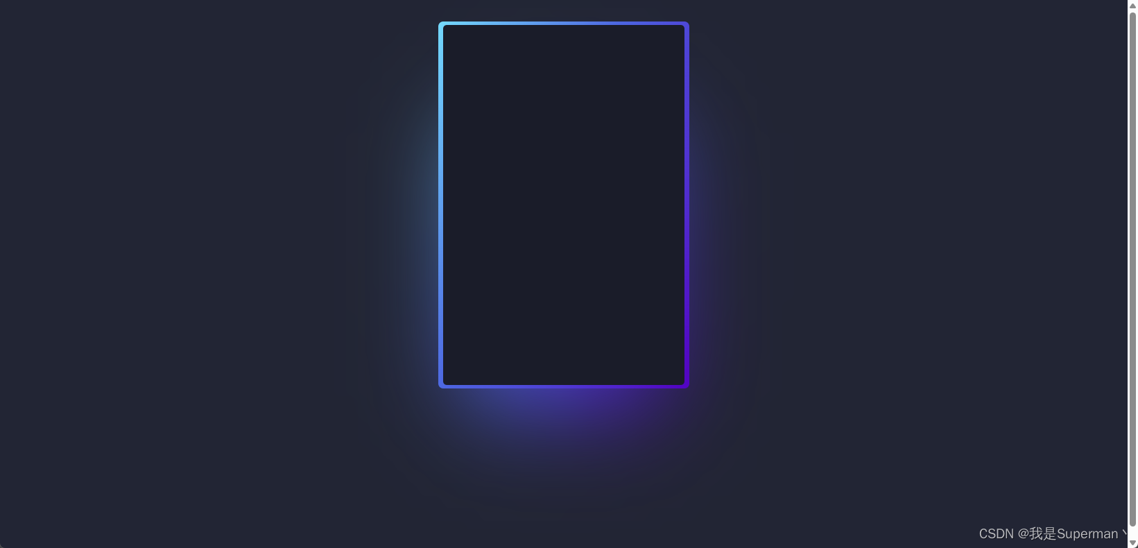
 本文介绍了如何使用HTML和CSS3创建一个具有呼吸效果的卡片,通过CSS的关键帧动画实现渐变色阴影在鼠标悬停时的旋转,增强了前端界面的交互性。
【前端】卡片渐变色阴影效果 旋转动画
<!DOCTYPE html>
<html lang="en">
<head>
<meta charset="UTF-8">
<meta name="viewport" content="width=device-width, initial-scale=1.0">
<title>Breathing Effect</title>
<style>
@property --rotate {
  syntax: "<angle>";
  initial-value: 132deg;
  inherits: false;
}

:root {
  --card-height: 65vh;
  --card-width: calc(var(--card-height) / 1.5);
}


body {
  min-height: 100vh;
  background: #212534;
  display: flex;
  align-items: center;
  flex-direction: column;
  padding-top: 2rem;
  padding-bottom: 2rem;
  box-sizing: border-box;
}


.card {
  background: #191c29;
  width: var(--card-width);
  height: var(--card-height);
  padding: 3px;
  position: relative;
  border-radius: 6px;
  justify-content: center;
  align-items: center;
  text-align: center;
  display: flex;
  font-size: 1.5em;
  color: rgb(88 199 250 / 0%);
  cursor: pointer;
  font-family: cursive;
}

.card:hover {
  color: rgb(88 199 250 / 100%);
  transition: color 1s;
}
.card:hover:before, .card:hover:after {
  animation: none;
  opacity: 0;
}


.card::before {
  content: "";
  width: 104%;
  height: 102%;
  border-radius: 8px;
  background-image: linear-gradient(
    var(--rotate)
    , #5ddcff, #3c67e3 43%, #4e00c2);
    position: absolute;
    z-index: -1;
    top: -1%;
    left: -2%;
    animation: spin 2.5s linear infinite;
}

.card::after {
  position: absolute;
  content: "";
  top: calc(var(--card-height) / 6);
  left: 0;
  right: 0;
  z-index: -1;
  height: 100%;
  width: 100%;
  margin: 0 auto;
  transform: scale(0.8);
  filter: blur(calc(var(--card-height) / 6));
  background-image: linear-gradient(
    var(--rotate)
    , #5ddcff, #3c67e3 43%, #4e00c2);
    opacity: 1;
  transition: opacity .5s;
  animation: spin 2.5s linear infinite;
}

@keyframes spin {
  0% {
    --rotate: 0deg;
  }
  100% {
    --rotate: 360deg;
  }
}

a {
  color: #212534;
  text-decoration: none;
  font-family: sans-serif;
  font-weight: bold;
  margin-top: 2rem;
}
</style>
</head>
<body>

<div class="card">
  Magic Card
</div>

</body>
</html>
参考


 扫一扫
扫一扫


 359
359

 被折叠的 条评论
为什么被折叠?
被折叠的 条评论
为什么被折叠?
 到【灌水乐园】发言


