


本章概要
- 新书页面
- 图书详情页面
- 加减按钮组件
- 标签页组件
- 标签页组件
- 图书介绍组件
- 图书评价组件
- 图书问答组件
- Book 组件
17.6 新书页面
当单击菜单栏中的“新书”菜单时,将跳转到新书页面。这里直接复用了 BooksNew 组件(参看 17.3.6 小节),只是在路由配置中为新书页面添加了一项路由配置。如下:
router/index.js
...
const routes = [
  ...
  {
    path: '/newbooks',
    name: 'newbooks',
    meta: {
      title: '新书上市'
    },
    component: () => import('../components/BooksNew.vue')
  }
]
routes.afterEach((to) => {
  document.title = to.meta.title;
})
...
17.7 图书详情页面
不管从何处单击图书链接,都将跳转到图书详情页面。图书详情页面中有两个子组件,其中一个是实现图书数量加减的组件;另一个是用动态组件实现的标签页组件,用于在图书介绍、图书评价和图书问答三者之间进行切换。
17.7.1 加减按钮组件
加减按钮组件由 3 部分组成:一个输入框和加减按钮。当然,至于采用什么页面元素实现加减按钮就无所谓了,本项目中采用的 a 标签实现加减按钮。
在 components 目录下新建 AddSubtractButton.vue
components/AddSubtractButton.vue
<template>
    <div class="addSubtractButton">
        <input v-model="quantity" type="number" />
        <div>
            <a class="add" href="javascript:;" @click="handleAdd">+</a>
            <a class="sub" href="javascript:;" @click="handleSubtract"
                :class="{ disabled: quantity === 0, actived: quantity > 0 }">-</a>
        </div>
    </div>
</template>

<script>

export default {
    name: 'AddSubtractButton',
    data() {
        return {
            quantity: 0
        }
    },
    methods: {
        handleAdd() {
            this.quantity++;
            this.$emit("update-quantity", this.quantity);
        },
        handleSubtract() {
            this.quantity--;
            this.$emit("update-quantity", this.quantity);
        }
    }
}

</script>

<style scoped>
.addSubtractButton input {
    height: 30px;
    width: 30px;
    float: left;
    text-align: center;
}

.addSubtractButton div {
    width: 15px;
    height: 30px;
    float: left;
    margin: 0;
    padding: 0;

}

.addSubtractButton a {
    text-align: center;
    vertical-align: middle;
    height: 16px;
    width: 16px;
    background-color: #ccc;
    text-decoration: none;
    border: solid 1px gray;
    display: inline-block;
    margin: 0;
    padding: 0;
    outline: none;
}

.addSubtractButton a.add {
    margin-top: -1px;
    color: black;
}

.addSubtractButton a.sub {
    margin-top: -3px;
    border-top: none;
}

input::-webkit-outer-spin-button,
input::-webkit-inner-spin-button {
    -webkit-appearance: none !important;
    margin: 0;
}

.disabled {
    pointer-events: none;
    color: gray;
    cursor: default;
}

.actived {
    color: black;
}
</style>
用户可直接在输入框中输入购买数量,也可以通过加减按钮增减数量,当数量为 0 时,通过 CSS 样式控制减按钮不可用。加减组件通过自定义事件 updateQuantity 向父组件传递数据。
另外要注意的是,提交的自定义事件必须采用 kebab-case 风格命名。
17.7.2 标签页组件
本项目中的标签页组件是根据 10.7 节介绍的动态组件知识编写的,并进行了封装。该标签页组件有 3 个子组件,分别是图书介绍、图书评价和图书问答。下面分别介绍标签页组件及其子组件。
1.标签页组件
在 components 目录下新建 BookTabComponent.vue 。如下:
components/BookTabComponent.vue
<template>
    <div class="tabComponent">
        <button v-for="tab in tabs" :key="tab.title" :class="['tab-button', { active: currentTab === tab.title }]"
            @click="currentTab = tab.title">
            {{ tab.displayName }}
        </button>
        <keep-alive>
            <component :is="currentTabComponent" :content="content" class="tab"></component>
        </keep-alive>
    </div>
</template>
<script>
import BookIntroduction from './BookIntroduction';
import BookComponentList from './BookCommentList';
import BookQA from './BookQA';

export default {
    name: 'TabComponent',
    props: {
        content: {
            type: String,
            default: ''
        }
    },
    data() {
        return {
            currentTab: 'introduction',
            tabs: [
                { title: 'introduction', displayName: '图书介绍' },
                { title: 'comment', displayName: '图书评价' },
                { title: 'qa', displayName: '图书问答' }
            ]
        }
    },
    components: {
        BookIntroduction,
        BookComment: BookComponentList,
        BookQa: BookQA
    },
    computed: {
        currentTabComponent: function () {
            return 'book-' + this.currentTab;
        }
    }
}


</script>

<style scoped>
.tabComponent {
    float: left;
    width: 100%;
    text-align: left;
    margin-left: 80px;
}

.tab-button {
    padding: 6px 10px;
    border-top-left-radius: 3px;
    border-top-right-radius: 3px;
    border: solid 1px #ccc;
    cursor: pointer;
    background: #f0f0f0;
    margin-bottom: -1px;
    margin-right: -1px;
}

.tab-button:hover {
    background: #e0e0e0;
}

.tab-button.active {
    background: #cdcdcd;
}

.tab {
    border: solid 1px #ccc;
    padding: 10px;
}
</style>
多标签页面的实现方式已经在 10.7 节中说过,此处不再赘述。
2.图书介绍组件
在 components 目录下新建 BookIntroduction.vue 。如下:
components/BookIntroduction.vue
<template>
    <div>
        <p>{{ content }}</p>
    </div>
</template>
<script>
export default {
    name: 'BookIntroduction',
    props: {
        content: {
            type: String,
            default: ''
        }
    }
}
</script>
组件代码很简单,只是定义了一个 content prop ,用于接收父组件传进来的图书内容,并进行显示。
3.图书评价组件
图书评价组件负责渲染图书的评论信息,评论信息以列表方式呈现,在本项目中,将单条评论信息封装为一个组件 BookCommentListItem,评论信息列表封装为一个组件 BookCommentList。
在 components 目录下新建 BookCommentListItem.vue。如下:
components/BookCommentListItem.vue
<template>
    <div class="bookCommentListItem">
        <div>
            <span>{{ item.username }}</span>
            <span>{{ formatTime(item.commentDate) }}</span>
        </div>
        <div>{{ item.content }}</div>
    </div>
</template>
<script>
export default {
    name: 'BookCommentListItem',
    props: {
        item: {
            type: Object,
            default: () => { }
        }
    },
    inject: ['formatTime']
}

</script>
<style scoped>
.bookCommentListItem {
    border-bottom: solid 1px #ccc;
    margin-bottom: 10px;
}

.bookCommentListItem span {
    margin-right: 20px;
}
</style>
该组件比较简单,只是接收父组件传进来的 item prop,并进行相应渲染。唯一需要注意的是,在渲染评论日期时,调用了一个 formatTime() 函数。这是因为服务端传过来的日期时间数据有时并不是我们平常使用的格式。例如,Java 服务端程序传过来的日期和时间中间会有一个 T 字符。如下:
2023-01-05T09:53:04
很显然,直接将该日期时间渲染到页面,用户体验不好。为此,在util.js编写负责日期时间格式化的函数,如下:
utils/util.js
export function formatTime(value){
    return value.toLocaleString().replace(/T/g,' ').replace(/\.[\d]{3}Z/,'');
}
同样在 App.vue 中使用 provide 选项向后代组件提供该函数,如下:
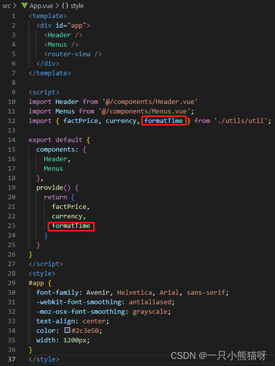
App.vue
<template>
  <div id="app">
    <Header />
    <Menus />
    <router-view />
  </div>
</template>

<script>
import Header from '@/components/Header.vue'
import Menus from '@/components/Menus.vue';
import { factPrice, currency, formatTime } from './utils/util';

export default {
  components: {
    Header,
    Menus
  },
  provide() {
    return {
      factPrice,
      currency,
      formatTime
    }
  }
}
</script>
<style>
#app {
  font-family: Avenir, Helvetica, Arial, sans-serif;
  -webkit-font-smoothing: antialiased;
  -moz-osx-font-smoothing: grayscale;
  text-align: center;
  color: #2c3e50;
  width: 1200px;
}
</style>
接下来,在 components 目录下新建 BookCommentList.vue。如下:
component/BookCommentList.vue
<template>
    <div>
        <h3>{{ message }}</h3>
        <BookCommentListItem v-for="comment in comments" :item="comment" :key="comment.id" />
    </div>
</template>
<script>
import BookCommentListItem from './BookCommentListItem.vue';

export default {
    name: "BookCommentList",
    data() {
        return {
            comments: [],
            message: ''
        }
    },
    components: { BookCommentListItem },
    created() {
        this.message = '';
        let url = this.$route.path + "/comment";
        this.axios.get(url).then(res => {
            if (res.status == 200) {
                this.comments = res.data;
                if (this.comments.length == 0) {
                    this.message = "当前没有任何评论!"
                }
            }
        }).catch(err => {
            alert(err);
        })
    }
}

</script>
BookCommentList 组件在 created 生命周期钩子中向服务端请求数据。数据接口如下:
http://111.229.37.167/api/book/:id/comment(http://111.229.37.167/api/book/1/comment)
返回的数据结构如下:
[{
  "id": 1,
  "content": "本书是VC 深入详解第三版,内容基于VS2017,从基础学起,最后自已会编程。",
  "commentDate": "2019-11-12T00:14:30",
  "book": null,
  "username": "张三"
}, {
  "id": 2,
  "content": "书收到了,快递非常快,书的质量也好,也是最便宜的,谢谢你们",
  "commentDate": "2019-10-03T09:15:09",
  "book": null,
  "username": "李四"
}, {
  "id": 3,
  "content": "确实不错,好书",
  "commentDate": "2019-09-14T18:16:10",
  "book": null,
  "username": "王五"
}, {
  "id": 4,
  "content": "真的很喜欢",
  "commentDate": "2019-07-04T09:17:14",
  "book": null,
  "username": "赵六"
}, {
  "id": 5,
  "content": "很好,物流很快",
  "commentDate": "2019-10-24T14:18:37",
  "book": null,
  "username": "钱七"
}]
接收到数据后,使用 v-for 指令渲染 BookCommentListItem 组件。
可能会考虑是否要给该组件添加组件复用时再次请求评论数据的功能,其实这是没必要的。当用户在浏览评论信息时切换了标签页再回到评论标签页时,多一两条评论信息并不会影响用户的购买需求,而且并不是每个购买图书的用户都会发表评论。
也就是说,图书评论的频次实际上是很低的。所有在 created 生命周期钩子中请求一次数据足以满足应用的需求。
4.图书问答组件
图书问答组件其实就是一个摆件,并没有实际的功能。该组件的名字为 BookQA,就显示了一句话:图书问答。
components/BookQA.vue
<template>
    <div>
        <h3>图书问答</h3>
    </div>
</template>

<script>

export default {
    name: 'BookQA',
    props: [''],
    data() {
        return {

        };
    },

    components: {},

    computed: {},

    methods: {},

    watch: {}

}

</script>
17.7.3 Book 组件
Book 组件作为页面级组件,放在 views目录下。如下:
views/Book.vue
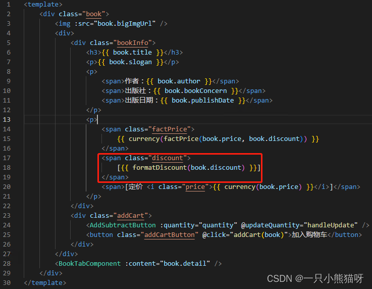
<template>
<div class="book">
<img :src="book.bigImgUrl" />
<div>
<div class="bookInfo">
<h3>{{ book.title }}</h3>
<p>{{ book.slogan }}</p>
<p>
<span>作者:{{ book.author }}</span>
<span>出版社:{{ book.bookConcern }}</span>
<span>出版日期:{{ book.publishDate }}</span>
</p>
<p>
<span class="factPrice">
{{ currency(factPrice(book.price, book.discount)) }}
</span>
<span class="discount">
[{{ formatDiscount(book.discount) }}]
</span>
<span>[定价 <i class="price">{{ currency(book.price) }}</i>]</span>
</p>
</div>
<div class="addCart">
<AddSubtractButton :quantity="quantity" @updateQuantity="handleUpdate" />
<button class="addCartButton" @click="addCart(book)">加入购物车</button>
</div>
</div>
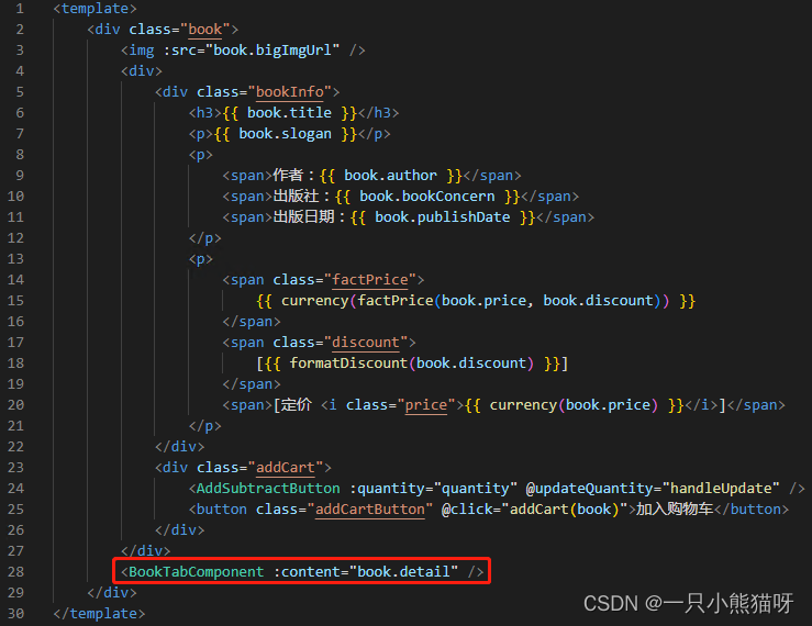
<BookTabComponent :content="book.detail" />
</div>
</template>
<script>
import AddSubtractButton from '@/components/AddSubtractButton'
import BookTabComponent from '@/components/BookTabComponent'
import { mapActions } from 'vuex'
export default {
name: 'Book',
data() {
return {
book: {},
quantity: 0
}
},
inject: ['factPrice', 'currency'],
components: {
AddSubtractButton,
BookTabComponent
},
created() {
this.axios.get(this.$route.fullPath)
.then(response => {
if (response.status == 200) {
this.book = response.data;
}
}).catch(error => alert(error));
},
methods: {
// 子组件AddSubtractButton的自定义事件updateQuantity的处理函数
handleUpdate(value) {
this.quantity = value;
},
addCart(book) {
let quantity = this.quantity;
if (quantity === 0) {
quantity = 1;
}
let newItem = { ...book, price: this.factPrice(book.price, book.discount) };
this.addProductToCart({ ...newItem, quantity });
this.$router.push('/cart');
},
...mapActions('cart', [
'addProductToCart'
]),
// 格式化折扣数据
formatDiscount(value) {
if (value) {
let strDigits = value.toString().substring(2);
strDigits += "折";
return strDigits;
}
else
return value;
}
},
}
</script>
<style scoped>
.book {
width: 1100px;
margin-top: 60px;
text-align: left;
}
.book img {
margin-left: 50px;
float: left;
width: 200px;
height: 200px;
}
.book .bookInfo {
margin-left: 20px;
float: left;
width: 800px;
background-color: #eee;
padding-left: 20px;
padding-top: 5px;
}
.book .addCart {
margin-left: 300px;
float: left;
margin-top: 10px;
}
.book .addCartButton {
padding: 5px 10px 6px;
color: #fff;
border: none;
border-bottom: solid 1px #222;
border-radius: 5px;
box-shadow: 0 1px 3px #999;
text-shadow: 0 -1px 3px #444;
cursor: pointer;
background-color: #e33100;
display: block;
margin-left: 80px;
}
.addCartButton:hover {
text-shadow: 0 1px 1px #444;
}
.book span {
padding-right: 15px;
}
.book .price {
color: gray;
text-decoration: line-through;
}
.book .discount {
color: red;
}
.book .factPrice {
color: red;
font-weight: bold;
}
</style>
说明:

接收到的折扣数据形式如 0.95,在显示时,直接显示 0.95折,显然不合适,为此编写一个方法,将 0.95 这种形式格式化为 95 折。
BookIntroduction 组件有一个 content prop ,用于接收图书的详细介绍数据,这里得到图书数据后,将图书的介绍数据通过 BookTabComponent 组件向下传递。
Book 组件在 created 生命周期钩子中请求服务端的图书数据。数据接口如下:
http://111.229.37.167/api/book/:id(http://111.229.37.167/api/book/1)
返回的数据结构如下:
{
	"id": 1,
	"title": " VC++深入详解(第3版)",
	"author": "孙鑫",
	"price": 168.0,
	"discount": 0.95,
	"bookConcern": "电子工业出版社",
	"imgUrl": "/api/img/vc++.jpg",
	"bigImgUrl": "/api/img/vc++big.jpg",
	"publishDate": "2019-06-01",
	"brief": "《VC 深入详解(第3版)(基于Visual Studio 2017)》以Visual Studio 2017作为开发环境,将之前适用于Visual C 6.0的代码全部进行了升级,并修订了书中和代码中的一些疏漏。",
	"inventory": 1000,
	"detail": "本书在内容的组织上循序渐进、由浅入深;在知识的介绍上,从内到外、从原理到实践。第1章首先为读者介绍了Visual Studio 2017的安装和使用,以及离线MSDN的安装。第2章帮助读者掌握Windows平台下程序运行的内部机制。第3章帮助读者复习C 中的重要知识,为后续知识的学习打下良好的基础。第4章重点剖析MFC框架程序的运行脉络,并与第2章的知识做对照,为读者彻底扫清学习MFC的迷雾。相信通过这一章的学习,很多以前学过MFC的读者都会有一种恍然大悟的感觉。前四章可以归为基础部分,从第5章开始就是实际应用开发的讲解了,包括绘图、文本、菜单、对话框、定制程序外观、图形保存和重绘、文件和注册表操作、网络编程、多线程、进程间通信、ActiveX控件、动态链接库、HOOK编程等多个主题,并且每一章都有一个完整的例子。本书的讲解理论结合实际,选用的例子和代码非常具有代表性和实用价值,我和我的学员在实际开发项目的过程中就曾经直接使用过很多书中的代码。",
	"newness": true,
	"hot": true,
	"specialOffer": false,
	"slogan": "王者归来!畅销10万余册的《VC++深入详解》全新升级,基于VS2017新版本! 内容更新!代码更新!实力更强! ",
	"category": {
		"id": 6,
		"name": "C/C++",
		"root": false,
		"parentId": 2,
		"children": null
	}
}


 3052
3052


 被折叠的 条评论
为什么被折叠?
被折叠的 条评论
为什么被折叠?
 到【灌水乐园】发言


